Why is the gap between acquiring website traffic and converting a customer so big?
And how big is it really?
The answer depends on your industry and product but Morgan Brown and Sean Ellis highlighted in their book Hacking Growth that for every $92 spent on acquiring more web traffic, only $1 was spent on converting those visitors into actual paying customers.
Tinuiti’s digital ads benchmark report mentions that in 2023 ad spend just for Google has increased by 17%.
While Facebook was the only one of these platforms to see a deceleration in growth between Q3 and Q4, it still saw the biggest lift in growth from the first quarter of the year to the last. Meta’s other major property, Instagram, continued to see the strongest growth across these five platforms with spending up 27% year over year in Q4. Across Facebook and Instagram combined, spending was up 13% in Q4.
Increased ad spending for acquiring customers isn’t a trend that has shifted much over the past decade or so. Meanwhile, that same increased ad spend is still sending traffic to low-converting landing pages.
Hubspot claims that the average landing page conversion rate across all industries is 5.89%, while Unbounce says the median conversion rate should be somewhere around 4.3% across all industries.
It’s time to step up your landing page optimization game. Here’s how to do it.
Quick Overview
| Many companies invest heavily in driving traffic but overlook whether their landing pages are built to convert that traffic. This blog explores how ads and landing pages work as a single system, where message continuity and intent alignment play a major role in performance. It highlights common issues, like sending paid traffic to generic pages or mismatching user intent, and explains how dedicated, campaign-specific pages can improve both conversion rates and ad efficiency. With the right measurement, research tools, and scalable page setup, landing pages become an ongoing optimization program rather than a one-off project. |
Table of contents
Establishing your landing page conversion baseline
Before you can jump into strategy and devise a foolproof plan to increase your landing page conversion rates, you need to understand what the current conversion rates actually are.
Countless analytics solutions help you track landing page performance, but Google Analytics remains the most popular option. This can make things somewhat difficult since the coming of Google Analytics 4 and its complete pivot from reporting when compared to Universal Analytics. If you need a guide to help you get started, take a look at this article by Koalatative for 4 quick tips for analyzing your landing page conversions with GA4.
It is important to establish a baseline that you can later build on. You should clearly understand your current landing page conversion rate and how it relates to your traffic sources and ad budget.
Understanding the causes behind your landing page conversion rate
Large organizations tend to operate in silos within their marketing departments, but paid ads should not be analyzed and created in isolation from their respective pages. One of the first things you should do when optimizing your landing pages is to take a look at the ads that lead to them.
The bigger the organization, the harder it is to bake this into the landing page optimization process, solely because of the number of people involved. When an ad campaign performs poorly, the team analyzing it often tends to focus on the creative and messaging of the ad itself while the web and optimization team works on their own to improve the landing pages.
The story mindset
This is where it could be helpful to implement the “story mindset” for your landing page optimization process. This will help make the messaging between your ad and landing page consistent and reassure your customers that they are at the right place with clear instructions to help them navigate to the next step in their journey.
Simply put, the ad is the introduction of your story and the landing page should continue that same story while driving the point home. The two are not individual projects, but two parts that should complement each other seamlessly and paint an integral picture of what you’re hoping your customers will achieve on your site.
If looking at your landing page creation and optimization process as a story is something that feels aligned for your organization, take a look at this talk from Experiment Nations 2023 online conference:
Landing page faux pas
Before diving into the often expensive and time-consuming qualitative research methods, it’s good to ask a couple of key questions that will highlight how big the disconnect between your ads and landing pages is.
1. Are you sending your paid campaign traffic to home/product/category pages?
Your home page has the most diverse set of information on the site. It has to educate new customers about who you are and what you do, it has to offer clear next steps in the buying journey, and cater to returning customers who are looking to access specific products and/or services all at the same time.
Product pages focus on a single product and its details, while category pages showcase similar products in the same category. If you’re working for a big e-commerce company and you have the resources to run individual campaigns for specific products then it can make sense to send that traffic to the dedicated product page.
Use dedicated landing pages for each campaign
However, you should create a dedicated landing page for each campaign. Koalatative published a case study about a company with 80% dropoff rates on their original landing pages tied to paid traffic and how they managed to turn it around by creating new dedicated landing pages.
While sending all traffic to an already existing page may seem efficient because you’re not spending extra resources on a new page, there can be serious drawbacks, and not just because of messaging and UX issues.
ConversionOwl highlights why sending traffic to a dedicated landing page is also important from a PPC standpoint:
In the case of paid advertising, relevancy is everything. If you put up an ad that talks about one specific product, but then send this traffic to your homepage that only mentions this product in the sidebar, Google is going to give you a lower quality score.
A lower quality score equates to a lower ad rank and a higher cost per click (CPC) to get users to your page. So you’ll show lower than the other more relevant ads, and/or you’ll pay more to rank highly.
2. Can your visitors easily access your site from the ad?
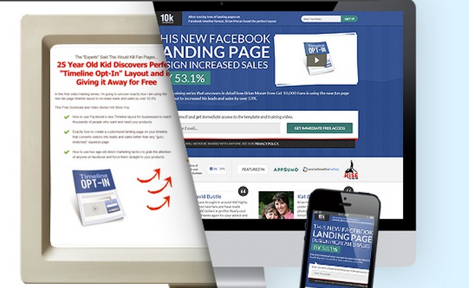
Here is an example where after clicking through from an ad, the customer is directed to a page that requires them to enter an email address without any clear option to bypass this step before viewing the product they saw in the ad.

It is the norm to offer a new customer a discount for e-commerce shoppers, but whether this example has resulted from a deliberate sales tactic or an error in the quality assurance process, it is clearly too early to make this step mandatory in the buying journey.
It is unfair to assume that a customer is ready to exchange personal information for a discount before having the chance to view the product details, reviews, shipping details, and all other important information listed on the site.
3. Have you created one dedicated landing page where all campaigns are now sent?
This issue is similar to sending paid traffic to the home page because a one-size-fits-all landing page, created in isolation from current campaigns usually has nothing to do with those new campaigns. So the same issue remains where the story between the ad and landing page gets broken. Landing page creation can’t be treated as a one-off project and the benefits of systemizing this will outweigh the initial cost.
4. Are your visitors’ intent levels aligned with the action you’d like them to take?
The gap between paid social media traffic intent levels vs organic traffic intent levels is colossal. When you imagine somebody who has never heard of your company clicking through from an Instagram ad compared to somebody who has read several of your company’s blog posts, searching for a solution for a specific problem they’ve been having it becomes clear that one of these customers is undoubtedly more ready to buy the solution that you’re offering than the other.
If you run into a similar situation during your analysis where you see that your organic search traffic is actually converting at a much higher rate than your expensive ad campaigns then this could be a massive optimization opportunity.
Analyze consumer behavior
Analyze the behavior of organic traffic closely and try to map out what type of content these visitors are consuming, in what order, and what questions that content is answering. This can fuel your new experiments on the landing page and greatly inform what copy and content to implement and showcase to your paid traffic as well.
Other important aspect next to your traffic source that influences intent levels is the device category. Contentsquare highlighted in their 2024 Digital Experience Benchmark Explorer that mobile dominated traffic to B2C sites in 2023, with over 70% traffic share in several B2C industries.

Interestingly enough, they also found that 40% of mobile traffic is now paid while only 20% of desktop traffic is paid.

Shopping on a mobile device is usually associated with “fun”, “simple” and cheaper products. Things like gaming and purchasing cosmetics, while the experiences on desktop devices tend to be for more serious activities and products that require more time to make a purchase decision. Think about buying plane tickets or choosing a new bank for example.
This also means that the intent levels while using a mobile device are considerably lower compared to desktop devices. It’s also common for customers to research a product while browsing on their mobile device but complete the actual order often days later while browsing on their desktop.
Juliana Jackson, an expert in optimizing mobile journeys expands on these topics here if you’re interested in learning more about optimizing website vs mobile experiences.
Investing in your landing page infrastructure
The thing that tends to put marketers off most with creating a dedicated landing page for each new ad campaign is the perceived cost and effort associated with it. This is actually a bias due to lumping the landing page development into the same category as regular web development.
The proper web development cycle includes but is not limited to research, wireframing, design, QA, testing, and implementation. All of this can add up to quite a hefty bill and months of work. A quick Google search will show that agencies can charge thousands for custom landing pages:

The landing page creation process should almost be the opposite of traditional web development (in most cases). If your organization is at the point where you launch new campaigns with large budgets regularly, it makes sense to systemize and automate a good chunk of it.
The initial effort of choosing a landing page builder and setting it up may take some work but it would hopefully be a one-time project with limited ongoing maintenance for your templates. Creating a landing page template that is easily editable for your marketing team without a huge design and development cost and having a system in place where new pages can be launched quickly alongside with the campaigns will only benefit your future conversion rates.
Low-cost landing page research
A way to get started with qualitative research can be Microsoft Clarity. It is incredibly easy to install and they claim it will be free of charge forever. MS Clarity is mainly a heatmap and session recording tool, which also integrates with GA4.
If you’re still in the early phases of trying to understand where the gaps between your ads and landing pages are, the filters make it easy to view data for all pages that are receiving your specific campaigns.

Session recordings have always been a powerful tool, but it can be a heavy time investment to view these recordings and try to make sense of them, identifying patterns and communicating them to the rest of your stakeholders. MS Clarity offers automated text insights for each individual session.
They’re not always perfect, so be careful copy-pasting them into your reports, but they can make the analysis process quite a bit simpler when working with large data sets.
Here’s an example of one of the automated insights:

Deborah O’Malley, a leading CRO specialist, adds in this article that the data you’ll get is both GDPR and CCPA-compliant, so you have the peace of mind of working with ethically sound data.
A case study from TurkNet, a leading telecom operator in Turkey, had an issue based on Google Analytics data. They saw that lower screen resolution correlates with lower conversion rates.
They decided to use MS Clarity to analyze the landing page performance in more detail and, thanks to session recordings, figured out that some users were not closing the cookie consent popup and couldn’t see the form and button at the bottom of the page.
Using these insights, their team designed a more appropriate user experience resulting in a 72% increase in the number of service availability check actions and a 107% increase in internet package subscriptions.
Conclusion
When team members are focused on specific tasks, they miss out on the bigger picture, which is the ideal customer journey. Web and ad teams must align on the story they want to tell and design a buying process that makes sense and is enjoyable for customers. Avoiding the upfront cost of building a system that benefits the entire business results in unproductive silos, and eventually, the team will have to pay the price of building that system.
There are countless landing page builder tools available to support ad campaigns, but it’s unrealistic to expect one page to accommodate all campaign messages. Online traffic is shifting towards mobile devices, a trend likely to continue as younger generations gain purchasing power. Consequently, landing page creation should be viewed as a continuous learning and optimization process rather than a one-off project.
Discover essential strategies like keyword research, on-page optimization, and technical SEO in our expert guide listing the best SEO courses to improve your SEO skills.
Related Posts
-

Men have become the tools of their tools. Henry David Thoreau Whether you’re a CX…
-

Learn how to run conversion optimization experiments the right way. In this video, I sit…
-

"I have too little traffic to test; hence, I can't do conversion optimization." I've heard…
-

So you have a landing page - or maybe 87 of them. Too bad you're…