
Typography is the detail and the presentation of a story. It represents the voice of an atmosphere, or historical setting of some kind. It can do a lot of things. (Cyrus Highsmith)
We only have a handful of tools to communicating online, really. Words, images, colors, and composition are the usual suspects, but they’re stealing most of the credit for what goes into making effective websites and landing pages.
Cyrus Highsmith, author of Inside Paragraphs, says typefaces represent the voice of an atmosphere, or historical setting, and that’s very true, but I want to add to that.
Typography is body language.
It’s what makes the first impression. Good typography enhances the character of the site and adds a tone of voice, which subliminally reinforces what the words say to influence how those words are perceived. And yes, there is research to back this up.
Table of contents
How little do users read?
Before we get into the effect of typography on behavior and perception, let’s look at why this is important in the first place.
Back in 2008, researcher Harald Weinreich and Jakob Nielsen published a study that measured 45,237 page views from 25 different users, and found that, of the people being analyzed, most people would scroll about halfway down the page for longer content and only spent enough time on the page to read less than 20% of the text.
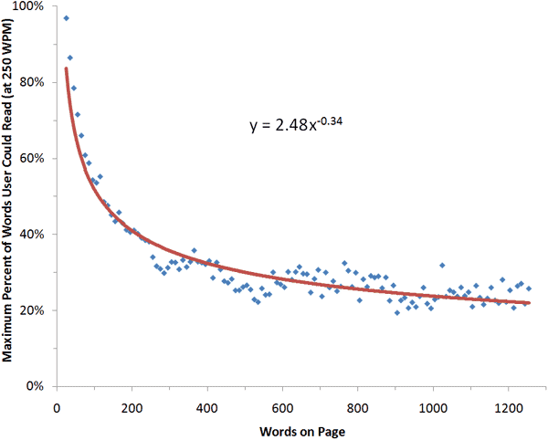
These findings were so consistent that they calculated a formula which described the amount of text users would read for articles in the 200 to 1,250 word count.
As you see in the graph, as the word count increases, the percentage of people reading not only decreases, but becomes more erratic around the halfway mark.
In the full data set, the average page view contained 593 words. So, on average, users will have time to read 28% of the words if they devote all of their time to reading. More realistically, users will read about 20% of the text on the average page.
In another report, Josh Schwartz from Chartbeat studied how users interact with articles on Slate.com. The results were surprisingly similar.
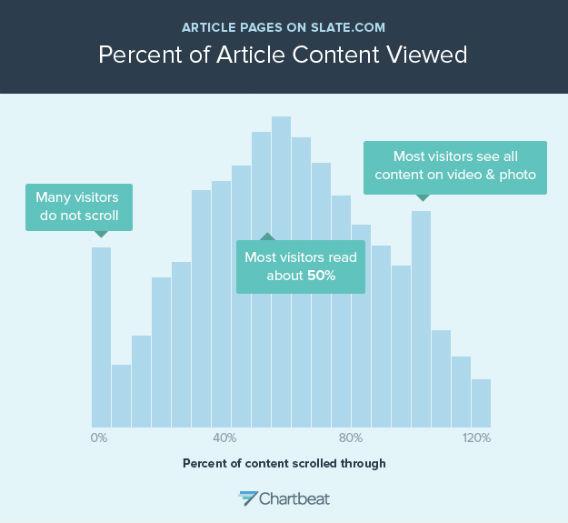
People can’t stay focused past the 50% mark. According to the data, the more you write, the more people stop reading.
So wait, does that mean you should create shorter content? Nope.
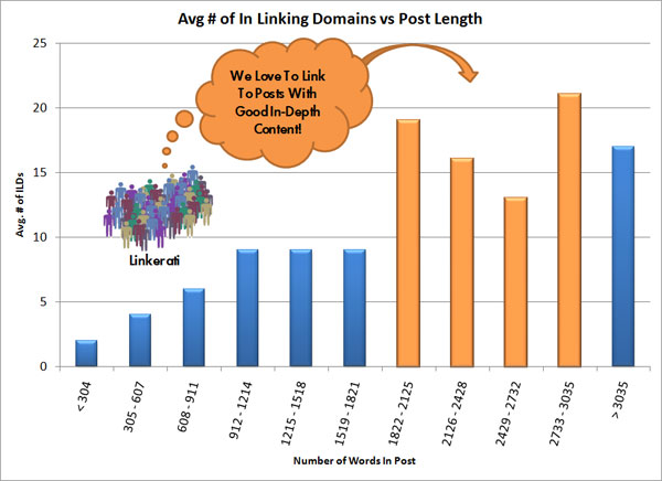
In an old, but still insightful analysis of all of the most linked content on Moz.com, cofounder of Sparktoro Casey Henry found that the content with the most links also seemed to have a higher word count.
A more recent analysis from Ahrefs indicates a strong correlation between the content length and ranking positions.
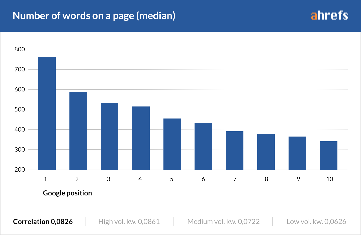
There’s no way of knowing for sure, but it would appear that those last 20% of visitors may also be the ones who are more willing to give links to those longer pieces of content.
Now, of course, this isn’t going to be uniform across all verticals.
But if your site uses a blog to provide deeply actionable information, like Unbounce for SaaS, long form content is absolutely worth considering.
I’ll also go out on a limb here and suggest this linking behavior may also be reflective of why, for high touchpoint products with a lot to consider, longer pages tend to perform better. (I could be wrong though—you should always be testing.)
Which brings me to my next point.
If your written content is going to be long-form, you better damn well be sure it’s readable and pleasing to the eyes.
The effects of typography on readability and comprehension
Before we get into the most readable typeface debate, I want you to first understand that there are three things more important than what specific typeface you choose.
- Size of type;
- Line spacing;
- Age of the reader.
Various research shows:
- Small font sizes and low-contrast are the number one complaint for web users as it relates to reading online. (Nielsen)
- Due to the effects of aging, at 40, only half the light gets through to your retina as it did at age 20. When you’re 60, it’s only about 20%. (See: presbyopia.)
- All readers, but especially low-vision readers, experienced better reading speeds when line-spacing was set to 2.5. (Global Journal of Health Science)
Now this is where it starts to get tricky.
In D Bnonn Tennant’s excellent article, “16 Pixels For Body Copy, Anything Else Is A Costly Mistake,” he walks us through some very compelling evidence as to why 16 pixels should be the standard for body copy in web design.
His central argument is that when you take in account the distance from the screen, 16-pixel font appears to be the same size as printed text, which is normally held much closer to your face.
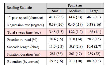
D Bonn’s argument that larger font sizes being easier to read correspond with findings from studies from Payame Noor University and a joint eye-tracking study by IBM/Google which show that as the size of type increases, readers also exhibit slightly faster reading speeds. However, both studies also concluded that the results were not statistically significant.
Interestingly enough, even though reading speed or comprehension haven’t been deemed significant, another study has shown that larger font sizes do have the ability to elicit stronger emotional connections.
That’s not surprising considering that the number one complaint in the Nielsen usability study was small font sizes, and nearly 40% of Americans are nearsighted. Increasing the size of your body copy, especially if your customers are around 40 or online natives, just makes it all easier to see, and could go a long way in making your visitor’s experience more enjoyable.
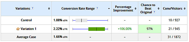
John Paul Mains shared the result of one client who saw improvements in conversions after changing the font size from 10 pixels to 13 pixels to be more readable. I wonder what would happen if he pushed it even further?
Rank Executives also reported higher time on site and lower bounce rates after adjusting their typography.
Serifs vs. sans-serifs (and do we have to stick with tradition?)
There has been no conclusive evidence to support either style of font as better for the screen, which is perhaps why the design community is split.
For example, in the Google/IBM study, they found that serif font Georgia was read 7.9% faster than sans serif Helvetica, but that it was not a statistically significant margin. They also found that serif or not, the style of type had virtually no impact on comprehension.
However, in the Psychophysics of Reading studies, participants perceived themselves as having better performance using fonts with serif, even though they scored higher in reading speed and comprehension when reading san serif fonts. Interesting.
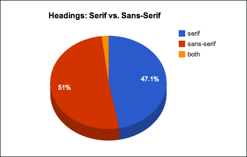
Could this self perception (in combination with higher screen resolutions making serifs more viable) be why 50 major websites seemed to have changed their perspective on serifs in a five-year span?

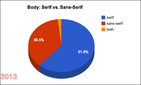
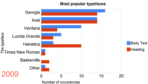
Don’t let the similarity in graphs confuse you. The Blue in this graph is represents sites using serif fonts. Nearly the same percentage as sites using sans in 2009.
In this study by Jan Constantin on Smashing Magazine, he closely analyzes the typographic patterns from 50 top websites ranging from The Boston Globe and Financial Times to A List Apart and UX Booth.
What he found was pretty incredible.
For instance, even though serif fonts have taken over the majority share for body copy, there is now a near even split between serif and sans serif headlines.
Even more surprising, even though Georgia and Arial are still the widely used typefaces, an overwhelming majority of font pairings are outside the traditional choices.
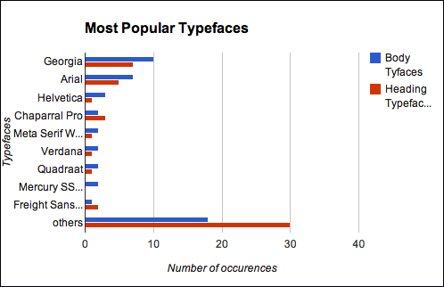
Compare that to only a few years earlier—it was mostly “traditional” typefaces that ran the web.
He hypothesizes that this shift towards “others” is due to the growth of font delivery services such as Typekit or Google Fonts which allow for more font choices to be rendered in the browser.
More font choices mean more personality, expressiveness, and creativity, which brings me back to the original point of the article, your typeface is the body language. It’s what helps create that emotional connection which can be so critical to the sales process.
If anything, the middle ground for this argument has evolved to one that says you should focus on learning to better pair both serif and sans serif fonts together to achieve maximum readability, as well as to develop a strong sense of “character” for your words.
To that end, I highly recommend you read Douglas Bonneville’s Best Practices of Combining Typefaces, and Simon Pascal Klein’s more technical, Achieving Good Legibility and Readability On The Web.

If you want to get kick-started, here’s a list of 20 different font pairings that are known to work well together for computer screens.
Also, as you’re pairing your fonts, make sure you’re really looking to find something that’s readable first. I’d recommend you check out font designer Jessica Hische’s Il1 test, which asks you to put the capital “I” and a lowercase “l” next to the number “1” to see if you can determine the difference.

Can typography impact our judgement?
Yes.
In a study on The New York Times website, titled “Are you an optimist or a pessimist?,” Errol Morris wanted to see how people would respond when asked about their feelings of security in a catastrophic event. Over 45,000 participants responded.
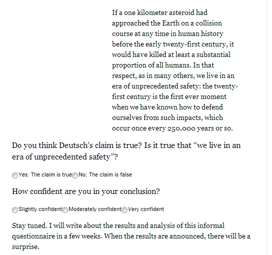
Readers were asked if they agreed with the statement and to what degree.
The real agenda behind the quiz was to determine if test subjects would find the statement more believable depending on the the choice of typeface.
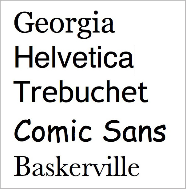
The fonts used were Georgia, Helvetica, Trebuchet, Comic Sans, Baskerville, and Computer Modern.
What were the results?
Baskerville—designed in 1754, to create the perfect balance of readability and high contrast—had a 1.5% increase in people agreeing with the “we live in an era of unprecedented safety” statement.
It’s small, but it’s about a 1% to 2% difference — 1.5% to be exact, which may seem small but to me is rather large. You are collecting these data in an uncontrolled environment […] to see any difference is impressive. Many online marketers would kill for a 2% advantage either in more clicks or more clicks leading to sales.


In another study by MIT psychologist, Kevin Larson wanted to see if something as seemingly trivial as type choice, layout, and line spacing could have an impact on the reader’s emotional state.
So 20 volunteers—half men, half women—split into two groups and asked each group to evaluate a version of The New Yorker.
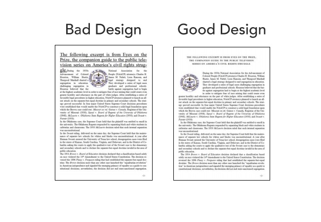
The researchers found that the viewers who read the poorly designed page were negatively impacted, expressed feeling bad, and would even physically frown.
While that may seem arbitrary, the muscles associated with frowning have been linked to the amygdala—the area of your brain responsible for governing emotions, forming new memories, and associating them with emotional events.
In other words, forming memorable associations isn’t just a matter of telling a compelling story or having an optimized landing page. It also has to do with the character of the font you’re using.
Mikael Cho of Ooomf also demonstrates a really good point when he shows you what a typeface Impact (one normally associated with newspaper headlines) does to the Bank of America website.
Normal type:
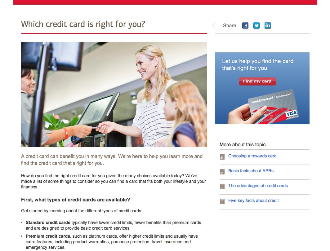
Changed to Impact:
Conclusion
The reality of the situation is, asking about “the best typeface” is going to be about as fruitful as asking which color converts the best.
It’s all subjective, depends on your target market, the story you’re telling & the emotions you’re trying to evoke. Looking at the the big 50 research from Smashing shows us “other” fonts are being used more and more, because they’re a better reflection of the brand’s characteristics and personality.
The question you have to ask is if the typeface you’re using accurately reflects you?
It’s a difficult question to answer, but could make all the difference in the world to your customers.
Recommended Resources
- Perception of Fonts: Perceived Personality Traits & Uses
- Type Connection
- Fonts.com
- Typekit
- Fontdeck
- Google Fonts
- Fonts In Use (a breakdown of font usage in the real world, and why it was used)
- We Love Typography
- I Love Typography
Have another great typography resource? Why not share it in the comments?
H/T to George Matthew for some of the research in this article.
Related Posts
-

What's user experience (UX) got to do with conversions? Everything. Great user experience is a…
-
User flow is the path a user follows through your website interface to complete a…
-

As you almost certainly know, copy is what sells. That’s true in print, and it’s…
-

Animation for the sake of "cool" can often hurt conversions since it's distracting, but not…


Typography provides additional features which provide quality to the text and layout. It will surely increase web view and provide quality user experience which leads to business growth.
Nice post Tommy but you lost me half way down the post. So Nielson was right?
Haha, I guess so!
::groan::
Great article. I read the whole thing and shared it. I guess it is one example that long articles do get shared. I assume it has to do with how interesting it is to the particular reader and their hence increased believe it is of interest to others too ;)
Great article.
–If you’re written content is going to be long-form, you better damn well be sure it’s readable & pleasing to the eyes.–
Check that contraction. Proofreaders please.
updated. Thanks. ;-)
Love this. Informative, entertaining, well researched
Hi Tommy,
thank you for another great article. You didn´t lost me…
One question… What about different devices? We held a phone closer to our eyes and more and more readers are reading (and bying) from mobile devices. How can we optimize for website and mobile devices at the same time? Aka – is there something in between which fits both? (And isn´t it D Bnonn?)
That’s a very good question & one that is up to the theme designer to build in.
It’s a little more technical than I am able to grasp, honestly, but what it comes down to is a scaling ratio based on the display size.
Chris Pearson of http://pearsonified.com came up with a tool that helps with this.
http://www.pearsonified.com/typography/
He also wrote an awesome oost on the subject, which, ironically enough, doesn’t scale for mobile :-p
http://www.pearsonified.com/2011/12/golden-ratio-typography.php
Hope that helps :-)
Thank you. I will check that out.
Thanks, Tommy! This is a very well researched article – definitely something I can share with clients to convince them of the importance of typography.
I have a typography resource called Typewolf that I’d like to share:
http://www.typewolf.com
Typewolf shows real examples of fonts in the wild and features lists of the most popular fonts in use on the web.