A landing page is your conversion engine—clear, focused, and built to drive action. It’s the first page visitors see after clicking on your banner ad, pay-per-click (PPC) ad, or promotional email, so it needs to leave a lasting impression. It can be a specific page on your website or a separate page created exclusively for search engines.
Whether it’s signing up, making a purchase, or subscribing to your email list, a well-optimized landing page directs visitors to take a specific action.
Ultimately, your landing page will likely determine the success of your ad campaign. A good landing page equals good return on investment (ROI). A crappy landing page (needlessly) wastes money.
Table of contents
- 3 Rules for building high-converting landing pages
- A 5-step process to design the perfect landing page
- Examples of good landing page designs (and how to implement these best practices)
- Spotify (E-commerce: Audio streaming)
- What Spotify’s landing page does well
- How to implement this
- Airbnb (Travel & leisure)
- How to implement this
- Wix (SaaS: Web Development)
- 3 things Wix’s landing page does well:
- How to implement this
- ExpressVPN (Digital Privacy and Security)
- 3 things ExpressVPN’s landing page does well:
- How to implement this
- Curology (Product: Beauty)
- 3 things Curology’s landing page does well
- How to implement this
- CXL (Education)
- 3 things CXL’s landing page does well:
- How to implement this
- Conclusion
3 Rules for building high-converting landing pages
Let’s start with the basics: the rules that every landing page should follow.
1. Never send traffic from an ad to your homepage.
You should never drive traffic from your promotional campaigns—whatever they are—to your site’s homepage. Homepages are usually cluttered with information, offering users many possible actions. The most important one might be missed.
Hence, you should drive traffic from promotional campaigns to a page that is aimed at only one thing—getting a user to take the one action that’s the goal of your campaign.
It’s the only way to convert browsers into buyers.
2. Clarity and relevance make or break your landing page.
Visitors spend just seconds looking at a landing page before determining its usefulness and relevance. If they can’t find what they’re looking for, or if your site has functional or usability problems, they will abandon the page.
Rather than let that happen, make the few seconds of their attention that you do have count. Answer the questions on their mind:
- Does this place have what I am looking for?
- Is there enough information?
- Can I trust this site?
- How long will this take?
Your landing page must entice visitors to stay and complete the desired action for conversion, whether it’s filling out a subscription form or buying a product.
3. Good landing pages follow a proven structure.
Although there is room for experimentation and variation when it comes to the anatomy of a landing page, this structure is proven to work in many good landing pages:
- Open with a benefit-oriented headline.
The headline is the most important part. If the visitors came from an ad, the headline must correspond to the ad text. If your banner or PPC ad promised a “Breakthrough meditation system,” then this phrase should also be in the headline of your landing page. - Write clear, relevant, and concise copy.
Don’t put too much text on the page; the visitor has to be able to read it quickly. Use bullet points to drive home the main points. Make sure the language in the ad is also present in the copy of the landing page. - Focus on getting visitors to take one specific action.
There should be only one possible action for the visitor to take—be it subscribing, making a purchase, whatever. Don’t offer options, or the conversions will suffer. - Remove distracting navigational links.
Remove all extra clutter—links, menus, buttons—that have nothing to do with the particular ad or campaign. Make it impossible for the visitor to ignore your message or get distracted. - Make the form or checkout option prominent.
The one action you want the visitor to take has to be big and obvious. Put a large sign-up form on the right side of the landing page; use a high-contrast color to make it stand out. If the landing page is long enough for scrolling, duplicate the form or button at the bottom of the page. - Maintain your brand.
Don’t make your landing page look different from your overall website and brand. Keep the same colors, font, and overall look and feel of your main site. This reinforces brand awareness.
A 5-step process to design the perfect landing page
Before you talk to your designer about creating a landing page, draw one on paper. The five steps below will help you get it right and keep you from wasting your designer’s time.
(Also, make sure the designer works with the actual copy, not lorem ipsum. That means you need to write the copy first.)
Here’s how to design the structure for a high-converting landing page:
- Identify your audience (their problem, their needs, and what they want)
- Define the most-wanted action that people should perform on your page
- Craft your solution into an easy-to-understand message
- Design your landing page with the core elements (explained below)
- Put it all together and upload it
Now that I’ve summarized all steps, let’s go into detail with each one of them:
1. Identify your audience.
Make sure the landing page talks to a specific audience. Know the problem, the need, and want of your target audience. Write the copy with a specific person in mind.
If you drive traffic to the landing page via advertising and run many different ads, create many versions of your landing page. They can be mostly the same, but tweak the headline and copy.
2. Define your most-wanted action (MWA).
Your MWA is the one action people should take on the landing page.
What that action is depends on your product and strategy. Generally, if your product is somewhat expensive and complicated, it’s better to just get their email address and grow the relationship via email.
If you’re selling cheaper and/or more straightforward products (e.g. wine, socks), go directly for the sell. If your product is software, offer a free trial.
3. Define your message.
You know the audience, their problem, and the solution you offer. Now craft that into an easy-to-understand message. There’s no way to know in advance what will work, so create a few hypotheses and split test them.
“Clarity trumps persuasion” is a good maxim.
4. Design your landing page.
Your MWA is in place, you understand your target audience, and you have a hypothesis about which offer will appeal to them. How do you design a landing page to motivate them to take action?
First, list all the elements you need on your landing page.
What your landing page needs to have:
- Headline that speaks to the target audience;
- Company logo;
- Quick explanation of your offer above the fold (i.e. visible without the average user having to scroll down);
- Longer explanation of the offer below the fold if the offer or product is complex;
- Image of the product being offered;
- Simple form, ideally with just 1–3 fields (usually just name and email, but do you really need the name?);
- Buy or sign-up button depending on your MWA;
- Link to your privacy policy (load it in a pop-up window to keep people on the page).
Remember, the more fields you ask the visitor to fill in, the more friction you create; therefore, fewer people will fill out the form.
What you should leave out:
- Navigation menu—focus only on your offer;
- Links to other parts of your site, such as “About Us”;
- Pictures or images that don’t relate to the offer; these are distractions;
- Hard-to-read text (i.e. anything less than 12px);
- Scary forms with unnecessary fields, such as “title” or “fax”;
- “Clear fields” button;
- Links like “Click here to subscribe” or “Click here to read more.” If you can’t cram all your content above the fold, let the user scroll down. Scrolling is almost always better than clicking to another page.
There are always exceptions, and you (usually) can’t copy best practices directly to your site, but this advice should be your starting point. Get the essentials in place first and tweak from there.
How long should a landing page be?
Long or short? There is no definitive answer. In most cases, if the offer is free, short copy works better. If you’re asking for money, longer copy performs better. The more money, the longer the copy.
As per Bob Kemper of Marketing Experiments, three factors affect the efficacy of copy length on a landing page:
- Nature of visitor motivation;
- Initial level of anxiety about product/company;
- Level of cost/commitment associated with conversion.
Short copy performs better when the offer is free, cheap, or otherwise not intimidating. It also works well for impulse buys or purchases that deliver emotional satisfaction (e.g. concert tickets, candy, something beautiful).
When rational thinking and analysis are factors for purchasing, longer copy helps you make a more compelling case by adding explanations, proof, testimonials, etc. Use longer copy with products for which more information helps people decide.
Many people associate long-form copy with hype, spam and cheesy get-rich-quick landing pages. Don’t hate the length; hate the content.
In a case study from Conversion Rate Experts, they showed how they massively improved conversions for a Moz landing page. One of the key changes they made was increasing copy length:

They’re not the only ones, of course. Take a look at product pages on Amazon. (Amazon is known to test everything.)
Some long-form landing pages for free offers convert well, but the linked example is a rather complex product, which may be why longer copy works better there.
When using long copy, make sure it’s obvious that people can and should scroll down—encourage them to do so. You can use CrazyEgg or Clicktale to see a scrollmap of how far down the page people scroll.
5. Put it all together.
Once you’ve created your page layout and the copy, put it together and upload it to your site. Use simple URLs that users can easily recognize.
If your landing page is about job offers to work on an oil rig, your URL should be something like somesite.com/oil-rig-job-offers/.
Such URLs often generate better click-through rates on Google Ads. A searcher who types “oil rig job offers” is more likely to click on an ad with a keyword-rich URL.
6. Test, test, test.
Once everything is up and running, test the effectiveness of the landing page based on your predetermined MWA. You should always create at least two alternate versions of a landing page. Test them, measure, and improve.
Read our guide on conversion optimization to learn how to do it all.
Examples of good landing page designs (and how to implement these best practices)
The best landing pages don’t just look good—they work hard to grab attention, spark curiosity, and drive action. They blend bold visuals, compelling headlines, and seamless user experiences that make it effortless for visitors to engage. By putting the user first and focusing on delivering value instantly, these pages turn casual visitors into loyal customers.
Let’s take a look at six landing page designs and how you can implement their winning conversion techniques in your own landing page designs.
Spotify (E-commerce: Audio streaming)

What Spotify’s landing page does well
- Clear value proposition: Spotify’s landing page immediately communicates its core value—access to a vast library of music, podcasts, and personalized recommendations. The messaging is straightforward and highlights the key benefits for the user.
- Simple call-to-action (CTA): The prominent CTA buttons, such as “Sign up for free,” are well-placed and easy to find, encouraging immediate action.
- User-centric design: The design is clean and visually appealing, using a simple layout with attractive imagery and smooth navigation, creating an enjoyable user experience.
How to implement this
- Clear value proposition
Craft a concise and compelling headline that directly speaks to your audience’s needs. Place it at the top of the page, paired with a subheading that explains the core benefits. Use action-oriented language and make sure the offer is easy to understand at first glance, e.g. “Create your first playlist. It’s easy, we’ll help you.”
- Simple and visible call-to-action (CTA)
Use large, contrasting buttons for your CTA (e.g., “Log in” or “Sign up for free”) placed above the fold and throughout the page. Make sure the language is clear and action-driven. You could also implement sticky CTAs that stay visible as the user scrolls down, to ensure they are always one click away from signing up. Use bold, contrasted CTA buttons with simple text.
- User-centric, clean design
Focus on an intuitive, minimalistic layout that prioritizes readability and simplicity. Use high-quality visuals that showcase the benefits of your product or service and make navigation effortless. Organize content into clear sections with a balance of text, images, and white space to prevent clutter. Use attractive product images or demo videos showing how your service works, like how Spotify showcases playlists and music players.
Airbnb (Travel & leisure)

3 things Airbnb’s landing page does well
- Compelling hero section: Airbnb’s homepage features a clean, visually appealing hero section with high-quality imagery and a clear value proposition, immediately capturing the user’s attention. Airbnb also effectively communicates its unique selling propositions (USPs), emphasizing affordability, variety, and the experience of staying in unique spaces.
- Intuitive navigation: The search functionality is prominently displayed, enabling users to quickly filter options based on their needs, which enhances the overall user experience.
- Personalization: The page often features localized recommendations or suggestions based on the user’s browsing history or location, creating a more relevant and tailored experience.
How to implement this
- Compelling hero section
Create a visually appealing hero section with high-quality, relevant imagery that resonates with your audience. Use concise, impactful headlines to convey your value proposition and include a supporting tagline to highlight your USPs like affordability, exclusivity, or variety.
- Intuitive navigation
Ensure your navigation is simple and user-friendly by prominently displaying a search bar or key features. Use filters, dropdowns, or categories to help visitors quickly find what they’re looking for, and prioritize a seamless, intuitive browsing experience.
- Personalization
Leverage tools like cookies or geolocation to display personalized content, such as local recommendations, recently viewed items or tailored offers. Incorporate dynamic elements that adapt to the user’s behavior or preferences to enhance relevance and engagement.
Wix (SaaS: Web Development)
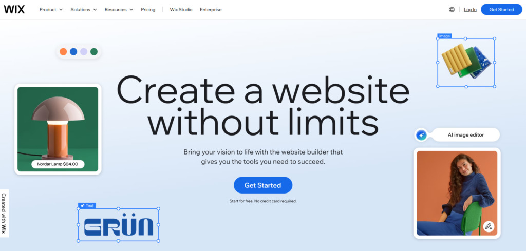
3 things Wix’s landing page does well:
- Minimal distractions: Wix’s landing pages maintain focus by using clean, uncluttered designs with ample whitespace, ensuring the visitor’s attention stays on the core message and CTAs. By using the ‘inverted triangle’ technique, (most important information at the top, followed by supporting information) the page directs visitors’ attention to the primary CTA, with “Start your risk-free trial,” below it enhancing the likelihood of conversion.
- Strong headline and subheadline pairing: Wix uses headlines to immediately grab attention and subheadlines to expand on the value proposition, creating a compelling first impression.
- Strong visual appeal: They leverage high-quality visuals and intuitive layouts to showcase their templates and features, giving visitors a clear sense of the platform’s capabilities.
How to implement this
- Minimal Distractions
Use a clean, uncluttered layout with ample whitespace to guide the user’s attention to key elements like your headline and CTA. Focus on the essentials—headline, subheadline, value proposition, and CTA—placing them prominently above the fold for maximum impact.
Use a prominent, contrasting button for your main CTA. Minimize distractions by removing unnecessary text, images, or navigation options, and consider simplifying or eliminating navigation menus to keep users focused on taking action.
2. Strong headline and subheadline pairing
To create an effective landing page, start with a clear, impactful headline that communicates your unique value proposition in a concise, compelling way, focusing on the benefits your product or service offers. Follow up with a subheadline that adds context, explaining how your offering delivers on its promise.
Testing different headline and subheadline combinations through A/B testing can help you identify what resonates best with your audience and drives higher engagement.
3. Strong visual appeal
To create a visually appealing landing page, use high-quality images or custom illustrations that align with your brand and clearly showcase your product’s benefits. Choose a consistent color scheme that highlights key elements, such as a contrasting CTA button, to guide visitors’ attention.
Incorporate interactive or dynamic elements like animations, hover effects, or demo videos to engage users and demonstrate your product in action. Lastly, ensure your visuals and layout are mobile-optimized, providing a seamless experience across all screen sizes.
ExpressVPN (Digital Privacy and Security)
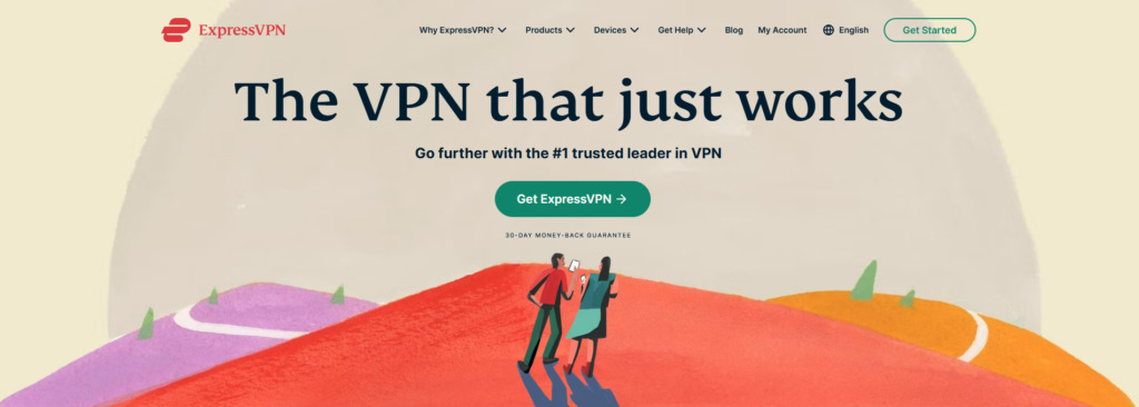
3 things ExpressVPN’s landing page does well:
- Clear and compelling headline: The headline, “The VPN that just works,” succinctly conveys the product’s reliability and ease of use, immediately addressing potential user concerns.
- Limited-time deals and discounts: ExpressVPN often highlights special offers (e.g., “Get extra months free”), creating a sense of urgency and exclusivity for visitors who act quickly.
- Trust indicators: The inclusion of a 30-day money-back guarantee, ”Go further with the trusted leader in VPN,” and testimonials from satisfied users builds credibility and reduces purchasing anxiety.
How to implement this
- Clear and compelling headline
Write a concise, benefit-driven headline that addresses your audience’s primary pain point or desire, such as “The [Your Product/Service] That Solves [Problem].” Use bold typography and place it prominently above the fold.
- Limited-time deals and discounts
Use urgency-driven offers to encourage immediate action. Highlight the deadline visually with countdown timers or contrasting colors.
- Trust indicators
Add customer testimonials, reviews, and recognizable logos of companies or certifications that endorse your product. Offer guarantees, such as free trials or money-back options, to reduce hesitation.
Curology (Product: Beauty)

3 things Curology’s landing page does well
- Personalization and clear value proposition: Curology’s landing page prominently highlights its personalized skincare approach, creating an immediate connection with visitors by emphasizing tailored solutions.
- Strong Visual Hierarchy and personalized call-to-action (CTA): The design uses clean, minimal visuals with a clear call-to-action (CTA) that stands out. The page features straightforward CTAs like “Get my formula,” or “Find your treatment,” encouraging users to begin their skincare journey with minimal friction.
- Use of social proof: Testimonials, before-and-after photos, and dermatologist endorsements help establish credibility and build trust with potential customers.
How to implement this
- Personalization and clear value proposition
Use a simple quiz to tailor recommendations for visitors, just as Curology does to personalize skincare solutions. Leverage dynamic content, using personalized messages or showing products based on user behavior or demographics (e.g., returning vs. new visitors).
- Visual hierarchy and personalized call-to-action (CTA)
There are various ways to implement visual hierarchy into your landing page design. Keep your design clean with a strong contrast between text and background for easy readability. Place prominent CTAs above the fold and throughout the page to guide users naturally toward conversion. Use compelling, action-oriented language, like “Start Your Journey” or “Discover Your Solution” to inspire action.
- Social proof
Add customer reviews, before-and-after visuals, or user stories, preferably with names, photos, or video clips, to validate your product’s effectiveness. Highlight endorsements from reputable sources or display metrics like “9 out of 10 members see clearer skin in just 3 weeks.”
CXL (Education)

3 things CXL’s landing page does well:
- Curriculum transparency and clear value proposition: CXL highlights the value of its courses prominently, with strong, benefit-driven headlines that speak directly to the user’s goals. The page provides a clear breakdown of course modules, learning outcomes, and instructor credentials, helping potential students understand exactly what they’ll gain. CXL emphasizes how the course can improve job prospects, boost marketing performance, and drive measurable business impact, making the investment feel worthwhile for professionals.
- Engaging learning format supported by social proof: The landing page effectively uses testimonials, case studies, and logos of recognized brands to build credibility and trust. It highlights interactive elements such as video lessons, real-world case studies, and hands-on exercises, making the learning experience feel dynamic and practical.
- Conversion-optimized design: The page uses a clean layout, persuasive CTAs, and strategic use of white space to guide visitors toward taking action, whether it’s enrolling or learning more.
How to implement this
- Curriculum transparency and clear value proposition
Ensure your headline and subheadlines clearly communicate the main benefit of your offer. Use language that speaks to your audience’s pain points or goals. For example, if you’re selling an online course, highlight the transformation someone will experience by taking it. Test variations of your headline through A/B testing to see which resonates most with your audience.
Include a detailed curriculum section with module breakdowns, key takeaways, and real-world applications. Highlight instructor credentials, emphasizing expertise and industry recognition to build trust.
Clearly communicate how the course will impact career growth (e.g., new job opportunities, skill mastery). Use data or case studies to show measurable business impact (e.g., “Graduates saw a 40% improvement in conversion rates”). Add a strong CTA that reinforces ROI, such as “Enroll now and start driving measurable results!”
- Learning format and social proof
Social proof can be a powerful motivator. Showcase customer testimonials, case studies, or logos of companies you’ve worked with to build credibility. Use quotes from satisfied customers, before-and-after metrics, or logos from recognizable brands. Gather testimonials or success stories from your customers and place them strategically near your CTAs to strengthen your message.
Video testimonials can also work great for engagement. Showcase video previews of course content to make learning feel interactive. Feature logos of well-known companies that have benefited from your course.
- Conversion-optimized design
Your page should be clean, visually appealing, and easy to navigate. Focus on a design that leads the user through the content and to the conversion point without distractions. Keep the color scheme simple and consistent.
Use ample white space around your CTAs to draw attention to them. Use a clear, contrasting color for your CTA buttons and ensure they appear multiple times throughout the page.
The placement should follow the user’s natural reading pattern (F or Z-pattern). Test elements like button text (e.g., “Get Started” vs. “Learn More”) to improve conversions.
Tools for building landing pages
There are many great tools for building landing pages, as well as tools to optimize and improve existing landing pages leveraging predictive analysis software. Check out these options:
- Unbounce. The most powerful.
- KickoffLabs. Viral landing pages.
- LaunchRock For “launching soon” landing pages.
- Crazyegg. User behavior and identifying optimization potential.
- Optimizely. AI optimization for landing pages.
Conclusion
Getting a customer to subscribe to your offer or email list isn’t enough. After a customer subscribes, you must sell them on actually consuming your content. Many visitors who complete sign-up forms will not actively consume your offer.
But everything starts with that additional signup. And if you’re already spending money on paid ads, you might as well take the time to design a landing page that’s going to deliver a greater return on that spend.
Mastering the art of creating high-converting landing pages is key to driving results for your business. If you’re ready to take your skills to the next level, CXL’s Landing Page Optimization course is your ultimate guide, packed with proven strategies and expert insights. Enroll today and start building landing pages that not only attract but also convert!
Related Posts
-

It took us six rounds of tests until we landed on a variation that was…
-

Navigation gives a user control, which is generally a good thing—but what about on a…
-
We talk a lot about creating high converting landing pages, getting traffic that converts, and…
-
In an iconic scene from Glengarry Glen Ross (1992), Alec Baldwin lectures a group of…


Great article, thank you for sharing!
I found my way here while searching for Landing Page Conversion. The information you are providing is really helpful in the IM business.
Good article, thanks for the info.
Thanks for the great article. I especially liked the examples and the critique.
Lots of good tips. I would add lead pages to the list of landing page creation tools
Peep, damn! That was brainstorming. I have sent this link to my designer as we are designing some important landing pages to get some clients in the field of internet marketing. Hope she grasps what you wrote! :)
Thanks a lot for the article. It really helped me a lot.