Ever scroll through a website and get irrationally angry? Maybe it was the slow loading time, the poor design, the frustrating lack of clarity – no matter the case, I’m sure you can relate.
Though you might not like to hear it, a substantial amount of your customers are going through the same thing on your site right now. This is inevitable. The real money comes from finding these common frustrations and fixing them.
But how?
Identifying user frustration on websites has always been a difficult and inexact science, but there are certainly ways you can do so accurately.
Table of contents
Detecting User Frustration Is Hard
We know a lot about what causes frustration, and recognize many of the telltale signs (even if they are argued over). But when diagnosing all the User Experience flaws of a website, there isn’t a single comprehensive and agreed-upon methodology that accurately pinpoints every problem.
There are a number of reasons for this, due to the limitations of the most common strategies currently used for UX analysis:
- Expert review and analysis on website usability issues assumes that the expert will be able to accurately see and judge the target website from the user’s point of view, even though they are not likely to be representative of the website’s target audience.
- Usability testing tends to rely on small sample sizes, for reasons of both cost and timeliness. Additionally, the researcher must choose which flows and pages to test, which immediately skews any study with preconceived notions. There may be serious flaws on pages you aren’t even looking at.
- The third common strategy that many companies employ is to simply not do UX Research, leaving usability decisions to the judgment of designers and product managers.
A 2003 study put the effectiveness of both expert evaluation and usability testing methods under the microscope. 17 usability teams analyzed the same website, 9 of them with usability testing and 8 with expert evaluation. Of the 340 total usability problems reported altogether, 60% were only identified by a single team. Furthermore, to have identified all the problems categorized as “serious,” the website owner would have had to rely on all 17 teams.
That’s not to say that expert evaluation or usability testing is useless. On the contrary, they are valuable tools, but insufficient on their own. The results of such methods fall short of being comprehensive, and both are costly in terms of time, human labor, and monetary expense. Yet forsaking UX research methods entirely leaves the product team completely blind.
New Solutions to Old Problems
There are user experiences happening on your website every day. They are replete with valuable, true user data that is rich with insights.
A digital analytics tool can characterize this flow of users with broad quantitative frameworks, but they don’t let you access insights on the actual causes of user frustration.
Current usability testing solutions, while great at answering “how to test” a website flow or prototype, are not great at answering broadly, “what to test.”
Because of that, UX researchers often default to testing the newest feature, flow or prototype on hand, without knowing if there are existing pain-points and problem areas that are flying under the radar simply because they are not apparent with the data on hand.
Imagine, then, if you could just watch every single user session on your website and see for yourself not only where, but also why, your users are getting frustrated.
That’s not just a hypothetical. With new technologies for doing advanced, big data-style UX Research, it is possible to capture every session – every story, every moment, every interaction.
By observing the behaviors of real visitors to your site, you can take a direct peek into the authentic experiences of your customers and would-be customers. Without speculation, bias, or uncertainty, you can know where your designs are failing your visitors and take quick steps to eliminate those issues. You can start making UX decisions based on the most information, the best information, and the right information.
Finding a Needle in the Haystack
When you have thousands of user session videos available to you, how do you know which ones to watch to find the critical moments of frustration?
This was the problem we were determined to solve in developing our own session-capture tool, TryMyUI Stream. Even if you collect every session video, human labor time is clearly limited, so we wanted a way to automatically detect moments of frustration.
There are a variety of things that practically everyone does in response to web browsing annoyances. If we could identify those behaviors using the Javascript events from each session and draw out every frustrating moment among the thousands of videos, it would save time and maximize the efficiency of conversion/UX research.
Here are some of the behaviors we detect…
Rage Clicks
The first marker we chose was an obvious one: the Rage Click. What do you do when you click on something and it doesn’t seem to respond? Click… Click… Click click click. A rapid succession of clicking like this is a clear sign that the user is getting frustrated.
What we know about it: Rage as a reaction to computer frustration has been studied as a psychological phenomenon. “Computer rage” is the manifestation of frustration at a computer interface by verbal and physical abuse. Anything from angry yelling to mouse slamming, keyboard pounding, or Office Space-style destruction is computer rage.
The Media Equation theory posits that we view our computers almost as human companions. When they suddenly block our path or fail to perform to our expectations, therefore, we react to it like a violation of social norms or even as a personal betrayal. That’s why our frustration can be so severe.
When confronted with severe frustration, “aggression is the natural, unlearned reaction” – which explains the verbal and physical abuse that characterizes computer rage. But another common reaction is fixation: “The repetition of courses of action that were once successful,” like clicking repeatedly on an unresponsive element.
What does it tell you: Rage Clicking means that an element on your website is broken, unresponsive, slow, or simply appears clickable when it is not.
A broken, unresponsive, or slow button or link is a serious issue – one that can fly under the radar for a scarily long time – but fixed easily enough.
An element that gives the false appearance of being clickable, on the other hand, is an issue of communication in design. Fixing such a problem involves a deeper level of thought about what action users expected to take with that click, why the element was misleading, and how your website design signals interaction opportunities to your users.
Scrandom
Random scrolling, or “Scrandom” as we’ve termed it, indicates a different kind of frustration.
What we know about it: Scrolling behavior is related to the scent of information. Every user has to make a decision about the amount of effort they will dedicate to achieving their goal on a website. The harder it is to find the right information and follow the right steps, the less likely people will stick around.
Rapid scrolling, often through large chunks of a page, indicate that a user is on the hunt for their next step, and they’re skipping through content they consider irrelevant. Because people have limited attention spans, and scrolling feels like “extra work,” this kind of behavior can quickly cause users to lose hope.
That’s why the idea of putting content “above the fold” has held such prominence. If it’s easier to find, it’s easier to convert.
What does it tell you: Scrandom can indicate that a content page is too long and causes users to become impatient; or, it may show you which information on your website users consider useful or useless. If your users scroll through a whole page without finding what they need, you’ve got a scent of information problem to address.
It can also show you the relationship between your content and your calls-to-action. Do users scroll through most of the content to hit the CTA, or do they linger on it and read up before they’re convinced of the value? (Or, do they leave the page unconvinced?)
Backtracking
Backtracking occurs when a user navigates to a new page, only to return to their previous page without taking any actions in between. It’s like making a U-turn: somewhere along the way, you took the wrong route, and now you’ve got to retrace your steps.
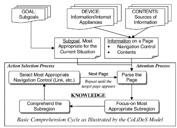
What we know about it: The Comprehension-based Linked model of Deliberate Search (CoLiDeS) model of web navigation differentiates 2 patterns:
- Forward search
- Impasse
Forward search describes a successful navigation that brings the user closer to their goal. However, according to a research paper, “forward search can fail when no screen object is similar to the user’s goal…This situation presents an impasse that results in the user backtracking, taking detours, and becoming lost in the site.”
This model treats all backtracking as failure. Of course, this is not always the case: users may also backtrack to review the content of a previous page, or to explore other options and pages – termed orienteering behavior.
What does it tell you: Backtracking can indicate that your user didn’t find what they were looking for. Similarly to Scrandom, it may be a sign that the scent of information for some flows is pointing people in the wrong direction, leading them to navigate to a page that doesn’t help them achieve their objective.
Even when users backtrack to explore different pathways, it may still suggest a UX problem. Hub-and-spokes page hierarchies that force people to “pogo stick” back and forth are frustrating and cause rapid loss of interest.
Wild Mouse
Wild Mouse is the reaction of everyone who’s waited for a video to buffer, a picture window to open, or a webpage to load: zipping the mouse erratically around the screen.
What we know about it: Wild Mouse is one of a handful of common mouse movement behaviors. It is defined by movement covering a high distance travelled in a short amount of time, with no intentionality.
Though it often happens when the user is waiting, it is also associated with high cognitive load and has been found to occur during more difficult questions on forms.
What does it tell you: Wild Mouse behavior indicates impatience, doubt, difficulty, or anxiety. You can look at the context to understand better what it says about UX issues on your website.
If Wild Mouse occurs while your user is engaged in an act of filling out, creating, writing, or other challenging task, the cognitive load may be too high. If it occurs while they are trying to view close-ups of a product, watch a demo video, or visit a new page, your website speed is harming the User Experience.
Loading speed is a critical factor for UX and for conversions: every additional 100 milliseconds of loading time can reduce sales by 1%. Your users value their time, and you should too.
Finding User Frustration on Our Own Plans Page
As we developed TryMyUI Stream and the user frustration markers, we used it on ourselves for testing purposes – and for UX Research. It’s pretty simple how it works: add a code snippet and the tool will automatically collect videos and tag the ones with frustration markers.
We had implemented the code on all our marketing pages, and we were watching some videos marked with the Rage Click tag. In one video, the user visited our Plans page and started reading the side-by-side descriptions of the different plans. Then they started Rage Clicking.
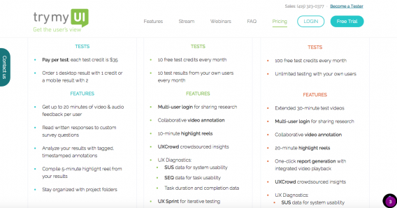
What was the issue? Under each Plan type, the names of features are bolded in the context they appear in (for example, “UXCrowd crowdsourced insights / 10-minute highlight reels”). The user in the video was trying to click on the bolded feature names.
The problem is, the feature names don’t do anything. They aren’t interactive. Clearly this user was trying to learn more about our features, but the bolded names did not reveal any extra information like he thought they would.
There are a few things to be learned from this video:
- Our Plans page did not explain the different features to the satisfaction of the user.
- The user expected to be able to access fuller descriptions of the features without leaving the page.
- The bolded font of the feature names may be misinterpreted by some users as indicating interactiveness.
All of this was brand new to us, as we had had no idea that such an issue existed on our Plans page. We continued to watch out for Rage Clicks on our Plans page, and found several more instances of the same issue.
With these new insights, we have started to investigate the usability of our Plans page in greater detail with remote usability testing, and formulating a plan to provide the information users are looking for in an obvious way on our Plans page.
Conclusion
Web traffic won’t wait patiently for your site’s usability issues to go away, so your UX strategy has to be fast-paced. With videos of every user’s experience on your website, you can diagnose and respond to issues with speed and certainty.
TryMyUI Stream is currently in Beta as we continue to refine the session capture and user frustration marker identification processes. If you are interested in getting early access to Stream and seeing every user session on your website, you can try the demo and add your name to the waiting list here.





Hey Guys,
I am Ritvij Gautam, the CEO of TryMyUI. I wanted to let you know that I am going to be on this comment thread periodically to answer any questions you might have about this technology, UX big data, or user research methods.
regards,
Rit
So, the behaviors identified in the article seem like they could contain far more “signal” than your average heat/scroll map in terms of UX problems.
The question is, can their discovery be automated to a certain extent?
Hey David,
That is a great question. We thought that automation was the logical next step as well. TryMyUI Stream has an A.I. engine that goes through the tens of thousands of user sessions and auto flags videos that had these areas of user frustration.
It is also self learning because the more data Stream collects, the more the A.I. engine refines its definition of the frustration parameters as they apply to YOUR users.
https://player.trymyui.com/player.html?session_id=e8c20af3-430c-41c1-985e-e6c05bfd9537
That is the video from the article, it has auto flagged areas of user frustration as you can see.
Loved this article!
Excited to see TryMyUI stream grow even more. I have so many instances of rage clicking, scrandom etc., and the insights from your platform are going to be a lifesaver!
I agree, Khunnas! I am alsoveveryone very excited about this product! Can’t wait to get off the wait list and start using Stream.
It’s great and useful.
when do you intend to publish this tool?
Hey Huy, I am glad you liked it!
The tool is in open beta right now. You can sign up for the Beta waitlist to try it out for free.
I congratulate you on what looks to be a great tool. I hope companies become more interested in the user experience and your product – I have had to ask my husband to step away from his computer several times as he was in computer rage and ready to throw the monitor on the floor (he has killed several mice by throwing them against the wall). I have tried to provide the type of feedback you are finding with your tool directly to companies and the usual answer a ho-hum thanks but no thanks. Right now Zoho is testing a new UI and even added a feature to immediately give feedback everytime you hit a frustration. In 15 minutes I sent 3 suggestions but was told nice but we can fix that on 2 and maybe on the third – the one where I explained the user can’t see where to input since they made the outline the same color as the page background (!). One thing to consider is also ADHD and dyslexic users – those are probably the ones in rage and wild mouse mode since that is my husband at most web pages. Great article.
Hey Janet!
I am so glad you liked this article. Numbers that companies make decisions on like conversion rates, churn and click throughs are all a result of very human moments and interactions. Our goal is to help companies find the moments that cause their customers frustration easily and actually implement some change to impact it.
Thank you so much for your positive comments! They made my day!