
If you’ve ignored the design and content of your “thank you” page, you’re neglecting:
- Recent purchasers.
- New leads.
These are some of the highest value segments of an online audience, yet what most sites decide to show them is an afterthought.
Whether you’re confirming access to a PDF download or thanking someone for a four-figure purchase, there are ways to add value for users to your thank you page design—and get more value for your business.
Table of contents
What is a thank you page?
A thank you page is the page that users see once they perform a desired action in your website. It is typically shown once visitors become leads, for example after buying a product, filling a form or subscribing to a service.
Thank you pages are similar to order confirmation pages and messages, but not the same. This difference will be explained further down this post.
Thank you page vs. thank you message: which one should you choose?
Technically, a thank you page is optional. Form submissions or checkout processes can end with a success message delivered on the same page via JavaScript or through a pop-up window.
While a thank you message may be easier to implement (it’s one less page to design), it has drawbacks:
- Users are left on a conversion page that’s stripped of navigation and calls to action. That’s a virtual guarantee that the user will close out the browser window—the page has nothing else for them.
- The space for a thank you message is small—often enough to include only the words “thank you” or “success.” Even if you sought to apply one of the strategies below, you’d be limited.
Confirmation email or confirmation page: what’s the difference?
KlientBoost differentiates confirmation emails from confirmation pages effectively: “Consider the email to be an extension of the thank you page that outlives the redirect URL.”
While a short-lived experience, a thank you page reaches visitors while they’re still just a click or two away from a sale; a confirmation page places added steps between a recent converter and another conversion.
Note: If you’re delivering the item via email (e.g. PDF download), the user interest in the email may outweigh the user interest in the thank you page, and you should adjust your thank you page strategy accordingly. “Best practices” are a foundation for testing, not a checklist for implementation.
How to design the perfect thank you page (with examples)
Once you’ve committed to creating a thank you page, here are 10 ways to add value to it:
1. Confirm the transaction
If your thank you page achieves nothing else, it should at least confirm a successful transaction.
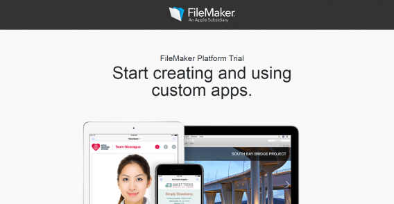
An example from the best thank you pages: after signing up for a trial of FileMaker, the confirmation screen reiterates exactly what I got (FileMaker Platform Trial) and tells me what I should do next:
A Basecamp trial blends a confirmation page with immediate access:
- I get confirmation that my account is ready.
- I can see that I’m already on the home screen for my account.
- I’m offered a brief onboarding video.
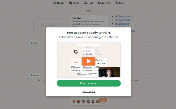
For Basecamp—and other SaaS companies offering free trials—getting a customer to start using their trial is a priority.
That need for an efficient shift between transaction and use may explain why FileMaker and Basecamp forego a standard of thank you page design: actually saying “thank you.”
2. Say “thank you”
A simple “thank you” is a starting point for creating a sense of reciprocity. We feel obligated to give back to those who have given to us. If I’ve just shared my name, email, and phone number, I’ve taken a risk and offered you valuable information. A simple thank you acknowledges that.
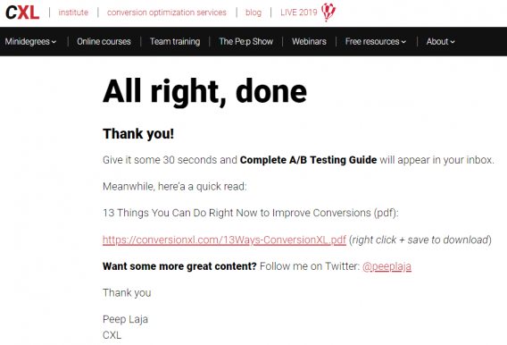
On one of CXL’s thank you pages for a guide download, notice the order of operations:
- Successful conversion confirmed.
- Visitor thanked.
- Additional resources offered (more on that later).
When it comes to how to say thanks:
- Make it from a human. A quick “note” from a member of your team (or the head of your company) feels more authentic than a generic corporate thank you.
- Make it feel human. Why not add a real image or brief video? This is an opportunity to put a company name with a face.
3. Fend off buyer’s (or subscriber’s) remorse
For buyers and subscribers, the post-conversion moment is exciting—and nerve-racking. Did you make the right choice? Will your inbox be bombarded? Should you have waited for a sale?
Our psychological default is for “post-purchase rationalization,” a cognitive bias whereby someone who has purchased a product or service overlooks any faults or defects to justify their purchase.
Immediately after a sign-up or purchase, consumers are looking for reasons to feel good about what they just did. A thank you page can reinforce those positive feelings.
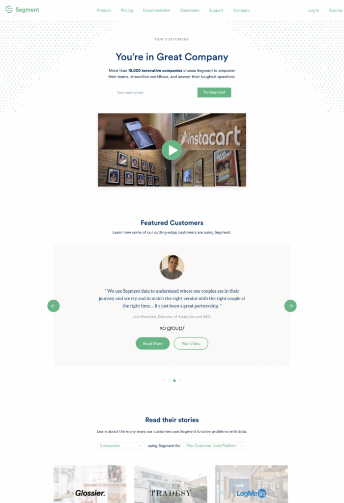
After booking a meeting with a representative, Segment immediately reassures users that “You’re in Great Company” and offers several success stories and strong social proof:
Showcasing positive reviews or testimonials can reinforce the consumer belief that a transaction—of cash or personal information—was a good decision.
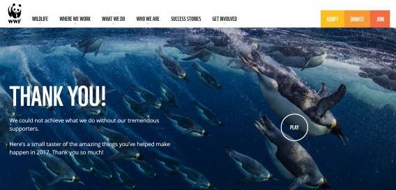
For non-profits, you can provide a tangible demonstration of a donation’s impact. The World Wildlife Fund includes a video on their thank you page to connect the decision to donate with a positive outcome:
Another way to fend off buyer’s remorse is to guide users toward their next step. As John Carvalho wrote:
Scientists studying “choice closure” have found that encouraging specific post-purchase behaviors can minimize buyer’s remorse and maximize satisfaction with the decision.
It’s why telling consumers exactly what to expect is critical.
4. Provide clear expectations of what’s next
Without knowing what to expect, users are left wondering, “What should I do?” Will log-in credentials get emailed to me in a minute? An hour? How do I know when my package is on the way?
Uncertainty about next steps feeds uncertainty about the decision to convert. Which questions do users have immediately after converting? Answer them.
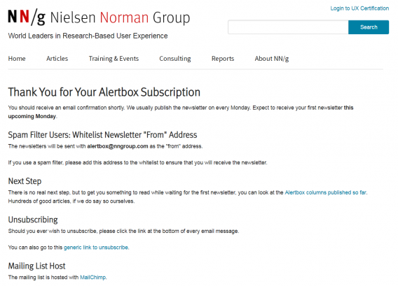
Nielsen Norman Group’s thank you page for an email subscription is effectively a post-signup FAQ page. It answers:
- How often will I receive your emails?
- When will I receive them?
- How do I keep them from going to spam?
- Is there anything else I need to do?
- How do I unsubscribe?
- Where do you store my personal information?
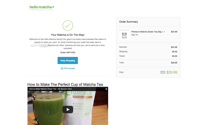
For purchases, user questions center on order processing. Take this example from Hello Matcha:
- Users receive confirmation of a successful purchase.
- An order summary is clearly visible on the right.
- A secondary call to action (CTA) offers the option to print a receipt.

(Hello Matcha reserves its primary CTA to encourage users to keep shopping and also provides a video about how to make a perfect cup of tea. There are more details on both strategies below.)
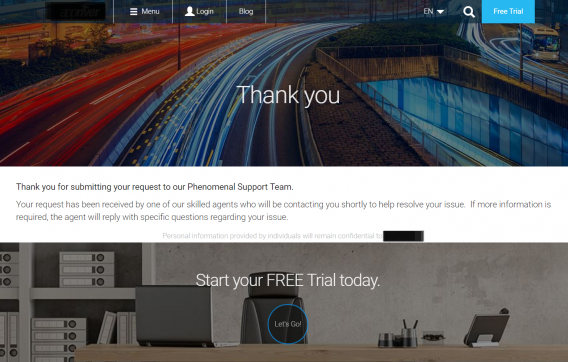
In contrast, a bad confirmation page disrupts expectations. After filling out a support ticket for this SaaS product, users are left in the dark:
- There’s no time frame for the company response to the technical issue; you’re left wondering how long “shortly” will be.
- There’s a CTA to start a free trial for a product you’ve already purchased, which makes no sense.
Or, consider this post-reservation page from a hotel:
- It’s full of cliched promises like a readiness to “make your stay unforgettable.”
- It suggests that pending visitors contact the hotel but provides no contact information.
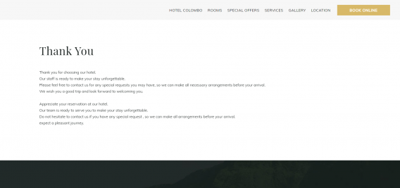
For industries like hospitality, the perception of thoughtful and attentive guest service (i.e. hospitality) is essential and, in this example, already breaking down the moment after purchase.
5. Pitch an upsell or cross-sell
The most direct way to create more value from a thank you page is to win a secondary sale.
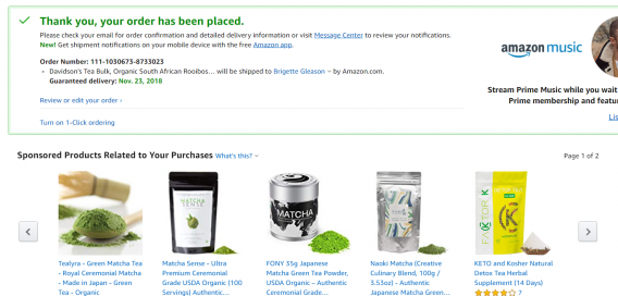
When it comes to upsell and cross-sell opportunities on a thank you page, everyone thinks of Amazon, with good reason.
About 35% of all Amazon purchases come from upsells and cross-sells, and “recommended products” succeed 60% of the time.
After ordering some loose-leaf tea, I received a thank you, confirmation of my order, order details, a recommendation for sponsored products, and a laundry list of opportunities to buy something else that was way too long to include as a screenshot:
- “Buy it again” grocery items
- Inspired by your browsing history
- Buy it again
- Related to items you’ve viewed
- Recommendations based on your order
Why thank you pages work well for upsells
There are a few reasons why upsells on thank you pages work especially well:
- You’re marketing to users who have just committed to buying from you.
- Personal information is already stored, easing the path toward a second purchase.
There’s a less obvious reason, too: A thank you page gives you more real estate to make your pitch for the upsell. If you’re offering an upsell at the checkout, you don’t want to disrupt the purchase, which limits how much detail you can include.
On a thank you page, the upsell becomes the primary product, and you can build an ideal landing page for that product, rather than relegating it to a subtle suggestion.
Using promotions to incentivize upsells
If you’re attempting to further incentivize a secondary purchase, consider adding a post-purchase promo code:
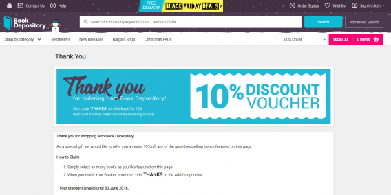
Two considerations:
- If you’re trying to incentivize a recurring purchase (e.g. coffee beans), a generic coupon for a discount on any purchase may encourage repeat business.
- For less-frequent purchases (e.g. television), a specific discount on an upsell or cross-sell item makes more sense.
6. Offer “anticipatory content”
Ecommerce purchases still require waiting, even if Amazon has reduced the delay to hours instead of days. A thank you page that links to resources on product usage builds excitement and can improve consumer satisfaction:
- Does the product require assembly, like a bicycle? Share videos to show users how to avoid common mistakes—and frustration.
- Is the operation technical, like an espresso maker? Link to content that will help them brew the perfect shot on their first try.
- Does the product have less-common uses, like a stand mixer? Show the value of meat-grinding or pasta-rolling attachments.
For many companies, this content already exists, but users find it too late, or not all. Highlighting it on a thank you page ensures awareness and gives users something to do while they wait.
Anticipatory content isn’t exclusive to ecommerce, either. Even while you’re waiting for a desktop application to download, there are opportunities to encourage interim engagement:
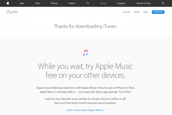
For ecommerce companies with apps (or SaaS companies with browser-based and mobile app versions), a CTA to download an app makes sense—it facilitates easier purchasing in the future and delivers more data on consumer behavior.
Even if you deliver your product immediately, linking to related resources on a thank you page has the same potential benefits:
- If someone downloads a PDF, are there supporting videos to deepen engagement?
- If someone signs up for a webinar, which related blog posts might interest them?
7. Encourage users to create an account
As we’ve written before, creating an account during checkout creates friction. (For one company, that friction cost them $300 million.) Social logins are one way to balance the user experience with marketing’s insatiable appetite for consumer data.
So, too, is moving the “create an account” CTA to a thank you page. As Baymard defines it, thank you pages are an opportunity to “move form fields from the checkout process to the order confirmation page.”
Post-purchase account setups have several benefits:
- Account creation doesn’t interfere with the initial sale.
- Since an account setup suggests the desire for repeat purchasing, it makes more sense after an initial purchase rather than prior to one.
- Most of the information can be pre-populated from the just-completed checkout.
For SaaS signups, many thank you pages add post-sign-up steps like email verification or account details.
A post-sign-up thank you page that takes users directly to the product—like Basecamp does in the prior example—reduces friction and gets more users using the product more quickly. (However, if the goal is to provide access only to more qualified users, that friction may be useful.)
8. Move users through the funnel
For lead-generation sites, thank you pages are an opportunity to move a prospect through the sales funnel.
You can deliver targeted calls to action by identifying the next logical step. If a prospect has just completed one action, what would move them one step further down the funnel?
For example:
- Requests an industry research study? Suggest an email list signup.
- Signs up for the email list? Recommend an upcoming webinar.
- Downloads product details? Offer a live demo.
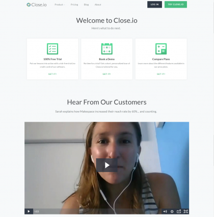
After signing up for their email list, Close recommends three next steps (as well as social proof), each of which encourages users to move down their sales funnel:
9. Ask for referrals
If you could ask recent purchasers to do one thing, what would it be? Share their experience on social media? Leave a review? Refer a friend?
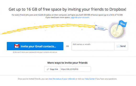
Offering a “friends” or “colleagues” discount may incentivize sharing and increase referrals. As Dropbox CEO Drew Houston detailed in a presentation, a referral offer that let Dropbox users “earn” 16 extra GBs of storage space drove millions of signups and dramatically reduced customer acquisition costs.
10. Gather customer data
Post-purchase rationalization suggests that you may not get accurate answers to “Why did you buy?” in a post-purchase survey. That doesn’t mean you can’t ask, but there may be more reliable data to gather from a qualitative survey:
- Did you consider any alternatives to our product? The answer could encourage you to develop or expand a comparison page.
- Which questions did you have but couldn’t find answers to? The answer could help you organize or expand product page copy.
- Anything else you would like to tell us? Find out the unknown unknowns.
Be aware that your results come from a biased sample—you’re asking only recent purchasers. Maximizing your appeal to them may boost sales to that segment, but it may ignore or alienate a much larger pool of potential buyers whose pain points aren’t shared by your current customers.
In short, don’t make post-purchase surveys your sole source of consumer data.
Getting data and improving the experience
Even if you collect basic interest data on your confirmation page, you can improve consumer targeting—and make a better first impression.
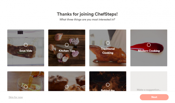
Consider the approach taken by ChefSteps: After you sign up for their email list, you’re taken to a thank you page that asks you to highlight three interests:
After choosing three recipe categories, ChefSteps delivers a set of tailored recommendations:
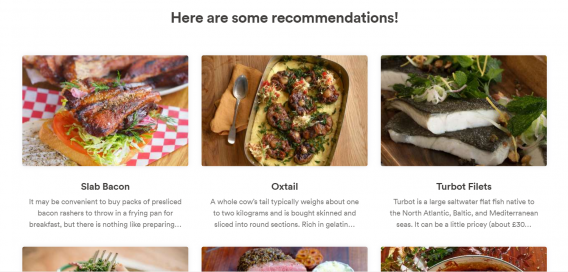
From a user’s perspective, this is enticing and helpful. For ChefSteps, it does far more:
- Delivers a customized experience for new users.
- Pushes information into their CRM to segment visitors for email follow-ups.
- Identifies the subset of users interested in sous vide cooking.
Since ChefSteps produces recipe content to support sales of Joule, a sous vide device, they’re able to create a more qualified segment of users right from the start.
Conclusion
What did they want? Did they get it? What will they want next?
The answers to those three questions summarize the ways to add value to a thank you page. Few take the time to answer those questions, even though a confirmation page is one of the only pages on your site that every lead and customer visits.
A thank you page is an opportunity to create near-term value with an upsell or by gathering data to improve targeting. But, more importantly, it’s the first step toward creating long-term value: ensuring that recent converters feel good about their decision and helping them get the most out of their experience with your business.
Related Posts
-

In today's review I'm reviewing 2 different ecommerce product pages. Watch this 5-minute review: Pages…
-

Get data-backed ecommerce guidelines you can implement right away to increase revenue. If you're wondering what…
-

In this post I'm reviewing 5 websites, analyzing their home pages - and mostly their…
-
Today I'm reviewing value propositions of several websites. Value propositions are critically important - especially…

