Your ecommerce checkout flow is where the money is at. Think about it. Random visitors leave the site before ever entering the checkout funnel. Motivated buyers come here to finish their order.
Any small design improvement in your checkout UX usually has a direct impact on how much money your site makes.
An ecommerce site that I analyzed recently had a payment page in which 84.7% of the traffic proceeded to buy. I calculated that if we could increase that to 90%, it would result in 461 more orders and an additional $87,175 per month—23.9% revenue growth. “Small” gains can be huge.
So, the question is, “How do we get more people to go through our checkout flow and complete purchases? Specific tactics depend on your site, but the principles for coming up with the answer are universal.
Table of contents
What is the checkout flow in an ecommerce?
A checkout flow in an ecommerce is the series of steps a customer has to go through on a website, in order to complete a purchase.
A framework for thinking about ecommerce checkouts: The Fogg Behavior Model
The bottom line is this: Behavior = Motivation x Ability x Trigger.
Here’s the model:
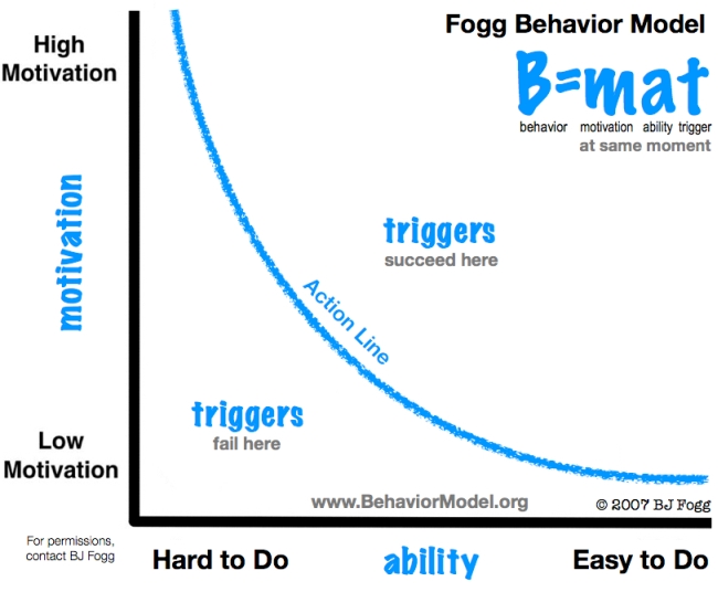
You want to aim for the top right of the graph—high motivation, easy to do, a trigger in place. If you have high motivation and low ability (difficult to do), what you’ll get is frustration. If it’s low motivation but easy to do (e.g. take out the trash), you get annoyance.
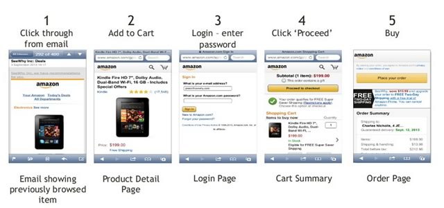
How Amazon uses the Fogg Behavior Model
When Amazon sends you an email with a product promotion, that’s motivation and a trigger. People click on the link and get to the product page. They read the copy and reviews, and look at the picture, all of which increase motivation. “Add to Cart” is the trigger to initiate the checkout process.
What about ability? How easy it is to complete the checkout process? This is where Amazon kicks butt. You need only to type your password and click a couple of times. The checkout flow is friction-free.
Here is the actual workflow on Amazon’s mobile commerce application:
Done and done. Let’s walk through the whole checkout flow step by step to see what makes a good one.
Note: You can get tons of other tips for ecommerce from our comprehensive ecommerce guidelines report (247 guidelines specifically for ecommerce).
How to Design Your “Add to Cart” Function and Shopping Cart Page
It all starts with people adding something to the cart. The moment a visitor adds the first item to their cart, they’re not browsing—they’re shopping.
What Should “Add to Cart” Look Like?
When people add something to the cart on your product pages, what should happen?
It should be stupidly obvious that they’ve added something to the cart. Clear confirmation. It’s ridiculous how many sites screw this up either by not displaying a proper confirmation or by showing a tiny animation or small confirmation text that’s hard to notice.
You can’t miss a cart add in Bonobos. After you click “Add to Cart,” the cart appears with a small animation, which is good because the human eye reacts to movement. It’s a subtle visual cue that indicates the shift from visitor to buyer.
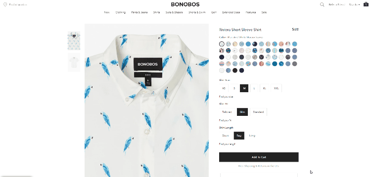
The cart contents along with the “Checkout” button also remain visible until the user clicks somewhere else. That’s good. I would change the “Checkout” button color to something other than blue—it doesn’t stand out enough. The main thing in the visual hierarchy is the “Add to Cart” button, but the product is already in the cart.
ASOS shows a small animation as well. They open up the cart contents, then fold it in after a few seconds. The “Add to Bag” button also changes to “Added,” which is a nice confirmation for buyers:
I would keep the cart contents open until the user makes a choice by clicking somewhere. This way, the “Checkout” button keeps staring them in the face.
While we always want them to buy more things, improving the process to purchase even a single item can lead to big improvements. Nudging them toward the checkout is always a good idea.
Once the product is in the cart, then what?
There are two main approaches:
- Show “cart add” confirmation and keep users on the same page. Pros: People didn’t ask to move to another page, so there are no surprises. They might also consider adding more items to the cart before checking out. Cons: They already have the product they’re now staring at in the cart. It would be more useful to you if they’d look at something else they might want to buy.
- Transfer the user to the cart page. Pros: You’re taking them one step closer to making a payment. This is also a great opportunity to make upsell offers. Cons: You might lose out on maximizing “items per cart.”
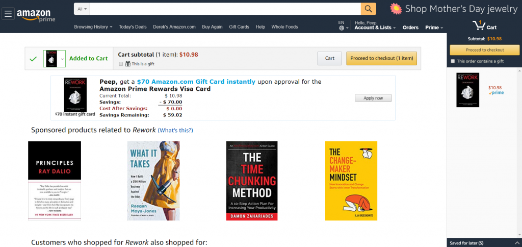
Amazon takes you to a cart page, confirms that you added a product to the cart, and shows you upsells. What Amazon does well is shrinking cart contents, so upsells stand out:
The right balance of potential strategies depends on your industry and goals, and you definitely want to test this.
Metrics to keep in mind:
- Average transaction value;
- Average quantity per transaction.
We don’t want to increase the number of transactions alone but also the amount spent for each transaction.
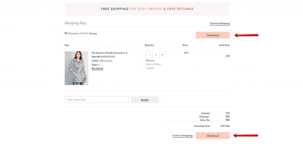
Display cart contents well
Key principles for displaying cart contents effectively are clarity and control.
- Clarity. It’s easy and obvious to understand what’s in the cart and the final cost, including shipping and taxes. Surprise costs down the line make people abandon carts.
- Control: It’s easy to make changes, like updating the quantity or removing products.
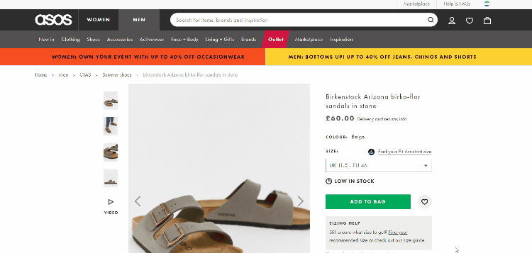
ASOS has a good take on the cart page:
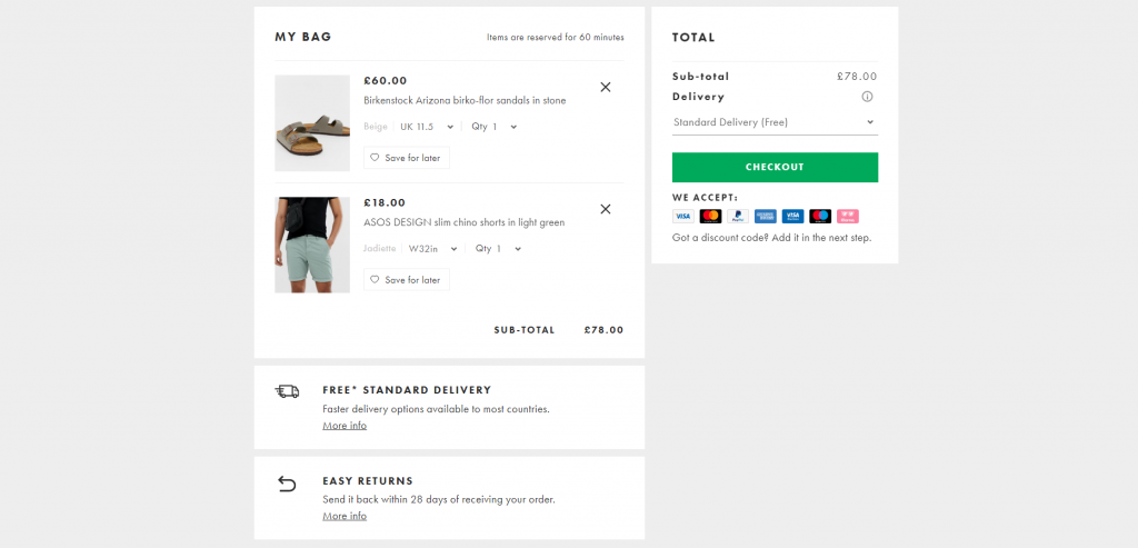
What they get right:
- Product photos;
- Product name and price;
- Ability to remove, save for later, or change details like size;
- Show the kind of payments they accept;
- Show the total price and confirm free delivery;
- Clear call to action to “Checkout”;
- Reduce uncertainty by highlighting “Easy returns.”
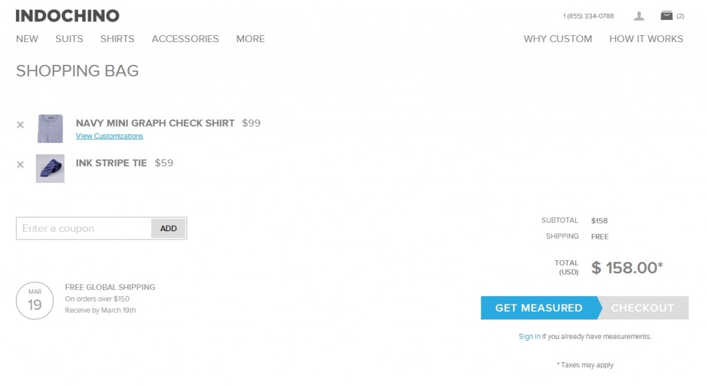
Indochino has a pleasing, minimalist approach to presenting cart contents. That said, the page still has a few issues, like a prominent coupon box and the inability to change quantities:
Get the visual hierarchy right
The number one thing in the visual hierarchy should be to continue to the checkout. (Test different CTAs.). There should be two calls to action: one above and one below the cart.
Something like this—the two checkout buttons clearly stand out:
Modcloth has improved this page since we last reviewed it. Previously, updating the quantity required typing. Now, you can use steppers to increase or decrease the quantity.
Notice that Modcloth also offers a PayPal option. While most people prefer to pay with a credit card, offering 1–2 alternative payment methods (e.g. PayPal, Amazon) is a good idea and has been shown to help conversions along. Too many choices are hurtful, though.
Modcloth also reminds you that they have free returns and free shipping on orders over $75.
Don’t make coupons prominent
When people see an “Enter coupon code here” field, they feel less special. “How come I don’t have one?” Many go to Google to find a coupon; many never return. Leaving the site in search for coupons is a common reason for shopping cart abandonment.
So, this is not a good idea:

Instead, have a text link that says “Got a coupon?” or something similar. When someone clicks the link, make an input field—like the one above—appear. Text links are less prominent, so fewer people will pay attention to them.
Customers who already have a coupon code will be looking for a way to enter it. Unless you hide it really well, they will find it and be able to apply their coupon code.
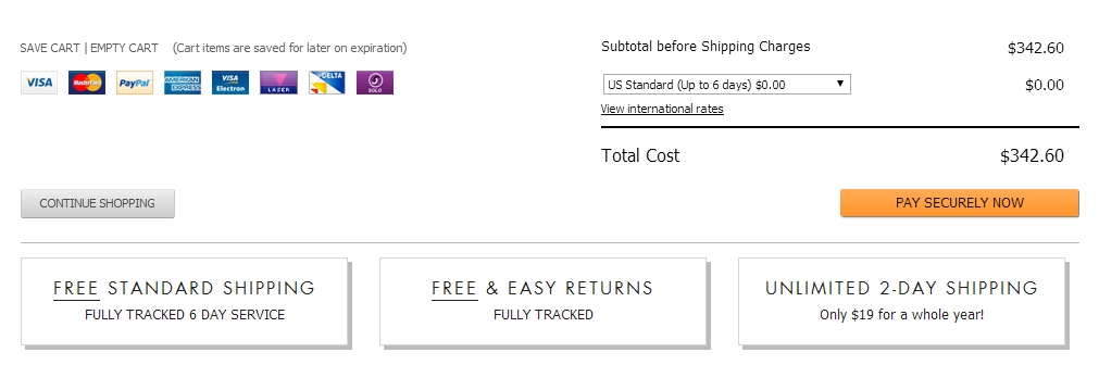
Remind shoppers about the good stuff: shipping, returns, and security
When will they get their goods? How much is the shipping. Is it free? Will the transaction be secure? Remind people.
Here’s an example that shows those three key messages underneath the checkout button, which also says “Pay Securely Now”:
Persistent carts FTW
When people add something to the cart, don’t let the cart contents expire. Use cart abandonment emails and retargeting ads to bring people back next week or next month so that they can continue where they left off.
Sign-up process: To create an account or not?
Many ecommerce sites want buyers to sign up before they buy. Some even force registration (i.e. not possible to buy without registering). Long story short: Don’t do it. It hurts conversions. A lot.
One in four abandons online purchases due to forced registration. Forced registration is part of the “greedy marketer syndrome.” It’s easy to understand why ecommerce marketers want to do it—they’re hoping the user gets “locked in” and will shop more because they have an account.
Is that really the case? Oh, please. How many websites do you have a registered account on? Do you now feel loyal to them for that reason? I bet you haven’t logged in to most of them more than once.
Here’s a good story on forced registration, told by usability guru Jared Spool:
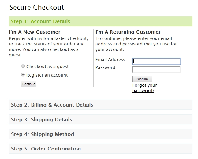
It’s hard to imagine a form that could be simpler: two fields, two buttons, and one link. Yet, it turns out this form was preventing customers from purchasing products from a major e-commerce site, to the tune of $300,000,000 a year. What was even worse: the designers of the site had no clue there was even a problem.
The form was simple. The fields were Email Address and Password. The buttons were Login andRegister. The link was Forgot Password. It was the login form for the site. It’s a form users encounter all the time. How could they have problems with it?
The problem wasn’t as much about the form’s layout as it was where the form lived. Users would encounter it after they filled their shopping cart with products they wanted to purchase and pressed the Checkout button. It came before they could actually enter the information to pay for the product.
The team saw the form as enabling repeat customers to purchase faster. First-time purchasers wouldn’t mind the extra effort of registering because, after all, they will come back for more and they’ll appreciate the expediency in subsequent purchases. Everybody wins, right?
We conducted usability tests with people who needed to buy products from the site. We asked them to bring their shopping lists and we gave them the money to make the purchases. All they needed to do was complete the purchase.
We were wrong about the first-time shoppers. They did mind registering. They resented having to register when they encountered the page. As one shopper told us, “I’m not here to enter into a relationship. I just want to buy something.”
By removing forced registration, they increased sales by $300 million.
Spool’s team also figured out that most people had multiple accounts in the system. People had forgotten that they already had accounts. They got error messages when they tried to create one with their standard email, so they had to use an alternative email to create more accounts.
What you should do instead? Always offer a guest checkout. You can work on registration after the sale:
- Don’t even mention the word “Register.” Say “New Customer” or a similar term.
- After they check out, offer account creation on the “Thank You” page. You already have their name, email, and address from the checkout, so it shouldn’t take more than a few clicks to create an account. Ask for their desired password (or provide an option to auto-generate it) and confirm permission to create their account.
In my experience, the most common approach on ecommerce sites is still sub-optimal. Overall, it’s too busy, and it asks new customers to make a choice, leading to hesitation:
There are several, far more preferable options.
Checkout registration option 1
Give users two choices, new or returning:
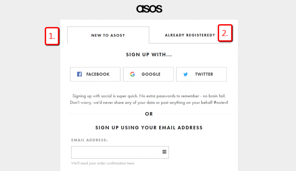
Asos didn’t always have this approach. This was their previous sign-up page, which had three choices:
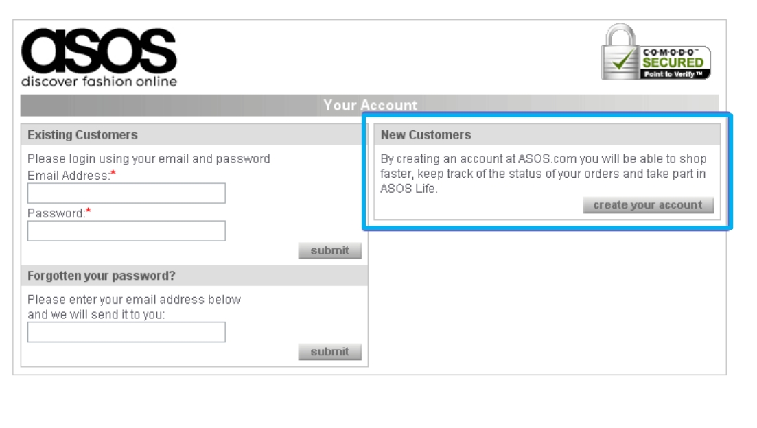
Killing this approach and switching to a streamlined version reduced cart abandonment by 50%!
It’s still (essentially) a forced registration, but it’s packaged differently. It’s also easier with social login options. A typical usability problem is reduced to just a few clicks.
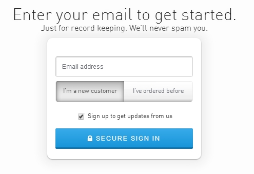
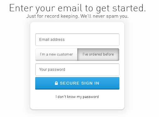
Checkout registration option 2
Shopping cart abandonment is a major issue. Asking for your email up front makes it easy to start an abandoned cart recovery process. Also, there are two easy choices—no sensory overload:
Checkout registration option 3
Another great way is to skip the log-in screen altogether. Instead, simply default to the guest checkout. People with an existing account can log in via the link, and new clients can create an account after they pay:
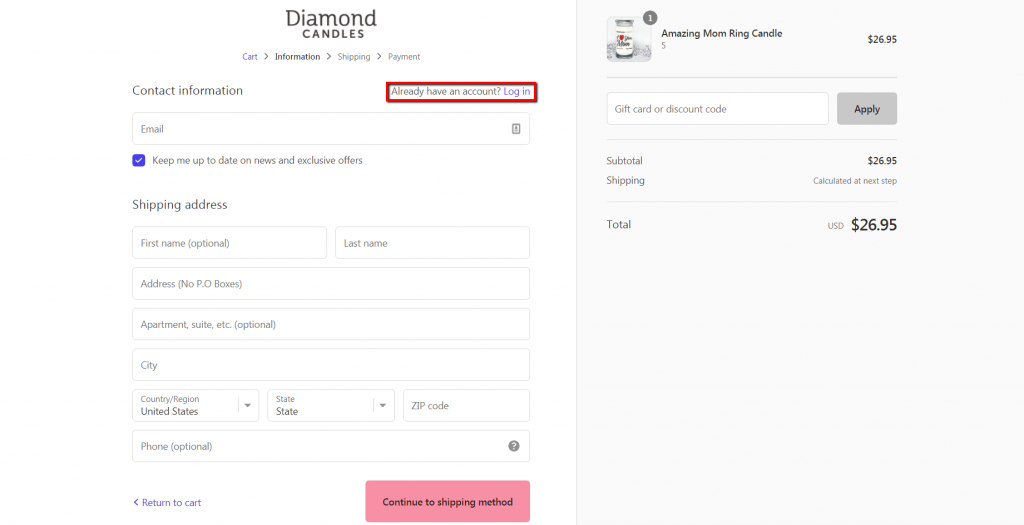
What Diamond Candles does well isn’t even visible. They create an account for you automatically but don’t mention it. Let’s say you go through four guest checkouts with the same email address, then finally decide to create an account (enter a password, essentially).
All your previous orders with that email address are merged for this account, so your freshly created account comes with a proper order history.
Checkout registration option 4
With this option, account registration is offered together with an incentive upon completing the purchase. Here’s an example from Speedo:
People aren’t bothered with any account registration until they pay you money. If you had to choose, what’s more important to you: account registrations or purchases?
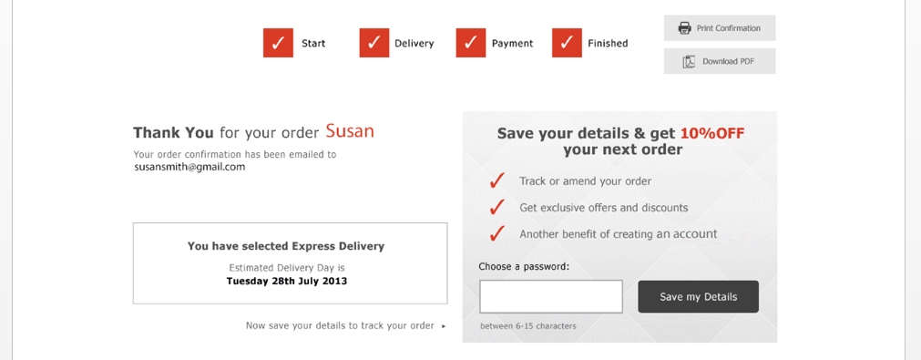
Usually, “thank you” pages aren’t very useful, but not so here. They give you a no-brainer offer: Enter a password and get a coupon (plus order tracking, faster purchasing, etc.). The account creation percentage for new users here is often over 75%.
The Ecommerce Checkout Page
This is the money page. Any lift on your final checkout page will make a nice difference to your bank account. Here are a few principles that will help you create a better final step in your checkout flow.
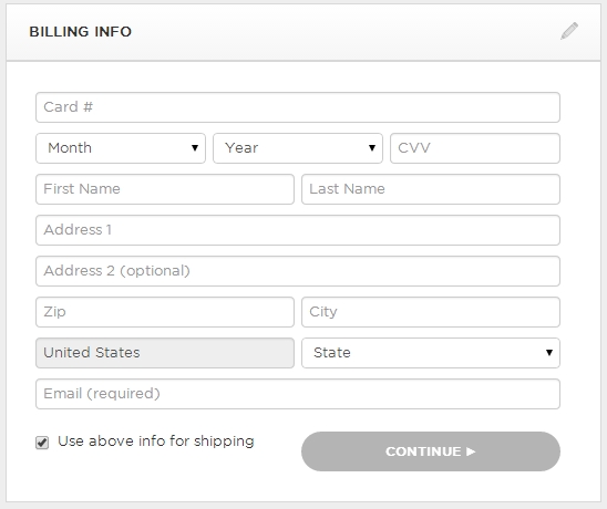
Ask for credit card info last
Have people complete shipping information before they get to billing. This puts Cialdini’s principles of Commitment and Consistency into action. Once people start doing something, they feel like they should finish.
They’ve already been asked to enter their name, email, and shipping info, which, ideally, is the same as the billing address, so they don’t need to type it again.
The same principle, sometimes called the foot-in-the-door technique, applies to form fields. Start with the easier fields first, like name. The credit card number field is the “hardest,” so it should come last.
This is what you should not do:
This is better. (You get here from the shipping page.)
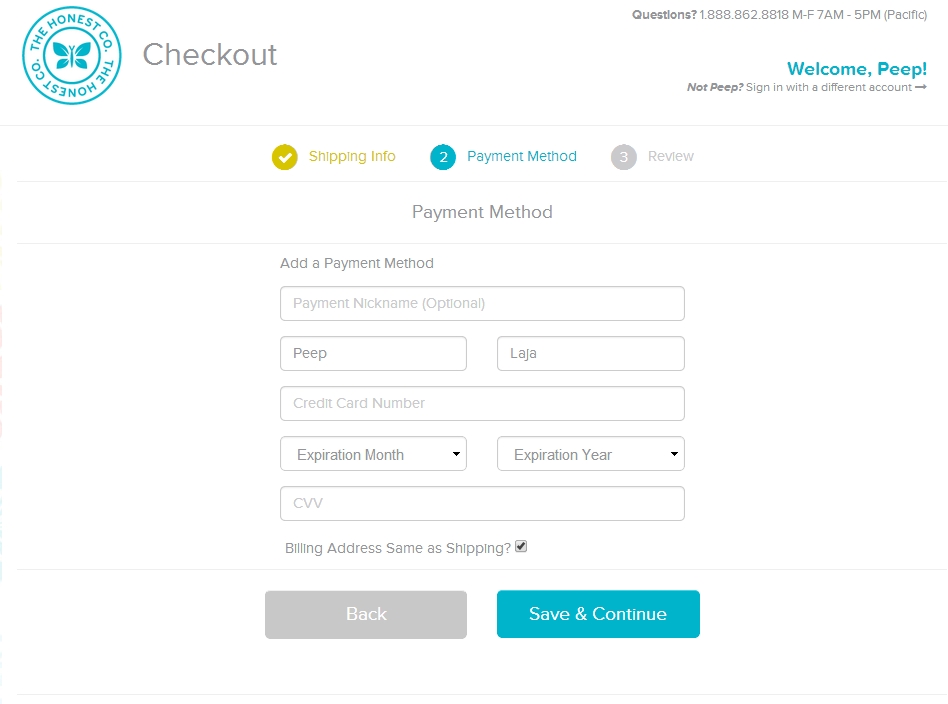
The good: It has a clear 1–2–3 step flow. The name field comes before card details, and the billing address (if it’s the same as shipping) doesn’t need to be entered again.
The bad: The main CTA is “Save & Continue.” Continue where? It should be specific, like “Continue to Review,” or whatever the next action is.
Use a payment form that looks like an actual credit card
Add real-life touch by designing the payment form in this skeuomorphic way:
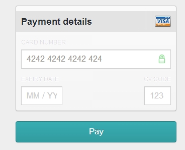
You can get an interface for this called Skeuocard for free(!) to implement on your system. Try a demo here.
Make the payment process look secure
Security is a serious concern. Besides actually making payments secure with SSL, tell people about it. This is an example of a form made to look secure:
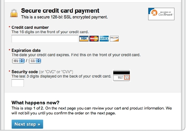
Some reasons why it works:
- Different background color for the credit card number field.
- SSL logo.
- Written statement: “Secure credit card payment. This is a secure 128-bit SSL encrypted payment.”
- Explanations for expiry and security code.
Note that if your audience is not tech savvy, they might not know what SSL or HTTPS are, so speak in plain terms.
Store credit cards in your system
Sure, you have to deal with PCI compliance, and there’s a risk of getting hacked, but you will make so much more money off returning users. When people don’t need to enter their billing info, buying becomes a one-click process.
Amazon is killing it largely because the friction for returning buyers has been almost completely removed! The checkout flow is barely a flow—it’s a one-click event.
Returning visitors are much more likely to buy than new visitors, but that’s nothing compared to returning buyers. Make it easy for them.
Conclusion
Start your ecommerce optimization efforts at the checkout flow. Relative gains here will result in very nice absolute sums.
To improve the UX of your checkout process:
- Make the “Add to Cart” function clear.
- Make it easy for visitors to change or remove cart items.
- Streamline the registration process—let new buyers register after the purchase.
- On the checkout page, ask for the easiest information first.
Working on something related to this? Post a comment in the CXL community!
Related Posts
-

User flow is the path a user follows through your website interface to complete a…
-

Today we're doing an eCommerce funnel review for Vintage King Audio. Watch the 7-minute review: Here's…
-
In today's review I'm reviewing 2 different ecommerce product pages. Watch this 5-minute review: Pages…
-

Get data-backed ecommerce guidelines you can implement right away to increase revenue. If you're wondering what…


Excellent piece. The one thing I would caution readers against is actually storing credit card information themselves. PCI compliance is challenging, and by storing credit card info yourself, you are taking on the burden of guarding it. If even major merchants like Target have had data security breeches in recent history, what time and resources can you claim to have to defend credit card information better?
The BBB provides a multi page checklist for PCI compliance.
http://www.bbb.org/data-security/becoming-pci-compliant/checklists/
While PCIComplianceGuide.org suggests that a checklist approach in and of itself isn’t enough.
http://www.pcicomplianceguide.org/merchants-20110714-security-checklist.php
There are merchant service tools like Stripe and Authorize.net which will allow you to maintain customer payment information, as well as process cards.
(Stripe has this as a feature. https://stripe.com/docs/tutorials/charges Authorize.net as an add in service. http://www.authorize.net/solutions/merchantsolutions/merchantservices/cim/ )
The burden is on them to maintain credit card security compliance, for the most part. You still have to design secure forms, and protect your connection and login information to these services. However, you are far less on the hook for guarding the specific credit info of dozens to thousands of individuals.
Bonus: using merchant service-based payment storage may make implementing this excellent future purchase friction reduction tactic easier.
For every 1 merchant that gets hacked, there are 25 million that don’t.
More than 1 plane have crashed, so you shouldn’t fly one. More than one car gets into an accident every day, so don’t drive one?
Come on! This is ridiculous advice. You want to make more money == store credit card details.
Well I personally won’t be flying any planes any time soon, because I’m not qualified. And of course I drive on a regular basis, but I observe the rules of the road, wear my seatbelt, and am grateful for things like airbags in case something goes really wrong.
Just yesterday Fast Company put out an article about businesses and individuals getting hacked. http://www.fastcompany.com/3026672/the-code-war/why-do-companies-keep-getting-hacked
Hacking and security failures are realities and risks of doing business. Doing everything you can to minimize those risks is smart for both you and your customers.
The point of my criticism and advice is not to encourage people away from using store credit card information at all. It’s absolutely a smart move to reduce friction from future purchases by having their card information securely stored and ready to apply to the next transaction. That was never in dispute and I apologize if it seemed like I was trying to discredit that tactic.
The point I was attempting to make here is that many people are ill equipped to do so in a way that they can guarantee reasonable safety.
Quickly searching for PCI compliance audit brings up a wealth of potential pitfalls in credit card security. http://www.darkreading.com/compliance/top-10-pci-compliance-mistakes/232400411
It also brings up a wealth of vendors who specialize in keeping businesses PCI compliant.
My recommendation is to either:
A) store credit card information with the help of a secure, reputable merchant service solution, and not in your own database
B) if you are going to store within your own data warehouse, get someone to be dedicated to security compliance, whether that be a staff member or a vendor
Since many businesses are small businesses who don’t have the resources to dedicate someone to watchdogging data, and even large businesses who do have additional staff still encounter difficulty with security, why not offload the burden of that security to an organization whose primary focus is PCI and credit card security? (i.e. a merchant service provider)
Not only does that provide much needed security against disastrous data breeches, theft, and fraud, but it enables you to more quickly bring ideas like card storage for future use to fruition.
Not to mention many of these security and merchant service providers give business owners security logos and other trust signals that businesses can use to reduce even more friction by ensuring they have the customer’s safety in mind.
Of course I agree with you.
My point is “store customer credit cards”. The “how” of it is another, highly technical, matter. Of course it should all be safe and secure, etc.
My point is not to shy away from it because “I might get hacked”.
Also in the case of Target the credit card info that was stolen was from in-store purchases, not online.
Peep – Correct – do not shy away from a good business practice because of some threat of being hacked. However, Georgene makes an excellent point about how tokenized payments still allow for this good business practice to exist, but removes much of the burdensome PCI requirements from the retailer. I guess with this approach the retailer can take your advice, focus more on creating a better checkout experience rather than focusing on how to secure the credit cards.
I recently wrote of this topic under a different light in my newsletter. Dan Kennedy uses the term “greased chute”as a visual depiction for how you want to to help guide prospects through the sales process as effortlessly as possible. It boils down to minimizing friction wherever you can, using good marketing by itself since you don’t have a personal salesman online to guide them along like you would at a car dealership.
I like it on how you compare the designs of those big ecommerce sites and how we can get ideas from them.
Thanks Peep – I liked and retweeted. Excellent as always
An excellent article and some great examples.
@Peep you are 100% right. It is essential to store card details AND to have a good handle on security. If you make the customer work harder because you can’t be bothered to do the hard work needed to be secure, then you deserve to go out of business. Doing it right is ALL about the customer.
Excellent piece of article!! – Thanks Peep.
Thanks Peep, this is an enlightening post, absolutely.
I think all relevant points of ecommerce funnel are touched upon.
Excellent post Peep,
the info about skeumorphic display of credit card entries is great. They even use a special web font to make it look like on VISA-cards.
To make things LOOK secure is even more important for conversion, than to make them actually secure (of course to really make them secure is obligatory). However, conversion is based on what users belief and perceive, not what is technically happening in the background. And with most people not tech savvy, little lock icons and trustmarks like TrustedShops, etc. are imperative for the step with the highest friction: Entering his CC number is a real financial vulnerability to the individual. Their insecurity and awareness about this fact needs special attention.
Great work, I love to read your inspiring posts since a long time.
Michael
The example used for “Still bad” when requiring users to register during checkout is the default checkout process for Big Commerce. Has anyone had any success changing this? The scripts on Big Commerce tend to get a bit fickle when you start trying to change them around.
Excellent piece, as always Peep! I feel like I have a lot of these principles set up on my shop already but would love to get your insight if you have a minute to check out my shop. Thanks!!
Peep — Great post as always. Do you have any shopping carts you recommend that have a simple and efficient checkout process?
We use Prestashop and the checkout flow is pretty close to on par with what Peep has mentioned above. Although there could be some minor improvements, some that I have solved with various modules and custom coding.
The other thing I’d be wary of is making credit card details split into first and last name. As a weird quirk of my UK bank, the name of my credit card is Ms J Doe rather Jane Doe, which can be problematic with forms (I usually have to put Miss J under first name and hope it works).
There are definitely a few ideas to try out on my site. Making the checkout process feel secure is more important than ever with all of the recent hackings that have happened (e.g. Target).
What about not offering customers to register at all? I never remember my password on shops where I dont often buy (which is always the case right?) so why register…
Offering it in the very last step (the thank you/confirmation page) seems the only way to offer registration, without affecting checkouts.
Other question; what about 1 page checkouts? Do you have information about how the number of steps involved in the checkout process relates to overall checkout rates?
If your customers buy only once from you, no registration needed. If you sell smth that they might regularly buy, it’s a good idea to go for it.
Single page vs multi-step checkouts: both work. You just have to figure out which approach works better for your site. Only way to know is to test it. What’s good about multi-step approach is that it’s easy to measure drop-off rates + if you capture email first (in the first step), you can attempt to recover abandoned carts.
Great article Peep. I’m amazed at how ‘set in stone’ many many of the checkout processes STILL are. It seems no one challenges them and marketers accept benchmark level conversions.
For the web developers who are in their infancy at trying their hand building ecommerce websites this is a definite must read for them. But more importantly, I try to get Business Owners to read some of this stuff as they are the first to complain when the balance sheet is showing the website as not delivering on making money.
Business owners should read articles like this and take the driving test towards understanding how conversion really works down at this level. And, to also understand this is why their website might cost a bit more build as having these processes in place will help them win more races online and have happy customers at the checkout.
Peeps I can appreciate the time and effort you have taking towards putting this article together. Business Owners should actually be paying you for gifting them with this valuable blueprint to help grow their ecommerce websites future.
Well done!
Wonderful article and very informative.
We are using the magento platform for our site with the standard one page checkout. I was curious if you could recommend a magento extension that in your experience would improve the checkout flow and lead to higher conversions.
You do a great job of breaking down items into actionable results, glad to have found you through Moz. We’re all tech savvy, we don’t mind buying things online. Secure payment is a great point especially if the buyers skew older.
Starting an e-commerce site and this is JUST what I needed to read. Thanks so much for a great article.
Great article and have a lot of new ideas. Thanks for sharing
Hey Peep,
This was a really nice post. You did a nice job of walking the reader through the process and explaining things in an easy to understand way. Anyway, I thought this would be of value to our blog readers, so I included it in my roundup of the month’s best Magento, WordPress, and ExpressionEngine content. http://blog.nexcess.net/2014/03/04/februarys-best-expressionengine-wordpress-magento-content/ Thanks for the helpful information.
Ben
Damn it, if only I could get someone at big commerce to read this. They break every rule and their checkout is horrible.
It effects every customer they have and they don’t seem to care or even worse they don’t have anyone there that realizes what a problem it is.
I would love to know if the Skeucard method helps or hurts conversions on paid subscription forms. My first reaction when seeing it was anxiety that it wasn’t a “real looking” or safe credit card form. I would expect a cleaner looking form with some security Icons would convert better.
Loved it! Great extensive walk-through! Will be using the comments to analyse our shopping cart platform!
Conversion tip.
In the right corner you have a floating registration form with a download freebie. I entered my email and pressed download midway through the article. When I clicked I was taken to a thank you page.
Dish the thank you in a new overlay in the same place and track with event tracking (click on download button), so the reading experience is uninterupted
This is a very good article , like the way you have approached it.
Hey Peep,
Super thourough walk-trough. Thanks for sharing this.
I have a question regarding coupons. I was working for a huge retailer here in Germany and we’ve used to have so many complaints regarding coupons in general. One of the main issue for PM team was of course how and where place the input field.
I understand the reasoning behind:
Because in the end there more customers without a coupon anyways. Moreover coupons are just bad for the RPU.
However, for many people, especially new customers coupon is a trigger to buy. They can easily abandond their cart if they see that they have to pay full price.
Maybe there is a way to personalize it, based on cookie information so make it more/less prominent for new visitors.
What do you think?
Great content for landing page design! It effects every business o generate leads