Guidelines 160-175
With product pages, it’s often way too easy to lose sight of the goal—to actually persuade people. Instead, on most e-commerce sites, product pages are treated with a clinical approach.
If the goal is to get the person on the other side of the screen to say, “I need this, and you can’t get it into my cart fast enough,” then the product page needs to consider all the tiny things that go into a purchase decision.
While there are many aspects that go into being more persuasive, this section focuses on design aspects of compelling product pages.
The following guidelines explain how to design a prototypical yet compelling product page.
16 guidelines for e-commerce product pages:
- Product pictures should have a simple background (ideally white or grey).
- Product page requires a CTA (usually “add to cart” type button).
- If you offer in-store pickup, add a “Find in store” CTA to product page (and explain how it works).
- Offer a “wish list” or “favorites” button in addition to “add to cart” button.
- Product page should show all possible variations (sizes, colors, models etc.).
- Product picture should offer as much information into the look & feel of the product as possible (3d view, zoom magnifier, etc).
- Show products in accurate context and scale.
- If a product variation (e.g. size) is unavailable, this should be immediately apparent.
- Offer an email notification system for when out of stock items come back in stock.
- Offer link to size guide on product page (if applicable to product).
- Color swatches should be accurate.
- Push urgency and/or scarcity.
- Consider adding product videos to the product page.
- Comparison info (e.g. dimensions, materials) for similar products should be presented in a visually similar format so people know where to look when trying to compare products.
- For expensive products: Display payment options.
- Social sharing is more effective on the “thank you page” than on the product page.
Guideline #160. Product pictures should have a simple background (ideally white or grey).
This relatively simple guideline stems from the fact that users are on the product page to look at the product. They don’t want to be distracted by irrelevant visuals like a busy background.
A neutral and unobtrusive background keeps cognitive load low, allowing your shoppers to focus on the essential aspects of the product picture.
American Eagle showcases their products and delivers ample information via product photos while keeping background distractions at a minimum:
I also liked the clean look of items displayed on white background.
user quote on American Eagle
I really like how all items were simply laid out.
user quote on American Eagle
Guideline #161. Product page requires a CTA (usually “add to cart” type button).
A prominent CTA is one of the most essential parts of a product page. Without a CTA, the user experience dead ends when shoppers find the product they want to buy. In other words, a CTA is vital.
Regardless of your site’s color scheme, the CTA should color-contrast the background. It should be high in the page’s visual hierarchy.
Common product page CTA phrases include Buy Now, Add to Cart, and Order Now. Is one of these CTAs more successful than the others, and what do these different phrases mean to shoppers?
In one test, Add to Cart performed best. The action “add to cart” implies a reversible decision: The shopper can remove the item from their “cart” if they change their mind. Buy Now, Order Now, and doing anything “now” implies that this is the shopper’s final decision, and there’s no turning back.
At the end of the day, however, the copy is relative. Test different CTAs for yourself to learn what best complements your product.
It was clear with the red buttons where you needed to press to add to the cart and checkout.
I would put ‘add to cart’ on the button.
Not being able to find the shopping cart entry point, I was not familiar with this particular setup and overlooked the order buttons to the right.
Guideline #162. If you offer in-store pickup, add a “Find in store” CTA to product page (and explain how it works).
Major benefits of in-store pickup:
- No shipping charges;
- Users’ ability to touch, feel, and fully understand a product before committing to it;
- The possibility of cross-selling once shoppers are in your brick-and-mortar store.
While your in-store pickup CTA should be visible, it should be secondary to the Add to Cart CTA.
After clicking the in-store pickup CTA, prompt users to enter their location and select a radius. (Are they willing to drive 50 miles to the nearest location?) Display whether the item is in stock at the nearest location to the shopper.
Once shoppers are in your brick-and-mortar location, make it easy for them to find the pickup area in your store using clear, prominent signage.
I was surprised there was no “pick up in store” option for the chaise, and the shipping cost of $55 (or $180 for expedited — seriously?) was sort of absurd. Maybe that was uncommon, and just that particular item?
I was surprised there was no “pick up in store” option for the chaise, and the shipping cost of $55 (or $180 for expedited — seriously?) was sort of absurd. Maybe that was uncommon, and just that particular item?
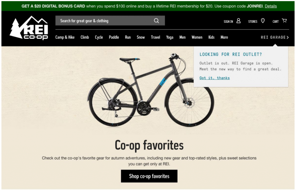
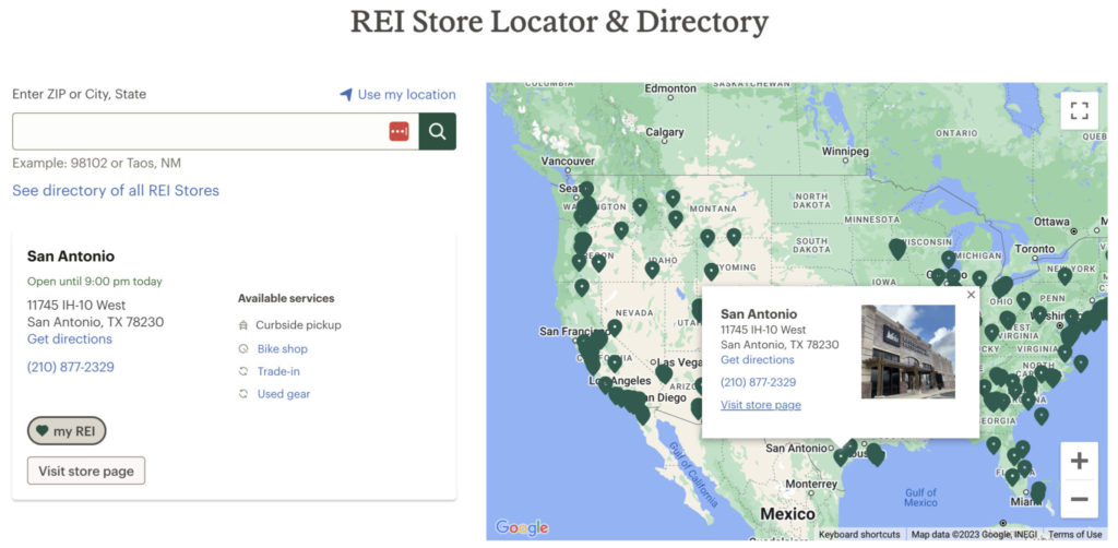
How to do it RIGHT
REI
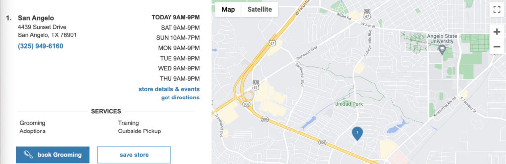
The popup (bottom right) appears when users click the “Find in-store” CTA. Once entering their zip code or clicking the “Use your current location” button, the page displays the nearest locations, each location’s distance from the user’s location, and whether the product is available (in stock) at each store.
REI goes so far as to provide a map, directions, and a phone number for each location as well.
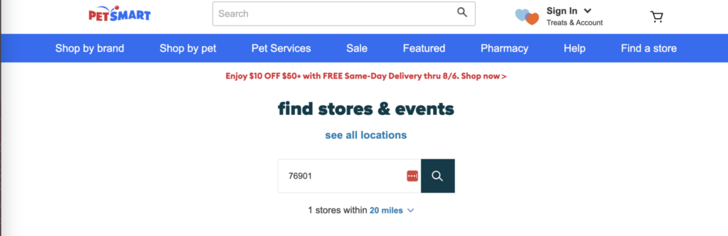
Petsmart
They provide in-store pickup on the product page. When the “check store availability” is clicked on, users are prompted to enter their zip code along with a distance radius for store locations.
Users will then be shown nearby stores and can “Select Store” by clicking on the corresponding blue CTA.
Guideline #163. Offer a “wish list” or “favorites” button in addition to the “add to cart” button.
Some shoppers don’t intend to make a purchase when viewing a product page. They might want to save the product instead for various reasons: to bookmark something they’re considering buying, a gift for a friend, a gift for themselves, or even to compare products.
Allow users to create a wish list, a place to save products. Create a simple, secondary “add to wishlist” or “add to favorites” button near (but secondary to) the Add to Cart CTA.


I would have not just a recently viewed tab, but a favorites tab because I liked the fact I could go back to items I’ve seen but some items i didn’t like on there and just cluttered the tab.
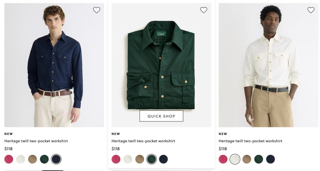
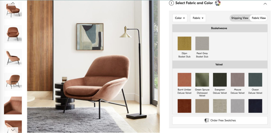
Guideline #164. The product page should show all possible variations (sizes, colors, models, etc.)
The purpose of the product page is to communicate effectively all possible information about an item you’re selling.
Display the variations of your product in a user-friendly way. The best approach will depend on the item and its variations.
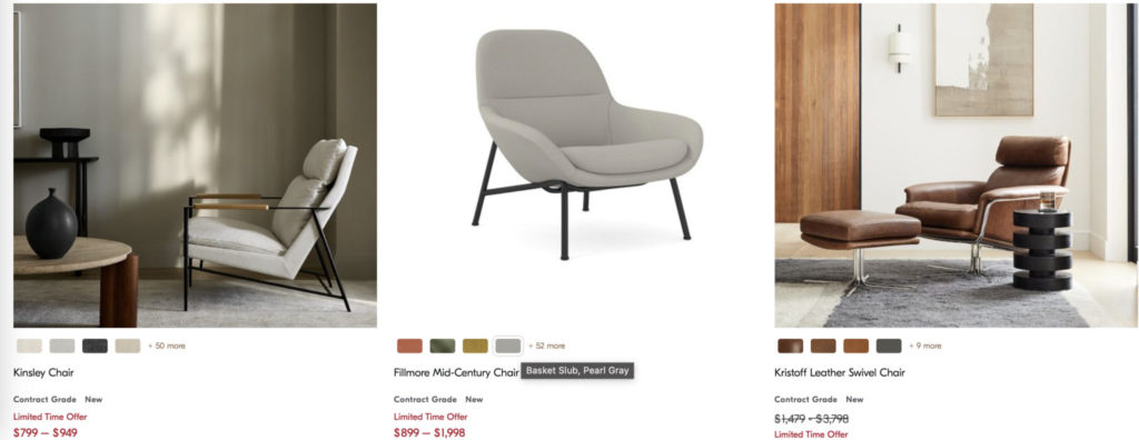
West Elm allows users to read information about each variation (color and material) when mouse-hovering over the swatch:
How to do it RIGHT
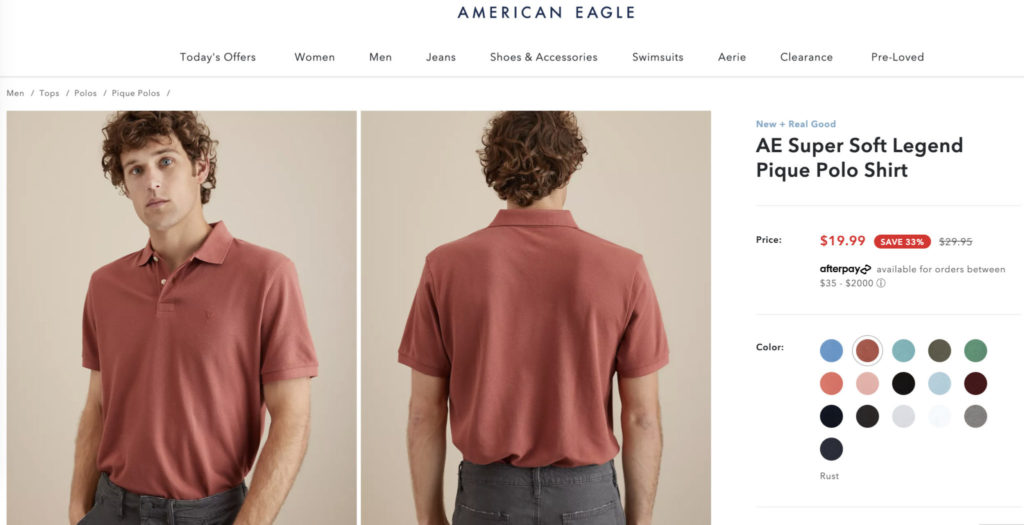
American Eagle
The company sells this basic tee in lots of colors and sizes, and they want you to know it.
How NOT to do it
J. Crew
They show all color variations of this shirt upon mouse-hover, but they could provide better product pictures.
Users can’t see each shirt on an actual person and don’t know the color of the elbow patch on different colored shirts.
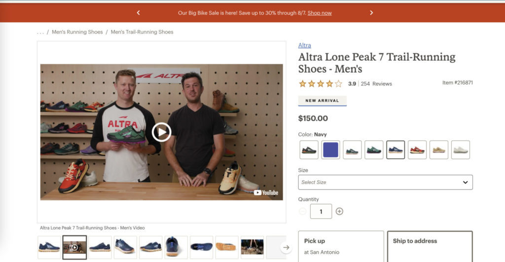
Guideline #165. Product pictures should offer as much information about the look & feel of the product as possible (3d view, zoom magnifier, etc.).
Especially for visually driven products, the amount of visual information offered on a product page is a make-or-break feature. If users don’t have a confident grasp of your product, they’ll go to a site where they can better understand what they’re buying.
Consider what shoppers want to know about your product: Do they want to know what it looks like from every angle? Do they want to know what it looks like up close? Offer features that answer these questions.
West Elm provides a variety of product pictures:
I liked seeing multiple photos of each item.
user quote on West Elm
How to do it RIGHT
REI
REI offers multiple views of its products. Knowing that runners care about the tread of shoes, the site includes a photo of the underside of the shoe.
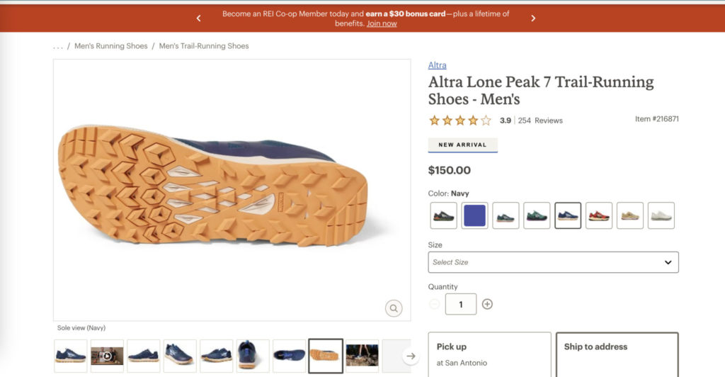
All photos can be magnified on mouse hover and are high-quality, so the details are clear. REI also includes a product video of the shoes so that users can see how they move and look in real time.
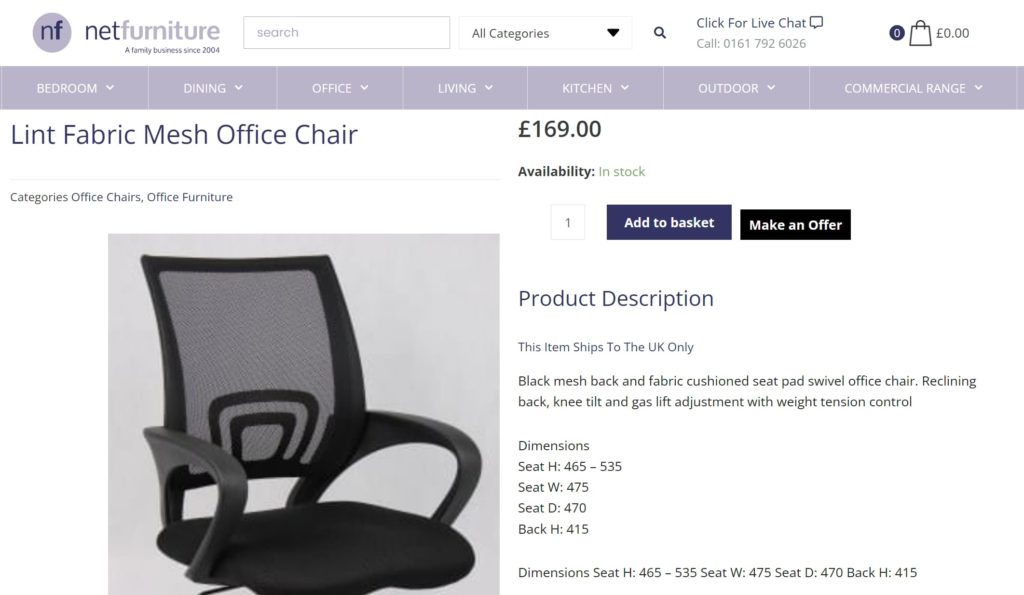
Guideline #166. Show products in accurate context and scale.
It can be hard to know whether a product will fit your needs when the product picture shows it completely out of context. Help users imagine how a product will fit into their lives by placing it in a realistic context.
This furniture from the UK should consider replacing the imagery for this office chair, and photographing it in a home or office setting instead:
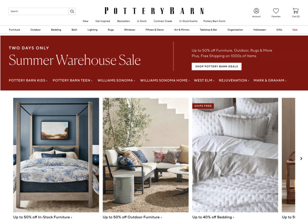
How to do it RIGHT
Pottery Barn
The site displays beautiful, high-quality product images that don’t just show the product in context but provide design inspiration, too.
Guideline #167. If a product variation (e.g. size) is unavailable, this should be immediately apparent.
Don’t frustrate your site visitors. Don’t waste their time. There are a few ways to display out-of-stock variations.
J. Crew grays out, puts a slash through, and displays “OUT OF STOCK” upon mouse hover for sizes that aren’t available:
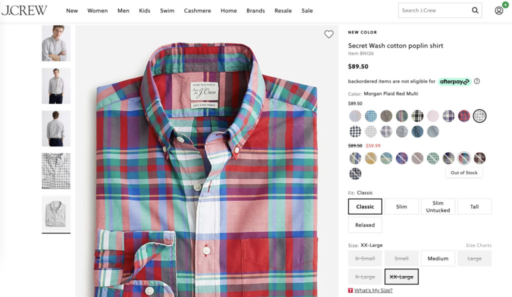
One of the items I wanted to add to my cart did not have the option to, whether it was out of stock or not was not expressed. If I wanted to buy it I would have to possibly go elsewhere in order to.
user quote on J. Crew
The websites strikes off {sizes] which are not available. Does this mean it is unavailable online? It would help if it suggests if the sizes are available in the nearest store.
user quote on J. Crew
Guideline #168. Offer an email notification system for when out-of-stock items come back in stock.
This is a viable solution for the problem of out-of-stock items. Users don’t have to keep checking back on your site to find out if your product is available. Instead, they simply enter their email address and receive an email when you’ve replenished your stock.
Decathlon displays a “sold out” notification. When clicked, a box pops up where users can enter their email to be notified when the product is back in stock.
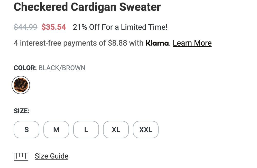
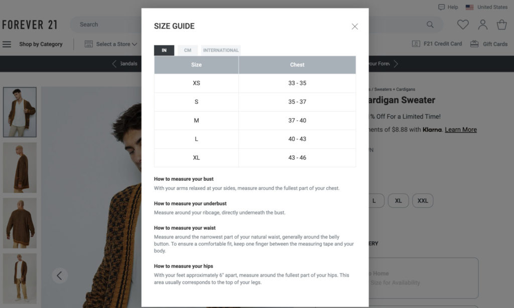
Guideline #169. Offer a link to the size guide on the product page (if applicable to the product).
This simple guideline has high utility for clothing sites. It’s common knowledge that sizes vary across brands. Display a link to your size guide in a visible location.
Guideline #170. Color swatches should be accurate.
This seems like a no-brainer, but one of the most common negative reviews on e-commerce sites deals with colors being “off.” Make sure your colors are accurate.
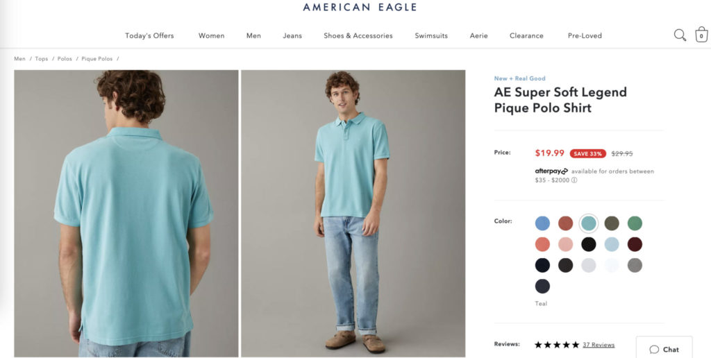
American Eagle shows multiple product pictures of each color variation, and the color swatches are actual photographs of the product:
How to do it RIGHT
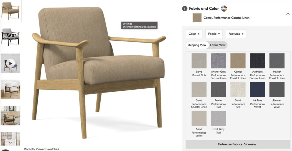
West Elm
West Elm shows product pictures for each color variation (camel, for this item).
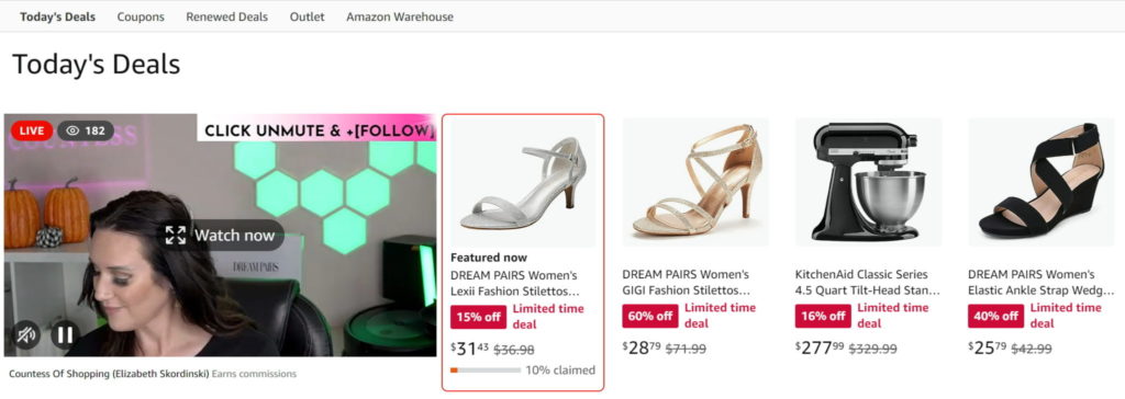
Guideline #171. Push urgency and/or scarcity.
Scarcity, a pillar of modern persuasion, communicates the idea that a product is so popular that there are hardly any left, so buy now!
This last part, the push to “buy now,” is linked to urgency. Urgency comes into play when shoppers feel the need to act immediately. Whether there
are only a few items left in stock or a sale is ending, urgency pushes users to buy.
Amazon advises shoppers to hurry with a progress bar that shows the percentage of claimed orders for Lightning Deals.
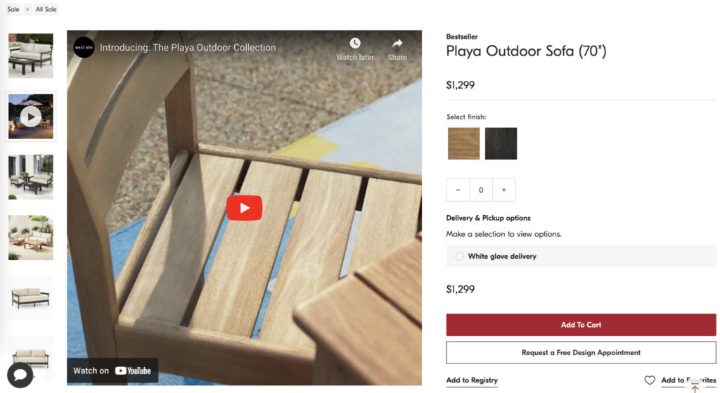
Guideline #172. Consider adding product videos to the product page.
Product videos can significantly increase conversions by providing information that would not be understood otherwise. Users can see how a product looks, moves, and fits into its surroundings with product videos.
Some great examples of product videos
West Elm includes videos on many product pages:

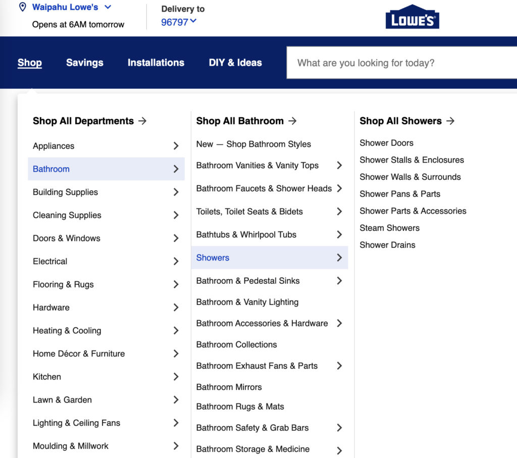
Guideline #173. Comparison info (e.g. dimensions, materials) for similar products should be presented in a visually similar format so people know where to look when trying to compare products.
This guideline aims to increase usability and decrease friction. Product pages should consistently show specs in the same place so users don’t become frustrated trying to find a small piece of information that could easily be hidden anywhere.
If you have lots of product info/specs, organize them with tabs or a collapsible menu.
Lowe’s devotes an area to a collapsable “Product Information” menu where users can find the same information across product pages:
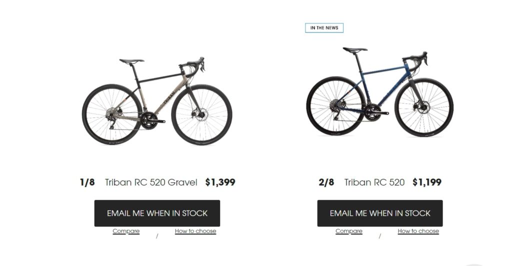
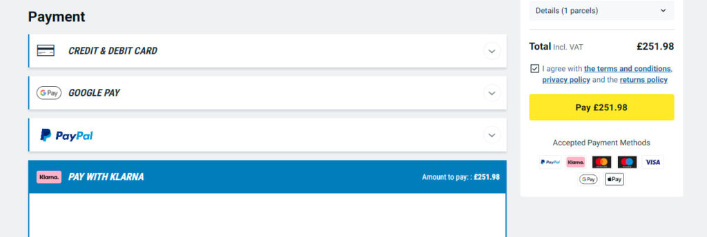
Guideline #174. For expensive products: Display payment options.
It would be a shame to miss out on revenue just because your site visitors don’t know that you offer a payment plan. Display them on the product page to alleviate any possible concerns immediately.
Decathlon offers a Klarna payment plan allowing customers to stretch their payment out over a three-month period. However, information on this plan is hidden deep within the website. It would be smarter to display this payment option on the product page, especially for expensive products like bicycles:
Guideline #175. Social sharing is more effective on the “thank you” page than on the product page.
Although the standard practice is to display social sharing on the product page, this isn’t complementary to the customer journey. Just because someone is looking at a product page does not mean that they’re already ranting and raving about it.
Instead, allow customers to share a product with their friends after they’ve purchased it. It’s much more likely that they’re going to be excited to share an item if they actually committed to buying it. Place social sharing buttons on the Thank You page.