
The best UX is the one you’re not aware of, the one you don’t even notice. That’s what makes a site truly intuitive.
Each time UX falls short of intuitive, cognitive load increases. As cognitive load increases, your conversion rate begins to suffer.
Table of contents
What Is Cognitive Load (and Why Does It Matter)?
Cognitive load is “the total amount of mental effort being used in the working memory.” Cognitive overload, then, is the need for an excessive amount of mental effort.
The Psychology
Cognitive load theory was born from the research of John Sweller in the 1980s. He argued that the way in which something is taught can influence cognitive load in learners. He also broke cognitive load down into three categories: intrinsic, extraneous, and germane.
To summarize…
- Intrinsic – The inherent difficulty of the concept.
- Extraneous – The complexity added by the way the concept is presented.
- Germane – The construction of patterns, models and associations.
Measuring Cognitive Load
By nature, of course, people differ in cognitive processing capacity. An expert would have a lower cognitive load than a beginner because she is more experienced and knowledgeable, for example. Some studies suggest those with a lower socioeconomic status experience higher cognitive load.
While research has been done on how to measure factors that contribute to cognitive load, it’s not easily applicable to the average optimizer. We can’t rely on task-invoked pupillary response to tell us how our sites are being processed cognitively. Similarly, we can’t use rate pressure product.
The Impact of a High Cognitive Load
Nicholas Carr wrote The Shallows, an incredible book on what the Internet is doing to our brains. In it, he discusses the impact of cognitive overload…

Nicholas Carr, Author:
“When the load exceeds our mind’s ability to process and store it, we’re unable to retain the information or to draw connections with other memories. We can’t translate the new material into conceptual knowledge. Our ability to learn suffers, and our understanding remains weak.”
Basically, here’s what happens when cognitive load increases…
- The likelihood of errors and/or interferences with the task at hand increases drastically.
- Stereotyping and attribution effect kick into high gear, disrupting rational thought.
Why This All Matters
Perhaps you’re reading this thinking that cognitive overload isn’t something you should concern yourself with as an optimizer. Well, Reuters conducted three business-focused studies and released a report called Dying for Information. Here are some of the findings…
- 43% of respondents thought that decisions were delayed and otherwise negatively affected by “analysis paralysis”.
- 2 out of 3 respondents associated information overload with tension with colleagues and loss of job satisfaction.
- 42% even attributed poor health to this stress.
The scariest part…? That research was conducted all the way back in 1996.
A lot has changed in 20 years and amount of information the human brain is asked to process each day has grown with the rise of smartphones, remote teams, push notifications, eCommerce, and everything in-between.
Needless to say, a site that adds to an already high cognitive load is not good for conversions.
Neal Cole, an optimization consultant, explains it well…

Neal Cole, Optimization Consultant:
“The danger here is that cognitive strain creates sufficient uncertainty and negative feelings about a site (i.e. friction) that visitors will not feel comfortable enough to sign up or make a transaction. It is human nature to avoid uncertainty because it makes us feel uncomfortable. This is partly why site security and trust is so important to website visitors.
On the positive side cognitive ease can assist conversion by making content appear more familiar and so visitors are more willing to consider signing up or making a transaction.” (via Conversion Uplift)
How Design and UX Add to Cognitive Load
While this list could go on endlessly, here are some common factors to consider.
1. Instruction overload.
Steve Krug, author of Don’t Make Me Think, explained it best…

Steve Krug, Advanced Common Sense:
“The main thing you need to know about instructions is that no one is going to read them—at least not until after repeated attempts at ‘muddling through’ have failed.” (via Don’t Make Me Think)
If your user experience is truly intuitive, you don’t need instructions. The next step is obvious.
So, if you have instructions written out for something (outside of your support documentation), remove them and focus on improving the UX to the point where those instructions are no longer necessary.
If the instructions are absolutely necessary, at least reduce them as much as possible.
2. Breaking prototypes.
Prototypes exist for a reason. Here are just a couple examples. See if you can guess the nature of this site…

Yep, that’s a blog. The Autopilot blog, to be exact. Now try this one…

And this one…

And this one…

SaaS, eCommerce, newspaper. I’m willing to bet you got them all right because they’re using protoypes that are familiar to you.
Steve addresses the UX and cognitive issues that arise when you depart from these prototypes too drastically…
Steve Krug, Advanced Common Sense:
“Faced with the prospect of following a convention, there’s a great temptation for designers to try reinventing the wheel instead, largely because they feel (not incorrectly) that they’ve been hired to do something new and different, not the same old thing.
Not to mention the fact that praise from peers, awards, and high-profile job offers are rarely based on criteria like ‘best use of conventions.’
Occasionally, time spent reinventing the wheel results in a revolutionary new rolling device. But usually it just amounts to time spent reinventing the wheel.” (via Don’t Make Me Think)
Be aware of the prototypes that exist for your industry (e.g. B2B, SaaS, agency). Then, use conversion research to better understand the prototypes your specific audience might be borrowing from other sites they commonly visit.
Be cautious and deliberate about departing from those prototypes.
3. Option overload.
We’ve written an entire article on whether more options really does decrease conversions. Here’s what you really need to know…
- Often, too many choices does decrease conversions.
- Often, too many choices does not decrease conversions.
The trick is finding the balance between limited options and overwhelming options. When you get too close to the “overwhelming” end of the spectrum, conversions drop. Similarly, when you get too close to the “limited” end of the spectrum, conversions drop.
This is true of online “clutter” in general.
Here’s what you can do to find that balance…
- Define your goal for the page.
- Watch session replays and conduct user testing to see how real people respond.
- Test the number of options you provide based on the research to see what actually works.
Generally, you want to aim to provide what is necessary and nothing more.
4. Clickable confusion.
Have you ever visited a site and tried to click something that wasn’t, in fact, a link? Of course you have.
Steve Krug, Advanced Common Sense:
“Another needless source of question marks over people’s heads is links and buttons that aren’t obviously clickable.
As a user, I should never have to devote a millisecond of thought to whether things are clickable—or not.” (via Don’t Make Me Think)
Typically, this issue arises due to stylistic inconsistencies, which can pop up in other forms as well. For example, a change in the tone of your copy, different font, unusual colors. Minor mistakes like this pop out at visitors, making it impossible for the UX to truly feel “invisible”.
Here’s an example…

The top yellow “button” is not actually a button. Rather, it’s a benefit. But because it looks so similar to the green button below, it creates confusion. Also, it is rather unusual as far as prototypes go.
This is why heatmaps can be so valuable to optimizers, to uncover unclickable elements that visitors perceive to be clickable.
5. Subtlety and ambiguity.
Subtlety and ambiguity are the enemy of clarity, which is essential for conversions. We’ve written an entire article on how you can improve clarity, so I recommend reading that before you continue.
Of course, a lack of clarity can manifest in many ways…
- Poor visual hierarchy.
- Confusing navigation.
- Ineffective visual cues.
- Confusing value propositions.
Speaking of confusing value propositions, here’s an example. Or rather, a lack of one…

That’s the site in its entirety. I don’t know about you, but I had absolutely no idea what it was. (It’s a weather app, according to Medium, but still no indication of why it’s better than every other weather app.)
We released a study on how best to present your value proposition, but the most important part is that it is clear, both in terms of copy and visual presentation.
In addition, Steve addressed subtle visual cues in his book…
Steve Krug, Advanced Common Sense:
“Too-subtle visual cues are actually a very common problem. Designers love subtle cues, because subtlety is one of the traits of sophisticated design.
But Web users are generally in such a hurry that they routinely miss subtle cues.” (via Don’t Make Me Think)
We released a study on effective visual cues, which can help guide you away from subtlety.
In summary, choose clarity over being clever, over aesthetics, over everything.
How Copy Adds to Cognitive Load
Cognitive overload can also manifest in copy. Why? Perhaps because we create sites with the notion that visitors will dive deep into each page, reading every word carefully, soaking up every detail. In reality, that’s just not how it goes.
In fact, Steve once wrote, “Get rid of half the words on each page, then get rid of half of what’s left.”
We’ve already written a detailed article on writing simply, reducing paragraph size, choosing clear fonts, etc. So, I won’t rehash the entire article.
Just remember…
- Use short, simple sentences and paragraphs (3-4 lines maximum). No more than 80 characters per line.
- Use clear subheadings and/or content blocks with different background colors or images.
- Use sans serif, 14-16px font in a high contrast color. Aim for a 24px space between two lines of text.
- Use familiar words and phrases, limit jargon and industry speak, limit complex words (the average American reads at a 7-8th grade level).
How to Audit Your Site for Cognitive Overload
When trying to reduce cognitive load, your focus should be on extraneous and germane load. There are two goals…
- Reduce extraneous load.
- Increase germane load by encouraging cognitive processes that result in the creation of schemas.
Like anything in optimization, it’s best to follow a systematic process. When looking at your site to identify elements that might be adding to cognitive load, follow these three: analysis, ideation, implementation.
1. Analysis
Start by going through your site page by page.
- Make note of everything you read.
- Make note of anything you’re asked / expected to remember.
- Make note of any decisions required.
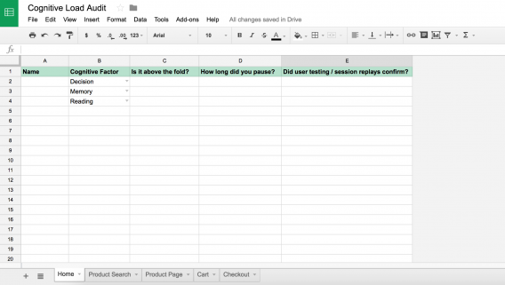
You’ll end up with a spreadsheet that looks something like this…
It’s also wise to make note of how many clicks away visitors are from completing your most wanted action on every page. It shouldn’t be more than one or two.
2. Ideation
Now, you must decide whether to remove the elements increasing cognitive load or brainstorm alternative solutions.
If you can remove the element without compromising usability or your value proposition, opt for that. If not, create a hypothesis and use that to brainstorm new, low load ways to present the element in question.
3. Implementation
Since you looked through every element of every page of your site, you now have a long list of…
- Elements to remove.
- Elements to change.
Go ahead and remove anything on that first list right away.
When it comes to the elements on your change list, you’ll need to decide whether the element is worth testing or if you should skip right to implementation.
Yes, in an ideal world, you would test every change. But where we are simply dealing with hypotheses to reduce cognitive load, there are many things you can go ahead and implement with minimal risk, allowing you to avoid wasting valuable testing traffic.
After all of those quick implementations are finished, you can run user tests and session replays again to see if the impact was positive overall. If there were negatives, keep brainstorming and try again.
If it’s worth testing, use a prioritization model like PXL to help you decide which hypothesis to test first.
Conclusion
When working memory is strained, rational thought and cognitive processes begin to suffer. As a result, so does your conversion rate. Arguably, so does brand recall, brand association and more.
Here’s what you need to remember about cognitive load…
- Instructions shouldn’t be necessary if the UX is truly intuitive. Remove, or at least reduce, them where possible.
- Be careful about breaking away from expected prototypes too much.
- Find the balance between limited options and overwhelming options. Provide what’s necessary and nothing more.
- Use heatmaps to understand what visitors think is clickable (and look for other stylistic inconsistencies).
- Aim for clarity and avoid subtlety and ambiguity at all costs. Think about your visual hierarchy, navigation, visual cues, value proposition, etc.
- Use a systematic audit to identify elements that are adding to cognitive load.
Related Posts
-

Do you want to make your website better? There are many ways to optimize a…
-

.... That concludes the list. Instead of looking for a quick fix, you have to…
-

I wrote this short rant. Isn't it fun? It's totally cool! Yes, it's that easy!…
-

Don't design your own website. No, really. It will suck. You might think that since…


Can we say that , for hypothesis, copy the ux of high active users app in your domain ,as user of that app now have a habit of that ux thus decreasing cognitive load and then with the help of heatmap and google analytics user behaviour pattern optimise ur ux as your app is a similar planet for other users but not exactly the same.
Hey Deepak! Can you rephrase? I’m not sure I understand the question.