Competitive analysis is an important element of business strategy.
Knowing where you stand in relation to competitors helps define product positioning, channel acquisition, messaging, and more.
But what good is it looking at your competitors specifically in regards to testing and optimization?
Depending how you’re benchmarking and with what metrics, it could be beneficial or it could be a waste of time.
Table of contents
Conversion Rates are Misleading; Comparing Them is Worthless
Let’s start by debunking one method of competitive benchmarking: comparing your conversion rate to that of your competitors is pretty irrelevant.
Different sites have different traffic sources (and the quality of traffic makes all the difference), traffic volumes, different brand perception and different relationship with their audiences.
Most eCommerce sites compete with Amazon one way or another. So will knowing Amazon conversion stats help you in any way?
Amazon Prime members convert at 74%. That’s a sign of a strong client relationship. Non-Prime members convert at 13%.
Now that you know that, what will you do differently? Not much.
The only true answer to “what’s a good conversion rate” is this: a good conversion rate is better than what you had last month.
So benchmarking in terms of conversion rate doesn’t mean much. You are running your own race, and you are your own benchmark. Conversion rate of other websites should have no impact on what you do since it’s not something that you control. But you do control your own conversion rate.
That’s not to say spying on competitors in terms of tactics and positioning is a waste of time, though. Just that knowing where you stand in terms of conversion rate doesn’t mean much.
However, UX benchmarking is different. It is directly actionable and helpful for you on a strategic and tactical level.
[If you’re interested in improving test prioritization with UX benchmarking, check out our Competitive UX Benchmarking Service]
Competitive UX Benchmarking Matters and Can Help You Optimize
UX research is important. We know that. But why add a comparison component?
For one, it helps you realize where to prioritize and if you should change in specific areas. As Jeff Sauro, Principal of MeasuringU, put it:

Jeff Sauro:
“Having a comparison makes interpreting the subsequent data you collect easier to understand as you can immediately see how good or bad the experience was relative to relevant comparisons.
In a comparative study, the focus becomes less on absolute scores and more on relative comparisons. You can argue the tasks are artificial, but if the performance and attitudes for a competitor are consistently higher than your website, you have a compelling argument for change.”
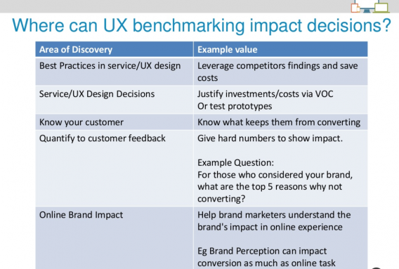
UserZoom, too, outlined some benefits of competitive UX benchmarking, including leveraging competitor findings, quantifying impact of UI changes, and help brand marketers make decisions:
We recently published some original research we conducted with MeasuringU where we measured the UX of five road bike websites. If you haven’t checked it out, it’s pretty interesting. In that article, we briefly outline our methodology that we refer to as Conversion-Focused UX (or the CUX model).
This type of competitive benchmarking analysis provides quantitative data on the user perceptions of your site compared to four competitors.
This methodology helps you answer two very important questions:
- Is your website’s UX behind your competition’s? If so, where?
- How and where to prioritize your website testing roadmap?
Simply put, competitive UX benchmarking lets you see where you stand in regards to competitors over time, and efficiency prioritize your experiment ideas based on where your sites seems to be lacking.
How does it work?
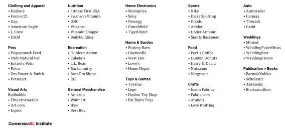
The benchmark database for any particular vertical consists of a select sample of 100+ sites from various eCommerce categories or subcategories of Amazon’s Alexa’s Top 500 Sites on the Web. We selected 4-5 sites from each sub-vertical. The focal website plus competitors are ranked against the sample database of scored sites, which can include, but is not limited to:
Case Study: Competitive UX Benchmarking of Nutrition Sites
As I mentioned, we just recently put out an original study on the UX of road bike sites. Similarly, as part of our eCommerce benchmarking report, we studied five nutrition sites:
We surveyed 108 people (55 men, 53 women) to calculate a conversion-focused, validated and standardized survey metric. Participants were surveyed after completing the following (example) task:
Scenario: Imagine you’re shopping online for whey protein powder.
Your Task: Click on this link to open the nutrition website: http://www.swansonvitamins.com// [or competitor’s site]
On the site…
-
Find whey protein powder in a 2-4 lb package that you’d buy.
-
Add it to the shopping cart.
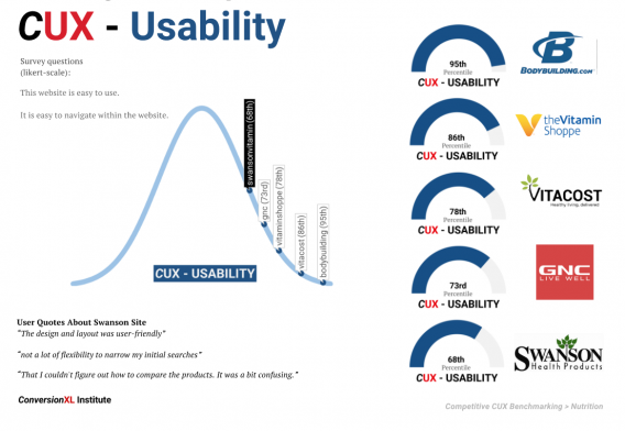
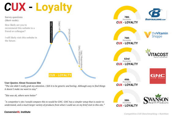
The psychometrically-qualified survey identifies five components of user perceptions of a website:
- Clarity (message, value proposition)
- Usability
- Credibility (trust, security, comfort)
- Appearance
- Loyalty
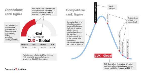
This report provides the survey results as a percentile rank score (compared to scores of 100+ other websites) for each CUX dimension and compares against 4 competitors in the same industry, in this case, nutrition.
The end report will have tons of benchmark figures looking something like this (click to enlarge):
Study Results
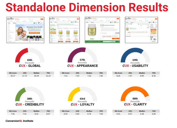
Here’s an example high-level overview of just one site (Swanson). You can see each metric, including the global ranking, in comparison to the entire benchmark database of scored sites (shown as a percentile ranking):
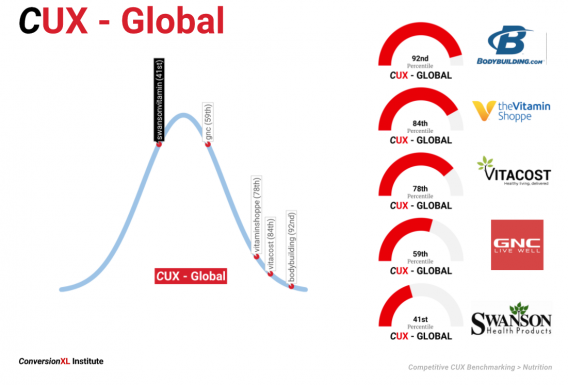
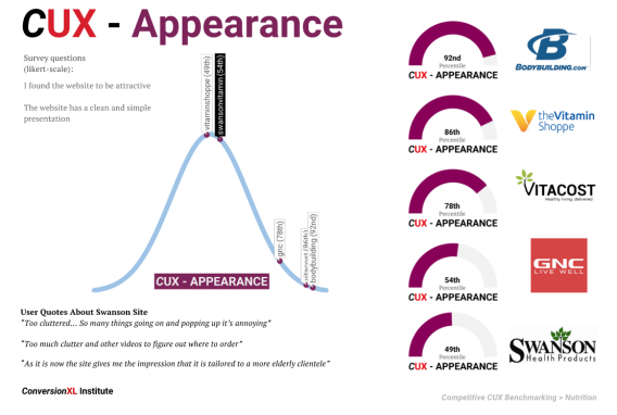
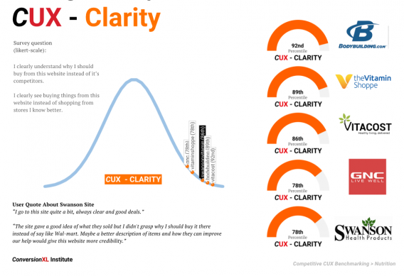
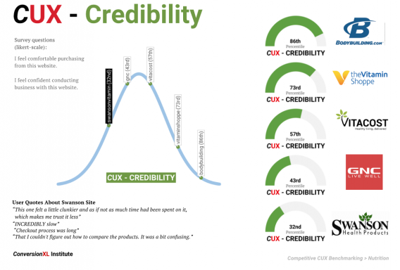
And here’s a visual showing each metric and how the nutrition subvertical sites stacked up against each other. The first one is the global ranking, subsequent figures show the relevant survey questions that created the score and user quotes related to the UX dimension (click to enlarge any of the following):
What Do You Do With This Data?
Is your website’s UX behind your competition’s? If so, where? Let’s say you’re behind in two areas:
- Credibility
- Loyalty
Then you know you need to focus in those two areas, and therefore you should prioritize test ideas higher if they might affect these two UX dimensions.
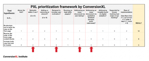
Since our methodology also includes user testing, we get qualitative feedback as well. This, of course, can be used to inform your testing ideas as well as prioritization. You can see how this could easily work with a prioritization framework like PXL:
Learning From Competitive UX Benchmarking
You can also derive certain guidelines from these studies. Of course, it’s a bit inferential, but because you get to 1) watch people interact with your site 2) get to hear their qualitative feedback and 3) see where you rank compared to competitors, it’s easier to see patterns in terms of specific UI elements.
These insights can be a springboard from which you can continuously optimize your site. Here are nine guidelines we took away from the nutrition sites study:
Appearance
#1. Invest in high-quality photography and product images
Images convert. Don’t use low quality ones. Online, users don’t have the luxury of seeing a product up close or feeling it, so high quality images make all the difference for UX.
#2. Implement bespoke imagery to maximize perceived value and first impressions
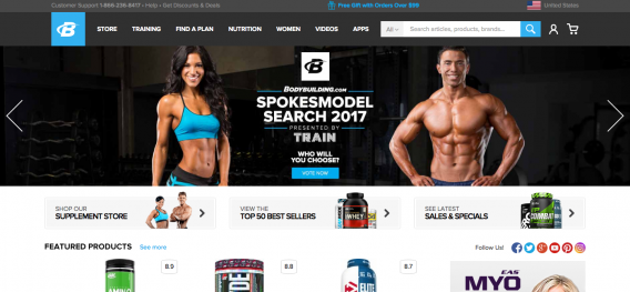
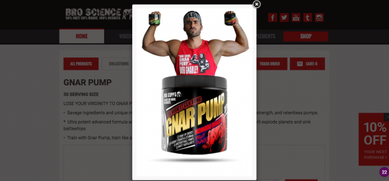
If you can, use your own original images. This is the founder of Gnar Pump (the BroScienceLife guy on YouTube) holding his own products:
Usability
#3. Avoid automatic image sliders
While there are excepts to the rule, we’ve almost never seen an auto-rotating image slider win in an experiment. If you have to use one, at least optimize it. Guidelines for that can be found in this article.
#4. Optimize images for faster site speed
A common problem we see in technical analysis during conversion research is that images on eCommerce sites aren’t optimized for load time. Load time affects SEO, and it affects conversions. It’s easy to fix.
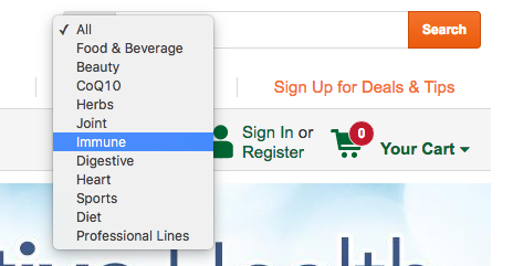
#5. Allow for filtering/categories when using search bar to narrow down/simplify search
Help people find what they’re looking for.
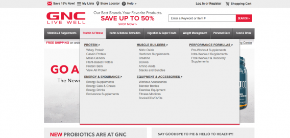
#6. Make dropdown menus easy to use and scan
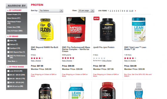
#7. If products are listed on a homepage, use advanced sorting and filtering (faceted search), if product categories are listed, allow for users to easily see groupings of categories and subcategories with mega menus
Always try to filter information to deliver the easier possible searching experience for customers. Often that means faceted search, which provides filtering that includes multiple product criterion (size, cost, etc.). Check the lefthand column on GNC’s site:
Credibility
#8. Maintain a modern, relevant design
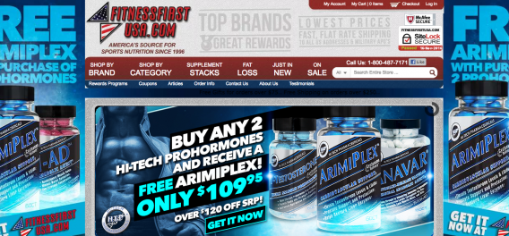
It’s hard to objectively say what modern design is, but it’s not this:
#9. Avoid cheesy stock photos
Unless you’re selling Gnar Pump to college bros (see #4 above). Then it’s cool to be cheesy (part of the brand).
Conclusion
Comparing your conversion rate to that of your competitors is worthless; comparing the UX to that of your competitors is a goldmine of insight and actionability.
If you do a rigorous analysis, you can:
- See where you rank compared to your closest competitors in overall US.
- See where you are better or worse than competitors in specific dimensions (clarity, usability, etc.)
- Prioritize A/B test hypotheses based on where you may need the biggest improvements.
- Derive ideas from the qualitative user feedback to further inform prioritization and continuously optimize.
Let us know if you have any questions about the methodology or potential use cases for this type of research. If you’re interested in UX benchmarking as a service, click here.

![UX Benchmarking: What Good Is It for Conversion Optimization? [Original Research]](https://cxl.com/wp-content/uploads/2016/11/Screen-Shot-2016-11-16-at-10.39.16-AM-1024x706.png)




Thanks for the great ideas. It seems like a lot to process, but I want to become a specialty firm in UX and Conversion – getting more leads and sales for my clients on their websites.
A couple questions:
1. Who do you have do the survey’s to compare UX for my competitors?
2. Do the people doing the survey’s need to know something about UX or is it better that they are just clients/contacts who don’t know much and are basing their opinions on what they see and how they feel?
3. Do you recommend offering this as a service to clients as part of a UX Audit?
Look forward to conversation.
Hi Nate, sounds like this line of research is perfect for your use case. For the panel, it is important to get the right quality and quantity, but after that what matters most is consistency. So if you want to benchmark 1 site before and after a design change, make sure the two groups are sourced the same and have a similar experience with the site (add a screener if they’re familiar with the brand/site). Remember, the absolute metric doesn’t mean much, it’s the comparison that you gather insights. I’d say it’s ideally 100+ people in a general population assuming a general product. I’d highly recommend offering this as a service, it’s a great service to gather information about where to focus further conversion research such as qualitative user testing, customer surveys, analytics audits, etc. Again, it means less without a large database of 100+ scored websites across different industries as we’ve created here, but still useful. Thanks for the comment, Ben