

Your design team likely thinks your website is number one compared to your competitors, but a quantified UX benchmark might tell you differently.
We all have our opinions on what good design looks like, but quantifying that and comparing it to competitors, really shows where you stand. Once you know that, you can take action based upon the insights.
This article outlines a UX benchmark study we conducted in partnership with Jeff Sauro and his team over at MeasuringU. We studied five road bike websites. We learned a lot in doing so, and you’ll certainly find some instant takeaways from our insights.
Though this may not be industry specific, you can still derive some UX guidelines from these bike sites. And, later, we’ll outline how you can conduct a similar study.
Note: CXL Institute recently published a comprehensive report on eCommerce UX guidelines using the same methodologies as outlined in this post. Check it out here.
Table of contents
How Do We Do UX Benchmarking? Background and Methodology
“Benchmarking” can be an ambiguous word. We know that it means to evaluate something by comparison to the standard, but by what metrics are we evaluating it?
A UX benchmark without a rigorous and standardized process could quickly devolve into something tenuously linked to performance and overrun by opinions.
So we worked with Jeff Sauro and his team over at MeasuringU to leverage the SUPR-Q methodology and supplementing this standardized survey methodology with an additional component that measures the clarity of a website’s message (e.g., value proposition).
The SUPR-Q tries to judge a website based on if it is usable, credible and visually appealing. It has 8 questions (including 1 NPS question), and it is scored on a 1-5 scale. The trust questions vary based on whether or not the site is commerce-oriented. They are as follows:
- The website is easy to use. (usability)
- It is easy to navigate within the website. (usability)
- The information on the website is credible (trust for non-commerce)
- The information on the website is trustworthy (trust for non-commerce)
- I feel comfortable purchasing from the website. (trust for commerce sites)
- I feel confident conducting business on the website. (trust for commerce sites)
- I will likely visit this website in the future (loyalty)
- I find the website to be attractive. (appearance)
- The website has a clean and simple presentation. (appearance)
- How likely are you to recommend this website to a friend or colleague? (loyalty)
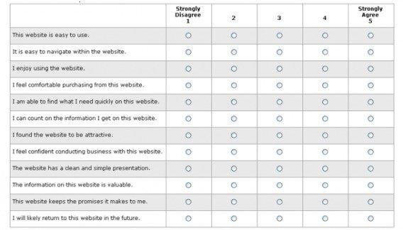
Scoring is pretty straight forward. You just average the responses for the first 7 questions and add this to 1/2 of the score for the Likelihood to Recommend question. This is your SUPR-Q score and it can then be compared to the industry benchmarks.
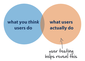
Now, ours (we’re calling it the Conversion-Focused UX, or CUX model) differs slightly, in that we really want to be as conversion-focused as possible. So we added a clarity question to the user testing process as well as on the survey.
We had a total of 102 people do this user testing + SUPR-Q study, then we calculated the metrics and benchmarked the sites against each other using both the site database of the SUPR-Q and our own database of scored sites that added the additional clarity component.
Finally, we took qualitative feedback from the user tests to bring you additional guidelines and insights – things you can possibly bring to your own website.
Specific Study Design for Bike Websites
So you know the general methodology we use for the study. Now I’ll quickly outline the specifics of this study (feel free to jump down to the results if you’re bored by the specifics).
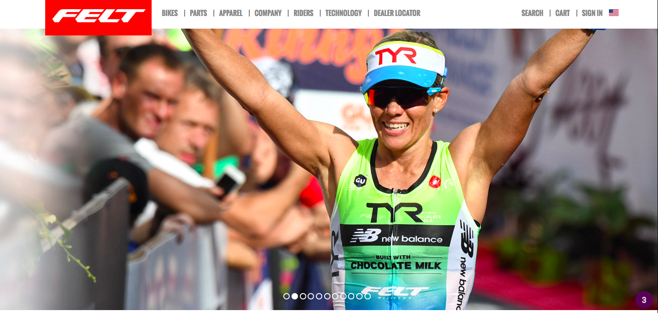
Here are the websites we studied:

We had 102 curated participants do a task on each website – search for and add to cart a particular item. Then they answered the SUPR-Q survey and our added clarity question.
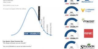
Results
Here are the benchmarking results for each corresponding UX dimension…
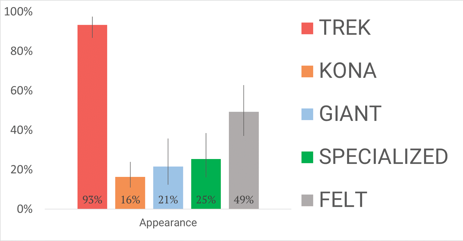
Appearance
Clarity
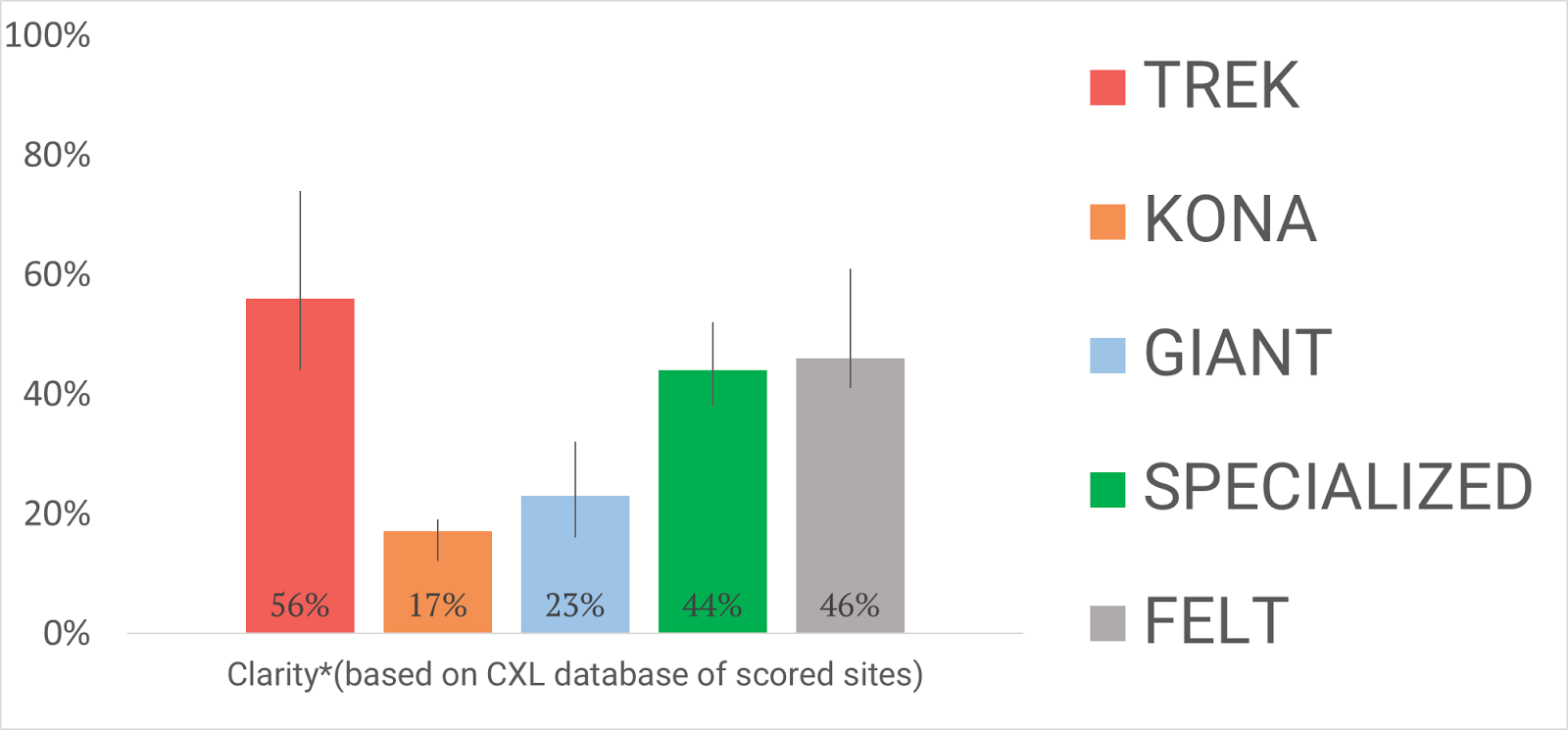
Note: Clarity is not a dimension on the original SUPR-Q; rather, we added it to reflect a crucial part of conversion-focused design.
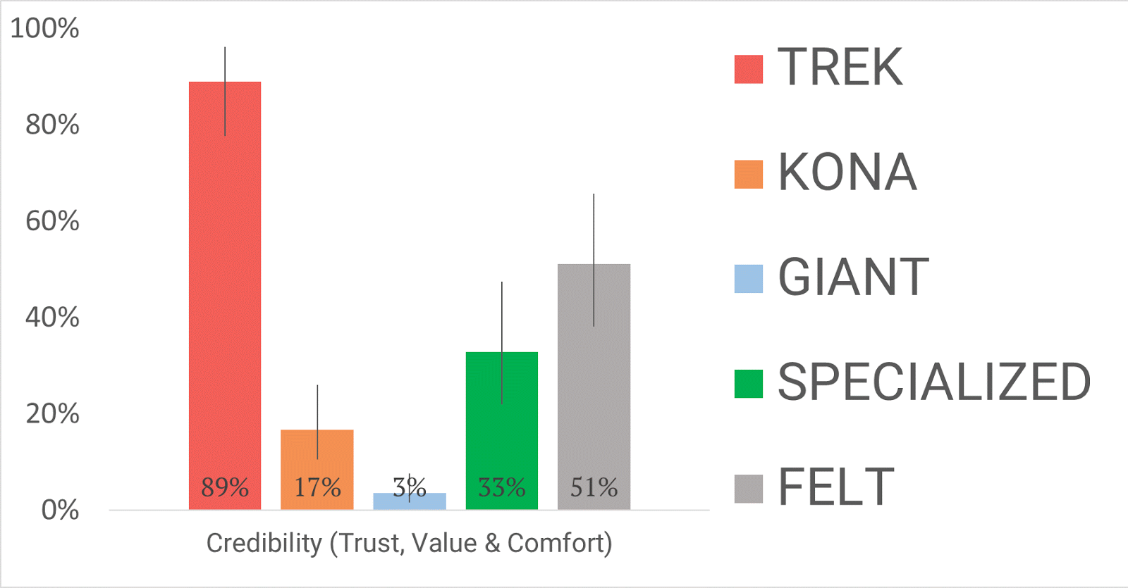
Credibility
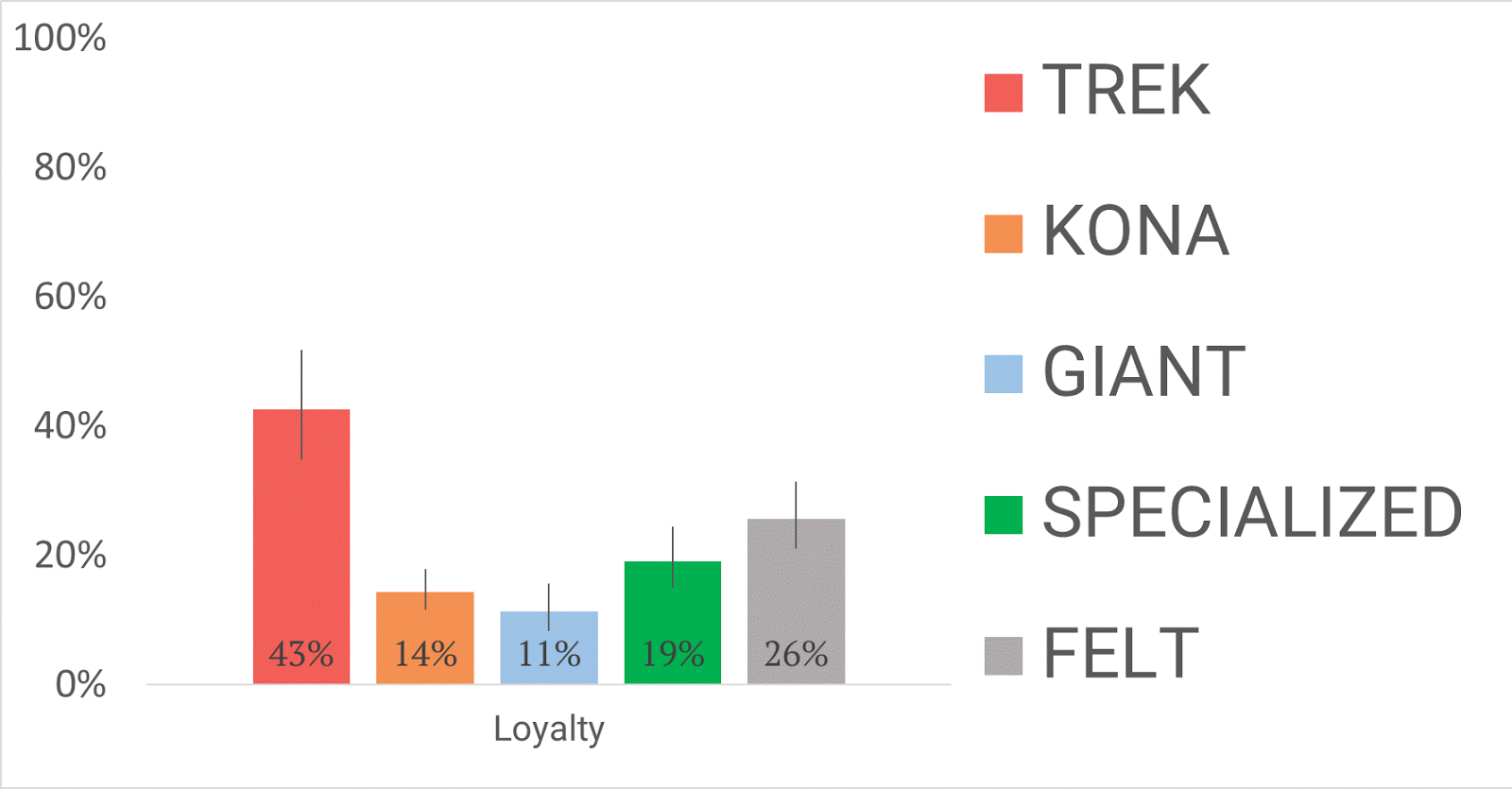
Loyalty
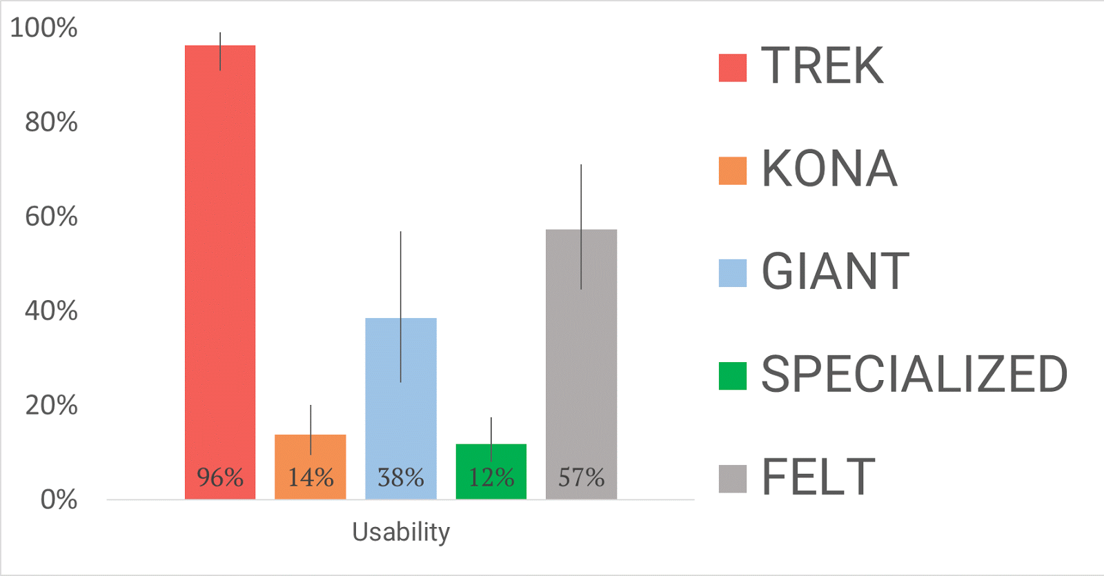
Usability
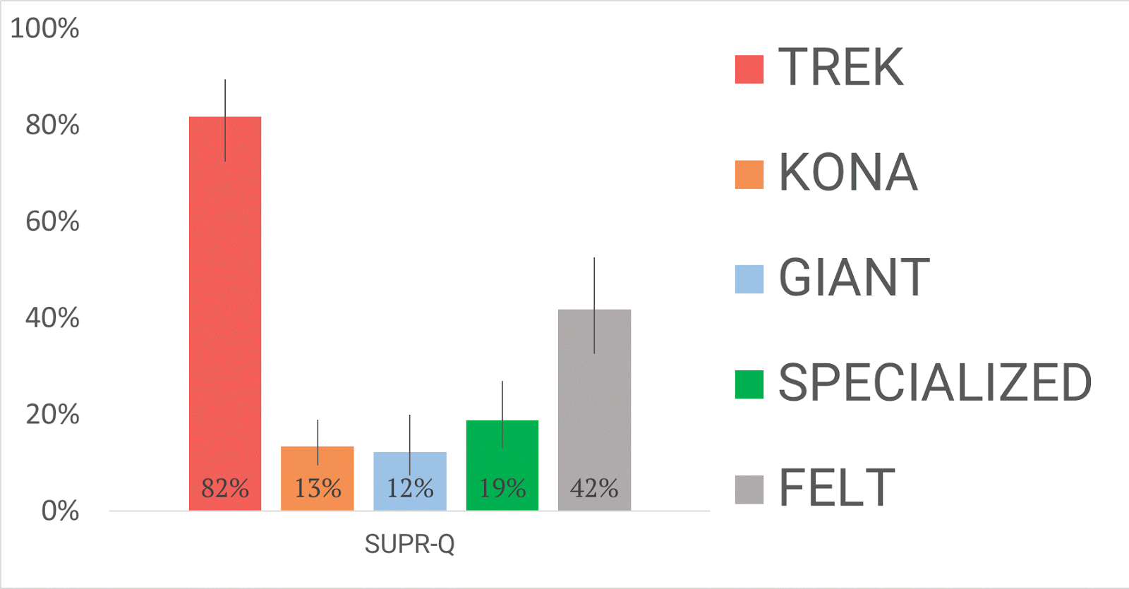
SUPR-Q
Takeaways: 10 Things We Learned
Now, unless you work at Trek, Kona, Giant, Specialized, or Felt, you might be wondering – what do I do with that information?
Well, we sifted through our hundreds of user tests and compared them with our benchmarked data and preferences questions to tease out some patterns, and even “best practices,” if you will.
Here are ten takeaways from our study:
1. Invest in high-quality photography. This applies to graphics, product pictures, and all other images on your site. Some of the most abundant responses during user testing were comments like these about the Trek website: “the photos were well done,” “the graphics were awesome,” and “nice, large, clear product pictures.” If you’re going to invest in one thing, it should be professional images.

2. Aim for a clean and simple layout. The phrase “clean and simple” comes straight from user testing. These two words were overwhelmingly the most frequently shared pieces of feedback. People love a minimal site layout. When facing a cluttered design, comments like, “the layout was too busy for my taste” (Felt website) and “the website was crowded, making navigation a little more difficult” (Specialized website) surfaced.
3. When in doubt, follow conventional design placement. This “lesson” addresses the power of typical design and the danger of atypical design. Conventionally designed websites create intuitive flow for users. Instead of wondering where to go next, users are already there. It’s the difference between going somewhere you’ve been to a thousand times and going somewhere for the first time. We saw many comments like this one about the Trek site: “I liked how easy it was to use. I knew right where to go in order to get where I needed to be.”
On the other hand, unconventional web designs threw users off course. Some feedback we received on Specialized’s atypical website design: “Really awkward presentation, sideways item classifications … very difficult to find what I was looking for”, and “It was very awkward to navigate the links, it seemed more focused on looking ultra-modern than being useful.“
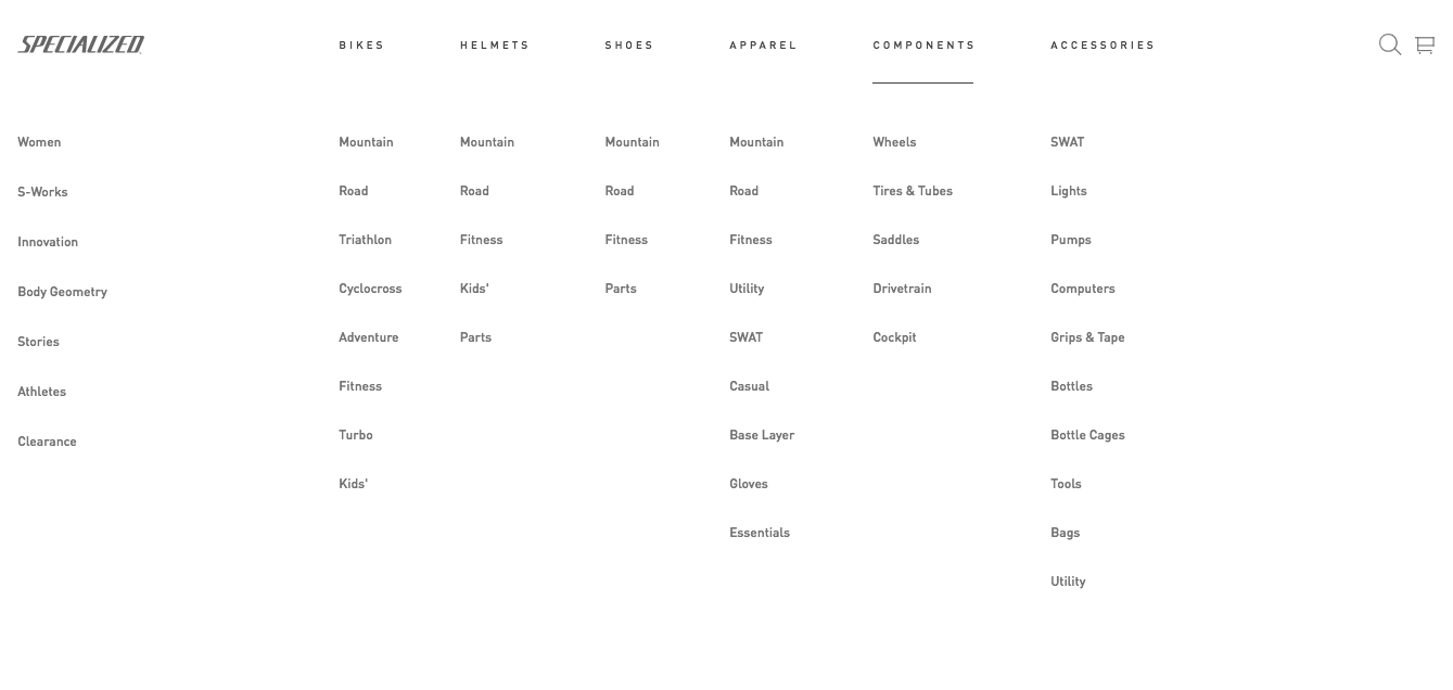
4. The navigation menu should be noticeable and placed at the top of the homepage. This falls under the category of conventional design (#3 above). However, it was mentioned so often during user testing that it has earned an entire recommendation of its own. A big navigation bar on the top of Trek and Felt home pages was called “simple,” “easy,” “great,” “good,” and “not hidden behind a bunch of junk.” It’s also worth adding that users often complained about hidden menus (“The dropdown menu was annoying,” – from user on the Specialized site).
5. Bigger is (usually) better. Images, copy, and buttons are made to be seen, and moreover, understood. People said they liked the “nice, large product pictures” on the Felt site, and had qualms about, “small menu buttons” and the font being “way too small” on the Specialized site. If an element is too small to be understood, it’s hurting your site— and ultimately your wallet.
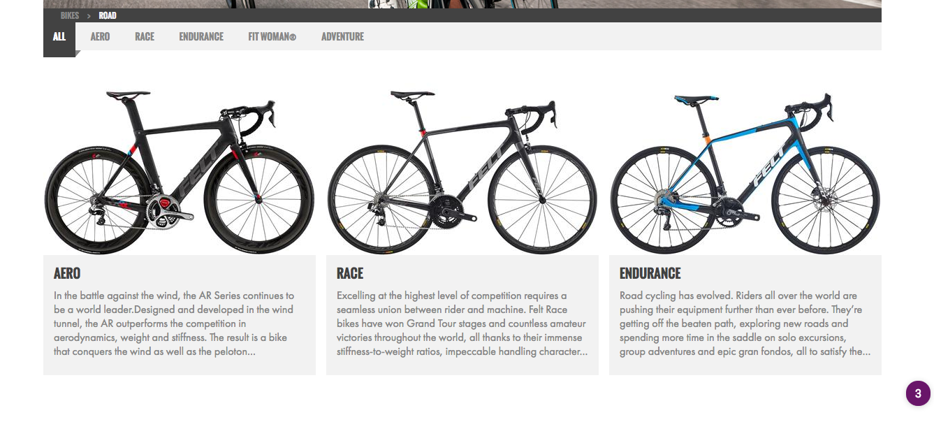
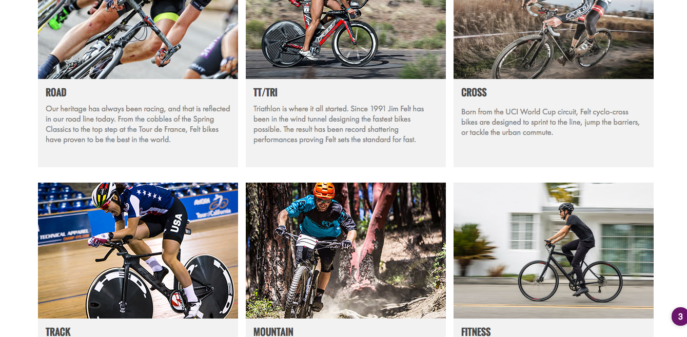
6. Optimize product categories. Another common issue dealt with users’ inability to find the product they were looking for (we tasked them with purchasing a jersey). Specifically, determining which category to find the product in. When the categories were aptly named, we received comments like this one about the Felt website: “The website was incredibly professional, and the best part was it was categorized so well, it only took me a few seconds to find what I was looking for. Definitely recommend this website!”
It didn’t always go this well, unfortunately. We saw lots of comments like this one about the Specialized website: “There were lots of menu layers to navigate. It wasn’t straightforward, I had to do some experimental clicks cause I was looking for ‘Jersey’ and the menu didn’t have that word.” Card sorting (and reverse card sorting) is a good technique for determining logical product categories and organization.
7. Page load should be as fast as possible. The issue we saw across every site, even the most “usable” ones, dealt with loading times. Whether it was links, images, or an entire web page, people had a problem with waiting. “The website was very, very slow to load compared to others” (Giant website) basically translates to “I would abandon this site for its competition.” Check out this post to optimize your site speed.
8. Minimize the number of clicks users have to make to complete their goal. Regardless of the objective (reading an article, making a purchase, contacting customer service), users want to accomplish it quickly and effortlessly. When the experience went poorly, we saw many comments like, “it took a ton of clicks to navigate anywhere,” and “there were too many clicks to get what I wanted” (Specialized). When it went well, we saw feedback like, “It took only a few clicks to get where I needed to go” (Felt).
Conduct your own user testing, ask a friend or family member to navigate your site, or simply analyze the site yourself. Consider each click that’s made, whether the action was necessary, and if there’s any way to get rid of the click without taking away from the usability of your site. Repeat this process, following all major paths users take on your site (analyze your clicks for people who are making a purchase, for people who want to return a product, for people who have a question, etc.).
9. Make sure your search is actually functional. First: Provide a search bar. While this seems like common sense in 2016, we received negative feedback from 2 of the 5 sites tested that a search bar wasn’t offered.
Next, take advantage of your site search data. This information will tell you what people call products (i.e. what you should name them), which products people are buying most often, and so much more. Lastly, if a product is unavailable for some reason, don’t show users a mysteriously blank results page. Communicate the situation with them. Check out our piece on internal site search optimization.

Specialized site: “I also wasn’t able to search more specifically and the search feature started to break it seemed after the first try.”
Kona site: “there is no search bar… I had to click through multiple pages to find the jersey.”
10. Ensure your site is secure. Upon entering the Giant website, the majority of participants were greeted with “an SSL certificate error stating [their] connection was not private.”
This (rightfully) warranted comments like:
- “Any browser would stop the user from buying products there. no go for me.“
- “I would never purchase from this site now or in the future, even if they fixed it.”
- “IT IS UNSAFE.“
Google Help provides useful information for securing a website.
Conclusion
We quantified the UX of five bike websites and learned a lot. First, we can see which sites are doing better in comparison to their competitors (something you can quantify with similar methodologies – feel free to reach out to us with questions if you’re interested in conducting your own).
And second, we have a series of “guidelines” based on the qualitative data. These are things that you can add to your test backlog and potentially increase conversions.
Note: CXL Institute recently published a comprehensive report on eCommerce UX guidelines using the same methodologies as outlined in this post. Check it out here.
Related Posts
-

Competitive analysis is an important element of business strategy. Knowing where you stand in relation…
-
In today's review I'm reviewing 2 different ecommerce product pages. Watch this 5-minute review: Pages…
-

Recently I critiqued a number of websites (links at the bottom of the post) and…
-
What's user experience (UX) got to do with conversions? Everything. Great user experience is a…


Trek appears to perform and easier to use all round but Giant & Kona, don’t appear to have anything to do with bikes!
Hey Rob, editorial mistake there. We updated the post with the correct urls, thanks for the catch. Ben
May be you are right Ben Labay. Different tools with different value. your comparison is very useful .
Great post, thank you Ben. Could we know how did you do test (only these questions?) and how did you contact 100 people? :)
Hi Davide, we asked the questions above plus some open ended questions to allow users to express themselves. Questions like ‘what frustrated you most about the site’, ‘what did you like about the site’….stuff like that. We have curated Amazon M-Turk and Google Consumer Survey panels for US general population that we use often for these types of studies. Thanks for the comment! Let me know if you think you could use the technique and how you might. Cheers, Ben
We have just conducted some user testing mainly around functionality, but your insights here regarding ‘ease of use’ are extremely helpful.
Application of the SUPR-Q / CUX methodology is exactly what I’ve been looking for.
A couple of questions – How long did it take you to complete this project beginning to end and do you have any tips on being time efficient with a task like this? We would only run a test on one site initially.
Hi Adrian, thanks for the comment. Glad you’re getting value from it. The process shouldn’t take more than a few days really. And note that a one time test on one site isn’t nearly as valuable as running it periodically after design changes or doing competitive benchmarking. That way the somewhat arbitrary metrics are comparable to something. It’s in reference that they’re useful, so initial numbers might not tell you much. How metrics improve after site modification or how a site differs from a direct competitor…these things are cool to have. What site are you going to run it on? The other big thing is to have the database of sites to see the percentile rank. Let me know if you’d be interested in working together and we can take your data and compare against our database. Cheers, Ben
Hi Ben
Could you contact me by email rather than over the blog regarding this? I need a quick solution.
Hey Adrian, I emailed you. Let me know if I can help. Cheers.
Thanks for sharing this, Ben! It seems that, in UX research, “conventional design” is always a better option (in terms of performance and conversion rates). You say… “When in doubt, follow conventional design placement”. Designers are supposed to always innovate and be creative… Don’t you think this might be an obstacle for innovation and creativity? Now, the “hamburger” icon is a must-do, but what happened the first time it was used?
Thanks again! Great post!
Hi Javi, good point. I think there’s always a balance between pushing boundaries and the need to balance what works for everyone. Not sure I’d call it an obstacle, but definitely see how one would think this. But it’s important to balance the needs of a brand and the needs of a companies bottom line. Thanks for the comment, Ben
Hey Ben,
This is an awesome research findings between these sites. I totally agree with a clean layout and bigger font. It really helps. Your approach should be adapted to big data analysis in any business to increase profits. Thanks so much for sharing your methods.
Hi Ben, great piece, it would be great to see the test results for the same sites with the testers using mobile phones.
Hey Glenn, yep, the differences would be interesting. We’ve just actually completed a benchmark for a round of mobile sites. Not the same ones, but interesting nevertheless. Thanks for the comment!