As marketers, we spend countless hours acquiring traffic and crafting persuasive content, but too often we drop the ball at the final stage of the lead gen funnel—form design.
We’ve all heard stories about the impact that forms have on conversion rates, like how Expedia made an extra $1 million per year by removing one field on their form or how Marketo received 34% more leads by experimenting with their form length.
Despite the impact a well-optimized form can have on the bottom line, most marketers still use “paper forms on the web” (web forms that look like forms you’d fill out on paper).
To illustrate this and the lack of improvement in forms, take a look at IBM’s contact form in 1996 and their form in 2016.
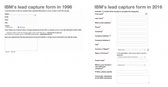
Besides asking for more information, little has changed in the way that they approach web forms. While easy to create, these forms are dull, outdated and, worst of all, a huge roadblock for efficiently driving conversions.
Here are some form improvement suggestions based on the insights I’ve collected from building and testing hundreds of lead capture forms at Leadformly.
Table of contents
- 1. Multi-Step Forms: How Asking More Questions Can Increase Conversions
- 2. Captchas Might Be Costing You Leads
- 3. Optimize Your Forms for Mobile Using the Correct Mobile Form Markup
- 4. Increase Engagement by Using Visual Question Types
- 5. Reduce Cognitive Load by Optimizing Your Question Types
- 6. Personalize Your Form Flow with Conditional Logic
- 7. Optimize for Motivation, Then for Ability
- Conclusion
1. Multi-Step Forms: How Asking More Questions Can Increase Conversions
An astro-turf company made a change to their form that increased conversions by 214%.

Instead of asking three questions (name, email, phone) all at once, Advanced Grass tested asking seven questions across two steps. As you can see above, this variation didn’t ask for any sensitive information on the first step – only questions focused on what the user wanted.
Despite being longer and spread across two steps, this form’s conversion rate was 214% higher than the simple 3-question form.
Why do longer forms sometimes convert better than shorter forms?
While it may seem counterintuitive that a longer form would convert better than a shorter form, there’s a good reason why multi-step forms usually outperform (pun intended) forms that ask all of the questions in one go.
First of all, multi-step forms are visually less overwhelming. Instead of seeing lots of questions all at once, you see one or two questions at a time, which is easier to digest and creates a sense of momentum as you move between steps.
Second, by placing sensitive questions (like email and phone) at the end of the form, there’s less friction for people to start filling out your form.
Finally, multi-step forms benefit from the endowed progress effect, a cognitive bias that explains how we’re more likely to complete something if there is an illusion of progress. In other words, in seeing a progress bar that shows we’re 50% done, we’re more likely to actually fill out the entire form.
2. Captchas Might Be Costing You Leads
A study by Stanford University found that captchas (those annoying boxes that ask you to prove that you’re a human) can reduce form submissions by up to 30%.
When Animoto removed captchas from their sign-up form, their conversion rate increased from 48% to 64%. While captchas may be bad for your conversion rate, how do you eliminate them without being bombarded with spam?
For WordPress users, Akismet will block the majority of form spam without impacting the user experience.
A slightly more advanced solution is to create a honeypot that blocks spam by displaying an invisible field (that only bots will fill out, giving them away and blocking their submission).
Based on the data I’ve seen from testing various anti-spam methods on our forms, honeypots are the most frictionless way to combat spam without harming the user experience.
3. Optimize Your Forms for Mobile Using the Correct Mobile Form Markup
For most sites, at least 1 in 3 form submissions come from a mobile device.
Here are a few lesser-known tips you can use to improve your form conversion rates on mobile.
- The average adult’s finger pad size is 11mm wide. Converted to pixels, that’s 48px. Ensure that all of your form fields are at least 48px tall to make them easy to select on a mobile device.
- Make sure all fonts on your form are above 16px. Anything below this and Apple devices will zoom in on the text when pressed, which you don’t want when someone is trying to fill out a form.
- Use mobile input types to display the correct mobile keypad.
Have you ever noticed how sometimes when you fill out a form on mobile, your phone displays a different keypad, such as a date selector or a number pad?
This is because the form had specific HTML markup telling the mobile device which keypad to display. This is easy to add and significantly improves the mobile form experience.
MobileInputTypes.com is a handy resource that lists how to implement all of the mobile input types that you can use to display different keypads.
4. Increase Engagement by Using Visual Question Types
The brain can process visual information 60,000 times faster than the time it takes for the brain to decode text.
Using images and visual elements on your forms achieves three things. First of all, it makes your form feel less form-like and more like using an interactive and engaging tool.
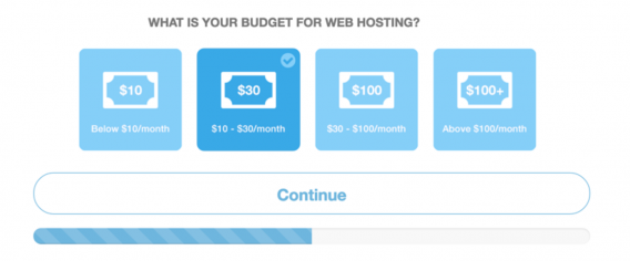
Second, large clickable image buttons like the ones used in this web hosting finder reduce the number of clicks required to answer the question. Instead of a dropdown box (which needs to be clicked three times to answer), a selection of large clickable images only requires one click to answer.
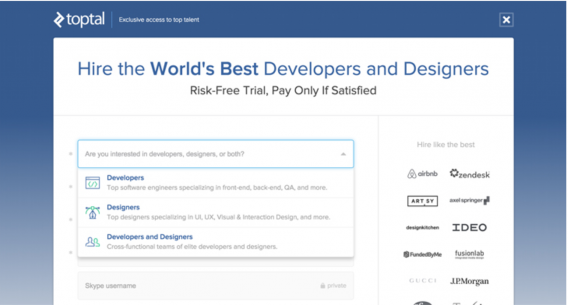
Finally, visual prompts make it easier to understand the question while skimming. Take a look at the example below from Toptal.com. Without having to read the question text, the icons make it clearer that this question is asking us to choose what we’re looking to hire – a developer, a designer or both.
5. Reduce Cognitive Load by Optimizing Your Question Types
When Microsoft released Windows Vista, fewer people shut down their PCs. Why?
Microsoft had updated their shutdown command from a button to a dropdown box. This trivial change meant that people now had to click three times to shut their computer down instead of once.

This illustrates how a small reduction in effort can result in significant gains in interaction. So how do you reduce the effort required to fill out your forms?
Optimize question types for minimal effort.
One approach is to optimize the type of question field you’re using to ask your questions.
For example, if you’re asking someone to enter the number of employees in their company, you could replace a dropdown list with a slider, numeric input box or clickable icons with number ranges.

As a general rule of thumb, motor actions (i.e. clicking buttons) require less cognitive load (mental effort) than actions that require the person to think and respond using language.
Use smart defaults to minimize effort.
Another good tactic to minimize the effort required to complete a form is to use smart defaults… setting a default answer to a question based on the most probable response.
For example, instead of forcing everyone to enter their country or search for it in a long dropdown list, why not just suggest the country they’re visiting the website from based on their IP address? In the vast majority of instances, this default value will be correct. When it’s not, they can still search for their country from the list.
Smart defaults can also be applied to many other fields, such as phone number fields (for suggesting the country code). This has the added benefit of cleansing and standardizing your phone number data.

6. Personalize Your Form Flow with Conditional Logic
You may want to ask some questions on your form that aren’t appropriate for everyone.
Instead of displaying them as optional questions, you can hide these questions for people that don’t need to answer them using conditional logic.
For example, the form on BrokerNotes uses conditional logic to only ask the question, “What are you looking for in a broker?” if a person answers that they’re an experienced trader.
This question is hidden to beginner traders who might be confused by the possible answers to this question, which use jargon that’s typically only understood by experienced traders.

7. Optimize for Motivation, Then for Ability
People don’t fill out forms for fun. They fill them out to achieve the outcome that sits on the other side of your form.
The more motivating the outcome is, the more people that’ll complete your form.
Requesting a Plumber vs. Receiving a Free Ferrari
Imagine you visited a plumber’s website and to get in touch, you had to fill out a form with 50 questions. You’d probably leave the website and find a different plumber.
Now, imagine if instead of being a form to inquire about a plumber, the same form was an application to receive a free Ferrari. Suddenly, the conversion rate of this form would shoot through the roof.
This illustrates how, even when nothing on the form changes, you can significantly increase form conversion rates by changing the outcome that drives people to complete the form in the first place.
Anecdotally, we’ve found that split tests focused on optimizing for motivation have resulted in far larger increases in conversion rates compared to tests aimed at optimizing for ability. So, how do you optimize your forms for motivation?
As a general rule of thumb, we’ve found:
- Tangible outcomes (e.g. request a free proposal) work better than intangible outcomes (e.g. inquire about our services).
- Instant outcomes (e.g. get an instantly generated audit) work better than delayed outcomes (e.g. request an audit).
- Personalized outcomes (e.g. get a personalized report) work better than generic outcomes (e.g. get our latest report).
In addition, outcomes that provoke strong emotions such as fear and hope tend to be more motivating than those than don’t provoke a strong emotion.
Conclusion
Optimizing your forms is a huge competitive advantage.
When you double the conversion rate of your form, you double the performance of every single marketing channel and campaign driving traffic to that form in one fell swoop. Your PPC cost per lead is halved, your content ROI doubles and your landing page conversion rate doubles.
Given the huge leverage that forms have over online marketing results and the fact that there’s so much opportunity to bring form design into the 21st century, it’s unsurprising to see companies like Expedia, Marketo, and HP getting big increases from small tweaks to their forms.
I hope these tips inspire you to take action and give you the insight you need to take your forms to the next level.






One more I’d add, optimize for accessibility so that users with screen readers can actually navigate and complete the form.
*Increase Engagement by Using Visual Question Types
Maybe provide some software examples to accomplish this.
Here are some I like to create visually engaging forms:
1) https:///www.quotechef.com (simple form builder)
2) or http://www.typeforms.com (advanced form builder)
Can you suggest some best web form plugins for WordPress sites?
~Sarah
Hi Sarah, it depends on the purpose of the form:
For lead generation forms I’d recommend Leadformly (https://leadformly.com), though I am biased ;-)
For checkout forms, SamCart (https://samcart.com)
For generic forms, anything like Wufoo (http://www.wufoo.com/) or Cognito Forms (https://www.cognitoforms.com).
Thanks for the Great Post. Like Sarah McIntyre even I would like to know your suggestions on best form plugins for WordPress sites?
~Ahmed