Growing your mailing list and generating leads should be a focus of your marketing. If HubSpot didn’t have 215,000 blog subscribers, they wouldn’t have a business.
Too many businesses don’t give sign-up forms enough attention. They just throw something together—then complain that online lead generation “doesn’t work.”
This post shows you 14 keys to building sign-up forms that convert.
Table of contents
- What’s a signup form?
- 1. Less is more.
- 2. Sell the email signup.
- 3. Show social proof.
- 4. Tell them what happens next.
- 5. Form design matters.
- 6. Single column, please
- 7. Try a Mad Libs–style form.
- 8. Communicate errors clearly.
- 9. Don’t be picky.
- 10. Don’t ask for the password twice
- 11. Drop-down lists, radio buttons and auto-complete fields
- 12. Submit button width = field width
- 13. Avoid clear fields button
- 14. Don’t use captchas on forms
What’s a signup form?
Sign-up forms are webpages, forms, or pop-ups designed to collect customer information at the moment of signing up. They can be used to collect emails or personal data, generate leads, or for customer acquisition.
1. Less is more.
Every field you ask them to fill increases friction. The best thing you can do to improve conversions is (usually) to get rid of as many fields as possible. In most cases, you don’t need to ask for anything but the email address.
In one study, an 11-field version of a contact form was replaced with a 4-field version, resulting in a 160% increase in the number of forms submitted and a 120% increase in conversion rate. The quality of submissions stayed the same.
In another test, a five-field form outperformed a nine-field form by 34%. Again, data quality wasn’t an issue. (People lie on long forms, anyway.)
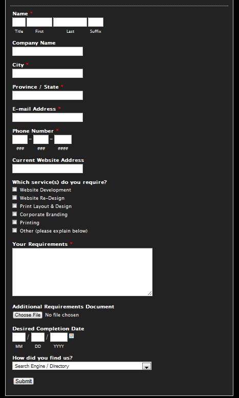
What’s the first thing that comes to your mind after seeing this type of form?
If you’re like me, you physically feel the brain damage happening. Suffix? Really?!
The example above is a lead-generation form for a web-design company. What they should ask for is name, email/phone, and maybe the website URL. Now, a salesperson can get in touch with the prospect and figure out all the other questions over the phone or via follow-up emails. The goal is to get the lead!
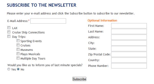
Start by getting rid of optional fields.
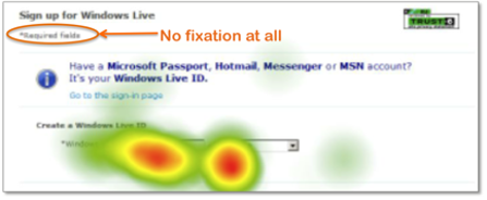
An eye-tracking study showed that people might not look at the “required fields” note on forms, and, therefore, think that they have to fill every field.
Think about it this way: Every additional fields loses a number of prospects. Is the additional information you gain from the field worth losing those people? Do you lose anything if you don’t get all the data right away?
The number of fields you can get away with also depends on the perceived reputation of the company. Well-known, trusted brands can include more fields in their sign-up forms, but even they can’t go overboard.
I’ve heard that The New York Times subscription form was 18 pages long(!) when they launched their online presence. Times have changed (pun not intended).
Do you really need it?
Do you really need people’s phone, fax, or address? If you aren’t gonna ship them anything, people won’t be motivated to share it. Ask only for what’s relevant. Expedia removed the “Company” field from their booking form and saw an $12 million annual increase in profit.
What will you do with their name? If it’s to mention their name in mass e-mails (“Hello [name]”!), forget about it. True personalization happens through personalized content. Everybody knows that the name field is filled in by an email software robot; nobody thinks it’s a personal email to them.
It used to work really well a few years ago, but now the effectiveness is in fast decline.
The best sign-up form is short.
Here’s an example from Barack Obama’s former campaign website:
Here’s another one:
2. Sell the email signup.
Getting people to give you their email (sign up to your list) is a transaction. You want them to give you their email address (and maybe other data); they want something in return. Generally speaking, you should ask for as little as possible on the sign-up form—and give the user as much as possible in return.
Motivated users are extremely likely to fill out a form of reasonable length. But are people motivated enough to care?
Here’s an example of the worst kind of form:
- No reason given to join;
- Ridiculous amount of fields.
Also bad:
While it’s short, it doesn’t provide any reasons for signing up.
Creating the motivation is up to you. Learn to create great microcopy. But don’t just ask for the sign-up. Sell it.
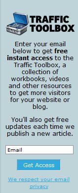
Here’s a better form. It’s short, there’s a clear value proposition, and the privacy policy is mentioned:
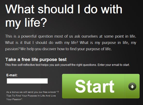
Or, take this example:
This one converts at 35%, which is pretty high. It works well because most traffic to the page comes via Google search, and the search terms match the offer on the form. When your offer matches user motivation, you get high conversions.
Test your lead magnet.
Test your lead magnet—what you offer in return for their email. The offer itself usually makes the biggest difference in your conversion rate. Everything else is just supporting it.
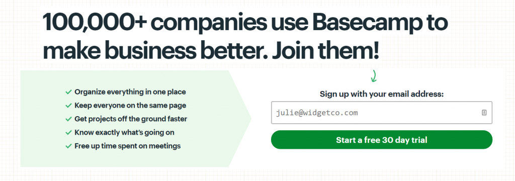
3. Show social proof.
Nobody wants to be the only idiot filling your stupid sign-up form. Show them tons of people have done it.
Basecamp
HubSpot
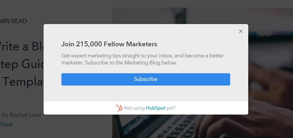
Social proof is very effective.
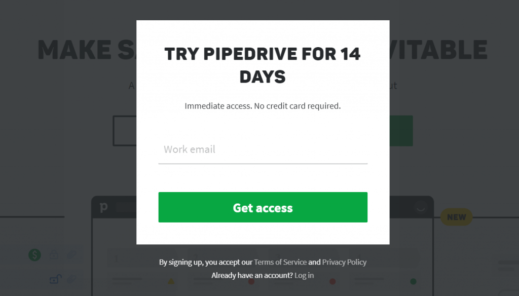
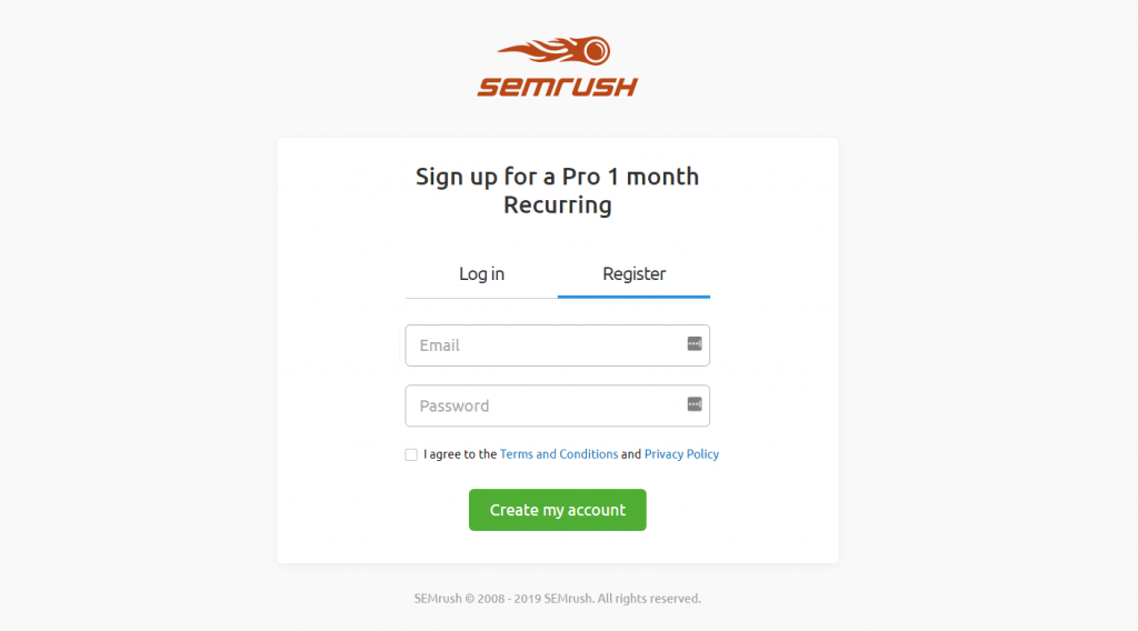
4. Tell them what happens next.
People like to be in control. Submitting a form without knowing exactly what’s going to happen creates uncertainty. Uncertainty causes friction.
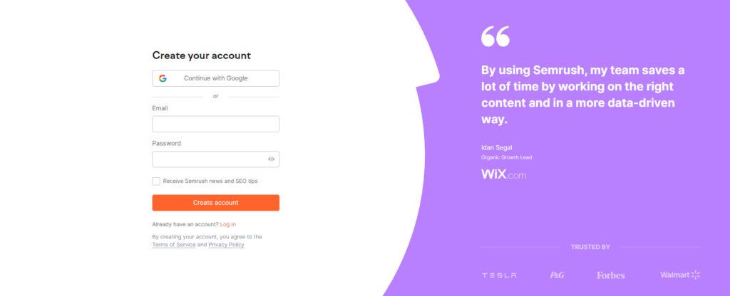
The worst thing your submit button can say is “Submit.” The best way to do it is to make the submit button say what’s going to happen.
Pipedrive
SEMRush
Wynter

5. Form design matters.
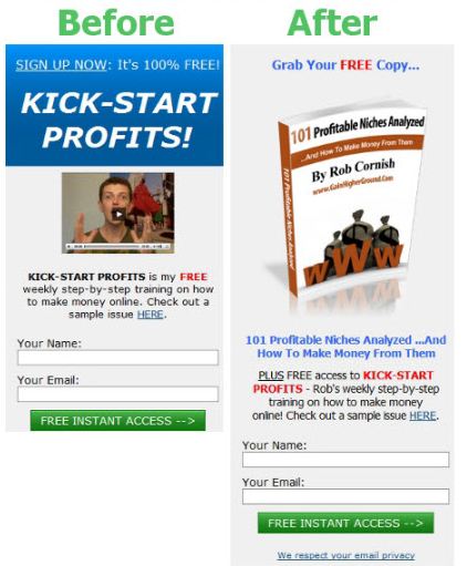
People trust beautiful design. This guy doubled his opt-ins with better graphics, showing the virtual cover of his ebook. It’s still a poor design, but progress is visible:
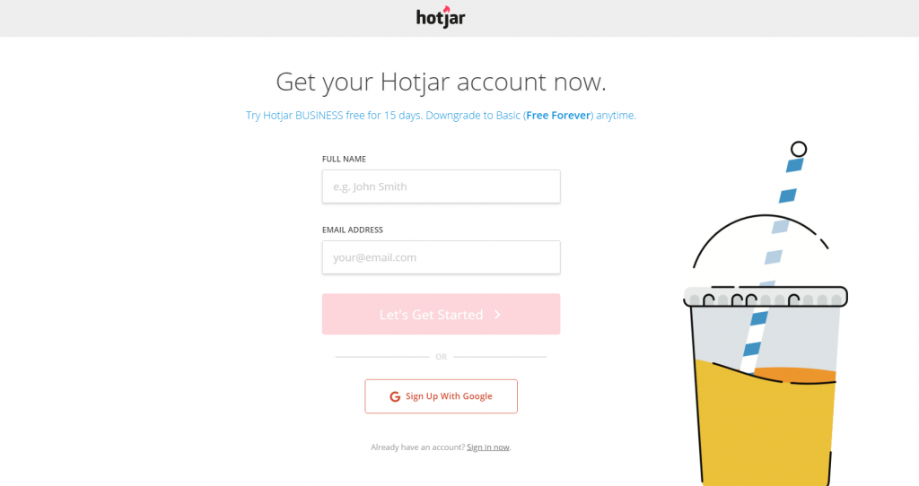
Hotjar
Uses a simple, streamlined form page to encourage signups:
6. Single column, please
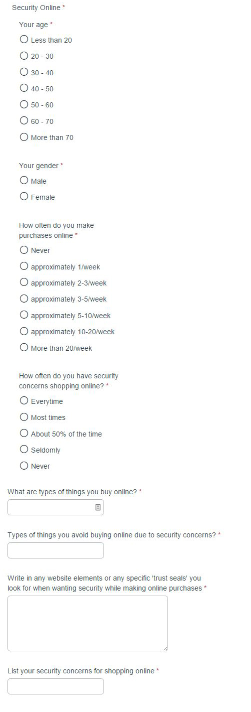
Our own research showed that single column forms take less time to complete. That was true even when though the single-column for was still pretty long:
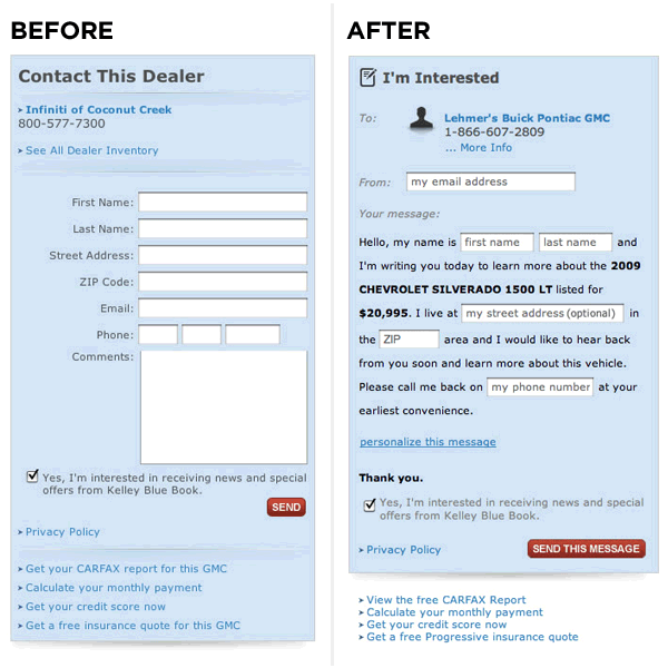
7. Try a Mad Libs–style form.
Mad Libs is a phrasal template word game in which one player prompts another for a list of words to substitute for blanks in a story, usually with funny results.
Vast.com did A/B testing comparing a traditional form design with a narrative “Mad Libs” format. The Mad Libs–style forms increased conversion across the board by 25-40%.
8. Communicate errors clearly.
If users fail to fill in a mandatory field or do something wrong, be very clear about it. Meetup does this well:
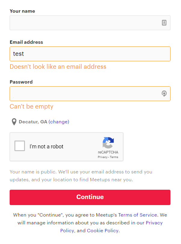
If a user fills the form incorrectly and you need to show an error message, make sure the fields are populated with the data they entered. If they have to start from scratch, it causes frustration, and they might not do it.
9. Don’t be picky.
There’s nothing more annoying than a form that requires information in a specific format.
For example, if you’re asking for a date, accept the year as 19 and 2019. Let them use a slash (/) or dot (.) between numbers. When you ask for a phone number, don’t require spaces, brackets, or anything else—let the user enter their phone number as they please.
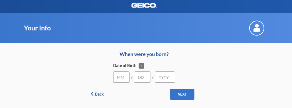
GEICO
If you need the data in a specific format, make it clear. This GEICO form avoids the potential slash-vs-dash issue and clearly specifics the MM/DD/YYYY format:
Better yet, convert form data with a script. You can also design the interface to removal all choice. In the case of dates, for example, you can have them choose it from a calendar.
10. Don’t ask for the password twice
The more fields you ask people to fill in, the fewer people will fill them. Having two fields for passwords is stupid.
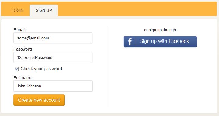
Most people do it (since “everybody is doing it”) but for no good reason. The idea is that entering it twice makes sure that there’s no typo. Well, a better way to do that is to give the option to see what they typed.
Vimeo
Vimeo doesn’t do it:
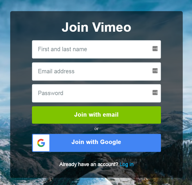
A “check your password” checkbox to show the password instead of a string of asterisks is a much better way to verify whether there are any typos:
11. Drop-down lists, radio buttons and auto-complete fields
You’ve probably seen those huge drop down lists for selecting categories, countries, or cities. If there are tons of choices, a drop-down list isn’t convenient.
This is bad:
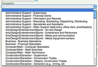
Instead, use auto-fill fields, such as this one for country selection (give it a try, it works):
Here’s a great article on redesigning the country selector. Get the country selector script here.
Use smart defaults where appropriate. For example, if most of your users come from the UK, it might be a good idea to default the country to “UK.”
If there’s anywhere between 7 and 15 options, a drop-down list is usually a really good fit. If there are only a few choices (2–6), go for the radio button:
12. Submit button width = field width
The call to action is the most important part of your form. A small button has weak affordance and can make users feel uncertain about using it. Make it as wide as the input fields (and join our email list while you’re at it):
Join our private newsletter and get the instant-impact guide for boosting your conversion rates.
13. Avoid clear fields button
Nobody who fills in your form wants to clear the fields. If they don’t want to fill it in, they can just leave.
But if they fill the form and accidentally clear the fields, there’s a good chance they won’t start over.

14. Don’t use captchas on forms
CAPTCHAs are those anti-spam things:
One study done over six months found that forms with CAPTCHAs could lose out on 3.2% of all conversions. Another study found that up to 30% of CAPTCHAs could be failed by real people because they were too hard to figure out.
Animoto used to have CAPTCHAs on their sign-up forms. When they removed them, they boosted their conversion rate from 48% to 64%. That’s an uplift of 33.3%!
So instead, what do you do?
If it’s an email list sign-up form, just use double opt-in.
If it’s a quote request or another type of form, you can use the “Honeypot” CAPTCHA technique. It uses CSS to hide a form field that’s supposed to be left blank. Every time the form is submitted, you check the field and see if it’s blank. If not, mark it as spam (but don’t delete it).
If you’re still keen on using captchas, this is the best captcha in the world.







Very helpful post. I have been seeking out help for getting more people to signup on my site but I realized in your last post that I was not thinking the right way. So I thought maybe it was my signup form so I came to this post and wow, what great info. Thanks and I will start to change my forms to just email only and then build that relationship and provide value added content to them for free. Thanks again for creating these posts they helped me a lot today…
Is there a Mad Libs wordpress plugin?
I’m trying to create a great sign up form with a little style to it. I’m not sure if basic looking forms are better for conversion as I have now or a more professional looking form. I am not good with styling, graphics, or anything like that so not sure if it’s worth hiring someone to design a good form. Do you want the form to stand out from anything else on the site? But then I don’t want the colors to look horrible with the rest of the site.
Anyways, thanks for the information here. I’m going to start working on an email signup form and will use the guidelines you’ve given here. I can tell you put a lot of time into the post, and I thank you for that. Hope I can do a good job designing this form.
Very true. The shorter the form the better. I like to get a phone number on forms for the simple reason being if they are serious…then they want to talk to you about your product or service. Getting the email address is key.
I think that newsletter signup forms from ContactUs.com have few fields and also can be useful. What do you think about it? (http://www.contactus.com/newsletter-signup-forms/)
Hey there – I’ve been searching for research on whether or not the width of the button makes a difference. I see the reference frequently, but nothing to back it up. Business leaders at my company think the large buttons look goofy and downmarket. Thoughts?
It can make a difference, and I’ve seen plenty of a/b tests where they have. The only way to know the impact in your case is to test.
Killer ideas. It’s funny because as I was reading your list, I was adjusting our email signup form. I’d say it looks a heck of a lot better now!
Thanks for the tips!
Jay