The call to action is a core component of marketing, sales, and any persuasion-based effort.When it comes to calls to action, there’s a lot of theoretical content about how to tweak copy, color, size, and other elements, but, sometimes, it’s easiest to learn through examples.
You can see how theoretical principles play out in the real world and how they can create effective experiences. Therefore, this post will focus on how to apply theory for calls to action.
A good call to action isn’t the only element you need to succeed online, but a good one will certainly improve your effectiveness. Let’s return quickly to the basics before we dive into any call to action examples.
Table of contents
- What is a call to action?
- Call to action examples in conversion optimization
- 25 call to action examples (with reviews and critiques)
- 1. Unbounce
- 2. KlientBoost
- 3. Dropbox
- 4. HotJar
- 5. TaxJar
- 6. Bulletproof
- 7. Travel Wisconsin
- 8. CXL
- 9. Wunderkind (previously BounceX)
- 10. Wunderkind (Bounce X) (Part 2)
- 11. Wunderkind (BounceX) (Part 3)
- 12. Intercom
- 13. Zoom
- 14. CXL
- 15. Tim Ferriss
- 16. Bonobo
- 17. Hulu
- 18. Tableau
- 19. Verve Coffee
- 20. Nomadic Matt
- 21. Mac Cosmetics
- 22. Mint Mobile
- 23. Zara
- 24. Adobe
- 25. Hinge
- Before you test your call to action…
- Conclusion
What is a call to action?
In marketing, a call to action (CTA) is any message designed to prompt an immediate response or encourage an immediate sale. It’s as simple as it sounds: a call for someone to take action.
In the online world, a CTA is a combination of words or phrases that seek to inspire action (usually a button click). In conversion optimization, a typical call to action example would look something like this:
Call to action examples in conversion optimization
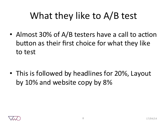
A while ago, VWO put out some data that said CTAs were by far the most popular A/B test run on their platform. Some 30% of tests involved a call to action.
This makes sense, especially when you think about how most people learn about conversion rate optimization: through case studies where small CTA tweaks lead to huge lifts.

While a call to action test isn’t always the most impactful area for experimentation, tons of CTAs are so bad that you can pick up some easy wins in this area.
Additionally, no web element lives in isolation. A good CTA draws heavily on the context of the page. When you optimize other elements, your CTA may need tweaking as well.
There are a variety of call to action best practices. I’ll leave the theory, for the most part, to other articles. In this piece, I’ll use examples to guide, instruct, and inspire CTA ideas.
So, let’s get to it! Here are 20+ call to action examples.
25 call to action examples (with reviews and critiques)
1. Unbounce
CTA: Get Pricing Now
After doing tons of button tests, Michael Aagaard realized that two questions can help you write CTA button copy:
- What is my prospect’s motivation for clicking this button?
- What is my prospect going to get when they click this button?
If you can answer those questions concisely and clearly, you’ll have a quality CTA button.
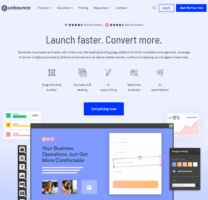
Unbounce’s homepage CTA does that well. “Get Pricing Now” explains exactly what you’re going to get.
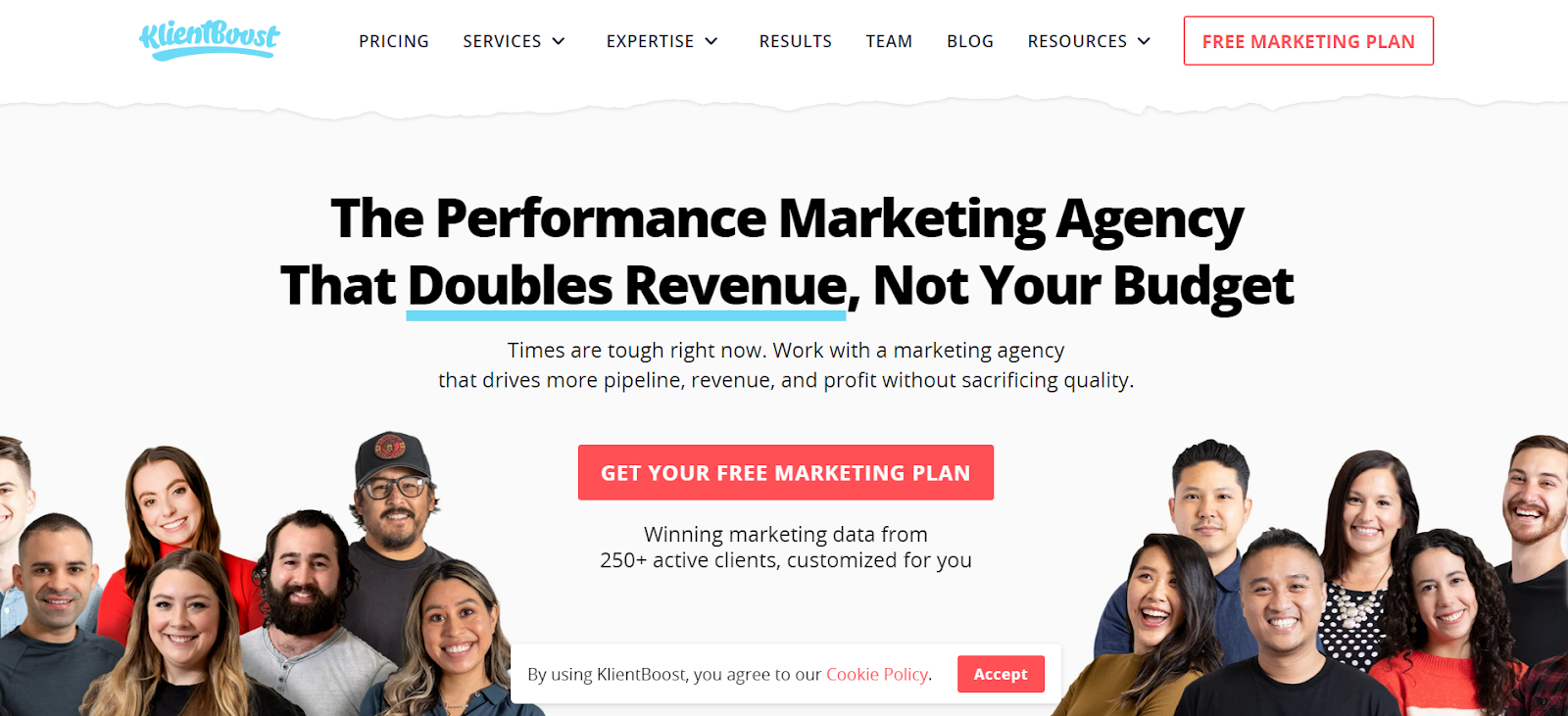
2. KlientBoost
CTA: Get Your Free Marketing Plan
It’s tough to shake things up with calls to action. Most offer the same things: “Download Now,” “Get Access,” or “Contact Us.”
KlientBoost does a good job shaking things up, and instead of using something like “Contact Us,” they say “GetYour Free Marketing Plan”—seemingly, a more compelling offer. It’s also more specific. You know exactly what the endgame is.
“Contact Us” is vague, but a free marketing plan is concrete.
3. Dropbox
CTA: Sign Up for Free
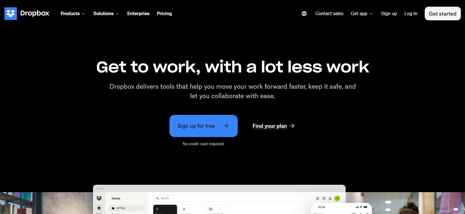
The word “free” is intoxicating for marketers. We sprinkle it everywhere to hype offers, and it usually works wonders. Humans like free stuff.
Therefore, if you have a freemium offer or a free trial, why not emphasize it? One of the biggest hurdles to conversion is uncertainty regarding payment or risk. If you can mitigate that with some soothing copy that assures visitors it “won’t cost you anything,” do it. Dropbox drives this home by adding “No credit card required” just below the main CTA.
4. HotJar
CTA: Book a Demo
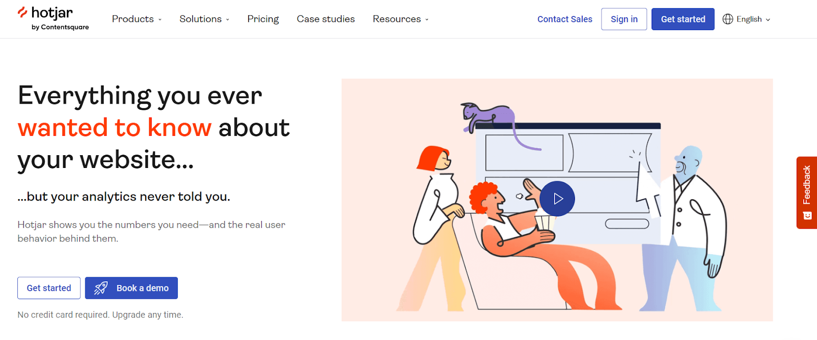
Not every call to action has to be super clever or witty. In fact, for anybody outside the inbound marketing echo chamber, a CTA saying, “Yes! I want to save money and get instant access!” with blinking arrows is annoying.
“Book a Demo” is boring, but if a demo is the desired action, it’s perfectly suitable. Clarity trumps persuasion. Just be consistent.
5. TaxJar
CTA: Start a Trial
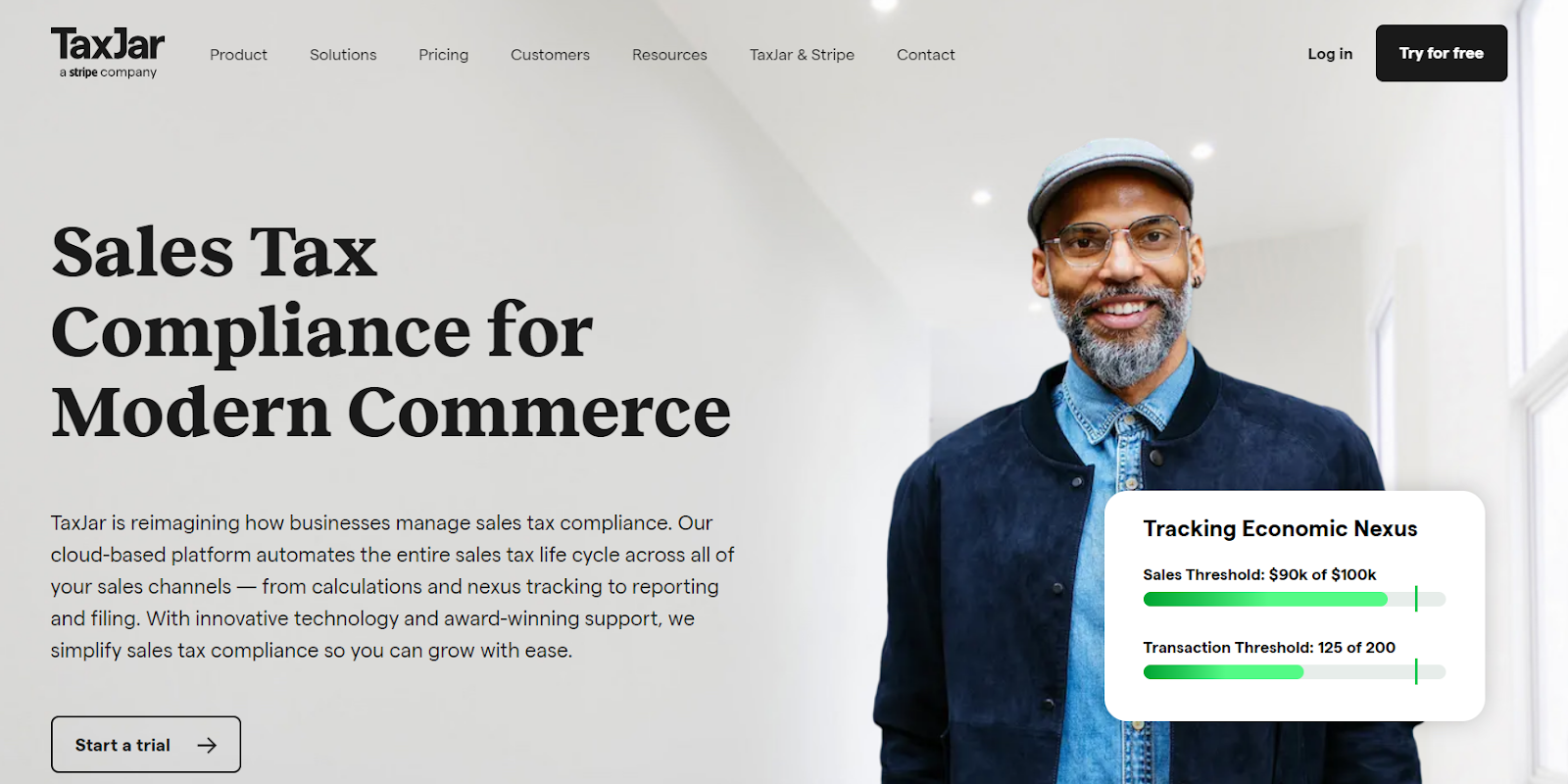
You don’t have to have the word “free” in the call to action. Sometimes, it’s obvious from the setup or page context. (Pro tip: It’s always about the page context.)
That’s the case with TaxJar, which offers a free trial but uses the more ambiguous “Start a Trial” as the primary CTA. The “free” component is implied—you’re prompted for a username, email, and password (but not credit card information).
6. Bulletproof
CTA: Shop Now
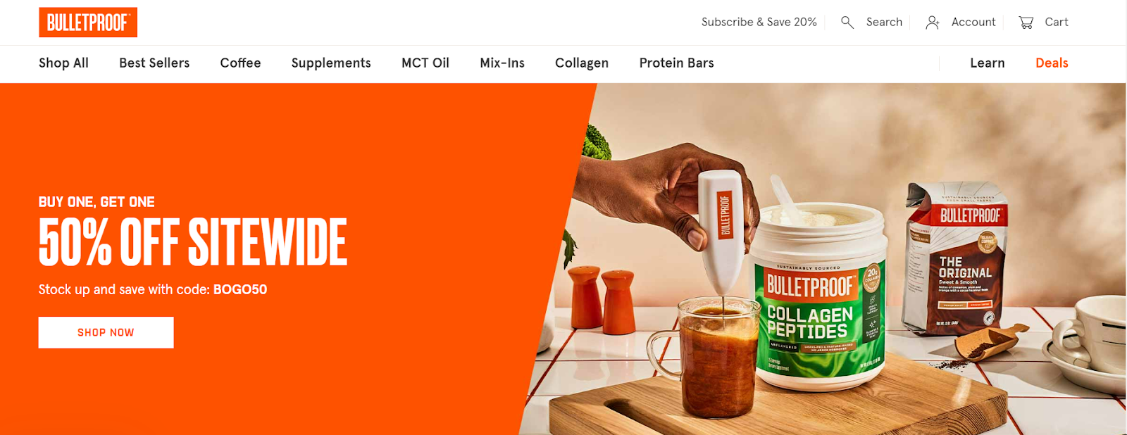
Bulletproof has a well-optimized site. The user experience, in my opinion, is excellent. They’re clearly testing things regularly.
The homepage features the prototypical example of an ecommerce call to action: “Shop Now.” It’s not unique or witty, but it moves users immediately toward product browsing.
Along the same lines, we’ve often seen “See Selection” outperform “Shop [product].” Even better, you can personalize your call to action for return visitors or past buyers with a “See What’s New” (as long as you have new things to show):
7. Travel Wisconsin
CTA: Start Making Memories
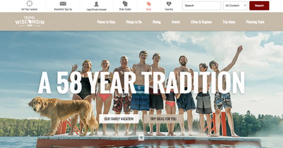
At one point, Travel Wisconsin split its homepage calls to action two ways: “Our Family Vacation,” and “Trip Ideas for You.” Now, I don’t know their audience well, but I can imagine trip ideas is a more compelling offer, much more in line with the intent of the site visitor.
In any case, the combination of the two CTAs is a bit confusing, and “Our Family Vacation” is completely vague. Everything above the fold is pretty vague, in fact.
Since we initially reviewed their homepage, they’ve updated it to a single (and far clearer) call to action: “Start Making Memories.” 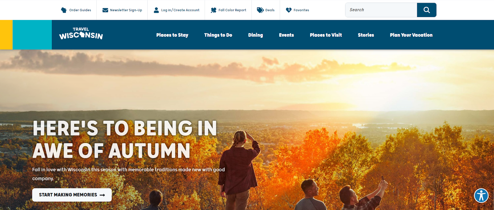
8. CXL
CTA: Read More & See What You Get
CXL also uses two calls to action, but they serve a specific purpose: to deliver more relevant information to two different sets of buyers.
Once users self-segment, they have the option to see what they get (if they’re almost ready to buy) or scroll down to learn more:

These things change, and we’re iterating, so it will be different in the future, but these call to action examples reflect the varying intent of our audience and the nature of our offers.
9. Wunderkind (previously BounceX)
CTA: Get Started With Wunderkind
A CTA doesn’t have to be words in a rectangular box with a contrasting color. A CTA just calls for action. You can get creative with the execution.
BounceX does a great job by making you click play to watch their promo video:
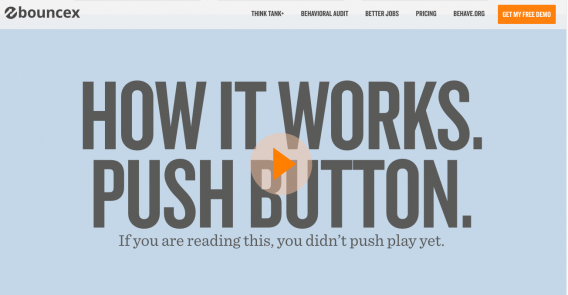
Since initial publication, they’ve ditched the hero video. Maybe it didn’t work. Or maybe they wanted to try something new.
The point stands: Be willing to test something outside the box if it makes sense for your company and audience.
10. Wunderkind (Bounce X) (Part 2)
CTA: Get Started With Wunderkind
Wunderkind has a treasure trove of behavioral marketing content in their “think tank.”
Each piece of content has a well-designed landing page. Each call to action example could be a case study on how to do things right. The size, color and contrast, affordance—everything about the design is great. In addition, they do copywriting well.
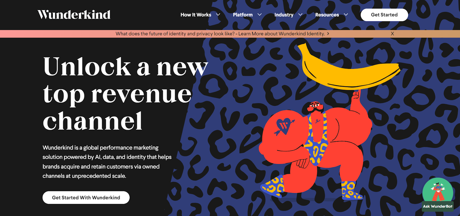
They get straight to the point in their CTA copy, “Get Started With Wunderkind,” potentially using that as a way to familiarise users with their rebranding.
11. Wunderkind (BounceX) (Part 3)
CTA: Download Now
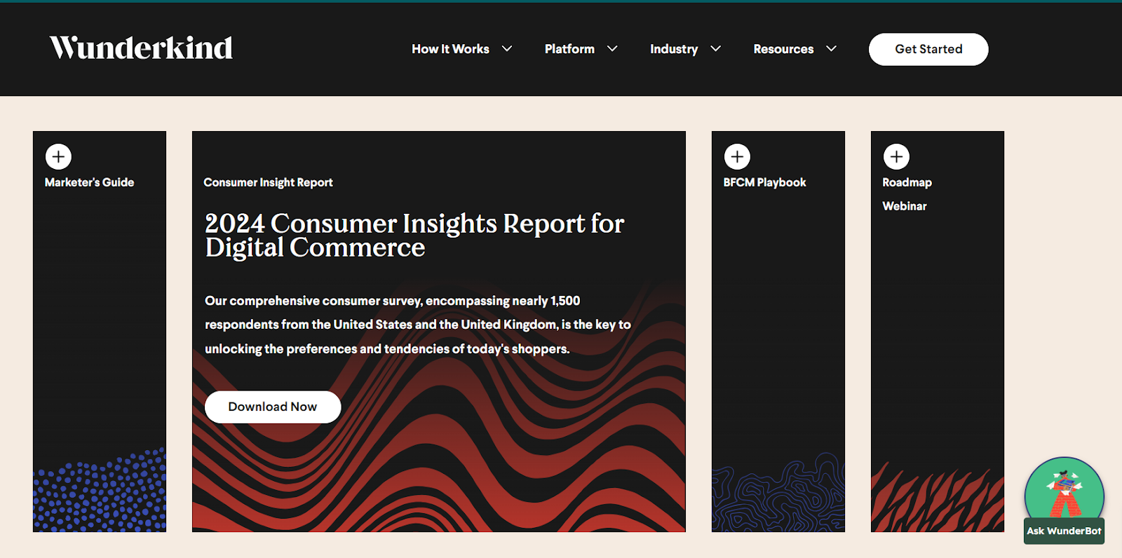
Same story in this example CTA. This call to action is for a consumer insight report, so the copy changes from “Read Now,” to “Download Now,” to “Register Now” keeping pace with the context of the offer and at what stage the buyer is in the marketing funnel.
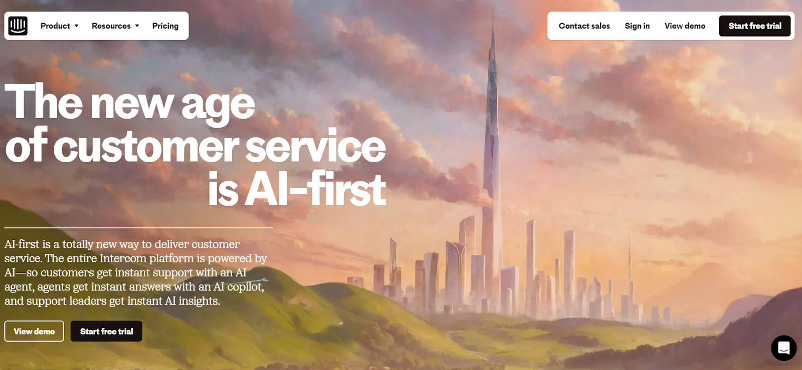
12. Intercom
CTA: Start Free Trial
On its homepage, Intercom maintains consistency with both above-the-fold CTAs. Since they offer a free trial, it’s a simple “Start Free Trial” that uses an email opt-in.
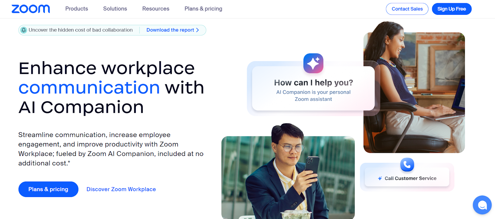
13. Zoom
CTA: Plans & Pricing & Discover Zoom Workplace
Zoom’s homepage follows a dual-CTA structure, with high-contrast, high-visibility CTAs that let users sign up for free or explore the workspace as well as plan and pricing options.
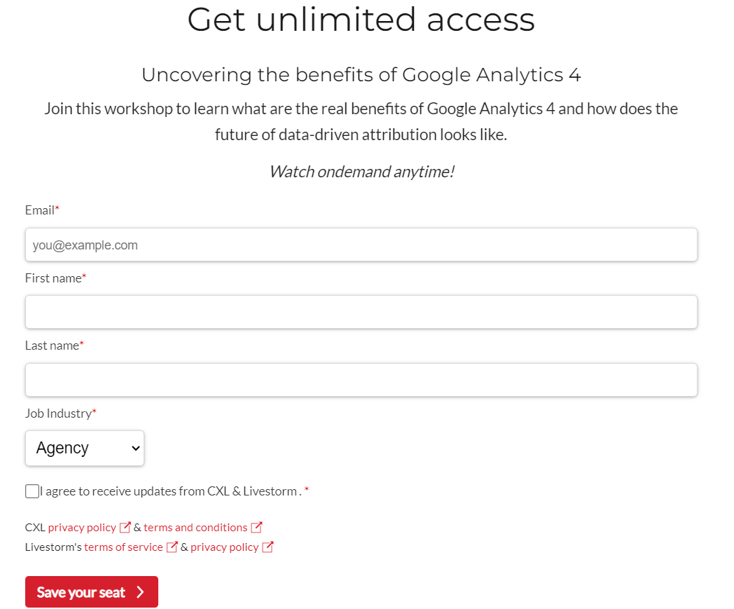
14. CXL
CTA: Save Your Seat
This is the general call-to-action template we use for our webinars. We’re going for clarity: “Save Your Seat.”
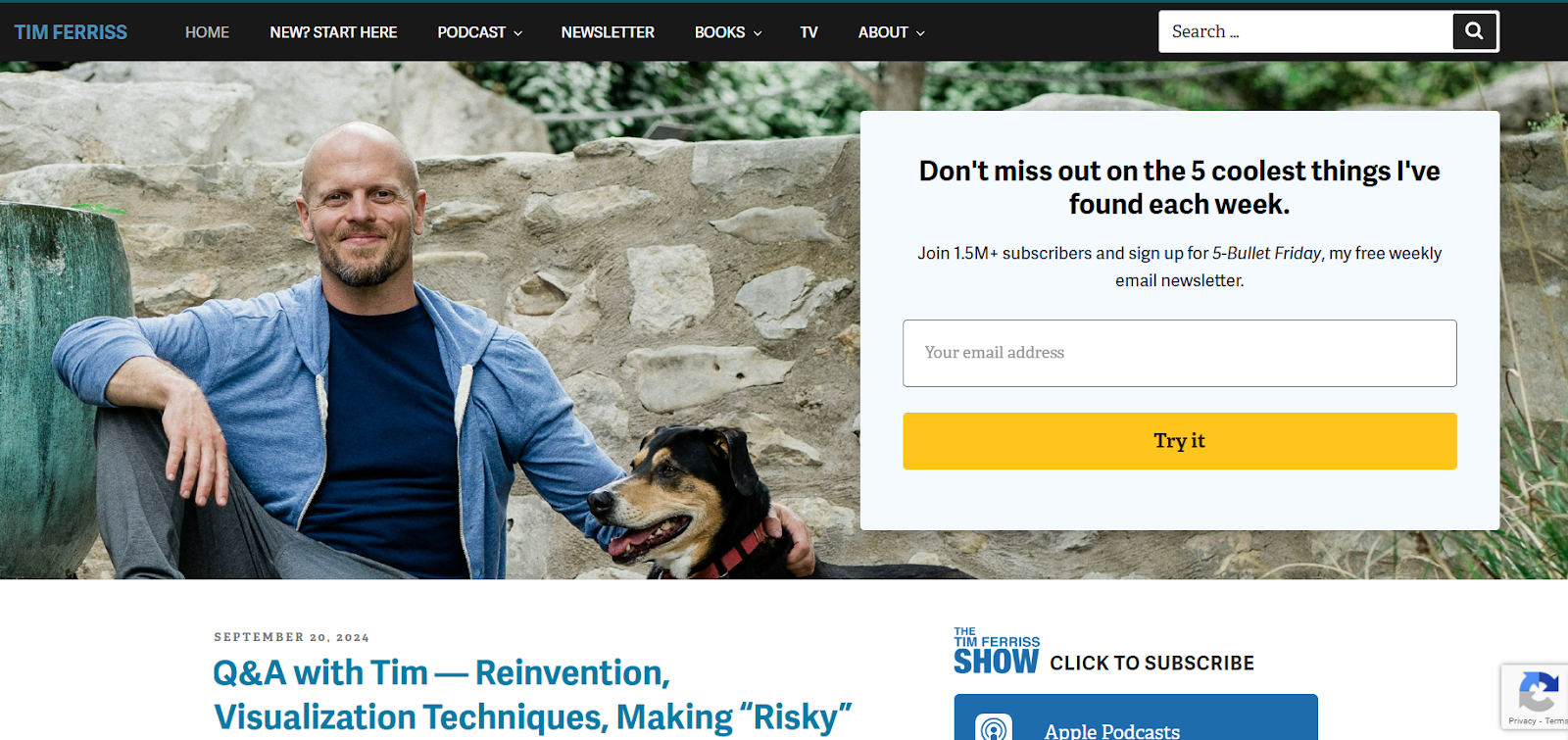
15. Tim Ferriss
CTA: Try It
Tim Ferriss’s call to action is unique both in placement and in offer. His focus is his podcast, so he asks users to “Click to Subscribe.”He also uses a simple CTA, “Try It”, to get visitors to subscribe to his weekly newsletter.
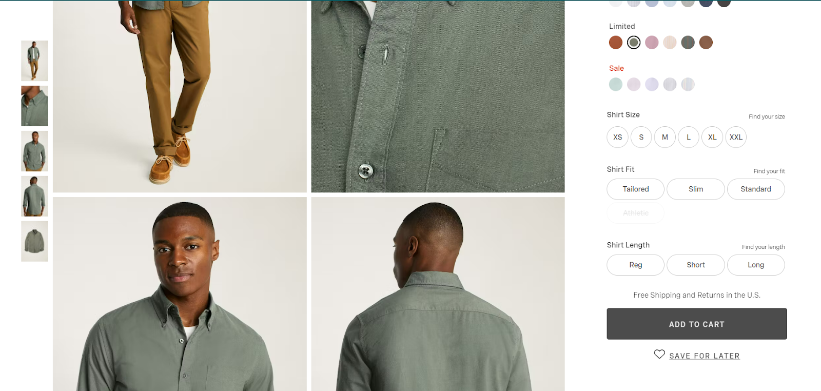
16. Bonobo
CTA: Add to Cart & Save For Later
Two ecommerce CTAs that complement “Shop…” CTAs use prototypical product page call to actions: “Add to Cart” and “Save For Later.” Most of the time, the best practice for conversion optimization is to do what your customer expects. That’s where prototypical design and the science of familiarity come into play.
.
17. Hulu
CTA: Get All Three & Learn More
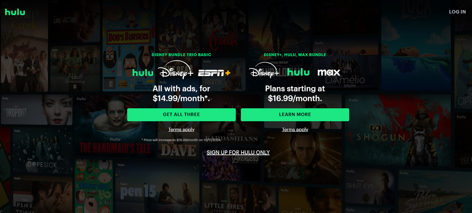
Although Hulu technically breaks the rules of CTA best practices, they’ve cleverly disguised the fact that they have three CTAs. Sure, having only one action per page reduces distraction and makes things clearer for the visitor.
But if you’re selling various bundles and know you have multiple audiences (in various stages of the customer journey), why not cater to both?
Hulu highlights the two CTAs they’d like potential customers to click on: “Get All Three” and “Learn More.” By highlighting these CTAs in a high-contrast color button, they’re directing the viewers’ eye to these bundle packages, ultimately, pushing higher sales.
Just below is the single “Sign Up For Hulu” option. Because this isn’t highlighted, it’s less likely that it’ll be the first CTA a user would click. Nevertheless, the option is still on the homepage, giving customers the option if that’s what they’re looking for.
18. Tableau
CTA: Watch Keynote & Try Tableau For Free
I’m not a huge fan of Tableau’s call to action. Well, there are actually two above the fold, and the one that pops out is “The Tableau Platform,” which doesn’t tell you much about what will happen after you click that button.
Is it a trial? A demo? A video? A product page?
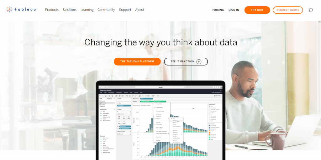
The other call to action is eerily similar. “See in Action” could take me to the same content as “The Tableau Platform.” In short, I don’t know which one I should click if I want to learn more about the platform’s features and whether it’s right for me.
If the “See it in action” call to action is vague. Is it a trial, a demo, or just a video? (Spoiler alert: It’s a video.)
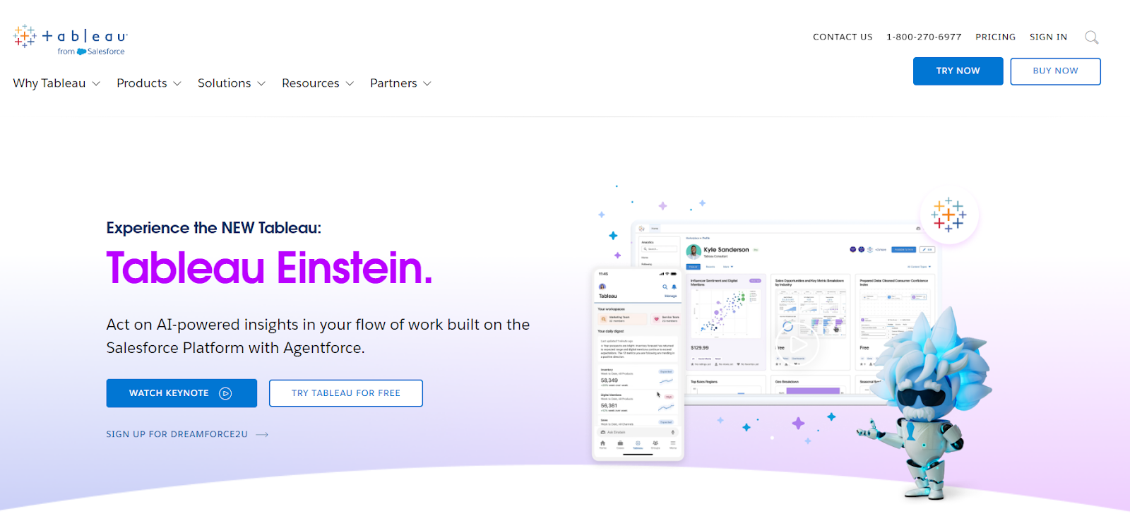
Since we originally reviewed the site, their CTAs have improved. The CTAs are more direct, and users now know what will happen once they click the CTA button. The one that stands our is “Watch Keynote.” The second CTA, “Try Tableau For Free,” is a huge improvement because, as we’ve mentioned previously, who doesn’t like free stuff?
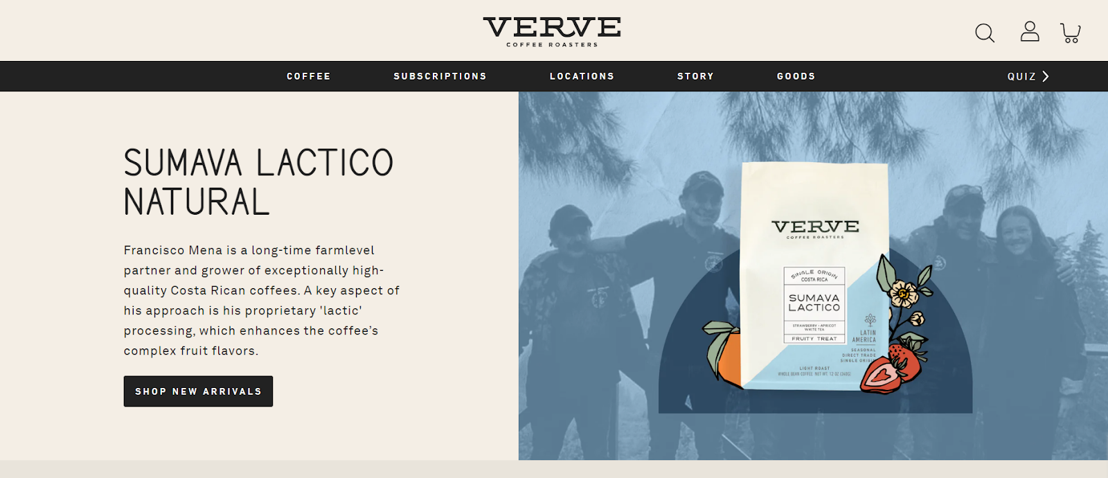
19. Verve Coffee
CTA: Shop New Arrivals
This one is pretty bad.
Starting from the page-context level, the headline and image aren’t super enlightening. I’m not sure what an “adventure pack” is. Then, the call to action is to “Join the Adventure.”
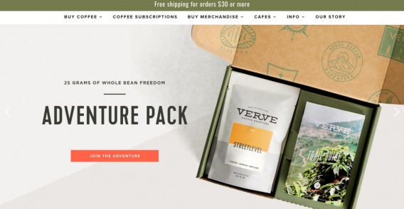
But I’m on a coffee website. I thought I was shopping for coffee. Very confusing. (Thankfully, they’ve since changed it to “Shop New Arrivals.”) They’ve also provided some information about the featured product, which is much more likely to pique a potential customer’s interest and motivate them to click the CTA button.
20. Nomadic Matt
CTA: Find Your Destination
This call to action at the bottom has strong copy: “Send me tips,” which follows the “I Want To ___” formula. It also has an easy and intuitive form and wonderful page context.
The call to action is one of two on the page, along with “Find Your Destination,” which takes up the most prominent real estate.
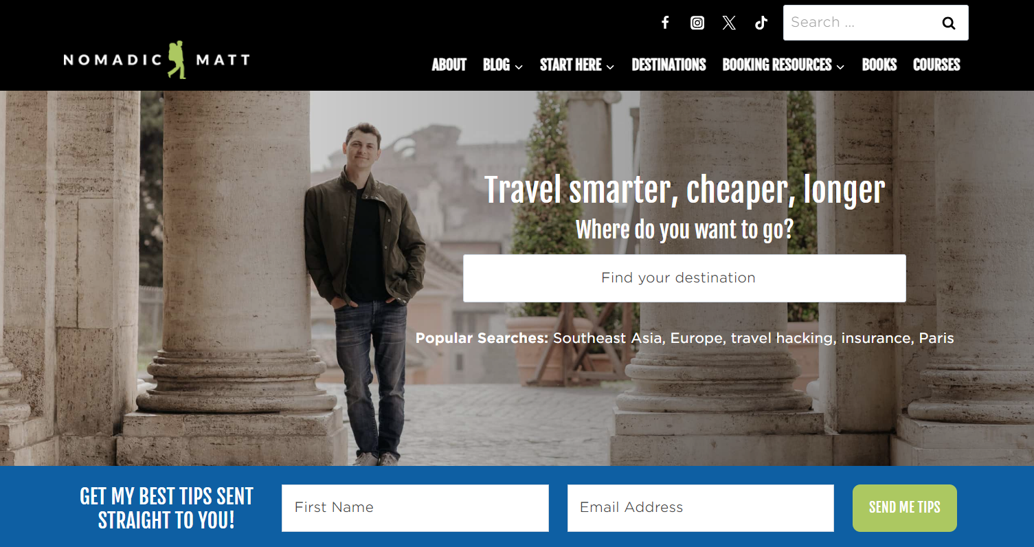
Personalized CTAs do 42% better than untargeted ones, (Hubspot), which Nomadic Matt does perfectly. By speaking directly to the user, using words like “your,” he personalizes the user experience.
21. Mac Cosmetics
CTA: Shop
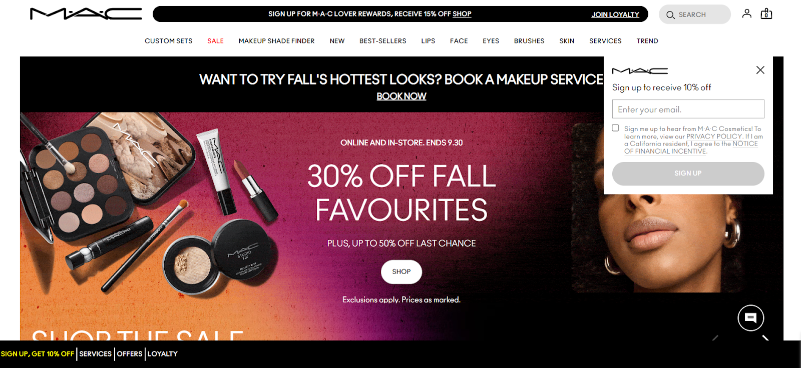
MAC is a good example of CTA overload. There’s just so much going on here that you truly don’t know where to look or click. Although the main CTA, “Shop” is centered and in a contrasted CTA button, there are just too many distractions.
When first visiting the site, I was distracted by a pop-up offering 10% to sign up with my email. Despite its less intrusive positioning, which (quite frankly) is less annoying, users are distracted by two other CTAs. One is “Book Now” to book a makeup service. The other is at the top of the page, which has CTA text that changes every few seconds.
Now, this may keep you on page longer. However, the page feels cluttered and the overload of CTAs is very distracting and could lead visitors to bounce from the page.
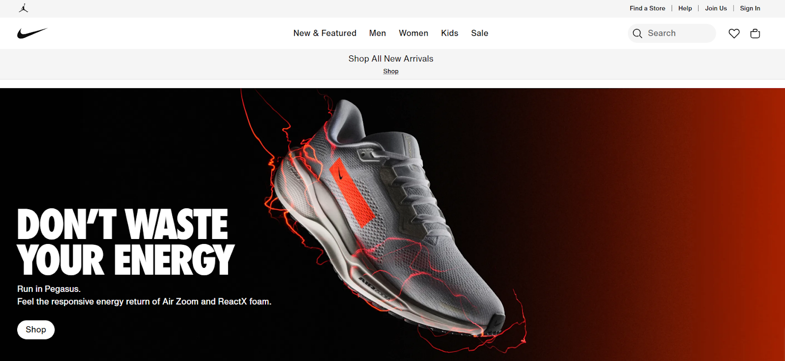
Nike shows how to use the CTA “Shop” correctly. The homepage has a clean design and the text just above, although related to the product it’s promoting, also relates to the user experience, implying that you won’t waste energy using their online shopping platform.
22. Mint Mobile
CTA: Let’s Go
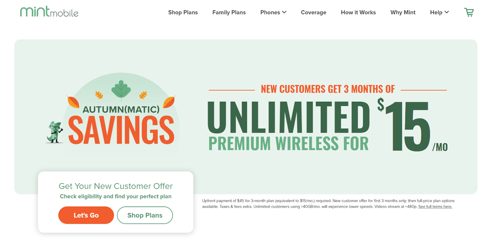
Mint Mobile does a good job of communicating what users will get when clicking their CTA in the text just above. The CTA “Let’s Go” caters to users who are ready to take up the offer while the CTA beside it, “Shop Plans,” is for those who need a little more information.
The offer is bold and clear for their Fall/Autumn(matic) savings promo and the CTA adds a little excitement to the idea of getting such a good deal.
23. Zara
CTA: Go

Zara is an excellent example of how a clean web design can be unforgiving of a low-contrast CTA button. The user is called to take three actions: enter the location, and language, and then just below is the CTA “Go,” which we could assume is a shorter version of “Let’s Go.” Although it isn’t literally telling you what will happen once clicking the CTA, Zara is such a well-known brand that if you end up on their site, you know you’re there to shop.
In this instance, the CTA is somewhat exhilarating, which kind of relates to the shoppers’ high some get when doing retail therapy. However, this would be ineffective if the user lands on a relatively new brand or startup site that doesn’t explicitly communicate what service or product they provide or uses supporting text to indicate what will happen after clicking the CTA.
24. Adobe
CTA: Get the Offer
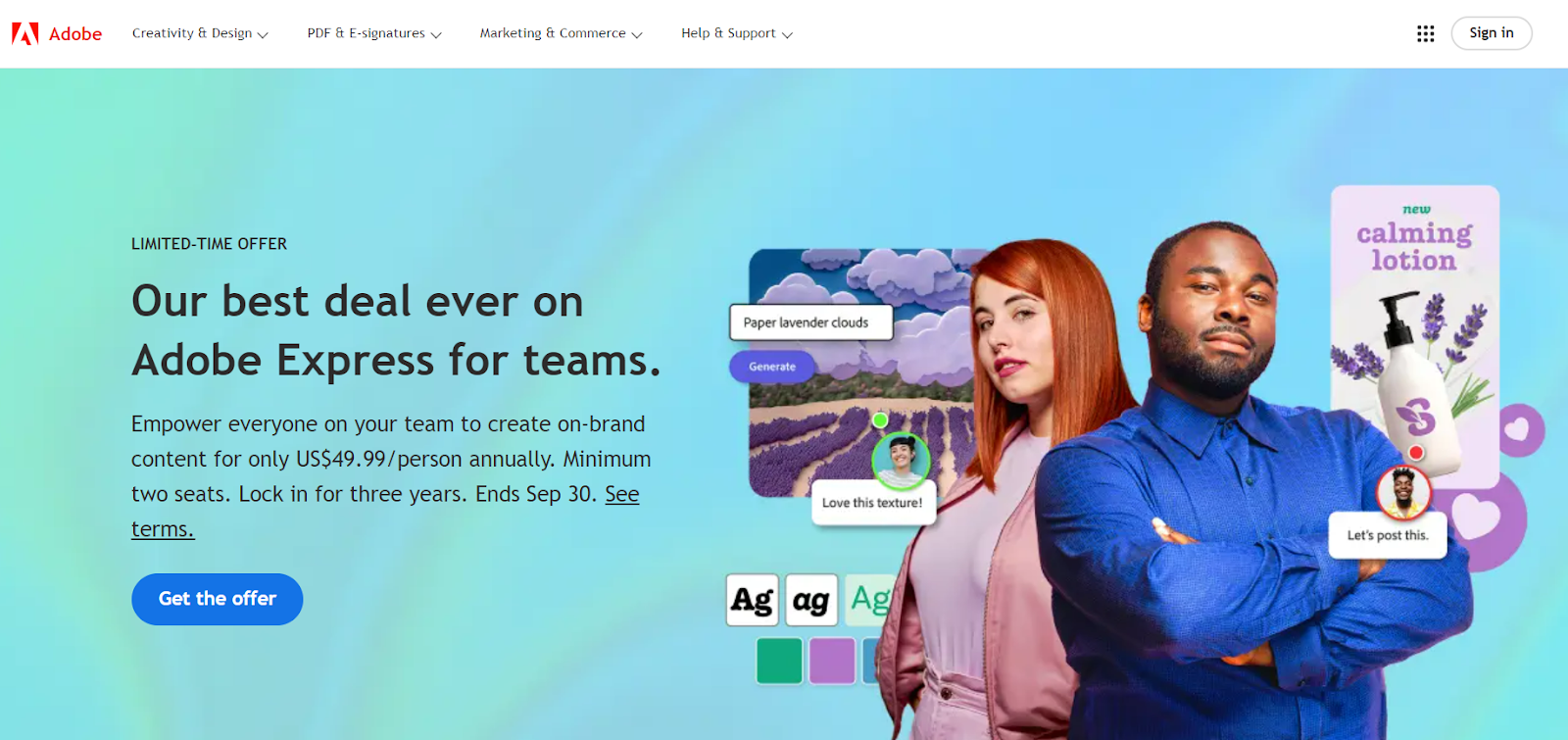
Adobe does it right with one explicit CTA that stands out in a contrasted CTA button. Users know exactly what will happen when they click “Get the Offer.” Adobe also creates a sense of urgency, highlighting that this is a limited-time offer on a reduced annual rate per person, which ends September 30. It’s clear and compelling. What more do you need in an effective CTA?
25. Hinge
CTA: No CTA/Difficult to find

Compared to its competitors Hinge has taken a bold risk with no CTA at all, or so it seemed. Upon entering the site, users will either hover their cursor all over the homepage in confusion, looking for the sign up or download CTA, or be forced to scroll in search of it. We did both.
The only CTAs on the homepage are “How We Do It” and “Join us.” After spending a fair amount of time searching for the ”download” button, I eventually clicked the first CTA, as the second was for those looking to work for the brand.
After endlessly scrolling through pretentious slogans and captions, core values, explanations, differentiators, and a slider deck going even more in-depth about their approach to online dating, I eventually found the download CTA button.
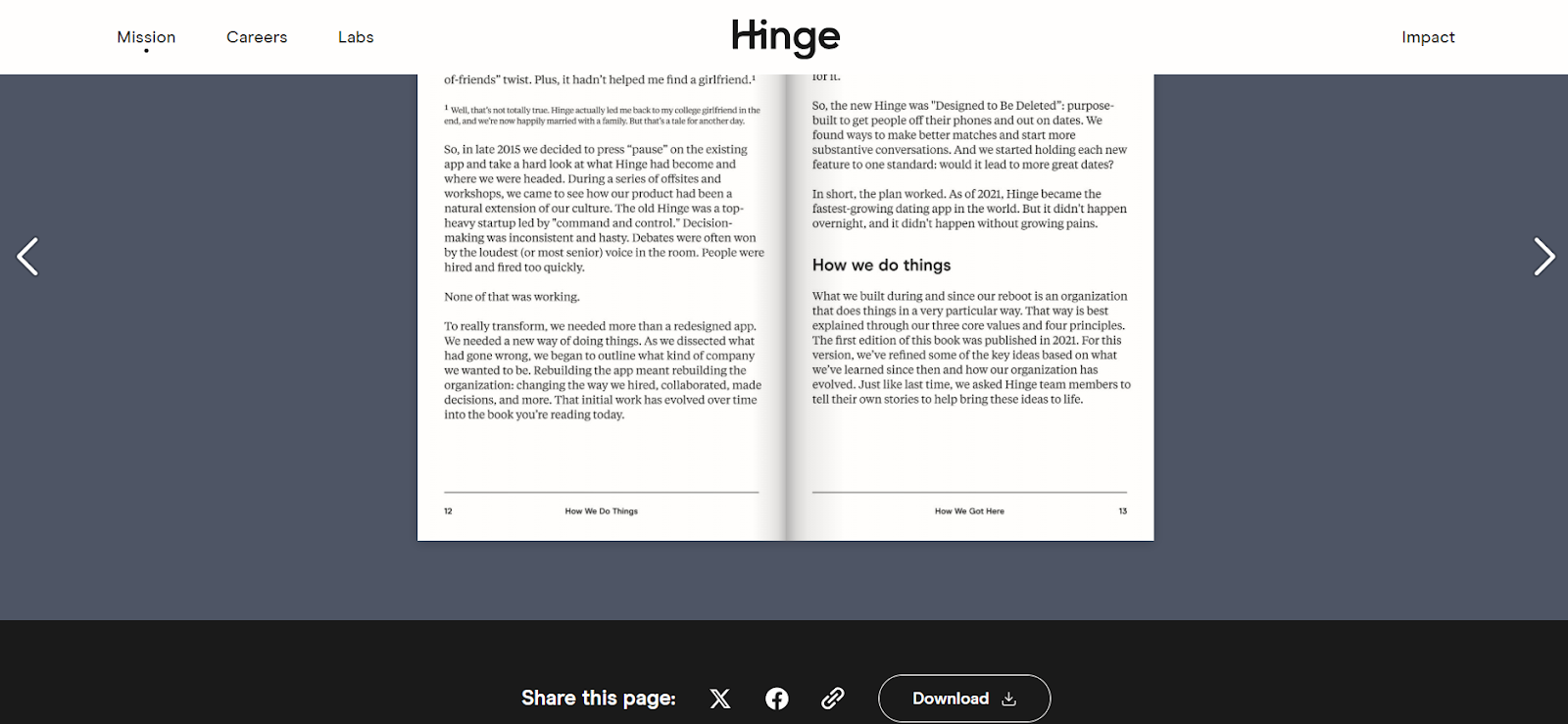
Needless to say, this is probably the most ineffective CTA technique if your goal is to get potential customers to download an app. Customers should never be forced into a game of hide-and-seek or to sit through a one-hour hypothesis on the science of dating when all they want to do is download the app.
Before you test your call to action…
This guide is meant to inspire, not to instruct. Every website is contextual, and while I can judge these call-to-action examples against the theory of web design and copywriting, I don’t know how they’re actually performing.
So, here comes the common conversion optimization advice: Test it yourself.
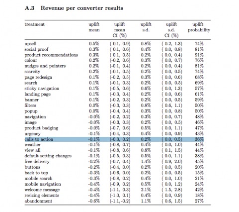
…Or don’t. Maybe it’s not the highest-value area for optimization. Maybe you have bigger challenges. Qubit put out an awesome meta-analysis of 6,700+ ecommerce experiments, and they found that CTA tests, on average, don’t move the needle often (and when they do, it’s not by a lot):
Maybe you’ve already tested a ton of CTAs and have a pretty good idea of what works. Call-to-action tests scale well. Once you’ve done enough experimentation, you can usually replicate the winners across similar offers. We use the same CTA across similar landing pages and offers.
If you’re just starting to optimize your website, it may be more beneficial to start with higher-impact areas. Use conversion research to discover real problems on your site. Don’t just test calls to action because they’re easy to set up in a visual editor.
Conclusion
The call to action is an important element of website design, conversion optimization, or any form of marketing or persuasion. Invest some time and effort into crafting good CTA copy, making sure the design is right, and designing with the page context in mind.
This post outlined a huge list of call to action examples, probably too many—some good, some bad, some non-existent. You shouldn’t copy any of them outright but rather use them as inspiration to design your own compelling call to action.
Related Posts
-

Should you say 'read more' or 'product information' in your product category view? Which is…
-

Wingify says 30% of all A/B tests run by their customers are CTA button tests. But…
-

In today's review I'm assessing whether websites in question could do anything to better get…
-
According to a study, 71% of website visitors complete their purchases offline. Online, we have…

Great read. It’s definitely one of thet first things that comes to mind when testing. A well placed call to action with great content to help the flow of a user is always on my mind.
This trading strategy ebook promotional email campaign has an excellent call to action. Instead of the usual “i want this” or “download now!”. It captured audiences with it’s awesome “GO LONG!” button CTA text.
http://mailchi.mp/1cfa67b346af/use-simple-price-correlation-to-know-stock-prices-before-us-markets-open-47807
I liked it since its relevant to the content of the ebook (Use correlated price movement in international stocks and U.S. ADRs to predict stock prices accurately before markets open.) and it’s audience, which is primarily stock market traders and enthusiasts. Find it here: https://gumroad.com/l/titan0346
This is a really great article, Alex.
One question: you mentioned you’ve seen CTAs like “See Selection” outperform the more generic/familiar CTAs. Did you guys at ConversionXL publish a study on this? I tried searching the site and couldn’t dig anything up.
Thanks for your time :)