In marketing, the call to action is where a page, ad, or email asks for the conversion: the “Start free trial” button on a landing page, the “Get a demo” link on a homepage, the “Shop now” in a promo email. There’s a lot of theory about how to tweak CTA copy, color, size, and other elements, but it’s often easiest to learn from real examples.
You can see how theoretical principles play out in the real world and how they can create effective experiences. Therefore, this post will focus on how to apply theory for calls to action.
The 22 examples below are marketing CTAs from homepages, landing pages, and product pages, with notes on why each one works (or doesn’t). If you’re after calls to action in essays, articles, or other persuasive writing, see our guide to call to action in writing instead. First, a quick refresher on the basics.
TL;DR
- Make the next step obvious. Visitors should understand what happens after they click.
- Match the CTA to intent. “Get a demo,” “Start for free,” and “Shop Plans” serve very different stages of the buying journey.
- Use the surrounding copy. The button doesn’t need to explain everything if the headline and supporting text remove uncertainty.
- Multiple CTAs can work. They make sense when they serve genuinely different visitor intents.
- Clarity usually beats cleverness. A specific CTA is often more useful than an abstract or branded phrase.
- Test the problem, not just the button. CTA changes matter most when they address a real point of friction.
Table of contents
What is a call to action?
In marketing, a call to action (CTA) is a prompt designed to get someone to take a specific next action. It’s as simple as it sounds: a call for someone to take action.
Online, that might mean starting a trial, booking a demo, buying a product, downloading content, joining a list, or moving to the next step in a customer journey. CTAs are most commonly buttons or links, but any element that clearly prompts an action can serve the same purpose.
What CTA performance data tells us in 2026
A CTA is only one part of the conversion experience.
Contentsquare’s 2026 Digital Experience Benchmark analyzed 99 billion sessions across more than 6,500 websites. Traffic fell 3.8% year over year, engagement fell 10%, and conversion rates fell 5.1%. At the same time, 35.2% of sessions still showed signs of friction, such as rage clicks, slow-loading pages, or excessive hovering.
That matters when deciding what to test. Changing “Get Started” to “Start Now” won’t fix a page where visitors don’t understand the offer, can’t find the right information, or hit technical friction before they reach the CTA.
The data also shows why intent matters. Returning visitors converted at 2.9% versus 1.7% for new visitors in Contentsquare’s 2026 benchmark. A visitor who already knows the product may be ready for “Start free trial” or “Buy now,” while someone arriving for the first time may need pricing, a demo, or more information first.
When optimizing a CTA:
- Check the surrounding experience first. Look for unclear messaging, technical errors, distractions, and missing information.
- Match the action to visitor intent. Not every visitor is ready for the same next step.
- Make the outcome clear. The examples above work best when visitors know what happens after they click.
- Test meaningful changes. Use research to identify friction rather than changing button copy because it is easy to test.
- Judge the CTA in context. Headline, offer, supporting copy, placement, and page structure all affect how the button performs.
CXL’s current landing page guidance follows the same principle: focused landing pages should have one clear goal, while headline clarity and CTA placement generally matter more than cosmetic changes such as button color or shape.
22 call to action examples
1. Unbounce
CTA: Start building for free
After doing tons of button tests, Michael Aagaard realized that two questions can help you write CTA button copy:
- What is my prospect’s motivation for clicking this button?
- What is my prospect going to get when they click this button?
If you can answer those questions concisely and clearly, you’ll have a quality CTA button.
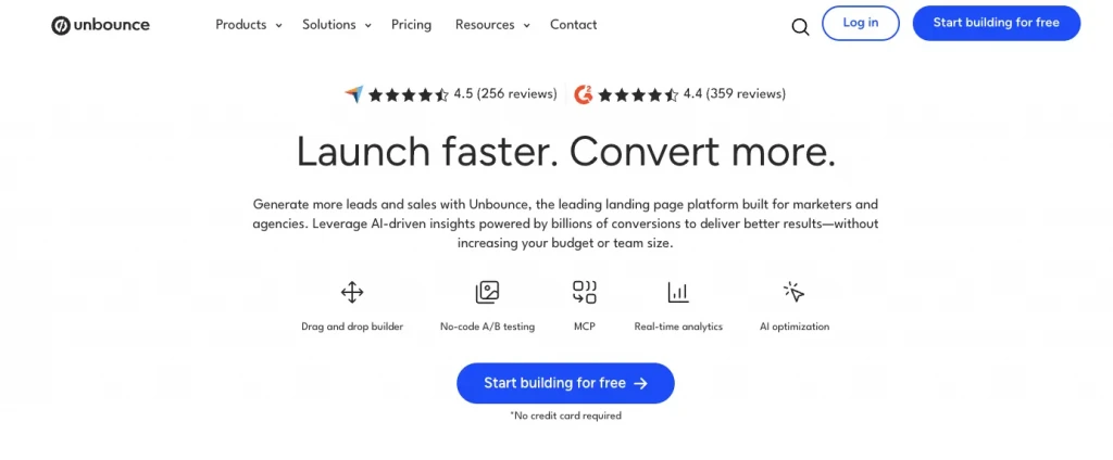
“Start building for free” tells visitors both what they can do next and that there’s no upfront cost. Directly underneath, Unbounce adds “No credit card required,” removing another common source of friction.
The CTA works because it answers two important questions immediately: what happens after the click, and what commitment is required?
2. KlientBoost
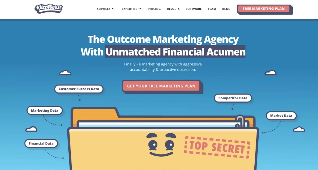
CTA: Get Your Free Marketing Plan
It’s tough to shake things up with calls to action. Most offer the same things: “Download Now,” “Get Access,” or “Contact Us.”
KlientBoost does a good job shaking things up, and instead of using something like “Contact Us,” they say “GetYour Free Marketing Plan”—seemingly, a more compelling offer. It’s also more specific. You know exactly what the endgame is.
“Contact Us” is vague, but a free marketing plan is concrete.
3. Dropbox
CTA: Try Dropbox Free
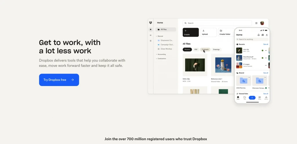
The word “free” is intoxicating for marketers. We sprinkle it everywhere to hype offers, and it usually works wonders. Humans like free stuff.
Therefore, if you have a freemium offer or a free trial, why not emphasize it? One of the biggest hurdles to conversion is uncertainty regarding payment or risk. If you can mitigate that with some soothing copy that assures visitors it “won’t cost you anything,” do it.
4. Fullstory
CTA: Get a Demo
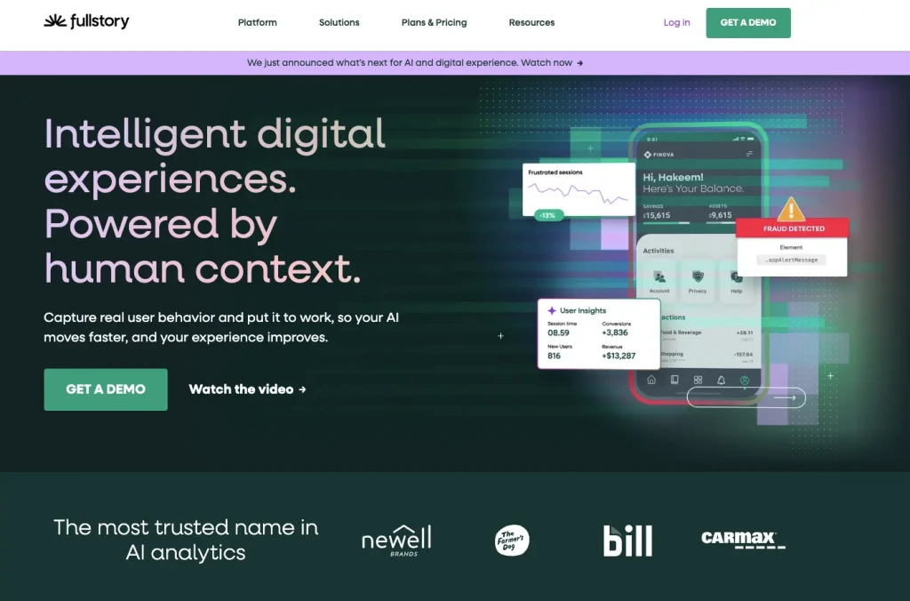
Not every CTA needs to be clever.
Fullstory repeatedly uses “Get a demo” across its site because that is exactly what the next step involves. There’s no ambiguity about what happens when someone clicks.
For sales-led products, clarity often matters more than trying to make the CTA sound distinctive.
5. TaxJar
CTA: Start a Trial
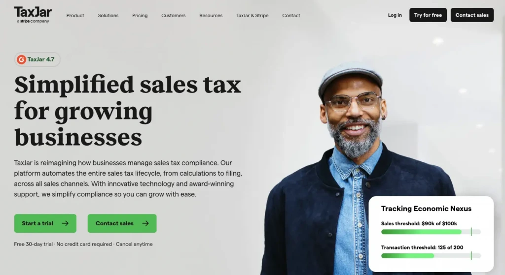
You don’t have to have the word “free” in the call to action. Sometimes, it’s obvious from the setup or page context. (Pro tip: It’s always about the page context.)
That’s the case with TaxJar, which offers a free trial but uses the more ambiguous “Start a Trial” as the primary CTA. The “free” component is implied—you’re prompted for a username, email, and password (but not credit card information).
6. Bulletproof
CTA: Get Yours Now

Bulletproof uses a more direct, product-focused CTA on its current homepage.
“Get Yours Now” sits underneath the hero promoting its Mood Booster Instant Latte, following the product benefit messaging around taste and mood support.
The wording works because it moves beyond a generic “Shop Now.” It refers directly to the product being featured and makes the next step feel immediate and specific.
The surrounding copy does the persuasion; the CTA simply gives visitors a clear way to act on it.
7. CXL
CTA: Learn about CXL subscription / CXL for Teams
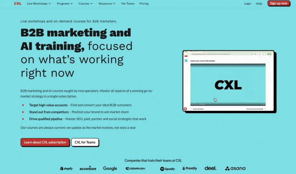
CXL uses two prominent CTAs because it serves two distinct types of buyer.
“Learn about CXL subscription” is aimed at people considering individual access, while “CXL for Teams” gives companies a direct route to the team offer.
Multiple CTAs aren’t inherently confusing. They work when each one corresponds to a genuinely different visitor intent.
8. Notion
CTA: Get Notion Free / Request a Demo
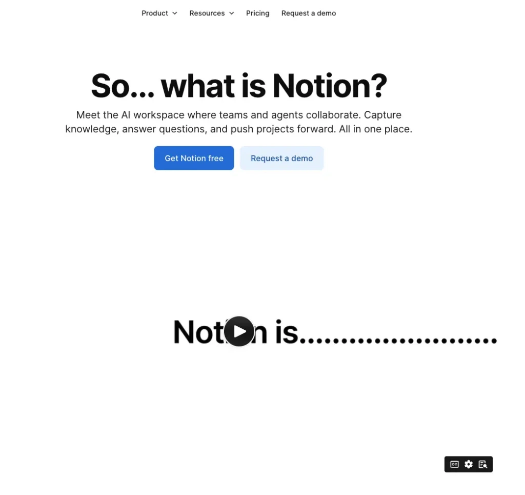
Notion uses two CTAs to separate self-serve users from buyers who need a sales conversation.
“Get Notion free” gives individuals and smaller teams an immediate route into the product. “Request a demo” gives larger organizations a more assisted path.
The two CTAs work together because they represent different buying journeys rather than competing versions of the same action.
9. Canva
CTA: Start Designing
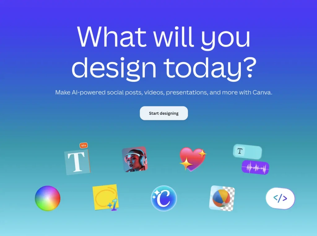
Canva’s CTA mirrors the activity visitors came to the product to perform.
The homepage asks “What will you design today?” and follows it with “Start designing.”
That connection between the headline and CTA makes the button feel like the natural next step rather than a generic conversion prompt.
10. Shopify
CTA: Start For Free
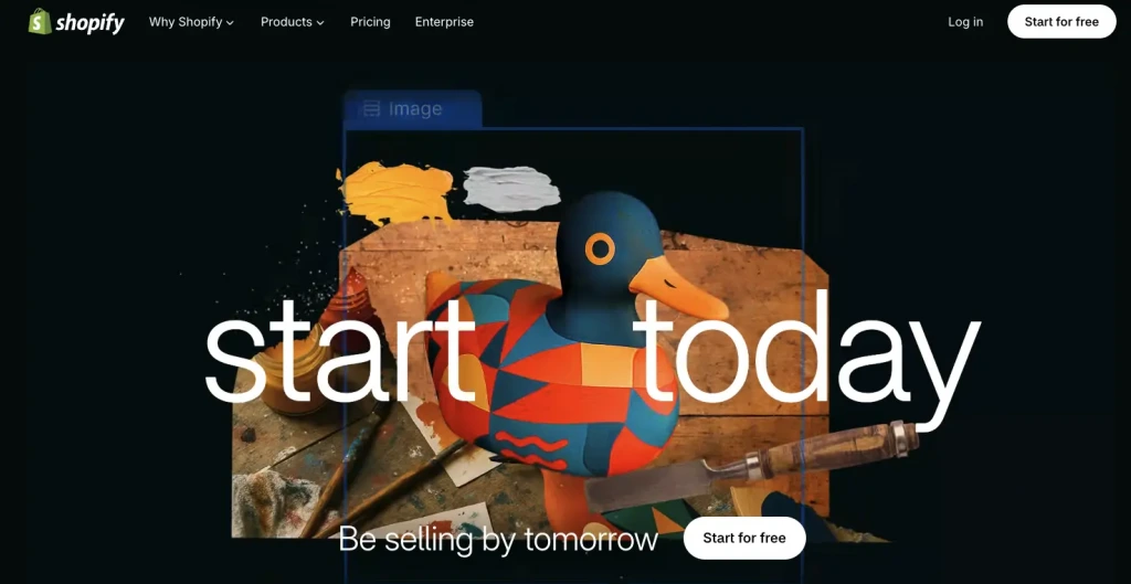
Shopify keeps the CTA short but reduces the perceived commitment by making “free” part of the action.
Its current start page pairs the CTA with messaging about creating a business now and beginning to sell quickly.
The visitor isn’t being asked to make a large commitment immediately. They’re being asked to take the first step toward the outcome Shopify is selling.
11. Intercom
CTA: Start Free Trial
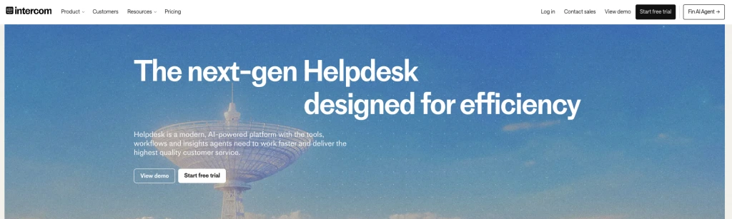
Intercom gives visitors two clear options based on how ready they are to use the product.
Someone who wants to start immediately can choose “Start free trial.” Someone who wants to see how the platform works first can choose “View demo.”
The same pairing appears consistently across Intercom’s product pages, which helps visitors understand the two routes available to them.
12. Zoom
CTA: Sign Up Free / Contact sales
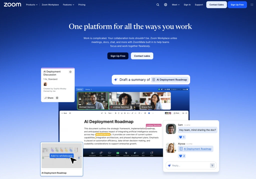
Zoom uses two clear CTAs on its current Zoom Workplace homepage.
“Sign Up Free” gives self-serve users an immediate way to start using the product, while “Contact sales” gives larger or more complex buyers a direct route to the sales team.
The two CTAs work because they represent different levels of buying intent without competing with each other. One is low-friction and product-led; the other is sales-assisted.
The surrounding headline, “One platform for all the ways you work,” explains the broader offer, while the CTAs keep the next steps straightforward.
13. Nomadic Matt
CTA: Find Your Destination
This call to action at the bottom has strong copy: “Send me tips,” which follows the “I Want To ___” formula. It also has an easy and intuitive form and wonderful page context.
The call to action is one of two on the page, along with “Find Your Destination,” which takes up the most prominent real estate.
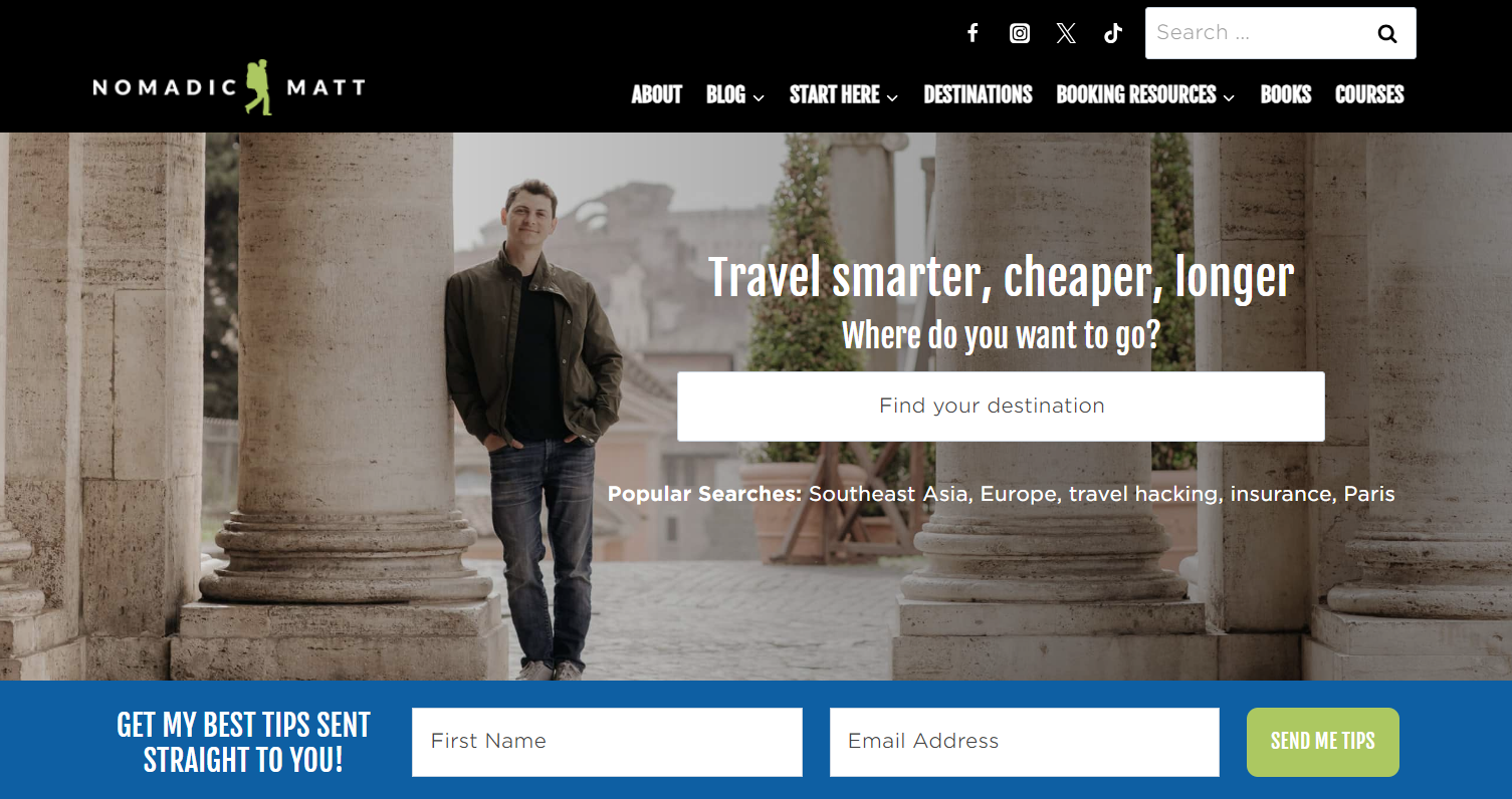
By speaking directly to the user, using words like “your,” he personalizes the user experience.
14. Mint Mobile
CTA: Shop Plans / Get Started
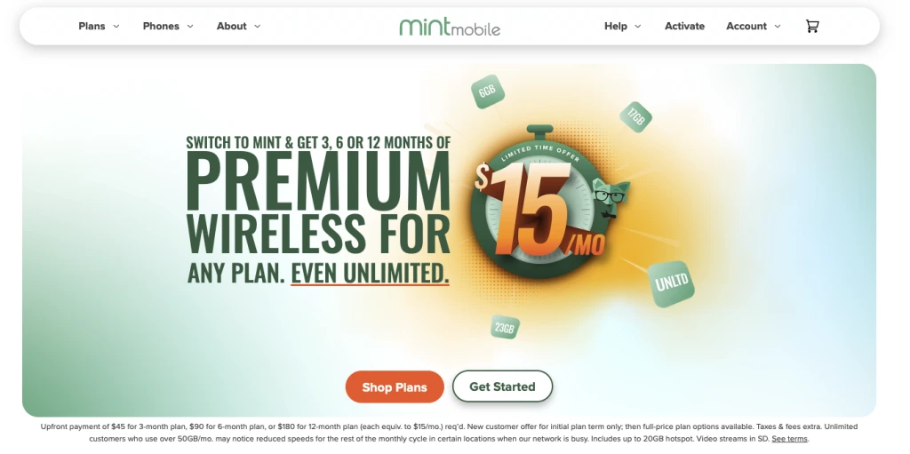
Mint Mobile puts two clear CTAs underneath its main offer: “Shop Plans” and “Get Started.”
“Shop Plans” works for visitors who are still comparing what’s available. “Get Started” serves someone who is ready to move further into the buying process.
The site also uses “Let’s Go,” but in a more specific context: checking mobile coverage after entering a ZIP code. This shows why CTA copy needs to be judged alongside the action it triggers, not in isolation.
15. Adobe
CTA: Try AI Assistant
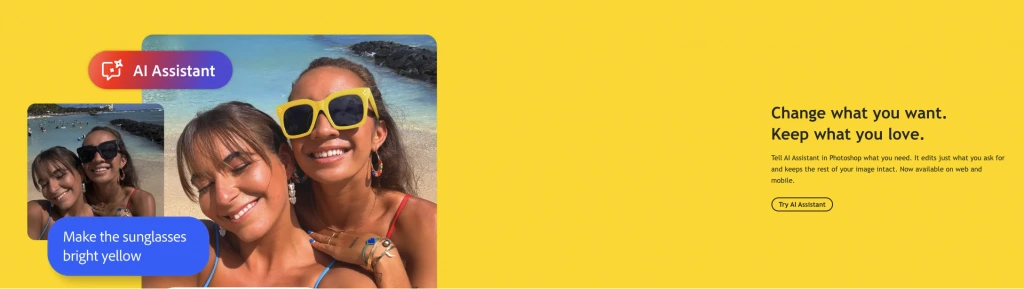
Adobe ties its CTA directly to a specific Photoshop feature.
The page explains that Photoshop AI Assistant lets users tell the tool what to change while leaving the rest of the image intact, then immediately offers “Try AI Assistant.”
The CTA works because the visitor has just been shown a specific capability. The button gives them a direct route from understanding the feature to trying it.
16. Hulu
CTA: Get All Three & Learn More
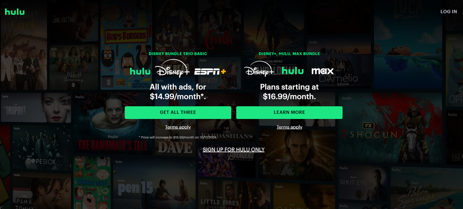
Although Hulu technically breaks the rules of CTA best practices, they’ve cleverly disguised the fact that they have three CTAs. Sure, having only one action per page reduces distraction and makes things clearer for the visitor.
But if you’re selling various bundles and know you have multiple audiences (in various stages of the customer journey), why not cater to both?
Hulu highlights the two CTAs they’d like potential customers to click on: “Get All Three” and “Learn More.” By highlighting these CTAs in a high-contrast color button, they’re directing the viewers’ eye to these bundle packages, ultimately, pushing higher sales.
Just below is the single “Sign Up For Hulu” option. Because this isn’t highlighted, it’s less likely that it’ll be the first CTA a user would click. Nevertheless, the option is still on the homepage, giving customers the option if that’s what they’re looking for.
17. Loom
CTA: Get Loom for free
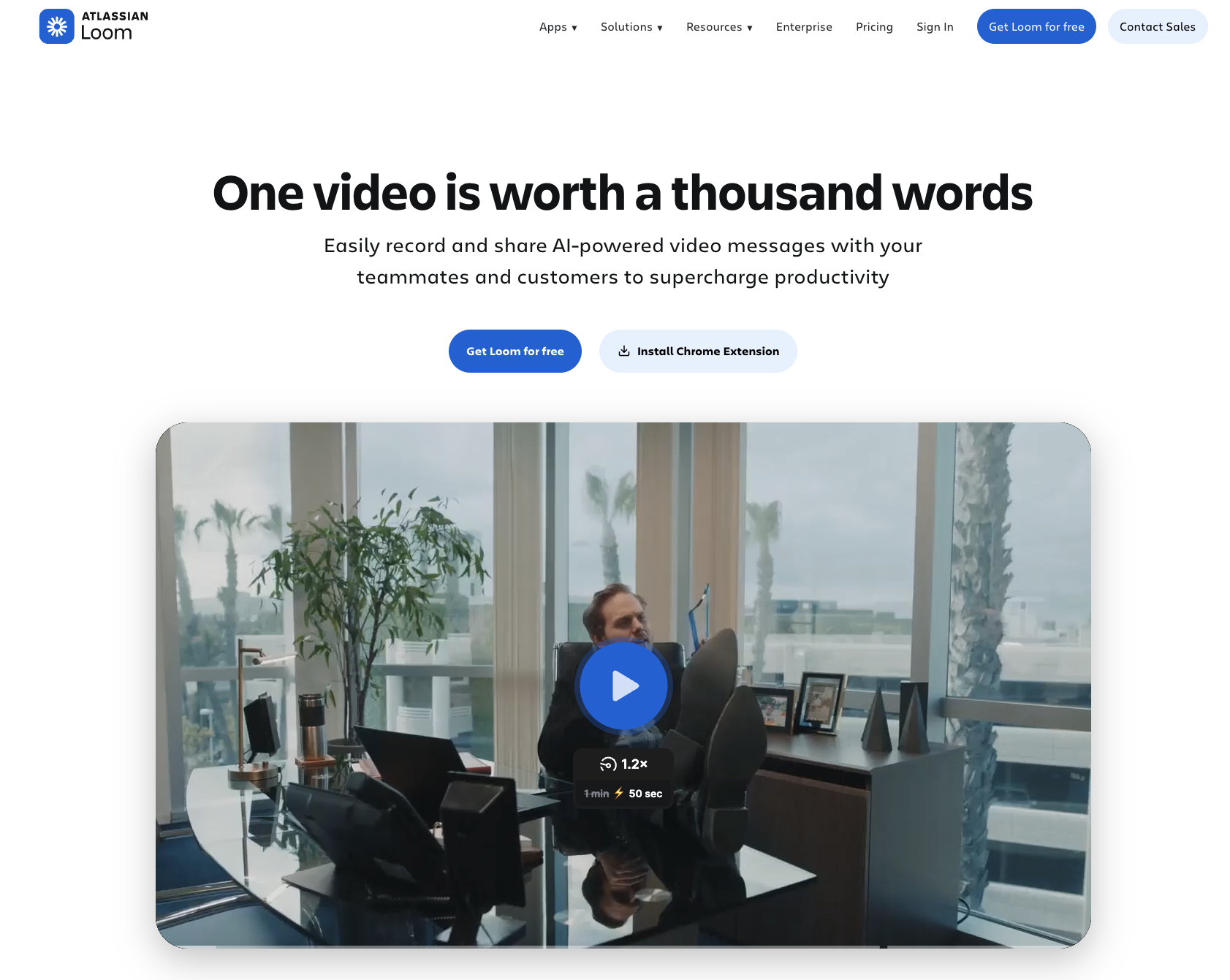
Loom uses one of the clearest product-led CTAs in this list.
“Get Loom for free” tells visitors exactly what they’re getting and removes uncertainty around price at the same time. It appears directly underneath messaging about recording and sharing video messages with teammates and customers.
It’s more useful than a generic “Get Started” because it names the product and the lack of upfront cost in one short phrase.
18. Grammarly
CTA: Sign Up It’s Free
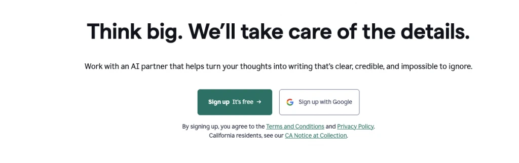
Grammarly puts the product and the main objection in the same CTA.
“Sign up It’s free” removes uncertainty around cost. The same wording appears across Grammarly’s current product pages.
It works because the CTA doesn’t just ask for an action. It gives the visitor a reason that action feels low-risk.
19. Spotify
CTA: Try 3 Months for $0
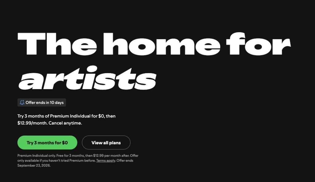
Spotify combines a specific promotional CTA with a lower-commitment comparison option.
Its current French Premium page leads with “Try 3 months for €0″ alongside “View all plans” The offer is explicitly time-limited and followed by the regular monthly price.
The first CTA is built for visitors ready to try Premium now. The second is for people who want to compare plans before deciding.
That makes the pair more useful than two buttons that lead to roughly the same place.
20. Semrush
CTA: Try free for 7 days / Get a demo
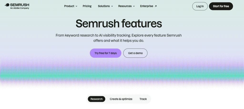
“Try free for 7 days” gives visitors a self-serve route into the product with the trial length stated directly in the button. “Get a demo” gives buyers who want more guidance a sales-assisted option.
The pair works because each CTA answers a different need. One reduces friction by making the free trial explicit; the other gives higher-intent or more complex buyers a direct path to a conversation.
The surrounding copy also makes the context clear: visitors are exploring Semrush’s features, from keyword research to AI visibility tracking, so both next steps make sense at that point in the journey.
21. Zara
CTA: Go
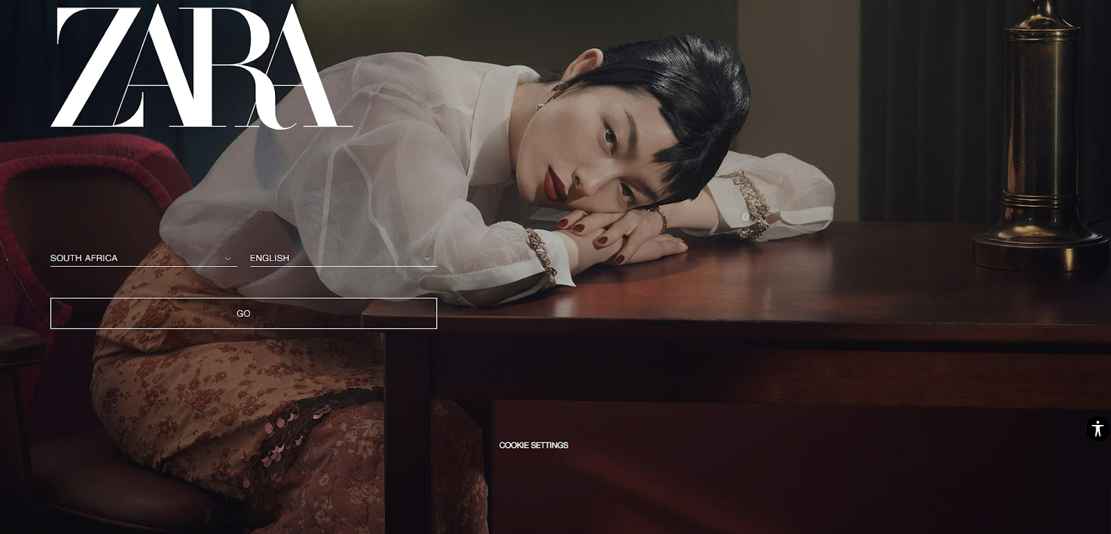
Zara is an excellent example of how a clean web design can be unforgiving of a low-contrast CTA button. The user is called to take three actions: enter the location, and language, and then just below is the CTA “Go,” which we could assume is a shorter version of “Let’s Go.” Although it isn’t literally telling you what will happen once clicking the CTA, Zara is such a well-known brand that if you end up on their site, you know you’re there to shop.
In this instance, the CTA is somewhat exhilarating, which kind of relates to the shoppers’ high some get when doing retail therapy. However, this would be ineffective if the user lands on a relatively new brand or startup site that doesn’t explicitly communicate what service or product they provide or uses supporting text to indicate what will happen after clicking the CTA.
22. Hinge
CTA: No CTA/Difficult to find

Compared to its competitors Hinge has taken a bold risk with no CTA at all, or so it seemed. Upon entering the site, users will either hover their cursor all over the homepage in confusion, looking for the sign up or download CTA, or be forced to scroll in search of it. We did both.
The only CTAs on the homepage are “How We Do It” and “Join us.” After spending a fair amount of time searching for the ”download” button, I eventually clicked the first CTA, as the second was for those looking to work for the brand.
After endlessly scrolling through pretentious slogans and captions, core values, explanations, differentiators, and a slider deck going even more in-depth about their approach to online dating, I eventually found the download CTA button.
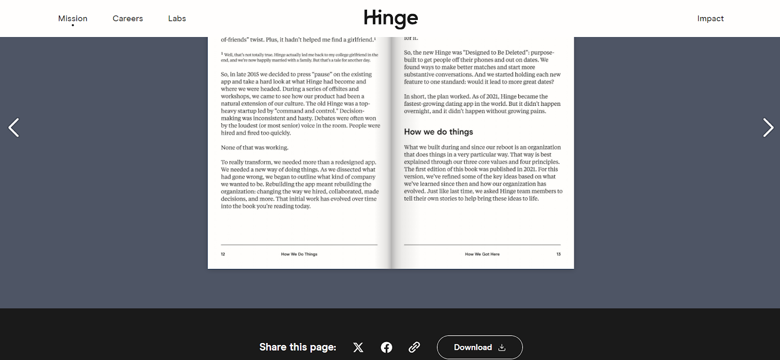
Needless to say, this is probably the most ineffective CTA technique if your goal is to get potential customers to download an app. Customers should never be forced into a game of hide-and-seek or to sit through a one-hour hypothesis on the science of dating when all they want to do is download the app.
FAQs about calls to action
What is a call to action?
A call to action is a prompt that tells someone what to do next, such as starting a trial, buying a product, booking a demo, downloading content, or joining an email list.
What makes a good call to action?
A good CTA makes the next step clear and matches the visitor’s intent. Specific wording such as “Start free trial” or “Get a demo” usually communicates more than vague alternatives such as “Continue” or “Submit.”
Should a page have only one CTA?
Not always. Focused landing pages usually benefit from one primary action, but homepages and product pages can serve several visitor intents. Multiple CTAs work best when each one has a clearly different purpose and visual hierarchy.
What are common call to action examples?
Common CTAs include “Buy Now,” “Add to Cart,” “Start Free Trial,” “Get a Demo,” “Sign Up Free,” “Download,” “Contact Sales,” and “Shop Plans.” The best wording depends on what happens after the click.
Should CTA buttons say “Learn More”?
They can, but more specific wording is often more informative. If the next page contains pricing, use “See pricing.” If visitors will start a trial, “Start free trial” makes the outcome clearer.
How should you test a CTA?
Start with a hypothesis based on research rather than changing button copy at random. Test whether the wording, placement, supporting copy, or number of actions is creating friction, then measure the effect on the conversion that matters.
Next steps: turn CTA examples into better experiments
The strongest examples in this article have one thing in common: the CTA makes sense in the context around it.
“Start building for free” works because Unbounce removes uncertainty around cost. “Contact sales” works because Zoom gives higher-intent buyers a separate path. “Get Your Free Marketing Plan” works because KlientBoost tells visitors exactly what they’ll receive.
Don’t copy the wording. Use the examples to ask better questions about your own page:
- Is the next action obvious?
- Does the CTA match what the visitor wants at that point?
- Is there enough context around the button to make the decision?
- Are multiple CTAs helping different visitors or just creating distraction?
- Is the CTA actually the problem, or is something earlier in the experience causing friction?
If the answer isn’t clear, start with research rather than another round of button-copy guesses.
For the next step, these CXL resources go deeper:
- Build the surrounding page: How to Build a High-Converting Landing Page — structure, messaging, CTA placement, social proof, and page hierarchy. Read the landing page guide
- Find the real conversion problems: Conversion Research — CXL’s framework for combining quantitative and qualitative research into testable hypotheses. Explore CXL’s conversion research framework
- Test changes properly: What Is A/B Testing? — research, prioritization, experiment design, analysis, and statistics. Read the A/B testing guide
The CTA is important, but it is the final instruction in a much larger decision process. Improve the context, make the next step clear, and test changes because the evidence gives you a reason to—not because the button is easy to edit.
Related Posts
-

Should you say 'read more' or 'product information' in your product category view? Which is…
-

Wingify says 30% of all A/B tests run by their customers are CTA button tests. But…
-

In today's review I'm assessing whether websites in question could do anything to better get…
-
According to a study, 71% of website visitors complete their purchases offline. Online, we have…

Great read. It’s definitely one of thet first things that comes to mind when testing. A well placed call to action with great content to help the flow of a user is always on my mind.
This trading strategy ebook promotional email campaign has an excellent call to action. Instead of the usual “i want this” or “download now!”. It captured audiences with it’s awesome “GO LONG!” button CTA text.
http://mailchi.mp/1cfa67b346af/use-simple-price-correlation-to-know-stock-prices-before-us-markets-open-47807
I liked it since its relevant to the content of the ebook (Use correlated price movement in international stocks and U.S. ADRs to predict stock prices accurately before markets open.) and it’s audience, which is primarily stock market traders and enthusiasts. Find it here: https://gumroad.com/l/titan0346
This is a really great article, Alex.
One question: you mentioned you’ve seen CTAs like “See Selection” outperform the more generic/familiar CTAs. Did you guys at ConversionXL publish a study on this? I tried searching the site and couldn’t dig anything up.
Thanks for your time :)