Guest post by Pratik Dholakiya.
Long-form landing pages (500+ words of copy) tend to convert better for high-consideration, high-price, or complex offers, while short-form landing pages (under 100–150 words) tend to convert better for simple, low-commitment, or intuitively understood offers. Neither format is universally “best”: the right length depends on the product being sold and on whether the visitor reading the page wants more information before deciding or less.
If you practice CRO, you already know that the debate over small versus long landing pages misses the point. Different products need different landing pages. A beautiful picture and a short description might work for a wrist watch…not so much for a $2,000 software product.
Long and short landing pages both have their time and place, but what if it came down to more than the product? What if it also came down to the person who was looking at the page?
TL;DR
- Long-form and short-form landing pages both convert. The right choice depends on the product, the price point, and the person looking at the page, not on a universal best practice.
- Audiences split into “explanation fiends” (convert better with more information) and “explanation foes” (convert better with less).
- Short landing pages fail when they are superficial for their audience, not because they are short. The same applies in reverse for long-form pages.
- Segment traffic by source, ad copy, keyword, or behavioural data to work out which version to serve which visitor, then test.
- Copy length has a measurable effect within some industries: pages under 100 words have converted up to 50% better than pages over 500 words in certain categories, though this varies by audience and offer.
Table of contents
Is a long-form or short-form landing page better for conversions?
Neither format wins outright. It depends on the product being sold and on which type of visitor is reading the page.
It’s no secret that lengthy landing pages can convert quite well, and sometimes much better than their shorter counterparts. Current landing pages still use both approaches. In Unbounce’s roundup, LinkedIn Premium uses a longer landing page with jump links that let visitors move directly to the sections they care about, while Calm keeps its landing page short and direct to avoid overwhelming visitors with unnecessary information.
Page length is not the variable to optimize in isolation. The useful question is whether the page gives people enough information to make the decision without adding unnecessary friction.
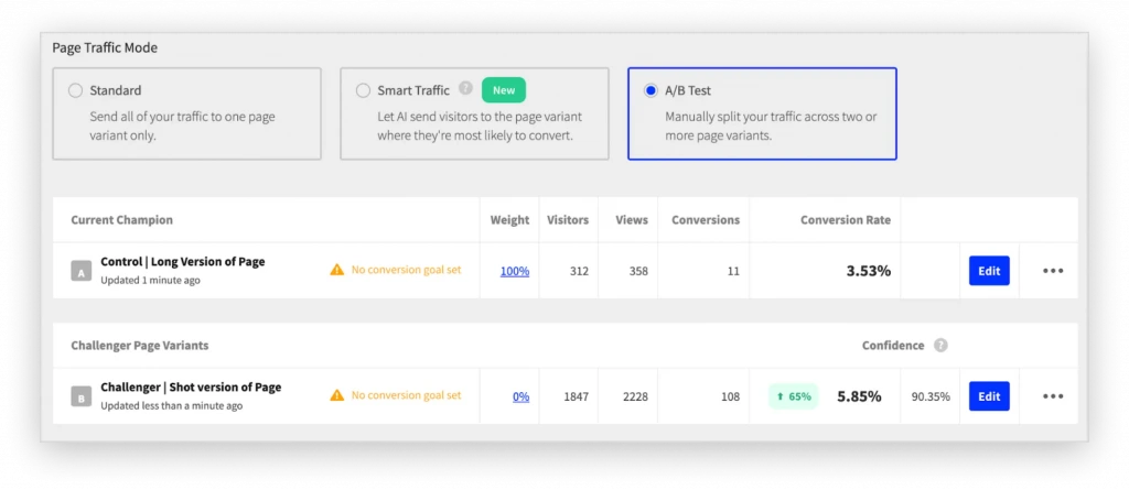
And shorter can perform significantly better when visitors don’t need more information. In one B2B SaaS test, cybersecurity platform Flare pitted its existing long-form “Book a Demo” page against a stripped-down version with shorter copy and fewer sections. The shorter page increased demo bookings by 65%, lifting the conversion rate from 3.53% to 5.85%.
A more useful way to think about landing-page length is the size of the decision being asked of the visitor. A low-barrier conversion can often be explained with relatively little content. High-stakes purchases need more room because visitors have more questions, objections, and uncertainty to resolve.
Long-form sales pages are therefore most useful when prospects need comprehensive information before they can make the decision confidently. Shorter pages make more sense when the offer and next step require substantially less explanation.
What are ‘explanation fiends’ and ‘explanation foes’?
Explanation fiends convert better with more product information, while explanation foes convert better with less, according to Brown University research.
The reason for this difference is that the consumers used two different thought patterns. Those who were more likely to buy with more information were less intuitive thinkers. They were better at choosing the correct answer on a multiple choice test where the wrong answers were more intuitive. The opposite was true for the “explanation foes.”
The study also discovered why these differences occurred. For both kinds of people, they were most likely to buy when they thought they knew the most about the product. It’s just that the more intuitive thinkers thought they understood the product much earlier on. After being presented with more information, they began to realize they didn’t understand the product as well as they thought they had, and they lowered their offering prices.
The researchers demonstrated this by asking half of the participants a question. When “explanation foes” were asked to explain a product after reading the short product description, they realized they didn’t know very much about it, and lowered their prices. In contrast, the “explanation fiends” didn’t change their prices when they were asked to explain the product.
This is why long form landing pages are a double edged sword. For some people, they provide them the information they need to feel confident about their purchase. For others, they actually help people to realize they don’t understand the product as well as they thought they did, and sway they away from a purchase.
What’s a marketer to do about this conflict?
How do you target the right landing page length to the right audience?
Segment traffic by source, ad copy, content interest, behavioural data, or keyword, then test which segments respond to a longer or shorter page.
To increase overall leads, you may want to test segments of your audience in order to determine which of them are more likely to respond to a short landing page, and which are more likely to respond to a long landing page. For example:
- Test traffic source: Social media referrals may be more likely to respond to a short landing page than search engine referrals (or vice versa), for example.
- Test ad copy: Different kinds of ads may attract different kinds of visitors. An ad that appeals to more intellectual motivations may be more likely to attract “explanation fiends” than an ad which appeals to gut instincts and emotions.
- Content interests: Among existing audience members, you may want to test segmenting them by their content interests and statistics. Those who tend to click on more instinctual than intellectual email headlines may be “explanation foes” more often than not.
- Behavioral data: If you have access to the behavioral data of your existing audience, you may discover that visitors who spend less time on your site will be more persuaded by short landing pages than by lengthy ones.
- Keyword: Whether you’re targeting specific keywords with SEO or PPC, there’s a good chance that some keywords will be searched for more often by “explanation fiends” and others more often by “explanation foes.” While I wouldn’t advise testing every possible combination of these, it’s worth testing at least a few keywords that are likely to indicate a difference.
Rather than assuming that a particular audience wants a long or short page, use actual visitor behavior to test the amount of content they need. Scroll and heatmap data can show where visitors stop engaging with a page and whether important content is sitting below the point where most people lose interest.
Use that evidence to test changes to page length rather than working from a fixed long-form or short-form rule.
Remember: there is more than one type of visitor. Some types of visitors will be more persuaded by a simple page, and others will only be persuaded after learning as much as possible about the product. You can’t maximize your conversions with a single landing page. You need various landing pages, all of them uniquely suited to their targeted audiences, and the length of the ideal landing page is going to be different for all of them.
Why isn’t a short landing page automatically superficial?
A short page only fails when it omits information its specific audience actually needs, not because of its length alone. It’s important to understand that a short sales page can convert, but a “superficial” one cannot. What do I mean by this?
In the Brown University discussed above, we discovered a common thread that all users shared: they were most likely to purchase when they felt that they understood the product the best. The difference is that the people who preferred short landing pages were intuitive thinkers. The added complexity of additional intellectual knowledge was, to them, superficial, and even confusing.
Another example is from Unbounce and its edX example: “In our testing, shorter copy worked better than longer copy.” The featured landing page converted at 52.68%. This directly supports the argument that shorter copy can outperform additional explanation for straightforward offers.
Additionally, Nielsen Norman Group’s UX research says short-form copy is appropriate when one main idea needs to be communicated quickly, but warns against defaulting to short copy when the subject’s complexity requires more information.
What Went Wrong?
A quick analysis makes it clear why. The shorter landing page tells a simple story of a customer who is satisfied and smiling about the product, and adds a few simple actionable reasons to use the product. This is what an “explanation foe” is looking for. They want a simple and intuitive understanding of what the product is going to do for them, and how they’re going to feel after buying it.
The additional information, in contrast, isn’t nearly enough to satisfy an “explanation fiend” who would probably want to see screenshots and in depth discussion about how the product works.
At the same time, the larger page ruins the emotional connection that an “explanation foe” would have with the story in the shorter page. It throws additional testimonials and statistics into the mix, and adds more reasons to buy it, but these only complicate the overall message.
For a short landing page to be successful, it must be designed to appeal to the type of consumer who can be persuaded by it. These types of consumers aren’t looking for a list of objective reasons to buy the product. These are intuitive thinkers, and you must appeal to them on an intuitive level, with images, emotions, stories, and gut instincts.
In other words, to an “explanation foe,” lengthy landing pages with detailed knowledge are superficial, while short pages with emotional messages are superficial to “explanation fiends.” Neither is inherently superficial, as long as it’s intentionally created for the intended audience.
How do you make a long-form landing page convert?
Long-form pages work when every added section removes a specific anxiety or objection, not when they simply add more content.
By now it should be clear that the purpose of a long form landing page is to make sure that the visitor feels as informed as possible about the product so that they can feel justified in opening up their wallet.
This doesn’t mean that “explanation fiends” won’t be persuaded by stories or emotional and instinctual images and copy, but the science does strongly suggest that most of them won’t convert unless they also feel like they understand the product itself in depth.
This is the crucial thing to understand about long form landing pages: they are there to eliminate anxieties and confront objections with concrete information.
This becomes especially important as the price or commitment increases. In an analysis of high-AOV landing pages, Convert found that successful brands were not trying to keep every page as short as possible. Instead, they gave visitors ways to dig into the information required to make a higher-risk purchase.
LIV Watches, for example, combines large product visuals with detailed technical information for visitors who need greater depth before committing.
This is the key that separates blind split testing from successful CRO.
Finally, one of the reasons so many designers hate long form landing pages is the fact that they are so closely associated with ugly, scammy microsites. But the truth of the matter is, there’s no reason long form sales pages have to look that way, or evoke those feelings.
Long-form also no longer means presenting visitors with an uninterrupted wall of sales copy. Modern pages can provide substantial information while breaking it into distinct sections that visitors can work through as much or as little as they need.
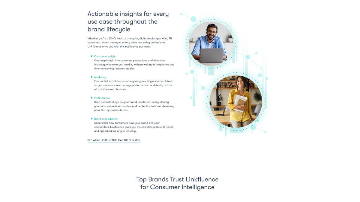
Conversion Sciences provides one example: its long-form landing page distributes the offer across multiple sections rather than forcing the conversion argument into a single block of copy.
Designing for Both Users
As much as we’d like to perfectly segment our audience so that only those who want a short page will land on a short page, and only those who want a long page will end up on a long one. Unfortunately, this isn’t how the world works. For every landing page we design, we have to keep in mind that some users think more intuitively and are more motivated with less information, while other users want as much product information as possible.
One of the smartest ways conversion rate optimizers seem to be tackling this issue is by placing videos on their long sales pages.
There is a strong possibility that these videos improve conversions by appealing to the more intuitive thinkers in the audience, who don’t necessarily feel the need to read everything. Keep this in mind while you are producing your videos.
Of course, lengthy landing pages can appeal to more intuitive visitors by following well known industry practices:
- Plenty of relevant images
- A visual design that conforms to expectations while still being novel enough to stand out
- A heavy helping of subheadings and bulleted lists where they make sense
- Loads of whitespace
- Directional cue that draw scanners to the most relevant parts of the page
Additionally, there are rarely any circumstances where you shouldn’t put a call to action above the fold, even if there is additional copy and another call to action at the bottom of the page.
Designers can also appeal to both user-types by designing short landing pages, but including easily accessible, obvious product pages with all the information an “explanation fiend” will want to see before making a purchase. This fits well with “putting the user in control” after all, a basic tenet of design for usability.
FAQ
Is a long-form or short-form landing page better for conversions?
Neither wins by default. Performance depends on the product’s price and complexity and on whether the audience segment prefers detailed information or a quick, intuitive decision.
What is an “explanation fiend”?
An explanation fiend is a visitor who becomes more likely to buy the more they learn about a product, typically a more analytical, less intuitive thinker.
What is an “explanation foe”?
An explanation foe is a visitor who becomes less willing to buy after reading more detail, typically an intuitive thinker who decides based on feeling rather than analysis.
Does a short landing page mean a superficial landing page?
No. A short page is only superficial if it strips out information that its specific audience needs; a well-targeted short page fully serves an explanation foe’s decision-making style.
Does shorter landing page copy always convert better?
No. Shorter copy converts better in some industries and for some offers, such as Business Services and Credit & Lending, but longer copy outperforms for complex or high-consideration purchases where visitors need more information to decide.
How do I decide whether to build a long-form or short-form page for my product?
Segment your traffic by source, ad copy, keyword, or behavioural data, then test a long and a short version against each segment rather than picking one length for the whole audience.
Does landing page length affect SEO?
Length itself is not a ranking factor; length only matters for SEO to the extent it changes on-page engagement signals and content depth relevant to the query.
Conclusion
If you’re in this business to make sales, you need to recognize that two fundamentally different kinds of users are visiting your site. Without targeted landing pages, testing, and an understanding of both of them, you will lose sales from visitors who would love to buy your products.
Getting landing page length right isn’t about blindly choosing long or short, it’s about giving visitors the right amount of information to make a decision. CXL’s Landing Page Optimization course teaches you how to use research, behavioral principles, and testing to build landing pages that match visitor intent and convert more effectively.
At CXL, we’ve also launched our new AI-Native Marketer Program to help marketers integrate AI into their everyday workflows. You’ll learn practical frameworks for creating, optimizing, and shipping high-converting landing pages faster, automating repetitive tasks, and using AI to make better marketing decisions without sacrificing quality.
Related Posts
-

If you're selling in a competitive market, you must live & die by the little things…
-

Which is better? Having a long home page with lots of copy, or a short…
-

Knowing how to write a sales page comes down to two jobs: sales page copywriting…
-

Don't design your own website. No, really. It will suck. You might think that since…




Amazing explanations. Thank you,Pratik!
Thanks, Chelsea. Glad you liked the post.
Nice. Detailed explanation with examples and research to back it up… actionable content. Very well done, useful and to the point. Time to adjust some campaigns!
Glad to hear that, Mark. Let me know how things work out for you.
this is an application of the principle write until you feel it’s enough. a sales page doesn’t have to be in certain length just what’s enough to send the desired message and get the action required.
Very actionable Tips. Prateek.
All in all testing is the key. Keep changing landing pages and monitoring the behaviours very closely is the key to success.
More than the length what is important is to cover all the important details in a landing page and not adding unnecessary details to make it longer just because your competitors do that.
Thanks for this detailed post.
Really appreciate you sharing this.
Very well written article…appears you backed it up with great data and analytics…there is such a fine line of what works, and what doesn’t…in a very difficult field of email marketing.
Great article
How about a big header saying “Need more information?” or “Got more questions” or “Need further explaining?” and this reveals all the extra stuff (like the 37S long form)
T
I am in the process of converting several long-form landing pages that are chalk full of scrolling text. Less is more. Keep it simple.
“How users read on the web:
They don’t”
-Jakob Nielsen
Hey Pratik! Thank you for this article – I’ve read it with pleasure :) If you’d like to take a look at ours insights to the optimal length of a landing page – here’s a link:
http://www.mavenec.com/blog/landing-page-copy-optimal-length/