Which is better? Having a long home page with lots of copy, or a short one?
The correct answer is of course ‘it depends’, but I’m going to show you 4 cases where short home page kicked long home page butt.
Case #1: Moto Message
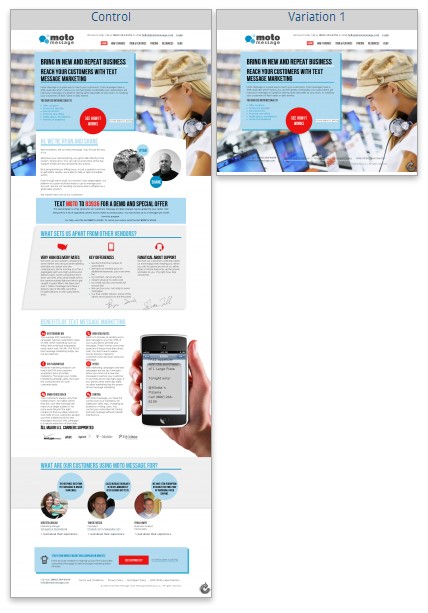
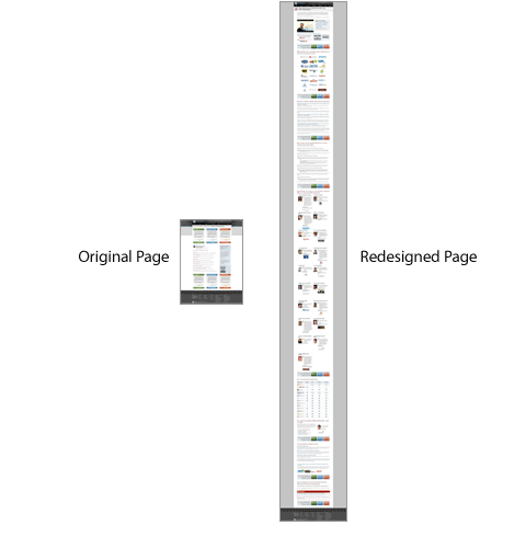
We initially built a long home page for Moto Message, addressing all the key issues that came out from our user research. The very first A/B test we launched was to test it out against a much shorter version.
Our goal here was to get more people to take a tour of their service (text message marketing software) and get to the pricing page.
Results:
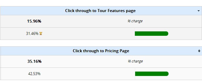
With the shorter version, 97% more people went to their Tour & Features page and 21% more people landed on their pricing page.
Case #2: DesignBoost
DesignBoost is like Codeschool for designers. They have online courses that teach you to design kickass mobile apps, landing pages and more in Photoshop.
The primary goal for the home page is to get more people to sign up for their free design course, so they would get a taste of what DesignBoost offers. Secondary goal is a clickthrough to the Courses page, so people would find a course of interest.
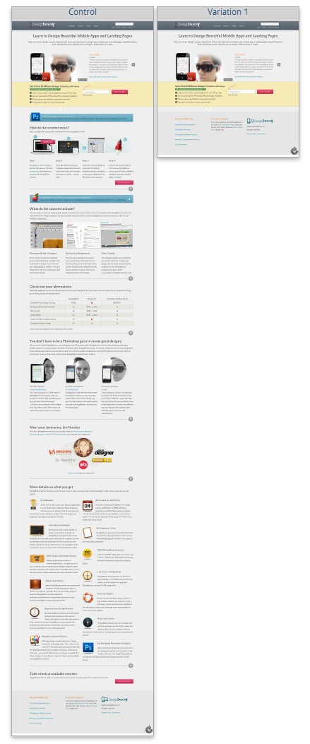
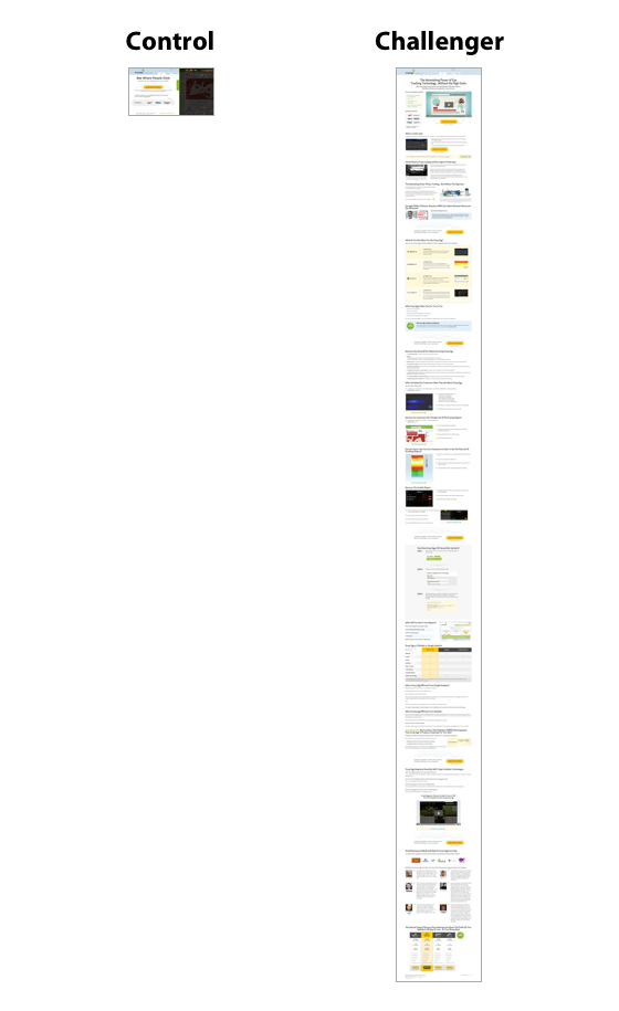
We ran a very long and thorough version against a minimal version:
Results:
13% more email signups (every bit helps) and 25% more people checking out their courses. I call that a win.
Case #3: Pipedrive
Pipedrive is a sales pipeline management tool, a kind of a CRM.
After their investors recommended making the homepage shorter, and they (at first) begrudgingly ran the test, Pipedrive achieved a 300% increase in signups:
This is what their CEO Timo said about this:
We confused people with loads of content and provided several call to actions, e.g. sign up, choose a package, read about features or see a live demo. We then put most of the text from the front page to other pages. We removed as many hurdles from the registering path as we could, even the package selection page had to go. We figured that if people like the product they can be bothered with settings and details later.
Case #4: CXL
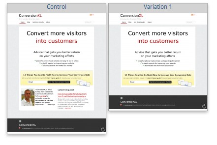
I run tests on my own blog all the time. Recently I ran a test where I ran my already short home page against even shorter one:
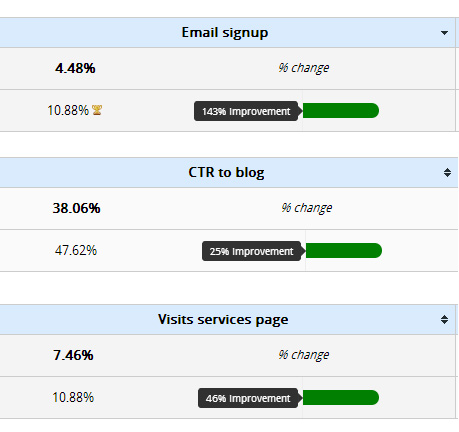
I didn’t expect much since the difference was tiny – the longer version had my handsome face + intro text + latest blog post excerpt. These were the results:
This blew my mind. Almost 2,5x more email subscriptions just because I removed two blocks of information? Wow. Not that just, also 25% more clickthroughs to my blog and 45% more people checked out my services – #winning!
Why is that
No-one can tell for sure, but my hypothesis is that due to short attention spans people want to get straight to the point. If there’s a single message and a single primary call to action, it’s far easier to figure out if this is the right things for me, and it’s easier to take action.
The goal of the home page is to get people off the home page – down your sales funnel. And shorter home page seems to do it well.
“But I’ve seen long form pages perform better!”
Of course you have, and so have I. It’s not about the length really, it’s what is the right content for a particular audience.
There’s the famous SEOMoz case study where a longer page helped to achieve a conversion increase of around 170% over four months:
And of course the CrazyEgg case study where updated and much longer version grew its revenue by 510% :
In these cases above, it wasn’t just the page length that was extended – but the right content was served to the target audience, the checkout process was optimized and so on.
When is short home page better?
Also, a major difference between the 4 case studies above and the 2 long ones is that the short pages didn’t ask for money. When you want people to take action that doesn’t cost them dollars (email signups, free trial, clickthrough), short pages perform better in almost every test I run.
If you’re asking for $$$, people need way more information to make a decision and hence a long form page might be a more suitable option. In the end, it depends on the goal of your home page.
The copy matrix
Bob Kemper, Director of Sciences, MECLABS, has created a simple matrix to help you determine which length of copy is likely to be more effective for your product or service. He has analyzed hundreds of tests in the MarketingExperiments optimization labs, and from that he has discovered a few factors that help determine copy length effectiveness.
Factors affecting the efficacy of body copy length on a landing page:
- Nature of visitor motivation
- Initial level of Anxiety about product/company
- Level of cost/commitment associated with conversion.
According to Bob, short copy performs better when there is low perceived risk, low cost, and low commitment. Also, when the customer has an emotional, impulsive, and “want-oriented” motivation. In other words, if you’re looking to write high-impact copy for concert tickets, designer shoes, or mp3 players…keep it short.
Bob states that long copy is the better performer when there is a rational, analytical, need-oriented motivation. Think consumer insurance products or many complex B2B offerings.
Conclusion
Always, always make 2 versions for your home page – and split test them.
If the short one ends up winning, it’s not a waste. You just take the content of the longer page and make it a separate page. In Designboost and Moto Message case, we created a separate Tour and Why Choose Us pages from the content of the longer home page.
You’ve got to capture people’s interest, and then they might be ready for more information. People always want information to help them decide when they’re comparison shopping or want to make sure a product is right for them. By moving the content onto a separate page and adding it to the menu, you’re giving people an option to read it when they’re ready for it.





Interesting. My strategy is to show the core message and price span on the home page and to change the “shop window” frequently. Maybe I will have to change that. Isn’t there negative impact on google index in case of short home page?
Well you can’t put much text on a short home page, and hence its indeed tougher to rank for a competitive term. The solution would be to make other pages search engine optimized, and use your homepage as a gateway to your sales funnel. No point having a page with tons of traffic and little conversions – that’s a waste.
Hey Peep,
It would be interesting to transpose that matrix from the Bob Kemper, over this prospect-awareness graph, on “when to be specific vs. when to summarize” — http://copyhackers.com/2012/10/when-to-get-specific-vs-when-to-summarize/
Cool post!
This kind of models and graphs are great for coming up with test hypotheses. Random testing is #fail.
peep, love it…this point really hit home to me that I have way too many call to actions on my home page, ie cluttered. It goes hand in hand with your great eye-opening article about slideshows/carousels and why they suck (I always thought they were cool looking too!) Thanks for the informative post….
Thanks Aaron!
I love the idea of testing conversion to see where or how any amount of lift can be secured.
I am wondering however if there is any data to suggest organic traffic increases or decreases to these home pages based on there being less content? I can only balance a higher conversion rate if I don’t get a drop off in traffic.
Definitely less content affects rankings. There are lots of ways to improve conversions, just use other approaches. Tweak by tweak, eventually you’ll get there.
Great article. Very encouraging since I am trying to simplify our homepage. I really like the idea to make it short, clean and to the point.
Great!
From your testing it certainly seems that short home-pages are more effective at converting the visitors that do arrive. However, what I’ve seen is that by having long home-pages containing lots of text, the text gets more deeply indexed by the search engines. The home-page typically starts to appear for many more long tail keywords, so as a result you get an increase in less targetted traffic to the home-page. Typically we have found that increasing the home-page text increases the visits to the website, but with a lower conversion rate, but with a higher number of conversions over all. I imagine “it depends” on a case by case basis. I think over all I agree with your philosophy of keeping it simple. If adding a lot of text, the demarcation between the first fold call to action and the text below should be strong, so as to make it clear to the user what is really important.
Another case for long pages on small business websites. Most of these types of sites don’t have many incoming links, as most of the links will be to the home-page, instead of to other landing pages. 90% of the links coming to the home-page is not usual from what I’ve seen on our sites, as users will simply point to the domain, not an interior page. As such, the home-page by default becomes the most important and linked to page on any small business website. As such, in order to take advantage of the page authority, to have lots of text on the home-page, so this text gets indexed for relevant keywords.
Perhaps another case of search engine versus human user.
this is tricky.. !
ultimately its the product itself that would make a difference..
anyways.. great case study.. as always..
Great article Peep.
How would you go about split testing a blog homepage where you have constantly changing posts? Would you split test a footer pop-up similar to the one you have below?
Cheers! Loz
What do you mean exactly, what to test or? Dynamic, changing content makes no difference
Great post Peep. Thanks :-)
Thanks for sharing this valuable data Peep! Could you explain your process of doing A/B test on home page?
Do you create 2 versions (www.yourpage.com vs. http://www.yourcompage.com/homepage2/)? and then later on do a 301 redirect of page B to the homepage (in case some people link to page B) after the test have been concluded? Or do you use A/B testing software like Visual Optimizer or Optimizely.
Thanks!
Hey
You should always, always use a split testing software (I use VWO, but Optimizely or Google Content Experiments are fine too) to get accurate results and save yourself a major hassle.
The traffic should be split between versions equally during the same time period. If you want to test by showing version A during week 1 and version B during week 2, you’ll get INACCURATE data. The test needs to be performed with identical traffic.
That being said, sometimes I use split URL testing (50% of traffic sent to url A, 50% to url B), sometimes testing different elements on the same page (VWO and Optimizely let you edit on page – you can change, add or remove elements).
Very interesting results.
What I find intriguing about the first test is that in the higher converting version, when people went to the Tour/Features page they presumably encountered more copy, probably even the same copy that was on the long version.
In which case it may be more about how the information is presented rather than how long or short it is.
Actually the copy was different, there was always a distinct Tour page. We created a new “Why” page from the content of the long home page
The results may be true, but you should also check how much traffic is coming to the page because of the content. Long Pages may be much more effective to attract traffic as the search spiders crawl the content.
Yeah, this post was about conversions
After reading (and examining in much detail) case studies from Conversion Rate Experts I would say that their approach was detailed and methodical. Money couldn’t have to do much with it, rather user-objections and questions they have in the signup process. I would like to see that much details for the test you showed here. But, as with everything CRO, it depends from case to case. Great post anyway. Thanks for sharing it!
Hey Peep,
I stumbled upon this post a few weeks ago and I thought cool, I’ll use these examples along with one’s where longer pages converted better to show to a client that we can’t just follow what others do all the time, we need to test ourselves!
However I went to look at the DesignBoost site and they’ve now gone back to a longer page http://www.designboost.net/ and I wondered why…
The common theme among these examples is that I think the metric used to measure ‘conversions’ is flawed.
For DesignBoost they may have got more free sign-ups but perhaps it didn’t help conversions to the products where they make money? Hence why they went back to a longer page, I don’t know
I believe that any change in the funnel should be measured all the way to the end of the funnel. The end of the funnel should be a point where the site delivers to the businesses core objectives. For DesignBoost this should be revenue or even better profit.
Thoughts?
DesignBoost: we’re running an experiment to use the home page as a long form sales page to sell bundles.
Never stop experimenting!