The home page of your website is the most important page. When you look at the traffic statistics of pretty much any website, the home page gets more traffic than any other page. Your home page also has the best chance to rank high in the search engines since most people link to your home page (as do your internal pages). So better make it good.
Here’s how to go about designing a home page that converts.
This is the process I’m using when evaluating or designing home pages.
- Map out buyer personas
- Craft a value proposition
- Build a connection
- Use proper visuals
- Define most wanted action
- Create call to action
- Write user oriented copy
- Add trust elements
- Test length
- Check load speed
I’ll touch upon all of these points below.
Table of contents
Let’s start with the obvious stuff
Logo
People expect to see your logo in the top left corner. Clicking on the logo takes you to the home page from every internal page. Don’t mess with it.
You don’t need to hire an expensive logo designer. Text logos are just as good, only with 1% of the cost.
You can create a beautiful logo by using text. Pick a beautiful font and a background color you like – and voilà! A designer from Edicy took just 15 minutes to create this logo for an imaginary company:
Image credit: Tajo Oja
Navigation
People are used to 2 kinds of menus: horizontal and vertical. Don’t innovate here – familiar layouts work best.
Remember people spend most of their time on OTHER websites. People don’t need to see a menu to know where the ‘contact’ link is at – by default they look for it as the last link in a horizontal menu or the bottom link in a vertical one. Ensure they find it there.
Keep it simple and obvious:

All is clear, right? No surprises here.
Now let’s look at a menu gone wrong. Clever innovation? Not! They make you move your mouse onto a number to reveal what link it is. Not many will have the patience:

Footer
People expect to find your contact information in the footer. Make sure it’s there.
Mapping buyer personas
What are buyer personas?
Buyer personas are essentially a specific group of potential customers, an archetypal person whom you want your marketing to reach.
Optimizing your site for buyer personas gets you away from an egotistical point of view and gets you to talk to users about their needs and wants. What people care about are themselves and answers to their problems, which is why buyer personas are so critical for marketing success.
Why use them?
Essentially it’s about knowing who you are selling to, what is their situation, what are they thinking, their needs and hesitations. If you’d know the exact person you’re selling to and the problems they have, you’d be in a much better position to sell them. RightNow Technologies increased their conversions 4x by building a persona focused site.
How to build them?
The truth is that most companies have only the faintest idea what lies behind the buying decision. We presume an awful lot. The buyer persona is a tool that can help you see deeper into the buyer’s thinking.
Use interviews with existing customers to map out different personas. To get more information on this read The Buyer Persona Manifesto (free pdf). Here’s a post on buyer personas I recommend checking out.
When personas fail you
Ideally the value proposition and everything else you present on your home page (and other pages) come from the buyer personas. That being said, some products are better defined by the job they do than the customers they serve.
Here’s Clay Christensen explaining job based marketing:
Value proposition
This is the most important part of your home page. Your value proposition is a concise chunk of text (headline, sub-headline and and maybe a few bullets points) that should address these questions:
- What is this site about?
- What can I do here?
- How is it useful to me?
- Why should I buy from you instead of the competition?
People’s attention span and patience are extremely limited. The world suffers from attention-deficit disorder. If they don’t get the answers from your home page within seconds, they will leave. Nobody will TRY to understand what you’re about nor read long pages of text. If you haven’t captivated them on your home page, you’ve lost them.
There are several ways to craft and present your value proposition.

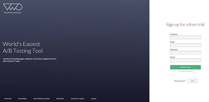
Campaign Monitor:
What I like about this value proposition
- Bold headline – stating what it is and who is it for
- A specific, benefit-oriented paragraph underneath describing the service
- Big visual to support the text
What I’d improve
- Clarify how is it different from the competition

What I like about this value proposition
- Big, clear headline you cannot miss
- A specific, benefit-oriented paragraph underneath describing the service
- Visual to support the text
What I’d improve
- Increase the font size of the descriptive text and remove the company name from it (needless waste of space). I’d make the first sentence user focused like the second one.
- Make the visual more clear, add descriptive arrows and texts perhaps
Dowce.com changed the wording of their headline and added bullet points to improve their value proposition, resulting in 24. 5% improvement in conversions.
Build a connection
Let’s do an exercise. I won’t ask you to write anything down, but make a mental note.
How tall are you? How much do you weigh? Where do you normally walk (city streets, gravel etc)?
Now let’s say I’m selling shoes and you need a pair. You have 2 options. The first pair is designed for everyone. The second one is designed exactly for people your height and weight, and for walking on terrains you normally walk on. The price is the same. Which pair will you buy? No doubt about it, right?
This is why you have to state who your product or service is for, and it has to be true. If you’re trying to sell to everybody, you will lose (unless you have a gazillion dollars to spend). Talking to everybody in your copy works for almost nobody.
Look again at the above example of Campaign Monitor. They have included the target group in their value proposition.

There’s no doubt who this service is designed for, is there?
If your current offering is NOT catered to a specific customer group, I recommend you re-think your strategy.
Most wanted action
Remember paradox of choice: the more choice you give somebody, the easier it is to choose nothing. Choice paralyzes. If you think people will invest time to figure out where to click next, think again.
Thinking is hard, and you should not make your customers think. Instead, clearly indicate the next action you want them to take. In one experiment they changed the home page to focus on a single action, and saw the users doing exactly what they wanted them to do. It works.
Before you can do that, you need to figure out what that action should be!
If you ask for the purchase or sign-up too soon, you will lose them. In most cases it’s a good idea to direct them to reading more about your service or checking out a demo before asking for a commitment (signup, purchase etc).
Making the button bigger is not gonna help – in most cases they just don’t care yet! It’s about focusing on what people really want, in the order that they want it. You don’t ask somebody to marry you on your first date.
Look at the screenshots above, all of them make this mistake (Campaign Monitor does offer View Features button too). People are not ready to commit after just reading a few sentences, so don’t force them. You can of course have a buy/sign-up button, but try making it less prominent and put the focus on a different step.
Try to think of the questions that are going through your customer’s mind while they’re on your homepage and whether the content on the page does a great job of answering them. Guide them to the next logical step in their usage lifecycle.
Joshua Porter makes a good case for burying your signup or buy button, I recommend reading it. One company removed the sign up call to action from the top of the homepage, and sign-ups increased 350%.
Trying the product without signing up
I love how Codecademy is doing this:

They pull you right in and make you use their service without asking for a signup or anything. The friction is usually high for any kind of signup – free or not – and here they have completely eliminated that.
While they do have a “Get Started” button, it only sets focus to the console:

So how do they get people to sign up? After playing around a bit, they offer you to create an account so you could save your work. By this time you’ve toyed around with it and fallen in love.
Call to action
Call to action wording matters a lot. I yet have to see a case study where a wording containing the word ‘buy’ converted the best. In e-commerce, add to cart always kicks buy now‘s butt.
In one split test they changed “Buy SMS Credits” to “View SMS prices”, and saw an uplift in conversions. This change along with minor added trust elements resulted in overall conversion rate improvement of 37.6%.
In another test they achieved a 83.4% improvement after changing the wording of their button from “Play right now!” to “Instant demo!”. Test your call to action.
I recommend making the calls to action benefit-oriented and indicating what happens when they click. Avoid empty words like ‘submit’.
Scrapblog:

Web Copy
Copywriting is super important and a huge topic on it’s own. Here’s one tip.
Most people on your website know what they are looking for in a product or service. If they find something that looks similar to what they want, they will follow it (read more, buy etc).
Consequently, having relevant information with the exact wording your customers would use is very important. Talk to your customers and see what language and exact phrases they’re using when talking about your products. Use it on your website.
When I’m looking for a project management software that has features like task assigning, time tracking and client management built in, those are they keywords I’m after when browsing different sites.
More on copywriting: what the science of persuasion says and 7 tips for effective sales copy.
Above the fold and below the fold
Above the fold is the part of a page that’s visible without scrolling. People do scroll and are not afraid of it, but make sure the most important elements are visible without scrolling:
- Value proposition,
- Some visual,
- Call to action.
Ideally the part above the fold answers the most important questions the visitor has, and the rest is supplemental reading.
How long the part below the fold should be largely depends on your business. Guys over at Pipedrive told me that when they shrunk their home page, their conversions tripled.
Make the contact information visible
Easy to find contact information is one of the key things to making your website more trustworthy. Display your email, phone and live chat options on every page.
LessAccounting saw a 1.8% increase in conversions after placing a phone number on their site. Flowr added a phone number to their site – and also observed a slight increase in conversions.
Leave room for text
Ignoring search engines is not wise. As I mentioned it the beginning, your home page has the best chance among all the pages on your site to rank high in search engines.
This, however, won’t happen unless there is substantial amount of text on the page (500+ words). Use the room below the fold also for SEO – write useful stuff about your products, services and address questions your users have, but make sure the text is optimized.
No text, no ranking.
Visuals
Thousand words and all that. Neuroscience tells us that people “get” images hundreds of times faster than from text (our reptile brain doesn’t even know how to read).
I firmly believe that using images is a powerful way to boost up any value proposition. Imagine this website without the large image:

Blu Homes sells prefab homes, and nobody is going to buy one without seeing it. How many words would you need to describe the picture above? Too many – nobody would read that.
Even if you sell less tangible goods like software, people want to get an idea what it’s like.
Project Bubble gives you an overview of their software via short video. I think video is great for more complex products, because watching a 1:30 minute video is less hassle for the user than reading a whole bunch of text.

Using video can provide an uplift. Dropbox boosted their conversions after adding a video to the home page. Not all the videos are same – video thumbnails can make a huge difference. Yobongo got a 70.9% conversion uplift after changing their video thumbnail.
Read more on how to increase conversions with video and how to boost conversions with images.
Trust and security
People don’t buy from you if they don’t trust you. In addition to showing off your contact information, it’s a good idea to use trust marks to reduce friction.
Here’s what Ice.com put in their footer:

Notice the mention of money-back guarantee, “trusted since 1999” and 2 trust logos.
Don’t ignore load speed
Speed matters. Slow sites cause frustration and make people leave, thus obviously hurting conversions. Speeding up sites increases conversions. Google knows it and has included site speed as one of the ranking factors.
Google’s own nifty Page Speed Online tool is terrific for providing you insights into your site speed and what you can do to make it faster. If you use Google Analytics, their Site Speed report will help you learn which of your pages are underperforming, so you can address this potential barrier to your conversions.
If you’re not terrified by technical discussions, read how to optimize your site with HTTP caching.
It’s never done
Your home page should be living and breathing organism, always evolving. Keep on testing different hypotheses and see what makes the difference. In the end, testing is not just about converting more customers, but learning. Make it your goal to understand why a change made a difference and what can you learn from this that you can apply elsewhere in your business.
Related Posts
-

If you’ve looked at enough SaaS websites, you’ve probably noticed a bit of a theme:…
-

In this post I'm reviewing 5 websites, analyzing their home pages - and mostly their…
-

Which is better? Having a long home page with lots of copy, or a short…
-

Read any copywriting manual or article, and it'll tell you that the headline is the…


Wow ! Peep, I think this is just one of the best post I have ever seen on this subject. You can feel that everything that is said here is just so relevant ! Congratulations !
I am actually trying to “re think” my home page / web page and all this advice is really useful. I would really like to work with you but I am based in France…
Keep going !
Olivier
Great post dude! I was making notes, crafting personas and thinking about how I can redue my home page as I read through. I may be reaching out when ready. Cheers, Tom
Great article. I think i’m gonna change a couple of things on my site.
Very great tips Peep. I am in the process of designing my own homepage and found your advice really great.
Thanks.
an amazing thought through article about creating a homepage. Thanks for sharing!
You have a broken link here: http://blog.hubspot.com/marketing/test/275002/homepage-for-textmagic-homepage-ab-test
FYI, your link ‘70.9% conversion uplift’ is no more valid.