A study by Google had two key findings:
- Users will judge websites as beautiful or not within 1/50th to 1/20th of a second.
- “Visually complex” websites are consistently rated as less beautiful than their simpler counterparts.
Moreover, “highly prototypical” sites—those with layouts commonly associated with sites of their category—that also had a simple website design were rated the most beautiful.
In other words, the study found that the simpler the design, the better.
But why?
In this article, we’ll examine the role of cognitive fluency and visual information processing theory, which play a critical role in simplifying your web design and can lead to more conversions.
We’ll also look at case studies of sites that simplified their design, how it improved their conversion rate, and show you how to simplify your site design.
Table of contents
- What is a “prototypical” website?
- Why does cognitive fluency matter in website design?
- Case study: a simple website design example
- Visual information processing and site complexity
- Why simple design is scientifically easier to process
- Every element communicates subtle information
- “Working memory” and the Holy Grail of conversion
- 7 tips to create a simple website design
- Conclusion
What is a “prototypical” website?
If I said “furniture,” what image pops into your mind? If you’re like 95% of people, you think of a chair. If I ask what color represents “boy,” you think “blue” (and girl, “pink”; car, “sedan”; bird, “robin”; etc.).
Prototypicality is the basic mental image your brain creates to categorize everything you interact with. From furniture to websites, your brain has a template for how things should look and feel.
Online, prototypicality breaks down into smaller categories. You have different but specific mental images for social networks, ecommerce sites, and blogs. If any of those websites lacks something from your mental image, you reject the site on conscious and subconscious levels.
If I said “trendy women’s clothing site” you might envision something like this:
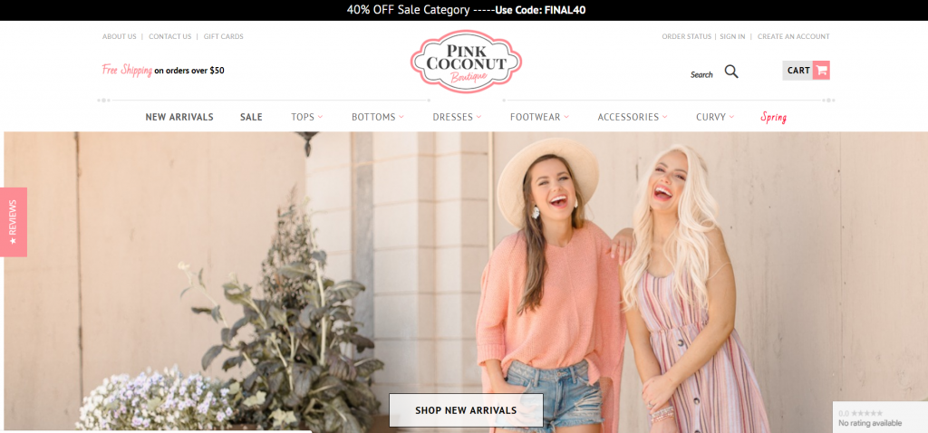
This follows the “online clothing store” prototype so closely that it shares many attributes with wireframes for other online clothing stores, even though they sell to a different demographic.
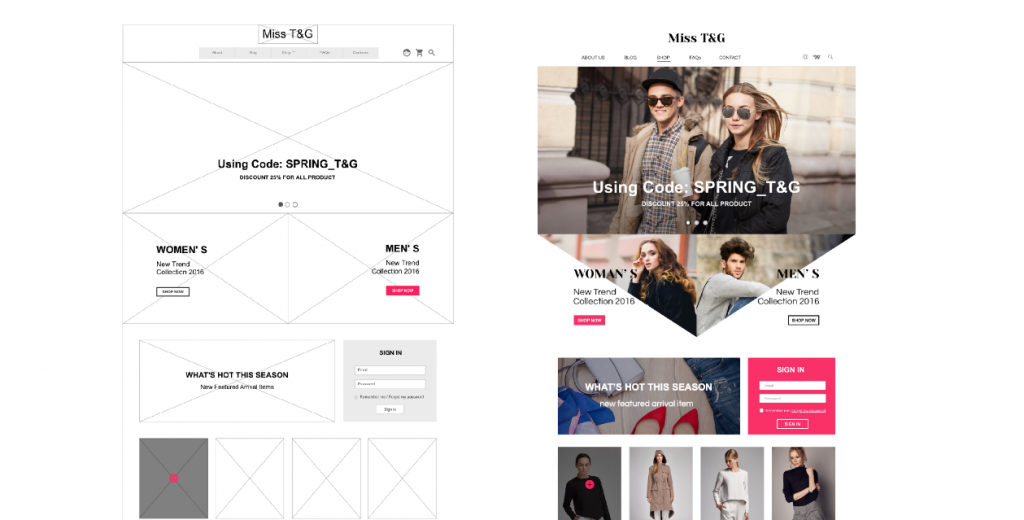
The similarities don’t mean that the sites lack originality or that they “stole” from one other. Instead, they’re playing into your basic expectations of what an ecommerce site should look like.
Why does cognitive fluency matter in website design?
The basic idea behind cognitive fluency is that the brain prefers to think about things that are easy to think about. That’s why you prefer visiting sites where you instinctively know where everything is and the actions you’re supposed to take.
As UXmatters explains it:
Fluency guides our thinking in situations where we have no idea that it is at work, and it affects us in any situation where we weigh information.
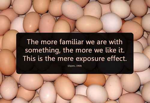
Cognitive fluency stems from another area of behavior known as the “mere exposure effect,” which states that the more you’re exposed to a stimulus, the more you prefer it.
Again, the rules are the same online. It’s “familiar” for blogs to have opt-ins on the right sidebar or for ecommerce sites to feature large, high-resolution images with an attention-grabbing headline and company logo in the top-left of the screen.
If your visitors are conditioned to certain site designs in your category, deviating from them might subconsciously put you in the “less beautiful” category.
This doesn’t mean, however, that you should just “do what everyone else is doing.” While it’s important to know which site design choices are prototypical for your category, it’s more important to find evidence that supports those design choices.
A lot of designers make bad choices. Without doing the research, you could make them, too. For example, many ecommerce sites use automatic image sliders to display products, but study after study shows that automatic sliders tank conversions.
Case study: a simple website design example
A site with a high level of fluency will feel familiar enough that visitors don’t need to waste mental effort finding the right product or button and can instead focus on why they’re on your site.
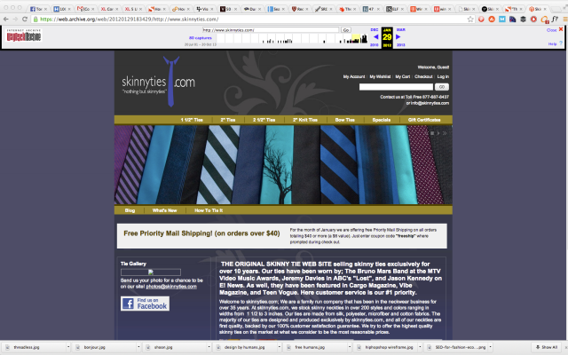
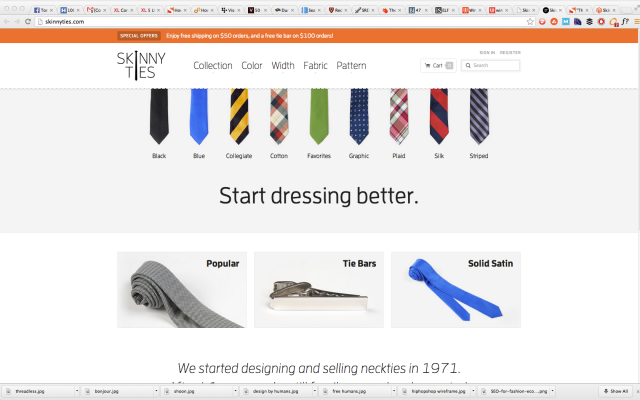
When the experience is dis-fluent however, you feel it immediately. Take online tie retailer, Skinny Ties, which didn’t really look like an ecommerce site until a redesign:
Before:
After:
A few key changes led to huge results:
- Followed prototypical ecommerce layout themes;
- Much more “open” by using whitespace;
- Images feature a single product with high-resolution pictures and contrasting colors.
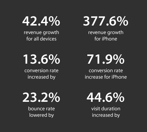
Check out the case study on this particular redesign, as it shows what’s possible when updating a site to “fit” with prototypical standards. After just two-and-a-half weeks, these were their staggering results:
The redesign itself, while pretty, isn’t doing anything groundbreaking. It plays exactly into the expectations of what a modern online clothing retailer should be. It’s “open,” responsive, and has a consistent design language across all product pages.
Visual information processing and site complexity
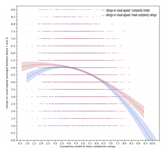
In this joint study by Harvard University, University of Maryland, and University of Colorado, researchers found strong correlations for “aesthetically pleasing” websites among different demographics. For example, participants with PhDs didn’t like highly colorful websites.
Ultimately, no specific, universal design guidelines emerged from the study. The only thing that was universal was that a more visually complex website had less visual appeal.
Why simple design is scientifically easier to process
The reason less “visually complex” websites are considered more beautiful is partly because low-complexity websites don’t require our eyes and brain to work as hard to decode, store, and process information.
Watch this short video about how the eye sends information to the brain to understand what I mean.
Basically, your retina converts visual information from the real world into electrical impulses. Those impulses are then routed through the appropriate photoreceptor cells to transmit color and light information to the brain.
The more color and light variations on the page (i.e. the greater the visual complexity), the more work the eye has to do to send information to the brain.
Researcher Saul McLeod explains that
the eye receives visual information and codes information into electric neural activity which is fed back to the brain where it is “stored” and “coded”. This information can be used by other parts of the brain relating to mental activities such as memory, perception and attention.
Every element communicates subtle information
When designing a website, know that every element—typography, logo, and color selection—communicates subtle information about the brand.
When these elements don’t do their job, the webmaster often compensates by adding unnecessary copy or images, thus adding to the visual complexity of the website and detracting from the overall aesthetic.
Optimizing a page for visual information processing—specifically, simplifying information’s journey from the eye to the brain—is about communicating as much as you can in as few elements as possible.
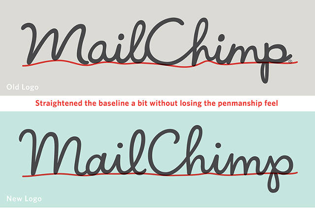
While that’s an article all on its own, consider MailChimp’s logo redesign. When they wanted the brand to “grow up,” they didn’t add the usual “We’ve been doing email since 2001! Three million people trust us! Here’s why we’re awesome! Blah, blah, blah…”
Instead, they tightened up the writing, simplified the website (the top headline simply reads “Send Better Email”) and added an even simpler explainer animation for the core product.
Mailchimp went through another logo redesign in 2018:

What were the guiding principles for the second major redesign? Simplicity was paramount:
The Freddie icon has long been our brand’s primary mark. We’ve simplified it a bit, with tweaks to its shape and fine details to make sure it looks great at any size.
[. . .] Through a process of iteration and refinement, we’ve developed a wordmark that lives in harmony with the Freddie icon to build equity for both.
“Working memory” and the Holy Grail of conversion
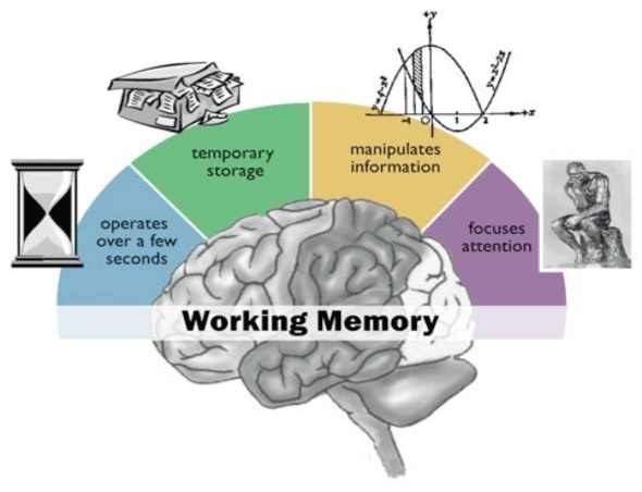
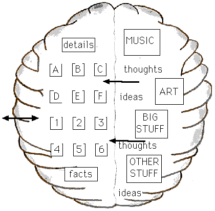
According to the famous research of Princeton psychologist George A. Miller, the average adult brain is able to store between five and nine “chunks” of information in their short-term or “working” memory.
Working memory is the part of your brain that temporarily stores and processes information in the course of a few seconds. It’s what allows you to focus attention, resist distractions, and, most importantly, guides decision-making.
On a “low-complexity, highly prototypical website,” the five to nine “chunks” of working memory can process things like guarantees, product descriptions, prices, or offers—rather than wasting time figuring out where to click.
When you deviate from expectations—the price was higher than expected, the color scheme and symmetry were off, the site didn’t load fast enough, the photos weren’t high resolution—the working memory processes those disfluent “chunks” instead of what matters.
That’s because the working memory calls the long-term memory to use what it already knows to perform the task. When the long-term memory can’t aid in the processing of information, the flow is broken, and the working memory disengages and moves on.
That’s why it’s vital to understand your visitor’s level of exposure—not just for sites in your category, but for websites in general—if you want to “hack” their working memory with design.
The blogs they read, the sites they shop on, their browser, age, gender, and physical location all hint at what will seem familiar upon first impression.
7 tips to create a simple website design
- Research your audience and the sites they visit most. Look for case studies on design changes from said sites and how those affected key areas.
- Create a mashup for your own site with all the “working” components you uncover.
- Obey the rules of cognitive fluency when you lay out your design. Put things where visitors expect to find them.
- Rely on your own colors, logo, and typeface to communicate clearly and subtly. Don’t add copy or images unless they communicate something your visitor cares about.
- When in doubt, less is more. One large image is usually better than a bunch of little ones; one column instead of three; more whitespace instead of more “stuff.”
- Make sure your site fits the expectations for pricing, aesthetics, speed, etc.
- Retain originality. A “prototypical” site doesn’t mean that every aspect of your site should fit that mold.
Don’t think of your site as a one-of-a-kind piece of art. Instead, make it a composite of all the best stuff.
Conclusion
If the visitor can’t rely on their previous experience, they’re not thinking about how innovative your site is. They’re just left wondering why things aren’t where they’re “supposed to be.”
That’s not the best frame of mind if you want them to buy stuff. By creating a design with cognitive fluency, you allow visitors to process other things with their working memory that make it easier for them to say “yes.”
You’ll have a beautiful site, too.



As usual great post, loved reading it. I am a web designer and strive to design simple and effective websites. I remember a quote, not exactly shure from where.., it might even be from you: “Clarity (always) trumps persuasion”. Important statement worth remembering and using almost always.
That’d be Dr. Flint Mcglaughlin :)
this principle applies to marketing materials in general. The more you meet you buyer’s expectations of how your campaign should work, the more you can get people into a buying ritual where there’s instant trust in your offer.
Valid point man. That’s why story and character archetypes do so well, why scripts follow a certain format, and why everything that really works feels “familiar”.
The real problem happens when the new creator doesn’t put their own spin on it. Without that, things just become bad copies of copies of copies. Thanks for bringing that up Hashim!
It’s more of a targeted marketing strategy and I definitely agree with this. Conversion are more likely to happen if you reach the right audience and one way to do that is to meet their expectation and supplement their needs by the information that you provide on your website.
This is, without a doubt, one of the best pieces I’ve read in a good while, and quite possibly THE best on design, EVER. It’s really refreshing to see someone attempt to go beyond simple correlation and actually base their work on scientific data. Excellent article!
Wow! Thanks so much Doc, I’m really glad you enjoyed it. I’ve got to give it up to Peep though, he had a really strong idea and unleashed me on it. It’s amazing to do the research and find out what’s happening in various labs. It’s a lot of fun to dig up :-)
Always super to see someone try to find root causes for our actions and decision making. This makes me want to do so much more thinking during website design:)
Cognitive fluency and working memory disengagement reasons where new for me and thanks for that!
No problem Janar, I felt the same way. It was really cool doing the research to discover working memory and how that is really what we’re trying to target when doing conversion stuff. That alone helped me reshape the entire way I think about design :-)
Really enjoyed this post. Less Is More! You have put into words what I think when I see really “busy” websites – too much information to compute sometimes. Now I know why.
Great article Tommy. Highlights the fact that simple is actually very hard to achieve, but when you do, the benefits are enormous.
Thanks Ben!
A great post that echoes the latest (though common) web design trends and preferences so very beautifully. I will share it with one of my clients for whom I just finished the scope and plan to begin UX by early Dec. Thanks for sharing!
I´m fine with. But the algorythm of Google is not. Because they will “eat” (a lot) of content, to serve more visits. Is´nt it?
I have been pushing to go s i m p l e on our sites for awhile now. Too many options = too many chances to lose your customer. Drive them down a path carefully planned to provide them the maximum amount of focused information. Good stuff.
Peep and Tommy,
Good stuff guys. So much valuable wisdom here, including the final 7 tips.
It’s always about the customers aka visitors, users. Focusing on the wants, needs and expectations of the Ideal target customers is the key to most things in successful business and, as you have explained brilliantly to teach us and remind us, successful website design is no different.
Thank you.
Cheers
Richard Keeves
Smarter Web Strategies
I’m surprised how people aren’t catching onto just this. Websites should be simple. I use the ‘me, my, mine’ test.
If it was ME going to this website, would it be too busy? If the answer is yes, then I need to do something different.
We should be minimal, and simple, focusing on the content that matters. Distractions should not exist, except where they are absolutely necessary (like optin).
The world is moving toward simple: Simple organic food, simple devices, simple UI, simple cars- why would websites be any different?
Thanks for the article. Always enjoy your stuff.
This is without doubt one of the best articles I have read. Clear, concise with supporting research.
I did some research here in South Africa on the design of e-commerce sites and they nearly always follow the formula discussed in this article, primarily lots of white space……and now I understand why.
I agree with everything Doc Sheldon said! This is by far one of the best and most straightforward articles regarding simplicity in design/UX I’ve ever read. Will share with my team at work. :)
Great points highlighted…I guess, I should get busy with some simpler design changes with my site..:D
Hate to always be that guy, CXL, but the video on this page doesn’t work. Eh, at least for me it didn’t.
Other than that, amazing flippin’ article. I’m definitely saying this to Evernote.
I’m repeating most of these things to our clients on daily bases :)
Some listen, some don’t, but the main thing is that it works for us.
Keep up the good posts!
This is all well and good, but can you possibly design me a website where a monkey runs around a spinning version of my logo for 5 minutes before you can use the site?
Also it should be at least 5 megs of initial download.
Thanks
Lol! No, but that sounds like that might be a fun website for about 30 seconds.
I suppose if there are lots of caps and the headline were all RED, it would look even better. Thoughts?
I agree. I like to follow the K-I-S-S philosophy: Keep It Simple Stupid! I’m new to the blogosphere and this article really helped to give me a better idea of what I should do about the look and feel of my blog. I’ve been really indecisive about it. Thanks for post.
Hi Tommy, fantastic post. As a marketer with an engineering background, it’s always good to investigate the logic and reason behind the experience.
When explaining to clients why things have to be a certain way, it’s worth mentioning that websites don’t come with user manuals, and that layouts need to be familiar and intuitive.
Thanks again.
Fantastic insight and studies. One thing I’ve learned over the years and it’s something for us to take caution to is: “Simple doesn’t mean Shallow.” Thanks Tommy!
Simply is always better I think. It helps the customer to concentrate on the product instead of the web page. Thanks for the other tidbits of info.
I am wondering how you could make this happen with a real estate website? I have an idea, but as stated in the article it must not look like something that has already been done. Good article I guess I will have to keep looking for ideas.
With real-estate, I would look at taking design cues from e-commerce or popular interior design sites. It’s not that you have to have to be totally original, but do the research to find out what people already know online. The people buying houses in your area have a certain income level, which means they can only work at certain jobs, which is an indicator to their online exposure.
A guy who works in oil with an income of 100,000/year will have a different level of exposure than a tech journalist with the exact same income.
Drop me an email if you want help with this going forward :-)
I think the answer to this riddle can be very subjective. I like a clean site but I think there is such a think as organized chaos when it comes to website design. Sometimes it is important to give website traffic many options on where they want to go next which is common in high profile eCommerce sites.
Thanks for this articel. It can really help us because we will do a redesign for our ecommerce store soon. Its kinda difficult for me to let go personal preferences and go for the best conversion layout, but I hope I will find a middle in that.
Greetings from Holland.
What small dedicated companies do you recommend for this type of design?
Drop me an email at Tommyisastrategist at [gmail], let me know your approx. budget, and I can give you some suggestions from there :-)
A great article! Thanks.
I wrote a similar piece you might like to read about AdWords also being about Identity, Numbers, and Flow:
http://www.davidnrothwell.com/adwords-is-a-game-of-identity-and-numbers-11338/
Great piece Tommy – certainly one that i’ve passed onto my designer as we’re mid re-design at the moment.
Sometimes it’s best trying to take a common sense approach (you’d be amazed how many people lack this) as it’s not all about being pretty. Functionality is far more important in my mind that pretty pictures etc.
I like Igor’s comment – “Clarity (always) trumps persuasion” – Brilliant!
Anyway – keep the posts coming!
That’s great to hear Louis! I’m glad this could be helpful!
Hi, The video does not play. The article is great info!!! I am true believer in / of SIMPLE is SIMPLE does.
This is an excellent article – the KISS principle explained :-)
Very well written article in terms of design and conversion of those who make it to your site. I dont think one could hardly communicate better than Tommy has here on the importance of clean, clear simplicity and what that looks like. It certainly is clear that such a simply designed site would stand the best chance of converting a viewer to a customer. However, the BIG caveate might be SEO. If a site is not designed to rank high in searches and does not get near as much traffic it is debatable as to whether higher conversions will pay off. For example, if you get 100,000 visitors to a well optimized site but only got 10% conversion (10,000 buyers) are you worse off than if you get 1,000 visitors to a simple site but convert 50% (5 buyers)? Id be extremely interested in hearing what a highly knowledgable and successful SEO expert would have to say about this approach. Im all for doing it so long as I dont sacrafice too much in my volume of traffic. Wade
Wade, that’s a very interesting point and I’m curious to see what others might have to say about it.
My question to you is, why would these things be mutually exclusive? By “simple” we’re talking about low visual complexity and being highly prototypical. I can’t see any reason why those things would have a negative impact on SEO.
If anything, like the SkinnyTies.com example shows, it could increase the time on site, and reduce the bounce rate, things that Google has said play a considerable role into ranking a site.
Also with low VC, wouldn’t that theoretically improve page load times, another big factor in SEO?
This is more about how the information is presented rather than stripping the information itself. I’m just not sure how this might have a negatively influence ranking factors.
Wade,
If anything, I think a better design website that converts well would/should rank better in search. Given Google’s ongoing updates that punish people for over optimizing content, you’ll see SEO changing in the near future. What comes to mind is the term audience optimization, rather than SEO. Google works to reward good websites, and good websites are produced to benefit their audience – via good design, usability, etc. Those things together will seemingly result in more conversions, better search results and more traffic. My two cents…
This is a great article, well researched. I’ve shared it with my team, thanks for writing it!
Thanks Helen!
Love the stuff you guys do over at SearchEnginePeople too! Keep up the great work :-D
How do very successful companies with very complex and noisy web sites play into this simplicity guidance? Something like GoDaddy comes to mind. Perhaps it’s to your point on knowing your audience – if it’s engineers or PhD’s as cited above – a more cluttered, complex design might resonate more as being authoritative in some way and convert better than simplicity?
As Einstein said, “Everything should be made as simple as possible, but no simpler.”
GoDaddy should run a test on their site to see if simpler works better. They actually already have simplified their site a lot compared to what is was years ago.
That would be interesting, perhaps Markitekt should send a proposal :-P
Domain.com has a much simpler site by comparison. I’d love to see heatmaps of both sites to get an idea of what’s actually being used.
Ah, I see what you’re saying.
Keyword density is still a thing, but with the recent algo updates, it’s more about having natural themes around the keyword, than it is about cramming it into the content as much as possible.
That being said, it’s still possible to package long copy in a simple, but compelling way. This site, CXL is a good example of that. Another is Medium.com.
“Simple” doesn’t mean using less text. It’s about making smarter choices to package that text to make it easier to consume.
Using Medium as the example, the site is mostly black text on a white background. But the articles are long, and can rank pretty high. The font choice, size, and typography used on the site as a whole, communicate something very specific about what the Medium.com brand is.
I think that’s what I’m saying when it comes to the visual communication aspect of it all. You can “say” things with design that you don’t have to say in words. Take a look at Medium, and hopefully that’ll make more sense.
Thanks for the article! I have a client that I am trying to convince to simplify their design. I sent them a link to the article.
Amen Tommy!
To clearly communicate a message or sell a complex product online is hard enough as it is. You article gives me a great deal to think about as to how I can help my customers simplify their message, keep prospects engaged, and make a sale.
Thanks
You’re welcome!
very interesting article, i guess some of things int he article are things i do without thinking about it…thats a good sign i think :)
back to basic sales, or, how to say KISS in 9 million words or less
Dear Tommy,
I must let you know that I enjoy reading this article. I have learn so much and I will be applying what I have learned to my website. I am a bit new to online publishing and so, I am happy I was referred to this blog at this time.
I have shared it with my friends on twitter and facebook. I know others are looking for information like this. :D
Thanks for sharing this great article! :D
All the best!
Carlinton
This is a terrific article, thanks! I wholeheartedly believe in simplicity. And as someone starting out as a freelance site designer, it makes me feel good knowing I don’t have to do fancy stuff to make a good site!
The hardest part with the simpler is better approach is boiling down what’s truly important to visitors and giving it to them in a easy to digest fashion. Great tips, the basic 7 point guideline at the end is really helpful in walking through the process. Awesome as always.
Wow! This article has changed the way I look at web design. I thought that the more the images and animations in a site the better it is for the audience.
I gonna use some of tips you shared here in order to renovate my blog to become “simple but terrible”.
Tommy,
This is one of the finest pieces I’ve read in quite a while. Definitely agree that “less is more” and thanks for proving it in such a great way!
Awesome job, well done!
Thanks Leon! I’m glad you liked it :-)
Hi – this is really helpful information – but I am curious – does anyone wonder that by simplifying and catering to instant gratification of senses and expectations, perhaps there is a point where it starts to lose it’s benefit? For example, what about offering a site with depth of content – how can we avoid that depth being overlooked?
You make a good point, but what we’re talking about isn’t “simplifying” the content by dumbing it down, but rather the visual presentation around the content to make it easier to absorb.
Take this website for example, the content would be far from “simple” yet it’s visually packaged in a way that makes it easier to take in, helping you retain the information, and make the decision to comment, share, or sign up via email much more natural.
Think of it more as the packaging of the content, rather than simplifying or stripping the content itself.
Excellent summary this is one of the best post I have seen on this topic. You hit all the points well done, thanks I will be sending this to quite a few clients.
Great article. I wonder how this would apply to Asia, where most websites are highly cluttered and visually dense. Our staff there often complain that our website design is too simple and thus feels unfamiliar to them.
Impressive article. Speaking of ‘thorough’, it certainly hit root. Thanx!
Awesome stuff. Clear, simple and ends in a recipe for greatness. Also, thanks for the reference to the slider research post. No more sliders for me.
This is one of the finest pieces I’ve read in quite a while. Great work and very simple and in layman language.
Awesome job, well done!
I am sorry I missed this article when it first came out. A good friend pointed it out to me since she knows we are redesigning some of our sites. It couldn’t come at a better time as we are right in the middle of discussing which whizbang features to keep and which to delete. My gut had been telling me to take a lot of it out but I didn’t have enough info. Thanks for giving me the ammo I need!
Have to keep repeating it over and over….A confused mind does not buy.
Very interesting. What do you think about Amazon’s layout? To me it looks cluttered and anything but simple, and overall it’s very confusing. Yet, they’re clearly a leader. What’s at work here?
(You could throw Ebay into the same busy camp.)
No you’re right. Amazon is a mess. But their success doesn’t stem fron high conversion rates necessarily, it’s from sheer product volume. I read a stat the other day that Amazon tests something like 4,000 discounts per minute.
Because Amazon, and Ebay too really, are able to offer as many products as they do, and often at a discounted rate, they’re leading the pack due to offering so many different things.
It would be interesting to see what would happen if they did simplify their design.
As a tangential thought, Youtube was able to see higher time on site and increased clickthroughs after their last major site design that simplified the watch pages. I mention them because they also have a high content inventory, though they are in a different category.
Thank you so much . This information is invaluable to seo’s and business owners. You really should have a donation button somewhere on your site. I’m sure I’m not alone when I say “I’d be happy to support your research”.
Thank you again!
Funny you say that Dan, we’re actually planning on conducting original research, but it’s going to be free (so how about that?!)
Simple website has better conversion rate than complicated sites because they are easier to understand by their visitors.
I am planing my portfolio page and while doing bit of researching, this article came out. It was real fun reading it. Great article.
Thanks Mihajlo! I’m glad you liked it :-) Hopefully it can help you create a really killer page!
Great information, thanks. I had my site redesigned a year ago. I love the look of my site but it is not converting enough! This really helps me identify what might be wrong. great work.
Thanks Mary! I’m glad you enjoyed it :-)
Funny story, we’re actually going to be doing weekly website reviews, so if you’re interested, shoot me an email at [email protected] and I’ll get you on the list :-)
Hi Tommy
Very interesting read, looking at the mailchimp logo redesign by Jessica Hische, although such a subtle change it can make a big impact, although when enlarged there is very difference, its the change on the smaller websized image where the changes are most apparent
However i am sure when they updated their logo they also had a fairly big advertising campaign going along side, so the graph on the new subscribers, could be a little misleading, but there again it can show the power of design can HELP improve a websites appeal
Enjoyed the post
Paul
Good information but you don’t need to why. You only need to know what. Look at some of the best ads of all time that were produced in the mid-20th century. They followed the same recipe: Photo, bold headline underneath and text in columns on a pure white background. They knew then how the brain works and how information should be utilized to sell, not impress with how it looks. Although I say the simple layout looks great.
You have a lot of valuable information.
//* FitVid may be a good addition to this web page. It was difficult scrolling down my iPhone when the page kept diverting over into the right margins.
Or
Not the greatest way, but:
overflow-x: hidden;
A great article and it touches on some very important psychological principles.
In the interests of “deviation causing disengagement”, please re-read this article and sort the missing words and other typos for smoother digestion. ;)
Brilliant article. Loved reading, especially from my own psychology background. The case study really pushes the point. I’d love to see what sort of stats they’ve achieved in the long term from the design? Year on year etc
Good information. I think an important point is to use less borders and defined spacing. You touched on with the “breathe” graphic and it is especially important to the skinnyties example. The old design was blocked out with the colors while the new design uses minimal borders and lots of open space.
Hi.
Its very good article… and helpful too. thanks for sharing.
Regards
Hello World
Came to the party late, but had a good time. Thanks for this, Tommy. Odd to see a plea for simplicity having such overwhelming graphix – do you believe your schtick or is it a put-on? Either way, it’s a help in a current project. Say hi to my hero Peep.
Welcome to the party Paul, glad you had a good time.
I whole-heartedly belive my schtick, however when I rented the hall, it came with it’s own rules & guidelines, so there ya go.
I’ll say hi to the boss for ya ;-)
Did it not bother anybody else that the first sentence of this post is missing a period?
Oh my God, YES! Thank you for pointing that out! *edited
Minimalism and consistency constantly in style. Simpleness is winning the battle this year. Many designers and developers focus on simplicity during the designing phase because they’re content-oriented. For your convenience. This is a really very well written piece of content on ease.