
Forms sit directly between user intent and conversion. Whether someone is creating an account, becoming a lead, completing a checkout, or submitting a request, unnecessary friction in the form can stop the process.
Good form design reduces that friction. It asks only for information that is needed, makes fields easy to understand and complete, prevents avoidable errors, and helps users recover quickly when something goes wrong.
FormAssembly’s analysis of 1.6 billion user interactions across different form types, industries, and devices found that nearly one in three forms experienced drop-off in completions. Long forms, confusing experiences, and poor feedback were among the recurring friction points.
The best practices below provide a strong baseline for designing forms, but they are not universal rules. Use them as a starting point, then validate important changes against your users and business context.
TL;DR
- Treat form-design best practices as a baseline, then test changes that could materially affect conversion.
- Ask for only the information you actually need and minimize the number of visible fields.
- Default to a single-column layout and make labels, requirements, and errors easy to understand.
- Reduce typing with autofill, autocomplete, sensible defaults, and automatic formatting.
- Use inline validation and clear error messages to help users correct mistakes without starting over.
Table of contents
- What is form design?
- Why does form design matter?
- 13 Form Design Best Practices
- 1. Less is more: remove form fields.
- 2. Single-column beats multi-column forms.
- 3. Communicate errors clearly.
- 4. Use inline form-field validation.
- 5. Order fields from easiest to hardest to fill out.
- 6. Use saved data and automated suggestions.
- 7. Indicate if each field is required or optional (unless they’re all required).
- 8. Consolidate name and address fields.
- 9. Use radio buttons for small sets of options.
- 10. Don’t make coupon code fields prominent.
- 11. Avoid the “clear fields” button.
- Mobile form design best practices
- Should you always follow form design best practices?
- What should you remember about form design?
- Frequently asked questions about form design
- What should marketers do next?
What is form design?
Form design is the process of structuring, labeling, validating, and presenting form fields so users can provide information with as little unnecessary effort or confusion as possible.
A form might collect contact details, payment information, account data, feedback, or information needed to complete another task.
When designing a form, consider:
- What information you want and need.
- How to present your request for information.
- How users of the form will move through it.
- How you’ll validate the data entered.
- How to make it as simple as possible to use.
Why does form design matter?
Poor form design creates unnecessary effort, confusion, and errors at exactly the point where users are trying to complete an action.
Good form design makes that action easier. Users can understand what information is required, enter it efficiently, correct mistakes, and move through the form without unnecessary friction.
What makes a web form accessible?
Accessible forms give users clear labels, instructions, feedback, and a way to complete every action with assistive technologies and a keyboard.
At a minimum:
- Associate every field with a clear label.
- Identify required and optional inputs without relying on color alone.
- Explain required formats before users enter the data.
- Make errors easy to find, understand, and correct.
- Ensure form controls can be operated with a keyboard.
Accessibility is not separate from usability. Clearer labels, instructions, and feedback make forms easier to complete for everyone.
13 Form Design Best Practices
1. Less is more: remove form fields.
Every field you ask users to fill out increases friction. One of the most direct ways to reduce form friction is to remove fields you do not actually need.
Most forms are too long. It’s “greedy marketer syndrome”—we think we need all the data.
Baymard’s form-field research, still identifies excessive form fields as an essential checkout usability issue. Large numbers of visible fields can overwhelm users and make the process appear more difficult than it needs to be.
The principle is straightforward: ask for what you need to complete the current task, not everything the business might eventually want to know.
So form-field reduction is ground zero for bottom-of-funnel conversion optimization. It’s where you can get some of your quickest wins. The effort and resources required are super low, and the potential gains are tremendous, especially at scale:
- How many forms do you have?
- How many people experience them?
- What would a 10% increase on each form mean to you?
Get the data you need
Every additional field makes you lose prospects. Is the additional information you gain from the field worth losing those people? Do you lose anything if you don’t get all the data right away?
When you’re optimizing form fields, ask about the data: Do you really need it? Do you really need people’s phone, fax, or address? Do you need a company name if you’re selling candles? Ask only what’s relevant.
For example, Expedia once removed the Company field from their booking form and saw an increase of $12 million a year in profit.
The best sign-up form is short:
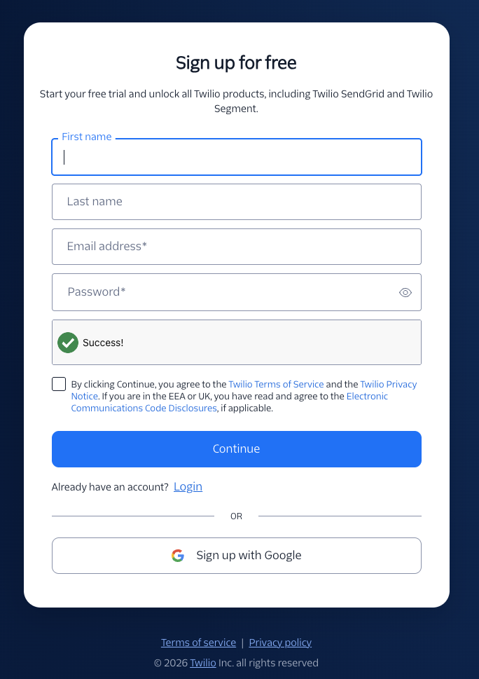
As always, there are exceptions. Reducing form fields doesn’t always increase conversions. Plus, the more information you collect on a user, the more effective marketing and targeting you can use (usually).
In general, though, it’s safe to follow this heuristic: Remove useless or superfluous form fields.
Alternatives to long forms
Now, there are definitely data concerns, especially if you’re a B2B company doing lead generation and passing leads to a sales team. You want to make sure they’re qualified leads; otherwise, more leads become an externality, incurring a cost in wasted productivity.
You can screen leads with, for example, a tiered system of allotted budgets. Basically, how much is the lead willing to pay? Set the lowest bar at the lowest you think a valuable lead would be worth, and you’ll weed out a lot of tire kickers.
Data enrichment can also reduce how much information B2B forms need to request upfront. Tools such as HubSpot’s Data Enrichment can enrich contact and company records with additional firmographic and demographic data after the initial conversion.
2. Single-column beats multi-column forms.
This has been well researched in eye-tracking studies (including our own), case studies, and A/B tests. When you’re deciding between a single-column or multi-column form design, default to the single column.
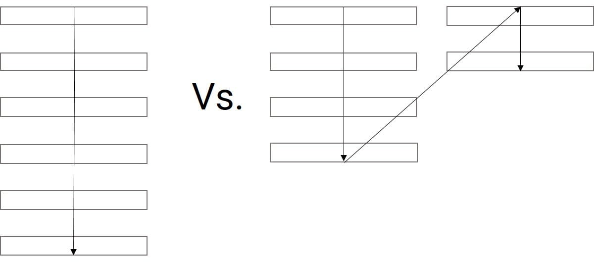
In the CXL study, survey participants completed the linear, single-column form (n = 356) an average of 15.4 seconds faster than the multi-column form (n = 346). This was significantly faster at a 95% confidence level.
This guideline isn’t new. In fact, it’s been around for years, but until our study, there wasn’t much quantitative evidence for it. Still, those in conversion optimization will have undoubtedly seen dozens of compelling user tests, as well as A/B tests, that show single columns to be more usable.
There are exceptions. Closely related fields can sometimes sit on the same row, but the overall form should generally follow a clear single-column flow.
3. Communicate errors clearly.
Users will make mistakes. It’s inevitable. Even if you use every form design best practice, users will still ring up error messages. How you handle error messages matters.
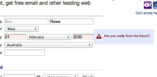
Error messages should tell users what went wrong, where the problem is, and what they need to do to fix it. Generic messages create more work because users have to diagnose the problem themselves.
So, yes, do usability research yourself, but start with these error message best practices:
- Don’t blame the user.
- Write like a human, not a robot.
- Make sure errors are clear, and the messages are positioned in an intuitive location.
- Make sure users know how to fix said errors.
- Don’t list all errors at the top of the page. Inline validation is a good solution.
4. Use inline form-field validation.
Also related to error messages is how you communicate to a user whether their submission is okay. Form validation is whole topic of its own, but we can cover some aspects here.
Inline validation is a beautiful way to find, alert, and correct errors in real time. Instead of waiting until users press “submit,” they learn right away what went wrong.
Here’s a great example of inline validation:

Current usability research still supports real-time validation. Baymard’s form-validation guideline, notes that waiting until submission to reveal errors forces users to stop, locate the problem, and then correct it.
Inline validation can surface problems earlier, but timing matters. Avoid showing errors before users have had a reasonable chance to finish entering the field, and remove error states as soon as the problem is corrected.
It’s all about clear expectations and communication. A user shouldn’t have to guess what will work and what won’t. The easier you can make it to understand the expectations, the fewer errors people will make and the more form completions you’ll achieve.
5. Order fields from easiest to hardest to fill out.
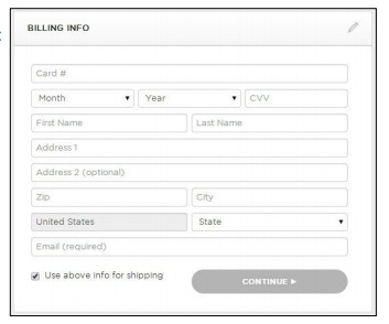
Start with fields that are easy and familiar to complete, then introduce higher-friction requests such as payment details or sensitive information later in the process.
Wait until later to introduce friction (e.g., billing information or anything too personal). Allow people to complete shipping information before billing. (They’re often the same, so they won’t need to type it again.)
Don’t do this:
6. Use saved data and automated suggestions.
The overarching principle for form design best practices keeps popping up: Make things easy for the user (especially for mobile forms).
Limit the amount of typing users need to do to complete a form. For example, booking.com asks its users to fill out their entire address, city, and zip code.
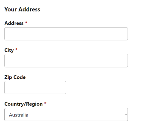
An alternative is to use a geolocation plugin to autosuggest addresses as the user types, decreasing the number of fields and the amount of typing and clicking required.

Using autosuggest and autocomplete has another advantage: they decrease the number of fake addresses input through user mistakes. Because they only offer suggestions that actually exist in the system already, they provide a sort of inline validation too.
Autofill vs autosuggest
Autofill uses data from the visitor’s browser to fill out your form. If the person has previously told their browser to store information like their address and phone number from forms, that data will be available for autofill. It’s a simple time saver that can greatly decrease the amount of typing required.
Autosuggest works a little differently. Rather than using information from the visitor’s browser, it uses more generic information. For example, as a user starts typing an address, the form can surface matching addresses based on the characters entered so far.
What to think about
When deciding on autofills, here are some good questions to reflect on. Do you have:
- Default values that people are likely to pick?
- Saved data for the visitor that you can use?
- Fields that are common and typically saved in browser autofill settings?
- A plugin that can autocomplete or autosuggest longer values like addresses?
Autoformatting is also incredibly important. Allow users to enter data like zip code, phone number, and credit card any way they want. Format it the way you need to store it afterwards.
7. Indicate if each field is required or optional (unless they’re all required).
First, ask if you need to include those optional fields. Most of the time, they’re unnecessary. Optional fields should first justify their existence. A title or middle name, for example, may not be necessary for the task the user is trying to complete.
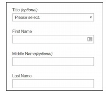
Focus on the information you need from users so that they can get started. You don’t want a user sitting at home thinking, “Why do they need this?!”
Clearly identify required and optional fields. Don’t rely on users inferring which fields they can skip, and don’t use color alone to communicate the difference.
8. Consolidate name and address fields.
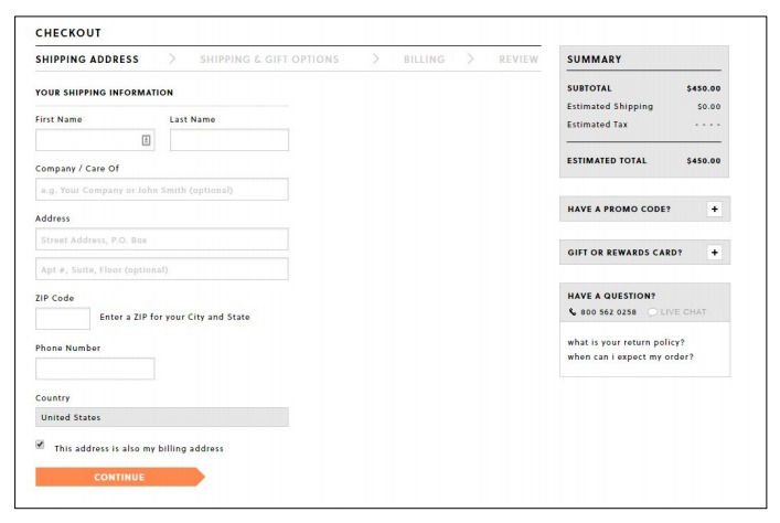
Avoid splitting a single piece of information across multiple fields unless there is a genuine technical or business reason to do so. Every additional field creates another decision, interaction, and opportunity for error.
Where appropriate, use a single full-name field rather than separate first- and last-name fields. For addresses, use automatic address lookup or autocomplete to reduce the amount users need to enter manually.
The problem with multiple fields is that they require more physical and mental effort to navigate. The user needs to pay attention to what they’re supposed to add to this particular field. Then click or tap into the next one. What does this one want? What’s the format needed? OK, got it. Type-type-type. Next field. Repeat.
When you consolidate fields, you can decrease the number of clicks or taps required, and the amount of attention that the user needs to apply. You make your form easier to navigate, and decrease friction.
9. Use radio buttons for small sets of options.
Radio buttons work well when users are choosing one option from a short list because every available choice is visible without another interaction. Drop-downs become more useful as the number of choices grows.
More specifically, they claimed that they slowed users down by interrupting user flow, being hard to read, and requiring dexterous mouse maneuvering. They provided no supporting data.
Well, it’s easy to test. So we did. We were just launching a large survey on online trust perception, so we had an opportunity to manipulate a survey form and ask different people the same questions in different formats (multi-select vs. radio buttons).
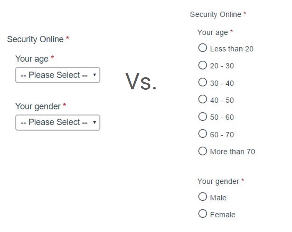
The results? The form with radio button was faster to complete. Survey participants completed the radio-button form (n = 354) an average of 2.5 seconds faster than the form with multi-select buttons (n = 354). This was significantly faster at a 95% level.
10. Don’t make coupon code fields prominent.
Prominent coupon-code fields can distract users who do not already have a code and encourage them to leave checkout to search for one.
Keep the field collapsed behind a secondary “Add promo code” or similar link. Where possible, automatically apply discounts that already apply to the customer or basket.
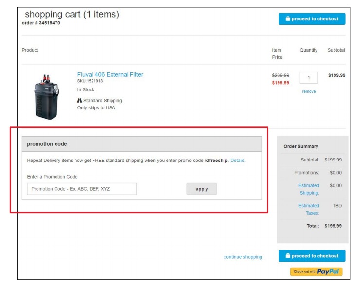
Instead of a large banner, have a text link saying, “Got a coupon?” (or something similar). If the user clicks the link, it should open an input field. Text links are not visually prominent, so fewer people will pay attention.
Customers who already have a coupon code will look for a way to enter it, so unless you hid it (too) well, they’ll still be able to apply their coupon. And if a customer has received a coupon (via email), apply it automatically and display the discount.
11. Avoid the “clear fields” button.
Nobody who fills in your form wants to clear the fields. If they don’t want to fill it in, they can just leave.
If they fill the form and accidentally clear the fields, there’s a good chance they won’t start over.

Mobile form design best practices
The same usability principles apply on mobile, but smaller screens and touch input make unnecessary typing, unclear focus states, and complex layouts more costly. Two practices deserve particular attention.
12. Offer field focus.
If you have a form with multiple fields, you don’t want users to get lost in the form. This is especially important on mobile devices: The smaller screen allows for less visual control over the form.
Make the input field being edited prominent and focused.

13. Let users show or hide passwords.
Password fields can be masked by default, but users should have an easy way to reveal what they have entered.
NIST’s current digital identity guidance recommends offering an option to display a password while it is being entered. Masked input is more prone to entry errors, particularly on mobile devices.
Also allow password managers, autofill, and paste. Making passwords harder to enter does not automatically make authentication more secure.
Should you always follow form design best practices?
No. Form-design best practices are starting points, not universal rules.
Context matters. A B2B qualification form, ecommerce checkout, newsletter signup, and enterprise demo request can have very different requirements.
Use established usability principles to identify likely problems, then validate changes that could materially affect conversion, lead quality, or the information the business needs.
These are guidelines, not mandates.
What should you remember about form design?
Good form design removes unnecessary effort between the user and the action they are trying to complete.
Start by removing fields you do not need, creating a clear single-column flow, reducing typing, making requirements obvious, and helping users identify and correct errors quickly.
Then test the decisions that depend on your specific users or business. The goal is not to follow every best practice mechanically. It is to make the form as easy as possible to complete without sacrificing the information the business genuinely needs.
Frequently asked questions about form design
How many fields should a form have?
Use only the fields needed to complete the current task. There is no universal ideal number.
Should forms use one or multiple columns?
Use a single-column layout by default. Closely related fields can sometimes share one row.
Should forms use inline validation?
Yes. Inline validation can help users identify and fix errors before submission when it is timed correctly.
Should optional fields be labeled?
Yes. Make required and optional fields explicit so users do not have to guess.
Should passwords be masked?
Passwords can be masked by default, but users should be able to reveal them when needed.
Are form design best practices always correct?
No. They are useful baselines, but important changes should be validated in the context of your users and business.
What should marketers do next?
Form optimization sits inside a broader conversion process: identify friction, understand why it occurs, make an evidence-based change, and measure what happens.
Build a complete CRO skillset: CXL’s Conversion Optimization Minidegree covers conversion research, UX, experimentation, testing strategy, and building optimization programs.
Get better at identifying UX friction: The Heuristic Evaluation course teaches a structured process for finding usability and conversion problems and prioritizing what to fix.
Build AI into the wider optimization workflow: The AI Native Marketer program teaches marketers to build working systems around research, analysis, measurement, and other marketing workflows.
Related Posts
-

Guest post by Pratik Dholakiya. Long-form landing pages (500+ words of copy) tend to convert…
-

You know those sales pages that are really, really long? They're great, but they mostly…
-

You have a landing page and plenty of traffic, but no one is clicking the…
-

Don't design your own website. No, really. It will suck. You might think that since…





#11 drives me nuts, both as a conversion guy and as a general consumer.
I’ve actively tried to think of any scenario where clearing the entire form makes even a lick of sense? And it NEVER makes sense to put just a self-destruct button right next to the post button.
Great points.
Something that wasn’t mentioned is breaking particularly long forms into multiple sections (steps). Then, less of the form is visible and it appears shorter.
Hi Alex,
I agree with all the guidelines, but I think the single versus multi-column needs some nuance. I agree that multi-column is a bad idea, but that doesn’t mean that you can put certain fields on the same line.
We ve seen some nice uplifts when putting these fields on the same line
– first / last name
– Street / number
– Postal code / City
Because these fields belong together and they make the form look shorter. We’ve had big gains doing this when the form was in an overlay and with long forms. See Class 9 of my UX and Usability course I did for CXL Institute.