
You have a landing page and plenty of traffic, but no one is clicking the submit button on your lead generation form. What gives?
If you’re like most people, your first instinct is to remove form fields to reduce friction. Sounds simple and, well, pretty obvious, right? If you want more people to complete your form, ask less of them. A best practice was born.
So, is it true? Does reducing form fields always increase form conversion rate? Are there any advantages to designing forms with more fields? Do they convert?
Table of contents
Busting the best practice
Michael Aagaard, Unbounce‘s former senior conversion optimizer, is well-known for his advocacy of conducting conversion research instead of relying on best practices. Here’s what he had to say on the subject of reducing form fields…

Michael Aagaard, Unbounce:
“A while ago, I was working with a client who had a lead gen site where people can go to find entertainment for events. So, let’s say you’re doing a thing with your company… You might want a band to come and play. You go to the website, search for one, find an interesting band, go to the landing page, fill out the form—you’re a lead. My assignment? Get more leads.
So one of the first things that stood out when I went to the landing page was the form itself. It’s a beast of a form. We’re asking for a lot of information. We’re asking for date, time, type of event, number of attendees, location, name, email address, phone number, a comment field where you have to describe the event. A lot of information! And all I really want to do is just contact an entertainer.
So, to me, the solution was obvious here. Based on experience, it’s way too much information. So, let’s shorten it down and ask for less information. I finally convinced the client to let me remove three form fields. I wanted to remove more, but I could only get away with removing three. But that’s still one third of the form fields—a lot less friction.
The result? 14% drop in conversion.
I removed all the fields that people actually want to interact with and only left the crappy ones they don’t want to interact with. Kinda stupid.
It’s very difficult to solve a problem you don’t understand. Vice versa, it’s pretty easy to solve a problem you do understand. That’s what research does. It helps you understand problems.” (via CTA Conference)
Evidently, the easier and simpler it is to complete your form, the more conversions you’re likely to get. However, the number of form fields isn’t the only factor that contributes to ease and simplicity.
Size does matter, but there are exceptions to the rule. [Tweet it!]
What other data is out there?
You’re probably used to seeing this Imaginary Landscape (i.e. imagescape.com) case study from 2007-2008…
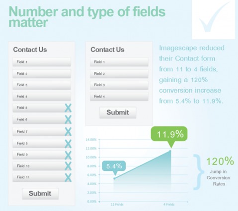
In over a decade since the study was conducted, it’s been covered by Unbounce, HubSpot, CXL, and many others. It’s not hard to see how one little study eventually became “reducing form fields will always increase conversions.”
More recent research has presented some more interesting arguments. Above, Michael talked about a client he worked with, a case study he described in detail at CTA Conference a few years ago.
Before conducting conversion research, Michael assumed reducing the number of form fields from nine to six would increase conversions.
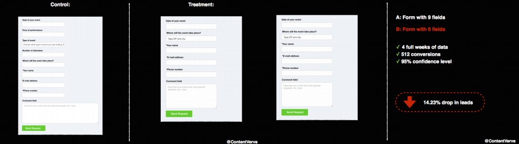
As you can see, it actually decreased conversions.
After conducting conversion research, Michael found that, in his original treatment, he had removed the three forms visitors were most engaged with. In his second treatment, he decided to leave the number of fields at nine and tweak label copy to reduce friction instead.
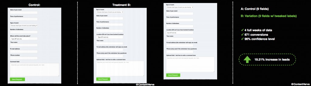
Well, a 19.2% increase isn’t too bad.
In this case, reducing form fields actually had a negative impact. Again, length isn’t the only type of friction affecting form completion rates.
If you have only one to three fields, you’re likely going to see a higher conversion rate. It’s not rocket science. The form is simple, there’s little room for error, and it’s not a big ask. There’s very little friction there.
If you have eight to ten fields, you’re also likely going to see a higher conversion rate. Why? Consider the context and desire.
- If you’re filling out a government form or a form to have the value of your house estimated, you’re expecting to answer a lot of questions. The context is there and the expectation is set.
- If you’re filling out a form to get access to an awesome, value-packed webinar or eBook or online course, you’re so motivated that you’re willing to answer a lot of questions. You want that value so much that no ask is too large.
A few years ago, Blivakker.no, a leading beauty ecommerce store in Norway, ran a test to discover the impact of removing form fields. According to VWO, they created three different versions of the registration form:
- Control with 17 fields;
- Skjema-Light, the original form minus three fields (account number, phone number, evening phone number);
- Skjema-Uberlight, a completely stripped-down form with fewer fields and navigational elements.
Here are the results:
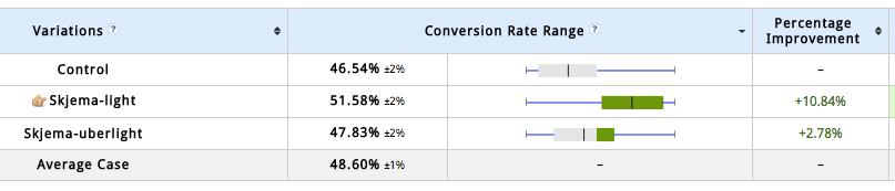
Karl Philip Lund, the Norwegian interactive marketer behind this small test, concluded that “when you reduce the number of unnecessary fields in a form, you increase the number of registrations. The test also shows that it’s not optimal to remove too much information from a form.”
The solution is not simply “reduce form fields as much as possible.” While reducing form fields to increase conversions is usually effective, the data concludes that it is far from being an absolute truth.
When is having lots of form fields okay?
As Joanna Wiebe of Copy Hackers and Airstory wrote in a Copyblogger article…

Joanna Wiebe, Copy Hackers & Airstory:
“Think of every field in your checkout as a hurdle your prospect has to leap over. Then ask yourself if it’s worth the possibility of losing a sale—or thousands of sales—because you want to fill a database.
After the Great Field Culling Exercise, as it will come to be known in your office, you’ll want to make sure the forms that remain are so frictionless, users will barely notice they’re doing actual data entry.” (via Copyblogger)
It’s a difficult question with a lot of grey area. I can’t offer you any hard and fast rules or absolute truths (as usual). Instead, let’s take a look at some examples.
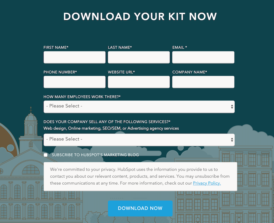
With eight fields to fill out in exchange for an advertising plan kit, HubSpot is a good example of a company with long(ish) forms…
Column Five is somewhere in the middle…

To download their eBook, you only need to complete four fields. (Note: According to Oli and Unbounce’s research, Column Five could ask three more questions with only a marginal conversion rate fluctuation.)
Finally, you have examples like the one from Instapage…
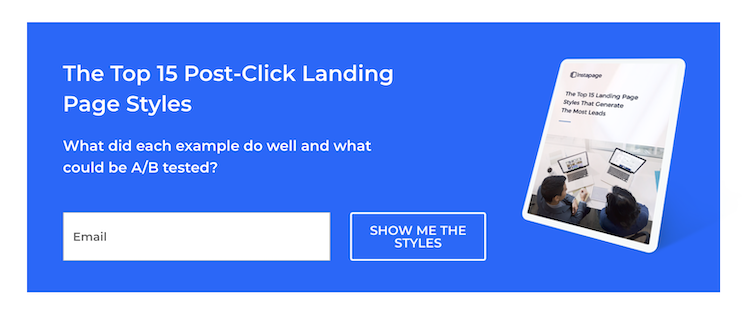
All it takes to get a copy of their eBook is your email address. Pretty simple!
So, who is doing it right? The answer could be all three of them and the answer could be none of them.
There’s a chance Instapage is missing out on valuable information, making it more difficult to qualify incoming leads. There’s a chance HubSpot is missing out on leads who aren’t willing to disclose all of that information for a free PDF.

Pamela Vaughan, HubSpot:
“In a nutshell, the length of your form inevitably leads to a tradeoff between the quantity and quality of the leads you generate. A shorter form usually means more people will be willing to fill it out, so you’ll generate more leads. But the quality of the leads will be higher when visitors are willing to complete more forms fields and provide you with more information about themselves and what they’re looking for.” (via HubSpot)
You can’t possibly know how many form fields you can pull off without conducting conversion research and running your own tests. Even then, you have to compare the ROI of additional information with the ROI of increased conversions. How much does having a phone number really help the sales team? Is it enough to warrant a potential decrease in conversions?

Oli Gardner, Unbounce:
“If you want to increase form conversions, you must consider reducing the number of fields. If you really need extra info, consider doing an a/b/c test where you compare all of your fields with the absolute minimum and a half-way version to determine which converts best—and then weigh it against the value of the extra data collected, and see how it will impact your post-click marketing.” (via Unbounce)
Your form should have enough fields to achieve the following:
- The form is easy to understand and complete; there’s limited friction.
- The value of the information your visitors are asked to provide is equal to or less than the value you are going to provide.
- You are able to qualify incoming leads and provide the sales team with enough information to close deals.

Bryan Eisenberg, IdealSpot.com:
“Web forms are a transaction. You need to look at them as an exchange of information and value in exchange for something of value you promise in your offer. When you don’t look at it as an exchange you fail.” (via BryanEisenberg.com)
Once you begin thinking of forms as a transaction, you begin to focus on the need to create a win-win situation for your visitors and yourself. How can you both get the most value as quickly and easily as possible? That’s the real question.
Here’s what you should be exploring in your conversion research to answer that question:
- What fields do your visitors interact with most? Least?
- Where are visitors dropping off and abandoning your form?
- What takes your visitors the longest to complete?
- Where are your visitors running into issues? What fields are triggering errors most often?
Tools like Formisimo can help you answer these types of questions.
Getting more from your lead gen forms
Now that you’ve run through some of the major points of friction, what’s next? What are some other optimization tips to consider when it comes to forms?
Joanna has some starting points for you…
Joanna Wiebe, Copy Hackers & Airstory:
“Top tips to boost form completions include:
1. Pre-populating as many fields as you can
2. Offering a tickbox if billing and shipping are the same, to reduce the need to complete two forms
3. Placing error messages near the point of error
4. Showing coupon code fields only to visitors arriving via email or affiliate links” (via Copyblogger)
Still eager to optimize? You can also try implementing a progress bar, asking higher value questions, and removing optional fields.
1. Use a progress bar
If asking for a lot of information is absolutely necessary, consider using a progress bar to show visitors how far they’ve come and how much farther they need to go.
If you’ve ever purchased something from Amazon, you’re probably already familiar with this concept…
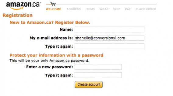
Imagine asking for all of this information at once, on one page. If you listen closely, you can hear the faint sound of thousands of your visitors closing the tab.
Bryan Eisenberg of IdealSpot.com agrees that time/effort perception and expectation setting are key, adding that forms often look more daunting than they really are…
Bryan Eisenberg, IdealSpot.com:
“Size does matter sometimes, if you want to see customers take action! How many actual pixels (height and width) does the form take? I have seen forms that ask for very few fields, but because they look long, they intimidate users into a misconception about the amount of time it might take to complete a form.
This is also one of the reasons you seldom want to place form fields horizontally next to each other—it makes the form look scary. For example, you never want to have a check-out with the billing information in the right-hand column and the shipping information in the left column.
This is also related to how many fields you ask people to complete as well; the more fields, the bigger the form will be. Don’t make your form look like tax or department of motor vehicle forms.” (via BryanEisenberg.com)
A progress bar sets expectations and breaks the process down into easy steps.
If you’re not an ecommerce site, you likely don’t have the need for a form this long… Or a progress bar. However, you might have a list of questions your sales team would like to know. Instead of trying to place all of those questions within the first step, creating friction, place them within the second (or third, or…) step.
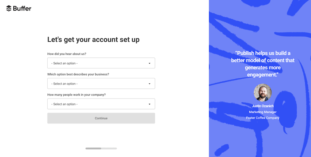
Take a look at how Buffer does it…
Step one: Enter your email and password to get started.
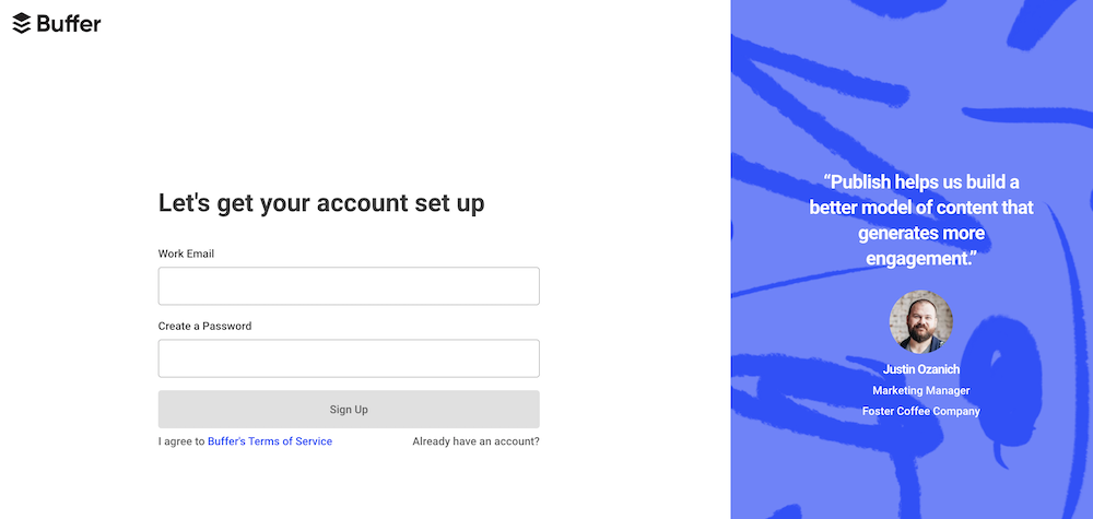
Step two: Complete these three fields in an onboarding flow, where Buffer gathers the information they need to customize (and improve) your initial experience. The progress bar below indicates you’re already halfway through.
Progress bars, and the concept behind them, aren’t just for ecommerce sites.
2. Ask higher value questions
Instead of asking more questions, simply ask higher value questions. For many of you, the “business email address” example comes to mind here.
By asking for a “business email address,” you will: (1) increase deliverability, (2) reduce the need for a “name” field, and (3) set the context for your product or service (i.e. “this is a business tool”).
Of course, there are other high value questions you can experiment with. For each question on your form, ask yourself:
- Do I already have this information from this visitor?
- Can I get this information from another source (e.g., IP address)?
- Will this information bring me closer to a sale?
3. Required vs. optional
If you have optional fields on your form, you’re likely asking for “nice to have” information too soon. If you optimize for retention, this initial form won’t be the only touchpoint you have with this visitor.
Joanna Wiebe, Copy Hackers & Airstory:
“Forms can be good for qualifying prospects, but if half your form fields are optional, really think hard about whether you need all of them on the page.” (via Page Fights)
Initially, focus on what information is necessary to get the visitor started. Maybe that’s one or two fields, maybe that’s eight or ten fields. The number isn’t so important. What’s important is that your visitors aren’t sitting at home thinking, “Why do they need this?!”
Here are some optional vs. required field testing ideas:
- What happens when you remove all of the required asterisks, implying everything is required?
- What happens when you make a field you consider required optional?
- What happens when you make a field you consider optional required?
Your idea of required could be vastly different from your visitor’s idea of required. Ask yourself whether each field is required to deliver value or whether it’s required to satisfy a database.
Conclusion
Now we’re back to the original question: should you really reduce form fields? Probably, but the only way to know for sure is to run the tests for yourself.
Reducing form fields to increase conversions isn’t a myth, but it’s also not an absolute truth. [Tweet it!]
Just because it works often, doesn’t mean it will work always.
Here’s what you really need to remember about lead generation form optimization:
- Some of the most commonly referenced form field data is over a decade old.
- Be purposeful about what you ask. Conduct conversion research to see which forms visitors are engaging with and which they are not.
- If you need more information, weigh the value of that extra information against the conversion rate. Is it worth it?
- Ask yourself whether quality (longer forms) or quantity (shorter forms) is more important. Design your forms accordingly.
- Only ask for the information you need. Don’t get greedy!
- The length of your form can be as daunting as the number of fields. Be aware of how greedy your form looks.
- Reducing fields isn’t the only way to reduce friction. Examine each field to identify points of friction and eliminate them.
- Use a progress bar for long forms, ask higher value questions and really experiment with the idea of required vs. optional fields.
Related Posts
-

Guest post by Pratik Dholakiya. If you practice CRO, you already know that the debate…
-

If you’re not following form design best practices, you're leaving a lot of money on…
-

You know those sales pages that are really, really long? They're great, but they mostly…
-

Nothing is more frustrating than filling out a badly designed form. It’s a common experience,…


Hi Shanelle,
great article, definitely worth question the blanket solution/myth that cutting out form fields will raise conversions.
Thanks for giving Formisimo a shout out. It’s really important that you understand how people behave in your form before making any decision to cut fields. Identifying a problem field and giving it some love could be a better solution than cutting it out altogether.
There are so many ways to reduce friction that don’t mean losing out on data; In-line validation, better labels, better error messages (Joanna Wiebe mentions placing the error message next to the error field), more flexibility with data formats, different ways of presenting info e.g. using segmented controls or buttons instead of drop-down menus. (phew – sorry for the long list!)
Layout can help the perception of length as well. As Bryan Eisenberg says above, “intimidate users into a misconception about the amount of time it might take to complete a form.”
Awesome post.
“It’s really important that you understand how people behave in your form before making any decision to cut fields.” Absolutely!
I’m looking forward to writing more in-depth on lead gen form optimization in the future, where I’ll touch on those other points of friction. I’m particularly interested in dropdown menus and their usability.
Thanks for reading and the kind words, Hazel.
Please excuse the typos above. I clearly get over excited about forms!
This post is great because it discards sloppy “best practice” and looks at data and observed behaviors.
I really like Oli’s diagram.
BUT
It would be interesting too see if there’s a bias here in the sense that “Form length” is related to ” Type of site”?
It might be that some types of sites inherently require more information, and/or these sites sets a certain expectation with the user on how many fields they expect to have to fill out.
If that is the case, the variation/correlation in conversion rate might have more to do with “type of site” than “number of fields”?
In any case – Great that some smart people get their heads around this topic.
Formstack released a report with some figures on conversion rates for types of forms and the average number of form fields in different form types. https://www.formstack.com/report/form-conversion-2015
Interesting stuff but I wouldn’t like for anyone to see those numbers and aim for that many fields.
11 fields on average? Wow. Perhaps grouping them all as “lead gen” instead of segmenting them (to provide context) is misleading.
Thanks John!
I tried to touch on desire / context to help explain why longer forms might still have relatively high completion rates. But I’d also love to hear from Oli on the subject. I saw that you sent him a tweet, so I’m looking forward to his thoughts.