More choice equals freedom, right?
Well, yes, but there’s a good body of evidence that the more choices presented to us, the less happy we are with the one we make.
What does that mean for conversions? Or retention? Or revenue?
Table of contents
“The Jam Experiment”
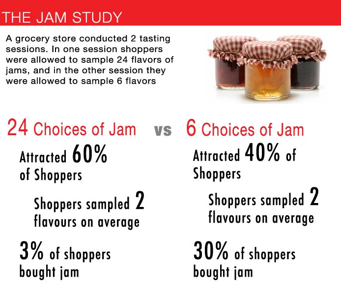
The most famous and, I believe, the first study that pointed to the adverse effects of choice was in 2000. The subject was jam. Researchers found that more people purchased jam when fewer options were available.
Since then, other studies have supported this phenomenon, with subjects ranging from chocolates to 401(k) plans. Most have supported the notion that more options debilitate consumer decision-making.
The psychology behind the “paradox of choice”
Of course, Barry Schwartz gave the famous Ted Talk on choice (and wrote the book on it). Watch it if you haven’t already:
Schwartz summarized the negative sides of choice by two features:
- Analysis paralysis;
- Buyer’s remorse.
There’s also a third negative effect of excess choice, ego depletion, which I’ll explain as well.
1. Analysis paralysis
More choices can often lead to a worse user experience.
Especially for calls to action (CTA), more is not better. By now, it’s a marketing cliche to judge content and landing pages by their “one call to action,” and for good reason. The more options you give, the more you distract users from the desired goal.
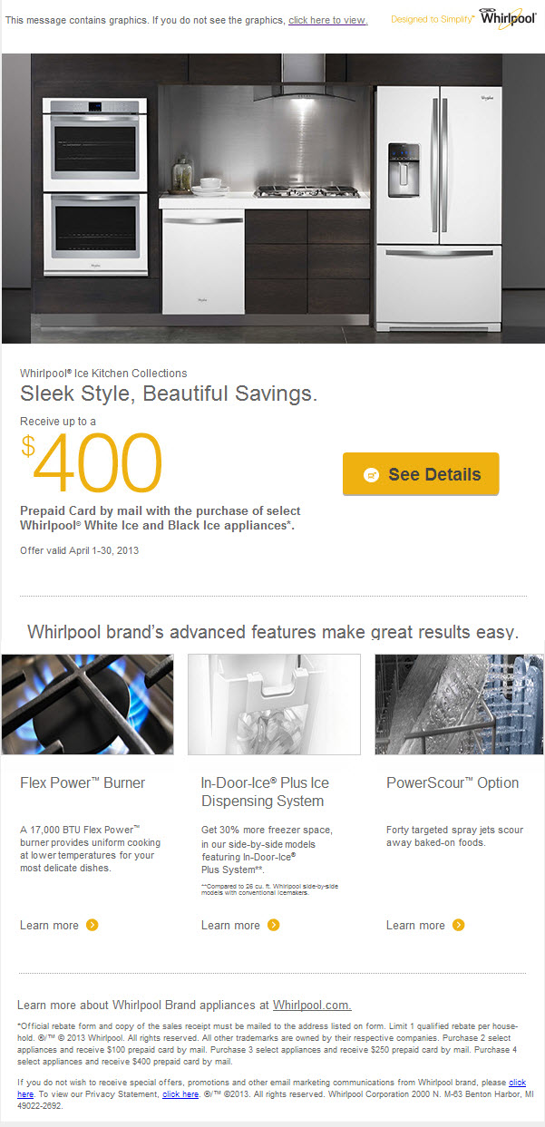
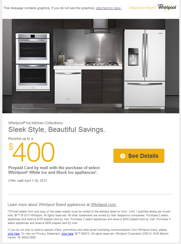
Here’s a good example from MarketingSherpa. To begin developing a testing culture, WhirlPool started small: They tested some simple changes in an email campaign.
Here was the original:
Here was their treatment:
So, they basically went minimalist and eliminated all the secondary CTAs and photographs. The result? The treatment with the single, focused CTA achieved a 42% increase in clicks for Whirlpool.
2. Buyer’s remorse
Generally, the more choices you have, the worse you feel after you buy. Why? Because your standards have been raised, and now all you can think about is how much better the other options may have been.
One article went so far as to say that choice is the root of all unhappiness. Here’s how HBR summed it up:
What’s more, psychologists and business academics alike have largely ignored another outcome of choice: More of it requires increased time and effort and can lead to anxiety, regret, excessively high expectations, and self-blame if the choices don’t work out. When the number of available options is small, these costs are negligible, but the costs grow with the number of options. Eventually, each new option makes us feel worse off than we did before.
3. Ego depletion
Have you noticed that figures like Barack Obama and Mark Zuckerberg wear the same clothes day after day? Do you know why they do this?
It’s because they know they have important decisions to make, and they don’t want to sap their energy with trivial concerns.
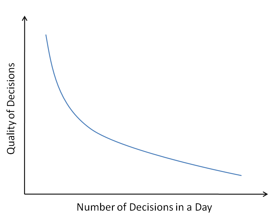
Ego depletion is a real thing. Willpower is a finite resource. The more decisions we must make in a day, the faster we drain that resource.
That’s one reason why, when making diet changes, you should keep the Cheetos out of your cupboard. Every time you see that glorious orange bag, you have to make the conscious and difficult decision not to tear into it and sate your hunger. At the end of a long day filled with tough decisions, you might not have the willpower necessary to make a healthy one.
This is also known as decision fatigue, and it’s often the cause of our crappy decision making.
While this doesn’t necessarily apply directly to conversion optimization, know that the more trivial choices you, as a human, make, the worse you are for it.
Limit trivial decisions, and you’ll save energy for important ones.
When reducing options increases sales
In defense of his thesis in The Paradox of Choice, Schwartz wrote a column for PBS that gave a few modern examples of increased sales that resulted from the restriction of buying options.
One compelling example was for a large retailer of office supplies, which had reduced the number of options offered in its print catalog in many product categories.
They did this not to increase sales based on psychological research but to save money on overhead (i.e. production and postage). They actually assumed that the changes would reduce sales, but that’s not what happened.
Instead, the company found that—in every category in which the options were reduced—sales increased drastically.
Even marketing messaging can benefit from simplicity, as an HBR study noted, likely because of the cognitive ease in processing fluency:
The single biggest driver of stickiness, by far, was “decision simplicity”—the ease with which consumers can gather trustworthy information about a product and confidently and efficiently weigh their purchase options. What consumers want from marketers is, simply, simplicity.
There are also compelling studies suggesting that having too many choices can stand in the way of achieving goals.
But what about online sales? Does having too many options really reduce conversions? Here are three examples from social media, email marketing, and SaaS pricing.
1. Social sharing
Here’s the big question: Do social share buttons help (by providing social proof) or hurt (by distracting)?
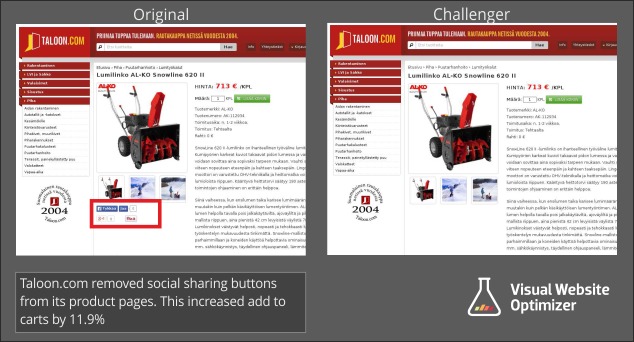
The answer is…yes. In some contexts, social share buttons hurt; in others, they help. Here’s an example from VWO that supports the elimination of social share buttons:
Keep in mind that this is one case study. We don’t know the full numbers. It could’ve been a poorly run test—we don’t know. Also, there’s no real way to tell why this happened. The social sharing buttons could’ve been distractions, but they also could’ve been negative social proof if share counts were low.
A clearer fix to make is to simplify your existing share counts. Do you need to display every single social network? Probably not. Chop most of them out, leave the most impactful, and add a button to expand sharing options.
Takeaways:
- The fewer CTAs the better, even when it comes to social sharing.
- Instead of giving every social option, list 2–3 of the most important ones, then give an option for other platforms.
- Experiment with excluding social share buttons on certain pages. Brian Massey recommends leaving them for the “thank you” page after a conversion.
2. Email marketing
Earlier, I outlined an example with Whirlpool that showed the power of simplicity in email marketing. While email marketing is still an effective way to reach customers, we’re busy and have short attention spans. Simplicity allows a core message to break through the clutter (instead of adding to it).
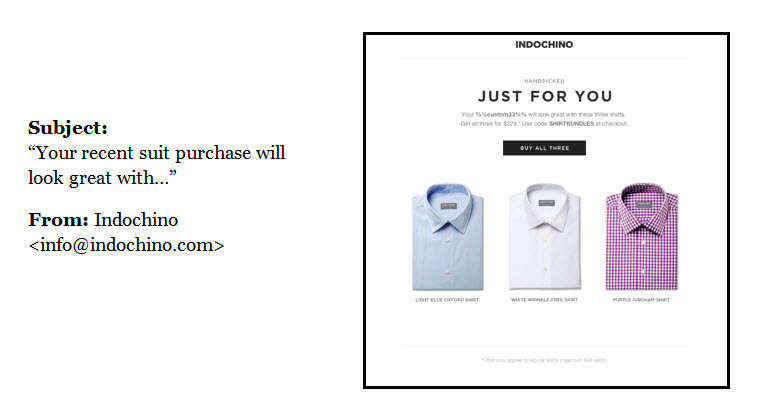
Try to have one goal for each email, or at least one desired action for the customer. Segmentation and personalization help with this. Here’s an example from Indochino:
They shoot this email to you right after you buy a suit, so it’s personalized based on the product you chose. The choices are limited to three shirts that would look good with your suit. It’s simple, and the desired action is intuitive.
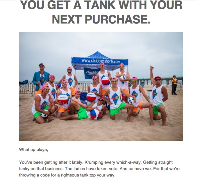
Chubbies does something similar, often sending you a free gift with your next purchase after you buy something. It’s simple, and the code is the call to action for your next purchase:
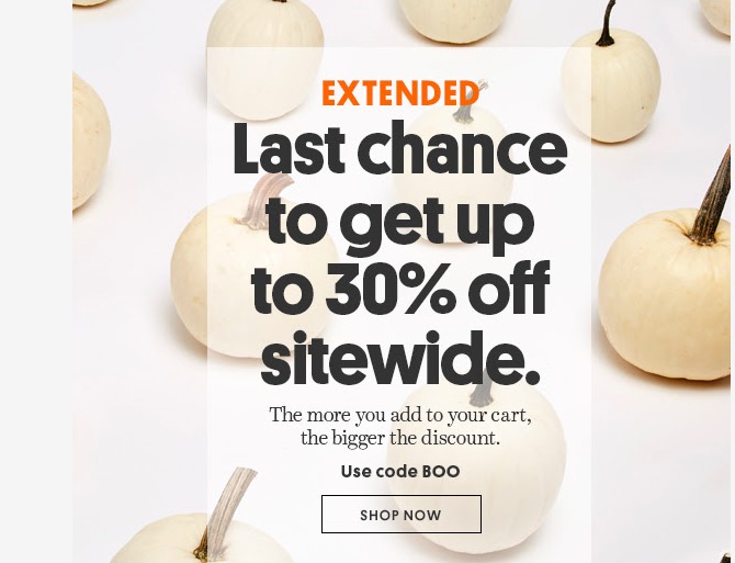
Bonobos is always good at getting me to click (and spend), too. Simple, with one call to action (and some urgency):
3. SaaS pricing
It’s common to offer three pricing levels. Some companies offer many more, some less, but three is by far the most common. Small, medium, large. But is this always best?
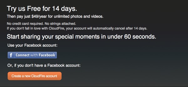
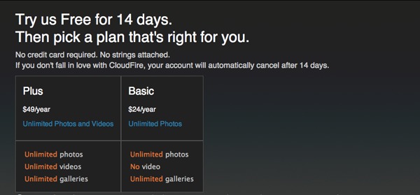
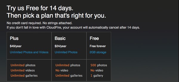
Ash Maurya tested common assumptions by setting up a pricing experiment with four variations.
Version 1
Version 2
Version 3
Version 4
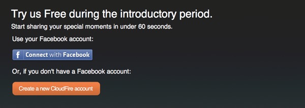
The results? Version 3 had the highest conversion rate but quite a bit of churn as well. The highest revenue increase—the overall winner—went to Version 1, the simplest option.
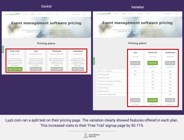
Similarly, VWO published a study with Lyyt that simplified their pricing page from four columns to three. They didn’t eliminate any pricing tiers. Instead, they better categorized the features and allowed you to select a free trial on any of the plans.
The variation ended up increasing visits to their free-trial page by 93.71%:
Choice can be a good thing, too
I’ve read so many blog posts with anecdotes about people overwhelmed by choice. Whether shopping for ice cream, toothpaste, or shampoo—or simply for the sake of narrative—everyone hints that they thought about walking out of the store without buying because of the overwhelming options.
But did they buy the shampoo? You bet they did.
Also, I’ll go on record and say that I’ve never once left an ice cream shop because there were too many choices, hard as it may have been to decide. (Similarly, I’ve never left a bar because they had too many craft beers on tap. Rather, that’s what brought me in the door.)
Then there are infographics, like this one from QuickSprout, that somehow offer prescriptive numbers on exactly how many conversions you’ll lose if you add whatever type of form field, nevermind the context:
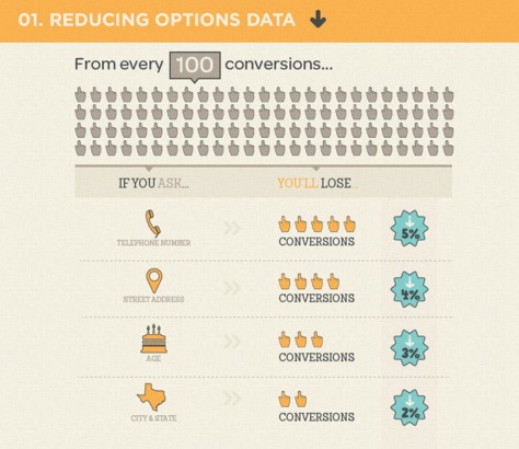
While it’s based a little bit in the psychology of choice, it’s still pretty silly to reduce nuance and complexity to this. Choice doesn’t always kill conversion rates.
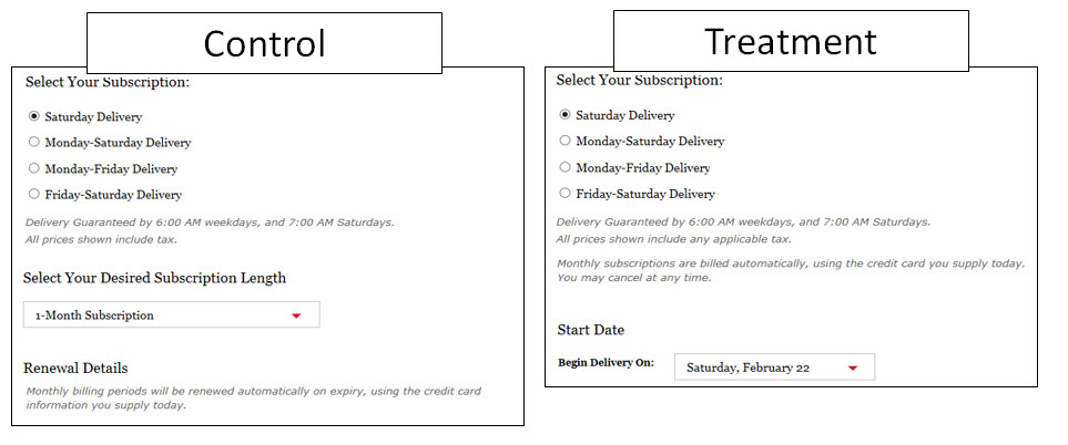
MarketingExperiments wrote about one such incident when they were optimizing a form. As is common, they hypothesized that reducing options on a form would increase the conversion rate:
The control had four choices for the subscription option, plus an option to choose your desired subscription length (monthly, six month, or one year).
On the treatment, everything was the same except that they removed the option to choose the subscription length, making it auto-renew monthly.
The results? The treatment—the one with fewer options—tanked conversions by nearly 40%.
That could be for a number of reasons. They chalked it up to the fact that “people find a lot of value in the ability to compare prices and look at options they may never be truly interested in.”
Who knows? Either way, sometimes having choices is a good thing for the customer and your bottom line.
Sometimes, more is more
Despite a substantial number of papers and blog posts that warn against providing too many options, The Atlantic published an alternative take. As they bluntly put it:
Sometimes, they concluded, too many options repel us. The researchers called it “the paradox of choice.” You might call it “feeling overwhelmed by options.” But some economists are calling it something else: “complete hogwash.”
Less isn’t always more. Sometimes, more is more.
They cite evidence like Starbucks’ 87,000 drink combinations and grocery stores’ multitudes of toothpaste and shampoo. You’d think, they argue, that these companies aren’t just blindly enacting these strategies.
Another piece of evidence is that a few researchers tried to reenact the jam experiment but couldn’t. As the Financial Times explained:
The average of all these studies suggests that offering lots of extra choices seems to make no important difference either way. There seem to be circumstances where choice is counterproductive but, despite looking hard for them, we don’t yet know much about what they are.
How might we explain these counter-examples? There are a couple of ways to think about.
1. Single-option aversion
The Atlantic also referred to a 2013 study by Daniel Mochon on “Single Option Aversion.” In the study, Mochon offered participants a choice to buy or not buy a Sony DVD player; 9% said they’d buy it.
However, when he offered a Sony or Philips model, the number that opted to buy a Sony went up to 32%. The presence of another option dramatically increased the overall willingness to buy.
He replicated his findings with TVs and donations. Here’s how The Atlantic summarized his research:
In a sentence, when shoppers are given a take-it-or-leave it option, it makes them more interested in searching for comparisons. The paradox of choice theory assumes that too many similar options—e.g.: multiple varieties of Belgian dark chocolates, or many kinds of jam with strawberry as a main ingredient—confuse what we’re really looking for. But Mochon suggests that similar options heighten distinctions and make us more certain about our final choice.
Something to think about with SaaS pricing.
2. Choice-supportive bias
Here’s a phenomenon that counters the “buyer’s remorse” findings above: choice-supportive bias.
Our mind has an excellent ability to perform mental gymnastics, tricking us into believing things that aren’t objectively true. After all, we’re not rational creatures.
Choice-supportive bias is defined as “the tendency to retroactively ascribe positive attributes to an option one has selected.”
It makes us feel good about our choices, no matter the contrary evidence. In a blog post on the subject, conversion expert Jeremy Smith gave some great examples of this bias:
“Once you recognize it, you begin to see it in all kinds of places:
- You voted for Bush. You don’t think about the negative things. You think about the positive things.
- You voted for Obama. And you don’t think about the bad things that have happened during his presidency. Only positive.
- You choose a faith. And you tend to ignore some of the less-than-favorable aspects of its history.
- You choose to buy a house. And you try not to dwell on the fact that it’s a bad investment.
- You pick a car. And you tend to try not to believe that it’s actually a lemon.
In many cases (not all) the brain tries to support its choice. The brain has a built-in cognitive bias to support strongly any choice that it made.
Thus, we have the choice-supportive bias.”
The evidence suggesting that more choices equals more regret and self-blame is pretty strong, but remember that humans are excellent post-decision rationalizers, too.
Conclusion
So a study comes out in the year 2000 and flips the idea of choice on its head. Since then, “more choice = worse sales” has been accepted dogmatically by most, and refuted by some.
The too-much-choice thing does happen. It just doesn’t happen all the time. That doesn’t mean that there isn’t solid support for the phenomenon, and it definitely doesn’t mean we should throw the insights away, as some publications have suggested.
The trick here, as usual, is to find a middle ground. The “sweet spot,” as Schwartz called it, allows people to benefit from a large variety but not be paralyzed by it.
Does choice overload always occur? Of course not. Does it affect all people, in all domains of decision making? Of course not. Does it matter how options are organized and arrayed? By all means, yes. Does adding options improve decision making by making salient features of alternatives that might otherwise be ignored? Sometimes, yes. But sometimes it has a perverse effect, by making salient features of options that ought to be ignored.
Some possible takeaways for conversion optimization:
- Try to define one goal per page, one call to action, one desired action from visitors. Eliminate things that distract from that goal.
- Limit social sharing buttons to a few impactful networks.
- Make emails simple, personal, relevant, and de-cluttered.
- Try to reduce items per page on ecommerce category pages. We’ve had clients for whom this has worked well.
- Don’t assume that fewer choices is always better. Sometimes it works; sometimes it doesn’t. Sometimes you should offer multiple pricing tiers and options. It’s all contextual.
All in all, the science of choice is still an unfinished story. For now, seek to understand your users and the optimal amount of choice for them.
Working on something related to this? Post a comment in the CXL community!



The result of “The Psychology of Choice” study is interesting. As they say, “Less in More.” The more you give choices to customers, the more they are distracted and eventually become undecided. Although, I must also agree that there are times that giving several choices can be an advantage as well. I think the trick is offering different kinds of products. I like your suggestions about conversion optimization. You mentioned about limiting Social Share Buttons. I would say that this is effective in enticing the readers to share a content. When it comes to share buttons, the lesser, the better. You just need to put these buttons on the strategic part of the page.
Totally right – thanks for the comment, Carl!
Spot on article.
When it comes to online shopping (and shopping in general) there is thing I like to call “critical amount of products”. It’s different for each niche, but if you have below the minimum the visitors feel that the shop is “empty” and not trustworthy enough.
IRL we don’t usually go in empty shops and bars, because we are social beings. Same applies to our online habits for some reason.
Thanks for the comment, Plamen. As I mentioned, it’s usually the plethora of craft beer options that brings me into a bar into the first place :)
However, that also speaks to the importance of context and categorization. It’s not as hard to decide between multiple options when you know that you’re an IPA guy and not into stouts
Cheers,
Alex
Loving the beer analogies…
Hey Alex,
I guess creating scarcity with in our products will bring about better value! It will inspire conversion as the “fear” of losing a ready offer would be imprinted on the minds on the visitors!
However, ‘scarcity mentality’ must not be taken to be serious at all times. There is need to understand where, when and to whom it works with. The following point summed up this point:
“Don’t always assume that less choice is better. Sometimes it works on some people, but then again, sometimes it doesn’t. Sometimes you should offer multiple pricing tiers and options. It’s all contextual.”
I left the above comment in kingged.com as well
Excellent post Alex. You prompted me to write about my own experiences learning about choices and the stress we can put our clients through when there are too many options. (linked via my name).
Oops. here’s the link: http://www.kayakonlinemarketing.com/blog/stop-stressing-out-your-clients
Thanks, loved your article!
Hi Alex
Very informative piece!
Yes, too much options create more confusion.
Thanks for the insight you put forward thru
this post.
The sub head email marketing made interesting read.
Hi Alex
Very informative piece!
Yes, too much options create more confusion.
Thanks for the insight you put forward thru this post.
The subhead email marketing made interesting reading.
Too much clutter in the mail will prompt the receiver
to press the delete button or the spam button!
Yes, as you said “Simplicity allows a core message”
and the share button policy too made interesting reading
Altogether lots of things to pick from here.
Thanks for sharing.
Have a great and profitable weekend
~ Philip V Ariel, Secunderabad, India
Great article Alex.
For all the sites we’ve put up, we definitely have to test the pricing packages page the most. Some markets do react better to certain things.
Love the breakdown you did. Keep it up!
Thanks for the comment, Dennis. Glad you enjoyed the article!
Cheers,
Alex