Every nonprofit that accepts online donations has a donation page. But there’s a big difference between having a donation page and having an effective donation page.
Your donation page may follow purported “best practices,” but you could still be losing donors and revenue. In fact, our experience running over 1,500 online fundraising A/B tests has shown that traditional “best practices” are rarely the most effective way to increase donations.
In light of this, I want to share strategies—based on our research and experimentation, not just assumptions—that have proven to increase conversions, donations, and revenue. Often, these tactics go beyond or, in some cases, contradict popular “best practices.”
1. Choose the right type of donation page.
One of the most common mistakes that new online fundraisers make is assuming that a single donation page is sufficient. In reality, donors come to your donation page with a huge variety of motivations.
If you send all of your traffic to a single donation page, you’ll likely see poor results. But if you utilize three types of donation pages—general, campaign, and instant—you’ll be able to align your pages with the motivations of your donors. Let’s cover each type in more detail.
General donation page
The general donation page on your website is your primary donation page. Every organization that accepts donations online has one. But to optimize this page, you must understand that visitors to your general page will always have a wide variety of reasons for giving.
To make this page more effective, keep these ideas in mind:
- Use copy to communicate why someone should give using broad reasons, rather than focusing on a specific project or fund designation.
- Keep your message clear and concise, using bullets.
- Offer a free gift for a specific giving level to drive up conversions.
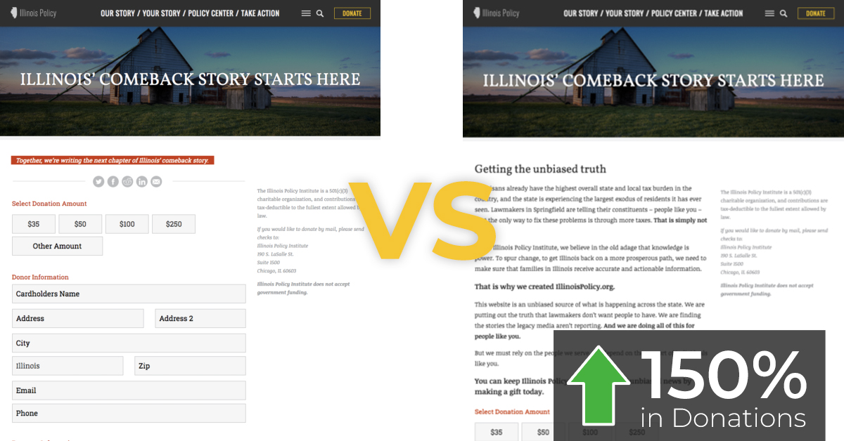
A general donation page case study
In the experiment below, the organization began with a donation page (left) that was virtually devoid of copy. They had one small line of text in red that said: “Together, we’re writing the next chapter of Illinois’ comeback story.”
Many fundraisers assume that general donation page visitors are already motivated to give, and so they neglect to add much copy that explains why giving is important.
But in reality, even highly motivated donors have the potential to abandon your page. In fact, according to M+R’s 2018 benchmark report, 83% of all donation page visitors leave without giving.
The organization below tested a new version of their donation page that included a lot more copy. The updated page:
- Explained what the organization did in broad terms.
- Used bold text and headers to make it easily scannable.
- Included a call-to-action headline with a specific donation ask.
The result? The new version of the donation page led to a 150% increase in donations.
Campaign donation page
It’s not enough to send all of your traffic (whether via email, advertising, etc.) to your general donation page. You need to create a dedicated campaign donation page for specific donation appeals.
Dedicated campaign pages work because your donation ask is made in a particular context. For example, if you’re raising money to build a new building and you send your potential donors an email about it, your campaign donation page copy needs to focus on that specific project.
If you focus on the broad reasons why your organization is great (as you would on your general donation page), donors won’t be confident that their money is going to the right place. They also won’t have a full understanding of the impact their gift can make.
In the example below, this organization converted their general donation page into a dedicated campaign donation page by making five distinct changes. This new page resulted in a 50% increase in revenue.
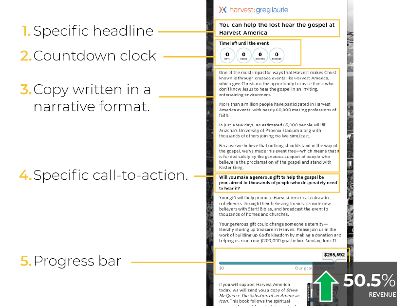
When creating a campaign page, keep these key ideas and page elements in mind:
- Write copy that’s specific to your campaign, not broad generalizations about your organization as a whole.
- Add a progress bar to show how close you are to reaching your campaign goal.
- Add a countdown clock to visualize your campaign deadline and create urgency.
- Avoid using videos. (If you don’t believe me, check out this experiment. Or this one. Or this one.)
Even small changes make a big impact on campaign pages
Optimizing your campaign donation pages can often come down to small copy variations and nuanced language. What may seem like an insignificant change to you may significantly impact the impression that your page makes on your potential donor.
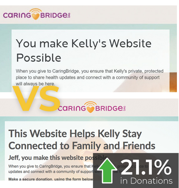
In the experiment below, an organization tested a new headline on their campaign donation page. The change wasn’t drastic, but the impact was.
The original headline read, “You Make Kelly’s Website Possible,” emphasizing the organization’s broader cause—providing websites to keep family and friends connected for people going through a health crisis.
A new version of the page used a slightly different headline: “This Website Helps Kelly Stay Connected to Family and Friends.” The shift was subtle, but significant. For the new version, the emphasis shifted to the impact the donation had on the individual goal (human connection) rather than the organizational goal (websites).
The result? The more specific headline led to a 21.1% increase in donations.
Instant donation pages
The instant donation page is the least common donation page. In fact, it flies in the face of traditional thinking about online donor acquisition.
Rather than trying to acquire a subscriber and then waiting months and months to cultivate them, the instant donation page focuses on converting new subscribers into donors right away.
Here’s how it works:
- Use a free offer (ebook, course, petition, etc.) to acquire an email address.
- Make a donation ask right away on your confirmation page.
- Make your donation ask in the context of the free offer they’ve just received.
- Include a donation form right on the confirmation page.
For example, one organization running Facebook Ads targeted likely supporters with a call-to-action of “Donate Now.” They conducted an A/B test with a version of the ad that offered a free online course. After enrolling in the course, the student was presented with an instant donation page.
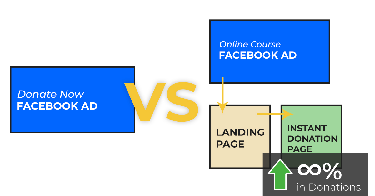
The “Donate Now” ads saw an abysmal 0.46% click-through rate and brought in zero donations. On the other hand, the instant donation page model increased clicks by 209% and started converting new donors right away—at a 1.18% conversion rate with an average gift size of $58.33.
The conversion rate is low. But many organizations using this instant donation page model make back all of their advertising costs, plus some. While most organizations plan to spend money on acquisition, this model can help you recoup some of your costs, or even make money on acquisition.
2. Friction can be your biggest donation killer.
It’s impossible to remove every element of friction from your donation page. Friction may include:
- Filling out form fields;
- Errors on your page;
- Confusing page layouts;
- Unnecessary required fields.
Some elements of friction are always present. For instance, you can’t make an online donation without requiring payment info.
But there are some elements of friction that you can reduce to create a better giving experience and increase the likelihood of someone making an online donation.
Field number friction
Field number friction is one of the most common barriers—too many fields, asking for unnecessary information, etc.
In the example below, you can see how too many fields make a donation form feel overwhelming and can cause a potential donor to abandon the process altogether.
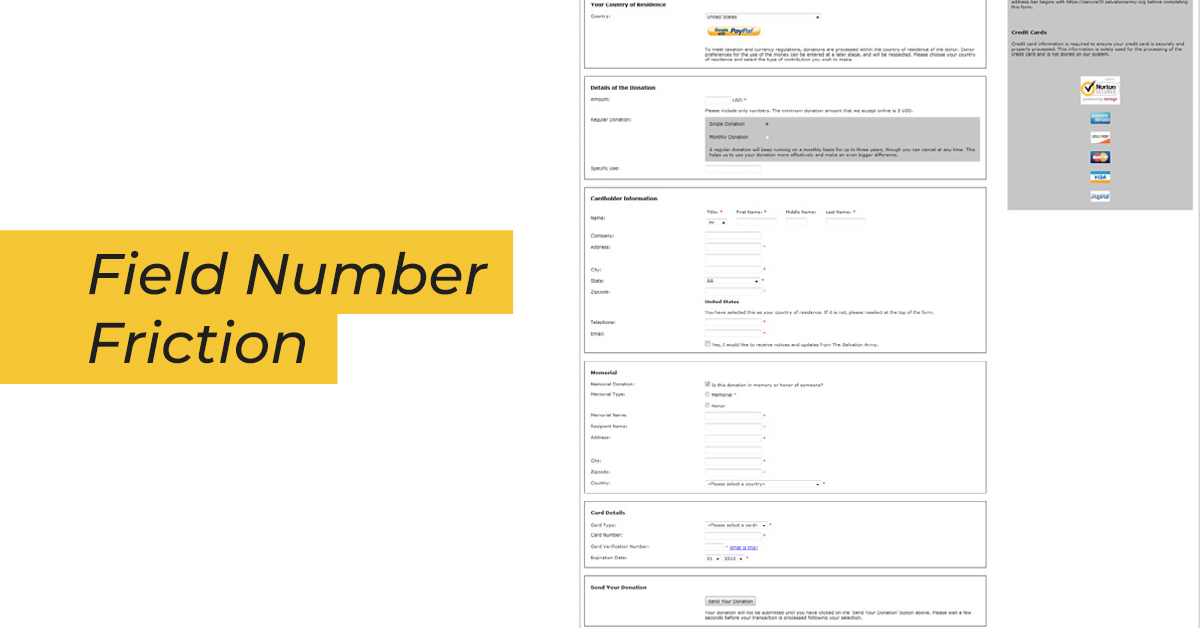
A few common fields that we see on many donation pages are unnecessary to complete a donation:
- Gift designations;
- “Make this gift in memory of…”;
- Titles (like Mr., Mrs., Ms., Dr., etc.).
Field number friction all comes down to perception. In many cases, you can keep the same number of fields but group them together in a logical fashion to make the page appear shorter.
A shorter form (usually) makes someone perceive donating as less work, even if it has the same fields.
Decision friction
Decision friction occurs when you ask a donor a question that they’re not informed enough to answer. Or, in some cases, decision friction can be caused by simply giving too many options for someone to choose from.
In the example below, you see one of the most common ways that decision friction shows up on the donation page: gift designation.
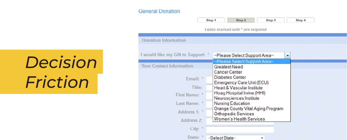
While there are many reasons why an organization may want each donor to designate how to spend their gift, most donors aren’t informed enough to know how to answer this question.
Easy solutions are to:
- Not require a gift designation;
- Default the gift designation field to “Where most needed”;
- Remove the field on campaign donation pages.
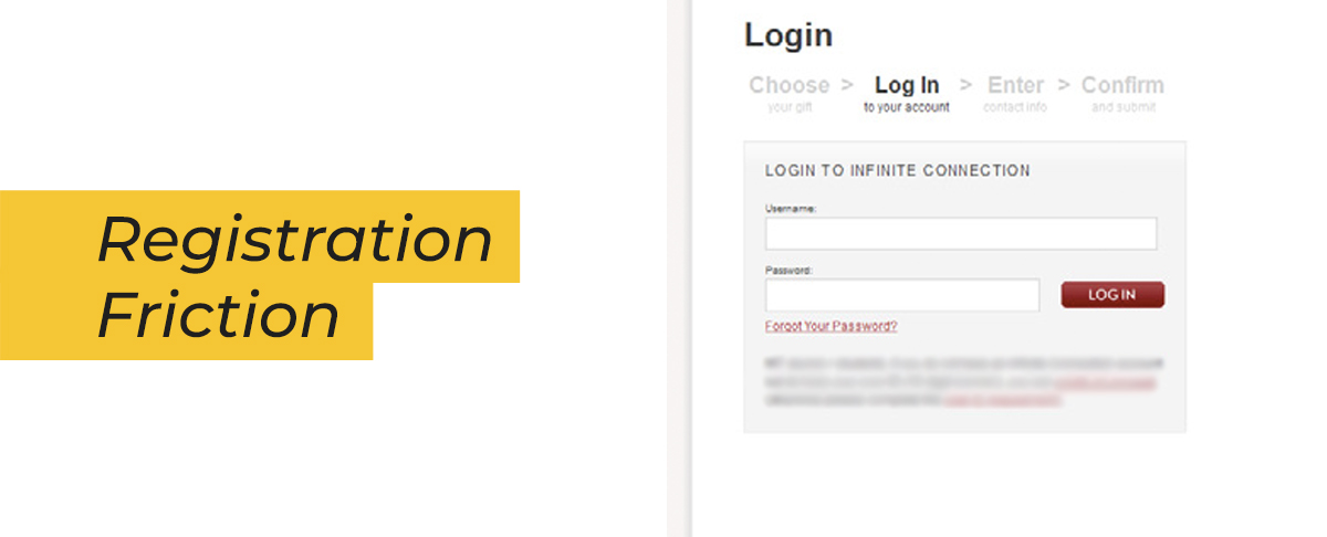
Registration friction
Another common way we often make things more difficult is through registration friction. Registration friction occurs when you ask a donor to create an account or log in just to make a donation.
Logging in might make things easier for the organization in terms of data tracking and gift processing, but it makes the donation experience much more difficult and frustrating for the donor—and can lead them to abandon their donation.
3. But making it “easy” to donate doesn’t guarantee you’ll get more donations.
A common refrain in non-profit meeting rooms is, ”We just need to make it as easy as possible for someone to donate.”
While there’s an element of truth to that, removing all friction from the donation process can cause more harm than good. The common practice to “make things easier” can dilute the impact of the most important element on your donation page: your value proposition.
If your only goal is to get people to the donation form faster, you won’t ask the donor to read about your organization before entering their payment info. But if you remove elements of your page that strengthen the reasons why someone should give to you, you risk losing donors.
An experiment in copy length
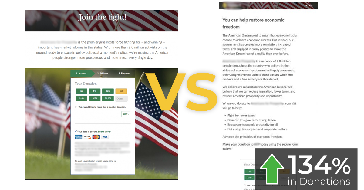
Fundraisers and nonprofit marketers often ask, “How long should my donation page copy be?” After running hundreds of A/B tests, we’ve learned that the length of your copy isn’t nearly as important as how effectively your copy communicates your value proposition.
In the experiment below, this organization had a short amount of copy on their original donation page. One might think this makes it “easier” for the donor because there’s less to read.
They created a new version of the page that added a considerable amount of copy. But the primary change was that the length of copy gave them more opportunity to explain why someone should donate.
The result? Adding more value-focused copy led to a 134% increase in donations, despite making the page significantly longer.
An experiment with “Donate” buttons
The donation shortcut button usually sits in the header on your donation page, anchored to the donation form at the bottom of the page. Functionally, when you click the button, it jumps you past all the copy and right to form.
The argument for these shortcut buttons seems sound: “If someone is ready to give, why slow them down by making them read a bunch of copy?”
In the experiment below, this organization added the button in hopes that it would lead to greater donations. The result? Allowing donors to bypass the copy by clicking the button led to a 28% decrease in donations.

Although the shortcut button made it “easier” to get right to the transaction, it made it harder for donors to understand the impact their donation would have.
Those results may not hold true for every site, but it’s a cautionary tale about blindly following “best practices” or focusing solely on making donating “easier.”
Conclusion
All of these tactics come down to a single skill, which is the one that all successful online fundraisers must develop: empathy.
If you can’t put yourself in the shoes of your donors and potential donors, you’re going to make decisions based on your personal preferences or your organization’s preferences. But in most cases, what fundraisers want and what donors want are very different.
Thankfully, testing and experimentation allows us to listen to donors and see exactly what works to inspire greater generosity—and leads to greater donations and revenue.
To increase conversions on your donation pages, consider:
- Creating multiple donation pages to serve specific audiences;
- Removing form fields that aren’t essential to complete a donation;
- Expanding copy, if necessary, to communicate your value proposition more effectively.
Related Posts
-

Do you want to make your website better? There are many ways to optimize a…
-

.... That concludes the list. Instead of looking for a quick fix, you have to…
-

Technology and consumer preferences are quickly evolving (seemingly by the hour). In this turbulent world…
-

In this post I'm reviewing 5 websites, analyzing their home pages - and mostly their…