Technology and consumer preferences are quickly evolving (seemingly by the hour). In this turbulent world of fast-paced change, we often forget that core tenets of sensory perception and human psychology remain the same.
One of those functions is how we view and process visual information, and in particular, visual hierarchy.
Table of contents
Humans are visual creatures.
While there’s not a smidgen of veracity in the widely shared infographics and “content marketing” posts that scream we process images 60,000 times faster than text, a study did find that presentations using visual aids are 43% more persuasive than unaided ones.
Thus, we can say with a fair amount of certainty that visuals influence the split-second purchase decisions that consumers make without even realizing it.
Consequently, marketers must learn how they can use visual hierarchy on their website or app to exploit impulsive consumer reactions at various stages of their sales funnel.
What is Visual Hierarchy? Visual Hierarchy Defined
First of all, what exactly is visual hierarchy in terms of web design?
Essentially, it’s the way in which the page is laid out to visually communicate order and importance of the content. Visual hierarchy is created by mapping out certain cues such as size, color, contrast, shape, positioning, and arrangement to form a sense of depth.
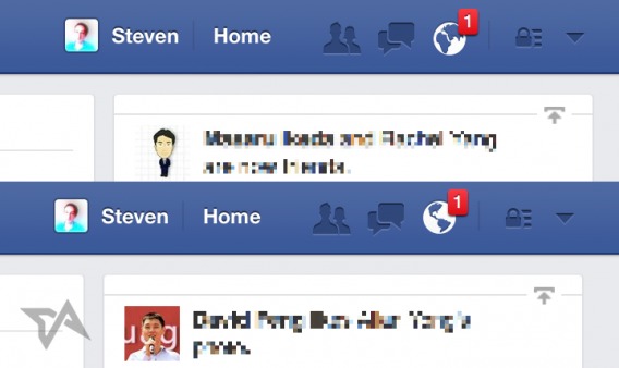
We experience visual hierarchy every day. To give you a simple everyday example, think about when you’re scrolling through Facebook’s blue and white interface, what always jumps out the most? The vibrant red notification indicator of course!
While visual hierarchy is a key principle of website and product design, the concept itself is by no means difficult to grasp. But getting it just right will most likely take some trial and error.
Here’s how you can incorporate neurological cues to create a strong sense of visual hierarchy on your platform…
1. Establish Defined Scanning Patterns
Regardless of cultural background, everyone generally consumes content from the top down, and the majority reads from left to right. It’s important to realize that visitors will seldom commit to reading every word on a website. Users typically scan web content as quickly as they can to determine if they want to dive deeper.
In 2014, Chartbeat famously revealed that you’ve got, on average, about 15 seconds of a reader’s attention online. Their CEO Tony Haile followed it up with sage words of advice for marketers:
“We’ve long used clicks as the standard for whether something is being read online, and therefore worth an advertiser’s dollars. What’s really worth measuring is attention—and attention is a function of time.”
We routinely discuss a million ways to “grab” a reader’s attention. But do we have any reliable ways of “keeping” it? A study conducted by Nielsen Norman Group found that the human brain commonly scans content in two distinct patterns.
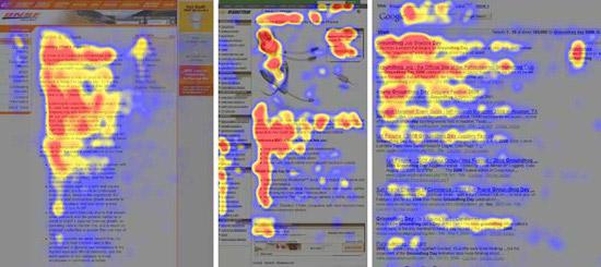
For text-heavy pages such as blog posts, or pages with consistent blocks of images, such as product listings, scanning behavior consistently happens in an F pattern.
Take a look at this heat map of eye traffic taken across ecommerce websites, articles, and (uniform) search results:
You’ll notice that the left side of the page is favored significantly more than the right. While this study was conducted with English speaking respondents, the opposite would most likely be true for those whose languages read from right to left. It essentially mimics the reading pattern that humans have embraced since the ancient times.
Throughout the years, with the increased prevalence of mobile apps as well as mobile web browsing, changes in content formats, innovative use of CTAs, and a total transformation in the display of search engine results, Neil Patel has argued that the F-shaped pattern “isn’t a commonality anymore.”
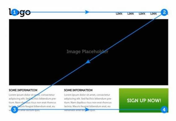
On the other hand, a Z pattern applies to more visual-oriented pages, such as advertisements.
This scanning habit typically occurs when content is not presented in block paragraphs. The reader’s natural tendency is to start at the top of the page, shoot to the opposite corner for more information, then come down diagonally to begin the next block from the left, and repeat.
How can you incorporate this concept into your website or product to improve UX and gain conversions?
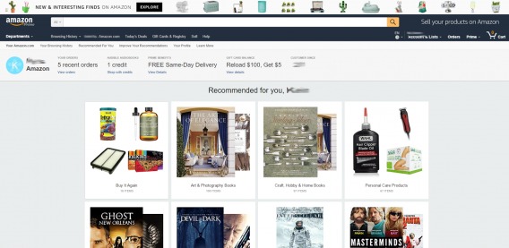
It’s common practice for web designers to craft their pages explicitly around these neurological behaviors. As both patterns begin the same way, it’s a smart choice to position your most important information in the top left. Look the leading ecommerce websites’ home pages. Here’s Amazon:
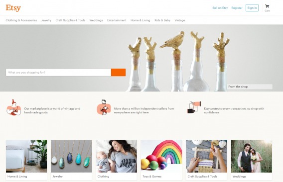
And here’s Etsy:
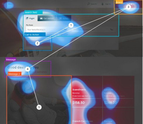
You’ll notice that logos are usually placed at the top-left corner of the page. On the opposite side, there are sign-up/sign-in options. Then, as eyes make their way to the middle, visitors are directed to look at products. The end points typically warrant a CTA for further action.
Using these neurological tendencies and scanning patterns to your advantage will not only help you entice users to explore your platform, but also effectively guide their subconscious decision-making process down the sales funnel toward a conversion.
As a data-driven marketer, know there are many tools at your disposal to discover your site’s particular viewing patterns.
These include software solutions for eye tracking, recording user behavior, heat maps (that show interaction with moving and dynamic elements, as opposed to just snapshots), click maps, scroll maps, and funnel visualizations.
In addition, these user experience insights and qualitative findings should be tested in a controlled experiment.
2. Experiment with White Space
White space is perhaps the most overlooked design component in the scheme of visual hierarchy.
Believe it or not, using white space has a unique visual significance in ecommerce web design. The basic idea is, the more white space surrounding an element, the more attention it will attract.
As far as neurological impact goes, there are many advantages to strategically implementing this concept…
1. White Space Improves Focus
There’s no denying that today’s users browse web content with a strong sense of urgency. In web design, simplicity is a powerful ally.
The human brain has two systems of reasoning: The unconscious thought process, which is impulsive, formative, and influenced by intuition (System One), and the conscious thought process, which is slow and analytical (System Two).
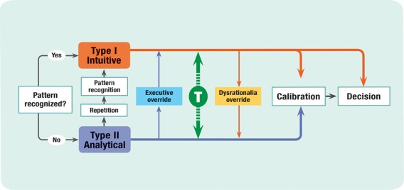
Since we only have a few seconds to grab visitors’ attention, using white space is a great way to quickly make them notice important sections of the website. This can include headlines, images, CTA buttons, or links to valuable content.
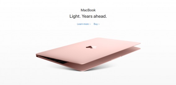
Apple uses whitespace to split the flow of its product pages, catering to both the conscious and unconscious thought processes, by clearly separating the informational (Learn More) and transactional (Buy) pathways:
2. White Space Cuts Through The Clutter
You know clutter when you see it.
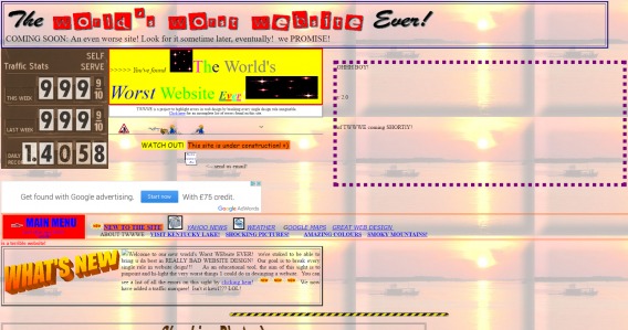
It overloads visitors and drives them away in droves. Have you seen the “World’s Worst Website Ever,” by the way?
This is what it looks like when there are too many elements clamoring for attention. And don’t even get me started on this one:
If your website looks like it was designed back in the 90s, consumers can easily jump to conclusions like a) you’re no longer in business and b) your website won’t keep their valuable information secure. Both will cost you credibility and turn potential buyers away.
What’s more, outdated websites do not typically fare well in search rankings. Google updates their search algorithms hundreds of times a year, and values user experience over most other ranking factors.
Not many people are aware that Google conducts frequent User Experience Research Studies to improve their own products. That’s how serious they are about website usability. Your website will get buried in the SERPs if you continue to ignore usability.
On the opposite side of the spectrum, an oft-quoted study found that strategically positioning white space increases comprehension by up to 20%.
3. White Space Creates Balance
Building a flow to your website relies heavily on your ability to form a smooth balance in terms of readability and usability. Finding the perfect mixture of messaging and white space can require a bit of experimentation. Keep in mind, too much white space can be perceived as a lack of content and substance, whereas too little can come off as disorganized.
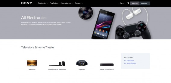
Sony provides a phenomenal example of how to use white space in a layout:
When visitors land on an ecommerce platform, they want to see the meat of the offering as quickly as possible. Sony uses sizing and white space to create navigational maps, guiding users towards products of their choice. You’ll see there is no overload of information at any point, and drilling down into categories is a simple, intuitive process.
Think of white space as the mortar that holds the entire visual hierarchy of your website together. At the end of the day, its primary purpose is to serve the boundaries of human memory and attention for a smooth UX flow.
3. Use Repetition
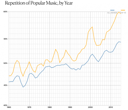
Repetition has proven time and time again to be effective in making a strong impression on the human brain. That is perhaps what makes it is one of the most persuasive elements of top selling musical records, as Elizabeth Hellmuth Margulis detailed in a TED talk.
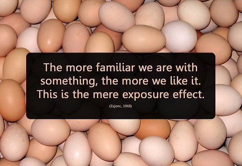
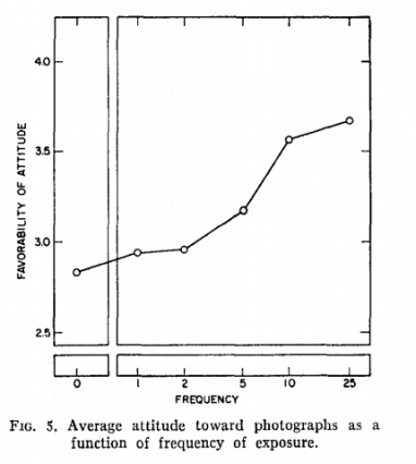
This phenomenon is backed by what is known as the “familiarity principle” in social theory and “mere-exposure effect” in psychology. A paper published in the Oxford Journal of Consumer Research found a strong correlation between fluency of exposure and favorable evaluation.
The reason repetition has such a powerful influence over people is because it increases our “processing fluency.” In other words, repeated effects are much easier for our minds to absorb.
In the late 1960’s, psychologist Robert Zajonc conducted a study on the “Attitudinal Effects of Mere Exposure.” Zajonc exposed two groups of subjects to a series of Chinese symbols and ideographs. The first group was given five exposures to the images. The second group was only given one. In both groups, the exposures lasted approximately five milliseconds (too fast to be consciously processed).
Next, Zajonc showed a larger series of images including new symbols and ideographs. These were in addition to the previous ones. This time, the subjects were able to view the images for a full second (enough time to consciously process). Then, they were asked how much they liked each one.
As it turned out, the subjects who had received the five short subliminal exposures to an image liked them better than those who had only seen them once. Overall, the group with more exposure generally rated the images as more likable, and were in higher spirits. Zajonc drew the conclusion that being in the presence of familiar things makes us happier, even when we are unaware of the exposure:
“The repetition of an experience is intrinsically pleasurable. It augments our mood, and that pleasure spills over to anything in the vicinity.”
Creating a pleasurable ecommerce UX flow is all about finding a rhythm; the best way to instill a rhythm is by using repetition.
While repetition is a foundational aspect, its uses range from simplistic to complex. Some obvious places to use repetition on your site or app are the font, color scheme, line thickness, shapes, etc. When establishing a theme, repetition is a vital ingredient to consistency through space emphasis and unification.
The overarching goal of repetition in web design is to ensure coherency of information.
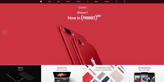
In terms of visual hierarchy, repetition is a great way to help exhibit relative importance. Going back to Apple’s homepage:
The main focus is obviously the brand new, special edition, red iPhone 7.
Below that, you’ll see the other products Apple is promoting all its other products, arranged in identically sized rectangles. By repeating certain components on your platform, you are providing visual cues for visitors to follow the content and understand how everything fits together.
Ultimately, when branded content is easier to consume, customers’ decision-making process speeds up.
If Justin Bieber can use repetition to sell millions of records, why can’t you use it to boost your website conversions?!
4. Create a Flow, Then Break It
Once scanning patterns and flow are firmly established, an effective technique in visual hierarchy is to interrupt the current status quo.
For instance, breaking the repetition you’ve created in your layout will inevitably stop users in their tracks and garner renewed attention. However, it is important to use this approach cautiously. Disrupting the flow of a website too frequently will make your platform look sloppy and unfocused.
The human eye is (and always will be) attracted to motion. In web design, an animation in the middle of text blocks is a simple but effective way of drawing attention to something you want to highlight. This is perhaps one of the most powerful techniques to use in establishing visual hierarchy.
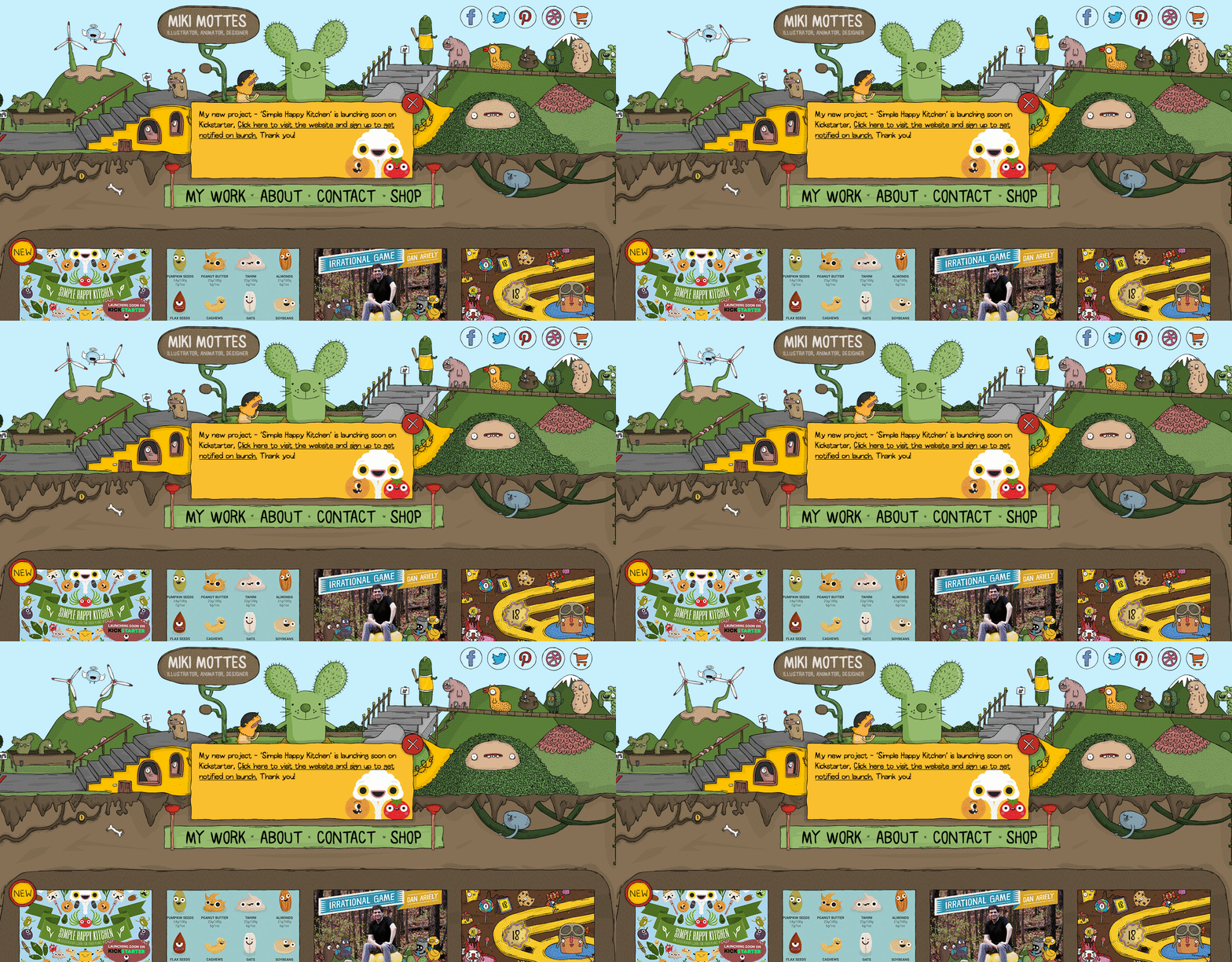
Take a look at illustrator Miki Mottes’ page:
First off, this webpage is fascinating to look at as is. The subtle shifts in the animation do a great a job in amusing the visitor. However, your eyes inevitably come back to the business part, which is framed in the middle.
Caveat: if your animation is overly flashy, it can a) be the only thing the shopper sees and b) distract them from the shopping experience. And God forbid if it’s an auto-playing video!
If applied correctly and strategically, breaks in flow can enhance the UX.
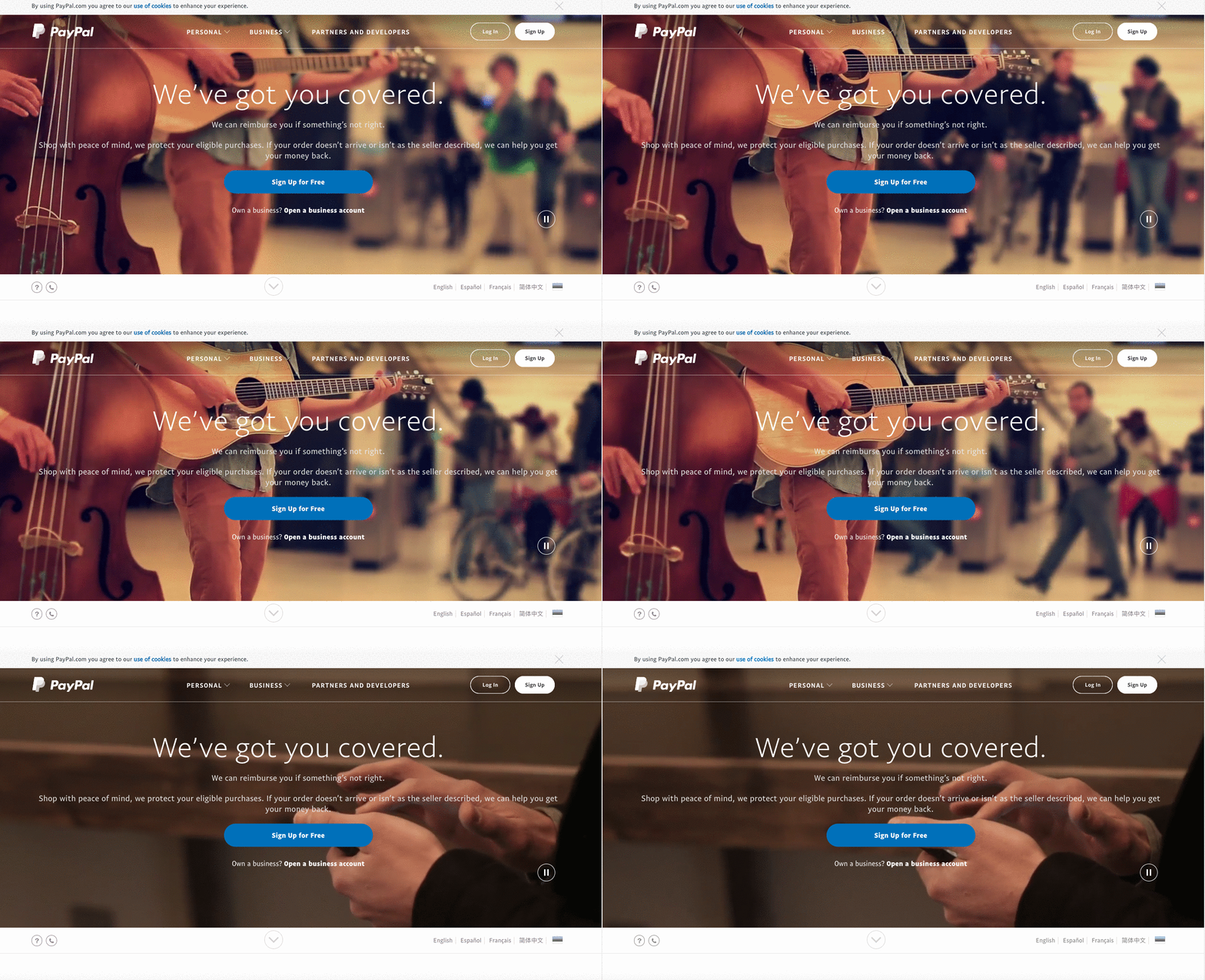
There are many ways to break the current flow of a website; a growing web design trend is using photo-video hybrids or “cinemagraphs.” This encompasses videos comprised of primarily static elements or photographs with occasional, repetitive movement of a single element. See how the model’s eyes shift slightly to look at you, over at Bundy Bundy:
For the sake of visual hierarchy, using such “distractions” in your web design can ultimately help prevent shoppers’ attention wander (and go where you don’t want it to) and direct it to CTA prompts instead.
Just be careful not to go overboard; this technique is a bit of a wildcard. As always, test it for yourself.
Conclusion
In website and product design, you can’t afford to waste any time whatsoever in attracting and retaining attention. Visual elements must be about much more than artistic decoration. They need to be strategically (and practically) placed to create an action-driven flow of usability.
Incorporating visual hierarchy around neurological triggers is crucial in communicating both the goals of your business and the overall functionality of your website. Don’t you think so?






Rohan, seu conteúdo é fantástico! Muito obrigado por compartilhar seu conhecimento! Utilizo o espaço em branco em meu blog e isto me apresentou um aumento na retenção de leitores … vou aplicar algumas de suas dicas a seguir… Abraços e Sucesso …
Great article! It’s nice to see principles which makes sense instead of “best practices”. In my opinion you must always know WHY something works or not. This article does exactly that.