
Conversion optimizers are in the business of attention management, just like magicians.
It’s your job, as an optimizer, to direct attention and focus your visitors on the next step. Yet, so few of us do this effectively. Landing pages are full of distractions, calls to action are cluttered, etc.
How can you eliminate distractions? How can you command attention, keep it and direct it the way you want? What does any of this have to do with increasing your conversion rate?
Table of contents
What You Should Be Focusing Your Visitors On
Here’s the hard and fast rule: one page, one goal.
We’ll call this goal your most wanted action. Why? Because there are likely other actions you’d like your visitors to take, but you must focus in on one per page.
For example, let’s say you want visitors on your home page to end up on the pricing page. However, it’d also be pretty nice if they submitted their email and signed up for your newsletter.
So, what’s your most wanted action? To find out, ask yourself two questions…
- What’s the action you want your visitors to take most?
- What action do your visitors want to take most?
The second question will ensure you’re being realistic. Using the same example, your visitors might not be ready to navigate to the pricing page yet. Perhaps they don’t know enough about your product or that’s too big of a commitment for their level of intent.
So, making “move to the pricing page” your most wanted action, in this case, would be a mistake.
Your most wanted action should be simple, distraction-free and realistic.
Your goal, as an optimizer, is to focus your visitors’ attention on the most wanted action. This is where being a magician comes into play…

Joanna Wiebe, Copy Hackers & Airstory:
“Magicians manage your attention by compelling you to notice what they want you to notice. Once they have your attention, they can adjust your perception to make you focus on something or to make something quite important seem perfectly shrug-worthy – visible, but unnoticeable.
Marketers do the same thing. We manage attention, not necessarily by misdirection but by focusing attention.
Imagine if you could manage attention as thoroughly as successful magicians do it.” (via Copy Hackers)
Let’s take a look at some examples. This time, we’ll look at pricing pages and how different sites focus attention on their most wanted action.
Worst: BuzzSumo
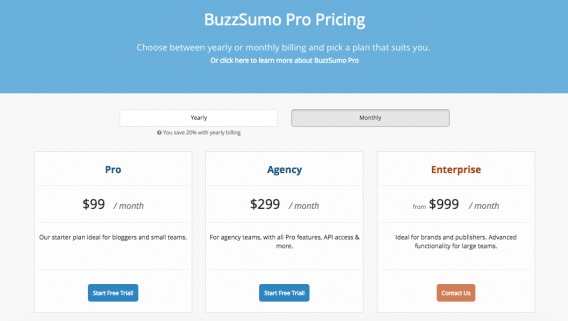
I’m willing to bet that BuzzSumo’s most wanted action is “Start Free Trial!” for either the Pro or Agency plan. Unless the majority of their visitors have a $999 a month budget, that’s the best most wanted action. However, by making the Enterprise plan the contrasting orange color, they’re directing attention to it.
When I first arrived on the page, I focused on “$999” and assumed the other plans were just as expensive. Had I been an average visitor looking for a basic solution, I might have bounced based on wrong assumptions.
Bad: Desk.com
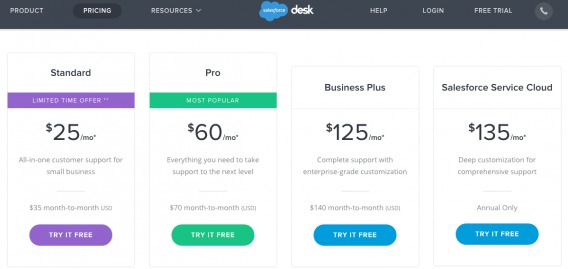
Desk.com has four options, two of which are aggressively competing for attention. “I’m the most popular.” “Yeah, but I’m not going to be around forever.” Which should visitors choose?
The effort to focus visitors is there, but it falls short. By trying to draw attention to both, they’ve actually just divided attention even more.
Good: Unbounce
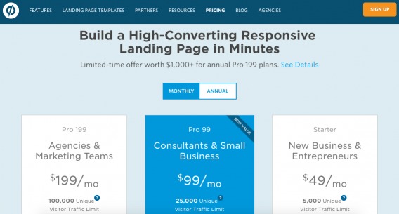
Three options, but one is clearly highlighted and marked “Best Value”. Simple, effective attention management.
Best: 15Five
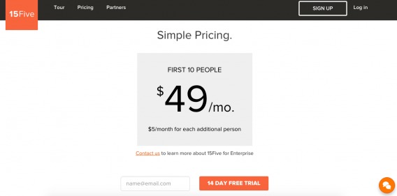
15Five has one plan. No options. Nothing else competing for your attention. No need to choose between plans, weigh your options or get distracted by feature lists.
Is this realistic for everyone? No, you likely have a more complex pricing structure, but it’s a valuable reminder to simplify and remove as many distractions as possible.
In each of the other examples, your brain needed to do a lot of heavy lifting. What is included in each of the plans? Which plan is best for your company? Do you really need all of these features? Do all of them have a free trial?
Here, your brain just needs to make one decision: Do you want the product or not?
What Is Distraction?
Distraction, then, is anything that prevents (or slows) your visitors from taking your most wanted action.

Peep Laja, CXL:
“Noise and distraction is not just about how many products you have. It’s how busy your layout is, how many competing design elements there are, all asking for attention.
Rule of noise: The closer you get to closing the sale, the less things you should have on your screen. Once they get to checkout screen, you shouldn’t have ANYTHING on the page that doesn’t directly contribute to conversion.”
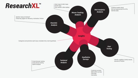
In the ResearchXL model, distraction falls under the heuristic analysis category…
Essentially, everything that does not contribute to your most wanted action is a distraction. For example…
- Large navigations that take up a lot of screen space.
- Distracting fonts and colors.
- Moving images.
- Additional calls to action with high contrast colors.
Note that it is not only internal factors that distract your visitors. They can also be distracted by external factors (their phones, their environment, their social media, their email).
Of course, they are also more likely to be distracted when they’re bored. (That’s why you’re more likely to get distracted when working on a client report on a Friday night than when watching your favorite TV show.)
Example: Enterprise
To demonstrate how common distraction is, WiderFunnel analyzed Enterprise’s PPC landing page, which also serves as their home page. What they found? 12 points of distraction on just one page…
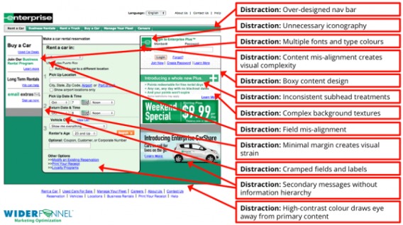
Note how minor some of these distractions seem. Distraction isn’t always Cosmic Sans and flashing banners. Chances are, your site is distracting your visitors from your most wanted action without your knowledge.
How Easily Distracted Is Your Brain?
Is distraction really that big of a problem? None of these sites seem particularly distracting. Chris Goward explains it well…

Chris Goward, WiderFunnel:
“You see, our brains are like computer CPUs. We may think we’re smart, but we have limited processing power and any ‘application’ we run can use it up and reduce our ability to process other applications (e.g. other streams of information).
Your prospects arrive on your website with pre-existing thoughts, concerns, feelings, questions, and external influences. They’re trying to understand what you’re telling them, but their attention span is stretched thin.
Then, they arrive on your landing page. Every design element, graphic, product option, copy block, unanswered question, misalignment, etc. gives them one more thought to allocate their limited capacity to.”
So, just how often are we distracted? The facts and figures might surprise you.
In 2000, the average human attention span in Canada was 12 seconds. By 2013, that number had fallen to 8 seconds, which also happens to be a second shorter than a goldfish. You know, the fish notorious for being unfocused.
Another study found that your phone distracts you even when you’re not using it. If you even feel the vibration or experience the phantom vibration syndrome, you’ve been distracted. Who is it? What do they want? Is what they’re saying more interesting than this site?
So, we can pay attention to something for no more than 8 seconds at a time and we’re routinely distracted by the mere idea that someone wants to speak to us. Now add in email notifications, Facebook notifications, new @mentions, people in the office, etc.
While none of the sites above seem particularly distracting, it doesn’t take much. Anything you can do to eliminate distractions will go a long way.
How to Identify Distraction Points
As mentioned, distraction falls under heuristic analysis, which is experience-based assessment. The outcome of this type of analysis is not guaranteed to be correct, but it can be “good enough”.
It’s as close as we get to using opinions to optimize. Of course, it isn’t random commentary, it’s structured, experienced evaluation based on core concepts (like distraction).
Here’s how to identify distraction points…
- Review your entire site, page by page.
- In a group setting, look for anything (design, copy, etc.) that might be distracting visitors from your most wanted action. Remember, if it’s not motivation, it’s friction.
- Record your findings.
Introducing: Visual Hierarchy
Distraction has a lot to do with visual hierarchy, which is refers to the arrangement of elements in a way that implies importance. So, for example, try ranking these circles in order of importance…
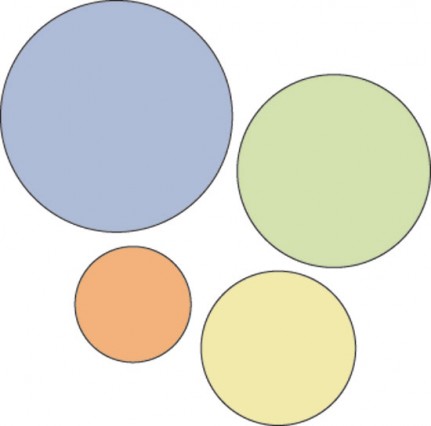
Purple, green, yellow, orange, right? That’s visual hierarchy.
Certain parts of your site are more important than others, which is why you need visual hierarchy. It’s what draws attention to your call to action. It’s why the headline is always bigger and bolder than the subheadline…
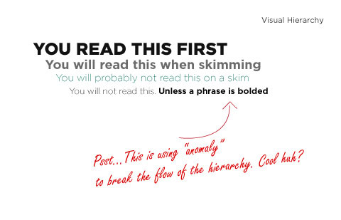
Assess the visual hierarchy of your site, page by page. What catches your eye the most? Are the right elements at the top of your hierarchy? If your call to action is low on the visual hierarchy, that means there are too many distractions.
Questions to Ask Yourself
When trying to identify distractions on your site, ask yourself the following questions…
- What’s on the page that’s not helping the visitor take action?
- Is anything unnecessarily drawing attention?
- What can I remove without compromising performance?
- Are there navigation elements that could be removed?
- Is the top header taking up too much screen space?
- Is there any unrelated copy here?
Now What…?
After heuristic analysis, you’ve identified “areas of interest”. That is, you’ve identified areas of high distraction that you have reason to believe would be solid “testing grounds”.
In order to validate your heuristic analysis, you’ll need to start testing. You can try…
- Removing distracting elements.
- Reducing the level of distraction associated with those elements.
Of course, distraction is not all about calls to action. Lots of elements on a site does not necessarily mean it’s distracting. If they are relevant, they might be fine.
For example, product pictures and Q&A on an eCommerce product page are positive elements because they serve the most wanted action. “Other Products on Sale”, however, might be a distraction.
Conclusion
The question to ask is always: Does this contribute to someone taking the most wanted action?
Conversion rate optimization isn’t magic, but we are all sleight of hand artists. Our job is to focus attention in a way that results in more conversions. [Tweet It!]
Here’s how to do it…
- Identify your most wanted action.
- Conduct heuristic analysis by reviewing your entire site, page by page.
- In a group setting, look for anything (design, copy, etc.) that might be distracting visitors from your most wanted action.
- Review your visual hierarchy. Move your most wanted action to the top.
- Record your findings to identify “areas of interest”.
- Begin testing those areas.
Related Posts
-

Do you want to make your website better? There are many ways to optimize a…
-

Online video keeps getting more and more popular. This year's Black Friday and Cyber Monday…
-

When trying to boost conversions, whether it’s on a signup screen or a landing page,…
-
Want to live longer, be there for your grandkids? But not just live longer, but…


The examples really hit it home for me. Sometimes I want to say so many things and end up creating clutter.. Really need to work on this, thanks the examples really help.
Glad you liked the examples, Sergey. Thanks for taking the time to read the article!
Just thought I would share a distraction on the CoversionXL Blog. When viewing in landscape on a phone, the social shares cover some of the content text :)
Thanks for the heads-up, Dave. What phone are you using?
Hi Shanelle,
I do agree with you on this 101%. Depending on your most important goal at any given time, your focus should be on achieving ONE goal per action. This is also true to building blog readership.
If you’ve been getting little to no traffic on your business blog, this implies that you’re not doing enough to attract attention. Without the right approach, your efforts to attract visitors, retain and direct them to act-on a specific goal won’t take you far.
This is awesome.
Thanks!
Thanks Enock! Glad you liked the article.
I agree. I see a lot of blogs with aggressively competing CTAs! Distraction can affect landing pages, emails, blogs – you name it.
“When I first arrived on the page, I focused on “$999” and assumed the other plans were just as expensive. Had I been an average visitor looking for a basic solution, I might have bounced based on wrong assumptions.”
I have to disagree with this conclusion, though I do agree with the next item in your list, based on the same thinking.
In the case of BuzzSumo, I would bet that this is a positioning strategy- they call attention to the top-level pricing on the purchase page, in order to establish the logic of their pricing for the off-the-shelf plans (pro and agency).
You are right that their most wanted action is a free trial, probably the majority of which are in the Pro category. But one issue they’ve probably had is that it’s difficult to establish price expectations for cloud services. $99 is a lot for a blogger. By highlighting the fact that the enterprise product is priced at $999, they are signaling that it is a high value purchase, and so the prospects who sign up for the free trial are likely to be more serious, and convert at a higher rate.
Again, I don’t have BuzzSumo’s data to prove this, but that’s my instinct. I don’t think this is likely to be a mistake.
Interesting perspective, Lloyd. Really appreciate you sharing it.
Of course, it’s all heuristic analysis at this point. It would definitely be interesting to see the data!
Nice article Shannelle!
Sometimes simple is better. If you give you give to many options or ‘distractions’, then that can turn people away from what you offering.
This article proves that “simplicity is key”. Thanks for sharing this post! :)
Benjamin
Thanks Benjamin! Glad you liked it.
“Simplicity is the ultimate sophistication.” ~Clare Boothe Luce
Great article about distractions. So many sites have this and they’re big brands.
I think another distraction to add is page load speed. The order that things are loaded many times effect the way your eye moves through the page to complete a desired action.
Removing things that slow up your loading time will also minimize distraction.
Load speed would technically be under “Technical Analysis” on the ResearchXL model, but I definitely see what you mean.
Any big brands in particular that have a lot of distraction on their site? I’d love to check them out.
Thanks for reading!
informative post. often i visit a website and it takes too much time to open, it really disturb me. thus the bounce rate of a website increases. i think this kind of destruction should also be eliminated.
Hey Andrew! Thanks for reading and the kind words. Actually, you might like this post on speed…
https://cxl.com/11-low-hanging-fruits-for-increasing-website-speed-and-conversions/
Another killer article, Shanelle! So on point.
Thanks Hannah! So glad you liked it.
Great overview, thank you Shannel. Btw I agree about this blog’s feature (sharing taking so much space) and in general about social sharing to be this much distracting before I can evaluate the content. If people like the content, they know it is always at the end (or the beginning) or they use browser’s native share/buffer.
Love this blog. Keep up the great work.
Thanks for the feedback, Ladislav. And thanks so much for the kind words about CXL.
Good going Shanelle. I’m reminded of the quote: “If you can’t explain it simply, you don’t understand it well enough.” – Albert Einstein
My take away: Make the page simple enough for the desired course of action to be obvious.
Great summary, Jacob. You’re absolutely right. Thanks for reading!