As a SaaS company, both your product and service are unique solutions, and your pricing page should reflect that.
It’s tempting to model your pricing strategy on successful companies. But by simply copying what your competitors are doing, you do your product and customers a disservice. You are falling in line with other options instead of communicating what sets you apart.
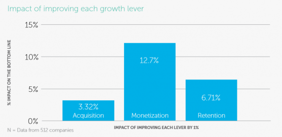
For many SaaS companies, pricing is the most overlooked way to drive growth. While most companies spend the majority of their energy on customer acquisition, pricing actually affects the bottom line nearly four times over: Monetization has a 12.7% impact on the bottom line when companies improve it by 1%, compared to the 3.32% bottom-line impact of acquisition.
One of the best ways to improve monetization and conversion is to focus on developing a value-based product pricing strategy. Value-based pricing establishes the price of a product or service based on how much your target customers think it’s worth.
With these eight keys to SaaS pricing pages, you’ll be able to communicate value effectively and motivate customers to act immediately.
Table of contents
1. Tailor pricing to your product value and customers
As part of an effective value-based pricing strategy, spend time determining the actual price value of your product and communicate it to customers immediately—as soon as they land on the page.
Don’t be like the average company, which spends less than one business day planning out their pricing. Instead, collect robust analytics data and survey customers about the services and products that matter most to them—and what they’d pay for them—to ensure you show the products and plans that resonate with each demographic and display unique pricing tiers for each one’s price tolerance.
Reevaluate your pricing strategy at least annually (ideally, on a continual basis). Make sure that all major departments in your organization weigh in, too.
Once you have a firm grasp on who your customer is and what they respond to, choose a tone for discussing your product that matches your audience. Don’t use highly technical language if most buyers are non-experts, for example. Do use technical language if they are.
Make it easy for customers to know which product is for them. One of the best ways to do this is to use single-word labels that show which option is best for which customer (e.g. bootstrapper vs. startup vs. growing company vs. large unicorn). Price each option based on the price tolerance of the group it’s designed for.
Appcues does a fantastic job at this by breaking down their pricing into three tiers that adjust in price based on a prospective customer’s monthly active users (MAUs). This way, as business for their customers grows, the price can rise to adjust with their price tolerance.
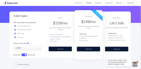
Additionally, each MAU bracket has at least one “Let’s talk” option that enables Appcues to meet serve customers who have needs outside a preset package.
Finally, make sure to highlight the key features of each plan to make it easy for customers to understand what they’re getting.
2. Keep options simple
Most customers who land on your pricing page have been funneled through other, more narrative-centered pages on your website.
By the time your customers reach your pricing page, they’re looking for cut-and-dry comparison points that will help them make a purchasing decision. Finding the balance that leaves them educated—but not distracted—can be difficult.
Aim to tie three aspects of your pricing strategy together on your pricing page:
- Positioning that aligns with the right customers.
- Packaging that shows a mix of features based on customer needs.
- Price points that represent value and what your customers are willing to pay.
For example, Campaign Monitor’s pricing page shows their understanding that customers fall into two buckets:
- those who need casual use of their email service.
- those that need a robust, high-frequency package.
Based on this, they outline clearly the features and differences between basic and unlimited packages:
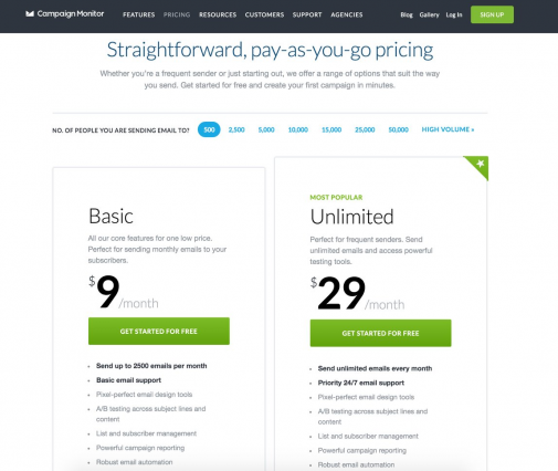
With this understanding of who their customers are and which features matter most to them, Campaign Monitor sets prices that both groups are comfortable paying.
Finally, don’t clutter your page with too much information or too many options. Instead, focus on breaking down the exact product cost and why it’s worth their money (with information such as product comparisons).
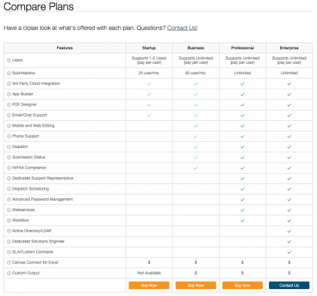
Canvas has aimed to combine two value metrics: number of users and number of submissions. By trying to address both metrics in one pricing breakdown, they’ve missed the mark by presenting too much information and confusing users:
3. Give your customers resources
When your customers land on your pricing page, they’re in the final stages of your sales funnel. And, while your pricing page design should be as clean as possible, customers still need resources to help them cross the finish line.
The last thing you want is for your customers to feel confused, uncertain, or rushed into making a decision because of incomplete information.
Drift provides a clear breakdown of multiple plans with strong calls to action (CTAs). But it also puts customer support front and center for users who need extra information on which plan is right for them:
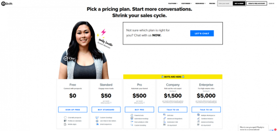
To prevent friction, make sure you include FAQs, access to customer support, reviews from other customers, and information on trials, returns, or guarantees on your pricing page.
In our study, “The Anatomy of a SaaS Marketing Site,” researchers found that:
- 76% of sites gave customers the option to contact sales or customer support on their pricing page.
- 66% included an FAQ section.
- 43% offered freemium plan options.
- 13% had a live chat feature.
4. Convert your currencies
Customers who see a product priced in their local currency are more likely to buy. However, currency is not the only necessary adjustment: You also need to adjust the price based on how its value may change for customers in different markets.
For example, Evernote heavily adjusts the price of its product depending on the country of origin for the purchaser.
Localization in pricing and currency boosts growth in all areas of the world and across customer groups. In fact, among 50 SaaS companies surveyed for our Anatomy of SaaS Pricing Strategy report, those that focused on localization showed faster growth than those that did not.
There are two ways to localize your prices:
- Cosmetic localization. Changing the currency or price based on exchange rates and the display language of your website.
- True market-based localization. Adjusting your package pricing based on local market saturation and your buyer personas.
Cosmetic localization involves adjusting currency on your site, changing elements of your website design, and tweaking your payment process to line up with regional best practices. All of this involves code-level changes of your website.
While true, market-based localization can include elements of cosmetic localization, it also involves carrying out market research into the demand for similar products in your region and what the geographic price tolerance is. This can be done in-house or with a third-party research team.
Companies with true localization saw month-over-month growth of 11%, compared to just 9% for those that incorporated cosmetic localization. Companies with multi-regional localization saw nearly double the growth of companies with no localization.
5. Leverage psychology
Beyond the explicit details about your product and its price point, customers respond positively to page design that takes consumer psychology into the equation.
Use design elements and word choice that implicitly tell your customers that they need (not just want) your product to usher them through your checkout (e.g. one month of our product will save you 500 hours of work vs. one year of our product will save you more than 5,000 hours).
Here are two ways to do it:
- Anchoring. Highlight your most popular (but mid-priced) plan in the page design to draw customers’ eyes to it immediately and create a favorable opinion of that plan over the others. Use a contrasting color to highlight this plan, too.
- Psychological pricing. Take a page out of the department store playbook and decrease your list prices by a couple of cents (e.g. $1.99 vs. $2.00).
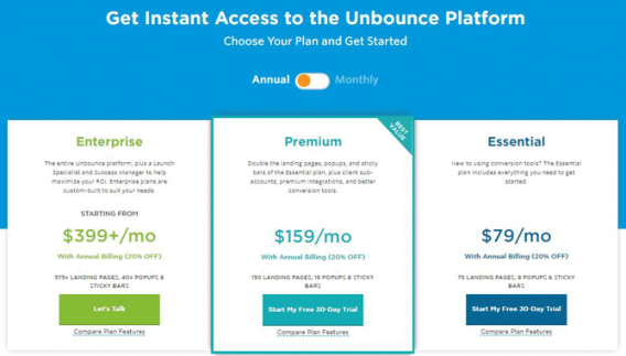
Unbounce has mastered psychology-backed package presentation. Their pricing page includes bright, contrasting colors without cluttering the page, as well as eye-catching CTAs for each pricing tier.
6. Make the action obvious and urgent
Once your customers have made up their minds to purchase your product or service, they’ll look for a clear, prominent way to take the next step.
Make sure that your call to action is, in fact, actionable. Don’t default to the classic “Submit” button. Instead, make sure the language on your “Buy now” button clearly communicates what will happen after the click.
Phrases like “Add to cart” and “Download our latest report” tend to perform better than their generic counterparts. (But you should still run a test.) When HubSpot audited their CTAs, they found that “Click here” and “Go” consistently outperformed other popular language like “Submit,” “Download,” and “Register.”
With a value-based pricing strategy, your CTA should reinforce to your customers the value that they’re getting with your product—e.g. “Start Saving Time Today” or “Increase Customer Satisfaction Now.”
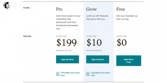
Mailchimp uses urgent, now-centered language to prompt action and explain what customers get with each plan: “Sign Up Now” for paid plans vs. “Start Now Free” for the free plan.
Your CTA can seem like a small detail, but it does a lot of lifting. For one company, changing their CTA by one word boosted their conversion rate by nearly 40%.
A couple other popular and effective tips for designing a CTA that grabs your customers:
- Make the button or form a bright, high-contrast color. Pick an accent color that fits well with your brand.
- Don’t make them scroll for it—keep your CTA in the top half of your page.
- A/B test different language for your CTAs on pricing pages to hone in on what verbiage customers respond to best.
7. Encourage upfront, annual payments
While monthly or multiple installment plans may seem attractive to your customers, annual plans that are paid upfront are better for them and your company: Customers get a discount, and you get immediate cash flow.
Though perpetually offering discounts will create the expectation among customers that they should wait for a sale to buy, presenting them with a consistent price drop for signing up with an annual plan increases the likelihood of their ROI from the purchase. It also increases the chances of creating a long-term customer relationship.
To lead customers toward an annual plan, offer discounts based on how far in advance they pay, incentivizing them with a deal on a product they know they need.
A great way to lay this out is to offer three tiers of pricing discounts based on different payment periods. The cheapest and longest-term plan should be listed first, followed by a middle-tier plan, then your least-discounted plan on the right.
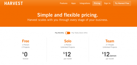
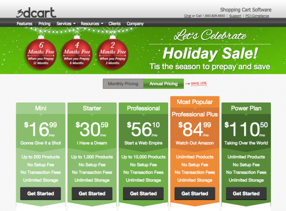
3dcart broke their pricing page up into monthly and annual pricing packages, and—for the holiday season—included clear language that annual plans came at a 15% discount, an incentive for customers to pay upfront:
A word of caution: Don’t fall into the trap of aggressive, time-limited price discounts. Customers know that other discounts for your services (or your competitors’) will come again, making them less likely to stay with you down the road.
8. Learn from your past
Even if you follow our advice to a T, it’s unlikely you’ll design a perfect pricing page the first time around. That’s why it pays to monitor the page’s performance metrics to adjust your design and price points regularly.
However, don’t resort to A/B testing when it comes to price. If customers see your prices drastically fluctuate as you test your product value, they can lose faith in your brand. Beyond that, A/B testing is rarely a viable way for companies to get a statistically significant idea of the impact of price changes because of insufficient purchase volumes and the multitude of factors that lead customers to ultimately buy a product, from page design to market saturation.
Instead, you can glean valuable data from surveying current and prospective customers. In these surveys, ask customers:
- What they most and least want out of all product options
- What price would be too high for them to consider
- What price reflects questionable quality
- What price is just on the edge of too expensive
- What price would be a good bargain
When creating your survey strategy, a good rule of thumb is to survey 25% of your customers quarterly to get a statistically significant picture of the opinions of your customer base.
Those questions should look familiar. The key to pricing a product or service to match the tolerance of your customer base is to ask the same questions you’ve been asking since the beginning of your business.
By consistently reevaluating your pricing strategy, you ensure that your prices stay within the center mass—not too cheap or expensive—of where customers find value from your product.
Conclusion
Building and growing a SaaS business is hard work.
Your pricing should show your customers not just the cost-based value of your product, but all the resources and vision that has gone into creating something to will help them.
By investing in a value-based pricing strategy and focusing on presenting it to your customer demographics in a way that resonates with them, you ensure that they’ll convert feeling as excited about your product as you are.



The whole article is sound useful. So, We should bookmarked https://cxl.com/ for further latest articles.
Pricing is key, and most people and companies don’t realize that often they can charge much more then they’d expect. But only accordingly from their follow up process, how much value they actually provide, and how they present themselves.
I’ve seen tens of thousands of dollars difference between two people or companies who offer the exact same service.
You have to have SOLID marketing to charge the latter!
-Awesome post!