Let’s say you just started using a new SaaS product. Who do you think would be able to explain the product to you more clearly: an engineer, a marketer or a customer service representative? You’d think the person who helped bring the product to life (the engineer), right?
His definition, however, would likely be more detailed and complex, thus, more difficult for you, a first-time user, to understand.
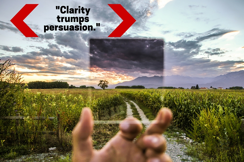
As it turns out, marketers struggle with clarity, too. And it’s hurting your conversions in surprising ways.
Table of contents
What Is Clarity and Why Should You Care?
If you’re a regular CXL reader, you’re likely familiar with the concept of clarity via the ResearchXL model…
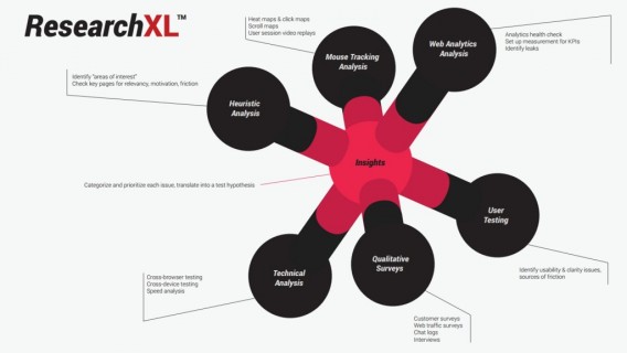
Under “Heuristic Analysis”, CXL focuses on…
- Clarity – Is what’s being offered and how it works perfectly clear on all pages?
- Relevancy – How well does each page match what the visitor thought she was going to see?
- Incentives to Take Action – Are the motivators clear, believable, timely and persuasive?
- Friction – What could be a source of fear and anxiety on each page?
- Distraction – Is anything directing the visitor away from your most wanted action?
- Buying Stage – Does the most wanted action align with the buying stage of the visitor?
Similarly, Marketing Experiments created this conversion formula, which puts a focus clarity as well…
C = 4m + 3v + 2(i-f) – 2a
Here’s what each letter represents…
C = Probability of conversion.
m = Motivation of user (when).
v = Clarity of the value proposition (why).
i = Incentive to take action.
f = Friction elements of process.
a = Anxiety about entering information.
Now, there are two things to consider when it comes to clarity: design and content. Clarity is not all about your value proposition. In fact, quite a lot goes into creating a high clarity site.
How Is Clarity Evaluated?
As you saw with the ResearchXL model, clarity is evaluated using heuristic analysis. If you’re unfamiliar, heuristic analysis is an expert-based analysis that uses experience-based techniques for problem solving, learning, and discovery.
Its results are not guaranteed to be optimal, but this is a good way to familiarize yourself with every area of the site and identify problem areas.
When evaluating design clarity, Peep suggests asking yourself the following questions for each and every page of the site…

Peep Laja, CXL:
- “Is there strong visual hierarchy in place? Does it follow most wanted action?
- Are less important things also less important design wise?
- Is there enough white space to draw attention to what matters?
- Are the visuals in place that support the content?
- Does call to action stand out enough?
- How much top priority information is below the fold?
- If there’s more information below the fold, is it clear that they should scroll? Any logical breaks that stop the eye flow?
- Is the eye path clear?
- Is the body copy font size large enough easy reading? In most cases the optimal size is 16px, but that depends on the font.”
When you move on to content clarity, go back through each page and ask yourself the following questions…
Peep Laja, CXL:
- “Where am I? What is this page about?
- What can I do here?
- How is it useful to me? Why should I do it?
- Can I understand what the product / service is, and how it works (in a reasonable amount of time)?
- Are there supporting images and/or videos that help me understand it?
- Is the product information adequate / sufficiently thorough for making a decision?
- Are all important associated pieces of information clear (pricing, shipping info, warranty, return policy etc)?
- Is it clear what I have to do next?”
Beyond heuristic analysis, one other clarity test is extremely common: the 5 second test.
According to UsabilityHub, a 5 second test allows you to “optimize the clarity of your designs by measuring people’s first impressions”. People are shown a page for exactly 5 seconds.
Afterwards, they are asked a number of questions to see how much they remember. The more they remember and the more accurately they are able to respond, the more clarity you have achieved.
UXstudio shared this example from Brickflow, which was formerly “a personalized visual-content discovery app that analyzes social profiles and provides a personal content flow of images, GIFs and short videos, based on what was previously shared”…
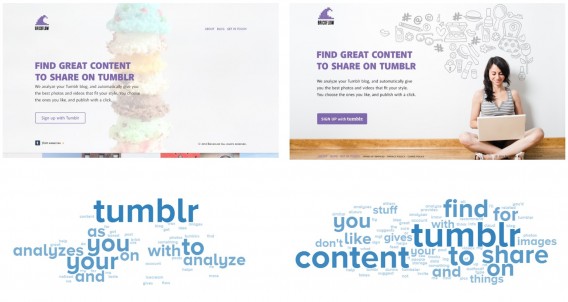
Both variations made the connection to Tumblr clear, but only the variation to the right made the connection to sharing content.
Angie Schottmuller has some suggestions for 5 second test questions…

Angie Schottmuller, Growth Marketing Expert:
- “Who is the company?
- What are they offering?
- Do they appear credible?
- What’s the call to action?” (via ThinkSEM)
Keep those four questions in mind whenever you’re evaluating clarity. (Note: An alternative to “Do they appear credible?” is “Why should you choose them?”)
How Clear Is Clear?
According to Jakob Nielsen and study from Microsoft Research, the first 10 seconds of your visitor’s time is critical. This chart best demonstrates the study’s findings…
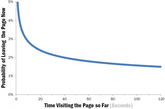
So, if your site survives the first 10 seconds, your visitors might decide to take a look around. Still, they’re very likely to leave during the next 20 seconds of their visit. If your site survives the first 30 seconds, there’s a good chance visitors will stay much longer. According to the study, often for 2 minutes or more.
Thus, it’s very important that you answer the four questions Angie mentions within the first 10 seconds.
UX Myths confirms this importance by busting the myth that visitors make optimal choices. In reality, visitors make quick choices. Zoltan Kollin explains it more in-depth…

Zoltan Kollin, UX Myths:
“In an ideal world, users would scan through your entire page to find the very piece of information they’re looking for, but research shows this is not the case. Usability tests prove that people tend to choose the first somewhat reasonable choice that catches their eyes.
That is, once they come across a link whose label refers even a little to what they’ve come for, they’ll click it. This is due to their experience that guessing wrong and hitting the back button is still more efficient than reading a whole page to find an exact match.
This behaviour, known as satisficing, is a well-known decision-making strategy in psychology.”
Note that improving clarity does not necessarily mean simplifying. Often, simplifying can have the opposite impact. Julie Zhuo, Product Design Director at Facebook, says that one of the most common design mistakes she sees today is: “Overvaluing simplicity and style at the cost of clarity.”
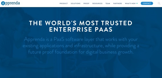
Bad Example: Apprenda
Take a look at this site and tell me if you can answer the four core questions…
Back to the questions…
- Who is the company? Apprenda. Pretty clear.
- What are they offering? A PaaS software layer. Confusing to me, but I’m not an IT professional or a developer.
- Do they appear credible / Why should you choose them? “The world’s most trusted…” How often do you see that type of superlative? How often do you believe it?
- What’s the call to action? Contact, maybe…?
When I moved my mouse, I found this…
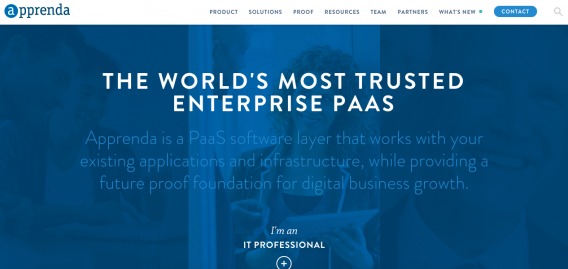
When I rolled over the faded image in the background, I see a call to action. A similar one appears to the right (executive) and left (developer). Clarity level? Pretty low.
Good Example: Optimizely
Now take a look at Optimizely’s site and ask yourself the same four questions…
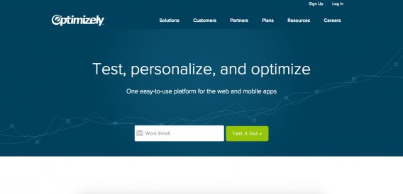
- Who is the company? Optimizely. Pretty clear.
- What are they offering? A testing, personalization and optimization platform.
- Do they appear credible / Why should you choose them? While there are no explicit trust icons (except perhaps the “Customers” label in the navigation bar), there are no reasons to believe Optimizely is not credible. Short on copy, the main case presented for choosing Optimizely is that it’s an easy-to-use platform for both the web and mobile apps.
- What’s the call to action? Enter your email to try the product.
Much better, right? That’s the power of clarity.
How to Improve Design Clarity
You might not always associate design with clarity. However, a clear design is just as important as a clear value proposition. So, how do you know when your design is crystal clear? When you barely notice it, according to Jared Spool…

Jared Spool, User Interface Engineering & Center Centre:
“Good design, when it’s done well, becomes invisible. It’s only when it’s done poorly that we notice it. Think of it like a room’s air conditioning. We only notice it when it’s too hot, too cold, making too much noise, or the unit is dripping on us. Yet, if the air conditioning is perfect, nobody say anything and we focus, instead, on the task at hand.” (via User Interface Engineering)
The list of ways to improve a design’s clarity could be endless. You’ll uncover many of them by asking the questions Peep suggests. That said, there are three solid places to start: whitespace, meaningful images, and visual hierarchy.
1. Whitespace
Whitespace is sometimes referred to as negative space. Essentially, it’s the unmarked part of your site (e.g. margins, gutters and space between text / images). Whitespace helps with readability by focusing attention.
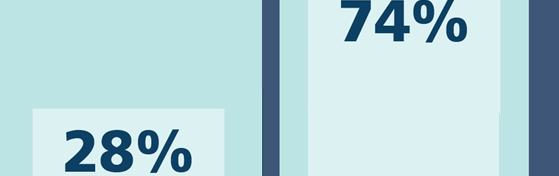
A Nielsen Norman Group (NN/g) study looked at 112 minimalistic sites. Only 84% of the sampled sites use substantial amounts of whitespace. Kate Meyer of NN/g found that number low, given that whitespace is the backbone of the minimalist design movement. Imagine how low that number might be for the average site.
Whitespace helps you draw attention to the most important parts of your site, like your value proposition or call to action. If you want to be sure something comes across clearly, be sure there is enough white space surrounding it, eliminating the threat of distraction and miscommunication.
Example: Direct Mail Ad (via Mark Boulton)
In an A List Apart article, Mark Boulton shared a great example of whitespace. Take a look at these two direct mail ads and decide which is more clear…
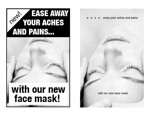
Did you choose the one to the right? Mark’s argument was that the ad to the right was more sophisticated and upscale thanks to whitespace. However, it is also more clear.
2. Meaningful Images
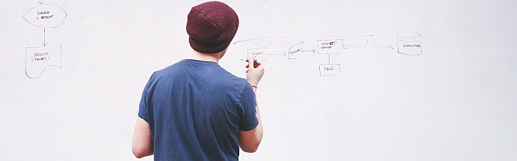
Let’s conduct a little experiment. Take a look at this site and decide, based solely on the image, what the company does…
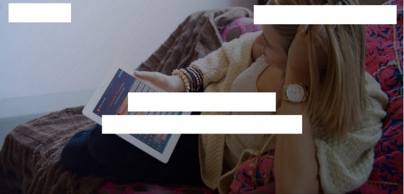
What did you come up with?
Maybe a mobile app? It looks like a dashboard of some sort is up on her tablet. Based on her posture and outfit, it’s likely a personal mobile app of some sort.
Samba TV is actually a television data company that gathers viewership information to improve the experience for watchers, broadcasters and advertisers.
Let’s try another one…

What did you come up with?
Something about kids, likely. Maybe a clothing company? A toy company? A bath product company?
Leo Health is actually a new, technology-powered medical practice.
When choosing any image on any page of your site, make sure it’s meaningful. It should be descriptive and, on its own, tell the same story the rest of the page is telling. When design and copy work together to create clarity, great things happen.
Example: Airbnb
Take a look at Airbnb’s site…
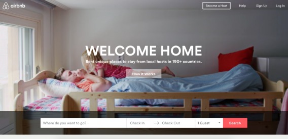
Do the image of the father and daughter say “home” to you? That image is actually a short video. That video rotates with about a dozen others. Many of them show people of different ethnicities and cultures coexisting happily. “Home away from home” is a clear theme.
The images speak volumes and clarify the value proposition.
3. Visual Hierarchy
The visual hierarchy, the arrangement of elements in a way that implies importance, of your site can help create clarity. The higher up the hierarchy something is, the more attention it will be given.
Take a look at this image and decide which circle is the most important. Then, decide how many levels there are in the hierarchy…

Of course, the yellow circle is the most important. It’s the biggest, it’s a different color than the others and it’s right in the middle. As a result, it will be given the most attention.
There are also clearly two levels to the hierarchy: yellow and pink. All of the pink circles are of equal importance. Your site will likely have more more levels, so prioritize the elements of your site before you head into the design phase.
If you have the wrong elements at the top of your visual hierarchy, your site likely lacks clarity. Use visual hierarchy to answer the four core questions as quickly as possible. Move your logo, your value proposition and your call to action to the top of the hierarchy.
Remember that every page of your site has a visual hierarchy, not just the home page. If you’re an eCommerce site, analyze the visual hierarchy on your product pages, checkout funnel, etc.
Example: Woopra
Take a look at Woopra’s site…
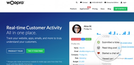
Can you label the visual hierarchy? What stands out to you the most?
The green “TRY IT FOR FREE” button is higher on the visual hierarchy than the muted “PRODUCT TOUR” button. The red “NEW” label above “AppConnect” moves that navigation link higher up the hierarchy.
How to Improve Content Clarity
Content clarity, on the other hand, should be familiar to just about everyone. The words and phrases you use to persuade your visitors can either be a stepping stone to conversion or a roadblock.
Similar to design clarity, the list of ways to improve content clarity could be endless. Optimization is an individual science: there are no universals or absolutes. However, there are three solid places to start improving content clarity: grammar rules, consistent language, and your customer’s language.
1. Grammar Rules
Remember all of the grammar rules you learned in elementary school? Don’t use sentence fragments, spell out small numbers, paragraphs should be 3-5 sentences long, etc. As it turns out, they aren’t that important online.
In fact, NN/g found that breaking some grammar rules makes scanning easier, which improves clarity and comprehension. Why? Because online readers are much different than the print readers those grammar rules were created for.
Hoa Loranger from NN/g explains those differences…
- “Web users are often action oriented, ‘leaning forward’ in the hunt for answers to their current question, rather than leaning back to absorb a good book.
- Web content is distributed among multiple locations — often on separate websites — whereas print content is usually delivered as a single object with no separate navigation other than turning the page.
- Interactive users read very few words on most web pages, because they’re impatient and already have their mouse-finger itching to move to the next page.
- People can be confused or misled when a search lands them on a web page divorced from the context provided if they had read the rest of the site. Elaborate writing styles take too long to set newly-arrived users straight.”
Earlier this year, I wrote an in-depth article on scannable content. If you’re interested in improving content clarity, I recommend you take a few minutes now to read it.
So, when writing for an online audience, ignore traditional grammar rules that hurt reading speed and clarity. Sentence fragments eliminate unnecessary words and can help drive a point home. It’s much easier to read “5” than “five”. 3-5 sentences is actually quite long, and online readers are not interested in a wall of text.
Example: Mashable
Take a look at this Mashable article…
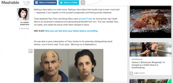
Not one of the three opening paragraphs have more than two sentences in them. It’s written in a relaxed, conversational tone. And you’d never expect to see “EIGHT HOURS AGO” under the byline, right?
2. Consistent Language
Consistency is incredibly important. Write in the same style on all of the pages of your site, follow the same grammar rules, follow the same formatting rules, use the same terms and key phrases, match your button copy to your body copy, etc.
If you’re going to use humor, use it consistently. If you’re going to use a conversational tone, use it consistently. If you’re going to call yourself “the most useful conversion optimization event” (for example), do so consistently.
Also, be sure the copy on your page is consistent with your button. When you call someone to action, be sure the language you use is consistent with the language you used to persuade them to act. Otherwise, you have a clarity issue.
Example: CXL Live
Take a look at the CXL Live site…
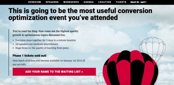
“ADD YOUR NAME TO THE WAITING LIST” is consistent with “Phase 1 tickets sold out!”. You’d be surprised how many sites let you register for an email course that’s closed or ask you to “get your FREE eBook” with a “DOWNLOAD” button.
3. Your Customer’s Language
In our 2X Your Conversion Rate in Less Than 30 Days email course, Joanna Wiebe explained how valuable using your customer’s language can be…

Joanna Wiebe, Copy Hackers & Airstory:
“You’re not writing copy; you’re feeding your prospect’s words right back to her. We want her to see herself on the page. We’re selling her a better version of herself. So we use her words, not ours.
If she uses jargon, we use that jargon.
If she writes “cuz”, we write “cuz.”
If she wants to double her revenue while working less, we tell her how she’ll double her revenue while working less.
Always in her words. If we don’t know what words she’d use for a particular message, we go back to the research phase to find out, often in innovative ways like this, which save time and reveal natural language.”
When you’re conducting your qualitative research, pay attention to the words your customers use, both in general and to describe your product / service. Use those words and phrases in your copy to improve clarity on all pages. (This strategy can work for home pages, pricing pages, product pages, contact pages, help pages, etc.)
Example: JSConf
Take a look at this landing page for JSConf, a conference designed for those who love JavaScript…
Note how the copy speaks to the customer, literally using the words she uses.
- “Hello Bs As!”
-
“<script src=’JSConf2014.js’></script>”
-
“<script>JSConf.end();</script>”
This same principle can be applied to any site to improve clarity. The best way to clearly describe a product or service, a pricing plan, a specific feature, etc. is to describe it in the words of your customer herself.
Conclusion
Clarity is critically important to conversions. If who you are, what you do, why people should trust and choose your product / service, and the next step are not immediately clear, your conversion rate will suffer. [Tweet It!]
To improve clarity, try…
- Using whitespace to draw attention to the most important parts of your site, like your value proposition or call to action.
- Using meaningful images that, on their own, tell the same story the rest of the page is telling.
- Arranging your visual hierarchy so that your logo, value proposition and call to action are near the top.
- Breaking traditional grammar rules in the name of increasing reading speed and clarity.
- Using consistent language, especially in your calls to actions and on your buttons.
- Using the words and phrases your customer is most likely to use.
Related Posts
-

If I were to tell you - what would you do with that information? Honestly,…
-

What's a good conversion rate? A conversion rate that's better than the one you currently…
-

Somebody asked me the other day, what are all the possible ways to increase the…
-

People hardly buy anything without seeing it. Usually, they also want to touch it, hold…

Great article and I love to see honesty and transparency winning out against trickery.
Cassius Kiani wrote on this subject for us recently, explaining Transparent UX Sells and Here’s Why. Cassius is a director at Brotherhood Design. In the article he looks at clarity at the conversion point and in the onboarding process, with particular reference to trialing services.
There’s some great real world examples in the post. If you’d like to read it, it’s at http://www.formisimo.com/blog/transparent-ux-sells-and-heres-why/
Thanks for reading and sharing those examples, Hazel. That article is a great read for anyone in the SaaS space.
While we’re on the topic of transparency, you might want to check out an article Alex recently wrote…
https://cxl.com/transparency-marketing/
Nice article, Shanelle! Nice to see someone else talking about design clarity, too – not just copy. We’ve been pretty focused on this topic here at EyeQuant. We actually built an AI that rates the clarity of your design on 0-100 scale, instantly. Airbnb scores a 92, for example. Let me know if you want to play around with it!
Thanks Kurtis! I appreciate you taking the time to read the article.
I’d love to check it out. Maybe shoot me an email ([email protected])?