
Eyetracking and other user research have studied how people look at websites. Here are 10 useful findings you can use.
Table of contents
- 1. The top-left corner gets the attention first.
- 2. People read in F-patterns.
- 3. Visibly bigger introductory paragraphs improve attention.
- 4. People won’t look past the first search results.
- 5. People do scroll, but put the most important content above the fold.
- 6. The left side of the page gets more attention than the right.
- 7. Large, high-quality images are most appealing.
- 8. If you need to show pictures of smartphones, stick with Apple products.
- 9. Dominant headlines draw the eye.
- 10. First impressions form in less than a second.
- Conclusion
1. The top-left corner gets the attention first.
When users land on your site, their eye path starts from the upper-left corner and moves down and right from there.
According to an eye-tracking study by Eyequant, these areas get the most attention:
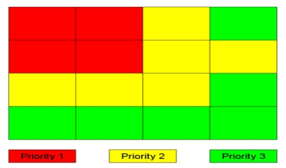
Similar findings came from a study by Yahoo. Check your site and see what you have in these zones. Move the value proposition to the top-left zone. Yes, there are exceptions, but use this as a starting point and test from there.
Are you familiar with the Gutenberg diagram? It describes a general pattern that the eyes move through when looking at (usually text-heavy) content. It fits this zoning conclusion pretty well, with the exception of the bottom right area.

The fourth, bottom-right terminal area is where you should place your call to action. Note that this is not some universal truth but a good starting point.
2. People read in F-patterns.
Most people don’t read but scan. A 2008 study concluded that, on average, only 28% of the text is read.
Eye-tracking visualizations confirm that users often read website content in an F-shaped pattern: two horizontal stripes followed by a vertical stripe. Another study confirmed this. (A similar study called this the golden triangle.)
This is why you want your value proposition toward the top of the page, and why your menu should be either top-horizontal or left-vertical. How else should you design for F-patterns? Read here.
(Note that this pattern doesn’t hold true for every scenario, like how people view search results.)
3. Visibly bigger introductory paragraphs improve attention.
Make introductory paragraphs in boldface or a larger font size. When test subjects encountered a story with a boldface introductory paragraph, 95% of them viewed all or part of it.
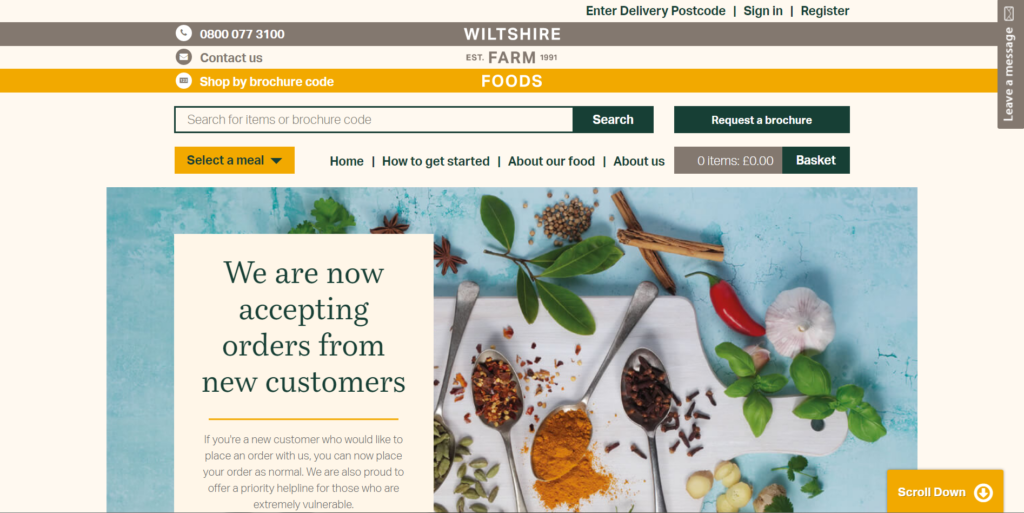
Every Smashing Magazine article starts with a highlighted summary section and boldface first line:
Keep the paragraph line lengths short and in a single column—that’s how people are used to reading text.
The font that you use doesn’t really matter. Oh, and people like links—the number of link clicks increases as you add more links.
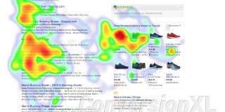
4. People won’t look past the first search results.
If you’re not among the top two or three results on Google, you’re losing out. An eye-tracking study by Google (even before mobile took over desktop search traffic) found that most users got what they wanted from the first two results.

Users never needed to go further down the page, which is exactly what Google wants. A perfect search engine gives users exactly what they need with the very first result, every time.
If that’s what Google is optimizing for, you should, too.
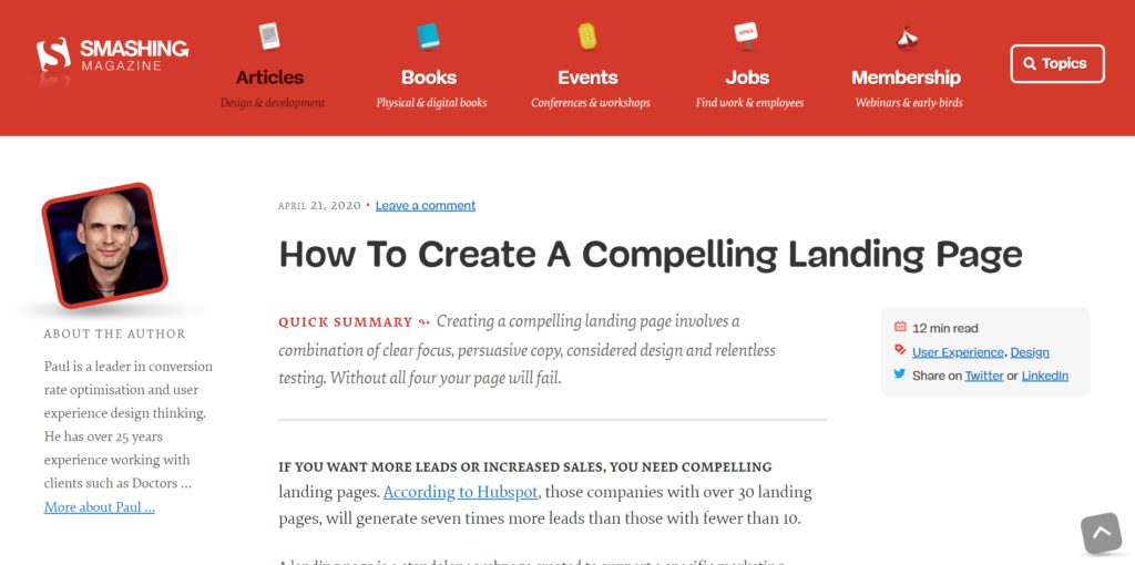
5. People do scroll, but put the most important content above the fold.
Users know how to scroll below the fold, but they don’t spend nearly as much time there as they do above the fold. Make sure that the above-the-fold area contains your value proposition, but don’t try to squeeze everything in there.
Scrolling still provides better usability than slicing up lengthy content into several pages. Yo do, however, need to guide people to scroll down.
Wiltshire Farm Foods gives a hint in the bottom right corner. (It also helps that the image is clearly cut off and the text block incomplete.)
Interestingly, several studies point out that the very bottom of a page also gets a lot of attention. That’s a good place for a call to action.
6. The left side of the page gets more attention than the right.
With some exceptions, people read from left to right. This is also why the left side of your web page gets more attention.
Web users spend 80% of their time viewing the left half of the page and 20% viewing the right half. A conventional layout is thus more likely to make sites profitable.
Sites like eBay default to a left-hand menu for browsing shoppers:
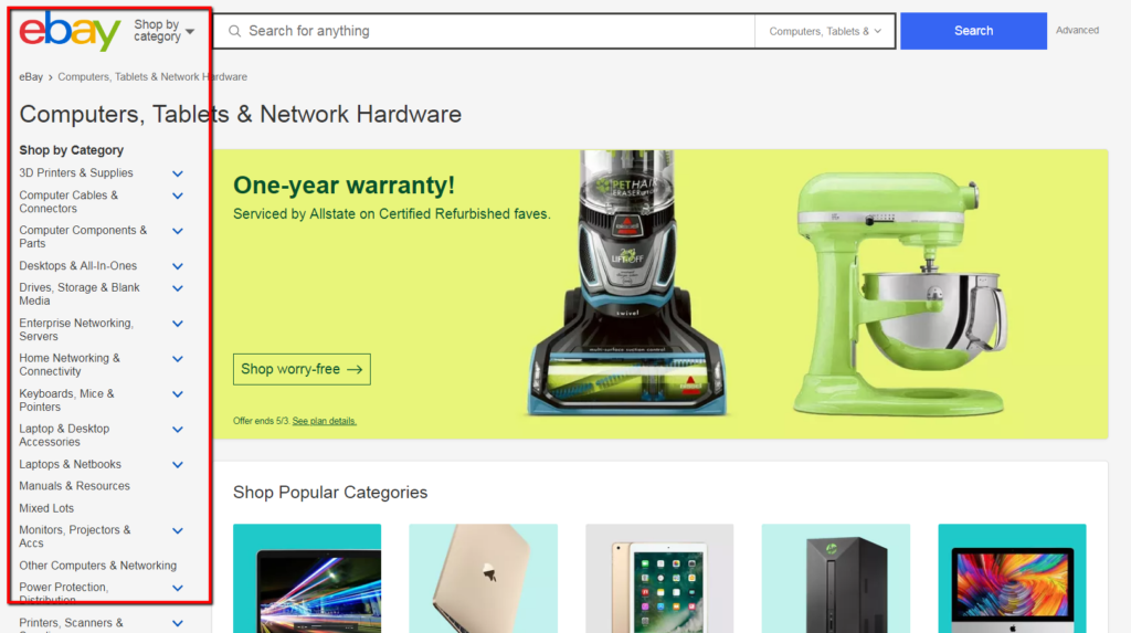
If you have a vertical menu, put it on the left. Navigation placed at the top of a homepage however performs best (i.e. is seen by the highest percentage of test subjects and looked at for the longest duration).
7. Large, high-quality images are most appealing.
Use large, crisp images recommends usability guru Jakob Nielsen (based on his eyetracking studies). Image quality is a significant factor in drawing attention. People facing forward in photos are more inviting and approachable.
This is exactly what we do on our own site:
Fuzzy, small images are less inviting than big glamour shots. Nielsen said his eye-tracking study also surfaced a counter-intuitive finding—people who look like models are less likely to draw attention than “normal” people. (This is one more reason to avoid stock photos.)
“A call center ad with model in it on the phone,” Nielsen said, “may be a good picture technically, but it will more likely be ignored.” Images that seem peripheral or altogether unnecessary will be tuned out.
8. If you need to show pictures of smartphones, stick with Apple products.
A study by EyeTrackShop (now known as Sticky) found that consumers looking at groups of smartphones spent more time looking at Apple products than Android devices from Motorola, Samsung, and other manufacturers.
The iPhone commanded the greatest amount of attention—2.3 seconds, on average—in its group. Among tablets, the iPad tied with the Amazon Kindle Fire for the lead, at 2.4 seconds each.
9. Dominant headlines draw the eye.
An eye-tracking study observed that big headlines most often draw the eye first upon entering the page, especially when they’re in the upper-left corner (no surprise there).
Present a complete value proposition within the headline. Keep in mind that clarity trumps persuasion.
Trello gets straight to the point—pitching its benefits clearly (and supporting them in the subhead).

If you have multiple headlines on a page, the components on the left get the attention. People typically scan a list of headlines—they don’t view the entirety of all of them. If the first words engage them, they’re likely to read on.
On average, a headline has less than a second of a site visitor’s attention. This means that the first couple of words need to be real attention-grabbers.
10. First impressions form in less than a second.
When viewing a website, it takes users less than two-tenths of a second to form a first impression, according to eye-tracking research by the Missouri University of Science and Technology.
Researchers found that their subjects spent about 2.6 seconds scanning a website before focusing on a particular section. They spent an average of 180 milliseconds focusing, or “fixating,” on one particular section before moving on.
Here are the website sections that drew the most interest from viewers:
- The logo. Users spent about 6.48 seconds focused on this area before moving on.
- The main navigation menu. Almost as popular as the logo, subjects spent an average of 6.44 seconds viewing the menu.
- The search box. Users focused for just over 6 seconds.
- Social networking links. Users spent about 5.95 seconds viewing these areas.
- The site’s main image. Users’ eyes fixated for an average of 5.94 seconds.
- The site’s written content. Users spent 5.59 seconds there.
- The bottom of a website. Users spent 5.25 seconds.
Conclusion
These are principles, not guarantees. But they’re great starting points, especially if you don’t have enough traffic to test any or all of these items in the near future.
While you may want your site to stand out, be cautious about how much novelty you introduce. It won’t do you any good to create an incredibly unique site that no one knows how to use. Expand on this by learning these universal web design laws.
Working on something related to this? Post a comment in the CXL community!
Related Posts
-

Most of the personal development advice there assumes you have no kids. I don't want…
-

How do people view search results? The answer to this questions brings great insight to…
-

Your product is so similar to 2 or 3 major competitors in the market that…
-
Your brand's value proposition is a promise of value to be delivered. It's the primary reason a prospect should…

Hey Peep,
Nice blog! Here is a visualization of the Missouri research http://thecreativefinder.com/portfolio-image.php?username=columnfivemedia&id=13547&filename=Webs-First-Impressions-where-people-look.png
Best,
Stefano
Awesome mate… just wondering what think about those users who use their left hands for controlling the mouse .. do these tricks also prove correct for them .. or a little changes is needed??
Bravo . . . good piece. I was presenting most of these concepts in my national seminars for graphic design and web design from 1988 through 1995 for Dynamic Graphics . . . the reader eye-flow is the most important, and I’ve since performed design critiques to hundreds of web owners sites that violate the concepts, but don’t understand they did it, and don’t understand why they should have done it. Web designers aren’t necessarily designers. It’s just a name that’s been tagged onto the term.
But this is a good piece. We’ll pass it along in our site.
Fred
Thanks. I’m explaining to my client why his logo should be at the upper left corner of his website.
Nice!
Thank you Peep. Found lots to study in this post.
Could you clarify #10: “They spent an average of 180 milliseconds focusing, or ‘fixating,’ on one particular section before moving on”, but then states that about 6 seconds is spent on the logo (that seems very long) and in that neighborhood for many of the other bullet points.
Very good, thank you so much
its so usefull to me , thanks alot
so nice and amazing article !
It’s very good :-)
Now provide that wasn’t so hard in a specific Twitter account.
Because your home because you are paying attention to what to look
for can do the work and supervising.
Website design matters. People are somehow attracted to websites that have beautiful design, simple functionality, and loads fast.
Sir Laja, thank you for a very informative post. I realize my question does not pertain to viewing websites. How do you suggest writing detailed instructions for students for an online assignment requiring six to ten steps? I have tried: #1-four-page detailed instructions including screen captures for each step, #2-page-and-a-half summary without illustrations and #3-video screen capture of me working a similar assignment. My international grad-students don’t like any of them. What should I do? (Maybe they just don’t like earning credits by experiential learning!) Thanks for the feedback, Jim
Hey Jim
Without knowing more (what exactly they dont like) it’s impossible to say. First figure out what the exact problem is and how they would like to consume the content, then go about figuring out a solution.
just wondering what think about those users who use their left hands for controlling the mouse