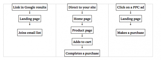
In the pursuit of sustainable and consistent ecommerce growth, we look to many places: content, SEO, Facebook, Instagram, paid acquisition, new channels, growth hacking.
But rarely do we turn the focus to our own website and ask, “how can we improve our own ecommerce user experience to drive growth?”
That’s what this post is about: looking inward instead of outward. Investing in user experience instead of further ad spend, promotion, or distribution.
We’ll answer the following question in concrete and comprehensive detail: how can we improve ecommerce UX?
Table of contents
- Why Care About Ecommerce UX?
- 8 Ecommerce UX Best Practices
- 1. Make Sure Your CTAs Are Clear and Prominent
- 2. Don’t Force People to Register (Have a Guest Option)
- 3. Use High Quality Product Images
- 4. Don’t Forget About Product Descriptions
- 5. Have a Prominent Sales and Specials Section
- 6. Offer Live Chat and Easy Customer Support
- 7. Add a Prominent and Site-wide Benefits Bar
- 8. Use Clear Progress Indicators During Checkout
- 4 Mobile Ecommerce UX Best Practices
- Persuasion Triggers that Boost Ecommerce UX
- Systems Thinking: Designing an Ecommerce User Flow That Converts
- Conclusion
Why Care About Ecommerce UX?
Improving UX affects many pieces of your ecommerce system. By that, I mean the benefits go further than simply increasing your conversion rate by a few percentage points.
A better ecommerce user experience leads to…
- Reduced customer support cost
- Reduced customer acquisition cost
- Increased word of mouth referrals
- Increased customer happiness and repeat purchases
And yes, an increased conversion rate. Which, if you’re in the ecommerce space, you’re undoubtedly interested in.
What is user experience, exactly? It’s both simple and broad at the same time. While there are many concrete definitions out there, I like how Peep Laja, founder of CXL, explained it in a past blog post….

Peep Laja:
“First of all, UI (user interface) is not UX (user experience). A car with all its looks, dashboard and steering wheel is the UI. Driving it is the UX. So the interface directly contributes to the experience (beautiful car interior makes a better experience sitting in one), but is not the experience itself.
…
User experience is not something new that was invented along with the internet. Since the beginning of times great designers have understood the importance of experience (Sistine Chapel, anyone?), and how the object of design was going to used, in what context and for which end-purpose. By using the abbreviation ‘UX’ it just sounds new, but none of it really is.
All in all, the user experience is a shared responsibility of all those who contribute and support a product – from the UI designer to customer support people.”
We know that most people aren’t satisfied with their conversion rates (if you’re satisfied, stop settling for mediocrity – you can always improve!). A foolproof way to boost conversions is to improve UX, so let’s get to it.
This post will cover the broadest possible base with regards to ecommerce UX, but it won’t go as in-depth as I’d like on every topic. So we may cover something like click-to-scroll for mobile UX in brief, and then we’ll link out to further resources to explore. That was, you can choose your own adventure in a way, and dive down whichever rabbit holes you’d like.
8 Ecommerce UX Best Practices
Best practices aren’t the end-all be-all of optimization. In fact, they’re best used as a baseline. Start here, but don’t end here – because best practices don’t work for everybody, and best practices are rarely actually the optimal solution.
That said, so many ecommerce sites are lacking and missing the baseline by quite a bit. These ecommerce UX best practices are pretty well established with research and experience, so they’re a solid place to start when designing a better experience.
In addition, this list is by no means comprehensive. There are many more well-researched ecommerce guidelines. If you’re interested in a huge resource, check out our Ecommerce Best Practice Report.
At the very least these should give you some ideas to test.
1. Make Sure Your CTAs Are Clear and Prominent
There’s a science to a good CTA. A good CTA should be noticeable, contrasted with the rest of the page, look clickable, be clear in what happens next, and inspire action among users.
Of course, there’s been a ton written about call to actions, specifically with regard to conversion optimization and UX design. Read our guide here. Find a bunch of inspiring CTA examples here.
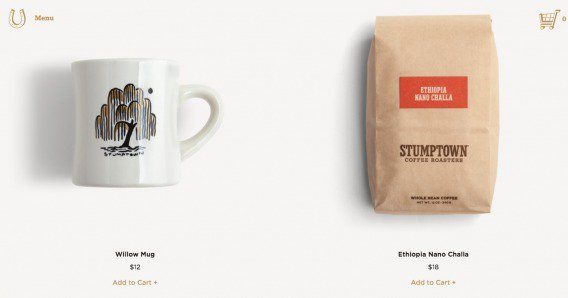
But let’s keep it simple for this post. Is your CTA clear? Is it noticeable? The following example is not very clear and it could be more noticeable (though it’s not the worst example I’ve seen)…
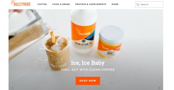
The following example from Bulletproof is much better…
2. Don’t Force People to Register (Have a Guest Option)
This one works more often than not.
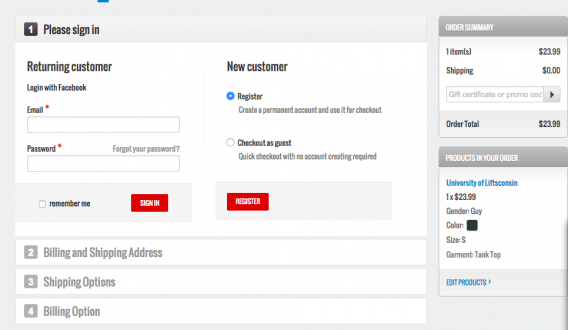
Do you know the story of the $300 million button? It’s famous. Forcing customer to register introduces unnecessary friction. In fact, 1 in 4 customers leave because of forced registration. It’s just another facet of “greedy marketer syndrome.”
Instead, offer the option to register if they want, but create an account anyway for those who opt for guest checkout. They will enter their email and name anyway. You just have to generate a password and email it to them once they complete their order.
3. Use High Quality Product Images
Ecommerce faces the constant and continuous struggle to bridge the gap between online convenience and real world benefits. For instance, you can’t try on products online. Actually, you can’t even see, feel, or experience them in tangible way.
To bridge that gap, images are what we have (until virtual reality becomes widely used and in vogue). Videos will do wonders as well, and sites like Zappos have seen great success implementing product videos.
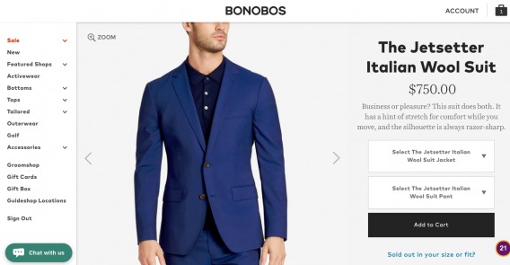
With photos and videos, the more the better. Show the products from different angles, in context, make them zoomable. Even better if you can show the product in use (as is common with clothing):
We’ve also seen in our own original research that image size affects attention and engagement. Depending on what type of product you sell, image size may help or hurt your cause. Read the full study to get the details, but the point is that there’s no silver bullet tactic. Get amazing photos and use them, but the smaller details matter too and you should test them for yourself.
4. Don’t Forget About Product Descriptions
In UX design, copy comes first.
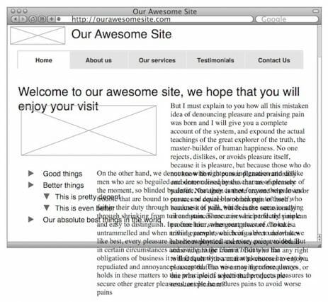
When most people design experience, they forget that. They wireframe pages with lorem ipsum instead of actual copy, and it usually ends up as a mess…
In a more specific sense, copy gets overlooked on tons of ecommerce sites in the form of product descriptions.
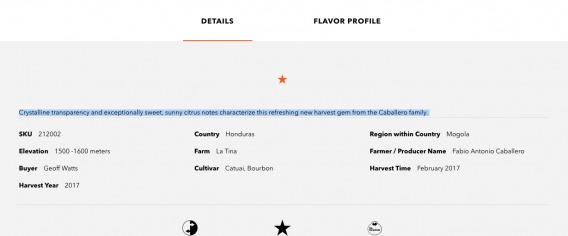
Product descriptions matter. The role of product copy is to give buyers enough information, so they could convince themselves this is the right product for them. Clarity trumps persuasion. The best sales copy is full, complete information. No hype needed.
What usually happens is either companies will use copy from the manufacturer (horrible for UX as well as SEO), or they will write weird, wordy copy that only makes sense to them. You’ve undoubtedly seen product descriptions like this, filled with jargon and meaningless adjectives:
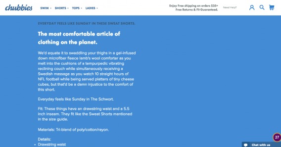
But then there are sites like Chubbies, where the copy is so good that it’s almost a feature of the product:
Read our in-depth article on product descriptions here.
(Also, when it comes to product pages, avoid distractions. Social icons are a frequent offender. A VWO study showed an increase of 11.9% in click-through rate for the ‘Add to Cart’ button when an ecommerce site removed social sharing buttons from their product pages.)
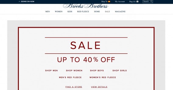
5. Have a Prominent Sales and Specials Section
Various studies have found that about half of online buyers would only buy discounted products, except under exceptional circumstances. Around 60% say they are looking for a section that identifies sales and specials.
Discount seeking behavior is set to continue, so thinking about having a dedicated “sales” section on your site.
Ultimately, do what’s right for your brand, but it might be something worth experimenting with.
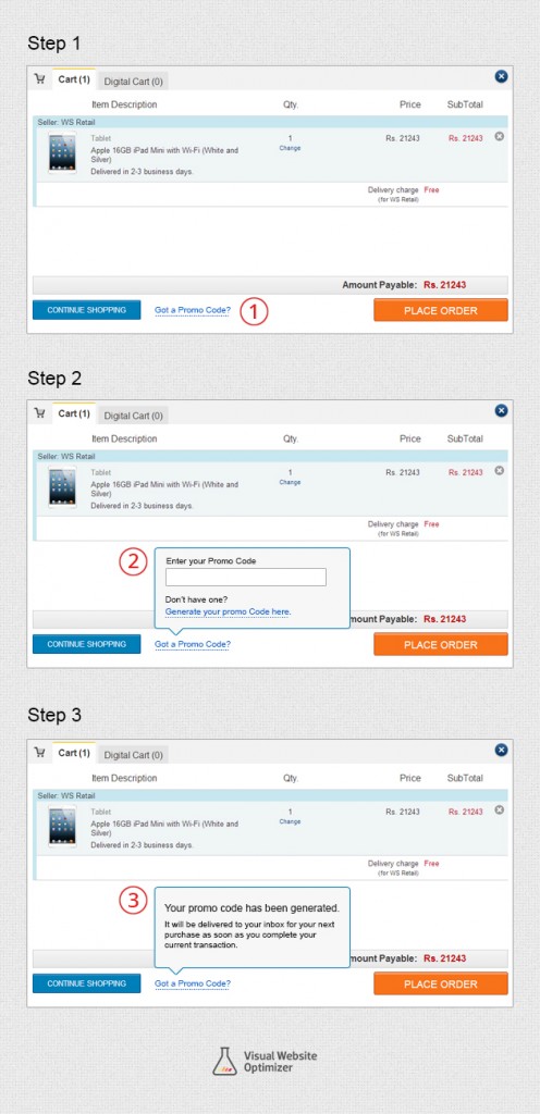
While sales are great, displaying coupon code boxes by default isn’t.
I’m sure you’ve had this experience: You’ve found what you were looking for. You’re about to make the payment…and then you spot a blank coupon code box.
“What?! I can save some money on this? But I don’t have the damn coupon code. Let me Google it.” (And, potentially, there goes your conversion.)
You can fix this issue with a subtle link that asks users if they have a promo code. After they click the link, a pop-up coupon code box allows them to get their discount:
6. Offer Live Chat and Easy Customer Support
Shopping on most sites, you get the impression that you’re unwelcome. First, it’s impossible to find answers to common questions like return policies. Second, it’s tough to know where to go when you want to talk to an actual human.
Zappos flipped this idea on its head a while back, training its customer support employees to go above and beyond expectations (and therefore, gaining a Guinness World Record for the longest support phone call). Adopt some of their customer-centric habits to improve the customer experience.
The first way to do that (and the easiest) is to make your contact information prominent and on the home page. Like this…
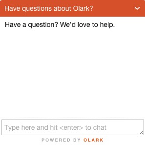
In addition, live chat is increasingly expected as part of an online shopping experience.
People like live chat (highest satisfaction rating among support channels). It’s obviously an operational thing, and not just an on-page element, so it warrants some number crunching. But generally speaking, users like the option to use chat.
7. Add a Prominent and Site-wide Benefits Bar
Unfortunately, everyone running an ecommerce business now has to immediately and persuasively answer the question, “why buy here and not from Amazon?”
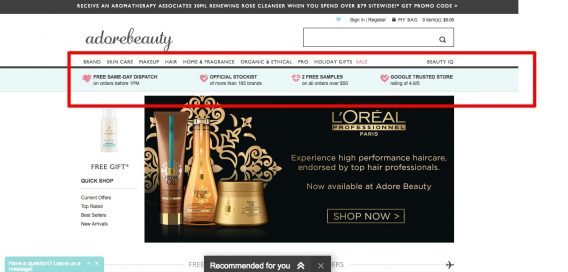
It’s easier for some products than it is for others, but a good way to actually convey that value and that reasoning is through a prominent benefits bar. You see it more and more on ecommerce websites, and it’s because they usually work to remind customers why they’re shopping with you…
8. Use Clear Progress Indicators During Checkout
In general, people like to feel they have an element of control over their experience. They like to be in the know – where they’re at on a website, how to back out, how to navigate, etc.
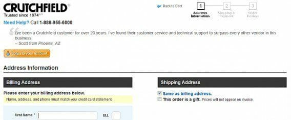
We also want to know how much longer something is going to take. This is why numbered lists are better than unordered lists, and it’s also why you should have clear progress indicators for your checkout flow.
Crutchfield has it in the top right corner, but I think it’s quite small and may go unnoticed by many:
Crate&Barrel’s approach is better, with more more prominent steps (1,2, and 3):
4 Mobile Ecommerce UX Best Practices
Mobile is its own battle.
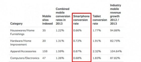
Even though mobile usage is steadily increasing (still), mobile ecommere UX hasn’t really improved much, and industry-agnostic conversion rate data shows it.
And if you think responsive design is enough, you’re wrong. It’s a start in the right direction if you’re not there yet, but there’s much more to mobile optimization than making it responsive.
We need to start with the fundamental truth that mobile users exhibit different behaviors and possess different intentions than desktop users. In a broad sense, mobile users are looking for something specific and want to find it as quickly as possible. They have less patience. That’s why you should test on mobile and desktop separately.
When you look at mobile optimization case studies, this is a common thread. If you can shorten the journey to the desired action, you’ll most likely win. That’s why mobile performance is so important, and that’s why you’ll often see companies making a sparser version of their website on mobile.
To get you started, here are four things that work more often than not when it comes to mobile.
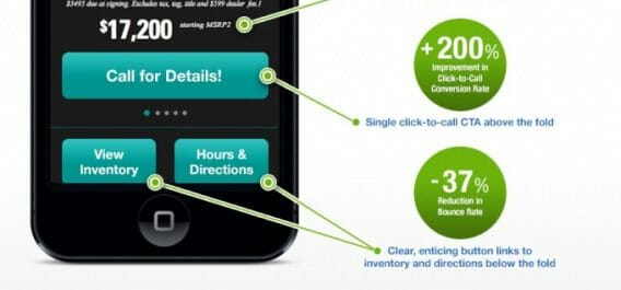
1. Click to Call
Deliver the easiest path to conversion for users. Often, on a phone, that is (unsurprisingly) a phone call.
As Tommy Walker, former Editor of CXL, pointed out previously, the ability to quickly make a call is most important to mobile users during the purchase phase of the buying cycle. This is the stage at which they’re closest to the point of a decision – one that benefits you. Make it easier for them to buy, huh?
2. Click to Scroll
Mobile users don’t want to do a lot of browsing and exploring. They have an action in mind, and they are searching for a key piece of data.
This is where Click-to-Scroll comes into play.
These buttons could take you to separate pages with the relevant information, but as you are probably already thinking, it makes far more sense for all this information to stay on the same landing page.
We know that users often fail to scroll and most importantly, they want instant access to what they’re looking for. Instead of forcing them to scroll for that data (or more likely, bounce), adding a Click-to-Scroll button allows them to navigate directly to their desired point on the landing page.
For Sling Automotive, adding two of these buttons reduced the page’s bounce rate by 37%.
3. Sticky Headers and Footers
A study by Smashing Magazine found that sticky navigation bars allowed users to find what they were looking for 22% faster.
Remember: anything that shortens the path to action for mobile users is a big deal. In addition, the same study found that 100% of participants preferred sites with sticky navigation bars, despite usually not knowing why (that’s all of the participants – crazy).
People who test sticky headers/footers often seem to come away with positive results. It’s something that works more often than not. While there are always exceptions to best practices, it seems that like Click-to-Call, sticky navigation is a must-test for any online business.
4. Mobile Popups
As a marketer, you’re likely familiar with popups. But remember, mobile users are different, and you especially need to approach popups differently due to SEO concerns (as well as ecommerce UX concerns).
You have to think about where mobile users are in the customer journey and how a popup could be used to aid their journey and help them reach a decision point.
For visitors looking to make a purchase, including a popup that displays a Click-to-Call button can have a significant increase in conversions, as Joel Harvey talked about at CXL Live 2016.
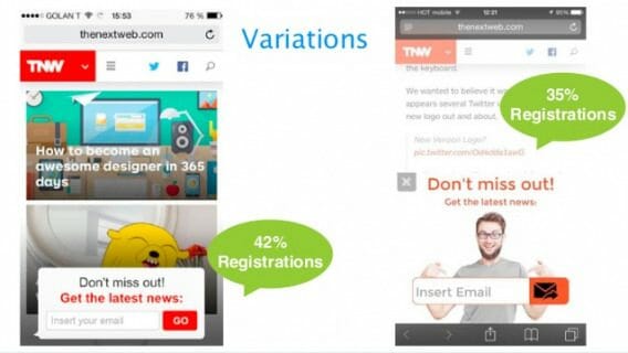
But mobile popups can be used effectively for lead capture, too. Mobile is often a good place to pursue email signups as opposed to direct sales, particularly for businesses that don’t revolve around incoming calls.
For example, The Next Web increased conversions by 42% through the addition of a simple email capture popup at the bottom of their mobile blog feed.
Be careful with popups, though, especially on mobile. The point isn’t to force your way into conversions. Conversions at gunpoint are a misleading metric, and it’s almost always a short term tactic that will lead to burnout.
Ask yourself, how can this popup help the user experience? It’s possible.
As I mentioned for desktop ecommerce UX, these are just best practices and guidelines. They may be ephemeral, too. Like I said, things move quickly in this space. So please, don’t just implement everything – think about your business and if it makes sense, and then test it.
Persuasion Triggers that Boost Ecommerce UX
It’s not just about usability. It’s about persuasion. The top persuasion triggers dig deeply from behavioral psychology to design persuasive and enjoyable experiences.
Some of the most common triggers in ecommerce ux design are…
Social Proof
Social proof is a very common and powerful persuasion trigger. It’s based on the idea of normative social influence, which states that people will conform in order to be liked by, similar to or accepted by the influencer (or society).
Humans look to others for cues on how to behave and decide. We don’t want to be the only idiot who buys something, dines at a restaurant, or even desires to date someone. We want proof in the form of social acceptance and the desire of others.
This, of course, can play out in many ways on an ecommerce website – testimonials, company logos, reviews, case studies, data, etc.
Growth Marketing Expert Angie Schottmuller put it aptly in a previous CXL blog post:

Angie Schottmuller:
“The social proof psychology principle says that when people are uncertain, they’ll most likely look to others for behavioral guidance. In order to harness this concept for persuasion, marketers must first identify the uncertainties of their customers and then buffer accordingly with appropriate social proof.
Customer words, numbers and visuals can boost credibility, convey relevance, answer questions, and counter objections. The conversion impact of inspiring confidence is roughly proportional to the social proof quality and the percent of ‘uncertainty’ friction preventing CTA completion.
In other words, if there’s little uncertainty, social proof will have negligible impact. If there’s notable uncertainty and weak social proof, negative conversion impact is possible. If quality social proof buffers notable uncertainty, get ready for some remarkable conversion impact — in some cases up to 400% improvement.”
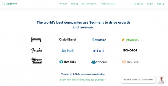
There are the classic examples that you’ve all seen, like company logos on a landing page (a la Segment):
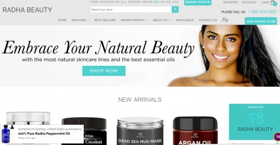
I like creative uses like the notifications used by Radha Beauty telling you that someone from X city just purchased Y product (bottom left side):
Social proof can be executed in millions of ways. Read more in this in-depth guide to social proof.
Just remember that if you share reviews on the site, people expect to see some good and bad feedback. You may think you can hide bad reviews, but users will go find the truth elsewhere (and not on your site).
That’s why it’s important to show both sides of the coin. Let them have faith in your credibility. According to research, consumers who seek negative reviews are more engaged visitors and convert 85% more than average visitors.
Scarcity & Urgency
Scarcity is a psychological trigger where a product or service becomes more attractive when it is limited in availability (or perceived as being limited).
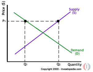
If you’re familiar with the core principles of economics, this makes sense. When there is lots of demand and little supply, prices go up. It also makes sense on an intuitive level. When mom said you couldn’t have a toy, didn’t you want it more?
The actual mechanisms behind the trigger are somewhat easy to intuit: people don’t want to miss out on what others are getting. Additionally, people like to have rare stuff or experiences.
As a 2015 research paper put it, “When something is rare, it’s alluring–true whether you’re talking about precious gemstones or a pristine edition of the first issue of Action Comics (which introduced Superman). And psychologists have long known that if you can make a consumer good more desirable by making it appear rare.”
More of it either comes down to simple FOMO (fear of missing out) or the desire to stand out and be different (which is where luxury goods marketing stands).
Outside of super luxury premium pricing, there are are generally two types of scarcity you can use to increase sales:
Quantity-related scarcity (2 seats left at this price)
Time-related scarcity (last day to buy)
Booking.com uses both (in abundance) so let’s use them as an example. Here’s a quantity-related scarcity tactic:
They lay it on pretty thick by showing two “high demand” notices, how many people booked in the last 24 hours, how many are looking now, and how many rooms left.
And here’s a time-related scarcity tactic (notice the countdown timer on the upper right corner):
As a bonus, they also list when hotels are sold out, to show that it is indeed possible to miss out on these hot dealz:
Urgency is quite related to scarcity, though I’d say more broad. Scarcity implies a low supply, where urgency could be any tactic designed to push a decision right now.
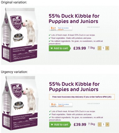
Here’s an example of an A/B test we ran to implement some urgency for Bob & Lush. The result was a stable ~27% revenue lift.
Read the rest of the case study here.
Scarcity and urgency are very effective, but don’t fake them. When done correctly, they add to the user experience (as opposed to taking it away for the purpose of cheap marketing tactics). For instance, it’s actually beneficial for the consumer to know that many other people are looking at a given Airbnb listing, especially if you really want to stay at that property.
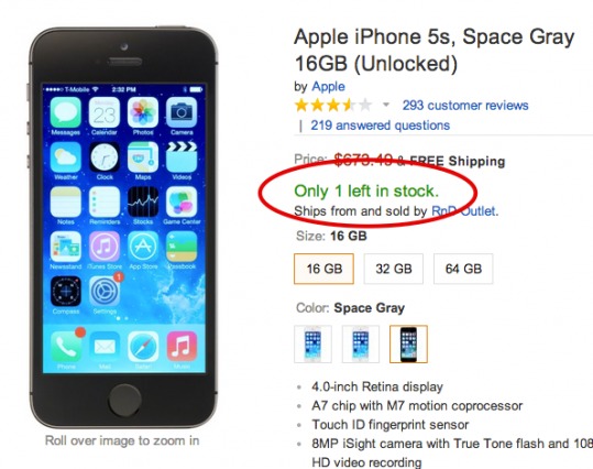
Same goes for Amazon (or any ecommerce site) concerning product stock:
Don’t fake scarcity.
Other Persuasion Triggers for Ecommerce UX
Social Proof and Urgency aren’t the only persuasion triggers, not by a long shot. This field is huge, and it’s got important ties to conversion optimization and marketing more broadly. The research continues to evolve, so it pays to keep a close eye on human psychology research. To get you started, here are a few of my favorite resources:
- The Advanced Guide to Emotional Persuasion
- Cialdini’s 6 Principles of Persuasion
- 17 Obscure Persuasion Techniques for Conversion Optimization
- 18 Cognitive Biases You Can Use for Conversion Optimization
Systems Thinking: Designing an Ecommerce User Flow That Converts
Any one off tactic or element working in isolation won’t cause a profound effect on ecommerce user experience or conversion rates. A dab of social proof here and a prominent CTA there do not make a great user experience.
Designed as a holistic system, though, each one works together to create a powerful experience.
A major factor affecting your conversions and user experience is known as user flow.
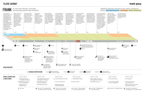
Essentially, it’s the path a user follows through your website interface to complete a task (make a reservation, purchase a product, subscribe to something). It’s also called a user journey.
This is a huge topic, one that we can’t dive into entirety, but the point is that you shouldn’t be thinking in terms of one-off tactics, element changes, or anything in isolation. You should be thinking from start to finish, how can I design a wonderful customer experience? It starts with the first touch and ends far beyond the conversion.
In conversion optimization, you also need to be thinking about what your highest leverage points are. Some small changes create small results. But some small changes create huge impact.
Answering this question isn’t easy; it’s contextual and is usually quite specific to an individual business. Most of the time, inflection points are due to some sort of behavioral insight. You discover these (usually) with user research.
“After running a few user tests and doing a funnel analysis, we noticed that almost all users get caught up on the third step of our checkout. They just don’t understand that they have to ____. Perhaps we can fix it by ___”
Searching for problems in this way allows you to find the highest leverage areas. No longer will you believe that changing a button color from blue to green will answer your greatest ecommerce UX challenges. You’ll know that, based on multiple observations, you have problems A, B, and C, and you could potentially address them with solutions D, E, and F. And then you test.
In summary, design with the system in mind and look for points of highest impact. This post doesn’t have the space to cover everything here, but I can recommend a few resources to get you started:
- Build It With The User in Mind: How to Design User Flow
- A Step By Step Guide To Building Customer Journey Maps
- How to Come Up with More Winning Tests Using Data [ResearchXL model]
- The Discipline Based Testing Methodology
Conclusion
Ecommerce UX is incredibly important. Don’t neglect it. It’s tough to regain footing in this battle, as a sour taste will often leave customers unwilling to try your site out again.
Good ecommerce UX, in a competitive market, is the ultimate advantage. When ads are increasingly expensive, keywords are getting tougher to rank for, and social media didn’t play out like you thought it would, return to the basics: provide an awesome customer experience.

