Ever wonder why your site has a lot of visitors but not enough transactions, purchases, or inquiries? In this post, we look at marketing and UX metrics from a slightly different angle.
The perspective will be particularly interesting for those who want to grow revenue—not just traffic! Traffic is a good thing, but traffic alone can only get you so far.
Table of contents
What is user experience?
There are many definitions for “user experience.” To keep things concise, NN/g defines it like this: “‘User experience’ encompasses all aspects of the end-user’s interaction with the company, its services, and its products.”
Continuing, it’s important to distinguish this from the user interface (UI). Here’s a quote from Peep further defining UX:

Peep Laja:
“First of all, UI (user interface) is not UX (user experience). A car with all its looks, dashboard, and steering wheel is the UI. Driving it is the UX. So the interface directly contributes to the experience (a beautiful car interior makes a better experience sitting in one) but is not the experience itself.
Visual beauty is important for websites, but visual design is only one step in the process. A beautiful website might make a great first impression, but if it has terrible usability (e.g., users can’t figure out what to do, forms on the site don’t quite work, error messages aren’t helpful, the copy on the website is vague), the overall experience will be quite bad.
Experience is also personal and subjective—and is greatly affected by our past experiences, personal preferences, mood, and a myriad of other things.”
Despite the subjectivity and variability of user experience, there are valid ways to measure usability and the overall user experience, for interactions with each part of your site and holistically.
Why measuring user experience is critical
In his ever-so-popular book Don’t Make Me Think, Steve Krug provides a simple definition for usability:
It really just means making sure that something works well: that a person of average ability and experience can use the thing—whether it’s a website, a toaster, or a revolving door—for its intended purpose without getting hopelessly frustrated.
Usability definitions share common themes. Two definitions are especially popular.
According to Nielsen (1993):
Usability of a system is multi-faceted and consists of five properties: easy to learn; efficient to use; easy to remember; low error rate; and meets user satisfaction.
According to ISO:
Usability is the extent to which a product can be used by specified users to achieve specified goals with effectiveness, efficiency, and satisfaction in a specified context of use.
Overall, usability is just one block of a large UX iceberg, as seen below, and a part of the overall user experience of products, physical (e.g., watches) or online (e.g., websites).

UX and usability metrics are a powerful tool to evaluate the performance of virtually any product. They work best when combined with marketing metrics.
Sound simple enough? Well, in the end, it really is simple—if you’re monitoring the right signs and measuring the right metrics. Before diving straight into the list, let’s take a quick look at some common UX measurement mistakes.
Typical mistakes when collecting UX metrics
1. Too much data, not enough knowledge
Marketing managers tend to obsess over figures. However, they rarely put second thought into their numbers.
Do you really know the value of a visit to your website? Can you put a number on a visit even if that person doesn’t buy anything? If you’re only adding more data points—and not more decision-influencing knowledge—more tracking won’t help.
2. Lack of reliable data
You should never obsess over numbers; instead, look at the big picture and how the whole system (website, customer support, sales, management, etc.) works. Bad marketing data, as a thorough study showed, is endemic, and the current situation hasn’t improved much.
The study concluded that:
- Just because tests look conclusive doesn’t mean they are.
- There are at least three validity threats beyond sample size to consider when testing—history effect, instrumentation effect, and selection effect.
3. Lack of context for metrics
Unless you run a content-heavy site, the number of monthly visitors isn’t giving you any real insight. Dig deeper and try to find out how people actually interact with your site.
Are they leaving comments? Do they click on items or add them to their cart? Something completely different? Run user tests to find out.
Marketing metrics vs. user experience metrics
A lot of businesses put UX metrics in the same pot as online marketing metrics. While there’s some overlap, many are very different, and some are essentially the same but carry different meanings.
Don’t get me wrong. There’s nothing bad about marketing metrics. Both UX and marketing metrics can measure the success of your business, directly or indirectly.
When it comes to measuring user experience, however, traditional metrics are flipped on their heads. Instead of pageviews, bounce rates, and other indicators, we look at external and internal metrics in the form of ratios.
In the end, tweaking the user experience of your website will have direct consequences to other areas of your business as well.
External metrics
1. Customer support performance
Why is it that, as marketing managers, we tend to look at figures but neglect other key areas, such as customer support performance? This metric is fairly easy to measure, though it does require good communication between departments.
If you are making radical changes to your website, service, or product, it’s natural to experience a phone-support peak in the first two weeks. Based on our experience, after the two weeks have passed, you should see a slow but steady decrease in incoming calls and emails.

Tip: Check in with your support staff from to time to time to see if their workload has increased or decreased. Identify the current issues that relate to site performance.
2. Online vs. office visits
Your website should decrease the workload of other communication channels. For a store that mostly sells goods online, it can be frustrating to deal with complaints and questions in an office environment (i.e. it’s easier to solve problems online than be face-to-face with angry customers).
Your website should help people find answers as swiftly as possible. If it’s impossible to find an answer to a question quickly, your in-person support staff will bear the burden of those online shortcomings.
Internal metrics
3. Form usage
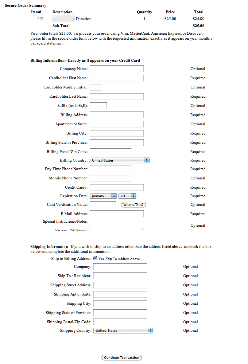
Good forms are the number-one indicator of good information architecture. In a perfect world, they’re simple, easy to understand, and user friendly, requiring only the essentials. Some examples of bad forms can be seen here.
Form analytics can easily measure how long it takes visitors to fill out a form, or identify where they’re dropping off in the process. You can also measure the success rate based on how many times your customers get error messages upon pressing “Submit.”
A/B and multivariate testing can help you find the right solution here.
4. How is the “back” button used?
How often is the “back” button being used? And when? Turn to Google Analytics (or a tool like Visual Website Optimizer) to see how people browse your site.
If clients press it multiple times at places where it doesn’t make sense, then chances are the architecture of your website is broken. If visitors aren’t encouraged to move forward (or can’t), find out what’s blocking them.
Usage of the back button is perfectly normal in many cases. But if usage is high—or occurring in unexpected places—verify your findings with some user tests to see if you face a real problem, or if you’re experiencing ordinary behavior. Quite often, there are surprises.
The same applies to using the search bar on the website after clicking around the menu.
5. How is pagination deployed?
In the pursuit of pageviews, website owners have developed a nasty habit of writing long, paginated posts and slicing content into chunks, often frustrating the hell out of their visitors.
Turn to your website analytics to see if customers leave after clicking on the first and second pages of an article.
From a usability standpoint, there’s no point having slideshows on a page when the content could be scrollable. Media sites have been especially guilty of splitting content across multiple pages, although some at least give the reader the option of viewing all content on a single page.
6. Navigation vs. search
How do customers navigate your site? Mouse tracking or using Google Tag Manager to tag individual links can show you where on a page users click, or if they opt for site search instead.
The navigation vs. search ratio shows you which pages are easy (or hard) for visitors to find.
7. Visitors who purchased vs. visitors who quit the process
One of the key indicators on whether the changes have had any effect is the number of purchases completed, compared with people who chose to leave their credit cards in their wallets. This is conversion rating at its finest.
8. Random visitors vs. visitors who bought something
The number of visitors won’t tell you anything unless you’re willing to dive further into the details. In this context, the critical metric is average value per visitor. (This is no longer a UX metric, but you can use it to measure your overall business performance.)
Unless you’re focused solely on content marketing and advertising, you should be looking at the sheer number of sales generated. In the end, it’s the only metric that matters.
Conclusion
Hopefully, this post has given you some essential information about UX metrics. If you’ve read this article, then you’re already ahead of the curve since most marketing managers ignore UX (thinking it’s “something IT guys do”).
Remember:
- Don’t get stuck in online marketing limbo—conversions alone aren’t the whole picture.
- Test, test, test (A/B, multivariate, and user tests).
- Don’t think that UX is something you do once; it’s a constant process of improvement.
- Measure less, interpret more.
- Prefer ratios over single metrics.
- Concentrate on the big picture, not just online sales or visits but also back-office performance.
- Speak with other managers in the company and agree on your main metrics.


Thank you Mark – Your clearly explained points and interestingly presented articles are a treasure trove for our team. I appreciate your blog and wish you much success in the year ahead.
Marko, what do you mean in the conclusion about preferring ratios over single metrics? Could you expand a bit or point me to another post?
Hi Shane! Well, what I meant was not singling out a single metric as you will not see the big picture if you only concentrate on one or two of them. Whether you are concentrating on the conversion rate, bounce rate, amount of visitors etc. That is only one side of the business.
Instead you need to look at how the entire company operates, not just the website. For example do you know just how much money you are spending in order to get a single purchase?
User experience metrics give you an overview of just how well the entire company operates.
Thank you Marko, the article helped in understand UX in better way and were it should be implemented well .
thanks
Thanks for posting this. At least now I have some notion of what is this UX.
may help me about this:
15 metrics for evaluate the systems or usability metric(except Completion Rate- Usability problems- Task time- Error)