Research shows that for every $1 you spend on email marketing, you can expect an average return of $42. Compare that to paid advertising where the average ROI is $2 for every $1 spent.
You can see why email is such a crucial part of an effective product launch strategy.
Email is profitable because it allows you to talk directly to your audience. You don’t have to rely on ever-changing algorithms and hope your message reaches the intended segment. Email gives you a direct, unobstructed means of communication, thus a bigger return.
In this article, we’ll cover what’s needed to grab attention in a stacked inbox. Then, we’ll break down 10 successful product announcement emails, looking at why they work and what you can learn from them.
Table of contents
Winning the fight for inbox attention
Whether it’s a new product launch, product update, or upcoming event invitation, the aim of a product announcement email is always the same. It should:
- Get the word out to as many people in your target audience as possible
- Educate customers on features, benefits, and availability
- Convince customers to take action
To achieve any of these things, you need to get your email seen. This means winning the battle for inbox attention. With around 320 billion emails sent and received every day, this is no easy feat.
That sheer volume means a product launch email can’t be a one-and-done effort. A single correspondence is too likely to get lost in the shuffle.
To reach, engage and convince your target audience, your best bet is to approach launches as an email campaign. Craft a series of emails that grab attention whether the recipient is an excited fan or only vaguely familiar with your brand.
Creating a product announcement email sequence
With any email sequence, timing is as important as the messaging. For a product announcement, you want to build anticipation ahead of launch and follow up after.
Your email sequence should look something like this:
1. Teaser email: A heads up that something new is coming soon. You can hint at what it is, but don’t go into too much detail. You only want to build hype and excitement. Scientists have found that anticipation can be even more rewarding than the experience itself, so make sure to utilize it to build interest. Aim to send out your teaser email up to two weeks before launch.
2. Product announcement email: Tell your audience about the product they’ve been looking forward to. Fill them in on key details (what it is, how it benefits them, launch date, etc). Use images and videos where necessary to show off your product and ramp up the excitement.
3. Product launch email: Let your audience know that the product is live. Reiterate features and benefits while you’ve got their full attention.
4. Follow-up email: After the initial excitement has died down and sales have slowed, follow up to remind your audience of your new product and what’s great about it. Send your follow-up email a week after launch. Make sure that your email list is segmented so that only subscribers who haven’t yet made a purchase receive it.
Crafting a product launch email sequence gives you several opportunities to engage subscribers. Those that open your first teaser email can go on a journey with you from announcement to launch.
Those that only see one email in the sequence should be intrigued to learn more or ready to make an informed decision. Every email in the sequence, no matter the order, should focus on these outcomes.
Work under the assumption that this is your only opportunity to grab attention. This means crafting a catchy product launch email subject line.
Writing an email subject line that stands out
There is no magic formula for this. And no subject line you try will work every time. But there are principles you can follow.
Shanelle Mullin goes deep on what these are in her post on improving open rates.
Here are the core principles to keep in mind…
1. Continuously test your subject lines and measure your success by open rate.
2. Research your audience’s voice through surveys and interviews.
3. Use tasteful personalization meaningfully, but test it to prove that it works for your audience.
4. Choose clarity over being trendy or clever. If you’re considering an empty suitcase or curiosity gap, think about the expectations you set with your audience upon opt-in.
5. Be aware of mobile subject line character restrictions.
6. Choose every word carefully. In subject lines, a single word can make a big difference.
7. Segment your email list to uncover deeper insights about what’s working and what’s not.
8. Treat preview text and from name as an extension of your subject line.
This email from Grammarly stood out in my inbox thanks to its use of the siren emoji and attractive offer:

Nike’s subject line also caught my eye:

It turned out the shoes weren’t my new favorites. But the subject line certainly made me want to find out. In that sense, it did its job perfectly.
“The headline is the ‘ticket on the meat.’ Use it to flag down readers who are prospects for the kind of product you are advertising.” – David Ogilvy
Let’s look at some different subject lines used by brands to get attention. And, dig into how they craft their emails to engage users and drive click-throughs.
10 examples of brands that nail product announcement emails
We’re not sharing product launch email templates. As soon as they’re out in the world they immediately become unoriginal. Instead, take inspiration from the launch email examples below to craft your own unique campaigns
1. Digit
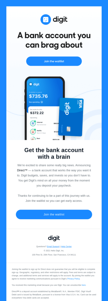
Subject line: Big (very big) news
Online bank Digit’s announcement of “Big news” in its email subject line is intriguing. But it’s the addition of “(very big)” that helps it stand out.
It’s a small touch, but it fits in with Digit’s quirky and conversational tone of voice. It also gives extra weight to the announcement.
The eye-catching subject line is supported by a strong header (representing the unique selling proposition (USP): “A bank account you can brag about.” This is followed by an image of its mobile app and prominent CTA button placement, making it easy to see how the app works and join the waitlist.
The body copy is concise, just five short sentences. But it tells readers about the product and how it benefits them: it saves and invests “so you don’t have to.” If financial planning isn’t your thing, this is very compelling. They then include another CTA button, giving readers multiple chances to sign up.
Subscribers that grabbed the opportunity to join the waitlist became part of a product launch email campaign:
Digit’s follow-up email features your spot in the line and how many people have joined the waitlist. Social proof 101: make people feel they are part of a shared experience so they feel more confident about their choices.
The email also includes referral links to engage members, giving them the chance to share the campaign to move up the list.
Finally, readers are driven to educational content about the new product. This works to convince members who are on the waiting list but unsure about fully committing. It also details why the product is important, giving readers more reason to want to jump the queue.
What you can learn from this email
CTA positioning is important
Your CTA placement should be strategically tied to your objectives. If you want users to commit to something, use more than one CTA.
Placing a CTA above the fold means that recipients will see it on whatever device they’re using. This acts as an instruction to readers to take the desired action.
The second CTA is used to nurture the lead if they’re not quite ready to commit. Digit places this one at the bottom of the email, giving readers the chance to learn more before taking action.
If you want users to take action, always go with a CTA button and clear instructions. Campaign Monitor found that using a button-based CTA increased its click-through rate by 28% over a link-based CTA.
Keep customers engaged
If a subscriber has joined a waiting list for your product, don’t let that be the last they hear of you before launch.
Digit’s confirmation email does a great job of keeping members interested by gamifying its list.
Everyone wants to be the first person to get their hands on a shiny new product. Giving them the chance to move up the list keeps customers excited while giving Digit greater exposure.
Look at ways to keep excitement levels high so that your subscribers look forward to launch day.
2. Kajabi
Subject line: Get a competitive edge with Kajabi
Kajabi’s subject line gives readers a reason to click by promising them something. “A competitive edge” is important to Kajabi’s audience of entrepreneurs, marketers, and influencers.
Clicking through, readers are met with a strong headline: “Actionable insights from a #1 Podcaster”. This instantly tells us that the insights are worth taking notice of.
The copy tells readers about the podcast and what we’ll learn from listening, with a CTA link to the podcast and a CTA button to Kajabi’s podcast tool.
Its use of CTAs is clever. By making the podcasting tool CTA a button, Kajabi subtly prioritizes its primary offer.
Those that are interested in the podcast will find their way to the podcast link. But the eye is naturally drawn to the blue button, which drives traffic to its sales landing page.
What you can learn from this email
Use influencers to give your emails gravitas
Kajabi highlights in bold that its podcast guest is “Alex Ferrari, author, blogger, speaker, consultant, and host of the Indie Film House Podcast (the #1 filmmaking podcast on iTunes).”
This adds authority. Even if you don’t know Alex, it’s clear he’s a big deal in film and podcasting. You want to hear what he has to say. And not only that, he’s a Kajabi user.
If a number one podcaster trusts Kajabi, it has to be good, right?
Think about how you can use influencers or prominent customers to convince users to take action. Even if the name doesn’t ring a bell with your audience, listing their credentials can give your product credibility.
3. Havenly
Subject line: Something new is coming to Havenly
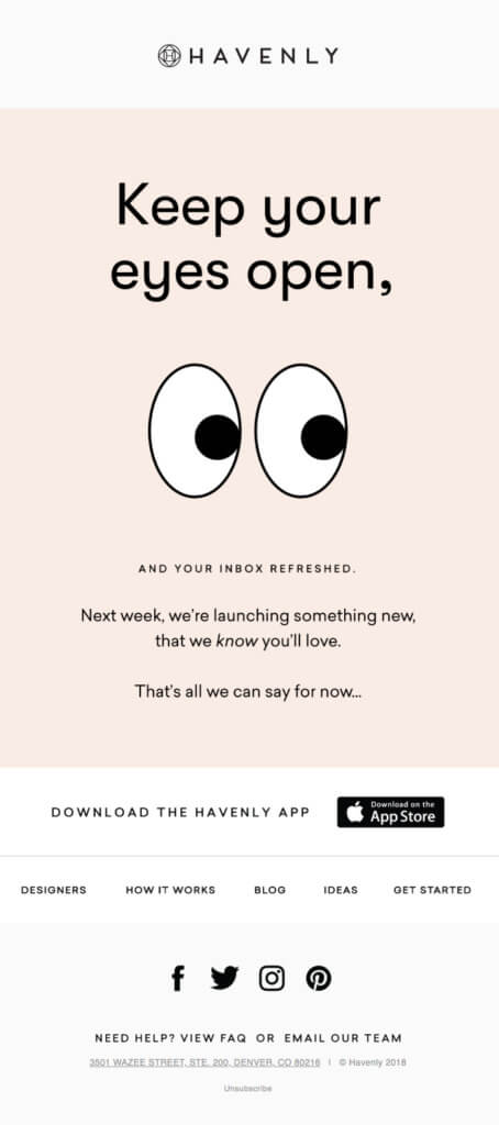
Havenly’s teaser email is a great example of how to build intrigue around a product launch.
The headline (with the help of a large blinking eye GIF) instructs readers to be on the lookout for further announcements. And the copy assures them that what’s coming will be worth the wait.
“Next week, we’re launching something new, that we know you’ll love.
“That’s all we can say for now…”
It is clean, simple, and makes you want to find out more.
The lack of a call to action is also a clever touch as it requires you to either sit tight or proactively visit the Havenly website.
What you can learn from this email
Sometimes, less is more
When it comes to building anticipation, provide just enough details or a sneak peek to keep readers thinking of the possibilities.
Forgo CTA buttons and eliminate any distractions in email design so that the readers are left wanting more.
Havenly’s email builds anticipation with the promise that they’ll love what’s coming. This growing curiosity should drive action in follow-up emails.
4. Apple
Subject line: AirPods Pro are here.
Apple is a master of the product launch. It’s why so many people tune into its live events and queue around the block when the latest iPhone hits shelves.
Its new product announcement email for the AirPods Pro uses strong imagery and powerful copy to sell the product.
A black background helps the product images and blue CTAs stand out to draw readers in. It also lets the visuals do a lot of the heavy lifting, with only short copy needed to highlight new features.
Information is also clearly displayed, including the price and details of how to experience AirPods Pro in-store. This level of clarity is important when a product is in high demand.
What you can learn from this email
Benefits over features
Announcement emails aim to drive action, so you should lead with benefits over features. That’s because people buy on emotion and justify it with logic—and benefits tap into emotions.
Rather than tell customers the AirPods Pro has a 519 mAh battery, Apple talks about them delivering “More than 24 hours listening time.”
From a dry fact, Apple has delivered a reason for people to buy the product.
To translate features into benefits, ask yourself: “so what?”. Here’s an example from Enchanted Marketing:
The oven preheats quickly.
So what?
It’s quickly ready to start cooking your lasagna.
So what?
Your food is on the table sooner.
So what?
Life is less stressful. There’s less hanging around the kitchen waiting for the oven to get ready. And you don’t have to worry you might forget to preheat your oven.”
Consider your readers’ intentions
Not all of your customers will be ready to buy the first or even the fourth time they read your product announcement emails, especially if you’re selling a high-ticket item.
To remove a barrier to purchase, provide supporting information that helps with decision-making.
Apple includes several CTAs in its email that point users at the AirPods landing page. There, they can find out more and compare models. It also provides a link to a store finder for its audience to try out AirPods in person.
This supplemental information works to nurture readers who aren’t ready to commit to buying. For those who are, the “Buy” button next to the price remains the most visible CTA on the page.
Everyone is catered to.
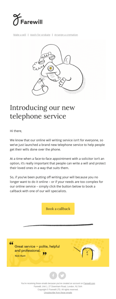
5. Farewill
Subject line: Farewill Launches Telephone Service
Farewill’s brand is defined by its conversational tone and use of illustrations to make their product (which is serious in nature) a bit less intense.
“The simpler way to deal with death” is their landing page’s USP, which sits on a bright yellow background and showcases cartoon-like figures smiling on a couch.
This vibe carries through to its product launch announcement email.
What this email gets right is the clarity of its message. In three paragraphs, readers learn the problem and are presented the solution. It’s clear and to the point, but written with just the right amount of sincerity.
The copy is capped off by a well-spaced CTA button that’s free from distractions. And, a little further down the page, a testimonial that adds social proof.
What you can learn from this email
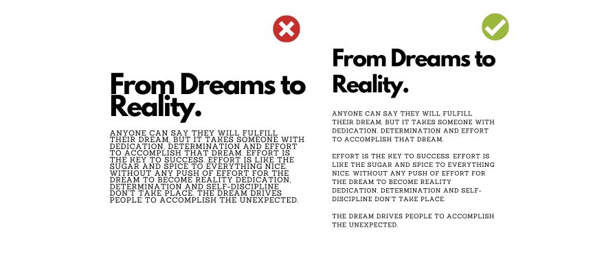
Write in short sentences and short paragraphs
Each paragraph of Farewill’s email is a single sentence, well-spaced across no more than four lines. This is important as it makes the words easy to digest.
People don’t read on screens the same way that they do in print. White space is important for helping us take in what we’re reading, especially on mobile devices.
A study by D.Y.M Lin shows that “proper use of white-space between lines of paragraphs and its left and right margins can increase comprehension up to 20%.”
Split any paragraph of more than three lines. This will ensure that even if the reader skims, they’ll be able to find the information they need and you’ll be able to get your key points across.
6. Willo
Subject line: Your exclusive invite | Willo is live in 24hrs
Electric toothbrush brand Willo builds the intrigue for its product announcement from the subject line.
Extending an “exclusive invite” makes customers feel like they’ve been chosen to receive this email and are part of a select few.
The simple headline (“The countdown has started…”) combined with a bold product image of Willo grabs attention and makes readers want to find out more.
When the reader scrolls down, they find out why they’ve been chosen, along with the key information and a code they need to purchase on launch day.
Finally, there’s a video that introduces the product and covers the benefits for those who need a little more convincing.
What you can learn from this email
Use scarcity to convince and convert
By giving recipients exclusive early access to one of only 1,000 units, Willo effectively uses the scarcity principle: the rarer the opportunity or product, the more valuable it is.
“When something is rare, it’s alluring–true whether you’re talking about precious gemstones or a pristine edition of the first issue of Action Comics (which introduced Superman). And psychologists have long known that if you can make a consumer good more desirable by making it appear rare.” [via Science Daily]
It’s the same technique that convinces people to act when an airline announces that there are “only 8 seats left at this price”.
If you want people to take immediate action, pushing a limited number of products, a limited price or a limited period can create a sense of urgency. It plays on people’s FOMO, as well as feelings of exclusivity and status.
Take a look at our article on 18 Scarcity Examples that Can Boost Sales for a deep dive into the impact of scarcity and how to harness it.
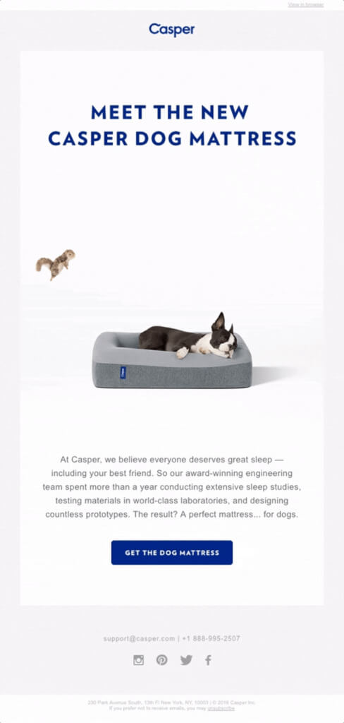
7. Casper
Subject line: You barked, we listened
Casper’s new product launch email is an example of a brand that knows its audience.
The subject line “You barked, we listened” resonates with dog owners, compelling them to click. This tone carries into the email.
The use of the word “Meet”, for example, is more friendly and personal to dog lovers used to meeting new pooches. They’ve likely conducted voice-of-customer (VoC) research and understand CTAs like “Get” or “Buy” are too abrupt.
The introductory copy is minimal but powerful. Referring to studies and testing shows readers that Casper has put a lot of thought and care into its product.
Finally, the white background helps draw attention to the CTA and, more prominently, to the GIF of a sleeping dog dreaming of a passing squirrel. Nothing connects with dog lovers quite like an image of a cute dog on your product.
What you can learn from this email
Tell readers why your product is the best
Casper is an established and respected mattress brand. Its email copy could have been as simple as “Get the perfect mattress… for dogs” and recipients would be interested in learning more.
But Casper doesn’t take this approach. Instead, it explains what went into making the mattress.
“So our award-winning engineering team spent more than a year conducting extensive sleep studies, testing materials in world-class laboratories, and designing countless prototypes. The result? A perfect mattress… for dogs.”
‘Perfect’ on its own is an empty word. The same goes for ‘unique’ or ‘the best’. Even as an established brand, you can’t rely on these words to get the job done. Explaining why your product is perfect or the best gives it weight (and helps you differentiate).
If you want readers to take action, tell them why yours is the product they need, and why it’s different/better/more interesting than anything else.
Use GIFs to increase engagement (but think about accessibility)
GIFs are a fun way to draw attention to an offer and show off a product with personality. But they may not always have the desired effect.
While most major email clients support GIFs, not all do. If you have a lot of subscribers using some versions of Microsoft Outlook, GIFs will only display as a static image.
This chart by Litmus shows which email clients do and don’t support animated GIFs:
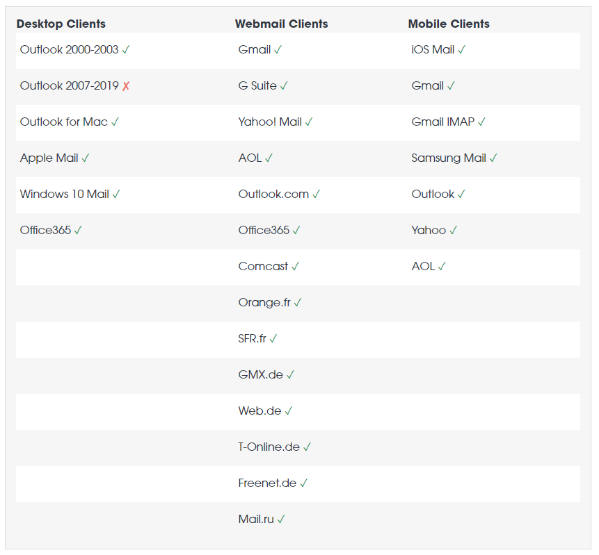
Text-heavy GIFs can also pose a problem to visually impaired viewers, who may struggle to review content before the animation changes. Additionally, flashing rates of between 2 Hz and 55 Hz are dangerous to recipients with photosensitive epilepsy.
To ensure GIFs work in your favor:
- Keep them simple (Casper’s GIF is good because it works just as well as an image)
- Avoid overly flashy content
- Keep file size below 1MB for fast loading
- Use ALT text for subscribers who rely on screen readers
- Back up GIFs with headlines and copy to provide context
8. Super Team Deluxe
Subject line: Super Team Deluxe, Now Open! Now this is what it’s like when worlds collide…Are you ready to go?
Super Team Deluxe’s new product release email is an example of the power of great writing.
Rather than using HTML, Super Team Deluxe’s email takes users on a journey with words.
The headline grabs readers:
“Wait.. what’s that smell?”
Posing an intriguing question makes you want to read on to find the answer.
The copy is equally fun, using Super Team’s Deluxe’s quirky conversational tone to tell readers about new products and answer common questions.
The CTA leaps off the page and is consistent with the language of the email, making you want to click it whether you’ve read every word or skimmed through.
What you can learn from this email
Be consistent in your voice and tone
The more consistent your brand messaging is, the more recognizable your brand will be. This familiarity will help you stand out in a crowded inbox.
Super Team Deluxe’s voice and tone in emails are consistent with how the brand presents itself on its website and social media. You can tell that it’s them, even without seeing their name.
Aim for this level of consistency in your own content marketing.
That’s not to say you can’t change things up when you need to be more serious, or drop in a joke if you write more formally. But the majority of your emails should be able to be read aloud to your audience with no context and have them know who’s talking.
9. CW&T
Subject line: In 24 hours
CW&T’s live launch email is another great use of scarcity. By promoting an Instagram Live stream and Early Bird reward tier for its Kickstarter launch, the brand effectively uses FOMO to convince users to act.
The email leverages concise copy, which is cleverly written to encourage readers to get involved:
“Join us on Instagram tonight”
“…get there on launch and tip off your friends”
“We need around 333.333 supporters like you”
“…we do need your help.”
CW&T also breaks up sections with subheadings to appeal to skim readers and gives each part of the email room to breathe. This is important when you have more than one action you want users to take.
As a final personal touch, the email is signed off by the CW&T team.
What you can learn from this email
Remove the guesswork
If you want customers to do something, tell them. CW&T leaves nothing to guesswork.
From the outset, readers are told what’s happening, when, and how to get involved. It backs this up with strong action words and phrases that generate enthusiasm.
Make it personal
Typically, we talk about email personalization as using recipient names or segmentation to deliver a personalized experience. But a simple sign-off at the bottom of an email is personal too.
Would CW&Ts email lose anything by not attaching “Sending hugs + gratitude, Che-Wei + Taylor” to the bottom?
Probably not. It gets its message across without it. But it’s more endearing with it.
You know that Che-Wei + Taylor have written this email and that they’re grateful for readers’ attention. This strengthens the emotional connection between brand and customer.
It’s a small touch, but a powerful one.
10. Dims
Subject line: Meet Word Table Light from Dims
Dims. is a contemporary furnishing brand that creates modern pieces in collaboration with world-class designers. This product release email from designer light company Gantri keeps with Dims’ minimalist approach.
Copy is used sparingly, with each line is followed by a clear CTA. This keeps everything straightforward. It also lets Gantri put the focus on the product.
The Word Table Light is showcased with strong imagery that lets recipients see how the lamp looks in different settings.
For those unfamiliar with Dims., the email ends with a short ‘About’ section for readers to learn more.
What you can learn from this email
A picture says a thousand words
The aim of a product announcement email is to help customers understand the product.
If your product is brand new or unfamiliar to audiences, you may need to go into detail. Willo’s email did this with an explainer video.
If, however, your product is self-explanatory, you can get your message across by showing the product in action.
People know how lamps work, they only want to see how this one might look in their home. There’s no simpler way of doing this than with images.
Where it makes sense, let images do the talking.
Conclusion
Here’s a recap of the key takeaways from the email example templates we’ve covered:
- Use well-spaced CTA buttons with clear instructions
- Keep readers engaged with incentives and educational content
- Where relevant, use influencers and thought leaders to add authority
- Create teaser emails with just enough details to keep readers wanting more
- Lead with benefits over features
- Consider the recipient’s intentions in every email you create
- Write clearly and concisely, using short paragraphs
- Use scarcity to drive immediate action
- Use strong imagery and GIFs where appropriate
- Be consistent in your tone and voice
- Add a personal touch to emails
Experiment with these tactics in your own emails. Not every tactic will work every time. Not all will work well together.
By testing and measuring open rates, click-through rates and conversions, you’ll learn what resonates with your audience and how to inspire action.
Working on something related to this? Post a comment in the CXL community!





As many marketers will use the cliche – the money are in the list. Email marketing is probably the best and easiest way to reach clients and keep them informed about future products or promotions.