A product demo is a critical tool in the sales process. It exists in the all-important consideration space between lead qualification and conversion, giving you the opportunity to show how your solution solves problems and makes prospects’ lives easier.
Done right, it’s a deal maker. Done badly, you risk losing sales.
In this article, you’ll learn what makes a compelling demo. We’ll look at the important principles and break down how successful companies use demos to engage prospects.
Table of contents
1. Usetiful
Like every good story, a product demo should take the prospect on a journey. To adhere to the tried-and-trusted storytelling format, Adobe’s Alexandra Nation sticks to the following steps:
“1. Tell them what you’re going to tell them. Use this opportunity to direct the conversation. Tell them what you want to say and what they need to hear. This will make your audience comfortable since they’ll have clear expectations of where you’re headed.
2. Tell them. This is when you build your business case for why your solution meets their needs. Don’t just rattle off different features. Speak to how you can help—how can your product or service can help them overcome their challenges?
3. Tell them what you told them. Repeat your takeaways to drive the point home before you end your presentation.”
These steps can be used even if you’re not delivering demos in the spoken word.
Take Usetiful. From the moment you land on the homepage, you can see that it places huge importance on its demo, making it the primary visual above the fold, with two call-to-action (CTA) buttons. Crucially, both of these sit below the introductory headline and copy. This works to tell prospective customers about the product and what it can do for them, making them want to learn more.
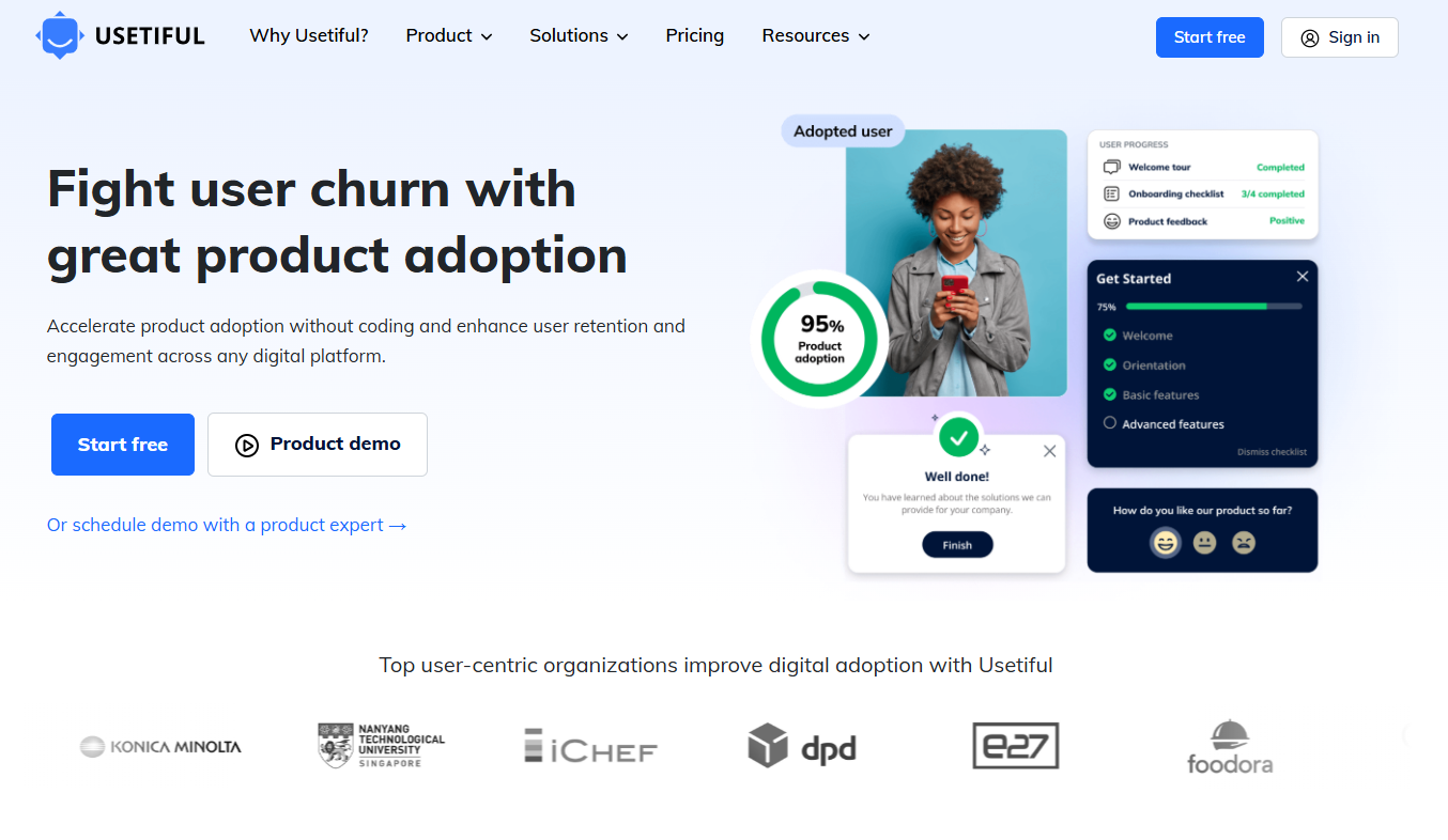
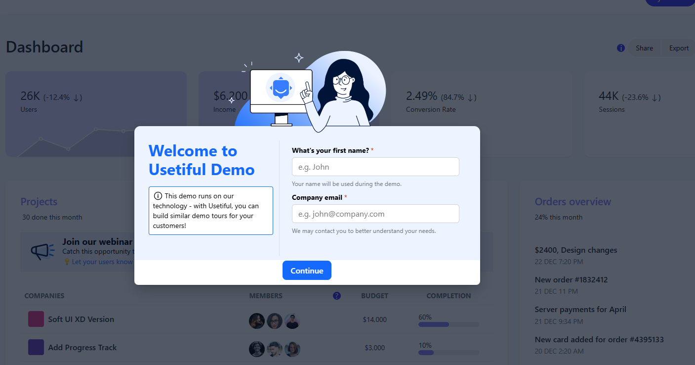
Clicking on either button brings up a form. Usetiful’s first demo button takes prospects directly to the demo tour, demonstrating the different solutions its product offers with pop-ups on the home page. However, before proceeding with the demo, prospective clients are first asked to complete a pop-up form by filling in their name and company email. A secondary form then asks what you’d like to use it for as well as your areas of work.
This could either work for or against you. The prospect is either going to appreciate that you’ve broken up the form into bite-sized chunks or they’re going to get annoyed with the constant interruptions because they just want to get to the demo.
The pop-ups then continue with a personalized intro.
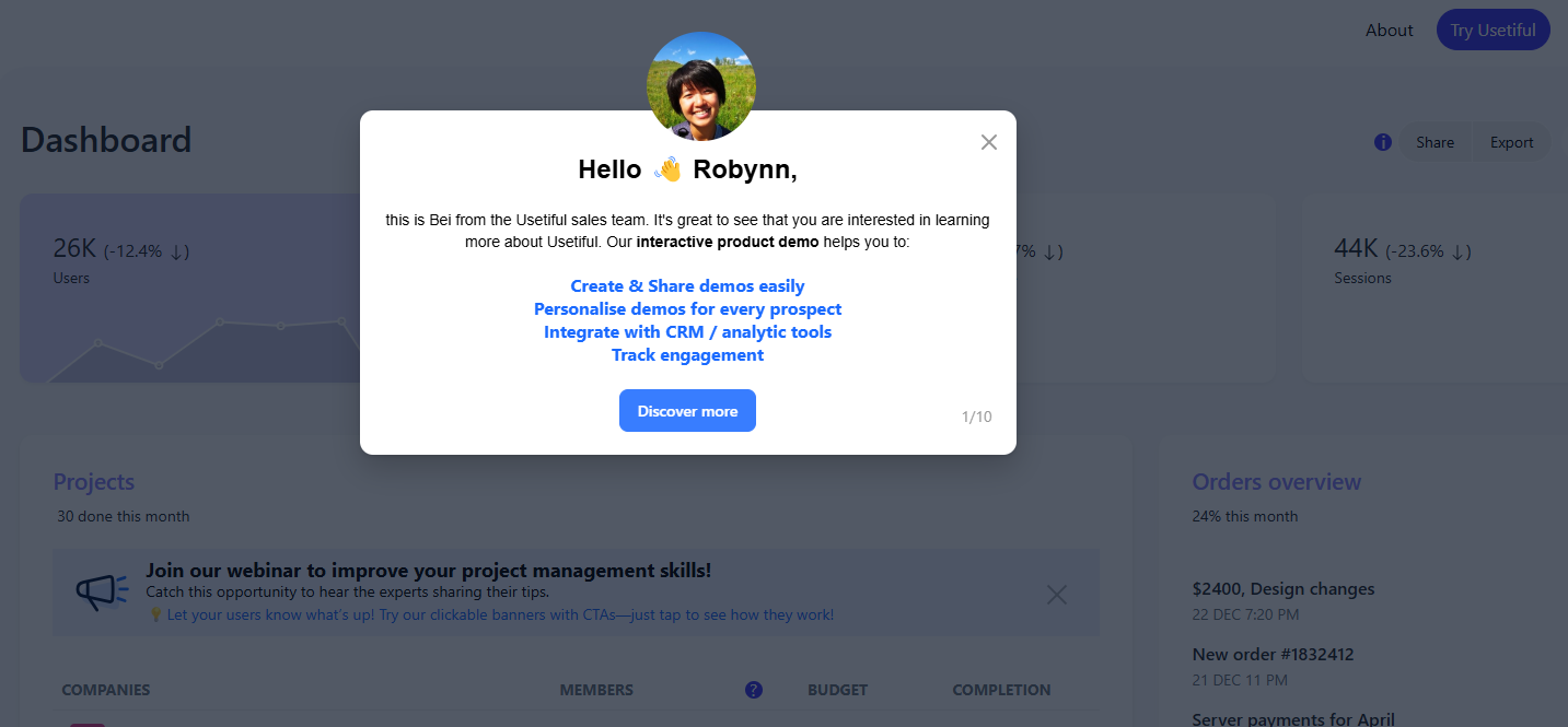
Then cycle through different real-use benefits.
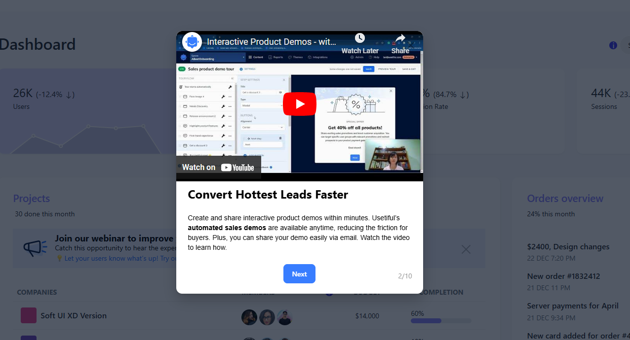
Before ending with a call to action.
We’ll look at how Slack has also done this with fewer words in its real-use demo later on in this article.
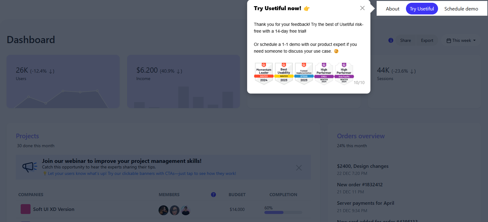
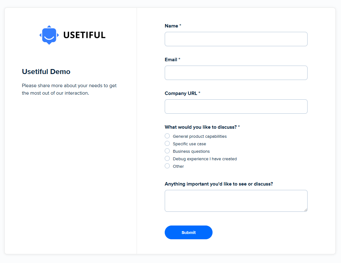
The second button allows users to schedule a tailored demo. This requires an email address and company URL as well as details about what you would like to discuss.
In his research of 78 SaaS demos, Jake Hatfield found this to be a common trait of good product demos.
“Based on the data, the consensus is that name, phone, and email are required together—83% of forms required all three. A good note here is that most forms also had “Business email” or “Work email” as the placeholder for the input, seemingly to qualify more serious leads and reduce spam submissions.”
This not only provides the sales team with vital information needed to prepare a tailored demo based on the prospect’s needs but also gives them time to rehearse, a vital part of the demo process.
Business author Geoffery James recommends doing this more than once.
“Demos are much more difficult than presentations–because, in a demo, you must simultaneously focus on the customer, the effect the demonstration is having on the customer, and the mechanics of the demonstration. So it’s utter madness to try to give a demonstration without rehearsing it at least three times.
You’d be amazed how many sales reps think they can wing it when it comes to demonstrations. The result is always a disaster.”
You should also test that everything works before going live. This includes your computer, mic, and camera. But also the product. The last thing you want is for a bug or kink to derail the entire thing.
Bonus Tip: If you’re collecting email addresses, waste no time in putting them to good use. Explain the benefits of your product and increase demo engagement for your list subscribers.
2. Headspace
Animated videos work well to help you explain the benefits of your product quickly and concisely by using visuals to do a lot of the heavy lifting. Nowhere is this better demonstrated than Headspace’s product demo video.

In under one and a half minutes, the demo explains how Headspace can help you live a happy, healthier life. It also shows you how to sign up and get started with meditation.
The demo uses the same characters as the Headspace mobile app and website and is narrated by founder Andy who delivers its meditation classes. This keeps branding consistent, creating familiarity—which is important.
Why?
Because 82% of searchers choose a familiar brand for the first click.
By ensuring your brand continuity across platforms, someone who has experienced it in passing and now wants to learn more is more likely to watch your product demo over the competition. Meaning you’re one step closer to a new customer than they are.
3. Snowflake
Snowflake is a global data cloud platform offering numerous products to various industries and departments. For them, one demo isn’t going to cut it.
Global demand and different time zones also mean that one-on-one demos will be resource-heavy and tough to pull off logistically.
So what’s the solution?
Weekly demos.
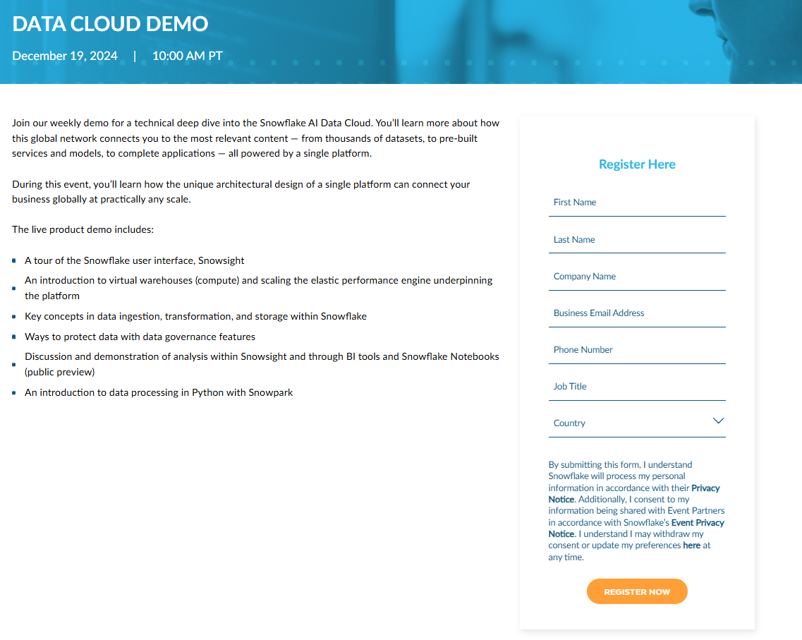
Each week, Snowflake hosts a live demo on a different topic. These work on rotation, held at different times and in various locations so that prospects can register for a demo that suits them.
In this sense, they’re more like webinars than demos. But the content is very much geared towards solving problems.
On the live demo page, prospects can filter results by region, workload, and industry to find the right demo. By choosing a specific time, prospects are more likely to block out time in their diary, meaning Snowflake is less likely to have people dipping in and out.
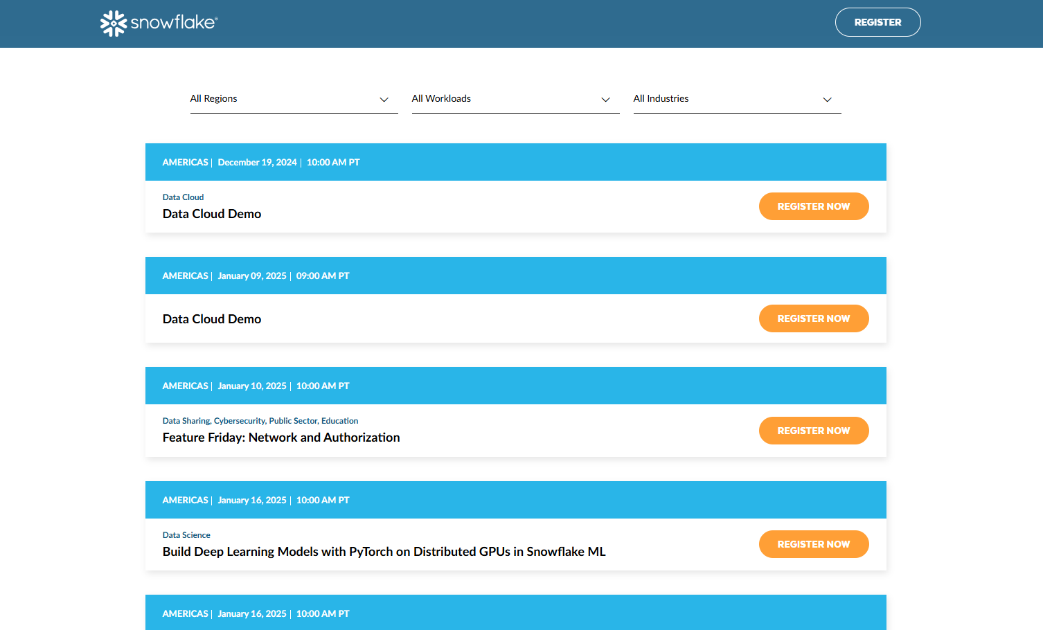
Prospects are then taken to a sign-up page. Here Snowflake lays out exactly what a user can expect to learn from the demo. This gives them more reason to sign up. Crucially, it also helps to filter out anyone who isn’t suitable.
If your brand operates in different markets or your product has many strings to its bow, creating a demo calendar is an effective way to reach more users.
4. Canva
The best demos know they’re talking to the right audience. They achieve this by pre-qualifying leads.
Pre-qualifying a lead is important for any kind of demo. It helps establish:
- If the prospect fits your ideal buyer profile
- If your product can solve their problems
- If it’s worth following up with the prospect
One simple way to qualify leads is in the sign-up process.
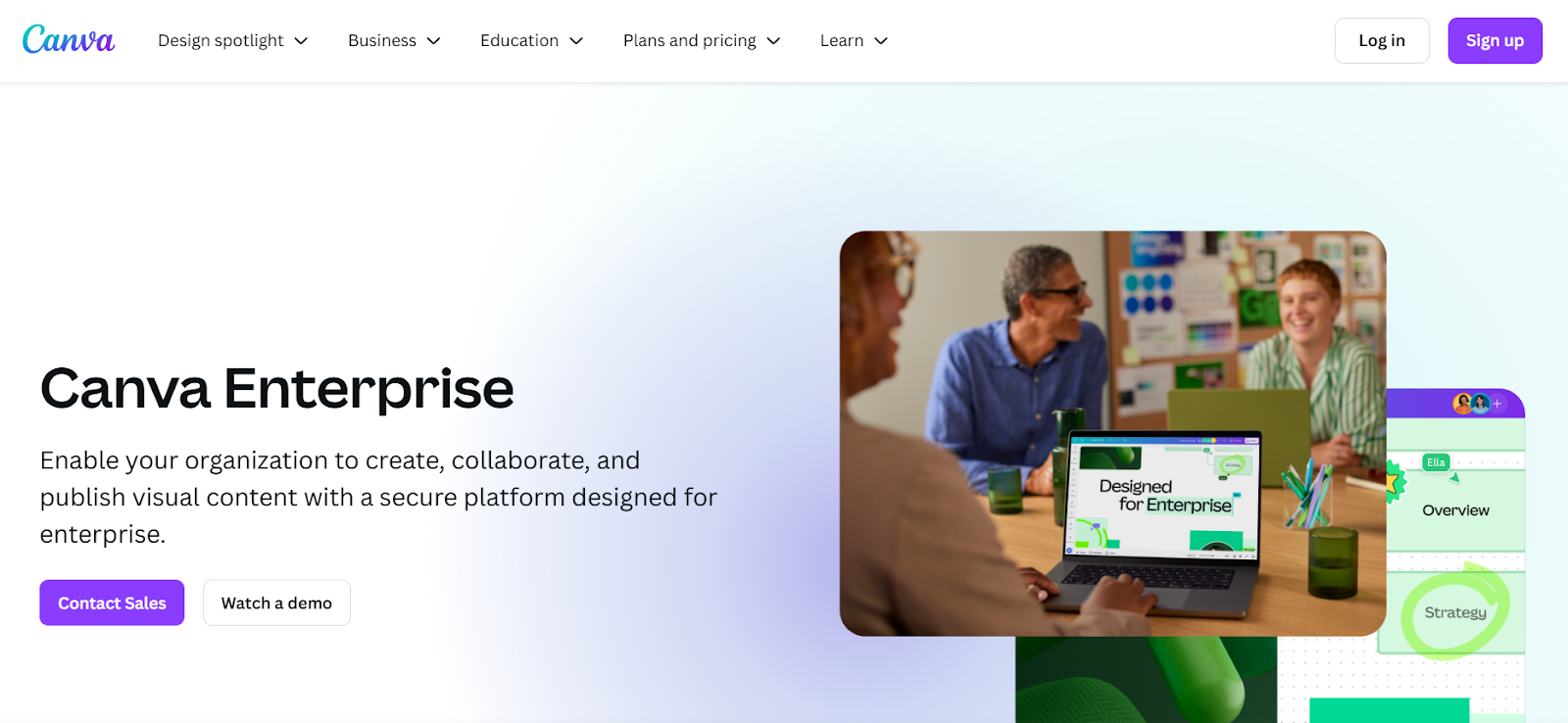
As with Usetiful, once you arrive at Canva’s Enterprise homepage, there are two clear CTA’s below the headline and copy: Contact Sales or Watch Demo. To watch the demo, prospective clients are asked to complete a form, to ensure that certain criteria align with what the product offers i.e. that they’re pre-qualified leads.
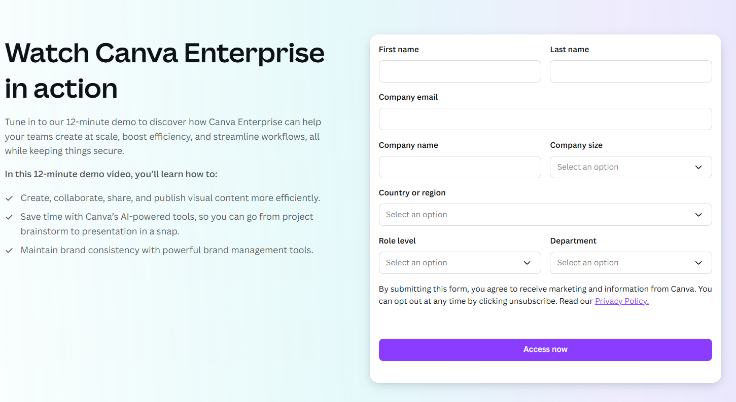
The demo form asks questions related to the prospect’s name, role level, and department, as well as the company name, size, and work email address.
This is a clever way to get potential clients on your email marketing list and provide the sales team with important information, allowing salespeople to tailor conversations to their needs.
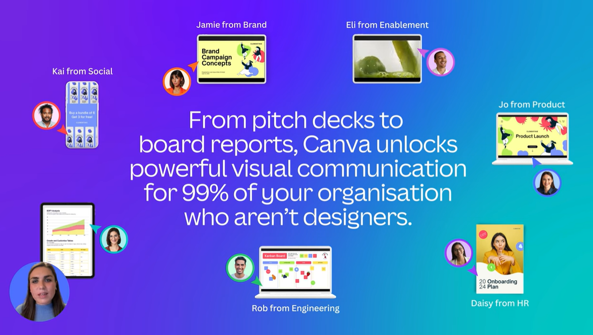
Canva’s Enterprise demo highlights how businesses can use the platform to streamline visual content creation, collaboration, and publication across departments while maintaining brand consistency. With features like customizable brand kits, AI-powered tools, and pre-designed templates, Canva enables teams to save time, cut costs, and scale creativity, offering various solutions to common challenges that an enterprise may face.
At the end of the demo, viewers are encouraged to go to canva.com/enterprise to learn more.
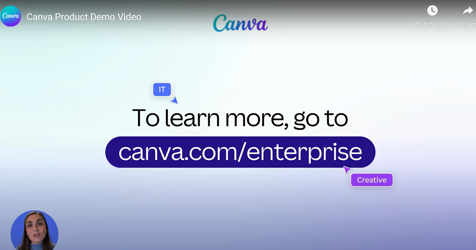
This brings the client full circle to the main site, where they have the opportunity to contact sales or sign up.
Canva’s demo is an excellent example as it comprises three key elements of what makes a product demo effective:
- Introduce your product: This should be clear from the offset–who are you and what services or products do you offer?
- Educate a prospect: This goes beyond the features offered, answering the question, “How do these features provide a solution to issues we may be grappling with?”
- Convince the prospect to act: Product demos should always have a clear call-to-action. There’s no point in a client investing 12 minutes of their time only to be convinced but have no idea where to sign up.
Remember, take your clients on a journey but, as with any good story, be sure that your demo has a beginning, a middle, and an end.
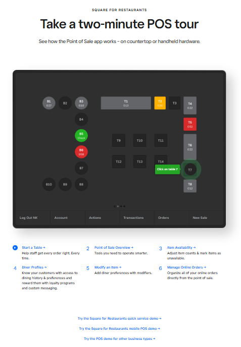
5. Square
In Jake Hatfield’s research, real-use demos were by far the least common, making up only 3% of the total.
Not every company has a product that’s geared for real-use demos. Our two previous examples, Atlassian and Snowflake, for instance, are too wide-ranging and complex. Prospects benefit from the help of sales reps to walk through solutions and answer questions.
They can also be hard to pull off. As Jake points out:
“If there’s a learning curve to using your product, people might not know where to ask for help or may give up completely. It’s also possible that these demos might have an up-front cost to design, code, and deploy.”
Payments platform Square has managed to do it, helped by the simplicity of its product and some creative demo design.
Rather than give people access to a limited version of the product, Square gives users common point-of-sale (POS) tasks to complete.
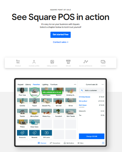
Users are taken through scenarios step-by-step, with a summary at the end to recap the process and remind them how easy it was.
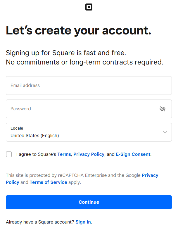
There’s no barrier to entry here. Potential customers aren’t required to register or download software. Square instead relies on the ease of its product and the strength of its demo to convince users.
It then backs this up with a simple form for users to complete to get started for free.
Unlike Usetiful’s demo CTA which sits front and center on its homepage, Square’s is located three-quarters of the way down the POS landing page.
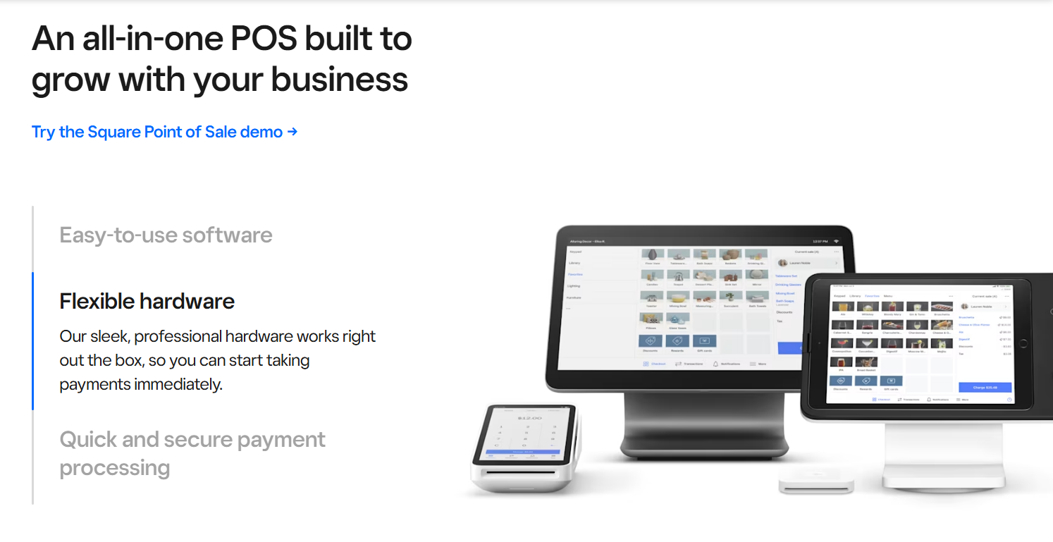
This makes sense as it’s not used for lead generation, but rather as one more way to win over potential customers still on the fence.
If a key USP of your product is simplicity, building a demo that complements your website and marketing copy by demonstrating this can be an effective sales tool to add to your arsenal.
6. Slack
Slack’s demo falls somewhere between product video and real-use demo. Like Square, it uses its interface to demonstrate what it can do.
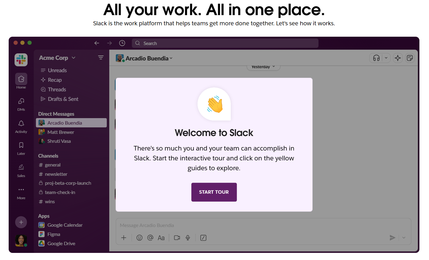
Hitting the “Start tour” button takes users on a product journey that details key benefits, including starting channels, integrating tools, and collaborating. It also shows prospects how to get a daily recap of missed messages thanks to AI.
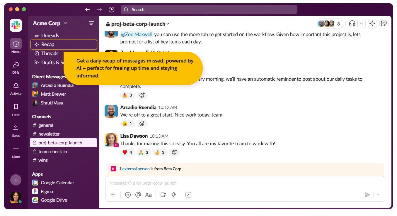
What’s clever about this demo is how Slack steers the conversation. Despite the absence of a sales rep, the demo guides prospects through each section, ending with a call to action.

It’s a great example of how to creatively sell the value of your product and deliver a clear beginning, middle, and end without a voiceover.
7. Fathom
Right from the start, analytics platform Fathom tells you what it offers and why.
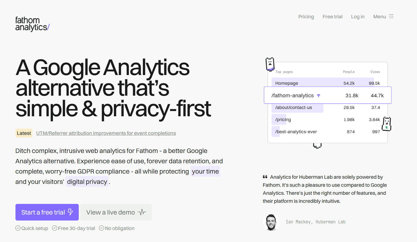
“Ditch complex, intrusive web analytics for Fathom – a better Google Analytics alternative. Experience ease of use, forever data retention, and complete, worry-free GDPR compliance – all while protecting your time and your visitors’ digital privacy.”
This copy doesn’t just work to sell the product. It’s a compelling invitation to check out the software demo.
Clicking the CTA takes you to a real-use version of Fathom’s platform. Here you can explore a fictional account to get a feel for the product and understand how it works. And there are no restrictions. Every button is clickable, and every hover-over delivers real-time data.
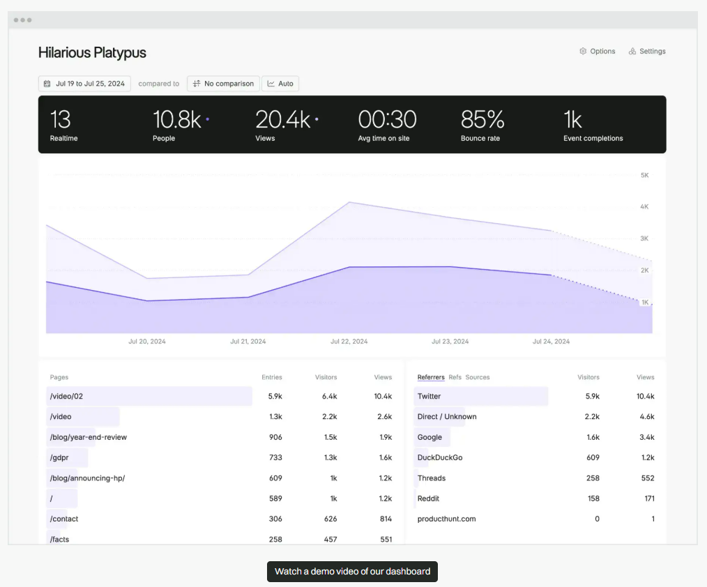
This demo works because it knows its audience. People who come to Fathom will most likely have experienced Google Analytics or Bing Webmaster Tools. This means they can let the product do the heavy lifting.
Having played around the platform, a prospect will have a good idea of whether it’s right for them. Clicking the sticky CTA at the bottom of the page takes them to a sign-up that helps to further convince them of its benefits.
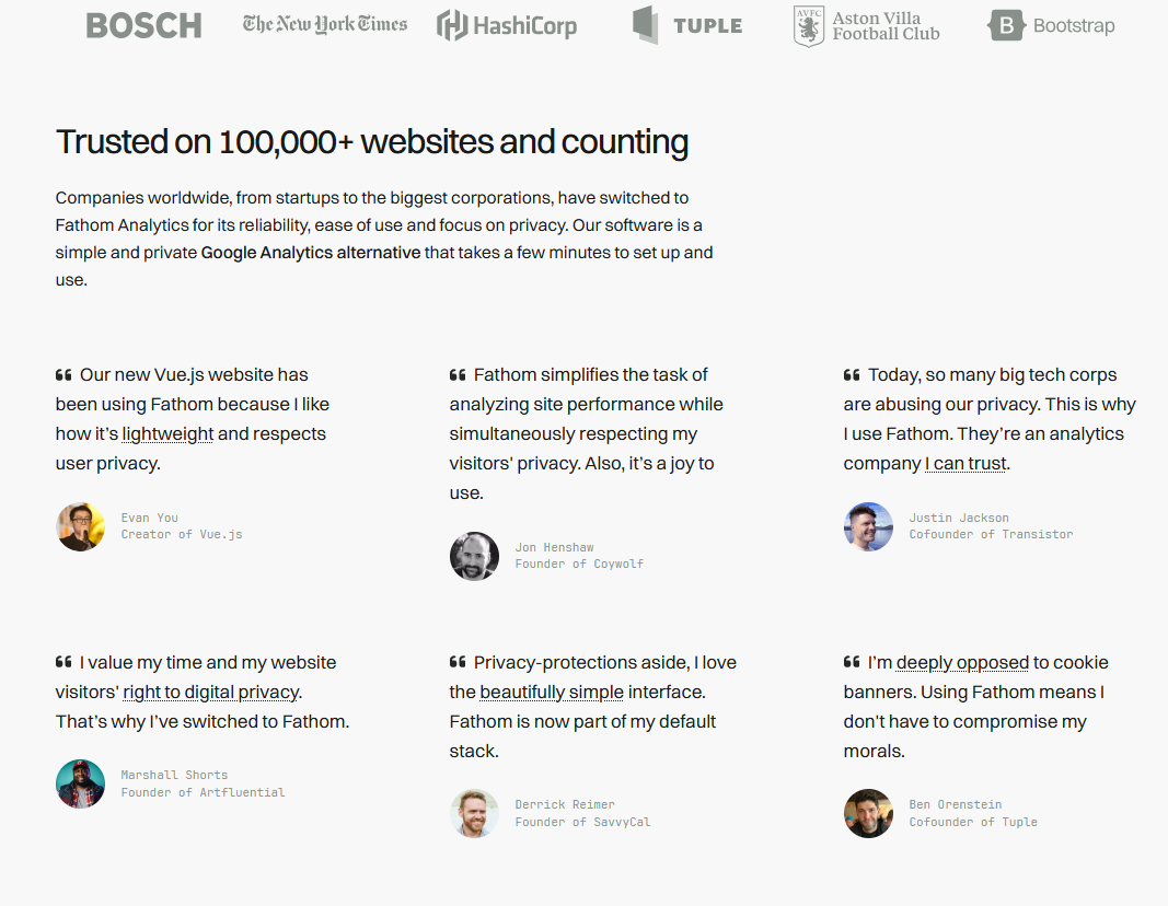
This is backed by social proof.
The main takeaway from this demo, however, is that if you have a product that’s genuinely disruptive in a market that’s already well-established, you can let that product do the talking.
8. Duolingo
If you’re up against strong competition, social proof is one of the best ways to stand out. Testimonials can be particularly effective.
“A type of social proof that works over and over again is testimonials. Whether it’s in video or written form, they’ve helped increase the conversion rate of my clients’ landing pages in every case.
When building a landing page, you can say all you want about your offer, but how can you prove what you’re saying is true? Authentic testimonials, preferably with a picture of the person, will take care of that for you. Test it, and I’m sure you won’t regret it.”
Raphael Paulin-Daigle, SplitBase.io
Rather than saving them until the end of the demo as one final way to convince prospects, Duolingo leads with them.
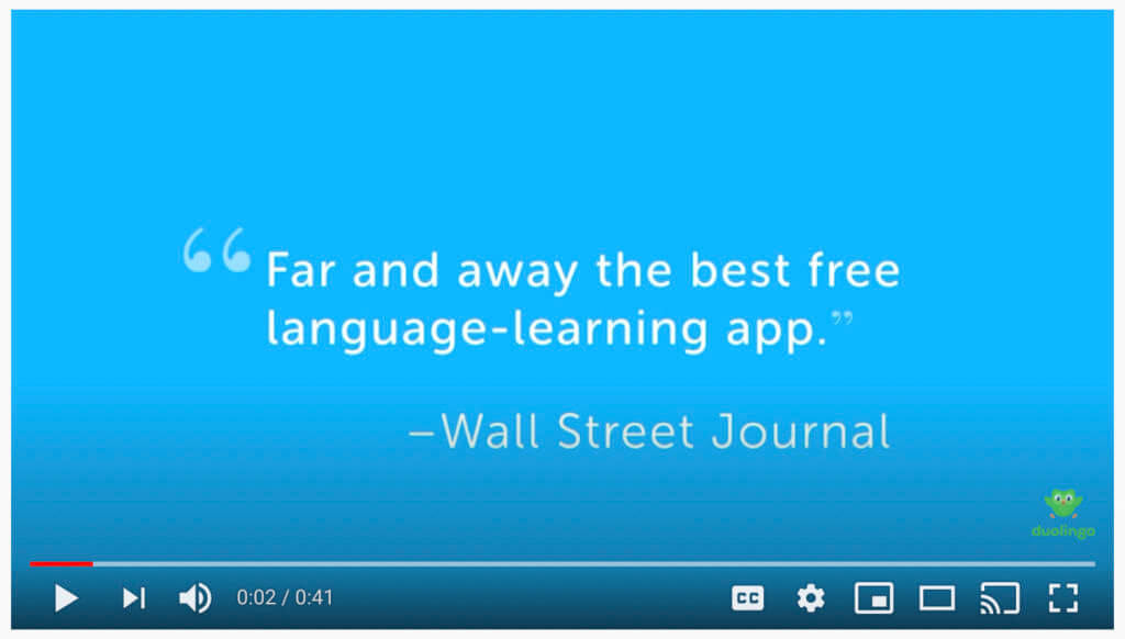
These set the stage for users to want to learn more.
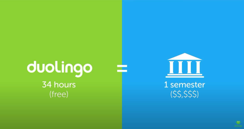
From there, Duolingo uses animation, rather than screenshots, to show how the platform works, featuring statistics to demonstrate its effectiveness. Like Headspace, this helps emphasize what’s important simply and concisely.
The demo video lasts just 0:41. Yet you’re left feeling confident that this is the right app to help you learn a language.
If you’re working on limited time or budget, pull in testimonials and research to strengthen your product’s claims.
9. ClickUp
ClickUp’s demo wastes no time hooking potential clients and setting itself apart from competitors with its headline and copy.
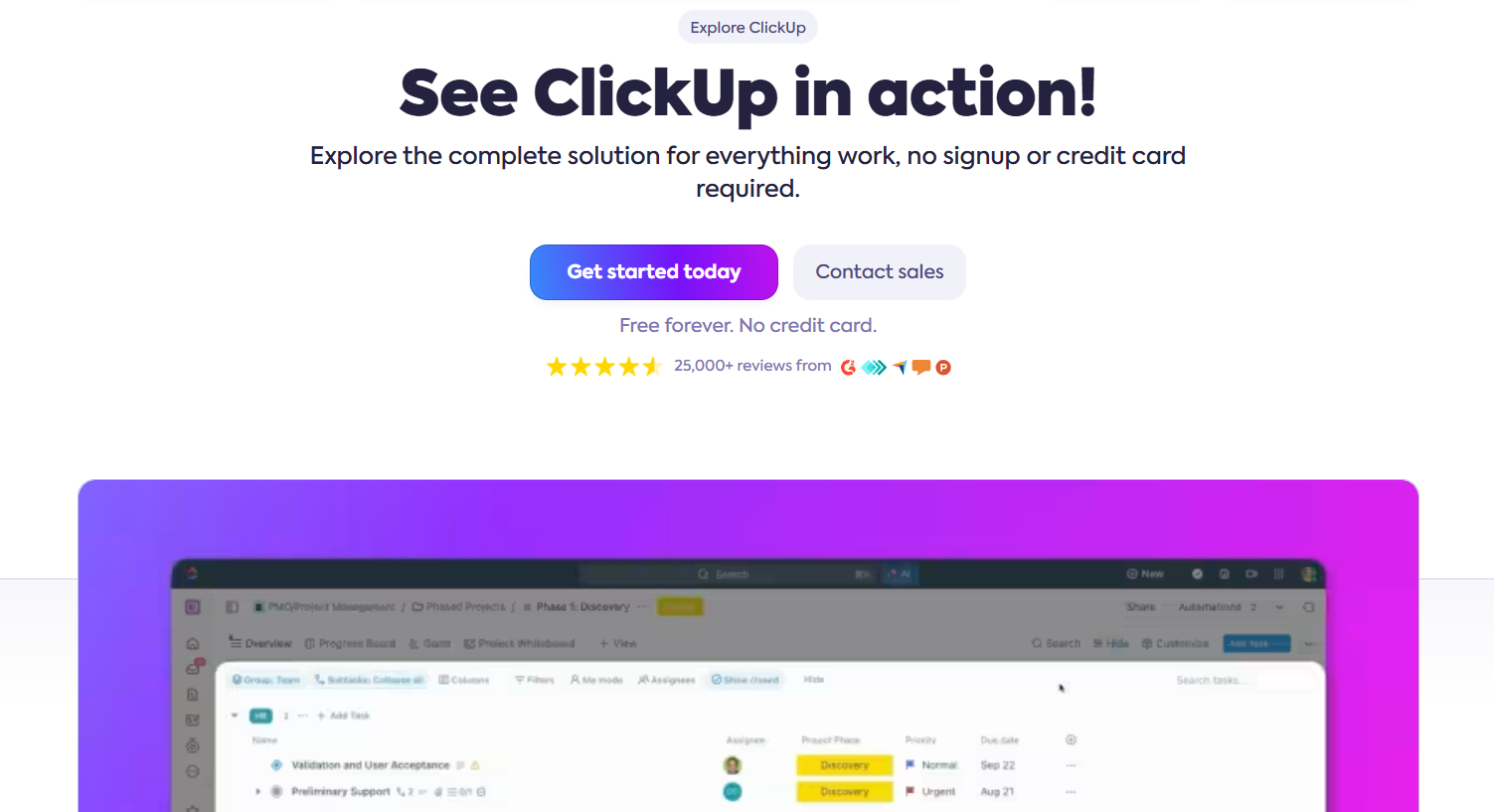
“Explore the complete solution for everything work, no signup or credit card required.”
Off the bat, prospects know that ClickUp offers solutions to any work challenges they may have and they can explore the demo without the annoying signup and credit card requirements that competitors are pushing. Below are two CTAs: “Get Started Today” and “Contact sales” and below these buttons, two magic phrases any consumer loves to read online: “Free forever” and “No credit card required.”
This is bolstered by visual star ratings and reviews on accredited platforms, immediately creating a sense of trust and credibility. All this before even clicking on the demo–this is masterful design and copy at its finest.
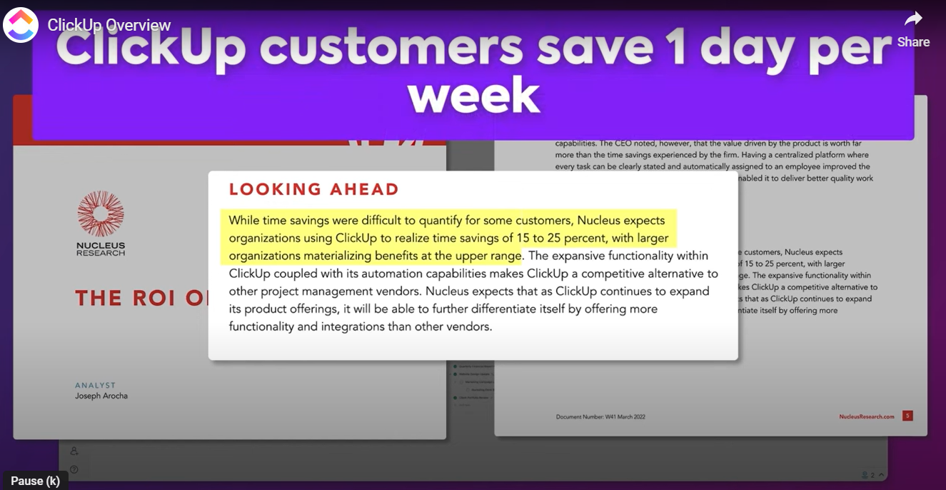
The product demo takes prospects through its features and how it solves work challenges like enhancing efficiency and saving time. But ClickUp doesn’t just make claims it substantiates this with actual research–again positioning itself as a trustworthy partner.
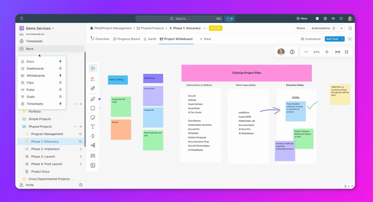
The demo then takes prospects through the basic features and how easy they are to use. With this, ClickUp plants a seed that its platform is what the prospect needs. The demo then works as much to confirm this as it does to explain the product.
At the end of the demo, ClickUp provides a summary of what it does, following the storytelling format according to Nation:
- Tell them what you’re going to tell them;
- Tell them;
- Tell them what you told them.
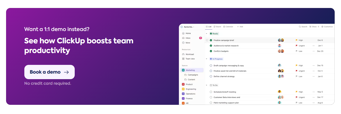
At the end of the demo, prospects can either click the sign-up button above, without having to scroll or search for it. Alternatively, should the prospect decide to explore the rest of the page without having watched the demo or find that they still have unanswered questions, ClickUp has a second CTA further down, offering the option to book a demo. And again, this puts the prospect’s mind at ease so that you won’t need to provide credit card details. This increases the chances of prospects clicking the CTA and booking the demo.
10. Apple
In the examples we’ve looked at thus far, product demos have worked in a conventional way. While creatively different, they all focus on a problem and how they solve it.
Apple’s product demos are much more subtle. They rely on their ability to wow users as much as educate them.
Its “Shot on iPhone” campaign uses storytelling to engage viewers while showcasing the best features of the iPhone camera. This makes it as much an ad or short film as it does a demo.
“What makes it brilliant is that, at its core, it’s one of the best, most elaborate, and stylish product demo campaigns ever. It’s focused on pointing out product features cleverly, and in a most entertaining way, basically by weaving them strategically into the storyline. And, the narrative of the ads shows how the product features enable and enhance creativity.”
Avi Dan, Avidan Strategies
It’s the perfect example of “Show. Don’t tell.”
It’s also proof that the principles of a good product demo aren’t rules. Apple’s live-action demo couldn’t be any different from Kajabi’s demo, which itself is very different from Square’s demo. Yet, all three deliver value: “here’s how our product solves your problem.”
Don’t be afraid to think outside the box.
Conclusion
A great product demo helps you qualify leads and turn prospects into customers. What none of the examples we’ve used in this article do, however, is go for the hard sell. Instead, they focus on how the product solves problems. It’s this quality that lets you build relationships and move leads towards a close.
Use their qualities as inspiration for your own demos. Look closely at what your product offers, who you want to target, and what concerns your customers have. This will give you an idea of what type of demo best fits their needs.
If your product is feature-heavy or has a steep learning curve, a live demo or pre-recorded demo led by a member of your team might be most beneficial. If it’s easy to use, developing short video animation or real-use demo might be better suited to convince prospects.
However it’s presented, follow the important principles. Qualify leads, prepare well, and take prospects on a journey from intro to solutions to next steps.
CXL’s product marketing courses empower businesses to craft compelling product strategies, refine positioning, and enhance go-to-market efforts. By offering expert-led training on user research, voice of customer research, messaging, and customer storytelling, CXL equips teams with the skills to drive product adoption and achieve measurable business growth.
Related Posts
-

In today's review I'm reviewing 2 different ecommerce product pages. Watch this 5-minute review: Pages…
-
“Show, don’t tell” is a time-tested rule in writing and filmmaking that helps viewers draw…
-
You've spent hundreds of hours perfecting your product and countless meetings defining your brand. You…
-

If you're selling in a competitive market, you must live & die by the little things…