The design of your website is more important for conversions than you think.
First impressions matter, and a good way to make one is with a hero image that complements your value proposition. But what’s a hero image, really, and how do you make them work for you?
Table of contents
What is a hero image?
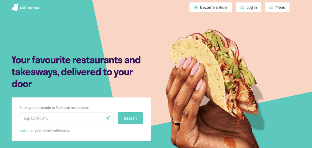
A hero image is a large, featured image that is displayed prominently on a webpage, usually at the top of it.
Hero images often look like this:
Angie Schottmuller described a hero shot as “a credible photo or video of a solution that encompasses relevance, context, value, and emotion to support, educate, or persuade a customer.”
So it’s not simply a large photo on a home page; it’s a large photo of a solution that complements your value proposition to provide clarity and context to your visitors. It’s a photo with a purpose.
Why hero images are important
Consumers feel pleased when they see a website that makes sense, one that is immediately:
- Easy to read;
- Clear;
- Understandable.
It doesn’t take much time for people to make a judgement, and a hero image helps introduce clarity, understandability, and ease of consumption right away.
In fact, it takes only about 50 milliseconds (that’s 0.05 seconds) for users to form an opinion about your website. That’s all the time it takes someone to decide whether they like your site or not, whether they’ll stay or leave.
A couple studies have supported this number, including Google’s own research. Actually, according to their study some opinions develop even within 17 milliseconds (though the effect was less pronounced on some design factors).
Again, with your hero image, you’re looking to complement your value proposition and create a better first impression for visitors on your site.
How to create a hero image: 7 best practices
Clearly, designing and choosing a hero image is as much art as it is science. It’s also usually as much about branding as it is conversion. But as with heuristic analysis, you can use frameworks to help guide your decisions.
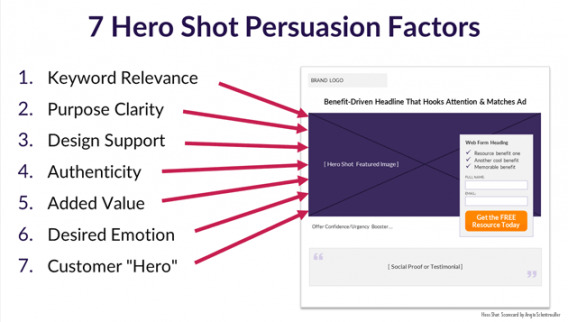
Angie Schottmuller created a 7 step framework for judging hero shots, and it goes like this:
- Keyword relevance (does the image complement the targeted keywords?);
- Purpose clarity (does the image help clarify the message of the site?);
- Design support (does the image support and enhance seamless flow of page design leading to the CTA?);
- Authenticity (does the image represent your brand in a credible way?);
- Added value (does the image add value, improve relevance, demonstrate benefits?);
- Desired emotion (does the image portray desired emotions that trigger action?);
- Customer “hero” (does the featured image depict the customer as the “hero” once equipped with this solution?).
You can also use another heuristic framework, such as the one we suggest on our ResearchXL model. Judge your hero image based on:
- Relevance;
- Clarity;
- Value;
- Friction;
- Distraction.
Is your hero image relevant to your value proposition? Is it clear? Is it distracting (as in an auto-rotating slider)? These are things you can’t validate without testing, but they give you a good place to start when initially designing and choosing a hero image.
The 4 types of hero images
When analyzing websites, you generally come across four types of hero images:
- Product images;
- Contextual images;
- Famous founders;
- Non-contextual images.
It’s not my job to tell you whether any of these categories works better or worse than any others (A/B testing should be a fine way to decide what’s working better or worse), but the following hero image examples can give you some inspiration for new variations.
The product hero image (+ examples)
The product hero shot is the most intuitive—it’s a large, HD shot of the product. This could be a product in action, static, or otherwise, but its job is to complement the value proposition with a visual demonstration. Here are some examples…
1. BarkBox
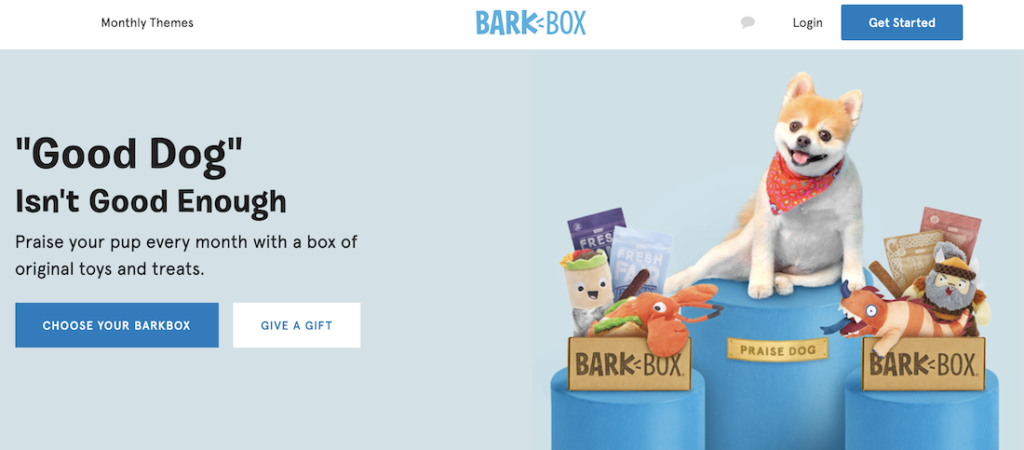
BarkBox is a subscription box that sends dog owners “a box of original toys and treats.” That’s all the explanation you need, because the image shows you examples of two full boxes—each box includes two toys, two bags of treats, and a chew.
2. Freedom
Freedom is an app and website blocker that can help you control distractions when you want to focus. In their hero image, they show you what using their app looks like in practice (the image in the background changes to one of a laptop, tablet, and a desktop computer after this image).
This hero image would be even better if the text wouldn’t cover it up.

3. Everlane
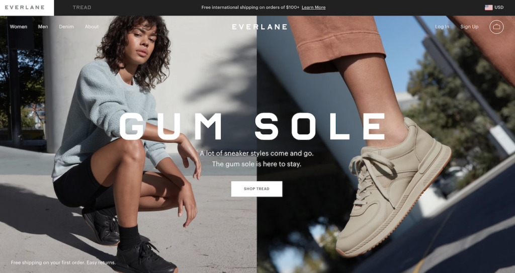
Everlane call their product quality ‘exceptional.’ It’s no surprise then that this hero image showcases their Tread sneaker in a real-life setting and from a closer view, as well as in different colors.
4. Bulletproof
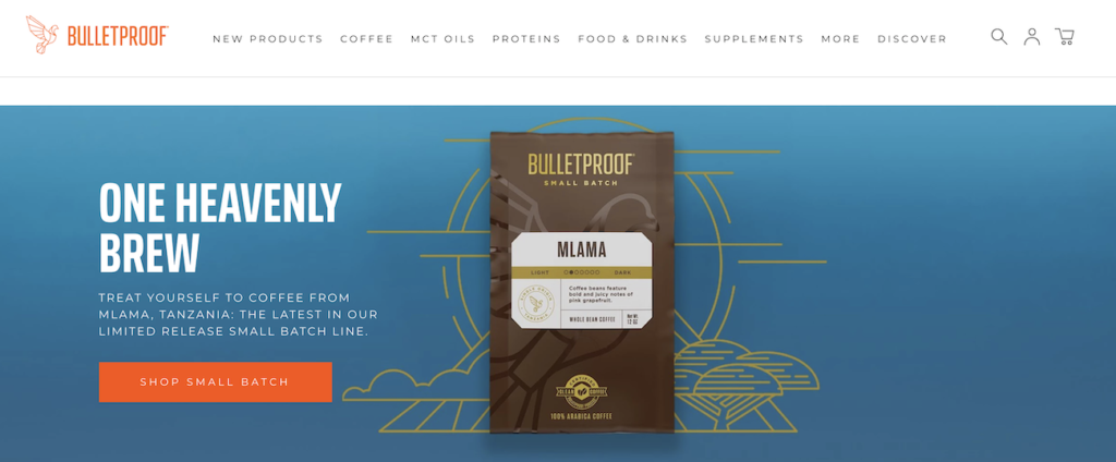
Bulletproof offers dozens of products across about 20 product categories. For their hero image, they’ve decided to put a spotlight on their limited-release, small batch coffee.
The hero image is clutter-free, so nothing steals attention from the coffee, and you can easily read coffee specifics from the packaging. If coffee is your thing, this is what you want to know.
5. Onnit
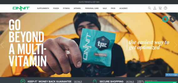
Onnit is another trendy nutrition and fitness company. On a former version of their home page, they featured their daily multi-vitamin. Their headline “the easiest way to get optimized” was complemented with an actual display of the product in its packaging.
6. Hammock Town
Hammock Town sells hammocks, so they show you what it looks like to chill out in a hammock. They also remind you what it feels like. Pretty great.

7. Instapaper
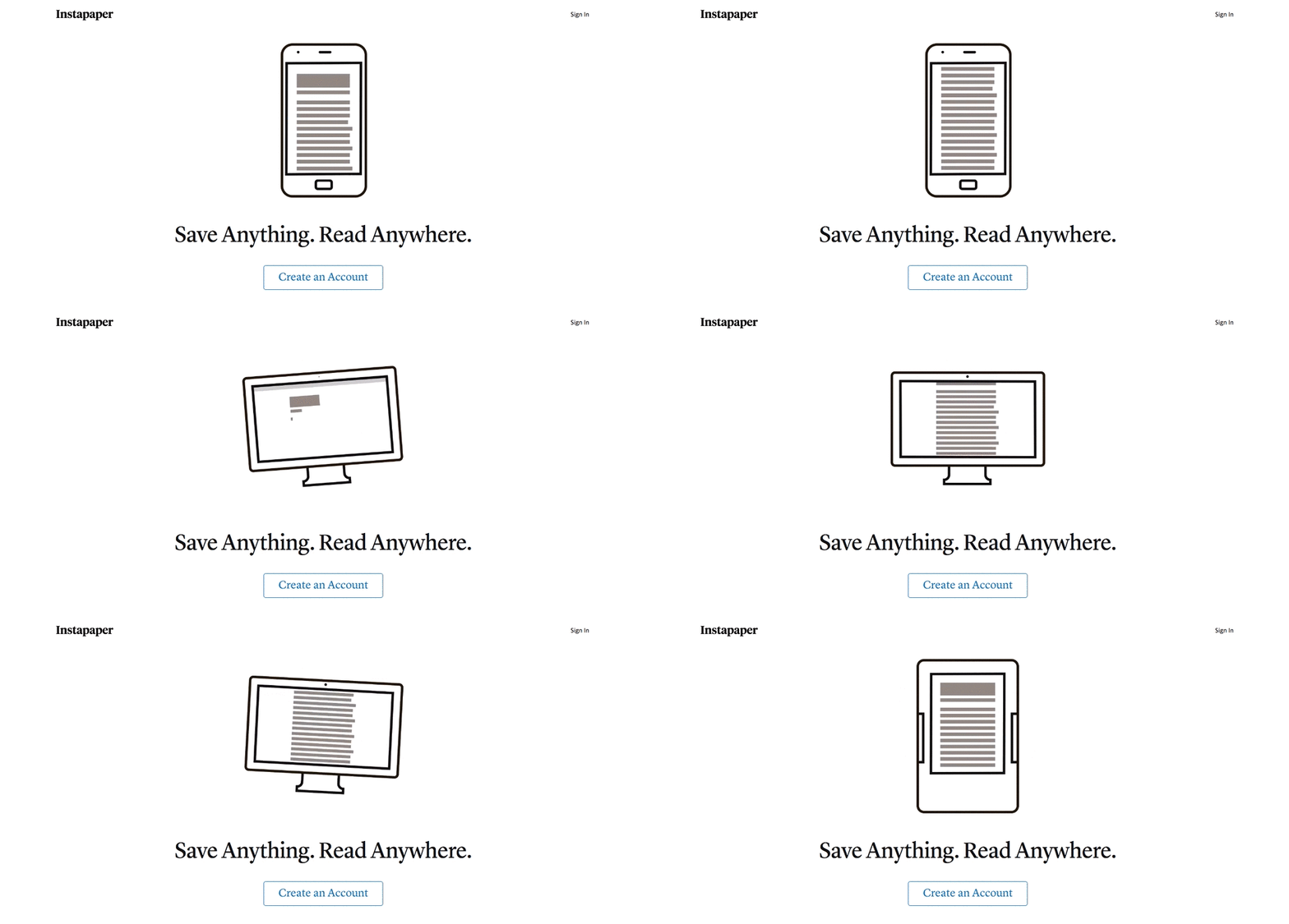
Another trend I’ve seen in the last few years is to have an animated hero shot. While this example from Instapaper isn’t necessarily an exact replica of their UI, it’s an illustration of the fact that you can read your articles wherever you are, whenever you want.
8. Heap
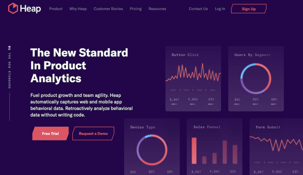
Heap (formerly Heap Analytics) showcase the graphs and charts you can use in the reports you generate with their software. In the past, they used to display these as animations, but these static examples of their reports seem to work equally well.
The contextual hero image (+ examples)
Sometimes, companies don’t simply throw up an image of their product, but instead they use a complementary image that provides context or support for their offer. This could be the environment in which you use the product, or just something related to the product that bolsters trust and value.
9. Poo-Pourri
Poo-Pourri tackles a problem that no one really wants to talk about—bad bathroom smells. They could have settled for a generic image of clouds and flowers as their hero image. Instead, there’s a classy, well-dressed woman sitting on a toilet, showing you when you’ll want to use the product (and uses the copy to explain exactly how). Genius.

10. Decathlon
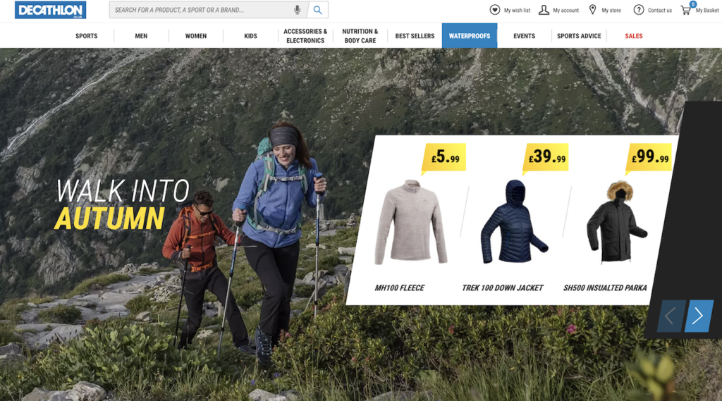
In their hero image, Decathlon shows you a selection of products (autumn and winter hiking gear), but they don’t stop there. Instead, you can see an environment in which you can enjoy these products—conquering a mountain with a loved one.
11. Dollar Shave Club
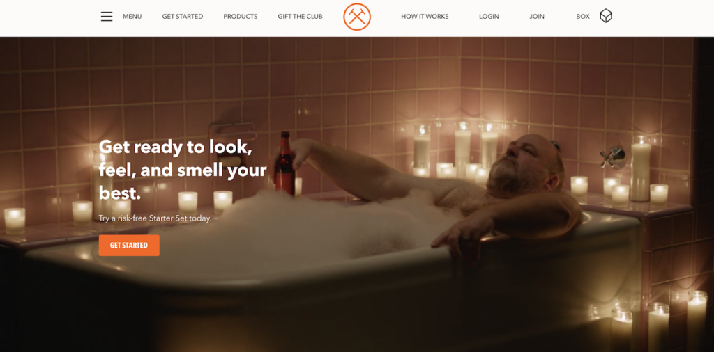
If someone tells you to “look, feel, and smell your best,” what scene pops into your head? There’s a chance it features you in a bubble bath with a beer in your hand. And it case it doesn’t, Dollar Shave Club helps you imagine what that feels like.
12. Brain.fm
Brain.fm provides their customers with music that helps them focus. Their hero image shows you an animation of a man at a desktop computer as he easily ticks off one to-do list item after another. Sign me up.

13. Shipt
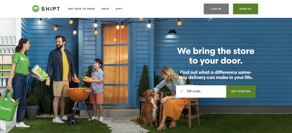
Shipt, a delivery service, shows an interaction between a family with an already eventful day and a Shipt staff member. The idea behind this hero image? You can keep enjoying your life and still get all the products you ordered.
14. Spotify
Spotify could show you what their app looks like. Instead, they show you what it feels like when you have unlimited access to music, with no ads to interrupt the joy.

15. RoverPass
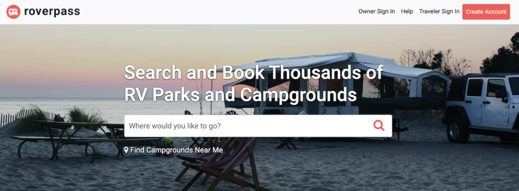
RoverPass is an Austin-based startup that provides on-demand booking for campgrounds and RV parks. Instead of showing you a close-up of their app, they show you what your experience is using the product. Their campground hero shot looks like an adventure—like it would be a really good time.
The famous founder hero image (+ examples)
The famous founder hero image is a shot of the founder of the site, usually on content-heavy sites with a heavy personal flair. It’s usually just on the home page and is often used in conjunction with an offer to join an email list. Sometimes, though, there are founder videos, which I’ll consider in the same category (especially if they’re not the annoying auto-play sales letters). Here are some examples you may already be familiar with…
16. The 4-Hour Workweek
The 4-Hour Workweek is the well-known brainchild of Tim Ferris—a self-help book for people who want to maximize their hourly input to change their life and the way they work.
It’s no surprise that The 4-Hour Workweek website features Tim Ferris front and center, along with the book’s social proof and an offer to join Ferris’ email list in exchange for free resources.

17. Smart Passive Income
Smart Passive Income is known to anyone looking to build a business based on passive income, and same is true for Pat Flynn, who introduces himself and his wide smile the moment you land on the homepage.

18. OKDork
OKDork is the blog of Noah Kagan, founder of SumoMe. It only makes sense that his smiling mug is next to the email opt-in.

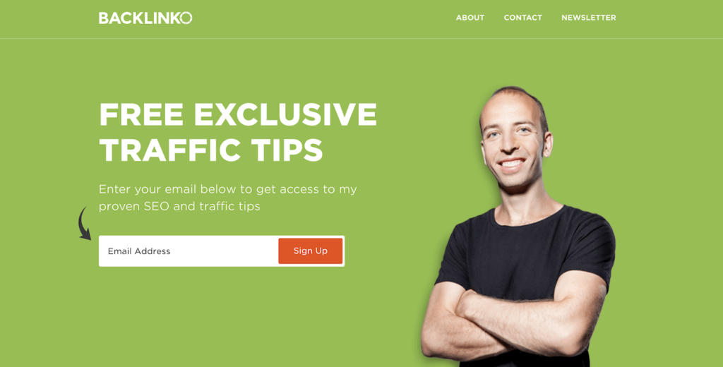
19. Backlinko
Same goes for Brian Dean and Backlinko. He’s a trusted face in the SEO community, so why not lead with that authority effect?
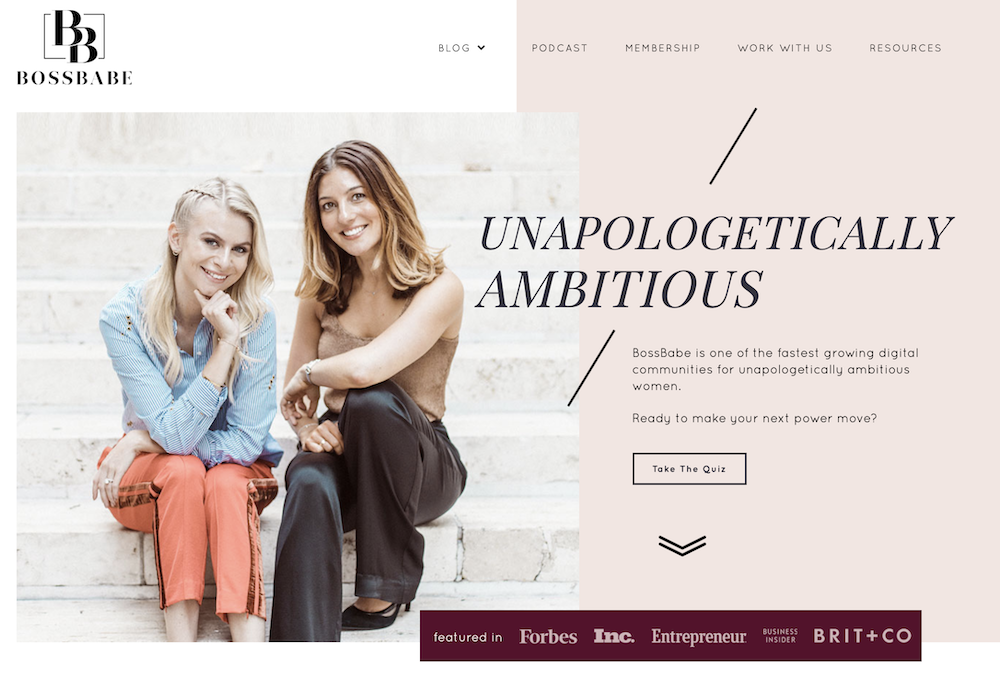
20. BossBabe
BossBabe, one of the biggest digital communities for women, uses the same famous founder strategy for their hero image. When you take into account that Natalie Ellis and Danielle Canty have a combined following of a couple hundred thousand people, it makes lots of sense.
21. I Will Teach You To Be Rich
The same strategy goes for I Will Teach You To Be Rich, a website with free and paid resources on automating finances, building a business, negotiating a better salary, and much more. Ramit Sethi is its owner, as well as the author of the book of the same name.

22. Youpreneur Summit
If you’ve heard of the concept of “youpreneur,” you’ve likely heard of Chris Ducker. He runs an academy, a podcast, and an event under the Youpreneur name. That’s also what his book is called.
A hero image of himself for the Youpreneur Summit is a smart move—the community he built around that name will instantly be drawn to it.

The non-contextual hero image (+ examples)
The non-contextual hero image is an image that just doesn’t fit in. It’s usually implemented because it looks cool, or because it’s trendy, but it simply doesn’t complement the offer or lend any additional clarity on the page. Often, non-contextual images actually distract from the message by making you think too much about what the offer/value is.
Note: maybe these companies tested the crap out of these and they’re clearly the more effective option for them. I don’t know that because I don’t have their analytics. But this is a heuristic based analysis, so these examples are what I find to be mismatched and therefore subpar hero images…
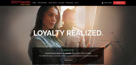
23. 500 Friends
It’s already hard to tell what 500 Friends does (you can’t see it from the picture, but their headline flashes a bunch of buzzwords before landing on “loyalty realized”). Then they use what looks like a generic stock photo for their hero image. Not helping.
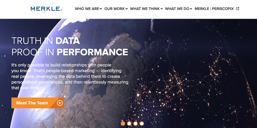
Sometime after we wrote this review, 500 Friends was acquired by Merkle. Merkle did a similar mistake as 500 Friends—a generic hero image that doesn’t clarify what they do or how their products help their customers.
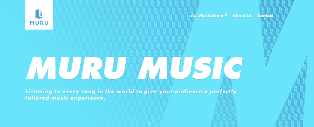
24. Muru
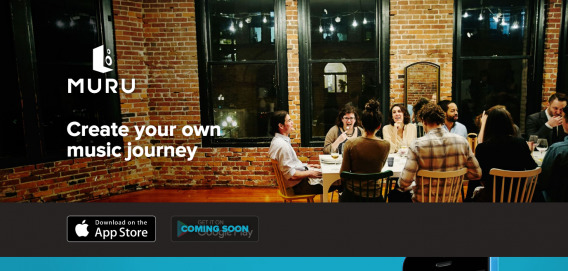
Muru is some sort of music app. I can tell that because of their headline “Create your own music journey.” I assume that entails some sort of customization or personalization with music.
But take that headline out, and what information would I get from that photo of a bunch of friends drinking wine and eating dinner? Nothing. It adds no clarity or additional value…
Since our original review of Muru’s hero image, it’s been replaced with a different one. Although the description now makes a bit more sense (you still have to scroll and dig into the copy to understand what Muru does), the image doesn’t add any important information to a visitor’s experience.
25. LeanKit
Who doesn’t love a good startup stock photo? Well, if you want to convey what you actually do, or if you want to differentiate yourself from the many other companies that use photos like LeanKit‘s below, then perhaps you should avoid the startup stock photo. It’s generally irrelevant and usually quite bland…
It’s important to note that since we initially reviewed their hero image, LeanKit updated it to the one below, which works a lot better. Not only does the image now show their software in use—the accompanying headline is extra specific, too.

26. Beme
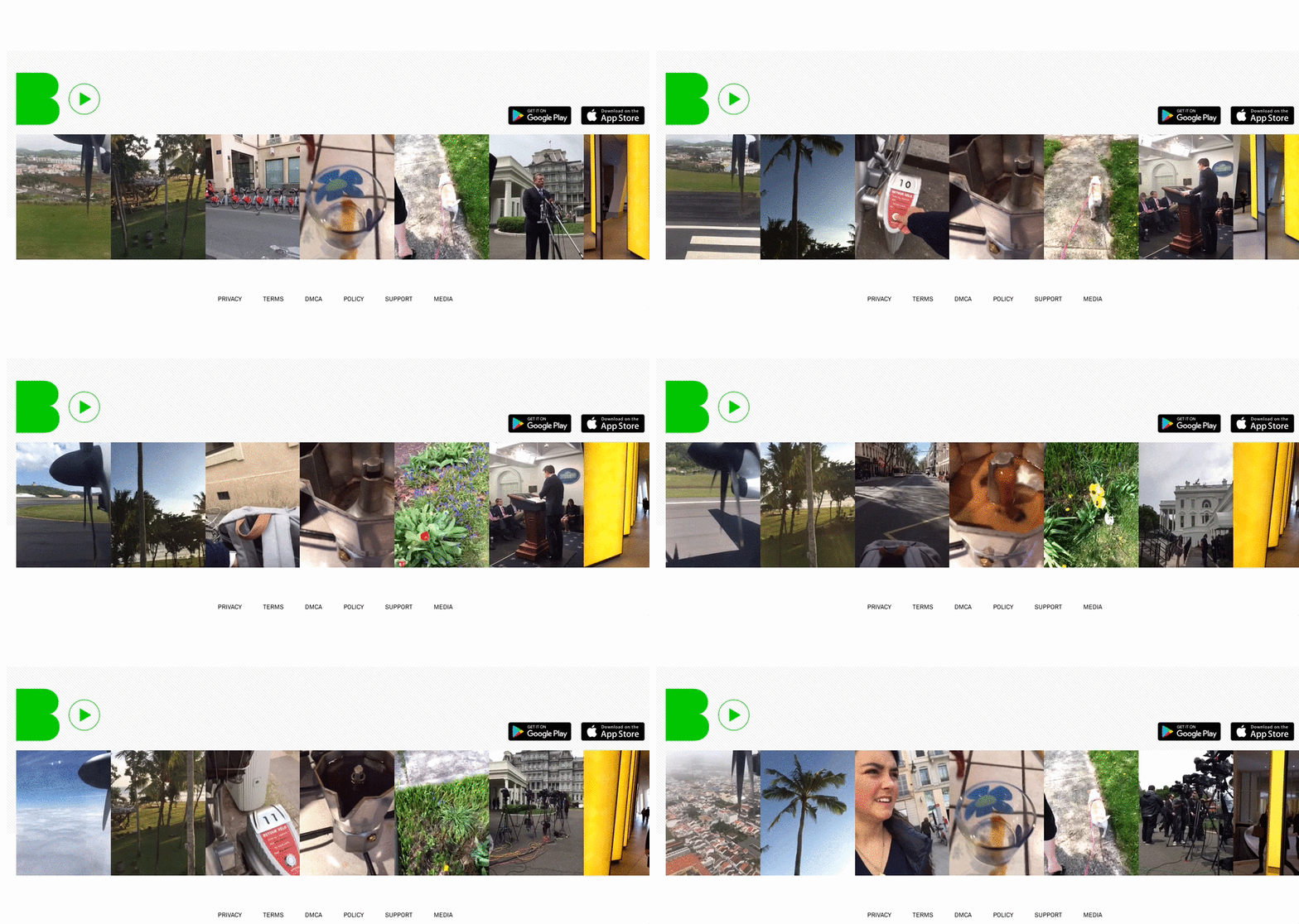
Personally, I think Beme (Casey Neistat’s company that was bought by CNN and shut down a couple years later) is the worst case scenario outlined yet. There was indicator of what they did—only flashing photos, and mostly generic, lifestyle photos that didn’t tell me anything about the product. I found no reason to dive further into the site to research what the product was. I had no incentive.
The site’s flashing photos conveyed the opposite of clarity, understandability and ease of consumption…
Conclusion
Hero images, when done correctly, contextualize and complement a value proposition to increase the clarity of a page. They help someone understand quickly what the value of your offer is.
There are also an infinite amount of ways you can execute a hero image; that’s why it’s an important thing to test. You can take some best practices (real people, product in action, etc.), and see what works best for your particular website. Just try not to use a startup stock photo of a laptop and a cup of coffee.




Thanks for the great post Alex. I totally agree that Beme can be confusing users with their hero. The trend now is to have these video background Hero Images that automatically play in the background.
Can you share a little bit of insight on what you learned from A/B testing Hero Images? Maybe a sneak peak as to what we will learn from the CXL Institute.
Thanks Luiz. I can’t tell you much in a paragraph about our experience A/B testing hero images, other than it’s contextual to the site and it’s hard to guess what works. Moving images (video backgrounds, auto-sliders) and anything that distracts tends not to do well.
We have two original research studies in the Institute right now that deal with hero images – one on value proposition placement and effectiveness and the other on visual cues (like arrows and people’s faces directed at CTAs). There are, of course, more in the research pipeline ;)
Great post thanks! Hero images seem to be in the epicenter of a lot of discussions and people many times rely on it to solve everything on a e-com site :)
I’ve found it really hard to quantify though, especially in cases where the test variant outcome in cta clicks for example, isn’t HUGE. Was it the picture that made the difference or something else time of day, traffic source etc? Any tips on how to analyze and or what sort of things to look at when deciding the effect of a picture in general, if other than the attached cta clicks?
It depends. We’ve definitely seen quantifiable differences with hero images. But I can see how they’d garner more attention than something less sexy like checkout flows.
When you say, “Was it the picture that made the difference or something else time of day, traffic source etc?” That’s really a common problem we’re trying to solve with A/B testing for any elements. We try to isolate those variables by testing for full business cycles, post-test analysis, segmentation, and accounting for external validity factors (https://cxl.com/ab-test-validity-threats/)
At our Institute, we’ve got a few studies in the pipeline that look at the trust value of certain types of hero images, where they place attention on the page, and how much attention people give different classes of images.
Hope that helps!
Thanks Alex for your prompt reply! Validity threats are definitely something we try to take into account as well, but I’m still hesitant of declaring something so clearly qualitative as a winner with quantitive measures. Hopefully I can eventually convince people with numbers to think pictures a little different though.
Looking forward to hearing more about those studies :)
WOW! Amazing article! Bookmarking, Pinteresting, sharing, and will be referring back to often, ha! This was not only well written with clearly laid out steps but the images were spot on! Seeing these images really helped connect the dots and made everything click. Great article to point my clients to as well!
Thanks!
Thanks Ed! Glad you liked the article and got value out of it :)
I liked the post and it’s really worth reading. Today I understood what is hero image and how it works. And the most important part how to use this efficiently. Thank you!
Thanks! Glad you liked the article
Hero images as far as I understand it came from my days as a dev at IBM. We used to have a tier system of images/blocks of content and the hero was in tier zero therefore it’s nick name was hero
How about NO hero images ?
Weird, huh.
Has it occurred to some designers that Visitors might want to get to the meat – the content ?
Some users just don’t care for a picture getting in the way of the task -however “pretty”.
Most (esp. those cheesy grin head shots) seem utterly irrelevant. More likely plain irritating.
Wouldn’t it be nice if some designers concentrated on function – and then ONLY make it pretty if function is not impaired?
THAT would be a craft to appreciate.