Guidelines 13-20

Proper product display is a key component of a satisfying user experience.
Great product images can also bring clarity to what the website is offering, and more clarity brings about a higher chance of conversion.
8 guidelines for ecommerce images:
- Make sure users know what you sell. Display a wide range of product types to communicate scope of your catalog.
- Show products and/or promotions with the widest appeal.
- Show products in usage context.
- Invest in high-quality photography and product images.
- Implement bespoke imagery to maximize perceived value and first impressions.
- Don’t show more than four products per row.
- When using thumbnails with product pictures, sometimes a few products better represent a category than just one.
- Design site promotions to resemble the rest of the website.
Research has shed light on the importance of product images: 67% of users who participated in the research study reported that clear, detailed product photos were “very important,” more important than the product information/description and customer ratings.
Moreover, content including “compelling” images received 94% more views than content without them. These findings apply to homepage content, images included.
Product photos can communicate different product categories and the range of products available within each category. Naturally eye-catching ecommerce images can direct users’ eyes to important content on a homepage.
The way product pictures, thumbnails, and promotions are designed impacts the perceived attractiveness of a site and ultimately influences the entire user experience.
Follow these guidelines to ensure that you’re presenting products on your homepage optimally.
Guideline #13. Make sure users know what you sell.
Display as many product types as possible to communicate the scope of your catalog.
Users may assume these are the only two product types available, so this guideline is particularly important for companies selling a wide range of products.
Display as many products as feasibly possible to communicate the range of your product selection.
However, be careful not to create a page that’s too busy.
The homepage was very long and i know they were showcasing their new boots as a seasonal item i would guess, but there was nothing that was showing me any collection or line of items that may just catch my eye in addition to what i came to the site to purchase.
How NOT to do it
Entirely Pets
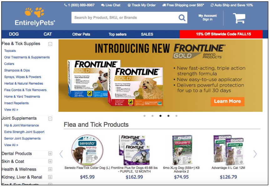
If it weren’t for the extensive product list running down the left side of the page, users might look at this homepage and think this website sells
only flea and tick medicine.
GO Electronic
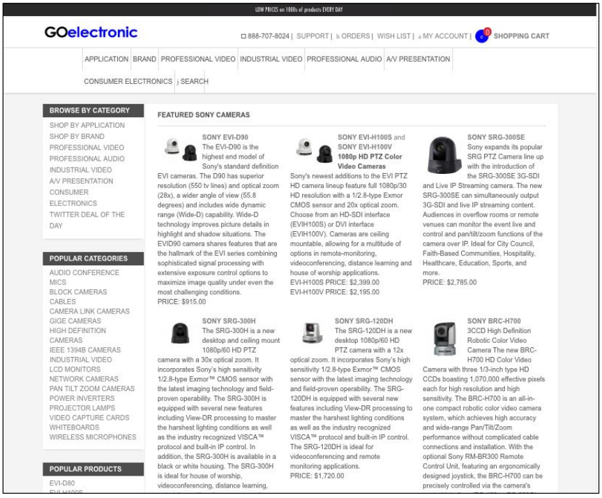
Although this website sells a huge variety of products, the homepage displays only Sony cameras.
How to do it RIGHT
H&M
This homepage includes a grid of product thumbnails. Users can see that H&M sells clothes for men, women, and children along with home furnishings. The page shows that there’s a product for everyone.
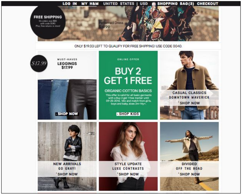
Clean, thoughtfully laid out. Easy to hone in on what i’m looking for without being overwhelmed with page after page of options.
User quote on H&M
Home Depot
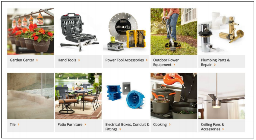
These photos on Home Depot’s homepage show a huge variety of product categories available. It’s clear that the company sells much more than tools.
The site offers a ton of items at good prices with lots of reviews to look at.
User quote on Home Depot
Guideline #14. Show products and/or promotions with the widest appeal.
If you have especially popular products or a great promotion going on, these should be displayed—with pictures—on the homepage.
These products can act as click-bait: Users will be enticed to click on the pictures, ultimately leaving the homepage and beginning to shop.
While it is important to display your most popular items, you need to display other products, too. First-time visitors might think you sell only one product (see Guideline #13).
Display a variety of popular products and/or promotions.
The homepage was very long and i know they were showcasing their new boots as a seasonal item i would guess, but there was nothing that was showing me any collection or line of items that may just catch my eye in addition to what i came to the site to purchase.
The site was very easy to navigate and find what I was looking for. The menu choices were very clear and I was able to get to what I was looking for without having to use the search function.
How NOT to do it
Bass Pro Shops
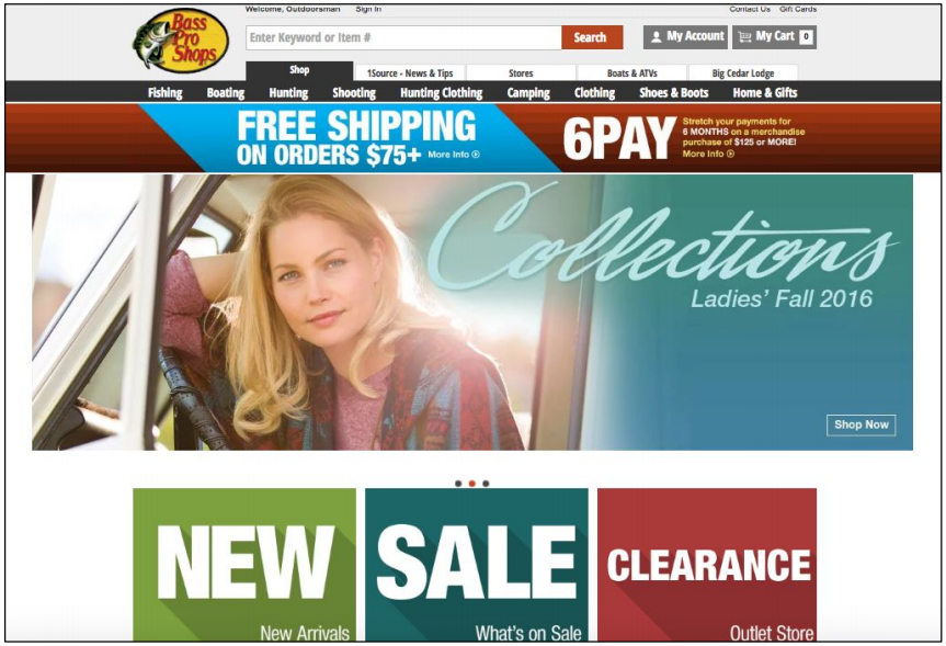
The three categories New, Sale, and Clearance would greatly benefit from being paired with complementary pictures.
If users can preview what they’ll be getting a discount on by looking at a photo, they’ll be much more likely to shop the category.
How to do it RIGHT
BodyBuilding.com
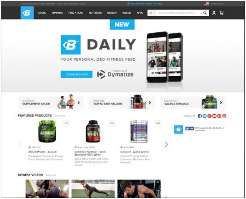
There is a prominent link to the 50 most popular products, paired with photos of various products on the list. The “Sales & Specials” category is also paired with various product pictures. The high-quality food photography tempts shoppers to check out one of the website’s most popular product categories as well.
I like that it’s a one-stop-shop for everything that I need for the gym.
User quote on Bodybuilding.com
Hayneedle
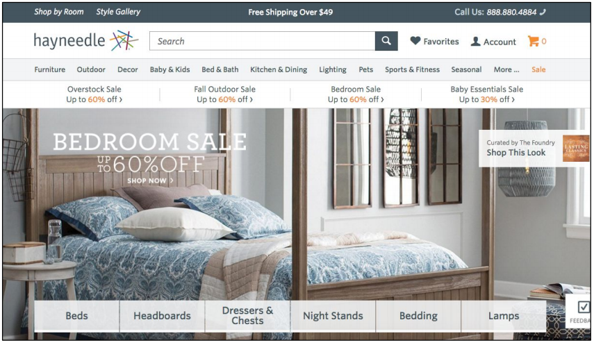
They do a great job coupling their bedroom promotion with photography showcasing various products.
Users will get inspired by this bespoke imagery and will understand that the sale applies to a variety of products in the bedroom category.
I like the format and the ease of finding general categories. Things like furniture or home decor were easy enough to find before I started working through the subcategories.
User quote on Hayneedle
Guideline #15. Show products in usage context.
Imagine a photo of a sofa with a plain white background. You might wonder how big the sofa is relative to other elements of a living room. You may also wonder about the actual color of the sofa, and whether it’s soft or firm.
Now imagine a picture of the same sofa in a living room with a couple relaxing on it. There’s a throw blanket and some accent pillows.
You can tell by the couple that the sofa is big enough for three people to comfortably sit on, and that the cushions are soft and yielding. You can tell that the sofa’s color has a cool tone.
When put in context, users can better visualize what a product will be like in their own lives. They immediately understand aspects of the product that they’d have no knowledge of without context.
How NOT to do it
Cabela’s
These product pictures would be more enticing and informational in usage context.
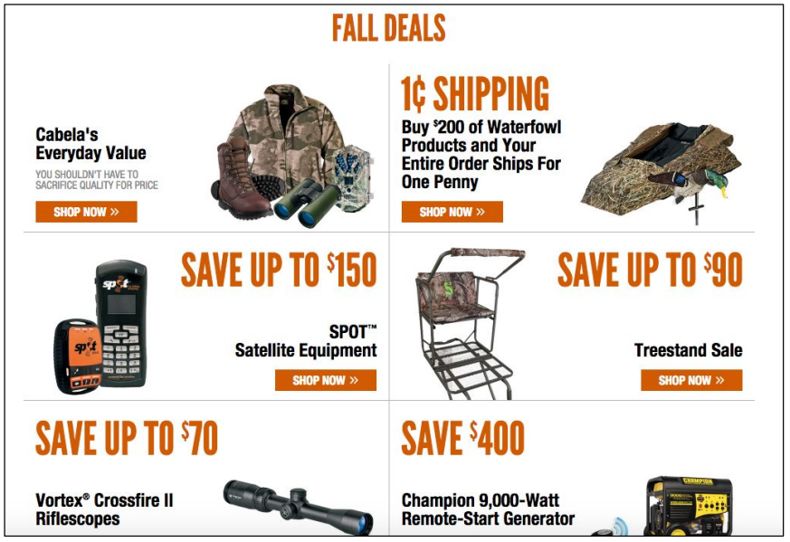
There isn’t anything particular that would make we want to buy this this website instead of the competitors. The main thing that stood out was that it is a one stop shop for all camping needs, but it didn’t seem to be any better than other companies that provide the same items.
User quote on Cabela’s
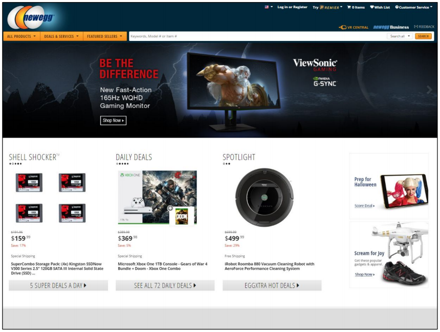
Newegg
This picture would be much better off in an accurate context for Newegg’s TV promotion. If the products were in a living room, site visitors could better understand how big the TVs are and what they’d look like in their own homes.
How to do it RIGHT
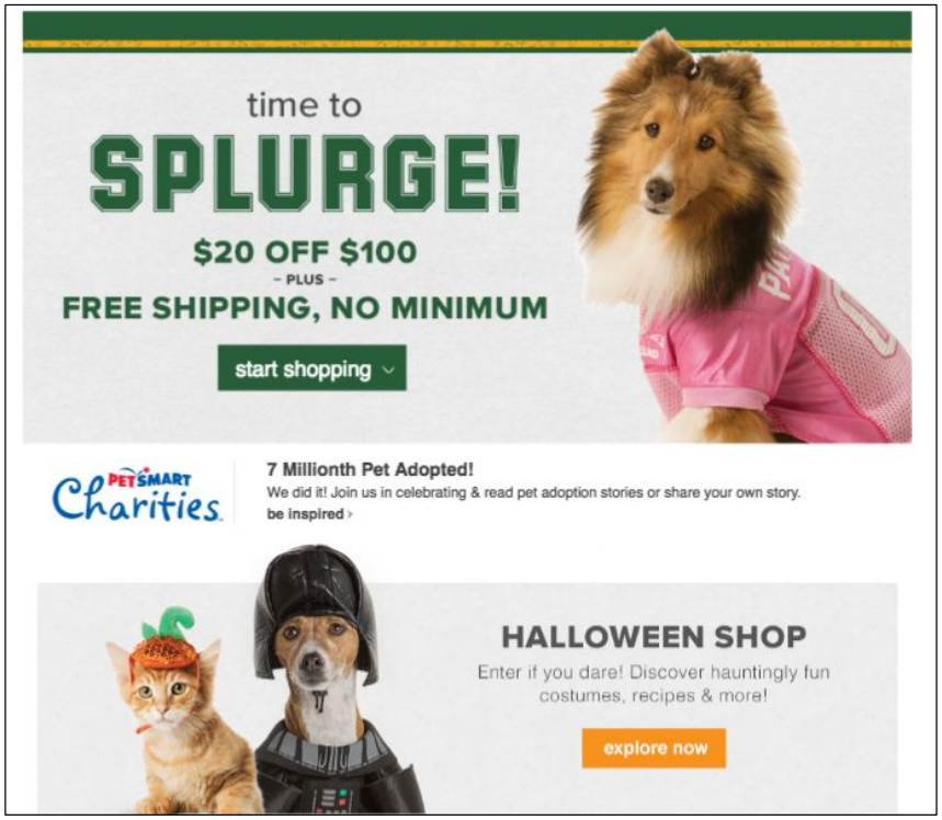
Petsmart
These costume product pictures show users just how adorable their pets would look in Petsmart Halloween garb.
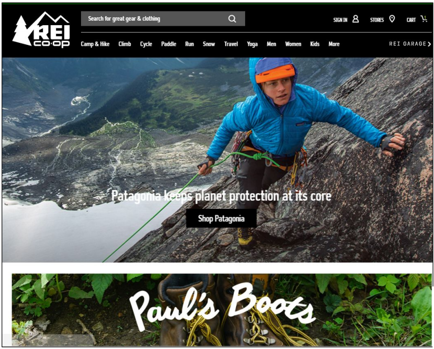
REI
This product picture instantly communicates the product’s true colors, textures, and relative size.
The layout looks nice and the pictures are really good.
User quote on REI
Guideline #16. Invest in high-quality photography and product images.
Time after time, research has shown that high-quality photos have a powerful effect. A low-quality image communicates a brand that isn’t concerned with quality, and probably makes cheap products. One of the smartest investments to make is in professional photography.
Joann Peck & Suzanne B. Shu of UCLA published a study that found that when the imagery of an object was vivid and detailed, it increased consumers’ perceived ownership of the product.
If you don’t have the revenue to hire a professional photographer, there is still hope. It’s amazing how much quality is packed into smartphones and other less-expensive camera options.
With a little planning and some basic knowledge on how lighting and composition work, you can take unique, high-quality photographs that better represent your brand.
How NOT to do it
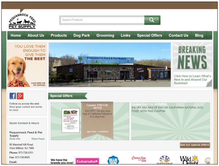
Pequannock Feed
The amateur photo of the brick and mortar location brings down the overall quality of this website.
How to do it RIGHT
West Elm
These are some product photos from the homepage. The photographs are high quality, not just in terms of the resolution but also the composition techniques. These photos are a strong argument for hiring a professional photographer.
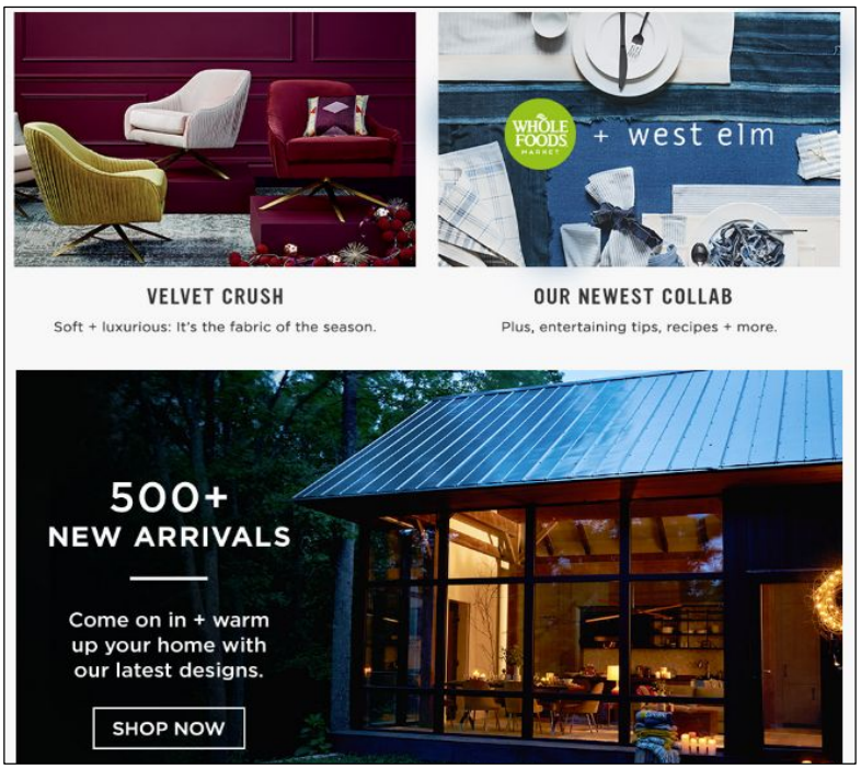
I was easily able to find and add the specific items that I wanted based on the pictures.
User quote on West Elm
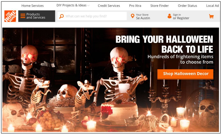
Home Depot
The photographer set a fun scene perfectly suited for the Halloween decorations. Although this expertly executed photo manages to combine many products, its success does not come from showcasing products: This artwork is evidence of the commitment of Home Depot to high standards (see also Guideline #17).
Guideline #17. Implement bespoke imagery to maximize perceived value and first impressions.
When it comes to online imagery, it’s not so much about having images as
about making sure those images give the visitor a sense of texture,
size, scale, detail, context, and brand.
According to MDG Advertising, 67% of online shoppers rated high-quality ecommerce images as being “very important” to their purchase decision, which was slightly more than “product specific information,” “long descriptions,” and “reviews and ratings.”
Bespoke imagery has a strong, positive influence on first impressions of a website. High-quality, custom photography communicates value to first-time site visitors. Use bespoke imagery to create positive first impressions of a website.
The models where each individually photographed, not stock images. And there was an ethnic diversity which I like as well. The color scheme was simple and easy on the eyes.
The first image on the website spoke to the craftsmanship of the product.
How NOT to do it
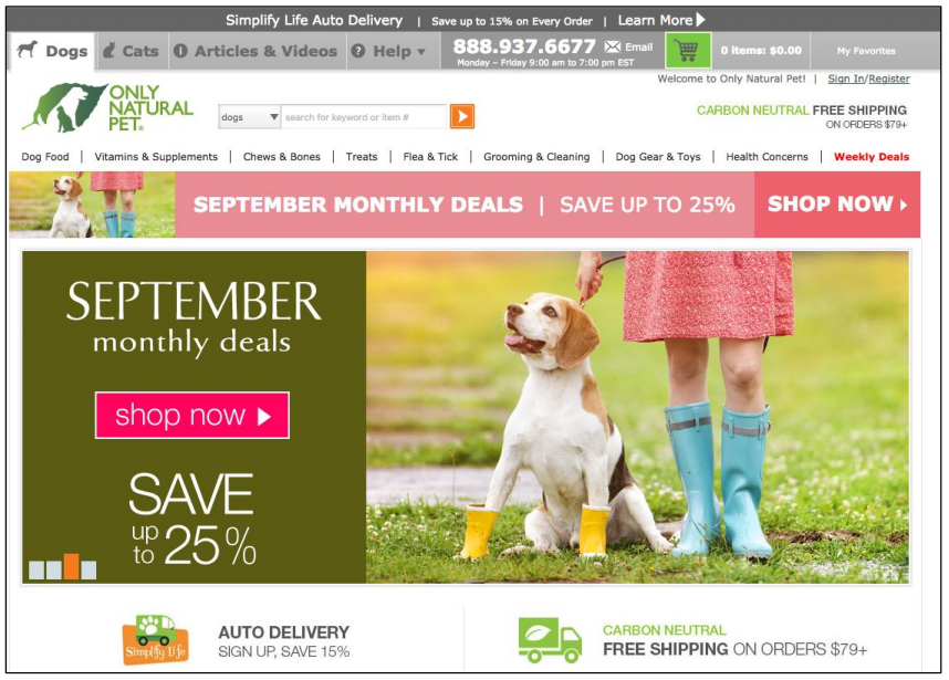
Only Natural Pet
The same stock photo is used twice above the fold on this homepage.
Not only is the photo contrived and irrelevant (are they selling dog shoes?), but the repetition of the same image reveals a careless, poorly executed design.
Swanson Vitamins
The stereotypical stock photo does little for this homepage. The real estate it takes up should be more wisely used for other content.
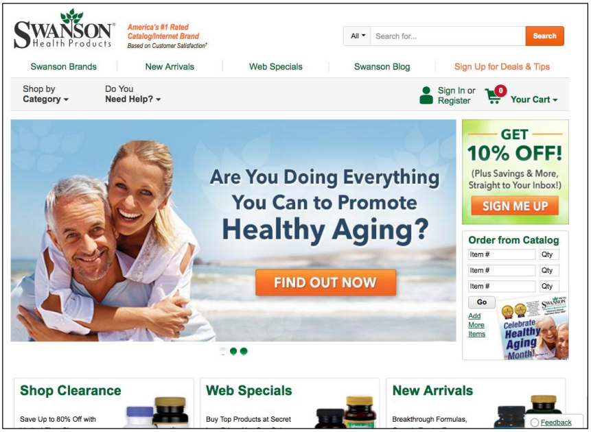
I would update …as it is now the site gives me the impression that it is tailored to a elderly clientele.
User quote on Swanson Vitamins
How to do it RIGHT
BodyBuilding.com
The large “Okto-bro-fest” banner has been tailored for the site’s current seasonal promotion. The graphic design communicates a brand that is well acquainted with its audience.
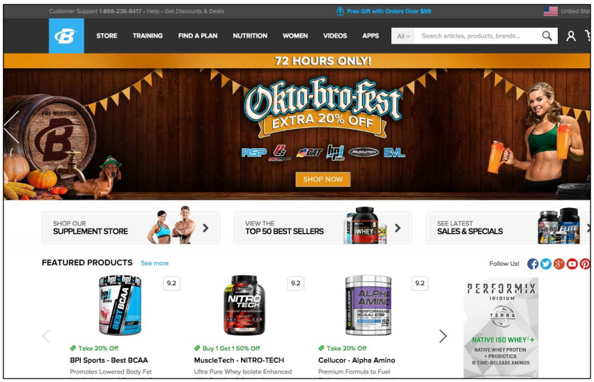
There were a lot of engaging images and the fonts were bright and easy to see.
User quote on Bodybuilding.com
Hayneedle
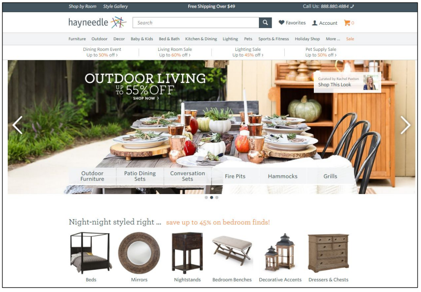
This photo captures the fall season by incorporating warm autumn tones and festive pumpkin decor.
The high-quality photo also includes a wide variety of sale merchandise. Users who see this bespoke imagery will be impressed by its quality and relevance, and will ultimately be interested in exploring the fall sale.
Guideline #18. Don’t show more than four products per row.
Thumbnails instantly communicate what products look like and jump start product browsing. So, the more thumbnails the better? No. Bigger thumbnail images help people understand the product better.
One straightforward way to advertise your product selection to site visitors
is to display product thumbnails on the homepage. People want to see a product before they buy.
They’d actually like to try it out, but since you can’t do that online, images have to do the trick. Because the purpose of a thumbnail is to display a product’s design or appearance, it should be big enough to see.
Large product photos are low-hanging fruit, especially if you sell wearables—clothing, jewelry, shoes, watches and so on. It helps users determine if the product is right for them, a crucial function of ecommerce.
As a rule of thumb, product thumbnails should be displayed at a maximum
of four products per row (three thumbnails per row is preferable). Thumbnails should engage the users visually. This won’t happen if they’re small and insignificant.
How NOT to do it
L.L. Bean
This thumbnail list is displayed toward the bottom of the homepage. The thumbnails are so small that, although these products are top items, they’re not tempting to click on.
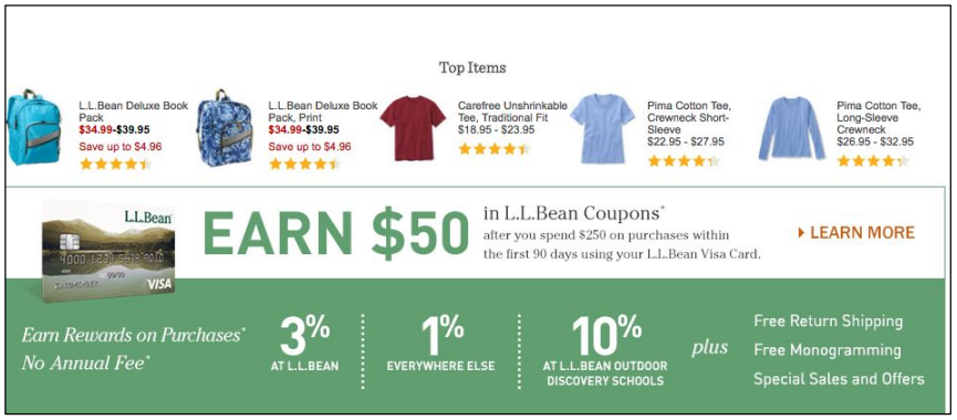
Small print. My eyes are starting to show early signs of aging. I don’t particularly love the size or type of text used.
User quote on L.L. Bean
The site is small in its width with current standards and there is more of the page that is usable and viewable with modern day monitors.
User quote on L.L. Bean
Entirely Pets
This is a great example of when four products per row is still too many.
Some products are so small—with cut-off text descriptions—that it’s impossible to understand the product’s purpose.
Three, or perhaps even just two, products per row would be more visually appealing and understandable to shoppers.
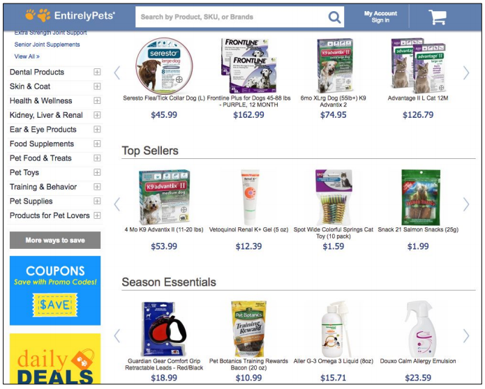
The site had a cluttered feel to me. I would clean it up a bit.
User quote on Entirely Pets
How to do it RIGHT
BodyBuilding.com
These thumbnails are large enough for users to see the package and read the labels with ease. Additionally, the thumbnails include text describing each product’s benefits and specifications.
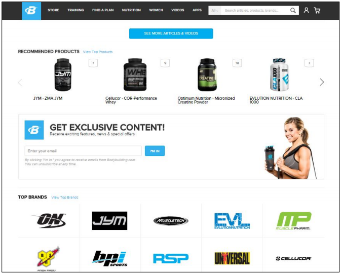
There were a lot of engaging images and the fonts were bright and easy to see.
User quote on Bodybuilding.com
Lowe’s
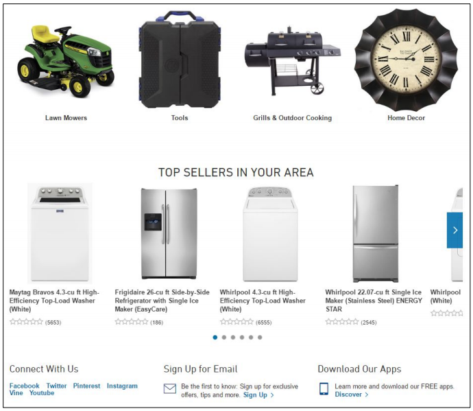
These thumbnails are big. They showcase each product’s design and include information-packed titles (along with the number of reviews, which communicates their popularity).
There are no small labels or descriptions that cannot be read. In this situation, four thumbnails per row absolutely works.
Guideline #19. When using thumbnails with product pictures, sometimes a few products better represent a category than just one.
Because humans are visual creatures, it can be helpful to pair product category lists with thumbnail images. Instead of mulling over a text list, visitors’ eyes will jump instinctively to the image of what they’re interested in.
Choosing a relevant product image is usually a simple task. If the product category is Dresses, use a picture of a dress. Sometimes, however, the product category is more nuanced. For example, if a footwear website has an Accessories category, finding one representative image becomes more tasking.
In these situations, it’s better to include a few images in the thumbnail that
communicate the range of the category (e.g. shoe polish and shoelaces).
How NOT to do it
Monoprice
This sale advertises musical instruments and shows a violin (you can barely see that). However, accessories and cleaning supplies are on sale, too. The thumbnail should display a variety of products to correspond with the contents of the sale collection.

TigerDirect
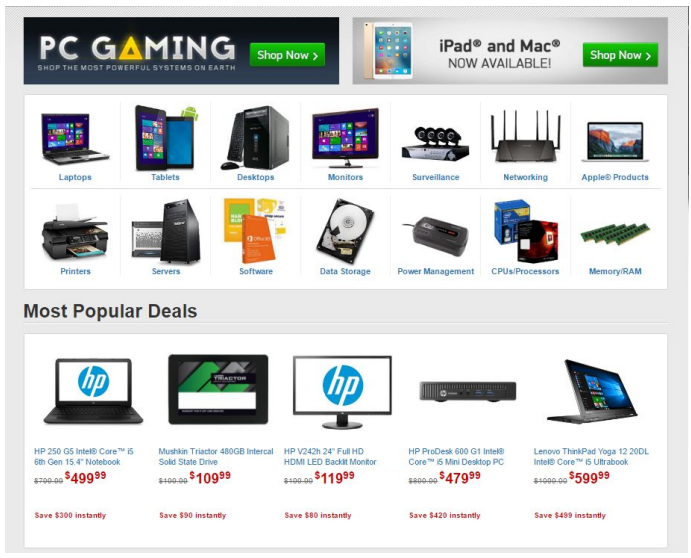
Most of these product categories sell one type of electronic and are matched with a complementary thumbnail.
The Data Storage thumbnail could be enhanced, however, to include a USB flash drive and external hard drive since these are two popular ways to store data.
How to do it RIGHT
Home Depot
They do an excellent job at visually communicating what can be found in their product categories.
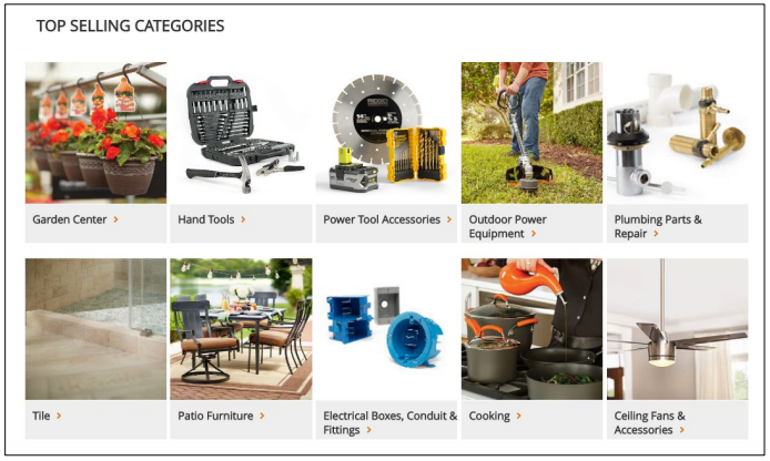
Nice wide array of products with good pictures, and decent prices.
User quote on Home Depot
Petsmart
The seasonal Halloween category is broken down into subcategories to illustrate the range of products available. Users immediately understand everything they might be able to find in this collection.
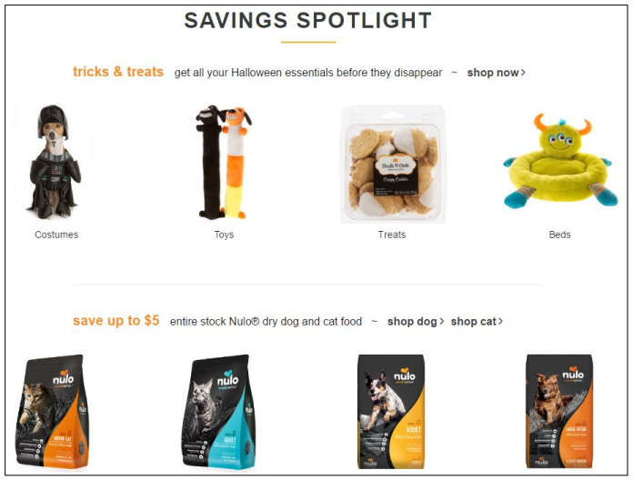
I like how everything was laid out and you didn’t have to go around guessing where things were.
User quote on Petsmart
Guideline #20. Design site promotions to resemble the rest of the website.
Site promotions should never look like advertisements. Banner blindness is real. In 2013, Nielsen reported in its “Trust in Advertising” study that online banner ads are the least trusted form of advertising among consumers, falling behind traditional ads like in newspapers or magazines.
If it looks like an ad, people will ignore it like an ad. When designing promotional graphics for the homepage, match the tone of the website’s design. This can include fonts, colors, and other visual features that carry through an entire site.
To avoid designing a promotion that users will mistake for an ad, don’t use boxes, borders, or flashy graphics (unless consistent with the rest of the site).
How NOT to do it
Entirely Pets
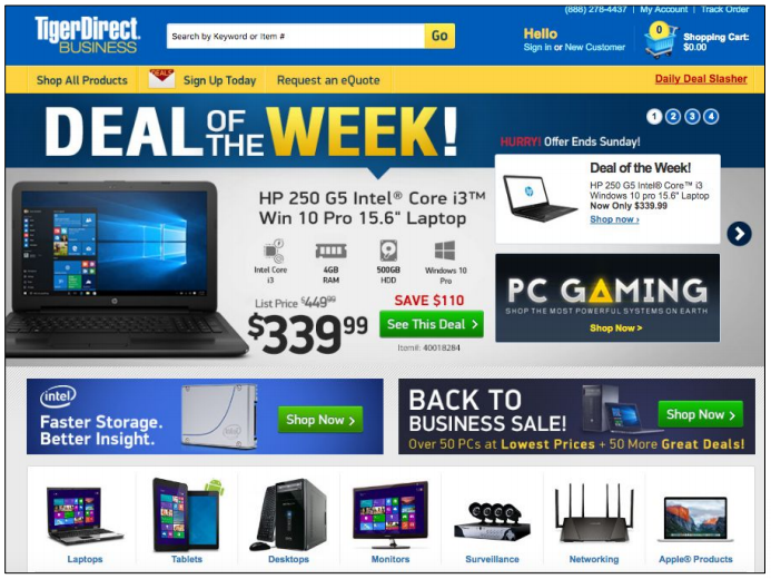
The four promotions on the left look like ads. Most users will notice these and unconsciously ignore them, missing out on coupons, sales, and shipping discounts.
The bright colors are not used anywhere else on the site. The font and designs also do not match.
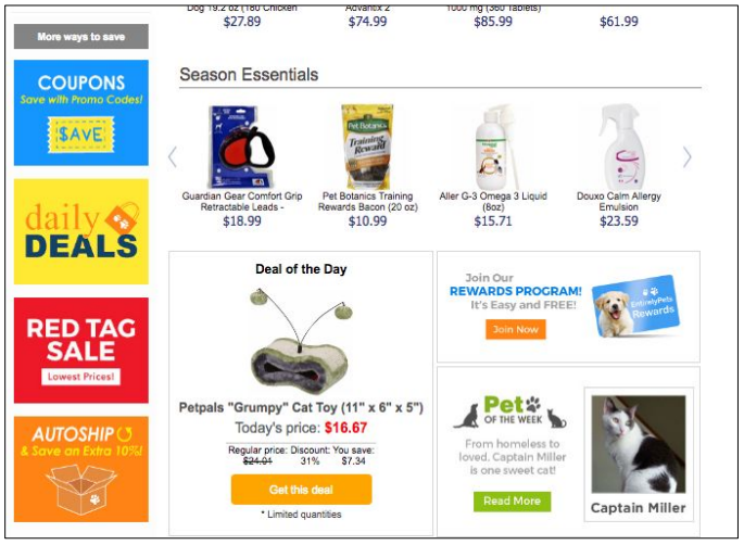
The site had a “clutterly” feel to me. I would clean it up a bit, and definitely change the font.
User quote on Entirely Pets
TigerDirect
This page is littered with site promotions that look like ads. Different colors, boxes, and fonts bombard the user. The Intel promotion especially looks like an advertisement due to the logo and slogan.
This site would be better off by sticking with a central design theme and creating promotions that follow the rules of that theme.
