The easier your website is to use, the more people use it. An essential part of “easy to use” is intuitiveness. Intuitive design means that when a user sees it, they know exactly what to do.
Intuitive design is invisible. Design is intuitive when users can focus on a task at hand without stopping, even for a second. Intuitive designs direct people’s attention to tasks that are important. In the end, an intuitive design focuses on experience.
Table of contents
- What is intuitive design?
- Why intuitive design is important for websites?
- The problem with designing intuitive interfaces: intuitive for whom?
- Current knowledge vs. target knowledge
- Conceptual models for intuitive design
- Know thy user (study them!)
- When is a website intuitive to use?
- How to design intuitive navigation and search
- People spend most of their time on other websites
- Be careful about redesigns
- Conclusion
What is intuitive design?
Intuitive design is the act of producing products that are easy to use by the consumer.
Imagine that you’re at a car rental place, and you’ve picked out the car you’re getting. You walk up to it and want to get in. But when you arrive at the car and reach out your hand to open the driver’s door—there’s no handle! How do you get in?
This is an example of non-intuitive design. A non-intuitive design steals the focus of the user. You were trying to get in the car, but the process was interrupted by an unfamiliar situation with no obvious solution.
The same goes for web design.
Since intuitive design is invisible, people won’t stop to appreciate it (since they won’t even notice it), but they will immediately notice if it’s not there. Unintuitive design forces people to focus on elements that are unrelated to their tasks.
Why intuitive design is important for websites?
Intuitive website design is important because it lets the user focus on what you want them to do.
As long as users can complete the tasks they want without interruption or thought, it’s all good. Intuitive design is invisible; non-intuitive design disrupts.
The problem with designing intuitive interfaces: intuitive for whom?
Why are there so many websites that make people cringe? Why not make all websites intuitive? That’s what everybody wants, right? The thing is that building intuitive websites is hard—people are different. What’s intuitive to one person isn’t intuitive to another.
Designs themselves can’t be intuitive—it’s whether the person using it feels it’s intuitive.
Most websites are designed with good intentions. They’re meant to be intuitive—but usually for the designer. The average developer or designer doesn’t spend any time watching people use the things they’re designing.
People see the world as they are, and when they design something, they unconsciously design it for themselves—for people who have the same level of computer skills, experience using a certain interface, etc.
Getting intuitive design right starts with understanding your users. You need to figure out what’s intuitive for them. An important concept to understand that is current knowledge versus target knowledge.
Current knowledge vs. target knowledge
People come to your website pre-loaded with existing knowledge (from previous experiences). This is what Jared Pool calls “current knowledge.” Then, there’s “target knowledge”—how much the user needs to know to use your website or application.
The difference between the two is the “knowledge gap.” Your job is to build an interface that minimizes the knowledge gap between what users know prior to coming to your site and what they must know to use it properly.
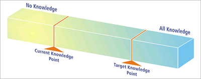
To complicate your task, you may have all sorts of users. Some are tech-savvy computer nerds; others are computer illiterate grannies—plus everything in between.
The narrower your target group, the easier it is for you. The wider your audience, the bigger the design challenge.
Conceptual models for intuitive design
If users have never used your site, it doesn’t mean that their current knowledge is zero. They have probably used other, similar websites or products before. Some haven’t, but everybody has a conceptual model.
Let’s say you’ve never shopped online—but you have made offline purchases millions of times. I sit you down in front of a computer and show you Amazon.com, explaining to you that you can buy stuff there.
You’ll apply your conceptual model of offline shopping to try to replicate the experience. The expectation of what online shopping is like derives from the mental model of offline shopping—the closest experience you’ve got.
But let’s say they’ve bought stuff online before, just not from Amazon. Now the conceptual model is slightly different. For that user, an intuitive design would need to mirror the experiences of shopping on other sites.
If most of your users have never used the kind of website or online service that you have, you need to deal with the conceptual model. This is why you have to figure out their closest experience to using your site. If the website doesn’t match the user’s mental model, the user will find the website hard to use—unintuitive.
Know thy user (study them!)
To design websites that users find intuitive, you need to learn where the current and target knowledge points are. What do users already know and what do they need to know?
There are two great ways of finding this out:
- Field studies. Go to your customers and observe them using the web in their natural habitat. You’ll get an idea of their current knowledge.
- Over-the-shoulder usability tests. Get people to use the site, have them perform a set of tasks, and ask them to comment their thought process out loud. This can also be done remotely (over the Internet). This will identify target knowledge.
In both cases, observe and take notes without interfering. You’ll quickly identify the main issues. Ten test subjects will normally reveal more than 90% of the challenges.
From there, build personas based on what you learned.
When is a website intuitive to use?
Broadly speaking, a design is intuitive when current knowledge equals target knowledge.
Spool wrote that, in their research, they discovered two conditions in which users will tell you an interface seems “intuitive”:
- The current knowledge point and the target knowledge point are identical. When the user walks up to the design, they know everything they need to operate it and complete their objective.
- The current knowledge point and the target knowledge point are separate, but the user is unaware that the design helps bridge the gap. The user is being trained, but in a way that seems natural.
In other words, you either make it so easy that it doesn’t require any learning, or you add instructions, tips, and microcopy that’s easy to spot and follow.
The best example for the first condition is Google search. You cannot use it incorrectly. There’s no learning curve. It’s as obvious as it gets.
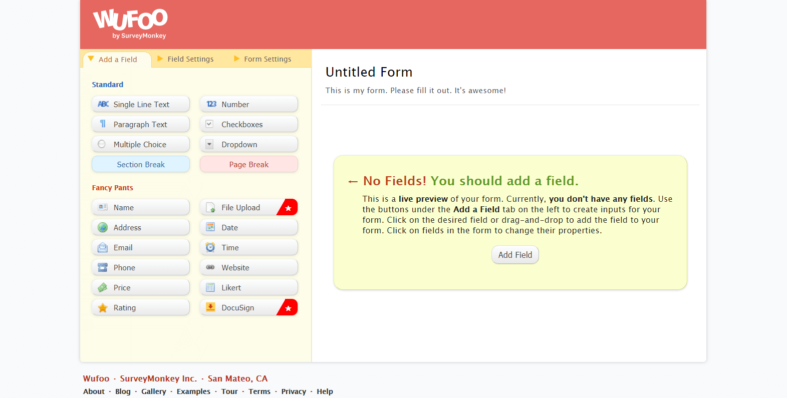
A good example of the second condition would be Wufoo. When you log in and start building your first form, the instructions make it easy and the learning process seems natural.
So you have two options for an intuitive design:
- Reduce the target knowledge requirement until it meets current knowledge by simplifying the design.
- Move current knowledge to target knowledge through instruction.
(You can also, of course, use a bit of both.)
How to design intuitive navigation and search
Some 76% of consumers say that the most important factor in a website’s design is that “the website makes it easy for me to find what I want.“
So how do they go about finding the stuff they want? Navigation, of course. Here’s where it gets tricky: If your site has a ton of content, how do you structure it so that it makes sense?
A great method for figuring out which content goes under which menu item is card sorting. Card sorting is a great, reliable, and inexpensive method for finding patterns in user expectations regarding content or functionality.
It also helps you choose the labels for menu items. Label your menu items clearly so people know what’s behind the link. Use trigger words. Seems simple, right?
And yet, 50% of all users don’t buy because they can’t find what they’re looking for. This is why site search is super important. You need to have a search capability for your site, and it has to be easily found.
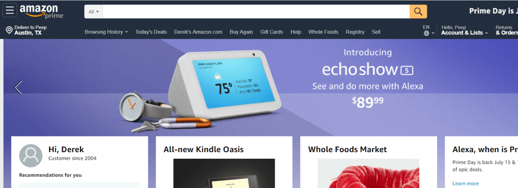
Amazon has a huge inventory, and they’ve made search the centerpiece of their site. Can you imagine it any other way?
(Oh, and make sure you turn on “Site Search” tracking in Google Analytics. You’ll likely find that users who use search have a higher conversion rate—searchers have intent and know what they’re looking for.)
People spend most of their time on other websites
A good thing to bear in mind is that people spend most of their time online on other websites. Your site is only a fraction of the total inputs they receive to form their conceptual model or establish their current knowledge. If you mess with convention, you’re asking for trouble.
Typical conventions for site design include:
- A click on the logo (in the top-left corner) should always take users back to the homepage.
- The last link in a horizontal navigation menu (or the bottom one in a vertical menu) should be “Contact.”
- You should have contact information in the footer.
- Strive for consistency: Navigation and other important elements should remain in the same location throughout the site.
- Links should be easily distinguishable from regular text.
- If users can (and should) scroll down, the scrollbar has to be visible.
- Left-aligned text is easier to read than right-aligned (since Westerners read from the left).
- Display descriptive help messages and notifications.
- Use plain language terms throughout the interface that users can understand (e.g. use “Contact” instead of “Communication”).
Yes, there are always exceptions to the rule—but innovation is difficult and risky. In most cases, don’t re-invent the convention. Have the stuff work like people expect it to work.
Be careful about redesigns
Luke Wroblewski took notes at a recent An Event Apart conference in Chicago where Jared Spool made this point about redesigning websites: They can mess with the knowledge gap—and cost you millions.
Spool continued:
A major retailer launched a $100M redesign and saw conversion drop 20%. A law firm had to shut down. Doctor’s offices and airlines experience significant delays. Their site/application was no longer intuitive for their most important users.
About 20% of users generate 80% of the revenue for a site, and it’s those top buyers who are most affected by redesigns. They know how things work, and when you redesign the website, you change it up on them.
It’s not that people hate change. They just hate change that takes away their current knowledge. An intuitive design doesn’t force users to attend to change.
You need to focus on your most important users buyers. The design needs to be most intuitive for them. Don’t try to please everybody.
A good way to go about redesigns is to use the Lean Design methodology. Reduce the time it takes to go through the build-measure-learn cycle. Little changes to a site over time are often a better approach than major redesigns.
This incremental approach enables you to measure and, thus, learn quickly whether a change brings positive or negative results. What’s the optimal outcome? You’ll be successful if, the day you go live, no one notices.
This applies when you’ve got a large audience full of return visitors. However, if your site has little traffic and the current design is flawed, don’t hesitate to do a complete overhaul (a “radical redesign”).
Conclusion
Aim to make your website intuitive for your core users, and you will be rewarded with higher conversions and greater user loyalty.
Study your users’ behavior, and always perform user testing on your interfaces.
Use an iterative redesign process that tests small changes rather than risking site performance with a massive overhaul.
Working on something related to this? Post a comment in the CXL community!



Peep, you do such an awesome job in writing. Thanks for the great guide and tips on website design and make it more intuitive. As Peter F. Drucker said “The aim of marketing is to know and understand the customer so well the
product or service fits him and sells itself.” Having intuitive design and navigation is a part of this very principle you’re sharing I believe. Thanks again!
Great article Peep. I especially like the last point. The last agency I worked with constantly tried to get their clients to redesign their site for better conversion numbers. They were all failures because they never attacked the problem from the roots. Not to mention no wireframes.
Great read!
Some great points in here :
Learn that your client(s) will have their ‘current & target’ knowledge ideas/gaps!
Trigger or Key words
Card sorting for Navigation
Also re the ‘re design’ thoughts- Know Thy Analytics and having awareness of what IS working well is critical.
Good Post- have shared!
:)
Great article as always Peep
Designing websites to be intuitive for your target audience also means being able to accurately define your target audience. “Intuitive for who?” is a good question – and researching your target market is a skill that’s often overlooked as something everyone assumes you should be able to do.
Perhaps we need an authoritative ‘Peep Post’ on how to successfully define your online audience – then everything else, including web design issues, can flow from this.
Keep ’em coming :-)
Cheers!
Loz
Good idea, will write one.
Excellent read, I just passed this onto a friend who was doing some research on that. And he just bought me lunch as I found it for him smile So let me rephrase that: Thanks for lunch!
Good write-up, I’m regular visitor of one’s web site, maintain up the excellent operate, and It is going to be a regular visitor for a long time.
I am really glad I’ve found this info. Nowadays bloggers publish only about gossips and internet and this is actually frustrating. A good website with exciting content, this is what I need. Thank you for keeping this web-site, I’ll be visiting it. Do you do newsletters? Cant find it.
Thanks. Yes I do newsletters – check the home page https://cxl.com
Excellent post, very well written. I particularly liked the “typical convention items”. Also just wanted to say that i loved the site design, very clean and effective. Signed up for your mailing list.
Thanks!
Dear Peep,
Although markets are different, market strategies won’t linger too far from one another in my point of view. Thank you for reminding me some of the basics and introducing me to new aspects I have yet to ponder about when facing the market I’m facing now.
My friend introduced me to your webpage the other day knowing I am facing several problems while facing a totally different market audience as of June 2012 – the Chinese in China… okay, not trying to stereotype (…well, born Chinese with a worldly education) but they have really thrown me off guard after years of working with a foreign target market mindset…
Thank you for writing these blogs, they are becoming of great inspiration on how I should replace my footing with this special group of consumers (where purchasing behaviour greatly differs depending on city / province).
Thank you once again and can’t wait to read your next article!
Warm regards,
Em
Great article.
I think intuitive design is hard, because most designers don’t really know what people need, and they try to put every things in one page.
Excellent article! We are linking to this great content on our site.
Keep up the great writing.
As a medical company this is something we struggle with often. Making sure are able to find the help that they need for their medical conditions is especially important, so thank you for writing such an informative article.
Great article, nice to hear someone else echoing the same song I have been singing to clients. I often tell clients that we need to make the menu and content so that an 8yr old could get it. One challenge business owners (and web designers) have is using industry specific terms… Like try discussing with a potential church website design client getting “conversions” through their site. ;-).
This industry or category specific terminology is a blind spot we all carry to a small degree, since everyone has usually been in their particular industry for a while. I work with a lot of property management companies and they are often quite unaware that many people have no idea that “property management” is the term or type of category of business they need to act as a landlord, on their behalf. Would an 8 yr old know what property management is? Not likely.
Love the articles Peep, if you ever start a conversion optimization training school targeting people wanting to learn, I’m game (and could help you build it). Checkout the vid for Guru from iJoomla.
Hey Peep, FYI the link to card sorting is outdated. Here’s the updated link http://boxesandarrows.com/card-sorting-a-definitive-guide/