Website redesigns are a huge risk. You can throw away years of incremental gains in UX and site performance—unless you have a battle-tested process.
But what does that process look like? And how do you know if your team—or the one you’ve hired—is focusing on the most important things? Many areas yield minor improvements, but to make a real difference, and protect past progress, you need a repeatable, evidence-based approach.
I’m going to walk you step-by-step through our company’s UX research process for site redesigns—the role of each aspect, how long each should take, and what, generally, each entails.
That knowledge will help you:
- Create a foundation for an internal research process.
- Improve the vendor evaluation process.
- Hold your current vendor accountable.
Table of contents
But first, a note on “radical redesigns”
As noted at the outset, full-scale site redesigns have the potential to backfire. A high-level stakeholder can overrule research-based decisions, designers can clash with optimizers, and the bevy of simultaneous changes can make it impossible to identify which changes are to blame if a redesign performs worse than its predecessor.
A “radical redesign” contrasts with a process of ongoing experimentation. That incremental approach makes it easier to isolate the impact of individual changes and avoid the risk of a total redesign. It also avoids a years-long fallow period between redesigns when competitors may continue to move ahead.
That said, there are three strong arguments for a complete redesign:
- Major company changes. A significant shift in your brand or product may justify a new look and feel for your site.
- Hitting the local maxima. If experimentation begins to show diminishing returns, a radical redesign can raise the ceiling for site performance.
- Low traffic. Sites with limited traffic may be unable to test changes in a reasonable amount of time.
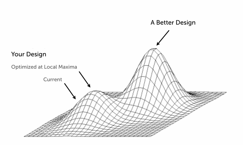
Hitting the local maxima can help justify a “radical redesign.” (Image source)
Other issues may also prompt a large-scale redesign, like a site that relies on old technology (e.g. Flash) or one whose design is clearly dated. (The latter scenario is common among startups whose rapid growth makes an initial “homemade” site appear amateurish.)
If a full-scale redesign is the right choice, the process starts with a comprehensive research plan that includes both generative and evaluative research.
Generative vs. evaluative research
While there are several categories of user research, the most important breakdown is between generative and evaluative research.
Generative research helps you understand your user’s world, learn more about their challenges, and generate ideas for your new website design. These techniques—such as stakeholder and user interviews, which I cover below—are mostly qualitative because the best audience insights surface during conversation and observation.
When you’re building your research plan, put generative techniques at the beginning. That way, the research will define the direction of your design.
Evaluative research validates how well your redesign solves the problems that inspired the redesign. Evaluative methods are quantitative—numbers measure the effectiveness the redesign. Examples of evaluative methods:
Don’t rush through the generative techniques. It’s natural to want to move quickly, get something designed, and test the design. But if you conduct only evaluative research, you’re just testing your ideas instead of building a website based on what users want.
The best results, as the example below from HubSpot shows, come from combining both methods.
The importance of combining generative and evaluative research
A prime example of how to combine research methods is HubSpot’s redesigned homepage. This page alone pulls in more than 4 million visits a month, so the stakes for the redesign were pretty high.

Here’s how HubSpot’s homepage looked before the redesign. The dual call-to-action is difficult to read against the blurred background.
Because HubSpot had so much traffic, they had a treasure trove of data. The design team identified patterns in how people navigated the homepage. Using a combination of Google Analytics, heat mapping, and session recordings, they uncovered three recurring patterns related to FAQs, pricing, and product information.
But they didn’t settle for quantitative data: HubSpot’s team wanted to hear directly from their users—particularly different personas. The design team interviewed customers and stakeholders, even gathering intel from tweets, support calls, and other qualitative sources.

Here’s HubSpot’s new homepage after the UX redesign process. Notice the increased usability of the text as well as the single CTA.
In the end, their research informed a new homepage design that boosted KPIs for HubSpot’s marketing team—specifically, increased engagement with high-value CTAs and more free-trial signups.
- Without the quantitative research, designers wouldn’t have been able to identify the three main behavior patterns for FAQ, pricing, and product information sections of the site.
- The qualitative research led the design team to deliver dynamic content based on visitor personas from logged-in users.
Which methods should you use to redesign your website? And in what order? Every project is different, so the process needs to be flexible, but there are fundamental steps that apply to almost any web design project.
Before you do any research, however, you need to build the business case.
Making the business case for UX research
Whether it’s convincing your CEO they don’t know everything about their users or just securing enough budget for research, these conversations can be difficult.
Involve all the primary stakeholders in your company. Most objections to user research can be overcome by pointing out a simple truth: Making changes to the design later in the process—when development resources are involved—is very, very expensive. Conducting user research early and often mitigates that risk.
It also ensures that the functions in your redesign are what your customers want.

Once you have internal buy-in, you can get started with research. (Note: This pre-research period is also the time to discover what research, if any, has already been conducted.)
Here’s how we do it at DePalma.
The 3 phases of UX research for site redesigns
Phase 1: Discovery and planning
- When should you do it? 1–2 months before the new redesign goes live (depending on the project scope).
- How long does it take? 2–3 days.
This initial phase gathers internal perspectives, catalogs existing content, and includes a heuristic evaluation of the current site.
Step 1: Stakeholder interviews
Although stakeholders are not your customers, they can:
- Provide context about research that’s already been done inside your organization.
- Uncover what each stakeholder values most about your project.
- Ensure stakeholders understand the value of your research.
Stakeholders can usually be divided into three groups:
- Business. Marketing, product, sales, and operations.
- Engineering. Development and IT leaders.
- Design. UX, UI, and graphic designers who will contribute to the project.
Schedule one-hour meetings with leaders in each category. The goal of each interview is to understand the project from the stakeholder’s perspective and identify how they define success.
Stakeholder interview questions break down into four themes:
- Why are you doing a redesign at all? Make sure your understanding is shared by stakeholders.
- Who are the users? Your site can’t be user-centered if you don’t know who your users are. Because stakeholders are not users, they often have an incomplete perspective about what users need. However, getting stakeholders’ perspectives can broaden your understanding of the market and identify patterns among users.
- How will success be defined? Uncover what each stakeholder imagines success will look like. Is it higher usability metrics, like task completion and conversions, or something beyond analytics, like revenue?
- What has already been decided? Every project has constraints; you need to uncover what’s beyond your control. For example, what is the deadline for the website launch? What technology will be used to build it? How many developers will work on the project?
The actual questions can be quite lengthy, so I won’t list them all here, but there are multiple resources, like this one or this one, that dive into the specifics.
Finally, lay the ground rules for communication. Here are a few questions we ask to finish off our onboarding process and set expectations for the rest of the project:
Step 2: Content audit
Like the previous step, a content audit is about discovery: You need to understand what already exists on your current website before you can plan a new design. A content audit builds a masterlist of all your content and may also uncover previously unknown relationships between content types.
The main idea is to build a series of increasingly specific silos for your content.
- Start with the navigation at the top of your homepage.
- Evaluate the type of content under each navigation item. Are there topics that merit a new subgrouping? That’s your next level of classification.
- Repeat that exercise until you’re down to the specific page titles. Once there, you’ve more or less reached the maximum level of detail.
In nearly every case, the largest content group will be your blog. Here’s a sample content audit we conducted for one of our clients:
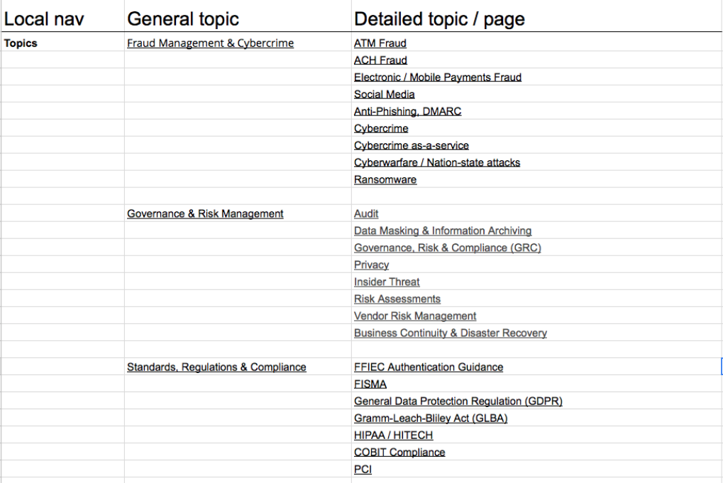
We started with the navigation and worked our way down to individual pages. You can get more specific, but you also run the risk of diminishing returns.
If your website has thousands of pages—or want to be exhaustive—you can also use a tool like Screaming Frog to crawl your entire site and enumerate all of the pages. This method will also keep you from missing pages that aren’t in your navigation.
Step 3: Heuristic evaluation
There are many heuristic frameworks (several of which overlap with conversion optimization). At DePalma, we typically follow some variation of Jakob Nielsen’s model and focus on four areas of heuristic evaluation: recognition, minimalist design, consistency, and user control.
1. Recognition. Instead of having to recall past information—like what an icon means—users should be able to recognize the context of each element.
For example, the icons in Inc.com’s top nav are easily recognizable for their readers: a magnifying glass refers to the search bar, the human figure leads to a profile page, and the hamburger menu brings up more navigation options.

Relying on recognition helps reduce cognitive load—people have to think less when using your site, which makes the user experience easy and enjoyable.
2. Minimalist Design. Major applications are moving toward a minimal, content-focused design, but many businesses still have flashy—and confusing—websites. Research finds that people prefer simple and easy experiences.
Robinhood takes the minimalist concept to another level. Just look at all that whitespace. The homepage presents simple choices with no distractions:

3. Consistency. For a website to be user friendly, it has to be consistent. That means all elements behave the same way across devices and on all pages. Digiday’s site maintains a consistent experience across mobile and web devices:

4. User Control. Users need autonomy to navigate your site and control their experience. People should be able to visit relevant sections of your site without unnecessary barriers, and they should be able to backtrack in the middle of any given process, like an ecommerce checkout.
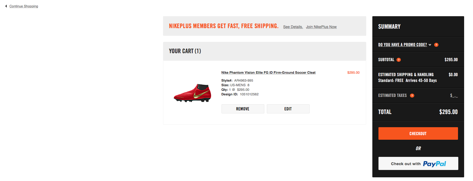
Nike’s website has large buttons that give users the ability to edit items in their cart or remove them altogether. The URL in the upper-left-hand corner provides an easy way to see more items. (This site is also an example of minimalist design.)
To be effective, a heuristic evaluation needs to be conducted by an expert with years of experience in UX design. And because the process is essentially a best practice review, it should be considered exploratory research to point you in the right direction for quantitative evaluations.
We compile results into a short report that includes “problem” and “recommendation” information for each heuristic.
With input from stakeholders and a review of the existing content and design complete, we can move on to the bricklaying phase, which focuses on end users.
Phase 2: Bricklaying
- When should you do it? At least 4 weeks before your website launches.
- How long does it take? Gathering and analyzing the research typically takes a week. If you’re traveling to interview customers, allot a few extra days.
The bracklaying phase focuses on research with your target audience—the people who actually use your website. The following techniques help you learn about your customers’ goals, challenges, motivations, and the context in which they use your website.
The more complete the picture of your customers, the better equipped you’ll be to design a website that’s tailor made for them.
Step 1: User interviews
User interviews are the bread and butter of generative research. Talking to your customers in an interview setting yields rich insights about how they interact with your website and how your redesign can improve it. Face-to-face interviews put people at ease and help you pick up on the subtext of an answer that would otherwise get lost on a phone call or live video.
To get the most out of your interviews, you need a good script. Your script should include which questions you’re going to ask, the order in which you’re going to ask them, and what you expect to learn from each question.
The last part is critical: If an answer doesn’t provide the insight you need, you can circle back and ask it in a different way. Focusing on simple, practical questions gets the best results. (People are notoriously bad at explaining abstract ideas about why they do something.)
Divide your questions into three categories:
1. Lifestyle/introductory questions. These questions ask participants about their lifestyle and preferences to build rapport.
Examples:
- What does your typical day look like?
- What are some of your favorite websites and mobile apps?
- What is your opinion about [your product’s industry]?
2. Industry/website-specific questions. These questions focus on the challenges and goals your customers have when using your website, or a website like yours.
Examples:
- How do you currently do [main action related to your website]?
- Tell me about the last time you [completed an action related to your site].
- What did you find frustrating about that experience?
- What did you enjoy?
Whenever possible, encourage storytelling. Stories are the goldmines of user research, and if you can get a customer to recall a particularly important moment, their memory will be better and their answers more specific.
3. User experience questions. These questions unearth ideas on how to improve specific parts of your website. Ask them immediately after someone interacts with your website.
- What did you like most about the website?
- What did you like least?
- How could the website improve?
After you complete your interviews, ask yourself: Do answers contain consistent patterns? Does each interview contain tons of new information?
If new information keeps bubbling to the surface, recruit more participants until their answers have established patterns. Set a maximum of 15 user interviews. At that point, you’ll have what you need.
Step 2: Personas
As a research technique, personas have lost a bit of their luster. Irrelevant data, half-assed research, and poor application can turn a perfectly useful research tool into a target of derision.
We still rely heavily on personas in our process, but we augment the quantitative aspects with qualitative inputs.
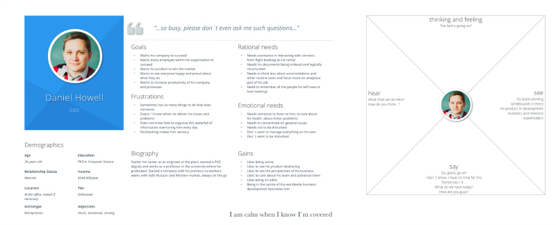
This CEO persona includes qualitative data, like goals, frustrations, and needs. This helps create more empathy between the designer and their audience, which leads to more effective designs. (Image source)
Quantitative data only makes up a small portion of our personas. The majority of our persona work focuses on goals, frustrations, rational needs, and emotional needs.
This information comes from the interview process and can be synthesized to create personas that give you a detailed, in-depth view of the challenges each audience segment faces when they use your website.
Understanding someone’s frustrations can directly influence your design decisions. For example, if Daniel Howell, our CEO pictured above, is frustrated by a lack of information about your service, then it’s probably a good idea to design an FAQ page or service-page widget he can expand for more information.
You won’t get those insights by knowing how old he is or how much money he makes.
Step 3: Use cases
A use case is a step-by-step description of how users complete specific goals on your website. Because a redesign attempts to solve a known issue, a use case can develop an optimized workflow that should make the experience easier—and increase the conversion rate.
Based on interviews, what did people find frustrating about your site? Use that feedback to identify redundant or confusing steps in the process and cut them out of your use case.
Usability.gov has an excellent example of this technique.

The use case walks us through each step the housekeeper takes to complete the goal. Laundry may seem like a far-fetched example, but the premise is exactly the same for your website. Plotting the course each of your personas takes to the proverbial finish line is a powerful technique.
Of course, it’s impossible to predict every path users will take to achieve their goals. Unlike doing laundry, navigating a website offers people myriad choices, and people often use your website in ways you don’t expect.
Because a use case represents an optimized pattern of behavior, you can account for non-linear (and sometimes inefficient) user flows with the user control heuristic. As long as a it’s obvious how to move forward or backward, your website will maintain a high degree of usability.
Once you’ve conducted your initial research, you can translate that knowledge into wireframes to conduct usability tests on the proposed redesign.
Phase 3: Usability testing
- When should you do it? Your first usability test should take place 2 weeks before the website goes live, but that timeline depends on how long you allot for development.
- How long does it take? Usability testing only takes 2–3 days in the design phase, but it should continue after the website goes live.
Usability testing puts research to work: Everything you’ve learned during the first two phases informs the choices you make in the development of an initial wireframe and clickable prototype.
Subsequent rounds of review and testing, in turn, offer both generative and evaluative feedback to refine your design.
Step 1: Wireframes
First, we create low-fidelity wireframes. Then, we show these wireframes to users and stakeholders and make changes based on their feedback. Eventually, the low-fidelity wireframes become a clickable prototype, which is what we use for usability testing.
The process of wireframing and prototyping is outside the scope of this article—those are design methods, not research—but I mention them because they’re necessary for usability testing, which is the standard for evaluative research.
Step 2: Usability testing
You can do usability testing in person or remotely. Unless it’s a very complex site, remote usability testing is fine (and saves travel expenses).
To set up a remote usability test, you need the right software to record video and audio of the test session. Audio is particularly important because you want users to vocalize their thoughts as they interact with your prototype. This will give you further evidence when something is confusing or when users react positively to the design.
Most test sessions typically last between 30 minutes and one hour. Good planning gets the most out of a testing session. A test plan should be broken into two sections:
- Introduction. The introduction gives the user context for the test sessions and makes them feel comfortable. Explain that you’re recording the test, and emphasize that you’re not testing the person but the software. There are no wrong actions, and if the user finds mistakes, that’s a good thing.
- Tasks. Plan three to five tasks for participants to complete during the session. Align tasks with the main goals for the site. If you have specific questions you want to ask during these tasks, write out and include them alongside the tasks.
Here are a few resources for creating a test plan:
Keep in mind that everyone prepares test plans differently. Usability testing isn’t something you do once then stop. Test each iteration of your design and compare the results to the baseline metrics you established on your first run. Even after your site goes live, don’t stop testing.
Here’s a good example of a moderated usability test with a clickable prototype:
Step 3: Test evaluation
Usability testing has qualitative aspects like audio and video recordings, but this technique is also your primary source for quantitative data. That’s a good thing—you can compare design iterations to see how one fares versus another. There’s still a bit of observational research, but, for the most part, you’re living in the land of data now.
Important usability metrics include:
- Completion Rate. The percentage of participants who are able to complete a task. If a significant number can’t complete a task, go back to the drawing board.
- Task Time. This measures how efficiently people are able to complete a task. The quicker the task time, the more intuitive the process.
- Clicks/perceived effort. Clicks can indicate the complexity of a task. The completion rate may be high, but if it takes a lot of clicks to get there, there’s room for improvement.
(Most usability testing software reports these stats natively in the platform.)
Depending on the size of your organization, you may outsource part or all of the research and testing process. Identifying the right vendor when so much is at stake—both in initial outlay and later results—is as essential as it is challenging.
Identifying the right vendor
Nearly all user experience professionals practice some form of human-centered design. This approach includes user research as part of larger, iterative design process.
The real difference between seasoned UX designers and newcomers is the sophistication of their process. Experienced designers have a repeatable process they can adapt from project to project; novice designers do things at random.
If you’re considering hiring a design agency to tackle your redesign project, here are a few things to look for:
- A research-first approach. Research is the lifeblood of successful UX design. If someone can’t articulate their approach, they don’t know how to do it.
- A portfolio of UX work. A lot of graphic designers claim that they’re comfortable doing experience design when, in fact, they haven’t the slightest idea. Make sure whomever you consider has a strong portfolio of experience design work and can explain that work in detail.
- A collaborative perspective. UX designers must approach their work with empathy and a sense of collaboration. If a designer is overconfident or doesn’t take an inclusive position, chances are they’re going to push their ideas instead of those gathered from customers.
Conclusion
If the process I just described seems involved, that’s because it is. Good UX design is powered by research, so to get the best results, you need to invest in learning about your customers. Remember: You are not your users.
That’s not to say that your process should be rigid, but any process should answer key questions:
- Discovery and planning. Which issues do internal stakeholders know about? What content currently exists? Which issues does an expert evaluation uncover?
- Bricklaying. What do our end users think of the site? Who are they and what are their needs? Which tasks do they try to accomplish on our site?
- Usability testing. How does our research-backed redesign perform? Do users like it? Can they complete tasks more efficiently?
Every project is different, so adjust your research to fit its constraints. Just make sure you take a user-centered approach—and do the damn generative research. You’ll be in a prime position to mitigate the risk of a radical redesign and create a website your audience loves.
Related Posts
-

Tommy evaluates Cheap Recipe Blog, and The Murray Group, an independent insurance agency out of Rochester…
-

What we know today as a "website redesign" isn't what it used to be. ‘Radical’…
-

User experience is a nebulous term. What defines a "good" UX from a "bad" UX,…
-

List building is a top priority for a blog. In this review we look at…