Website design affects how quickly visitors understand a page, what they notice first, which elements appear related, and how easily they can take action.
Design trends change. The underlying principles behind how people perceive information, make choices, and interact with interfaces change much less.
This article covers eight principles that can help you make better design decisions, including visual hierarchy, Hick’s Law, Fitts’s Law, Gestalt principles, white space, and Occam’s Razor.
They aren’t rules that guarantee higher conversions. Use them to identify potential usability and design problems, then validate important changes with user research, behavioral data, or experimentation.
TL;DR
- Visual hierarchy helps users identify the most important information and actions first.
- Hick’s Law and Fitts’s Law help explain how the number of choices, target size, and distance can affect interaction difficulty.
- Gestalt principles explain how proximity, similarity, closure, symmetry, movement, and continuity affect the way people group visual elements.
- White space and composition can clarify relationships between elements and reduce unnecessary visual clutter.
- Treat these principles as design heuristics, not guaranteed conversion tactics. The right implementation still depends on the page, audience, and user behavior.
Table of contents
- 1. Visual Hierarchy
- 2. Divine Proportions
- 3. Hick’s Law
- 4. Fitt’s Law
- 5. Rule of Thirds
- 6. Gestalt Design Laws and Principles
- 7. White space and clean design
- 8. Occam’s Razor
- Takeaways on web design principles
- Frequently asked questions about web design principles
- Improve your website design and conversion skills
1. Visual Hierarchy
Squeaky wheels get the grease, and prominent visuals get the attention. Visual hierarchy is one of the most important principles behind good web design. It’s the order in which the human eye perceives what it sees.
Exercise. Please rank the circles in the order of importance:
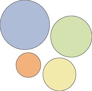
Without knowing anything about these circles, you were able to rank them
easily. That’s a visual hierarchy.
Certain parts of your website are more important than others (forms, calls to action, value proposition, etc.), and you want those to get more attention than the less important parts.
If your website menu has 10 items, are all of them equally important? Where do you want the user to click? Make important links more prominent.
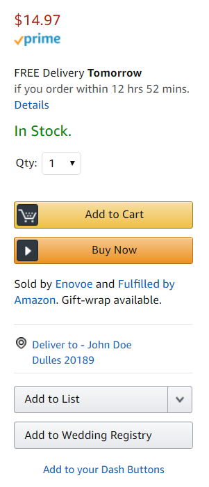
Hierarchy doesn’t come only from size. Amazon makes the “Add to Cart” and “Buy Now” call-to-action buttons more prominent by using color:
Start with the business objective
You should rank elements on your website based on your business objective. If you don’t have a specific goal, you won’t know what to prioritize.
Here’s an example. It’s a screenshot I took from the Williams-Sonoma website. They want to sell outdoor cookware.
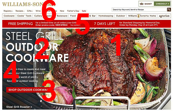
The biggest eye-catcher is the huge piece of meat (make me want it), followed by the headline (say what it is), and a call to action (get it). Fourth place goes to a paragraph of text under the headline; the fifth is the free shipping banner, and the top navigation is last.
This is visual hierarchy—a timeless principle of web design—well done.
Exercise. Surf the web and consciously rank the elements in the visual hierarchy. Then go look at your site. Is something important (i.e. key information that visitors seek) too far down in the hierarchy? Make it more prominent.
2. Divine Proportions
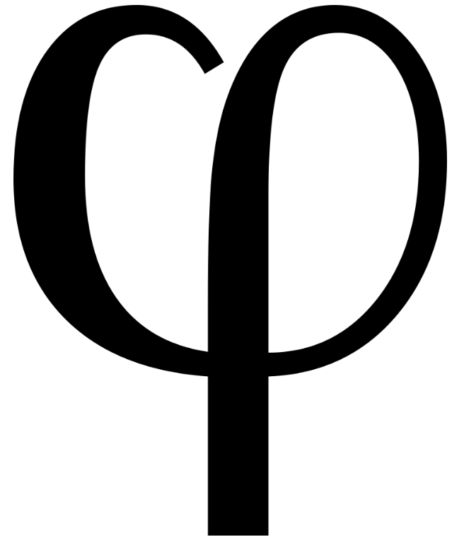
The Golden Ratio is the magical number 1.618 (φ). Designs that use proportions defined by the golden ratio are, it’s believed, aesthetically pleasing.
Then, there’s the Fibonacci sequence. Each term is the sum of the two previous terms: 0, 1, 1, 2, 3, 5, 8, 13, 21, and so on. The interesting thing is the two seemingly unrelated topics produce the same exact number.
Here’s what the Golden Ratio looks like:

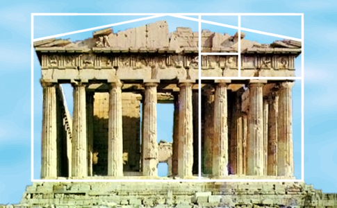
Many artists and architects use proportions to approximate the Golden Ratio. A famous example is the Parthenon, built in Ancient Greece:
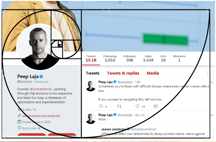
Can the Golden Ratio work for web design? You bet. Here’s Twitter:
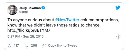
Here’s a comment, from years ago, by Twitter’s creative director, Doug Bowman. The design choice wasn’t accidental:
So, if your layout width is 960px, divide it by 1.618 (=593px). You know that the width of the content area should be 593px and the sidebar 367px. If the website height is 760px tall, you can split it into 470px and 290px chunks (760/1.618=~470).
If you want to learn more, check out this article on how to apply the Golden Ratio to typography.
3. Hick’s Law
Hick’s Law describes how the time needed to make a decision tends to increase as the number and complexity of choices increase.
You’ve experienced this countless times at restaurants. Menus with huge options make it difficult to choose your dinner. If it offered two options, making a decision would take much less time. This is similar to the Paradox of Choice—the more choices you give, the easier it is to choose nothing. Both principles come into play with web design.
The more options a user has on your website, the more difficult it is to use (if it’s used at all). The goal isn’t to eliminate every choice. It’s to remove unnecessary choices and make larger sets of options easier to navigate through grouping, filtering, or progressive disclosure. To make a better web design, focus on eliminating distracting options throughout the design process.
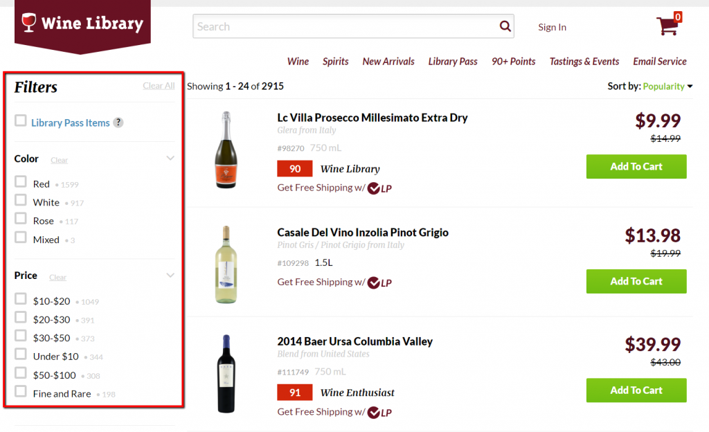
When a site needs to offer a large number of choices, filters can reduce the number a visitor has to evaluate at once. An earlier version of Wine Library’s site showed this clearly: the retailer offered a large wine catalogue but used filters to help customers narrow the available options.
They do a good job with the filters:
4. Fitt’s Law
Fitt’s law stipulates that the time required to move to a target area (e.g. click a button) is a function of the distance to the target and the size of the target. In other words, the bigger an object and the closer it is, the easier it is to use.
The Spotify interface shown below used this principle by making the primary Play control larger and more prominent than the surrounding controls:
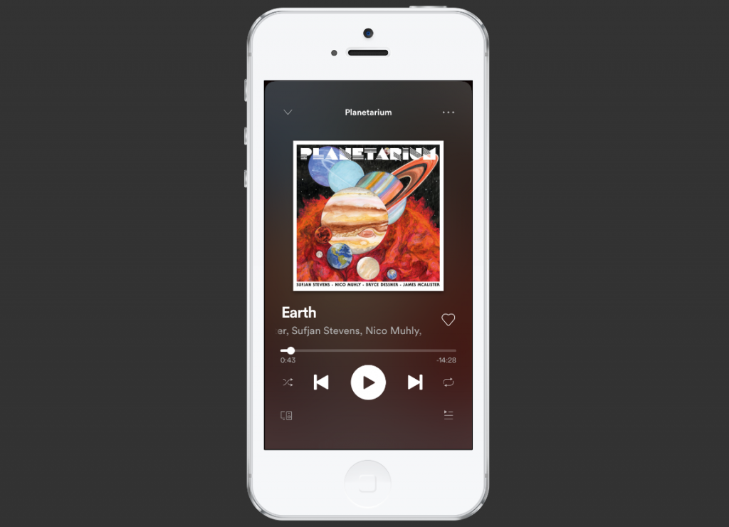
The mobile interface used the same idea by keeping the primary playback control large and easy to reach.
Bigger isn’t always better. A button that takes up half the screen isn’t a good idea, and we don’t need a mathematical study to tell us. Even so, Fitt’s Law is a binary logarithm. This means that the predicted results of the usability of an object run along a curve, not a straight line.
A tiny button is much easier to click when given a 20% size increase, whereas a very large object, given the same 20% boost in size, won’t deliver the same benefits in usability.
This is similar to the rule of target size. The size of a button should be proportional to its expected frequency of use. You can use mouse tracking to see which buttons people use the most, then make popular buttons bigger (easier to hit).
Target size also matters for accessibility. WCAG 2.2 introduced a Level AA minimum target-size criterion of 24 × 24 CSS pixels for pointer inputs, subject to defined exceptions such as sufficient spacing between smaller targets.
Let’s imagine there’s a form you want people to fill. At the end of the form, there are two buttons: “Submit” and “Reset” (clear fields).

For most users completing the form, Submit is the primary action. It should therefore be easier to identify and select than a destructive secondary action such as Reset.
5. Rule of Thirds
It’s a good idea to use images in your design. A visual communicates your ideas much faster than text.
The rule of thirds is one composition technique that can help create visual balance and draw attention toward important parts of an image. An image should be divided into nine equal parts by two equally spaced horizontal lines and two equally spaced vertical lines. Important compositional elements should be placed along these lines or at their intersections.
Below, see how the image on the right is more interesting? That’s rule of thirds in action.

Strong imagery can support visual hierarchy and make important content easier to notice, but image size alone does not make a design effective.
6. Gestalt Design Laws and Principles
Gestalt psychology examines how people organize individual visual elements into larger patterns and perceived wholes. Rather than processing every element independently, we naturally look for relationships between them.
Here’s what I mean:
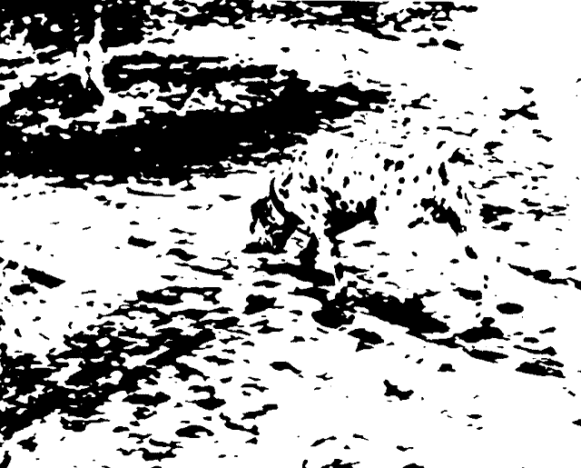
Notice how you could see the dog without focusing on each black spot that the dog consists of? A founder of gestaltism, Kurt Koffka, explained it this way: “The whole is other than the sum of the parts.”
As it relates to web design, people see the whole of your website first—before they distinguish the header, menu, footer, and so on.
There are several overlapping Gestalt principles that describe how people visually group and interpret elements. Here are some of the most useful for web design.
Gestalt law of Proximity
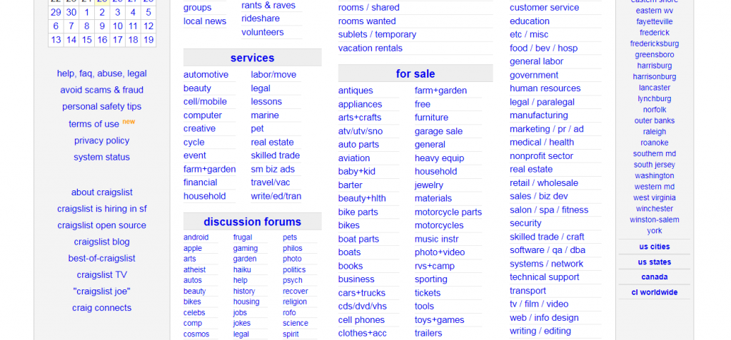
People group things together that are close together in space. They become a single perceived object.
For effective web design, make sure that things that do not go together are not perceived as one. Similarly, you group related design elements together (navigation menu, footer, etc.) to communicate that they form a whole.
The Craigslist example below shows the principle clearly: spacing groups the individual subcategories under “for sale” into a perceived unit.
Gestalt law of Similarity
We group similar things together. This similarity can occur in the form of shape, color, shading, or other qualities.
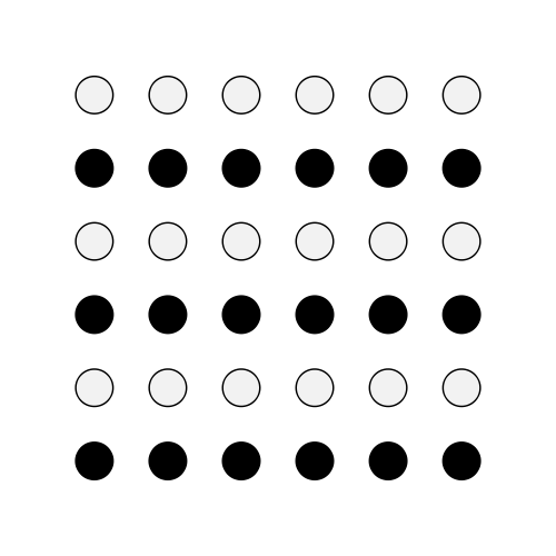
Here we group black dots into one group and whites into another one, because, well, dots of the same color look similar to one another.
What’s this look like when applied to web design? An earlier Mixpanel design used the same visual treatment for its case-study links, making them appear as one related group:

Gestalt law of Closure
We seek completeness. When shapes that aren’t closed or parts of a picture are missing, our perception fills in the visual gap. We see a circle and a square even though neither shape actually exists in the graphic below.

Without the law of closure, we would just see different lines with different lengths. But the law of closure combines the lines to form whole shapes.
Using the law of closure can make logos or design elements more interesting. A good example is the World Wide Fund For Nature logo, which was designed by Sir Peter Scott in 1961:

Gestalt law of Symmetry
The mind perceives objects as symmetrical, forming around a center point. It is perceptually pleasing to divide objects into an even number of symmetrical parts.
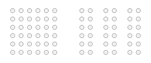
When we see two symmetrical elements that are unconnected, the mind perceptually connects them to form a coherent shape.
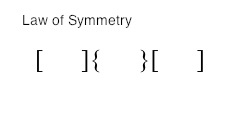
When we look at the image above, we tend to observe three pairs of symmetrical brackets rather than six individual brackets.
Symmetry can make related elements feel balanced and visually connected, which can make a layout easier to interpret. An earlier version of Trello’s homepage used alternating image-and-text sections, centered elements, and balanced columns to create this sense of symmetry:

Gestalt law of Common Fate
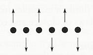
Elements that move, or appear to move, in the same direction tend to be perceived as belonging together. Designers can use shared motion or directional cues to communicate relationships between interface elements.
Mentally, people group together sticks or raised hands pointing somewhere because they all point in the same direction. In your site design, you can use this to guide the user’s attention to something (e.g. a sign-up form, value proposition, etc).

For example, if there’s an array of dots, and half the dots move upward while the other half move downward, we perceive the upward-moving dots and downward-moving dots as two distinct units.
Gestalt law of Continuity
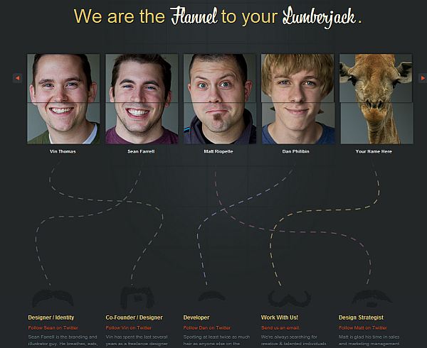
People have a tendency to perceive a line as continuing its established direction. When there’s an intersection between objects (e.g. lines), we tend to perceive the two lines as two single, uninterrupted entities. Stimuli remain distinct even with overlap.

The Fixel design shown below used continuity to visually connect each face with its corresponding biography:
There are other gestalt laws, too, such as Figure and Ground or Law of Good Gestalt. (Objects tend to be grouped together perceptually if they form a pattern that is regular, simple, and orderly—like the Olympic rings.) The principles covered above are some of the most useful when thinking about how users group and interpret elements in an interface.
7. White space and clean design
White space (also called “negative space”) is the portion of a web page that remains “empty.” It’s the space between graphics, margins, gutters, space between columns, space between lines of type, or visuals.
It’s not just “blank” space—it’s an important element of web design. It enables objects within it to exist. White space is all about the use of hierarchy for information, typography, color, or images.
A page without white space, crammed full of text or graphics, risks appearing busy or cluttered. Typically, it’s difficult to read. (People won’t even bother.) This is why simple websites are scientifically better.
The right amount of white space makes a website look “clean.” While a clean design is crucial to communicate a clear message, it doesn’t just mean less content.
A clean design makes the best use of the space it’s in. To create a clean site design, you need to know how to communicate clearly by using white space wisely.
The historical MADE.com homepage shown below used white space particularly well:
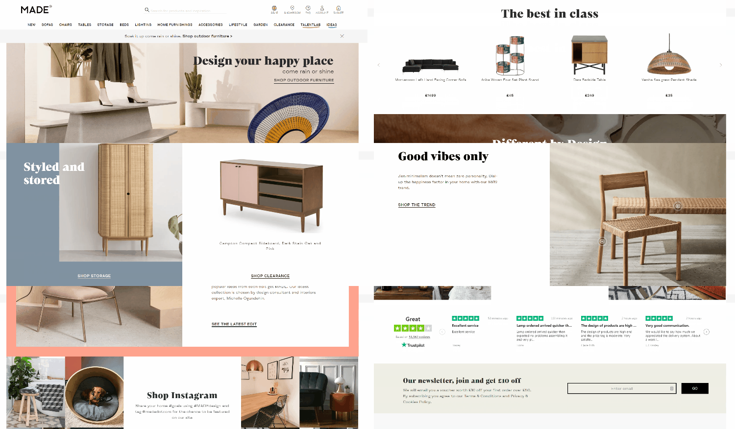
In this example, the generous spacing makes it easier to focus on the primary message and imagery while keeping the body copy distinct from surrounding elements. In general, white space promotes elegance and sophistication, improves legibility and drives focus.
Read more about white space and simplicity.
8. Occam’s Razor
When given several competing hypotheses, Occam’s razor urges you to choose the one that makes the fewest assumptions and, thereby, offers the simplest explanation. Applied to web design, the useful interpretation is to avoid unnecessary complexity when a less complicated approach solves the same problem equally well.
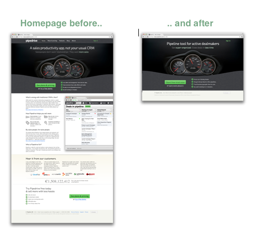
An older Pipedrive case study from its time at AngelPad gives a useful example. The team wrote:
The Angelpad team and mentors challenged us in many ways. “You have too many things on your home page” was something we didn’t agree with at first, but we’re happy to test. And it turned out we had been wrong indeed. We removed 80% of the content, and left one sign-up button and one Learn More link on the home page. Conversion to sign up increased by 300%.
It’s not just about the looks, but also about how it works. 37signals also made reducing unnecessary product complexity part of its product philosophy. Its founders wrote in Rework:
Lots of people hate us because our products do less than the competition. They’re insulted when we refuse to include their pet feature. But we’re just as proud of what our products don’t do as we are of what they do. We design them to be simple because we believe most software is too complex: too many features, too many buttons, too much confusion.
Minimalism does not automatically produce a better website. The more useful objective is to remove elements, choices, and interactions that add complexity without helping users complete what they came to do.
Takeaways on web design principles
These principles are useful because they describe recurring patterns in how people perceive information and interact with interfaces.
Visual hierarchy can direct attention. Hick’s Law can help reduce unnecessary decision complexity. Fitts’s Law can make important actions easier to select. Gestalt principles can clarify relationships between elements. White space can separate information and strengthen hierarchy.
But none of them should be applied blindly.
A larger button is not automatically better. Fewer choices are not always better. More white space does not automatically improve a page. And following a mathematical proportion does not guarantee a stronger design.
Use these principles to identify potential problems and generate design hypotheses. Then use customer research, usability testing, analytics, and experimentation to determine whether the change actually improves the experience.
Frequently asked questions about web design principles
What are web design principles?
Web design principles are guidelines for structuring visual information and interactions so users can understand and use an interface more effectively.
What is visual hierarchy in web design?
Visual hierarchy uses size, contrast, position, spacing, color, and other cues to indicate which elements deserve attention first.
What is Hick’s Law in web design?
Hick’s Law describes how decision time tends to increase as the number and complexity of available choices increase.
What is Fitts’s Law in web design?
Fitts’s Law describes how the size of a target and its distance from the user affect how quickly and easily it can be selected.
What are Gestalt principles in web design?
Gestalt principles describe how people visually group elements based on characteristics such as proximity, similarity, closure, symmetry, movement, and continuity.
Why is white space important in web design?
White space helps separate information, clarify hierarchy, improve legibility, and reduce visual clutter.
Is the Golden Ratio required for good web design?
No. It can be used as a compositional reference, but there is no requirement for effective websites to follow Golden Ratio proportions.
Do web design principles guarantee higher conversion rates?
No. They can identify potential usability improvements, but important changes should still be validated with research and experimentation.
Improve your website design and conversion skills
Web design principles become more useful when you can connect them to user behavior, conversion research, and experimentation.
Identify usability and conversion problems: CXL’s Heuristic Evaluation course teaches a structured process for evaluating websites, identifying friction, and prioritizing UX improvements.
Build landing pages around user behavior: The Landing Page Optimization course covers page structure, behavioral design, conversion research, and testing landing-page changes.
Develop deeper conversion optimization skills: The Conversion Optimization Minidegree covers conversion research, user behavior, experimentation, and optimization strategy.
Related Posts
-

Ghost buttons are transparent calls to action found on websites and apps. They tend to…
-
People judge books by the cover and other people by their looks. Take a look…
-
The easier your website is to use, the more people use it. An essential part…
-

As you almost certainly know, copy is what sells. That’s true in print, and it’s…





Great article….!!!Nice to know about new
things with helping concept. I am almost brand new to blogging and really like
your post, it is really on target! Thanks for all of your time & work. Hope
you always write this blog.
Thank you,
The given information is very effective.
I’ll keep update with the same.
website designing
Great article & very practical. Thanks for all the tips – I’ll be thinking about them for awhile as we work on our website redesign. [But by the way, your photo under #2 is of the PARTHENON (temple in Greece), not the PANTHEON (church in Rome or church/crypt in Paris).]
This blog post should be GOSPEL to anybody involved with designing websites.
so, it’s made up and shouldn’t be believed?
Whats made up?
Otto appears to be referring to the bible Peep. Your work is brilliant and certainly invokes a serious change of my web designing consciousness. Great Post!
nice research, thanks for sharing
by
Sivakumar, HTML Developer
I knew some and i`ve learned some thnx for sharing this research work…
My yr.10 ICT students are going to get a LOT from this tomorrow. Thanks for the great article.
Great, hope they’re interested.
I will be sharing your site with my composition students who are designing their webfolios–great info, thanks!
this is very good, thanks for the info
Great article….!!!Nice to know about new
things with helping concept. I am almost brand new to blogging and really useful for me .that is collection of the tools are helpful for the web designing.
Thank you
Great article. Really useful information. Best I’ve read in a while on this subject. Thanks so much for all your efforts.
Great article! I shared it in my article “Newbie’s Guide to Getting Started in Web Design Business” I wrote for Webiny.com
Hi there! Quick question that’s completely off topic. Do you know how to make your site mobile friendly? My weblog looks weird when viewing from my apple iphone. I’m
trying to find a theme or plugin that might be able
to fix this problem. If you have any suggestions, please
share. Cheers!
nice post. i learn so many things from your article. i’ve been reading your articles and i find it helpful in making my projects.
Another amazing blog post Peep! How the heck did you learn about all these laws and then apply them to design? Brilliant!
Web designers would be wise to use products such as Microsoft OneNote and EverNote as a way to jot down any ideas they have. These programs are great for organizing your thoughts and putting them all in one place. It’s a great starting point when trying to determine how to build your site.
WoW!
Great article, complete is a better expression here, complete set of basis i designer should have,
wonderful article, thanks to you
Thanks for sharing. These principals will definitely be useful to me.
Wow! I really enjoyed reading this. I’m an aspiring web designer and these information made me think I still have a lot to learn to be certified one.
Nice piece of article. Tweeted it as well. :)
These are all good tips and that piece of meat in the middle reminded me how hungry I was!
really worth tips
i like the first principle very much
I thoroughly enjoyed reading this, i’ve bookmarked the page and will referring to it until it has been memorised!
Good article. Next time you might want to have someone proofread it for spelling and punctuation. (That is, if you value “aesthetically and financially rewarding results.”
That’s the Acropolis, not the Pantheon (which is in ancient Rome).
…actually, the Parthenon to be more specific!
Superb article, bookmarked with a plan to read over and again to sink your musings in.
Super agree!! What you posted and shared here is something is valuable to many web designers! Thanks a lot!
The Occam’s razor part is incredible. 300% increased conversion, wow
Great post but I would like to make a correction. Pantheon is in Rome and not Greek – In the photo this the Parthenon from Athens.
Thank you for a brilliantly concise overview and compelling examples. It all has that ring of unstated truth about it.
Well done Peep!
Great Post, i learn a lot form this article. I hope you can post more for beginners in web design like me..
I like the information shared. Your efforts in researching such a good content is really appreciated. I like everything written but the important that taken my attention is the Law of Common Fate, which is really new to me. I am a web designer and love reading blogs. Keep sharing latest news about market.
Great article, loved reading it. I think it will influence my future desings a bit, though I allready know about some things. Keep it up!
I couldn’t refrain from commenting. Exceptionally well written!
It’s nearly impossible to find knowledgeable people in this particular subject, but you seem like you know what you’re talking about! Thanks
Amazing!!!!! Excellent blog post. Even non technical person would understand what a user needs and designers would know what should be included and what needs to be not. I must say one should share this blog post before leaving it.
Great article, it’s very useful to know the most important principles in web designing. I’m a web designer. I’m going to consider these article for my next web design work. Thank you a lot for this valuable article. :)
Great piece!! Awesome and practical too. It’s a game changer to me.
Keep it up!
You’re a goddamn machine son.
Careful with the language, please.
Very informative stuff. You are way beyond than just a writer. I have never been so impressed before with the other articles. This piece must have taken a while to explore things. Very nice.
Fuck Yeah!
Your definition of Occam’s Razor is not correct. It should read the simplest solution that contains the necessary components is better. Just because something is simpler doesn’t mean it’s correct. Otherwise, this is a helpful article with time-tested principles.
Thanks ! it is too useful and important for all of us. Great !
Great knowledge learn form u.
Peep – Awesome post, one of the best marketing posts I’ve read in awhile. I took away a ton of new knowledge. Nice work!
Ryan
The article displayed above is a complete package of theoretical knowledge sequenced through a very sophisticated manner by Sir Peep Laja. Especially for new learners like me . I must give an approval here as per a professional from the same field, that gestalt law is indeed very practical in website designing as mentioned above.
Thank you so much sir for providing us this way great deal of knowledge . God bless you. Keep helping folk the same way you are doing. :)
Best Regards
Really Great Information, it will help me to learn more.