Ghost buttons are transparent calls to action found on websites and apps. Their use reached its peak a few years ago, but can still be seen across a wide range of websites. They’re generally used more on websites that use a minimalist or flat design.
From a design perspective there are several advantages of using ghost buttons. They work well on ’flat’ and ‘minimal’ websites. Their subtle design can give prominence to other design elements on the page. They also tend to work well with responsive websites.
There are arguments against using ghost buttons—primarily that they can be hard to see if their contrast with the background image is poor. They can also sometimes be too subtle, potentially making them harder for users to spot.
So, are ghost buttons good or bad for conversions and user experience?
Table of contents
What are ghost buttons?
Ghost buttons are transparent calls to action that appear on websites and in apps. They tend to have a thin border and a text label that sits within the transparent body of the button.
The pros of ghost buttons
In the right context, ghost buttons can undeniably look great. They can give an elegant, subtle feel to a design. They can make pages appear more minimal, lighter, and modern (even though they can no longer be considered ‘new’).
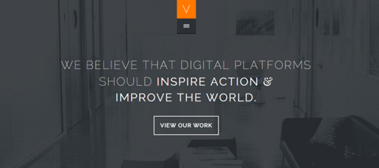
When used well, they can play an important part in the visual hierarchy of a design. They can give an order of importance when there is more than one CTA on a page, giving a more subtle effect to a secondary CTA.
The cons of ghost buttons
On the other hand though, ghost buttons can cause issues for users and may result in important page elements being overlooked.
Conversion optimizer Angie Schottmuller summed it up nicely when she wrote this:
Ghost buttons drive me crazy. It goes against usability. The concept is a designer’s fantasy trend that should die. The only time I find this tactic useful is when a client insists on having two CTAs on the page, and I basically want one to disappear. Ghosted buttons have ghost conversions.
The Nielsen Norman Group also had some less than positive opinions on ghost buttons:
Flat ghost buttons can have legibility problems, and they break away from the established convention of what a clickable button should be.
Ghost buttons can often suffer from usability and accessibility issues. Their usage as an alternative to traditional ‘solid’ buttons can be a very questionable design decision.
But, let’s look at the actual data
Rather than just hypothesising on the impact of ghost buttons, we decided to test them, as that’s what we do here. We ran three different types of tests to find out how ghost buttons impact conversions.
1. The A/B test
In this case we ran a test on the homepage of our own website to find out how ghost buttons changed our user behavior.
The test
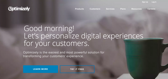
We used Google’s split testing tool, Optimize 360, to test the impact of changing our regular buttons on our homepage to ghost buttons. The screenshots below show what was tested.


We ran this test over the course of 10,000+ visits to the homepage and measured clicks on any of the CTAs on the homepage.
The results
We reached statistical significance for the test, which saw a 20% decrease in clicks on the buttons in the ghost variation.
Aside from this, there was very little difference in overall user behavior. The behavioral metrics in Google Analytics looked very similar for the original and variation.
While this was a one-off test it, gives an indication, as we predicted, that ghost buttons are less attractive than normal CTAs.
It is in no way definitive, but it shows that, in this instance, the conventional solid buttons appeared to draw the users’ attention more.
2. The click test
In addition to the A/B test, we also ran simple click-testing to measure the impact of the two button types. By monitoring whether users were drawn to the button, and how quickly, we were able to gain insight into how ghost buttons may change user behavior.
The test
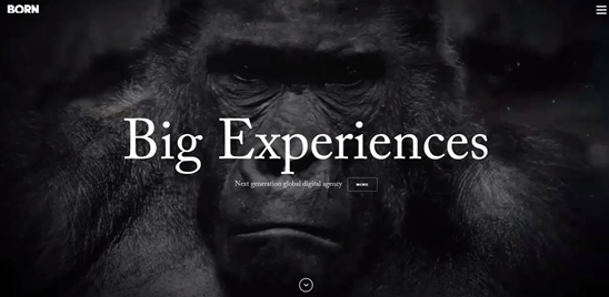
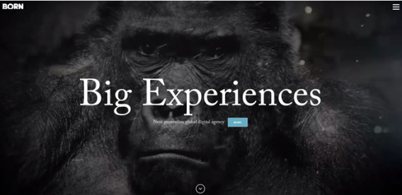
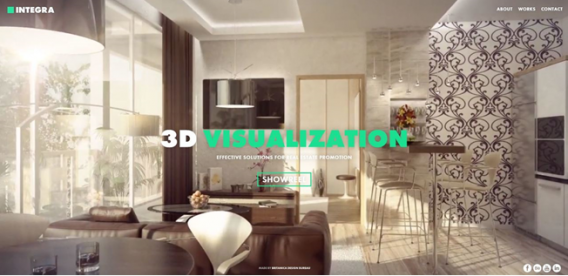
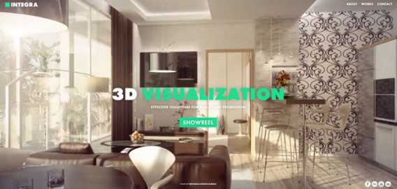
We ran a click test on three different ghost button designs, each on a different site. These websites were picked as being good examples of ghost buttons, using clear minimalist design.
We simply showed users two designs, one with ghost buttons and one with solid buttons and asked them to click the action of the button label (e.g., ‘where would you click if you wanted to buy tickets?’).
We used the click test tool from UsabilityHub to measure the visual impact of ghost buttons. The screenshot below shows an example of the results heatmap:
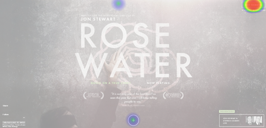
We measured the amount of time that it took users to click on the button and the number of ‘errors’ where users clicked elsewhere on the page.
The results
Ideally, we’d have run these tests with more users and on more designs to improve our certainty of the impact of ghost buttons. Based on the data available, however, it was clear that the ghost buttons were harder to spot during the tests that we ran.
Click test one:
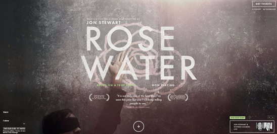
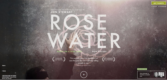
Click test two:
Click test three:
The table below shows the results for the three tests. They show the error rates as well as the average time it took users to click.
Table showing the error rates for the design variations:
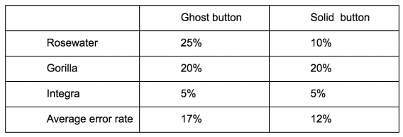
Table showing the average time to click for the design variations:
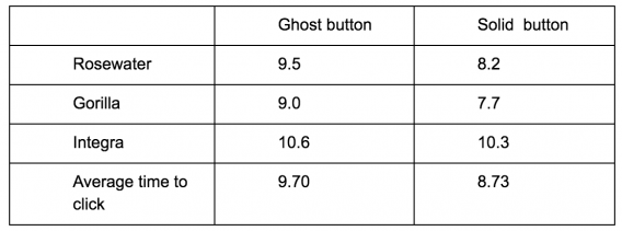
The results suggest that ghost buttons are likely to be harder for users to spot and interact with. The error rate was higher for the ghost buttons and it took users around a second longer, on average, to click.
Of the three designs that we used, the one with the ghost button located in the top right of the page performed the worst. This makes sense as the buttons located in the middle of the page are perhaps more likely to be seen quickly by users, making them harder to miss whether they use a solid or ghost design.
3. The attention test
Finally, we ran a test to find out how the different button types change the users’ attention. This would show us whether changing the buttons into ‘ghosts’ had any impact on whether they were a focus to users.
The test
We ran this test using EyeQuant, an artificial intelligence tool that gives instant, objective feedback on web and mobile designs. One of the tools available in the suite shows the ‘regions of interest’ of a webpage.
The Region of Interest scores are a relative metric. When you analyze a design with the tool, it gives every pixel an “attention score.”
When you highlight a region using the ROI tool (in this case, the button), it calculates how eye-catching the average pixel inside the region is when compared to the average pixel on the entire screen.
The results
Once again, the results showed that ghost buttons are less likely to draw the users’ attention. An example of the Region of Interest tool analysis can be seen in the image below. In this case, the solid button has an Interest Score of 60% compared to just 38% for the ghost version.


The table below shows the scores for the different variations that we tested.
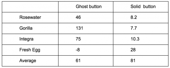
It’s clear that there is a consistent pattern here, and that the ghost buttons scored worse across all variations. This type of test doesn’t tell us anything about how likely users are to click the buttons, but it shows that ghost buttons are less likely to grab the attention of the user.
Context matters, as always
Our initial tests showed a trend towards ghost buttons having a negative impact on attention and conversions. For all three tests that we ran, we saw that more traditional ‘solid’ buttons performed better.
We need to remember though that these were isolated tests. More data would probably help make a stronger case for the negative impact of ghost buttons.
So, can we really say that ghost buttons have a negative impact on conversions? As with many things in CRO the answer is: it depends.
Our data suggests that the impact is likely to be negative, but this is likely to depend on how they’re used and what they are used for. For example, if ghost buttons are used on secondary CTAs to purposely make them less prominent, this could actually be beneficial to primary conversions.
For certain sites, there is no need for the conversion CTA to stand out. In some cases, it would be better to make the product information, USPs, or trust signals stand out more.
As long as users can easily find the CTA, that could well be enough. It doesn’t always have to be the most prominent element on the page. Making your buttons more prominent is unlikely to lead to sizable increases in conversions on its own. However, if your buttons are harder to spot, then some users may struggle to find them.
Conclusion
Our testing has shown that ghost buttons generally grab less attention than solid CTAs.
When deciding which type to use, you’ll need to carefully consider what impact you’d like your CTA to have. Ultimately, it reinforces the power of split testing designs. The only way to be sure of the impact of a design change is to test it on real users.
This is just one part of a larger debate around how aesthetics of design fit in with conversion optimization.
There are undoubtedly times where a less ‘visually pleasing’ design converts better than a beautifully crafted design. As optimizers, we sometimes have a duty to look beyond the results of a split test and consider the overall impact of a design on brand perception.
Working on something related to this? Post a comment in the CXL community!


Nice collection of tests Luke! I have always felt the same as Angie when it comes to Ghost Buttons in principle. I would say that if there is some strong desire to use one, it would have to be on a page with a white background. All of the examples above except your own were against Image backgrounds, which will make the button almost impossible to notice. The Fresh Egg example is against a black background, which will be almost as difficult. I have seen (but not tested) some examples of a ghost button in a truly minimal design, with a white background, where the buttons do tend to look much more like clickable elements and stand out more as such. I’d love to hear if anyone has tested a Ghost Button on a white page. Anyone?
Thanks Tom,
I’d love to see results from a test on a white background too. Most of the ghost buttons I see are on coloured, or graphic, backgrounds. As you suggest, they could work better, and look good on a white background.
Thank you for the research! My hypothesis in explanation of the results is that ghost buttons don’t motivate users to click them. I will be extremely grateful if you would test solid flat buttons vs normal 3D-looking convex buttons. My intuition suggests that old-fashioned rich buttons will beat any types of flat/minimalistic buttons.
That’s another good one to test Ivan. I ran an eye tracking test on flat vs skeuomorphic buttons few years ago. This was fairly inconclusive but it would be good to do it as an A/B test.
Luke – very interesting article! One thing to add on top of your well made research could be this: Once it comes to Ghost Buttons they are perfect for implementing the Illusion of Choice. This is linked to Cognitive Bias called Hobson’s Choice – where a visitor is given a free choice in which only one option is offered (such as “take it or leave it”).
Interesting stuff Aleksander. I find cognitive bias a fascinating subject, and something that we should all be more aware of when it comes to optimisation. There’s a whole area around the ‘illusion of choice’ that can be very valuable if used correctly.
Thanks for sharing your A/B test results. I’ll show this post to all designer friends who love ghost buttons!
I assume the results would be quite similar in case of email templates. I’ll definitely involve your findings in my next post about optimizing email designs for conversion! ;)