UX mistakes often go undetected because they are quiet. They aren’t a broken image or a misspelled word or a form that isn’t sending. No, UX mistakes are foundational.
To visitors, UX mistakes are loud, whether they consciously detect them or not. In fact, IBM is credited for the saying, “Ease of use may be invisible, but its absence sure isn’t.” [Tweet It!]
Visitors are leaving pages completely unaware of content blocks, they’re assuming they’ve reached the end of the page long before they truly have, they’re missing cues to scroll horizontally, etc. The false bottom is still alive and well… and it’s expanding quickly.
Table of contents
What Is a False Bottom?
A false bottom is the point on a page where a visitor believes the page will not scroll further, despite the fact that there is more content below that point. It’s also referred to as a logical end and the illusion of completeness.
This has been an issue for well over a decade. Yet, sites continue to make the same mistakes over and over again.
Typically, when people think of false bottoms, they think of vertical scrolling. The term does have the word “bottom” in it, after all. Due to the rise of mobile, horizontal scrolling has become somewhat familiar as well. Now, it is possible to have content to the right or left of the visible screen.
For that reason, we’ll use the term “logical end” going forward.
How Common Is the Logical End?
Despite popular belief, visitors do like to scroll. It’s second nature to them, an expected part of the online experience.
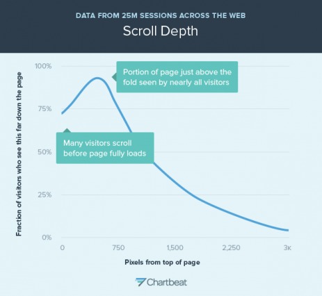
In a study based on 25 million sessions around the world, ChartBeat found that over 70% of visitors scroll before a page is even fully loaded…
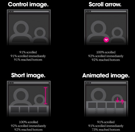
Huge found that almost everyone scrolls, regardless of the directional cues given (or not given)…
Rebecca Gordon, part of the research team at Huge, concluded that visitors do scroll, but contextual cues are still important…

Rebecca Gordon, Huge:
“We learned that participants almost always scrolled, regardless of how they are cued to do so – and that’s liberating. While it’s hard to make universal recommendations, we’d suggest that designers use the cue that works best in its context.
Designers should choose cues for scrolling based on the content, the business category and the overall design. Does the content feature block text, images or video? Is the site for ecommerce, editorial or news? How do visual cues integrate with existing design elements? All of these variables will affect the optimum placement and effectiveness of scrolling cues.” (via Huge)
When considering the need for directional cues, you have to consider two factors:
- How motivated is the visitor?
- How familiar is the visitor with your product / service / company?
The more motivated, the further along in the buying cycle, the less likely they are to scroll. Why? Because they don’t need more information, they’re highly motivated and want what they want. They’re likely to immediately click “Pricing” or “Demo” or “Products” or enter their email without scrolling.
Similarly, the more familiar the visitor is with your product / service / company, the less research is required. Someone who is hearing about you for the first time is more likely to scroll through your home page than someone who already knows what you do, who you are, etc.
While Huge’s results are impressive, without knowing the motivation and familiarity of the visitors included in the study, it’s impossible to generalize the results.
I’m willing to bet the “reached bottom” numbers for an average visitor are much lower. Why? Because logical end does not only come into play above the fold. You could be halfway down a page and experience a logical end.
In the words of Zoltan Gocza of UX Myths, “To make sure that people will scroll, you need to follow certain design principles and provide content that keeps your visitors interested.”
According to Luke Wroblewski, there are two core reasons visitors don’t scroll or stop scrolling..
Seems straightforward, right? To avoid creating a logical end, you have to set expectations with the visitor. Jared Spool of UIE agrees that when visitors don’t scroll, it’s because the site is not designed to encourage scrolling…

Jared Spool, UIE:
“Not much has changed in our observations since we released our original research on the subject. Basically, users have no trouble scrolling, as long as the page is designed to accommodate it. If our clients are finding their users aren’t scrolling, we suggest they look for a reason beyond ‘Users don’t expect to scroll’ and see if maybe the design of the page is preventing it.” (via UIE)
But why is it so important that visitors scroll? Isn’t it more valuable if they skip right to the pricing or product categories? Not necessarily.
Research is an important part of any conversion. Your visitors want to ensure they’ve made it to the right place, that you offer what they’re looking for, that you’re trustworthy, etc. By not designing to accommodate scrolling, you’re taking away that part of the conversion. The result is less qualified leads and fewer sales.
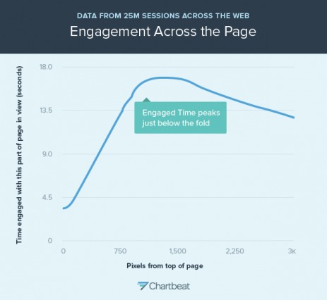
Josh Schwartz of Chartbeat demonstrates this by showing how visitors who do scroll are more engaged below the fold…

Josh Schwartz, Chartbeat:
“[…] because much of an article’s actual content is downpage, those readers who do scroll down spend much more time down the page than they do at the top. We see this represented in the next figure, where we show the amount of time each area of the page was actively viewed by those who actually scrolled to view it at all.” (via Chartbeat)
9 Most Common Cases of the Logical End
Since vertical scrolling is more familiar to most people, let’s start there. There are five common cases of the vertical logical end: huge hero shots, too much white space, familiar “conclusions”, horizontal lines and return to top arrows.
1. Huge Hero Shots
This case is perhaps the most common of all, especially among tech startups. Huge hero shots take up the entire above the fold area. Typically, they include a short headline and a call to action button or email capture form.
Example: Mapbox
Here’s the Mapbox home page…

Just from looking at it, would you assume that there’s content below the fold? Probably not. Of course, there is. Nine content blocks, to be exact.
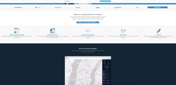
Is all of that content irrelevant to someone interested in getting started? If not, why is it hidden below a logical end?
2. Too Much White Space
If there’s too much white space surrounding a content block, it’s easy to assume that there is nothing below or to the right / left of it. The minimalist design movement has put a focus on incorporating white space into designs. I won’t argue that that’s a mistake, but the need to use white space strategically to avoid creating a logical end is key.
Example: Tribe
Here’s part of Tribe’s home page (just below the fold)…
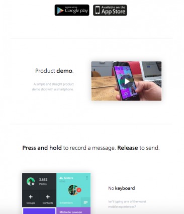
Take note of all that white space. After each content block, you assume that you’re at the end of the page. Every feature could simply be the last one.
The pattern continues further down the page…
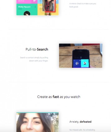
The simplicity of the design works against usability here. White space can be helpful, but you can also go too far in the wrong direction.
Note that I was zoomed out to about 50% when I captured the screenshots above.
3. Ads, Calls to Action and Otherwise Familiar “Conclusions”
If you read CXL regularly, you recognize the author bio box as a “conclusion”. It’s a signal that the article is over. On other sites, that “conclusion” might be when you see a set of ads or a text-based call to action or article recommendations. Now imagine the author bio box was placed in the middle of the article.
Example: Forbes
Here’s a randomly selected article from the Forbes site…

Halfway through the article, the “Recommended by Forbes” slider appeared. Typically, that would appear at the end of an article. After I’ve finished reading, the site might show me some other articles I’d like based on the article I just read.
Here, that familiar conclusion is not a conclusion at all. There was still another half of the article to read.
Example: Cosmo
Cosmo does something similar…
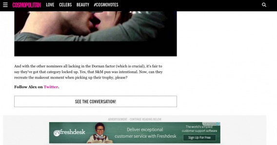
This is at the end of the article, but there is other content based on what you just read below this point. This ad, unfortunately, will stop many people from discovering that content because it is a familiar conclusion.
Yes, Cosmo goes a step further than Forbes by adding “ADVERTISEMENT – CONTINUE READING BELOW” above the ad. Still, it is barely visible and likely to be ignored.
4. Horizontal Lines
A horizontal line that extends across the entire screen signals a logical end. While they are often used to signal the end of a section, it’s not difficult to see how a visitor could interpret it as the end of the page itself. Different colored content blocks are a better solution.
Example: Undullify
Here’s the content just below Undullify’s fold…
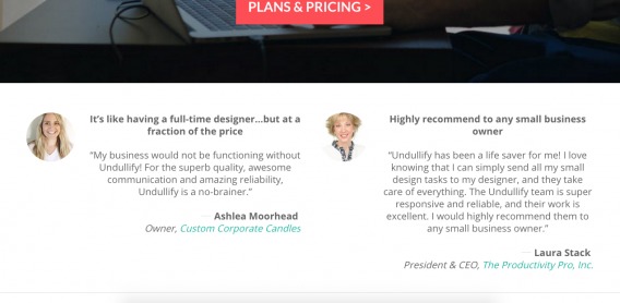
Note the horizontal line that extends across the length of the page. Paired with the fact that testimonials are above the line, it’s reasonable to conclude that this is the bottom of the page, right?
Actually, there are six other lengthy content blocks below that horizontal line…
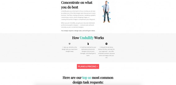
What’s interesting is that the horizontal line technique is not used again. Instead, content blocks are given different background colors, white space is used, etc.
5. Return to Top Arrow
When do you want to return to the top? Typically when you’ve hit the bottom of the page. Having a return to top arrow that scrolls with the visitor can be helpful, but it can easily signal the end of the page if you’re not careful. Transitional cues become even more important.
Good Example: CXL
If you’re a regular CXL reader, you’re familiar with our return to top arrow, which follows you as you read…
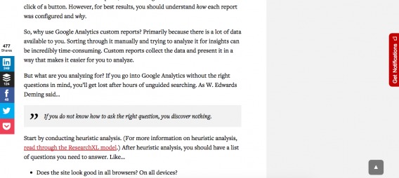
Since most of our articles are between 1,500-3,500 words long, a return to the top button makes sense.
Also, given the nature of our site, it’s relatively difficult to assume you’ve reached the end of the page when you haven’t. If you’re scanning, you can see how much content is left using the scroll bar. If you’re reading, you won’t assume the article ends on “Does the site look good in all browsers? On all devices?” Since it’s a blog, you’ll expect that the page is coming to an end when you reach the author bio and comments.
Bad Example: Semplice
Now look at how Semplice uses a return to top arrow on their home page…
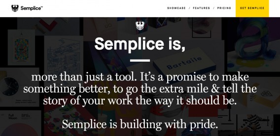
Can you find it? It’s there, but due to the dark background, you can’t see it.
As you continue to scroll down, you can see it appear…
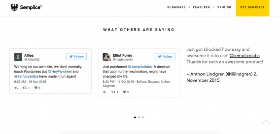
You notice it now, of course. Unfortunately, since it is not visible continuously, it’s easy to assume that you’ve reached the end of the page when you see it.
Return to top arrows can be helpful on home pages, too. Especially long sales pages, but make sure the arrow is always visible. If it appears suddenly, visitors will assume they’ve hit the bottom of the page.
Before moving on to horizontal scrolling, it’s important to note that it is not quite second nature yet. Mobile is definitely encouraging the behavior, but UX experts still consider horizontal scrolling to be a faux pas (especially on desktop).
Katie Sherwin of Nielsen Norman Group explains…

Katie Sherwin, Nielsen Norman Group:
“While horizontal scrolling is acceptable in some situations, it should be applied with caution. Be aware: horizontal scrolling on the desktop is one of the few interactions that consistently generate negative responses from users. (Anecdotally, the disdain for it is so widespread, that I like to use it to illustrate what user experience is to people unfamiliar with the field. I ask if they can think of a website scrolling horizontally. They usually groan and say they hate it, and then I explain how we look at things like that and find ways to make them better. Usually they respond along the lines of ‘Thank you, I wish there were more of you.’).” (via NN/g)
Now, if you’re going to proceed with horizontal scrolling, there are four common cases of the horizontal logical end: carousels, pricing pages, personal portfolios, and failure to conduct quality assurance (QA).
6. Carousels
Peep wrote an article called Don’t Use Automatic Image Sliders or Carousels, Ignore the Fad a couple of years ago. Unfortunately, the fad has stuck around. Another reason sliders and carousels, automatic or not, are a less-than-stellar idea is that they require conscious effort. First, visitors must recognize the option, then visitors have to scroll through the carousel item by item.
It’s not as intuitive as it should be. It requires a great deal of attention and physical effort.
Example: Super
Here’s a manual carousel from Super…
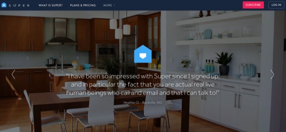
The arrows are faint and difficult to notice. They’re also used to display testimonials, which is a common choice. While this type of social proof can be impactful, when’s the last time you sought out testimonials? Case studies, maybe. Polled social media, maybe. But when’s the last time you put effort into finding testimonials on a site?
That’s what’s required here… effort. I’m willing to bet not many people are willing to put it in. Why not display all of the testimonials? Alternatively, at least make the arrows more prominent.
7. Pricing Pages
This is a common issue for SaaS sites in particular. With so many pricing plans available, horizontal scrolling seems like a viable option. Again, you run into the issue of horizontal scrolling feeling unnatural and being unexpected. Most people aren’t looking for horizontal scrolling, so it’s easy to miss.
Example: SendinBlue
If you send 9-120K emails per month, SendinBlue has four different pricing plans for you to choose from…
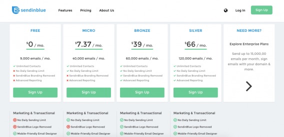
They do quite clearly mark the horizontal scroll arrow here. So, you know that if you need to send more emails per month, you can click it to see additional pricing plans…
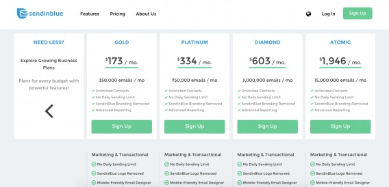
By placing the arrow in a pricing plan box, SendinBlue makes the horizontal scrolling option pop. Due to the fact that there are only two options, it doesn’t feel like a lot of effort.
8. Personal Portfolios
Personal portfolios are a place for designers and photographers to show off their creativity. Often, this involves “breaking the mold” and horizontal scrolling. Creativity at the expense of usability is, well, expensive. [Tweet It!]
Example: Dean Oakley
Here’s Dean Oakley’s designer / developer portfolio page…
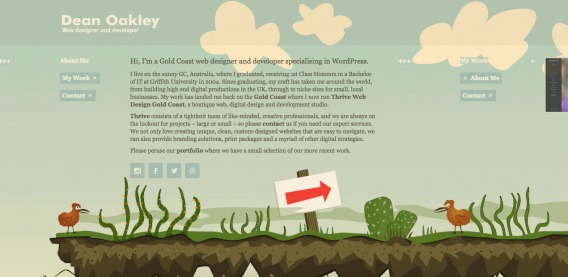
You can’t scroll up or down. I tried to scroll horizontally by clicking the cut-off image to the right. Instead, I was taken to a new page. Then, I noticed “My Work” and “Contact” buttons. So, I clicked “My Work” and was automatically scrolled to that section.
I then clicked over once and was taken to more examples of his work…
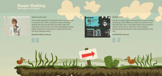
The option to get to “Contact” is gone. To get back to the main screen, I need to scroll, click by click, back to it. And Dean has about a dozen items in his portfolio, so it’s quite a bit of effort.
It’s a clever idea, but UX takes a hard hit.
9. Failure to Conduct QA
According to Conversion Rate Experts, horizontal logical ends often occur because marketers fail to conduct quality assurance…
Horizontal scrolling doesn’t come naturally to most web users. It normally becomes an issue when the users’ browser windows are narrower than the width for which the website was designed. One way to get around this is to design for small screen resolutions. Another is to separate your content from your layout, so you can use different style sheets for different devices, or use a liquid layout that automatically adjusts to the browser width.
Be sure to view your site using multiple devices, browsers and resolutions. Here’s a simple process to get you started…
- Check Google Analytics for “low hanging fruit”. What are some popular devices / browsers / resolutions that have surprisingly low conversion rates?
- Conduct heuristic analysis to identify issues visitors using those devices / browsers / resolutions might be experiencing. Is horizontal scrolling an obvious option?
- Conduct user testing if you’re unable to identify issues.
- Now, go through all other browsers and devices. Just because you don’t use ancient versions of IE doesn’t mean none of your visitors do.
Perhaps that right arrow looks visible to you, but not to 5% of your visitors using a smaller screen. Conducting quality assurance ensures you don’t run into these types of issues.
For heuristic analysis, you can use the Chrome Inspect Element process described in Is Above the Fold Really That Important?.
How to Encourage Continuation on Your Site
Start by assessing your current scroll landscape with a scroll heatmap (you can use a dedicated tool or even Google Tag Manager). Ask yourself…
- Where does scrolling tend to stop?
- What content block is there?
- Does it come across as a logical end?
- Why?
- What can I do to fix it?
- Are visitors scrolling horizontally at all?
- Are they trying to?
- Are they clicking the horizontal scroll buttons? On carousels?
Now that you know what you’re working with, you can begin to optimize.
1. Use Strong Directional Cues
Directional cues are fairly common. You might see an arrow or a “Read More” on a home page every so often. Unfortunately, not all directional cues are created equal. Using directional cues is not enough… you have to use strong directional cues.
Take a look at this example from Nielsen Norman Group…
The two horizontal scrolling buttons are almost completely ignored, despite the fact that they are clearly marked.
A strong directional cue is contextual and answers the following questions for your visitors…
- Is there content below or beside this point?
- Will that content be interesting / valuable to me?
- How long can I expect to scroll for?
Good Example: Exploding Kittens
Here’s the Exploding Kittens home page…
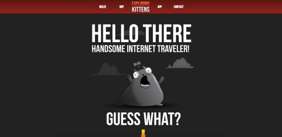
You see the start of an arrow there, right? Here’s the rest of the page…
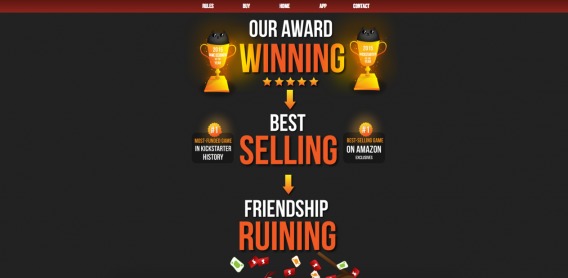
This is the strongest example of directional cues that I’ve ever ever come across. Your attention is focused, your expectations are set and you’re ushered from one statement to the next.
Well done, Exploding Kittens.
2. Be Aware of UX Prototypes
UX prototypes are everywhere. When’s the last time you visited an eCommerce site and the cart wasn’t in the top right-hand corner? Would you not assume that to like something in a mobile app, you double tap?
It’s your responsibility to identify the prototypes at work in your industry (e.g. SaaS, agency, eCommerce, etc.) and on your medium (e.g. mobile site, desktop site, mobile app). From there, do your best to fit those prototypes.
If you don’t, you’re going to create UX issues. Your site should function the way your visitors expect it to function. If you stray too far from those prototypes you identified, you’ll end up creating logical end after logical end.
Bad Example: A vue d’air
Here’s the home page…
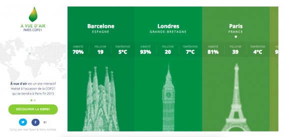
You can’t scroll up, down, left or right. Since one location appears to be cut off, I try to click it. Nothing happens. Eventually, I realize that I have to put my cursor over the green area and then scroll.
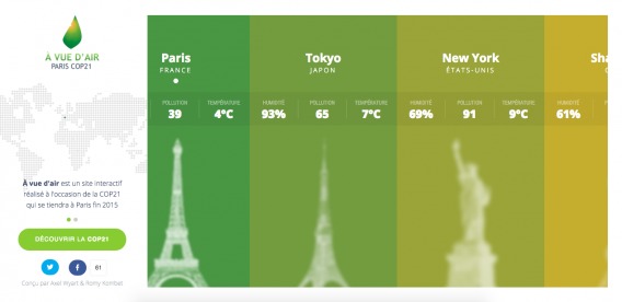
After originally finding this example, I returned to the site 12 hours later. I was just as confused about how to scroll as I was 12 hours earlier. That’s what happens when you assume your visitors will quickly pick up on something that is not prototypical.
Good Example: Snapchat
In contrast, here’s a Snapchat story from a media outlet…

Since it’s Snapchat, I know that I can tap to see the next item. The context and prototype make the UX simple, even without directional cues. What I don’t know as a Snapchat user is how to read the article itself, which is why the word “READ” appears under an up arrow.
When I swipe up, I get this…
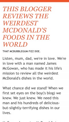
The more aware you are of prototypes, the more intuitive you can make your UX and the fewer logical ends you’ll accidentally create.
3. Try Using the Cut-Off Look
If you use Netflix or iTunes, you’re familiar with the “cut-off look”. Essentially, an item appears half cut-off to indicate that the need for scrolling.
According to Conversion Rate Experts, this plays on innate intuition…
If a page element is clearly straddling the fold, users will intuitively understand that the page continues below the fold. A simple way to remove all horizontals is to have page elements in each column end at different heights on the page. That way, at least one page element will straddle the fold, regardless of the user’s computer settings.
Ideally, the page elements that straddle the fold should be ones that have a well-known form, so it’s obvious when they are incomplete.
Good Example: iTunes
Take a look at how iTunes does it…
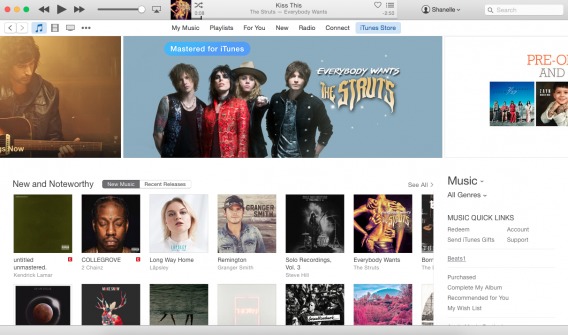
You’ll see that the album covers below “New and Noteworthy” are cut-off. So are the banners to the left and right of the banner advertising The Struts.
Because they’re all clearly incomplete, it’s obvious that horizontal scrolling is required.
4. Develop a Pattern / Rhythm
According to GoodUI, the key is to develop and maintain a pattern / rhythm…
A false bottom is a conversion killer. Yes, scrolling long pages are great, but be careful of giving your visitors a sense that the page has come to an end somewhere in between sections where it really hasn’t. If your pages will scroll, try to establish a visual pattern or rhythm that the user can learn and rely on to read further down.
You can create a rhythm by repeating heading and content formats, including icons or arrows, alternating the background colors of content blocks, using numbers, alternating the alignment of images, etc.
This is all about setting expectations. The better your rhythm, the better your visitors can predict whether there is more content below or beside.
Example: Funnel
Look at the consistency Funnel uses here…
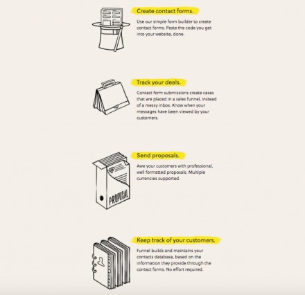
Icon, heading highlighted in yellow, 3-4 line description. Repeat.
That same pattern extends down the page until the footer, which is wider.
Conclusion
False bottoms are as prevalent as they were 10 years ago. Despite popular belief, false bottoms are not only relevant above the fold. In fact, they’re no longer only relevant vertical, either.
Here’s how you can avoid creating logical ends…
- Assess how your visitors are currently scrolling and clicking using a heatmap tool.
- If you have a huge hero shot, add a strong directional cue to bring visitors down the page.
- Assess your white space around content blocks. Is there so much that someone could assume they’ve reached the end of the page?
- Do you have any “familiar conclusions” like ads, calls to action, article recommendations, etc. in the middle of the page? Remove them.
- If you have a carousel or slider, make sure it’s easily recognized for what it is and limit the amount of physical effort required to use it. Alternatively, remove it completely.
- Conduct QA to ensure your site appears the way it should in every device / browser / resolution.
- Be aware of UX prototypes. Identify those relevant to you and do your best to fit them.
- If horizontal scrolling is an option, try using a cut-off image vs. a directional arrow.
- Develop a visual pattern / rhythm to set expectations.





CXL ppl test your #scrollup arrow around the middle of the page. (Center, Right) Around 40-60% .
When scrolling, my mouse is near the center of the page. Would make an interesting case study…
Cheers!
On mobile, mid-page would obstruct actively read content.
On spacious device categories, for mid-page position, I’m thinking the chances are high for too much of a distraction, constantly poking the reader in the eye.
Try to figure out how scrolling on this website works: http://www.lot.com/inspirations/
Wow. Really good find, Pawel. Thanks for sharing the example.
What’s interesting is that with this site, I assume there is more and there isn’t. Reverse logical end, hah.
Nice thorough piece here Shanelle, appreciated. Most of my clients are savvy enough to avoid horizontal scrolling on desktop, but they often encounter it on mobile. Worse, they don’t do thorough enough QA, so they didn’t know about the scroll until I told them!
Thanks Chris! I totally agree. One of the biggest issues here is definitely a lack of QA. It’ll be especially important as horizontal scrolling eventually successfully moves to desktop, which I think it will.
Shanelle,
This article is very well structured congrats. It is engaging and I didn’t have a false bottom issue, even reading on my iPad. I think this is the point. If you are engaged you are motivated to look for more. My team and I are working on predictive storytelling to push content to to users. We don’t envision a no-scroll future for UX, but a much more limited use. I think that emerging UIs based on VR and voice will ask for less “physical” interaction.
Thanks a lot, Clavac.
Interesting. What exactly is predictive storytelling?
Speaking of brand storytelling, it means to adapt the story to customer’s context and profile. The goal is to provide users the content they are looking for instead of asking her to scroll around in search of it.
Ah, ok. So, essentially content personalization?
Content personalization can be a good alternative definition, depending on how we define content. In our vision a story is actually a dynamic sequence of events generated by interactions of a user and a digital property (I.e. A user visiting a website). Each event being a combination of content, entertainment features and social media interactions. In this context the content personalization is the specific sequence generated for a given user visiting the website.
Ah, ok. Interesting. Well, thanks for the explanation and for reading! Appreciated.
Great article, thank you! False bottoms and autoscroll also have accessibility issues. One major issue is that a keyboard user can’t reach the page footer. For more, see: http://www.webaxe.org/infinite-scrolling-and-accessibility/
Thanks guys. I’ll check it out.