This post will make you money. It will teach you about conversion optimization – how exactly to do it, based on all the best research and experiments.
Why do conversion optimization? It is the cheapest, quickest way to increase sales online – and it demonstrates a clear ROI.
Think about this: if you’re currently converting at 1% (1% of your visitors buy your stuff), but can increase that to a mere 2%, you’ve doubled your sales.
Conversion optimization is about growth. Most companies are not happy with their online conversion rate, says Econsultancy. Companies who were happy with their conversion rates did on average 40% more tests than those companies who were dissatisfied.
Table of contents
Why don’t you test?
3 likely reasons:
- You don’t really know what conversion optimization is or how to do it
- You think it’s too complicated
- You figure it takes too much time
It’s not that complicated nor that time-consuming. Your business exists to make money, and conversion optimization makes your business more money. If that’s not worth your time, I’m not really sure you’ve got your priorities straight.
How do you know if your conversion rate is high enough?
It depends. It depends on what action you want people to take, how much your product costs, where the people are coming from and so on.
Send spam to 100,000 people with your offer and you conversion rate will be 0%. Send an email to your in-house email list that has been nurtured for years, and you might sell to more than 10%.
The average conversion rate for purchases is commonly believed to be 2%, but don’t get stuck on that. If you’re doing more than 2%, it doesn’t mean you’ve reached Nirvana and should stop optimizing. A good conversion rate is the one that’s better than your current one!
Note: Bear in mind that overwhelming majority of people will NOT buy anything on their first visit to your site. Hence, no need to hard sell to everybody right away. Instead “sell” them the idea of coming back – ask them to join your email list, subscribe to your rss feed, follow you in Twitter and so on.
A quick refresher on testing methods
Create multiple versions of a web page (such as home page, product page, landing page, etc) or even a part of a web page (such as headline wording, call to action button size, email capture box location etc) and see which version converts better – which version gets more people to do what you want them to do.
Customers often behave unexpectedly. This is one reason we need to test. The second reason is that you are not your customer, hence thinking customers use your site like you do will leave you in the dark.
You don’t know what works until you test it.
A/B testing
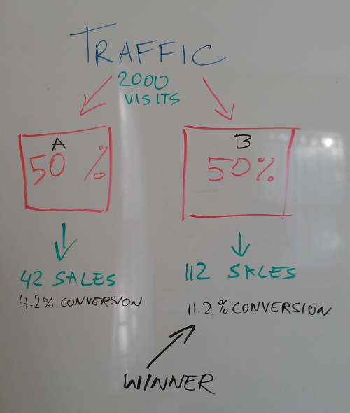
There are 2 ways to test. A/B testing (or ‘split testing’) is when you create two versions of a page (page A and page B). 50% of the traffic is showed page A, and the other 50% is taken to page B. This division is done automatically by software (see the end of the article).
If a user lands on page A, a cookie is placed on her computer, so that when she comes back later, she will always see version A. This ensures that people won’t really notice that you’re conducting any testing on your website.
Technically you could also do A/B/C/D etc testing, but the more versions you test at the same time, the more time it takes for you to know which one is the best. You need statistical significance. There’s a significance calculator spreadsheet in Excel you can use.
Google recommends at least 100 conversions per page before deciding which version is best. The exact amount actually needed is a matter of debate. I say sometimes 25 conversions is enough to spot a winner (exact conversion rate requires more time).
If you test more than two pages against each other, it will take you much more time to find the winner. Speed of testing is also important, so I say skip the Cs and Ds.
Multivariate testing
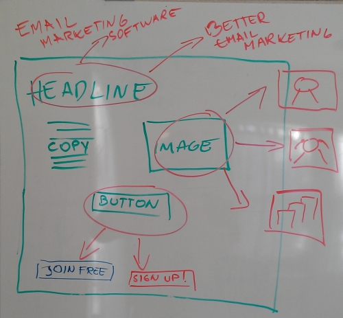
Multivariate testing enables you to test more than 2 combinations at the same time, and the combination of different combinations. Let me explain.
Let’s say you’re testing 2 versions of a headline, 2 versions of a call to action text on a button and 3 different images of the page at the same time (as on the picture above).
So the winning combination could be:
- headline 1, button 2, image 1
- headline 2, button 1, image 3
- headline 1, button 1, image 2
… etc etc. Lots of possibilities, and you’d need a lot of traffic to find the winning combination.
Only do this if you have a ton of traffic. Low modest traffic websites should stick to A/B testing.
Structured approach to optimization
According to the conversion optimization report, companies that have a structured approach to conversion are twice as likely to have seen a large increase in sales. So don’t just throw spaghetti on the wall and see what sticks, but have a “structured approach”.
Let’s go over some frameworks you can use for your conversion optimization.
Invesp Conversion Framework
Invesp has 8 principles in their conversion framework.
- Build buyer personas and focus on a few select personas when designing your layout, writing copy and so on.
- Build user confidence, make them trust you by using all kinds of trust elements.
- Engagement. Entice visitors to spend a longer time, come back to visit, bookmark it, and/or refer others to it.
- Understand the impact of buying stages. Not everybody will buy something on their first visit, so build appropriate sales funnels and capture leads instead, and sell them later.
- Deal with fears, uncertainties and doubts (FUDs). Address users concerns, hesitations, doubts.
- Calm their concerns. Incentives are a great way to counter FUDs and relieve friction.
- Test, Test, Test.
- Implement in an iterative manner. Build smaller blocks, make smaller changes, and test them and improve their performance.
C = 4m + 3v + 2(i-f) – 2a
This is not a lesson in physics, but a conversion formula developed by Marketing Experiments.
Luckily you don’t need to solve the formula above, it’s actually a helpful tool to keep at arms length (like print it out and stick on your cubicle office wall). This is what the characters mean:
C = Probability of conversion
m = Motivation of user (when)
v = Clarity of the value proposition (why)
i = Incentive to take action
f = Friction elements of process
a = Anxiety about entering information
Translation: The probability of conversion depends on the match between the offer and visitor motivation + the clarity of the value proposition + (incentives to take action now – friction) – anxiety. The numbers next to characters signify the importance of it.
Friction is defined as a psychological resistance to a given element in the sales or sign-up process. Anxiety is a psychological concern stimulated by a given element in the sales or sign-up process. Reduce these as much as possible and do what you can to increase the users’ motivation and incentive and clarify the value position.
Michael Aagaard’s 6 Step CRO Process
Michael Aagaard from Unbounce has a succinct 6 step framework to optimize websites:
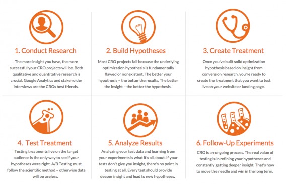
#1) Conduct Research
The more insight you have, the more successful your optimization attempts will be. This includes qualitative research from surveys and user testing, as well as quantitative analysis from your analytics setup.
#2) Build Hypotheses
The better the hypothesis, the better the results. Good hypotheses give your testing program direction, and allow for increased learnings no matter the results.
#3) Create Treatment
Based on your insights and driven by your hypothesis, design treatments to test against your current page.
#4) Test Treatment
This is where you actually run the A/B test, applying a solid foundation of statistical knowledge to make sure your data is accurate.
#5) Analyze Results
Analyzing your test data and learning from your experiments is what it’s all about. Every test should provide deeper insight and lead to new hypotheses.
#6) Follow-up Experiments
Conversion optimization is a continuous, iterative process. That’s how you make real gains and attain substantial growth.
LIFT Model
An interesting framework for analyzing landing pages is LIFT, developed by WiderFunnel:

This framework has value proposition as vehicle that provides the potential for the conversion rate. It’s the basis of it all. Relevance and clarity boost conversions, while anxiety and distraction kill it. Urgency is what propels people to take action right away.
Ingredients of a successful test
Not all tests are equal. Here’s what you need for successful conversion testing:
- A hypothesis: testing is not there to prove an idea works, but to assess whether it works.
- Don’t test your site by showing a different version at different time periods (e.g. one week one design, second week another design), the results will NOT be accurate.
- Don’t be afraid to fail: In testing & optimization, failure is success. Too many times, I have seen the uglier, poorer cousins convert better
- If you don’t have huge amounts of traffic, don’t test too many variations at once. Also, if you do A/B testing, it’s worth testing one change at a time – otherwise you won’t know which thing made the difference.
- Don’t end the test too soon, make sure results are statistically significant.
- Avoid “meek tweaking”—in other words, making changes that are never likely to have a significant effect.(See below)
- Testing should never end. Decide what to test, test it, make a change and test again.
What are the most important things to test?
We could test everything, but let’s test the 20% that makes 80% of the difference.
Now let’s look at each area separately. I’ll showcase some cool recent experiments you can learn from.
Value Proposition
Value proposition is the main reason a prospect should buy from you.
(If you’re struggling with yours, here’s a worksheet (pdf) to guide you through the process of effectively communicating your value proposition.)
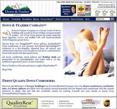
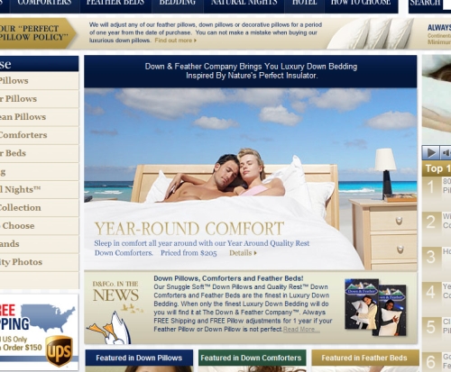
Can you find a value proposition here?
Didn’t think so. Stating your company name as the first thing and throwing around superlatives like “finest quality” don’t convince much.
What about here?
This makeover version brought 145% increase in conversions.
Marketing Experiments recommends you test your value proposition via PPC ads first, and only then test the winning versions on your landing page:
Images from Marketing Experiments
Headline
“On the average, five times as many people read the headline as read the body copy. It follows that unless your headline sells your product, you have wasted 90 percent of your money. The headlines which work best are those which promise the reader a benefit.”
– David Ogilvy, ad guru
A good headline can make the difference. It’s kind of nice when just changing the wording of your headline increases your results by 127%.
A headline is the first thing a visitors sees and reads on your website or landing page. It’s the very first thing you say about you. If you start out with “Welcome!”, you’ve already lost.
If the visitor came through a paid ad, the landing page headline should reinforce the message from the ad; utilize persuasive momentum.
If you’re split testing article headlines or email subject lines, remember the 65 character rule. Google only displays 65 characters in its search results, email clients such as Gmail will truncate long subject lines and Twitter doesn’t allow too much for tweeting your headline.
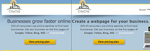
CityCliq: 88.9% improvement
The winning headline is the one on the right.
Offer
A confused mind always says ‘no’, goes the old direct marketing adage.
The offer is the deal you’re presenting to your visitor. Make it clear and concise, nobody will try hard to understand what is it that you’re offering.
NB! Offer is not a “call to action,” that comes later.
Call to Action buttons
The most important part about CTA buttons is that they’re clearly visible, above the fold and there’s ideally just one per page. The more choice you give, the harder it is to decide.
People’s attention span is limited. They don’t want to figure out what buttons that say “submit” actually do. Buttons without the word ‘submit’ convert better, tests show. Steve Krug was right: “don’t make me think.”
The word ‘free’ on the other hand seems to be quite magical. For instance Firefox improved their conversions by 3.6% (over 500 more downloads per test) when they changed their button text from “Try Firefox 3″ to “Download Now – Free.”
What about the color of the button? Big orange buttons are all the rage these days (think Amazon), but there are still some other colors in the world. In this test red kicked greens butt and converted 21% better (orange was not tested):
Image: Hubspot
Larger sized buttons usually do better. Hubspot found that a good button size is around 225px wide and 45px high.
Oh yeah, never ever have a “reset fields” button. Nobody fills a form to clear the field in the end. If they do, they won’t bother to start over.
Friction
Whenever there’s somebody asking for a sale, there’s friction! Reducing friction produces a disproportionately high return on invested effort.
Friction consists of two components:
Length: fatigue, irritation, or aggravation caused by forms or processes that ask for more time or information than feels reasonable)
and
Difficulty: poor usability, asking questions people don’t know the answers to, insufficient product information etc).
Absence of trust is also friction – a visitor will not convert if he doesn’t have confidence or trust in you.
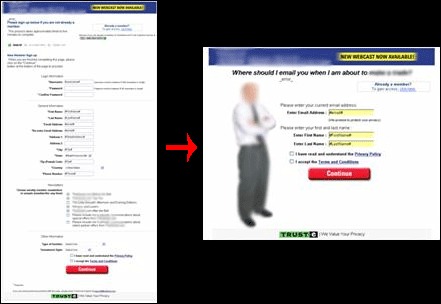
MarketingExperiments brings this case study. The original page with 3 calls to action:
This was the treatment:
The optimized form requires only one choice, and the call-to-action is simply a “Confirmation,” thereby minimizing difficulty-oriented friction.
By including the offer price on the landing page (which also removed one page in the order process) and minimizing friction by reducing the level of decision making difficulty on the order form, free-trial-signup conversion rose by 65%.
Simply reducing the number of fields and dramatically reducing the perceived page length through layout increased overall conversion by 77%.
Here are some things that reduce friction:
- Testimonials and/or customer reviews,
- Case studies of previous customers,
- Third-party references such as media mentions or reviews,
- Easy to find company contact info, employee photos and bios,
- Trust marks that communicate your site is secure and confidential data is handled with care,
- Short forms (whenever you add an input field to your form, ask yourself, “Is this additional information worth losing sales?”),
- Clarity: focus on what the user gets and needs to do to get it,
- Distraction removal: the offer page doesn’t contain anything not related to converting the user,
- Use language that is familiar to your target audience – avoid jargon and corporate speak,
- Guarantee: offer a guarantee on their purchase such as a 90-day risk-free trial; 100% money-back guarantee; or a 100% satisfaction guarantee,
- Beautiful design: websites that are more attractive create a greater feeling of trustworthiness and professionalism in consumers.
Stanford Persuasive Technology Lab’s web credibility guidelines is a must-read for all.
Price
The right pricing can really help you boost your conversions.
Read our article on pricing experiments.
Radical change
This is when you go beyond testing one element to create an all together new and different version.
Great examples (click on the links of each case study to read the specifics):
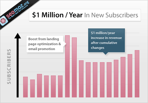
SEOMoz: 52% improvement in sales and $1 million dollars increase in revenue
Image: Conversion Rate Experts
How they did it:
- created a web page long enough to tell the story
- infused the headline with curiosity rather than overt “buy me” language
- explained precisely what customers would get at each level (plan)
- showcased things customers cared about but SEOmoz had taken for granted
- augmented the message with video
- lowered the risk by offering free subscribers a 30-day full-featured membership for just $1
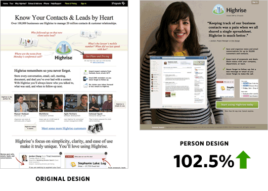
Highrise: 2 radical changes, 37.5% and 102.5% improvement in conversions
What they learned:
- You really need to test: A long form page had a 37.5% increase in net signups compared to the original. A person design converted better than the original. Then they added more info under the person design page, and it converted worse.
- Big photos of smiling customers work (but specific person didn’t quite matter)
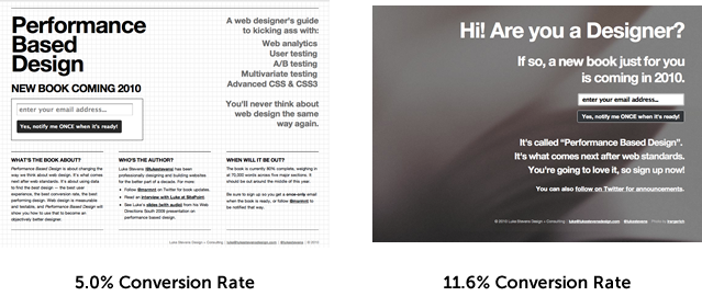
Performance Based Design book: 131.2% improvement on landing page
What they learned:
- Engaging visitors through appropriate copy improved sign ups by 100%+
- Sometimes you can overthink. The winning design was thrown together very, very quickly, yet outperformed the more formally ‘designed’ landing page with more than double the conversions.
Conversion optimization tools
There are quite a lot of tools available. I’m going to skip expensive enterprise tools and list some of my favorites that are easy to use and easy on the wallet.
- Google Content Experiments – The best part of Content Experiments is that it’s free. They also run bandit algorithms, which is unique. Cons: Split URL testing only. No code editor. No visual editor.
- Visual Website Optimizer and Optimizely. Great services for entrepreneurs – both easy to use. Here’s how they compare to each other.
- ChangeAgain.Me provides a visual interface to Google Experiments for A/B Testing.A good solution for those companies that already have Google Analytics and want to try split testing.
- Marketizator is another new player in the testing tool market. They position themselves as a sort of all in one optimization tool: pop-ups, on-page surveys, A/B testing, personalization, segmentation.
What worked for them, won’t necessarily work for you
Just because something worked on somebody’s site, doesn’t mean it will work on yours. For instance take this case where reducing the size of call to action and removing urgency elements actually increased the conversion rate.
No website is the same and no users are the same. The trick is to understand your users and target them in the most appropriate manner. Customers are influenced by a range of activities before they convert; website content, website usability, on and offline advertising all play a role in whether or not the consumer will make a purchase. You have to test.
Excellent libraries of case studies
There are several good conversion optimization case study resources.
- MarketingExperiments blog has a ton of case studies. Not all of the posts in the link are case studies, but a lot of them are.
- Visual Website Optimizer has a user-friendly database of case studies. Free.
- Optimizely also has a growing body of informative case studies.
- WiderFunnel case studies. 30 or so.
Do you have an experience with Conversion testing to share?
Thanks for reading.
Image credit for the top image.







I would like to know where I could learn, Conversion Optimization for Websites?
Thanks Paul
If you have a low traffic website, how many conversions do you need BEFORE you start conversion optimization? How many do you need prior to testing in order to actually get statistically significant results once you do start testing? Thanks in advance..
@Paul – There’s no better place to start then this one!
This is a pretty good collection of tips, though it is a bit long. Perhaps a top X tips conversion optimization article would do well. ;-)
Hi,
Nice article! I tried this link, but it i gives a 404: “significance calculator spreadsheet in Excel” https://vwo.com/split-testing-blog/ab-testing-significance-calculator-spreadsheet-in-excel/
Is there a new calculator? What I find strange is that all calculators are based on just orders. But if you have 5% less orders, but 20% higher average order value it can be still be positive.
What is your opinion about this?
Thanks.
Tom