Netflix began in 1997 as a DVD-rental business and evolved into one of the largest streaming platforms in the world.
Its interface has changed significantly since then. Netflix introduced its first major TV redesign in more than a decade in 2025, followed by a redesigned mobile experience that rolled out globally in 2026. But the core UX priorities remain consistent: reduce friction, make content easier to discover, personalize what users see, and shorten the distance between browsing and watching.
Those principles show up throughout Netflix’s signup flow, recommendations, profiles, content discovery, playback experience, and retention strategy.
Let’s break down all the elements of Netflix’s UI design and user experience (UX).
TL;DR
- Netflix reduces friction by making the next action obvious, from signup to starting or resuming content.
- Personalization affects recommendations, ranking, rows, artwork, and other parts of the viewing experience.
- Profiles give different household members separate recommendations, ratings, viewing histories, and settings.
- Netflix uses prominent content placement, previews, and contextual information to reduce the effort required to choose something to watch.
- Its TV and mobile interfaces have changed, but the underlying UX principles of discovery, personalization, and reduced friction remain.
- The broader lesson is to make important actions obvious, reduce unnecessary decisions, and use personalization to make complex choices easier.
Table of contents
How does Netflix’s user journey keep new users engaged?
Netflix reduces the number of decisions between arriving on the site, creating an account, and starting to watch. Clear CTAs, repeated value cues, manageable signup steps, and personalized recommendations keep the journey moving forward.
Unlike other platforms, where the “wow” comes after inputting your credit card information, Netflix reels in new users right from their homepage. The design and copy are minimal, with one goal—signups.
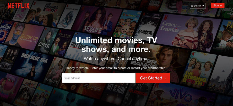
The homepage uses a clear visual hierarchy and keeps the primary action obvious: enter an email address and get started.
Their unique selling proposition also explicitly describes the biggest benefits and preempts two common FAQs: “Unlimited movies, TV shows, and more. Watch anywhere. Cancel anytime.”
The goal is obvious, the ask is clear, the task is simple.
Together, the USP and UI makeup a value proposition that is optimized for conversions. They are incredibly specific about what they do, include relevant images in the background that support the “unlimited” claim, and feature a value prop booster (i.e. “cancel any time”).
Other elements below the fold that add value include:
- Mention of the numerous platforms Netflix is compatible with, such as game consoles and connected TV devices
- An example of how to download streaming content to watch offline, as well as the ability to stream unlimited movies across all devices
- The provision of child-friendly programming options
- A Frequently Asked Questions (FAQ) section placed directly above a second opt-in form
Here, Netflix has chosen to emphasize its flexibility. Their homepage isn’t offensively long. They use minimal copy to communicate their offering, features, benefits, and FAQs to combat obstacles and sway hesitant buyers.
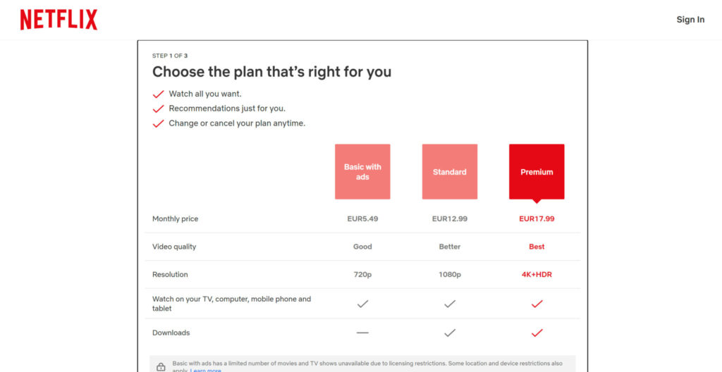
The signup flow shown here breaks account creation into a short sequence of clearly defined steps, reducing uncertainty about how much effort remains.
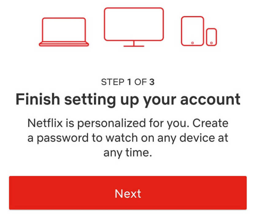
The expectancy-value theory postulates that if the expectation of completing a task is high, and the subjective value is also high, people will be more motivated to follow through. In other words, motivation = expectancy x value. If either one of these factors is missing, motivation easily disintegrates.
By centering “Step 1 of 3”, it dictates that the task will take a short amount of time, thus increasing expectancy. By this stage, the value should already be high (given their strong value proposition, USP, and UX).
On the second screen, they ask you to choose a plan. They again answer the biggest objection upfront to combat hesitancy: “No commitments, cancel anytime.”
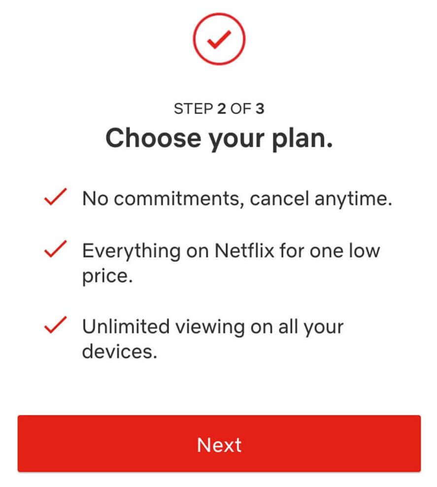
Then, you choose your plan. They follow the rule of three when listing out their plans to keep benefits compact and engaging.
This reduces overwhelm and provides ample opportunity to opt out. They list their core benefits again to remind the user why they clicked the signup button in the first place (this works to keep the subjective value high).
Once a user has created an account, Netflix prompts them to choose a few movies or TV titles they enjoy. This data is then used as inputs in the Netflix algorithm to “jump-start” personalized recommendations (more on personalization based on their algorithm in a moment).
Netflix’s signup flow now varies by device. On many TVs and streaming devices, users begin by entering an email address or phone number and continue the process through an activation link. The broader UX principle remains the same: make each stage clear and keep the next action obvious.
Post-signup, the first thing you see is an auto-playing video trailer from one of their original productions that is similar to the preferences selected during onboarding.
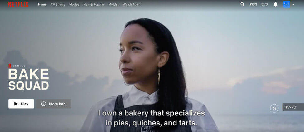
The primary CTA is to press “Play” to interact with the platform straight away. Akin to “frustration-free” packaging, a prominent play button motivates engagement and works to keep users on the platform longer.
Once watching commences, their behavior supersedes initial preferences as their algorithm continuously populates the homepage with newly relevant media.
Netflix lets users rate titles as “Not for me,” “I like this,” or “Love this!” using thumbs-down, thumbs-up, and double-thumbs-up controls. Those ratings give the recommendation system another signal about individual preferences.
Earlier versions of the interface used a simpler thumbs-up/thumbs-down system:
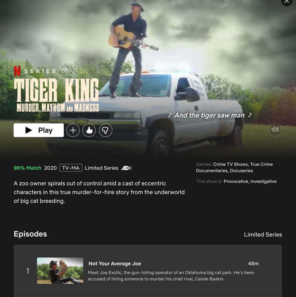
For example, when you rate thumbs up for Tiger King, Netflix will show you more true crime documentary series.
Netflix estimates the likelihood that a member will enjoy a title using signals such as:
- Viewing history
- Genre or category
- Time of day watched
- How long the user watched
- Devices used to watch Netflix
- Rating history for similar content
- Other Netflix users with similar preferences on the platform
Netflix continually updates its recommendation algorithms using signals from how members interact with the service. It also considers viewing history, ratings, similar member preferences, title attributes, time of day, preferred languages, devices, and how long a title was watched.
Netflix UX lesson #1
- Simplify the user interface. Make your CTA prominent and clear and state your most important benefits next to relevant images.
- Specify the number of steps to complete the signup to increase expectancy and boost motivation. Implement user testing to ensure your UX has minimal barriers to conversion.
- Overcome obstacles by addressing common questions in an FAQ section before your final CTA.
- Use personalization where it genuinely reduces the effort required to find something relevant.
There are ways you can implement user preferences even if your platform doesn’t use intelligent algorithms. From the beginning, Netflix asked users to state their preferences. They then delivered a customized homepage based on those answers.
How does Netflix make onboarding work across devices?
Netflix keeps the account and profile experience consistent across devices while adapting signup and navigation to each platform.
Netflix’s sign-up process can be completed on many digital devices, including:
- Android phones and tablets
- Computers
- iPhone and iPad
- Smart TVs and TV streaming devices
After registering, a user will be brought to a home screen. They can add a profile by clicking on a simple plus sign icon—another example of efficient UI design.
From here, users can create up to five profiles on a single account, with separate recommendations, ratings, viewing activity, language preferences, maturity settings, and other profile-level controls.
Netflix accounts are now intended for people living in the same household. People outside the household need their own account or, where available, an extra-member account.
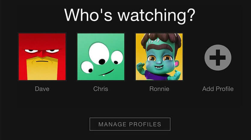
To complete the onboarding process, they can customize the type of streaming material they’ll see, including:
- Profile lock
- Maturity level
- Playback settings
- Viewing activity log
- Subtitle appearance
- Language preference
- Specific viewing restrictions
- Personalized TV show and movie suggestions
Netflix exposes important personalization choices through profiles and onboarding rather than relying entirely on account-level settings.
This allows the user to feel like they’re tailoring a unique experience from the beginning (keeping subjective value high).
Netflix UX lesson #2:
- Another nod to simplification—streamline your onboarding and login screen. Include only the most necessary buttons and copy, and where possible, exchange text for universally understood symbols.
- Give your users the ability to customize their experience. You may already have opportunities to do this in your settings, such as setting language or notification preferences.
- Let users know about this or walk them through the preference set up in the onboarding stage.
As with the rest of their user journey, the beginning is simple, easy, and customer-focused. Once users get into the platform, they’re given an abundance of choice—starting with Netflix’s original content.
How does Netflix use original content to drive discovery?
Netflix uses original content as both a product differentiator and a discovery mechanism, giving selected titles prominent placement, personalized artwork, previews, and recommendation positions.
Netflix gives selected titles prominent placement through larger artwork, previews, ranking, and contextual information designed to help users decide what to watch.
In Netflix’s redesigned TV experience, recommendations can also update as members browse, using actions such as watching trailers or rating titles to refine what appears next.
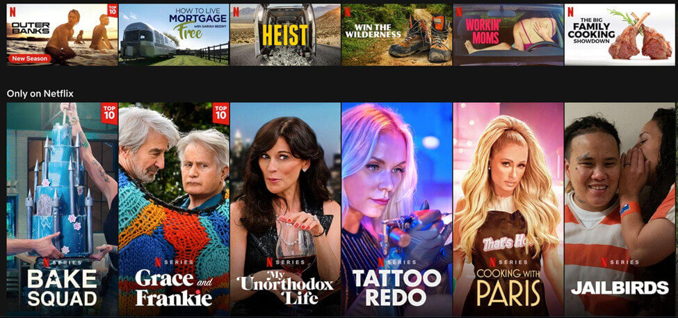
Original programming remains central to Netflix’s product. In the first half of 2026, members watched more than 97 billion hours of Netflix content, while new and returning series continued to drive large audiences and discovery of earlier seasons.
Netflix originals continue to rank among the most-watched streaming titles. Nielsen named Stranger Things the top streaming original of 2025, with 40 billion viewing minutes in the U.S., while Netflix also led several other streaming categories.
Original Netflix series such as Orange Is the New Black, Stranger Things, and Black Mirror have became some of Netflix’s best-known original series. More than 105 million users have watched at least one episode of Orange Is the New Black alone, according to an exclusive interview with ex-executive Cindy Holland.
Though the platform’s ease of use may have exploded their popularity, it’s these original productions that continue to add value to a user’s subscription.
The success of these series has bred innovative tactics that draw users deeper into the Netflix catalog. Netflix has long tested multiple artwork options for titles and personalized which representation individual members see. This tactic is referred to as “artwork personalization”.
Take a Netflix original production such as Stranger Things, for instance. If a user has expressed interest in comedies, their platform will display a lighthearted Stranger Things thumbnail with the kids dressed as Ghostbusters.
But if a user were to routinely watch crime dramas, Netflix would display a more serious thumbnail of a police officer looking over a foggy pumpkin patch.
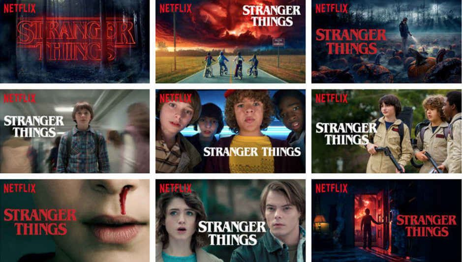
This active personalization and consideration of a user’s preferences is one reason why Netflix’s retention rate has remained so consistent over time.
How does Netflix promote content inside the product?
Netflix uses previews, prominent artwork, ranking, contextual labels, and personalized recommendations to help users evaluate titles without leaving the browsing experience.
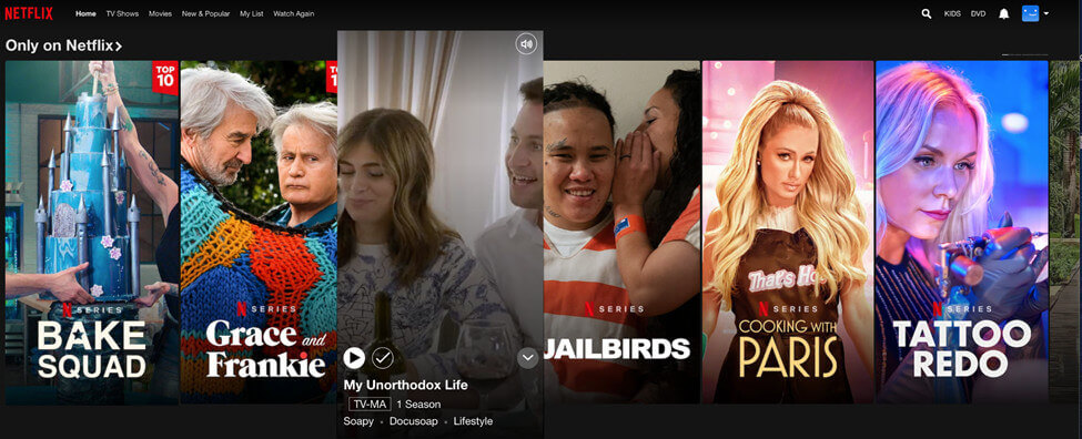
Netflix has used auto-playing previews to add motion and context while users browse titles.
In the example above, hovering over My Unorthodox Life auto-plays a video trailer about how Julia Haart went from escaping a cult to a successful New York City CEO in seven years.
This UX tactic envelops users in potential binge-watch material, providing a quick view of content that may have been skipped over without the trailer.
Netflix UX lesson #3:
- Give your high-value content pride of place. Feature it prominently, give it a badge, promote it with video, or find another way to help it stand out among the crowd.
- Continually add value to your platform. Netflix does this through its original content.
- If possible, tailor your high-value content to each segment. Netflix does this through the algorithm’s selection of content and their thumbnail design.
We’ve learned about Netflix’s simple, customer-centric user journey that gets users into the platform quickly and easily. Now let’s look at how they’ve mastered the art of keeping them there.
How does Netflix use personalization to support retention?
Netflix reduces the effort required to find something relevant by personalizing recommendations, ranking, artwork, rows, and resume states around each profile’s behavior.
Netflix itself treats engagement as closely linked to retention. In its 2025 engagement reporting, the company said that members who watch more tend to remain subscribed longer and recommend Netflix more often. That makes discovery and relevance commercially important: the easier it is to find something worth watching, the more value the service can deliver over time. About Netflix
For the users that do want to cancel, Netflix makes the process easy while still giving them opportunities to change their minds or come back at any time.
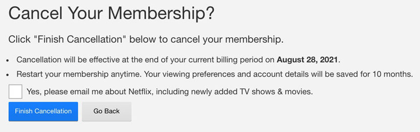
What else can we learn from the platform about how to keep users around for longer?
How does Netflix personalize the viewing experience?
Netflix personalizes which rows users see, which titles appear within them, how those titles are ranked, and how individual titles are represented.
Personalization is a major factor in why Netflix boasts such high retention rates. As we mentioned above, even thumbnail images on Netflix are customized to match exactly what each user would prefer to see.
In each row below the fold of the homepage, there are three layers of personalization:
- The choice of row, such as Continue Watching and other personalized or thematic rows
- The choice of titles within the row, such as new comedies within New Releases for users who prefer humor
- The ranking of chosen titles, such as placing a romantic comedy before a children’s comedy for users who enjoy more explicit material
In each row of recommendations, the Netflix algorithm weighs dozens of different factors (which they keep close to the chest) to present what they believe a user will want to watch at that moment.
For shows you’ve already started watching, the primary button changes from “Play” to “Resume”. It also prominently displays what episode you are on as well as episode progress.
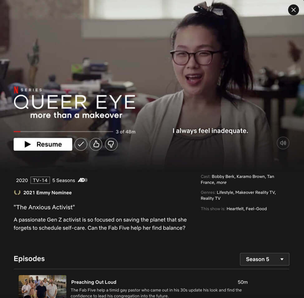
Offering so much choice may seem like a luxury held in reserve for only the most successful platforms. But leveraging this power of selection has driven their success—and the competition has cottoned on. Hulu, Amazon Prime, and Disney+ all offer ample options to choose from, too.
How does Netflix use email to encourage re-engagement?
Netflix uses email to show relevant releases, returning series, and other reasons for members to return to the service.

Netflix also runs a consistent email marketing strategy that highlights new content on the platform. They also invite stagnant users to check out the latest developments in shows they’ve previously watched to spark reengagement.
The frequency and content of these emails can vary by member, but they commonly use viewing interests and new releases to create reasons to return.
- New shows
- New movies
- New Netflix original content
- New seasons of a show a user previously watched
The example above uses a consistent visual template that carries Netflix’s branding into the inbox while keeping the featured title prominent.
Within the email, users can add shows straight to their list or get started watching.
Netflix UX lesson #4:
- Give users the opportunity to choose. Let them personalize their experience and give them as many options as you can allow.
- Make cancellation painless, but offer opportunities for users to change their minds. Netflix does this by offering to keep in touch via email (and then showing users what they’re missing regularly throughout the month).
- Remind users to return to the platform repeatedly through an engaging email marketing strategy.
Of all the streaming platforms, Netflix is the one service that continues to reign supreme, year after year. Both their cutting-edge UI and UX design and high-performing original content keep users engaged and returning.
How has Netflix’s UX changed?
Netflix has redesigned both its TV and mobile experiences around the same core objective: make discovery faster and reduce the effort required to choose something.
Netflix introduced a major new TV experience in 2025. The redesign moved key navigation into more visible positions, added more context around titles, and made recommendations respond more dynamically as members browse.
In 2026, Netflix rolled out a redesigned mobile experience globally. It introduced streamlined navigation and a vertical discovery experience designed to make it easier to move from short previews into full titles.
The interface continues to evolve, but the underlying product principles remain consistent:
- reduce the effort required to find something relevant;
- make navigation and primary actions obvious;
- use personalization to prioritize content;
- give users enough information to make a decision quickly;
- shorten the distance between discovery and playback.
What can marketers learn from Netflix’s UX design?
Netflix’s strongest UX principle is not a particular carousel, preview, or recommendation algorithm. It is the consistent reduction of friction between discovering something relevant and acting on it.
Make the primary action obvious. Reduce unnecessary steps. Give high-value content appropriate prominence. Use personalization when it genuinely helps users make a decision. Preserve progress when people return. And use behavioral signals to improve what they see next.
Netflix also shows how personalization can make a large amount of choice easier to navigate. Users do not have to evaluate every title equally because the interface helps determine what deserves attention.
You do not need Netflix’s recommendation infrastructure to apply the same principle. Start by identifying the decisions that create the most friction, then use customer data, behavior, and testing to make those decisions easier.
Frequently asked questions about Netflix UX
Why is Netflix’s UX effective?
Netflix reduces discovery friction through clear navigation, personalized recommendations, prominent content, persistent progress, and obvious actions such as Play or Resume.
How does Netflix personalize its interface?
Netflix uses viewing behavior, ratings, similar member preferences, title information, language, device, time of day, and other interaction signals to personalize recommendations.
Does Netflix personalize thumbnails?
Yes. Netflix personalizes how titles are represented as well as which titles and rows appear and how they are ranked.
How many Netflix profiles can one account have?
A Netflix account can have up to five profiles, each with its own recommendations, ratings, viewing activity, and settings.
Has Netflix redesigned its interface?
Yes. Netflix introduced a major new TV experience in 2025 and rolled out a redesigned mobile experience globally in 2026.
What can other products learn from Netflix?
Reduce unnecessary decisions, make the primary action easy to find, preserve user progress, prioritize relevant content, and use personalization to make complex choices easier.
Improve your product UX
Netflix shows how interface design, behavioral data, personalization, and continuous testing can work together to make a complex product easier to use.
Learn how customers actually use your product: CXL’s User Research course covers research methods, interviews, usability testing, and turning user evidence into better product decisions.
Understand the psychology behind better digital experiences: The Digital Psychology & Persuasion course covers attention, decision-making, motivation, and behavioral principles that influence digital experiences.
Test whether UX changes actually improve results: CXL’s CRO and Experimentation course covers research, prioritization, experimentation, and evaluating changes with evidence rather than assumptions.
Related Posts
-

Ghost buttons are transparent calls to action found on websites and apps. They tend to…
-

Don't design your own website. No, really. It will suck. You might think that since…
-
Best practices are starting points: If you have no data, start with these. They are…
-
Typography is the detail and the presentation of a story. It represents the voice of…





You’re right! Netflix has definitely created immersive usability. The #1 thing every business owner and company NEEDS to scale. If the product/service gets results – and has high usability – it’ll do exceptionally well. Great article, people underestimate the thought put into even simple campaigns done by large companies. Good stuff here!