There’s nothing that always works and pretty much nothing that never works either. Websites are highly contextual.
That being said, there are tests that tend to have a very high win rate. These are the test ideas that, while they don’t work 100% of the time, work more often than not.
Naturally, everything depends on the specific implementation — a good idea implemented poorly will not yield any results.
The following 20 testing ideas come from our own client-based research done over the years.
Table of contents
- Test idea #1: One static image with a single value proposition is better than an auto-rotating slider.
- Test idea #2: Proper value proposition beats no value proposition.
- Test idea #3: Prominent contact information
- Test idea #4: Prominent free shipping information
- Test idea #5: Prominent section for sales and specials
- Test idea #6: Emphasize wide-appeal products
- Test idea #7: Make the search bar more prominent
- Test idea #8: Add a site-wide benefits bar below the header
- Test idea #9: Level-up your product descriptions
- Test idea #10: Use product videos and test autoplay with captions
- Test idea #11: Ask for email first on checkout
- Test idea #12: Make the shopping cart persistent
- Test idea #13: Create visually prominent and clear progress indicators during checkout
- Test idea #14: Clearly address purchase uncertainties
- Test idea #15: Expand payment options
- Test idea #16: Cut form length
- Test idea #17: Don’t force people to register, add it in the backend
- Test idea #18: Display reviews more prominently
- Test idea #19: Intelligently upsell
- Idea #20: Clear, big calls to action
- Conduct user research to come up with test hypotheses
- Conclusion
Test idea #1: One static image with a single value proposition is better than an auto-rotating slider.
In general, don’t use auto-rotating sliders (aka carousels). Though there are undoubtedly examples of them working better than static images (rare as they are), for the vast majority of sites, they are a usability nightmare.
What’s wrong with using carousels?
- The human eye reacts to movement, distracting us from the important stuff.
- Too many messages equals no message. This is known as the clutter effect.
- They look like banners, which people ignore because they mistake them for ads and generally hate them (Banner blindness).
Ultimately, users crave control and autorotating carousels offer the opposite of that.
The solution?
Implement a simple, static hero image with a strong value proposition. Here’s a good example from Acquainted.
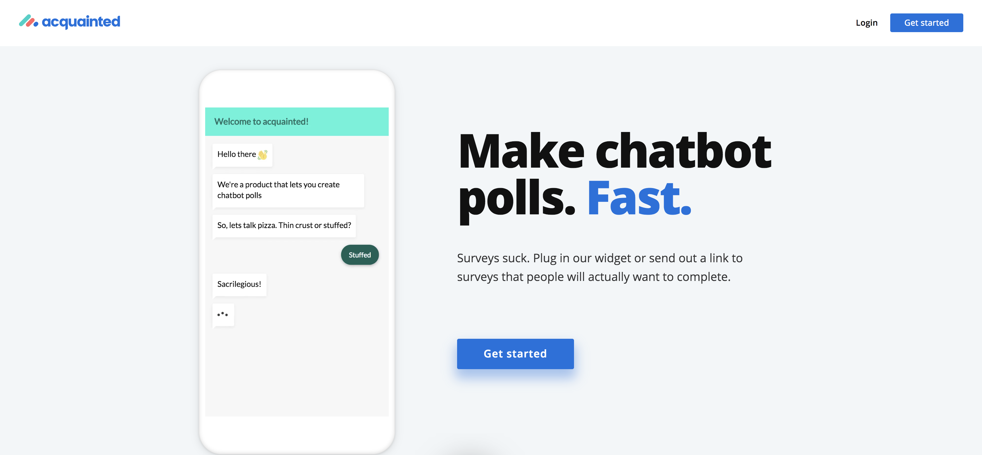
Test various images and messages that complement each other.
User quote
The constantly sliding images were very distracting, too fast and made me feel like my computer was sliding off the desk. I’d much rather see scroll arrows at each side of an image, so I can look through if I want to, and at my own pace. Also, they continued to slide around in the background when I was obviously not looking at them, because I had a menu pulled down.
Test idea #2: Proper value proposition beats no value proposition.
A value proposition is a promise of value to be delivered. It’s the primary reason a prospect should buy from you.
If you’re Amazon, you don’t need to explain yourself. Most ecommerce stores don’t have that luxury and have a large portion of visitors that have never heard of them before.
You have to present your value proposition as the first thing the visitors see on your homepage, but should be visible in all major entry points of the site (category and product pages).
What should your value propositions convey? Relevancy, quantifiable value and unique differentiation.
Here’s a good example from Podia.

If you want to know more about crafting compelling value propositions, read this.
Test idea #3: Prominent contact information
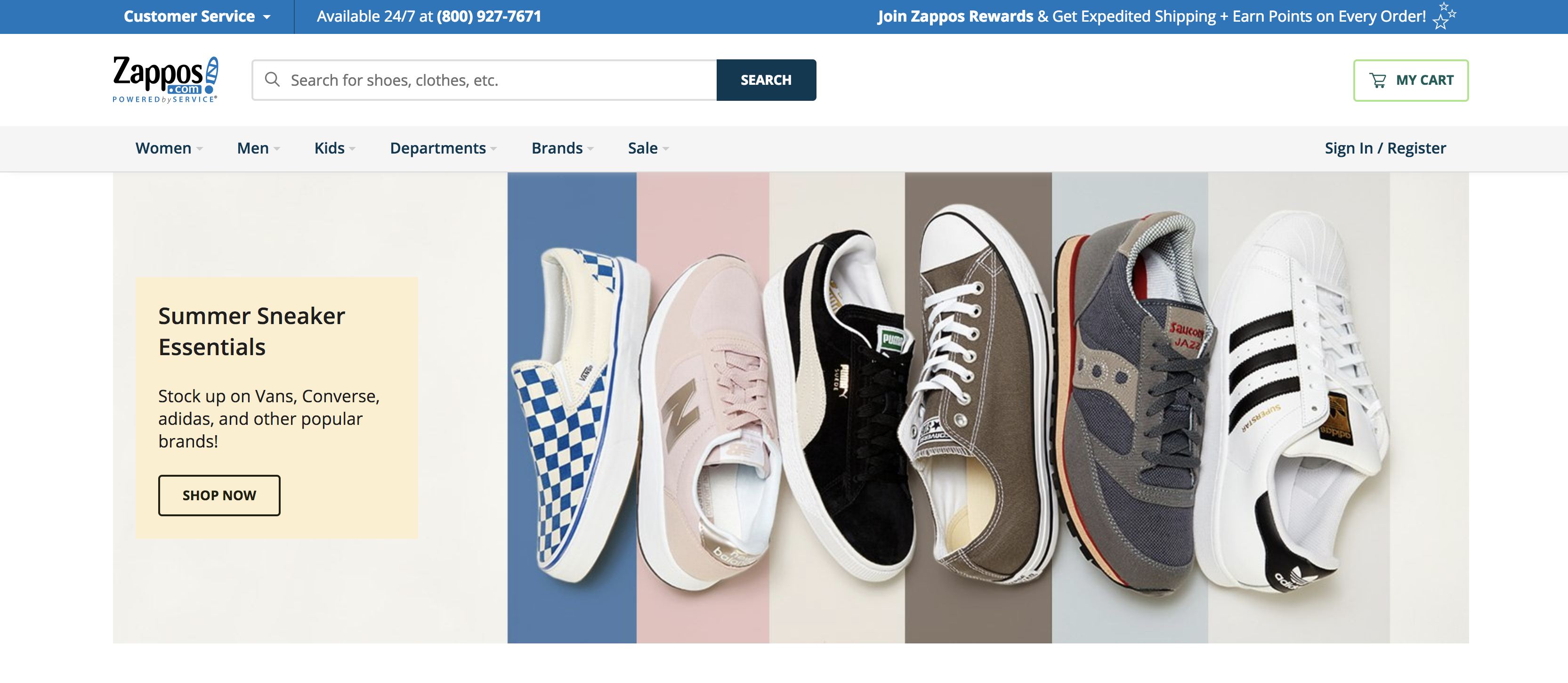
Although it seems like a small thing, putting your phone number and email address on the top of your site usually boosts conversions.
It’s a trust thing. People want to know that they can reach you. It’s a simple fix that adds a lot of value in most cases. The famous example, of course, if Zappos. Along with their fanatical customer support, they’ve always featured their number prominently on their site:
Test idea #4: Prominent free shipping information
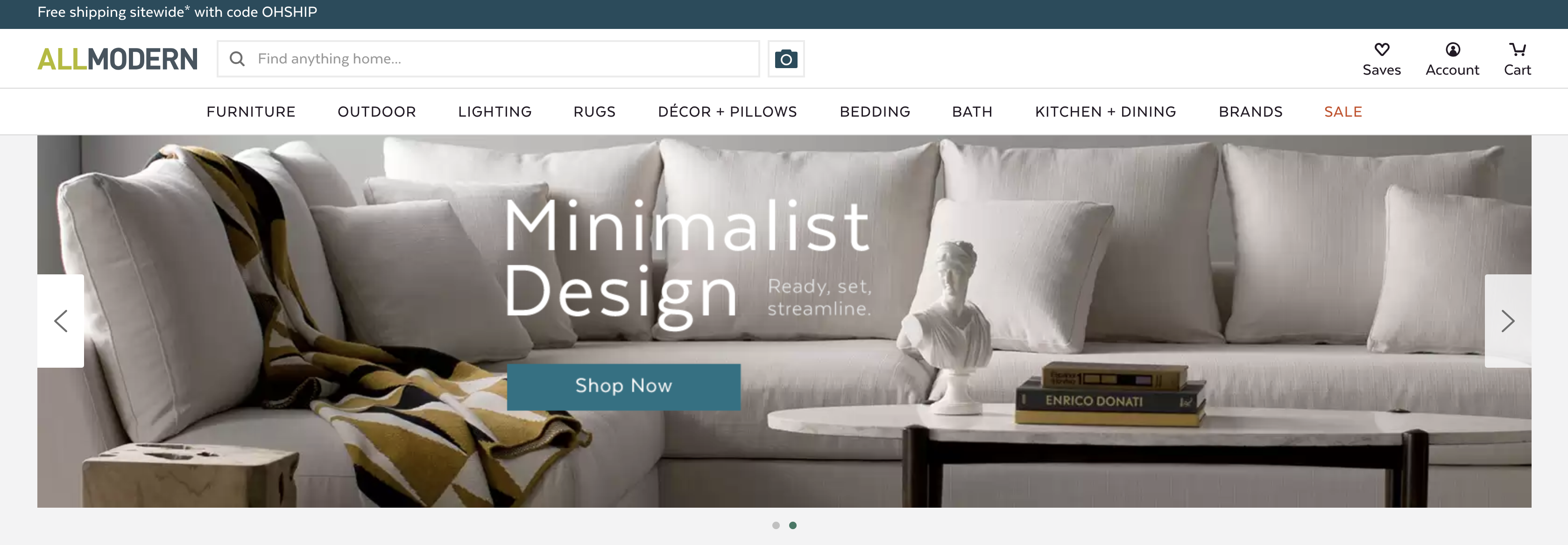
Charging for shipping is a conversion killer.
At this point, the majority of companies offer some form of free shipping, and pretty much every ecommerce site competes with Amazon Prime.
If you’re not offering free shipping, try to figure out a way you can offer it.
Sometimes, it might be near impossible to make free shipping profitable. However there are strategies you can experiment with:
- Establish a baseline: Compare conversion with and without a free shipping offer.
- Create thresholds: Increase the minimum order value required for free shipping, and test the improvement in margin.
- Set restrictions: See what kind of improvement you’ll get by offering free shipping only on select products where it is profitable.
- Enact price increases: Increase all your product prices to compensate for the loss you take on free shipping and see how your profit compares.
Test idea #5: Prominent section for sales and specials
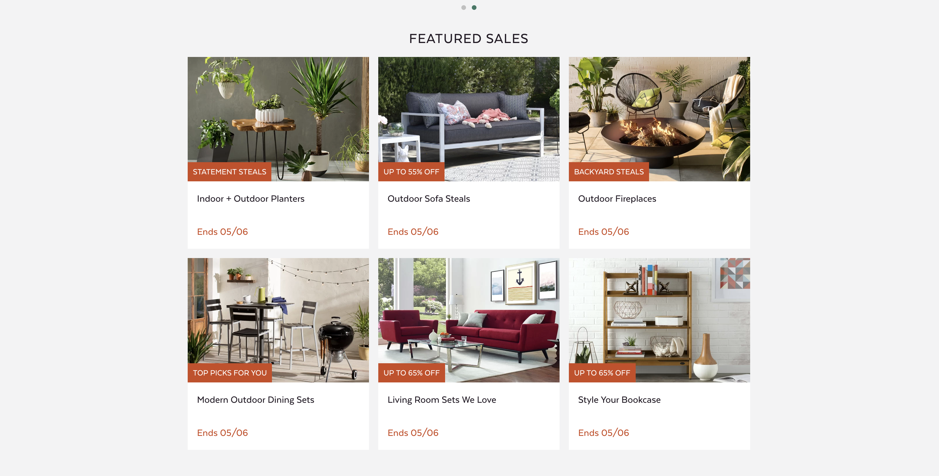
Various studies have repeatedly found that about half the online buyers would only buy discounted products, except under exceptional circumstances. Around 60 percent say they are looking for a section that identifies sales and specials.
Ultimately, do what’s right for your brand, but it might be something worth experimenting with.
Test idea #6: Emphasize wide-appeal products
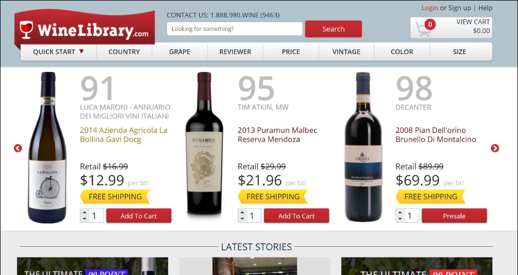
The goal of the homepage is to get people off the homepage. The best way to do it is to get them to click on an offer they’re interested in.
Look at your best-selling products or best deals, and emphasize them on the homepage above all other (make them #1 in the visual hierarchy).
Here’s how WineLibrary makes it hard to miss these three great deals:
Test idea #7: Make the search bar more prominent
If you sell products that people know to search for, making the search bar bigger and more prominent tends to work great. Think Amazon-style search bar — the center of it all.

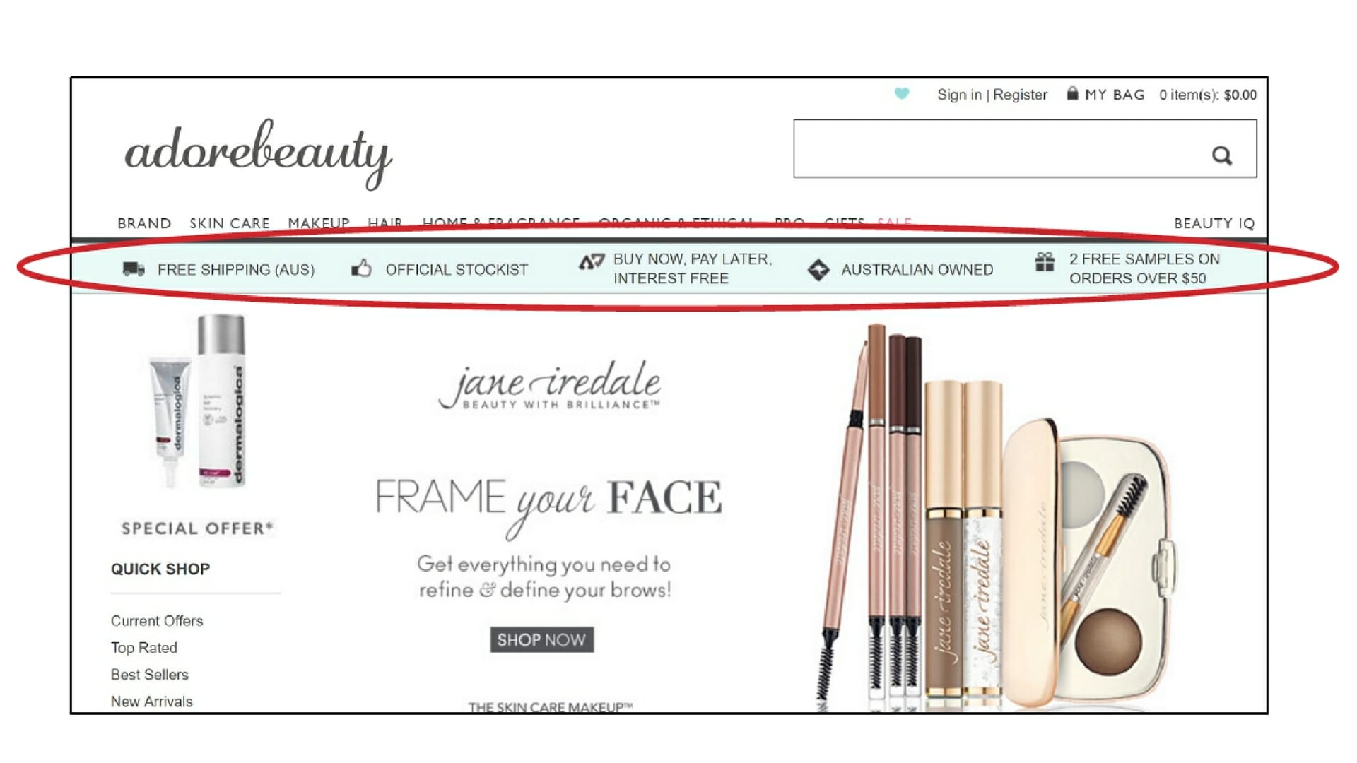
Test idea #8: Add a site-wide benefits bar below the header
“Why buy here and not from Amazon?” is a question that all ecommerce sites must answer. A prominent benefits’ bar above the fold is one way to make your case.
Test idea #9: Level-up your product descriptions
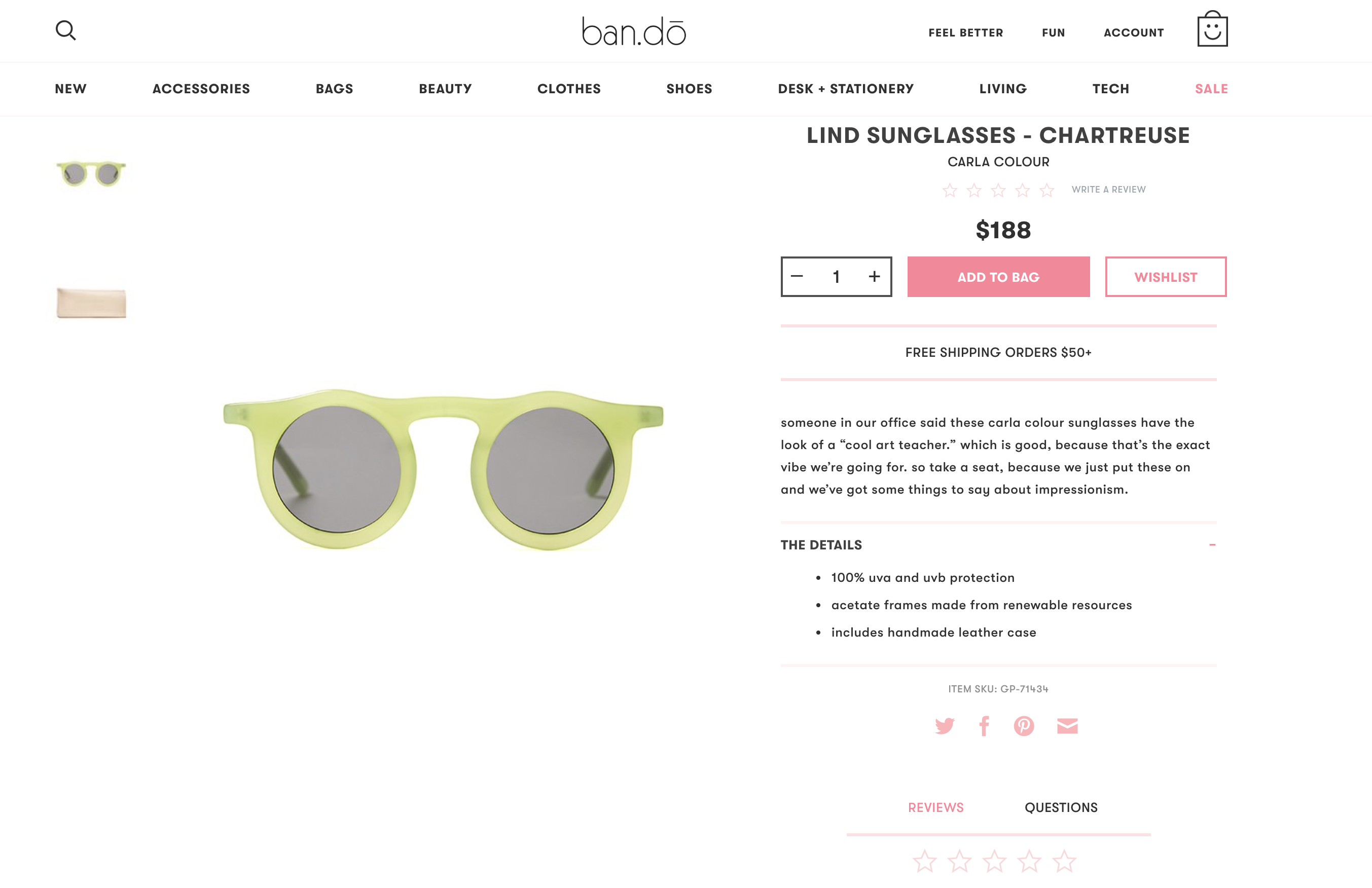
Product descriptions matter. The role of product copy is to give buyers enough information, so they could convince themselves this is the right product for them. Clarity trumps persuasion.
Amazon has proper text for humans, turns features into benefits, and even provides a comparison table. Technical info is provided too.
If you sell stuff you don’t make, don’t just repeat the manufacturer’s canned descriptions. Add your personality and recommendations. Tell the customer why you personally recommend this product and how it will help them.
Test idea #10: Use product videos and test autoplay with captions
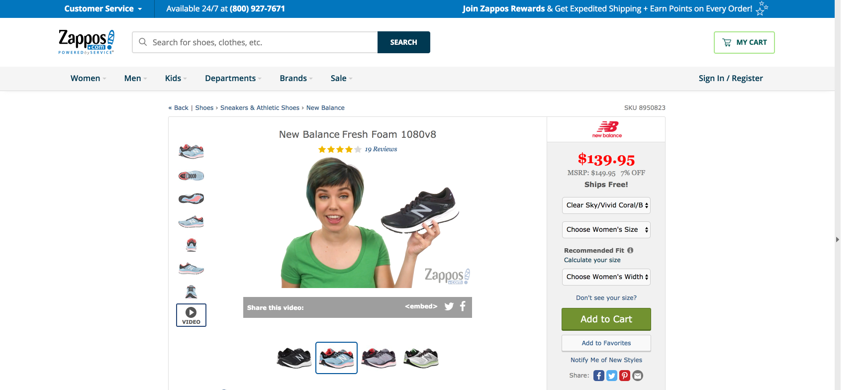
Images are good, but everything indicates that video is the future. Photos have their limitations, video is the next step before actually touching and feeling.
If you’re not doing product videos yet, do them for at least part of the inventory and see if it makes a difference.
Zappos has videos for nearly all of their products.
Read my post on how using video increases conversions. Our own split tests have suggested that auto-play videos work well fro complex, high-ticket items.
Test idea #11: Ask for email first on checkout
This is so you’re able to do email retargeting if they abandon their cart.
This is the screen people are taken to on Amazon when they’re ready to check out:
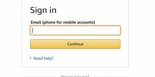
Make sure the first follow-up email goes out ASAP. If they complete the purchase somewhere else, it’s over. If the purchase takes place, send one or two more follow-up emails (might include a coupon).
Track the effectiveness of those emails (open, clickthrough and conversion rates).
Many ecommerce platforms, such as Magento, 3DCart and Volusion offer integrated cart abandonment solutions. There are also several add-on software providers out there that can do this, such as Rejoiner.
Test idea #12: Make the shopping cart persistent
People comparison shop. A common behavior is that they add products to cart on a site, so they can return to it later.
If upon their return, they discover the contents of the shopping cart has expired, they will not start from scratch (too much hassle).
The solution? Persistent shopping cart.
Done with a persistent cookie, this shopping cart will be right there even a day or a week later.
Save the cart.
An alternative to this option is to save their cart so the user can come back to it later.
Giving them the option to send the cart contents to email (later retrievable through a link) is a smart way of staying on the shopper’s mind.
Test idea #13: Create visually prominent and clear progress indicators during checkout
People like to be in control and to be in the know.
Are we there yet?
We to know how much longer something is going to take. This is why numbered lists are better than unordered lists and why you should have clear progress indicators on your site.
Crutchfield has it in the top right corner, but I think it’s quite small and may go unnoticed by many.
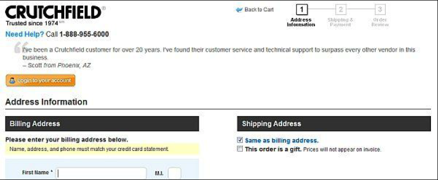
Crate & Barrel’s approach is better, with more prominent steps (1, 2 and 3):

Test idea #14: Clearly address purchase uncertainties
Is this safe? Can I return it? When will I get my stuff?
If the visitor has never ordered from you, she will have several uncertainties you must deal with.
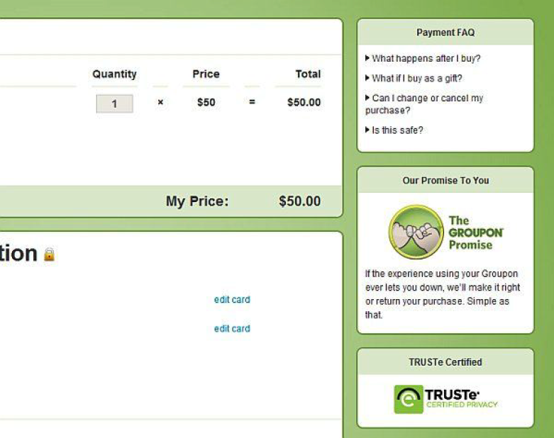
Make a list of the most common objections and doubts, and address them on the product pages and in the shopping cart.
Here’s how Groupon deals with this (see sidebar):
Test idea #15: Expand payment options
Options are good for two reasons:
- Given the credit card scandals about identity theft, some people are wary of using credit cards for online payments (especially on sites they’re unfamiliar with).
- A 2009 survey of 2,000 online British adults found that 50 percent of those who don’t regularly shop online said that if their preferred payment method isn’t available, they’ll cancel their purchase.
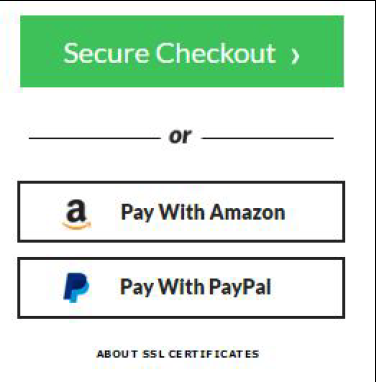
These people aren’t the majority, but adding options like Paypal or Amazon Payments to credit card payments will help you win over some customers you’d lose otherwise.
Checkout how Moosejaw does it:
Test idea #16: Cut form length
Eventually, people will add some stuff to the cart, and they’ll be ready to check out.
Your success in leading them through this process depends a lot on forms. The more fields they have to fill in, the more friction there is.
This is the very reason people prefer to buy from Amazon.
Their shipping and credit card information is already there, so they will save themselves from the hassle of completing forms. They’re even ready to pay a higher price just to save a couple of minutes (I know I am!).
We do something similar at CXL Institute. Look at how short our demo request form is:
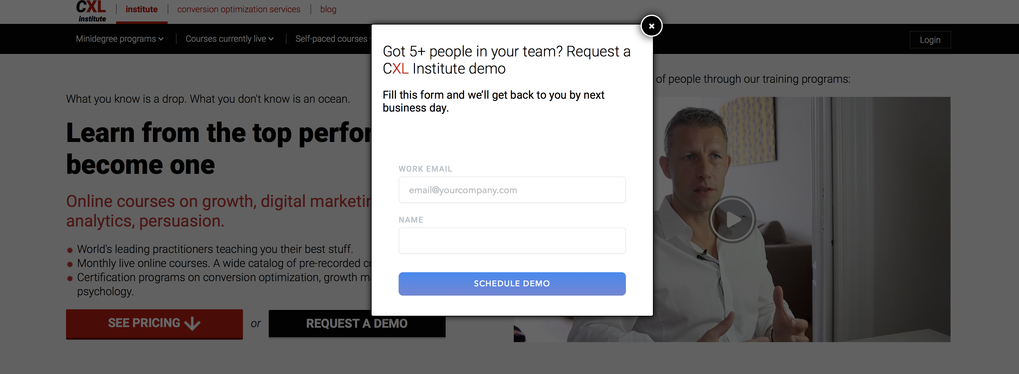
I’ve seen stores ask for shipping addresses for digital downloads. Ugh! Just stick with the essentials!
You don’t need the customer’s title or middle name!
Bottom line: Don’t ask for information you don’t absolutely need.
Test idea #17: Don’t force people to register, add it in the backend
Surely you know the $300 million button story.
Don’t force people to register!
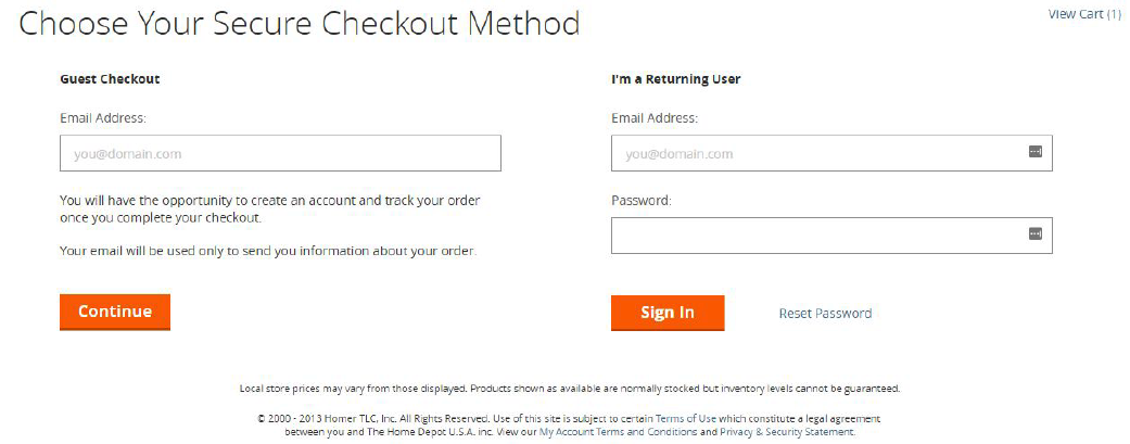
Instead, offer the option to register if they want, but create an account anyway for those who opt for guest checkout. They will enter their email and name anyway. You just have to generate a password and email it to them once they complete their order.
Home Depot plays nice and offers guest checkout as the first option.
Test idea #18: Display reviews more prominently
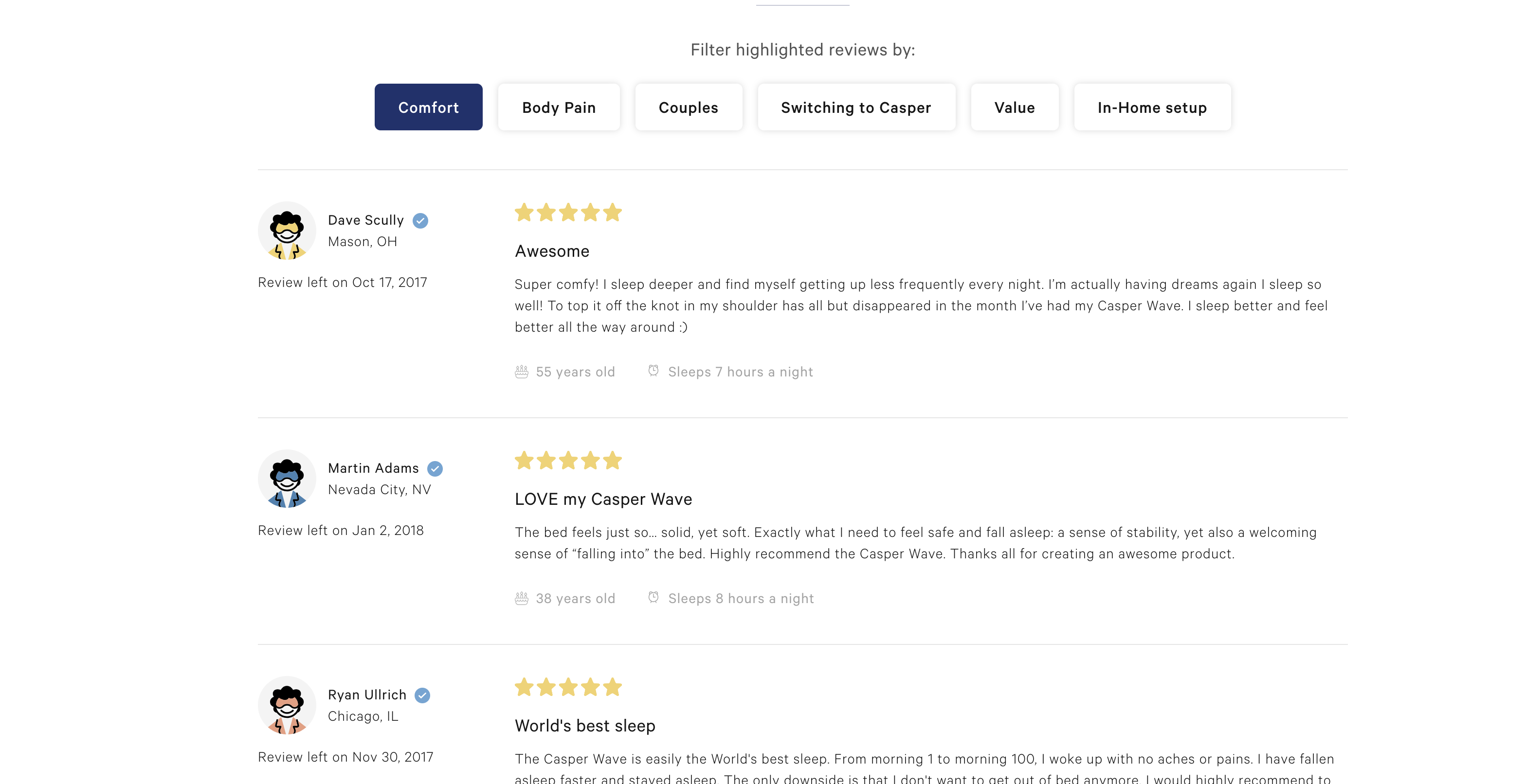
People use reviews a lot. Even while they’re shopping in brick and mortar stores they read reviews online. You’re probably doing it too. I know I am.
Nearly 60 percent of online shoppers consult reviews prior to purchasing consumer electronics, and 40 percent of online shoppers claimed they wouldn’t even buy electronics without seeking reviews about the product online first.
Bottom line: Start gathering and showcasing reviews on your site.
If you sell commodity products and can’t get users to write many reviews, you may want to look into pulling reviews from an external site to have more of them.
Don’t delete negative reviews they actually help sales if there are only a few of them.
Test idea #19: Intelligently upsell
Upselling and cross-selling will boost your average order size.
Apple knows this and immediately after adding an iPad to your cart, it tries to upsell you:
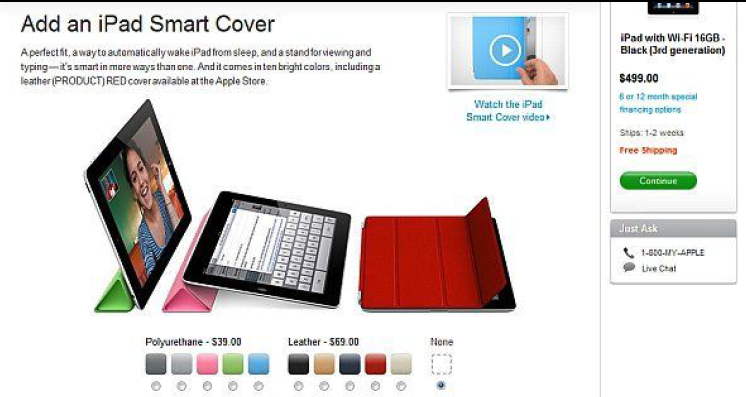
Here’s the rule of upselling: You only offer related products (Apple offers smart cover for iPad and doesn’t try to sell you an iPod), and the offer must be at least 60 percent cheaper than the product they just added to their shopping cart.
So, if they’re buying pants, upsell a belt.
Brick and mortar supermarkets will try to upsell you while you’re checking out (grab a candy bar while you wait). Online, don’t do it. Focus on getting them to check out.
Idea #20: Clear, big calls to action
The user experience must be smooth. Smooth in the sense that they should never have to look for something. It should always be obvious how things work.
If people need to look for “add to cart” or “checkout” buttons, you’re failing miserably.
Those two are the most important buttons in your store. You want them big, bold and prominent. Avoid text links.
The wording and color of the button also matter, but you must test it.
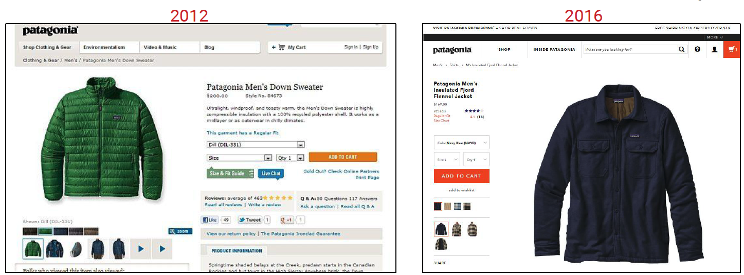
Check out how Patagonia has evolved their product page. Notice how the newer design on the left, and the red color that sticks out is the add to cart button and the cart itself.
Conduct user research to come up with test hypotheses
I strongly recommend conducting user testing on your ecommerce site to find problems with your interface you might not be aware of. Give people some tasks (e.g. find X, and buy it), and have them comment out loud while they’re browsing your site.
You either watch over their shoulder or watch the recording of it. TryMyUI is what we used for our user testing. Try them out. Fifteen people will discover 99 percent of your problems. Even testing one target user is better than testing none at all.
Want to get some quantitative data? Try standardized surveys via UX benchmarking.
We have our own methodology that was used in this report. You can try that, or use your own approach.
One benefit of UX benchmarking is that it is increasingly useful as you repeat, either as a comparison after a design change or against competitors to see where you’re falling behind.
Conclusion
Take ideas from this post and take the ideas in this report, and do your own testing. Don’t copy blindly.


Test idea #11: Ask for email first on checkout.
Wrong idea.
Customers understand that a website wants to grab their email as early as possible in order to spam them in the future. They also understand that email is not necessary to deliver goods. The result: drop in conversions.
Correct:
Ask for *delivery address* first (because it obviously relevant to order delivery). You may also ask for email somewhere during the checkout but you should clearly state that their email may be used for delivery purposes only and you will never use it for marketing.
Ivan, not so sure about that one. Grabbing their email first for the purpose of dropping them into an abandon cart campaign is a guaranteed win. If the buyer is concerned about spam, they usually just enter a bogus email.
Bob, “if the buyer is concerned about spam”? WHO is NOT concerned about spam? They may call it “remarketing”, “retargeting”, “email marketing” or use other euphemisms but the true name for this is “spam”.
Hi Ivan,
Can’t say I’ve ever seen a site that asks you for your address first? Could you please share some examples?
Also, I don’t think the majority of shoppers are as concerned with SPAM as most email providers have some pretty intuitive safety nets that filter out any unwanted emails. I have 3000 unread spam emails and it’s not a big concern.
You need to ask for email first to not only ensure you can remarket (most sites allow you to opt out easily anyway) but also so that you can receive your order confirmation details etc… it’s a no brainer to request the email first.
Hi Alvaro,
> Can’t say I’ve ever seen a site that asks you for your address first? Could you please share some examples?
Check *any* Woocommerce website.
> I have 3000 unread spam emails and it’s not a big concern.
People are different. At the moment I have 0 spam emails and spam is a big concern. Send me a link to research showing that the majority of people tolerate spam, please.
> but also so that you can receive your order confirmation details etc… it’s a no brainer to request the email first.
You should clearly explain how you will use their email (“We will use your email for order confirmation and will never use it for marketing purposes”). Asking for email first without explanation of the purpose is a conversion killer. And it is better to ask for email *after* filling-in delivery address fields.
Thank you for those useful tips! I’ve already applied some of them in my online shop since I asked ad agency Tech-Media for help and my selling boosted a lot
#11 Email field first:
Cart abandonment email campaigns require an opt-in by the customer outside the US. Please be careful when implementing such a solution otherwise it will lead to possible lawsuit cases.
Only after May 25th 2018 :) This article was written in the US before the GDPR date as was valid at the time of writing.
You’re wrong Peep – opt-in has been required for years in most EU countries, and the new GDPR rules has nothing to do with it.
Europe requires opt-in for email, but most EU countries have opt-out (presumed consent) for organ donation – which tends to save lives. http://theconversation.com/organ-donation-does-presumed-consent-work-49478 A subtle disconnect in what’s good and bad as a whole, perhaps? :) Philosophically, what if a little reminder to purchase (or to find out what can be improved about the purchase process / product) actually helps the customer(s)? I’d be careful about labeling opt-in as some ideological absolute evil.
… on of course I meant opt-out instead of opt-in, in that last sentence. :)
No you are wrong. GDPR clearly regulates that, no EU-wide policy prior to that.
@Luis I’m guessing your comment was aimed at Drc?
If so I’d have to agree with Drc and say that actually you are wrong.
GDPR governs the data you use for email marketing, the required permission to send email marketing is defined by ePrivacy directive (EU) or PECR (UK-interpretation of ePrivacy) and there is soon to be an updated version of this namely the new ePrivacy Regulation.
@Peep perhaps you might consider adding an update to this post, seen as we are now post May 25th?
Maybe even write a new post to cover off the do’s and don’ts for abandon cart/behavioral email campaigns, possibly interviewing some of the leading abandon cart software solutions to get their take on it?