Over the last years, Google Data Studio has evolved from an appealing but clunky application to a tool that we recommend to any digital marketer.
Data Studio allows you to communicate data simply and in a repeatable format, and their expanded integrations, customizations, and editability have made Data Studio dashboards extremely powerful.
A relatively new feature, data blending, came out last year. This underused function can do a lot of cool things; it also has some limitations. Once you’ve got your head around the basics, the possibilities are endless.
Table of contents
What is data blending?
Data blending is the process of combining data from different sources and merging it into a single dataset.
Blending allows you to create charts based on multiple data sources. Separate data sources—not just those from the same application—can be combined as long as they’re comparable (i.e. share a “join key,” something discussed more below).
Traditionally, if you wanted to create direct comparisons from different sources, you had to export data from each source and combine them in Excel. If you suddenly needed to study a longer timeframe, you had to download the data again and start over.
By default, each element in Data Studio pulls information from a single data source. You could hook up multiple data sources to a dashboard, but until the introduction of data blending, you couldn’t present those together in a single chart or table.
With a few clicks, data blending can reveal valuable relationships between data sets. Because everything happens within Data Studio, you save time on data manipulation and enjoy new opportunities to present findings.
Jon Meck, Senior Marketing Director at Bounteous, highlighted several benefits his team has identified:

Jon Meck:
With a familiar and intuitive interface, we continue to find use cases for data blending that showcase the connected Google ecosystem, facilitate real-time decision-making, and save hours of manual work.
We love using it to combine third-party data around advertising details or CRM data, and it’s allowed us to bring in personal data from external sources that are off-limits for other Google products.
What can it offer your analytics team? Here’s what you need to know.
Keys are…key…to data blending
To blend data, the data sources need to share a common dimension. This is known as a “join key.” It’s the common denominator to compare data. Your join key could be a page URL, product name, user ID, or many other things.
The simplest join key is “Date.” Measuring things over time is a common part of data analysis, so let’s use that as an example.
Selecting “Date” as the join key lets you spot correlations in data sets. Want to see how many leads came into your CRM against compared to organic sessions last month? No problem:
Choosing the right key depends on what you’re trying to illustrate. A good starting point is to come up with a hypothesis. For example, your hypothesis might be that “website users are more likely to pay via PayPal if they’re on a mobile device.”
In this instance, you’d combine data from your ecommerce platform with Google Analytics data. Transaction ID would be the join key. (You can find more examples in the table below.)
How to blend data in Google Data Studio
When it comes to data blending, there’s an easy way and a not-so-easy way.
The easy way to blend data
- Create two charts that you want to compare.
- Select both graphs (CTRL + Click).
- Right-click and hit “Blend data.”
As long as the two charts share a common dimension, Data Studio automatically combines your two charts into one. If you select two charts but a right-click offers no option to blend the data, your charts are unblendable.
The not-so-easy way to blend data
The second way to blend data is a little more involved but gives you more control.
- Click “Resource > Manage blended data.”
- Click “Add a data view.”
- In the panel displayed, select or search for the first data source you want to compare.
- Click the “Add another data source” button. This will be the second data source.
- Select a join key(s) available in both data sources.
- Select dimensions and metrics you want to compare.
- Adjust settings as usual and hit “Save.”
- Your new blended data source is now available when you select “Data source” for new charts.
Start with the easy option to get a feel for data blending before going with the not-so-easy way.
Importantly, data blending uses “left-outer join,” which means that charts and graphs contain all values from Data source A—whether or not there’s corresponding data in Data source B. Additionally, values in Data source B that do not exist in Data source A are ignored.
If you want to learn more about how data blending works, Google offers some baseline documentation to get you started.
Practical applications for data blending in Google Data Studio
1. Overlaying line graphs from different data sources
Combining simple graphs shows relationships between data sets. For example, we wanted to demonstrate to a client that the keywords we tracked in Advanced Web Ranking (AWR) correlated with an increase in organic traffic:
Our blended data combined organic sessions from Google Analytics with AWR’s Visibility Score. Date was our join key. The correlation wasn’t a surprise, but it confirmed the success of our SEO campaign.
Whether you’re an agency or an in-house marketer, being able to demonstrate the value of what you’re doing is essential. Often, data visualization helps you present something you already know clearly and persuasively.
2. Combining Google Analytics data with imported data
Have you ever wanted to see data from all your tools at a glance? Well, you can. Data Studio allows you to blend data from other sources. Even if you’re not keen on forking out for Google’s Partner Connectors, any third-party data can be tapped into via a file upload or Google Sheets connection.
The example below shows data from Google Trends on interest in Wimbledon (the tennis tournament) compared to visits to a website that sells Wimbledon tickets.
We produced this graph for one of our clients. They invest a lot in inbound marketing and wanted to know why their traffic was so much lower on peak sales days. As their PPC agency, we had to justify this dip. We hadn’t taken our foot off the gas, so what was the cause?
We discovered that news and press activity had a huge impact on people searching for Wimbledon. On the low-traffic days in question, the sports press was divided, discussing the Women’s World Cup and cricket as much as tennis.
The drop in Google Trends for “Wimbledon” correlated with website sessions. Data blending allowed us to demonstrate these traffic blips to the client. The revelation also informed their marketing strategy for next year.
Without native integration of a data source in Data Studio, your best option is Google Sheets. It allows you to tweak your data on the fly without having to upload it again. If your Google Sheet runs scripts that update the data in real-time, your Data Studio blends will update, too.
3. Combining Google Analytics with CRM and ecommerce platform data
Connecting website data with a CRM or ecommerce platform can reveal fascinating insights. While BigQuery and Google Analytics 360 allow you to do this without data blending in Google Data Studio, that convenience comes with a six-figure price tag.
A User ID, assigned at purchase or user login, can act as a join key to connect website data directly to individual site users. In the example below, we’ve connected pageview data from Google Analytics with supplier accounts in a CRM.
The blended data helped the client’s sales team suggest products to cross-sell to key accounts. In this example, Data Studio’s “filter controls” let the viewer select the partner account and date range.
Similarly, as Morgan Jones details in a post for Practical Ecommerce, data blending can help calculate new metrics, like net profit by SKU. Jones’ example blends data from two sources:
- A table that includes products’ wholesale cost by SKU (“COGS”);
- Google Analytics sales data.
By combining those sources, Jones was able to create a table with the net profit of each product:
More examples
The possibilities for data blending are nearly endless. Here are a few more:
| Data source 1 | Data source 2 | Metric comparison | Insight gained | Join key(s) |
|---|---|---|---|---|
| Google Analytics | Google Search Console | Correlate organic search impressions to organic traffic | Determine whether increases in SERP visibility are impacting traffic to drive future SEO strategy | Page |
| Google Ads | Google Search Console | Compare paid search impressions to organic search impressions | Assess overall SERP visibility for paid and organic traffic sources | Search term / Query |
| Google Analytics | Ecommerce platform | Compare product stock levels to product sales via website | Spot check inventory against product sales; manage stock for busy/slow periods | Product |
| Google Analytics | Google Sheets | Correlate any metric to blog length, title style, etc. | Compare blog post performance to editorial decisions | Page |
| Google Analytics (Site 1) | Google Analytics (Site 2) | Compare the performance of two websites | Visualize the performance trend of a portfolio of websites in a single chart or table | Any Dimension |
Of course, no new feature is perfect, and several early-adopters have felt the pain.
The limitations of data blending in Data Studio
Portent’s Michael Wiegand has written about data blending in Google Data Studio multiple times. His articles have showcased the potential promise—and limitations—of data blending.
When asked about some of the wrinkles he’s encountered, he listed three:

Michael Wiegand:
1. Sometimes you have to re-aggregate metrics in your formulas when creating custom fields that involve two metrics from different data sources to get them to work for date ranges any longer than one day.
For example, instead of Pageviews from Data Source A/Sessions from Data Source B, you need to state Sum(Pageviews DS A)/Sum(Sessions DS B).
2. There are several threads about this in the Google Marketing Partners forum for Data Studio, but since data blending works on a left-join basis, if there’s historical data in the left-most data source that isn’t also present on the data sources to the right, previous period or previous year date-range comparisons will return no percentage-change data.
3. We’ve also run into a limit on data sources with blending. A maximum of 5 data sources are allowed in any one blend.
Oeuyown Kim, an Analytics Strategist at Portent, shared additional details on the limitations identified by Wiegand.

Oeuyown Kim:
GDS does not replace “null” values with zeros when there’s no value available for a metric in the Outer Left Join Key.
For example, in the image below, instead of summing the values that do exist, GDS will show “null” if there’s no value for “Transactions” for a date—even if there are transaction values in the other columns, Transaction (EN) and Transaction (FR).
Similarly, Kim continued,
When there’s no comparison value for one row, Google Data Studio shows all comparison values as “null.” In the image below, no comparison values appear for any row in the highlighted columns—even though deltas exist for three of them.
When I raised this issue to the Google Data Studio team, their “solution” was to recommend that I not show any comparison metrics.
Despite those perceived limitations, Lee Hurst resolved them:

Lee Hurst:
It is correct that Data Studio will put in a “Null” if data is not available, but there is a fix for this.
In the image below, you can see the null values for previous week and year. You can also see that difference values are calculated, and the last column adds all three values in the row for a total—even when there are nulls for values.
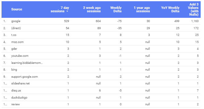
What’s the secret? NARY_MAX:
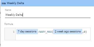
As Hurst continued:
It’s not surprising this function was not well known! I was looking for examples of NARY_MAX usage and happened to find a single reference in a Supermetrics support group question.
The official documentation mentions that it will return only the max value from any number of arguments. It does not mention that null values are included in this comparison!
These are the formulas that Hurst used. (He also shared a report with the formulas in use.)
YoY Weekly Delta
7 day sessions – NARY_MAX(1 year ago sessions,0)Add 3 Values (with Nulls):
7 day sessions+nary_max(2 week ago sessions,0)+NARY_MAX(1 year ago sessions,0)In general you can use:
NARY_MAX(FieldWithNulls, 0) to replace nulls with a value of 0.
Conclusion
Data blending helps you create Google Data Studio dashboards that are dynamic, real-time visualizations of the metrics that define marketing success.
Over time, as Google connects its data vizualization platform with more third-party data sources, data blending will make comparisons easier and more powerful.
Getting started with data blending now will better position you and your team to take advantage of those impending improvements. Here are the key takeaways:
- Data blending lets you compare up to five data sources in a single table or graph.
- A common dimension, called a join key, connects data from different sources.
- Start with a hypothesis before deciding on which sources to blend.
- Don’t overcomplicate matters. You can blend more than two data sources, but the goal is to present clean, clear data to stakeholders and clients.
Working on something related to this? Post a comment in the CXL community!



There is a simple fix for the null limitation from Kim. It took me a while to find it , but you can simply use nary_max(field, 0) if you need to replace nulls with a 0. In the example it will give a value of 0 if the field is null. Hope that helps!
I second what Lee stated, nary_max(field,0) was the key (pun intended) for me to combining data that returned a null otherwise. For example, we were combining data from three different GA properties and wanted to show the combined eCommerce Conversion Rate, however for those channels that didn’t exist in one property nothing would show up until we used nary_max:
(nary_max(transactions_a,0)+nary_max(transactions_b,0)+nary_max(transactions_c,0))/(nary_max(sessions_a,0)+nary_max(sessions_b,0)+nary_max(sessions_c,0))
Hi. I have sometimes problem that google data studio gets wrong data. Where can by a problem?