Marketers have access to more data than they need. Your time on this page has already generated data on the pop-ups you close, how fast you read, and where your cursor stops.
To extract value from the numbers in your analytics tools and on your dashboard, you need to organize them.
Bar graphs, pie charts, and matrices are data visualization tools that reveal trends and key findings in an understandable and engaging format.
In this article, you’ll learn how to use data visualization to scale your organization through partner networks, sales enablement, and product-led content. We’ll also look at advanced data modeling tools and data visualization examples to automate your data representation.
Table of contents
How to use data visualization to accelerate growth
A graph that points up and to the right quickly signals growth. Likewise, large vs. small bars or bubbles help viewers grasp comparisons faster than they can glean them from a spreadsheet of numbers.
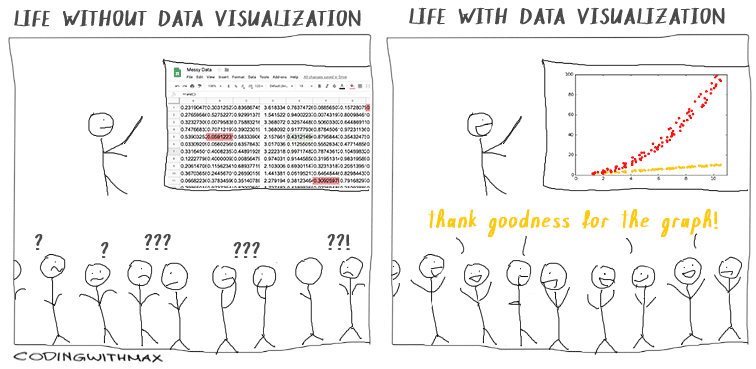
How you present information is critical to getting viewers to understand what they’re looking at and getting buy-in, whoever the audience may be.
Marketers use data visuals in two ways:
- Internally. Representing data to stakeholders and team members to understand the market, progress, financials, etc.
- Externally. Demonstrating findings from research or analytics in content.
Whether your audience is a group of internal stakeholders or customers, data visuals can be a powerful tool to accelerate growth. Let’s look at how to do this through three channels: partners, sales, and product.
Collaborate with partners on data
You can use data visuals to create sales enablement presentations and case studies for business partners.
Find data points and analytics that align with your partners’ business goals. Use these to create graphics that address their challenges.
UK-based gym Everyone Active and Weight Watchers (WW) formed a brand partnership in 2021.

WW research revealed that 41% of British people admitted to a weight increase during the 2020 Covid-19 lockdowns, and 65% of those surveyed gained seven pounds or more.
Everyone Active marketers used this information to emphasize the importance of working out on staying healthy, creating a number of marketing materials and promotions that align the brands.
Help sales reps communicate with leads and other departments
When designed as sales enablement assets, data visuals can align sales and marketing teams.
Data visuals make it easy for your sales teams to:
- Help leads with decision-making by showing them how you’ve helped other businesses (or individuals) grow their brand;
- Showcase industry trends through graphs and charts;
- Speak the same language as the marketing team and work towards the same goals.
Coordinate with sales to identify customer concerns. Then collect data for the related metrics and create visuals.
Let’s say your company sells an intelligent paid promotion tool, but prospects are not converting because of the time it takes to see results.
The marketing team recently noticed that customers triple their sales after six months of use on average. Your sales teams can use this metric to show prospects exactly how long it takes to see results and the increase in sales past that point.
Instead of presenting sales teams with a bullet list of “handy metrics,” give them the data in visuals. This way, they can gather the information at a glance while on a call or copy the graph directly into an email.
I interviewed Tina Donati, Head of Marketing at Alloy Automation, to learn how each marketing function can use data visuals:
Use data visuals internally—extensively.
You can probably look at the data without visuals and understand it, but people on other teams don’t have that same context that you do about the projects you’re working on.
So, having those visuals tells the story about why you worked on a project and how successful it was. And helps you paint the argument about why certain projects are worth spending more time on than others.
Data visuals create a common point of reference for teams across your organization.
With that in mind, here are more ways to use data visualization internally and foster interdepartmental alignment:
- Show traffic distribution from different channels, campaigns, and marketing initiatives;
- Show results of A/B testing content and messaging;
- Indicate ready-to-buy prospects and how they measure on your lead scoring matrix;
- Categorize leads based on demographics, geography, and company size;
- Understand patterns of use (e.g., what customers love, what they look past, and what they engage with);
- Show where customers stop using your product or leave.
We’ll look at ways to represent data and insights like this in a moment.
Share critical information with customers
You can use data visuals to share information like product enhancements, customer journeys, and industry trends that emphasize your product’s value.
You can see customer-facing data visualizations in many places: on web pages, in blog content, in YouTube videos, and on social media. One of the most common places you see data visualizations is in lead magnets, like ebooks.
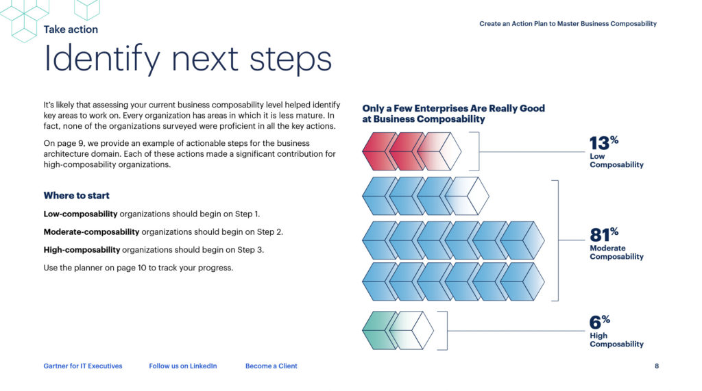
Gartner uses data visualization to represent their research findings:
Instead of “yet another bullet list,” help your customers visualize data in a memorable—and shareable—way.
Before you start visualization
You could be creating a data visualization for a number of reasons: you’ve identified an interesting trend in your analytics, you commissioned a study and want to represent the results, you’ve been asked to give a presentation.
Whatever your motivation: start with the objective in mind.
Knowing why you’re creating the visualization will help you (or your design team) choose the right way to display it. For some, it will be obvious because it’s what they set out to learn in the first place. Others will need to nail down an objective before designing their data.
You can uncover your objective by considering four questions:
- Who is your audience?
- What are their pain points?
- What do you want to achieve through the visualization?
- Which data points are relevant to your audience?
As with any marketing exercise, the answers to these questions should be data-driven.
Let’s say you’re a company with an HR solution. You want to create data visuals about employees who quit their jobs in 2021. Through qualitative surveys, you might learn:
- Your audience is HR leaders at companies generating at least $2 million in ARR.
- They’re struggling to retain employees after a growth period and their own insights point to dissatisfaction in the length of time to promotions.
- You want these leaders to consider your continued-development tool to help employees upskill and promote through the ranks quicker.
- You need to show them data on the relationship between role performance and access to upskilling opportunities.
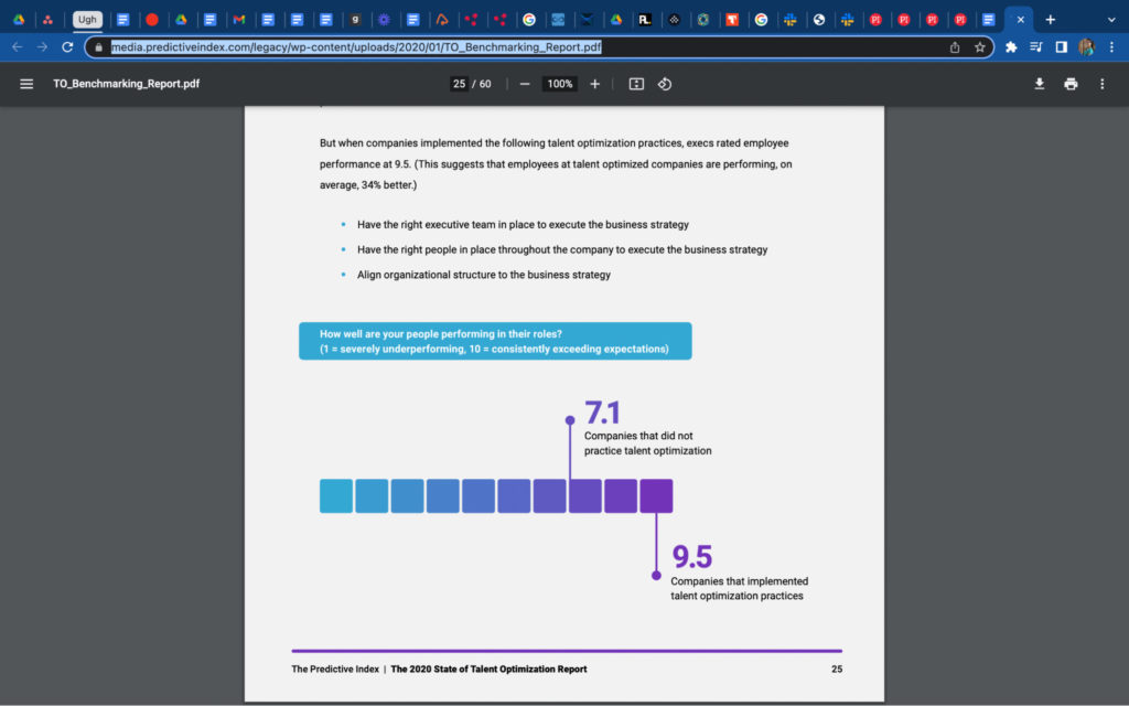
Your readers don’t want to sift through the numbers. They should be able to get the message quickly from your visuals.
For example, this visual by The Predictive Index indicates that companies that implement talent optimization perform better in their roles:
Decide how much time and budget you’ll put into your data visualization ahead of time. Data for an internal presentation will likely have a different project management process to data presented for customers.
For example, if the objective is to create shareable content to generate brand awareness, you’ll need to do additional research to learn what’s trending in your chosen channels, decide where you’ll promote the content, and you’ll probably need to book a design team.
On this, former Head of Marketing at The Predictive Index and creator of the Research Report Playbook, Erin Balsa shares her advice:
When you’re using data visuals to share the findings of a survey or research publicly, work with your designers to identify which findings and what displays will be popular on social channels.
Then, put the most effort into the creative visuals on the landing page because those are the key to convincing your readers to download your full report.
Nail down your objectives before designing your data. This way, you’ll see any additional steps that you need to take to achieve your goal with this data visualization.
6 examples of advanced data visualization
There are many types of data visualizations. Static histograms and line graphs look antiquated and out of place on a dynamic webpage or housed in a flashy ebook.
Large data sets don’t mean you need to shy away from beautiful data representations.
To engage your audience, whether internal or external, consider putting your data into some of today’s more popular data visualizations.
1. The magic quadrant
The magic quadrant, often called the 2×2 matrix or the four-blocker, is great for reporting differences (i.e. opposites) or data points across two ranging scales.
The quadrants often represent data points that indicate strengths vs. weaknesses, high variables vs. low variables, or good vs. bad. It’s similar to a scatter plot but with an added dimension.
Gartner’s magic quadrant is an example of a branded 2×2 matrix that plots a company’s ability to execute against its completeness of vision.
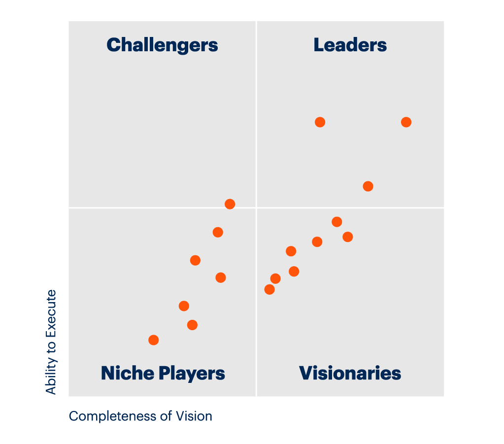
Magic quadrants are useful for conceptualizing complex data where a data point might contain up to four traits.
Use a magic quadrant in cases like:
- Importance and urgency (high/low importance and high/low urgency);
- Cost vs. benefits (high/low cost and little/greater benefit);
- Time vs. money (less/more time and less/more money).
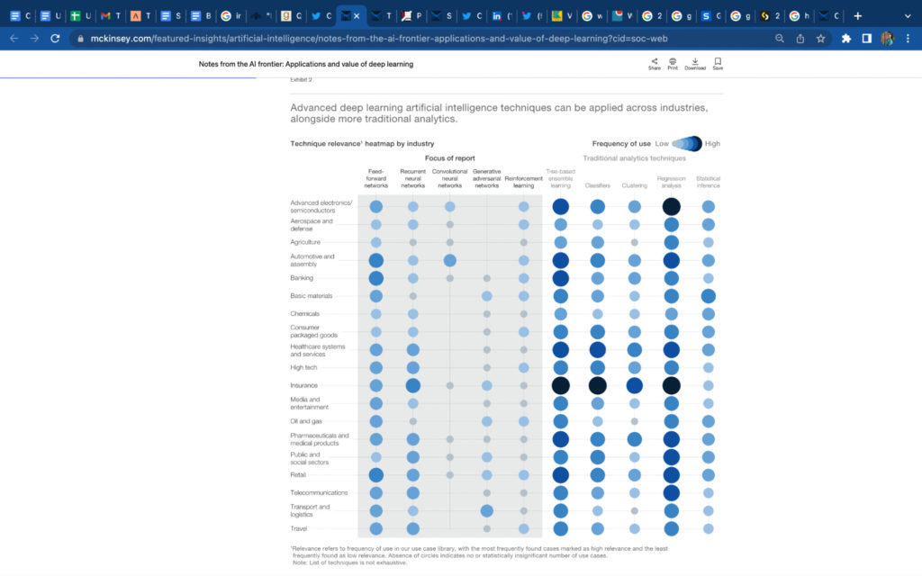
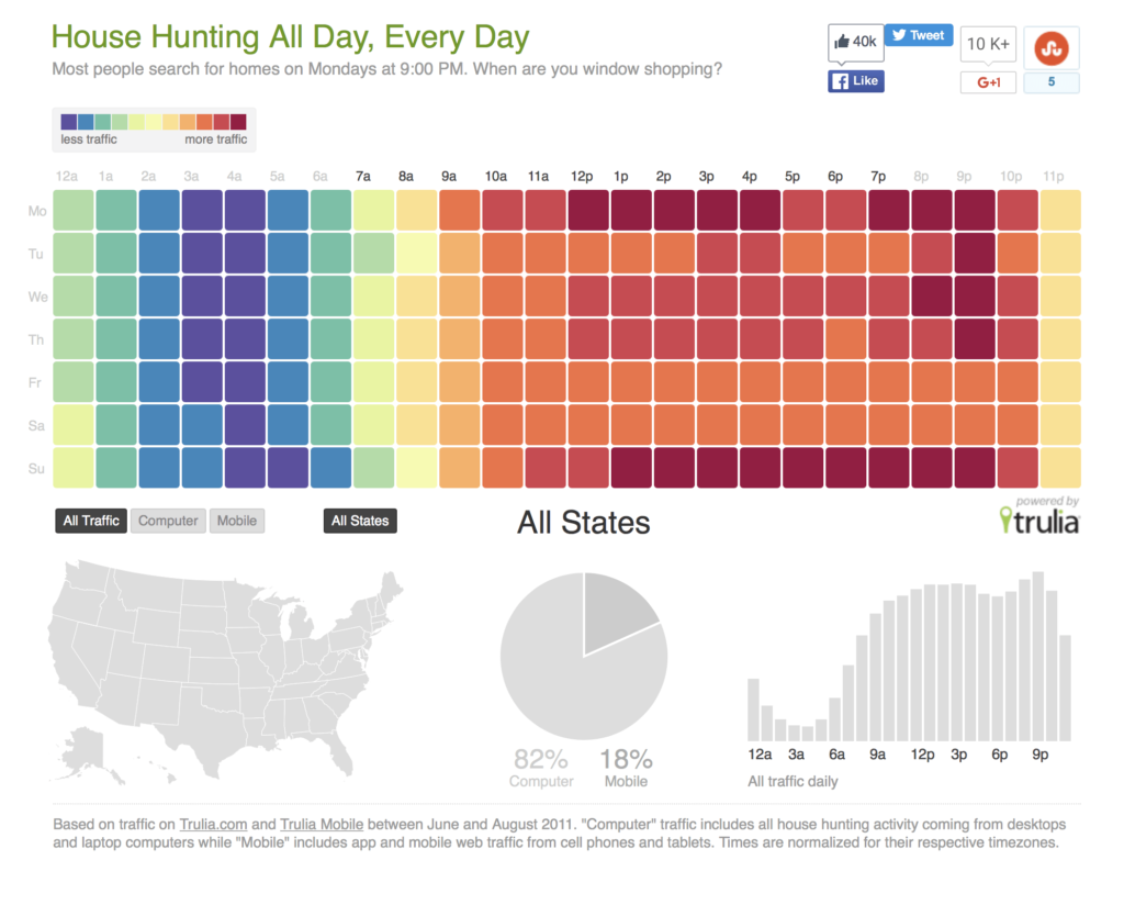
2. Heat Maps
Heat maps, also called heat tables or density maps, show correlations, comparisons, distributions, and trends over time.
McKinsey uses a heat map to show the frequency of artificial intelligence techniques across different industries:
Here’s another example of heat maps used to represent popular times of day that people spend house hunting:
And here’s a density map in 3D representing the population of Manhattan:
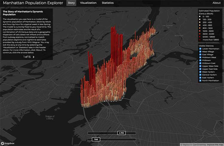
You can clearly see the densest areas where people live and it’s far more engaging than numbers in a table.
Use heat maps to show data like:
- Customers in a geographic area;
- Engagement across different social media channels;
- Actions at specific times of the day or months of the year;
- Popularity of products.
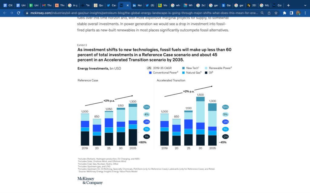
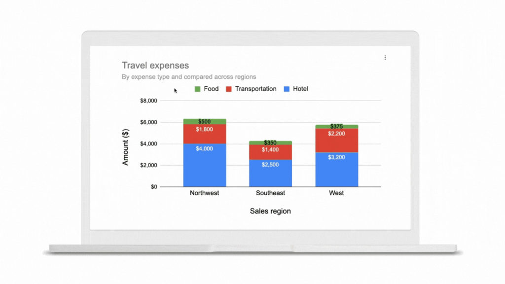
3. Stacked Bar
A stacked bar is used to show comparisons between different categories of data or when representing parts of a whole.
This graph shows a prediction about investments in fuel types between 2019 and 2035:
You can get creative with your stacked bar charts, such as this representation of loaf ingredients:
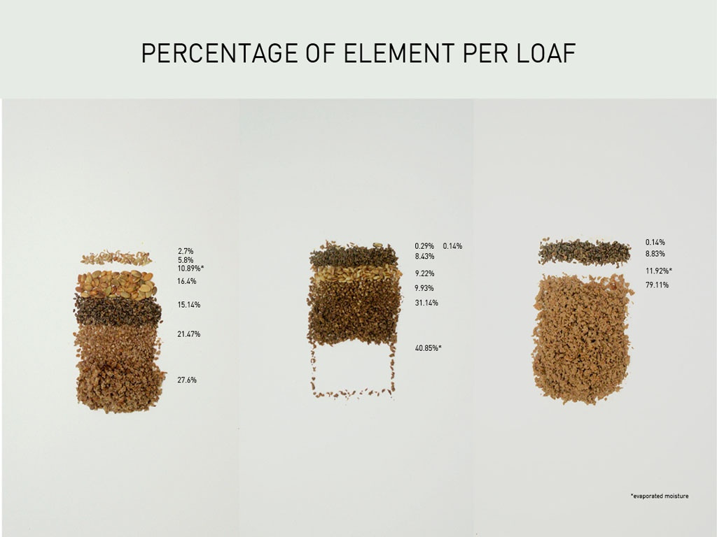
Stacked bar charts can give you a lot of information at a glance. You can clearly see relationships between elements that make up a whole as well as whether that whole increases or decreases.
Use stacked bar graphs to show data like:
- Investment in different marketing channels;
- ROI of different marketing channels;
- Conversions from different content pieces.
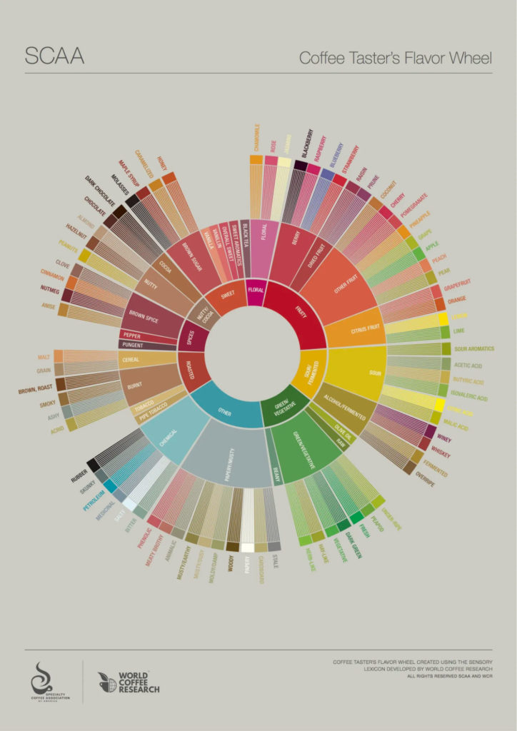
4. Sunburst diagrams
If you want to spice up your organizational graphs, consider opting for a sunburst diagram (also called a ring chart or multi-level pie chart) over a traditional hierarchy diagram.
These diagrams allow you to represent comparisons of categories while also representing subcategories.
This is represented in this highly shareable coffee flavor wheel by the Specialty Coffee Association of America (SCAA):
Here’s an interactive data visualization representing the popularity of holiday days worldwide:
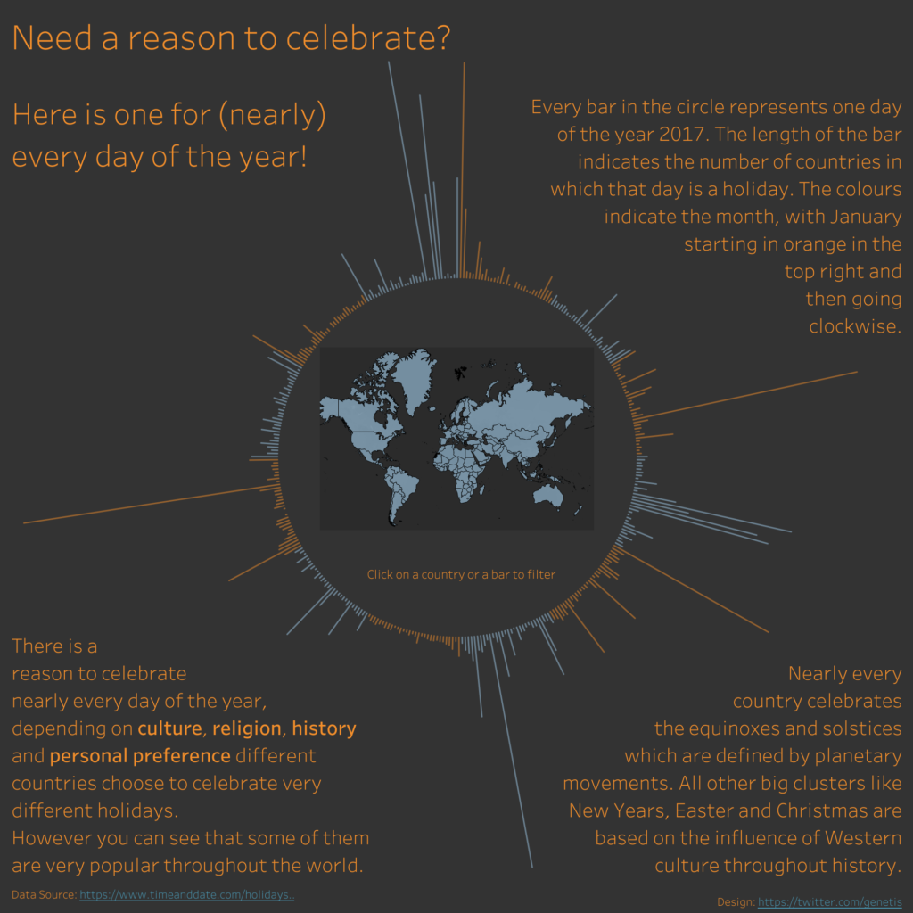
This holiday ring chart is a dynamic way of presenting information; by clicking on any line, users can see how many countries participate in each holiday.
What could easily have been a bullet list or a bar chart on a slide is now presented in a more engaging medium.
Its interactive nature makes it more suitable for non-presentation settings, such as hosting on landing pages or blogs or linking to it on social media.
Use sunburst charts to demonstrate data like:
- Popular products by category and subcategories;
- Your current blog catalog;
- Industry information;
- Social media segments across channels.
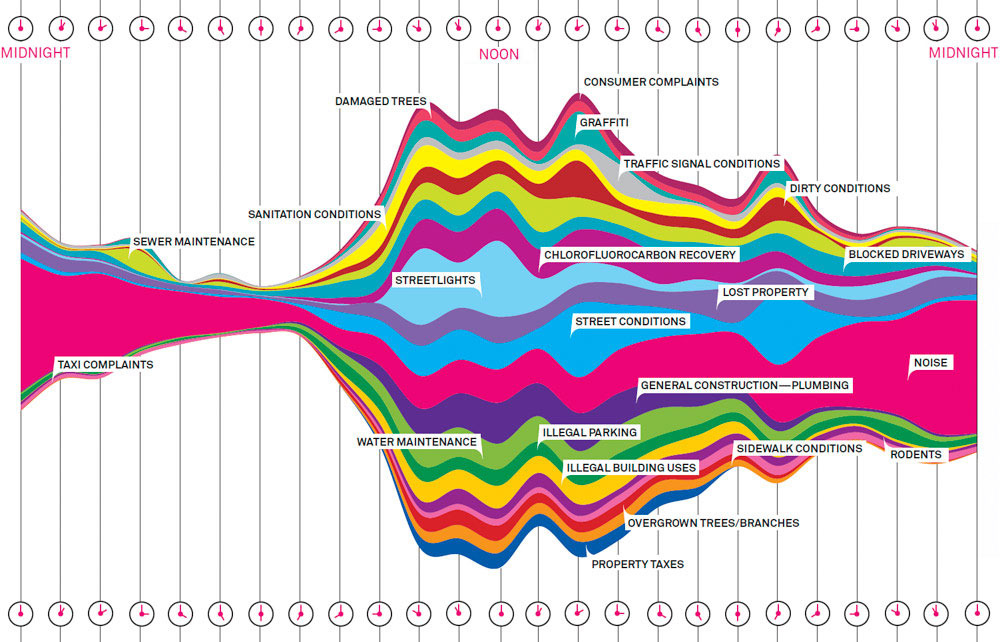
5. Stream charts
Stream charts are used to represent comparisons and distribution changes over time. The variations are placed on top of each other around a central axis.
Here’s a stream chart representing the most common complaints made to a New York public support number over the span of one week:
And another showing the number of Winter Olympic medals per country over time:
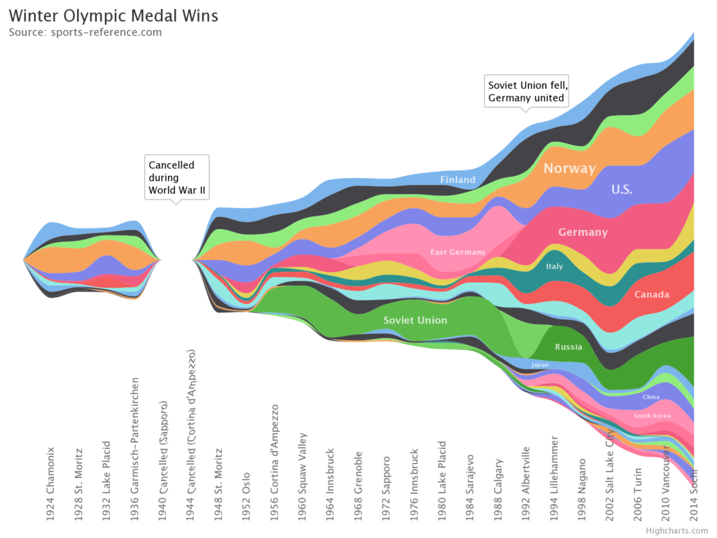
This is a great one to get creative with using brand colors. Use the stream chart to demonstrate big differences, as minor changes will be more difficult to see.
Use stream charts to show data like:
- How customer segments have changed over a period;
- Popular activities depending on the time of day;
- Behaviors across a year.
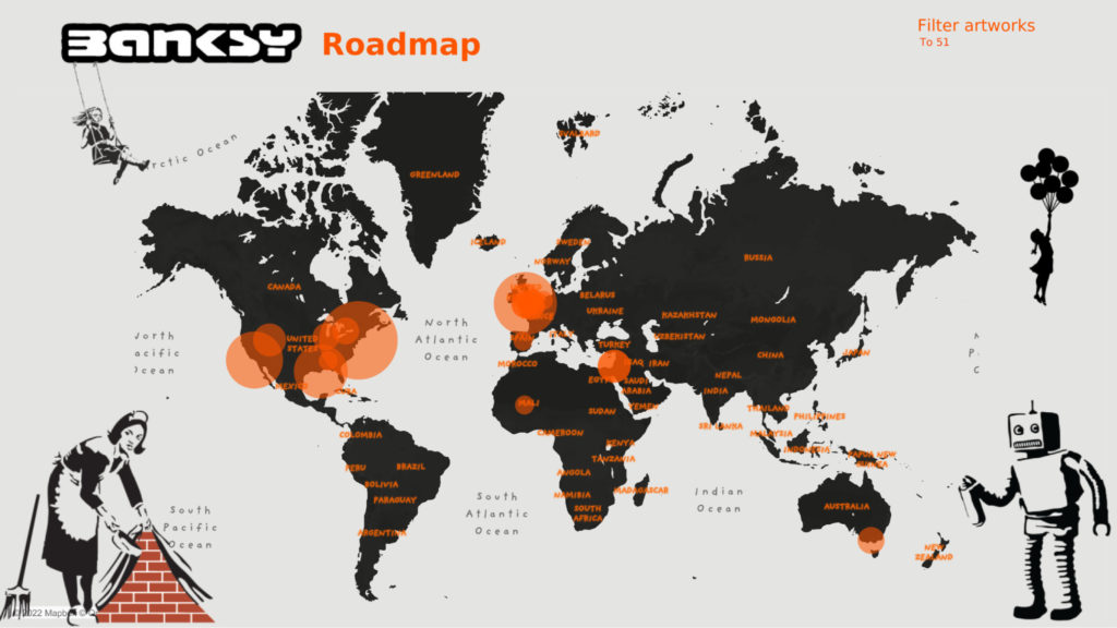
6. Bubble charts and maps
Bubble charts display three dimensions of data: an x-axis, a y-axis, and the size of the data point. A bubble map displays the size of the variable on a map rather than a grid.
Here’s a bubble map of Banksy art worldwide:
Here’s a bubble chart representing the relationship between income and life expectancy in various countries:
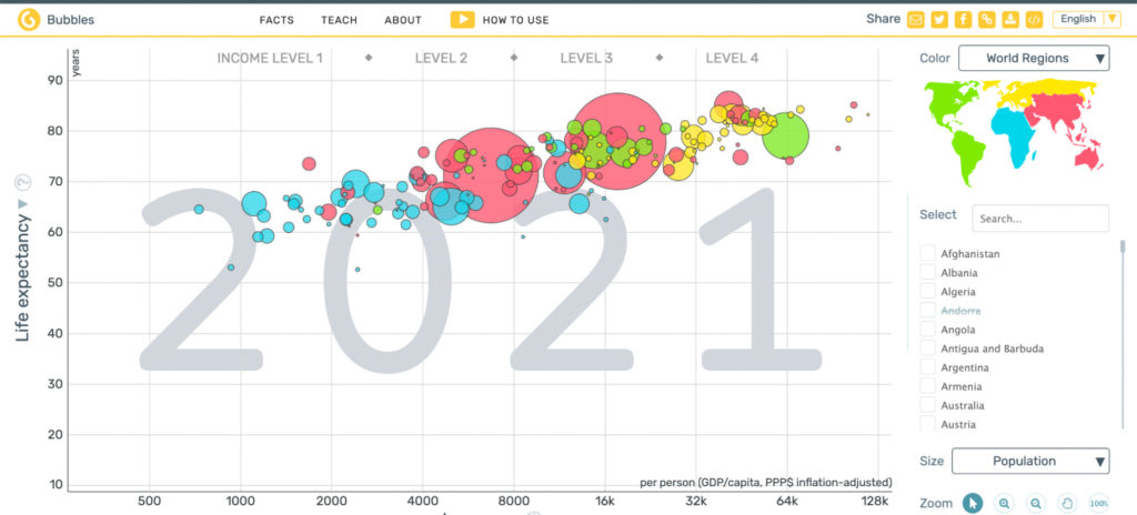
You can represent complex datasets in a comprehensible way using visualizations. It doesn’t need to take up a sizeable chunk of time and budget to do so either.
Use bubble maps and charts to demonstrate data like:
- Popularity of actions or purchases in a geographic area;
- The number of brick-and-mortar stories in a city;
- The popularity of specific activities globally.
Best tools for data visualization
Most organizations already have access to spreadsheets that can create basic visualizations. Google Sheets and Excel are the go-to tools to quickly create simple data visuals.
It’s extremely easy to do and you can use the free templates to make it even quicker. If you tweak your numbers, the template algorithms update the graphs automatically.
However, these template charts are fairly basic. The most you can do to enhance your graph is play around with some basic design elements, like font and color.
For more advanced data visualization, you’ll want to look outside these integrated spreadsheet tools to data specialist platforms and add-ons.
1. For creative visualizations: Tableau
Use Tableau to make sense of complex data with machine-generated data analysis, or when you want to create interactive visuals.
Connect your data sources (via spreadsheets or your analytics platform, such as Tableau’s analytics platform or Google Analytics), then let Tableau’s data interpreter organize the information.
Create a visualization and use the filters to zero in on specific results, such as results by region or year.
In Tableau, you can customize every element of the visualization, though you might need an experienced data scientist designer to do it if time is limited. The tool isn’t one to pick up immediately.
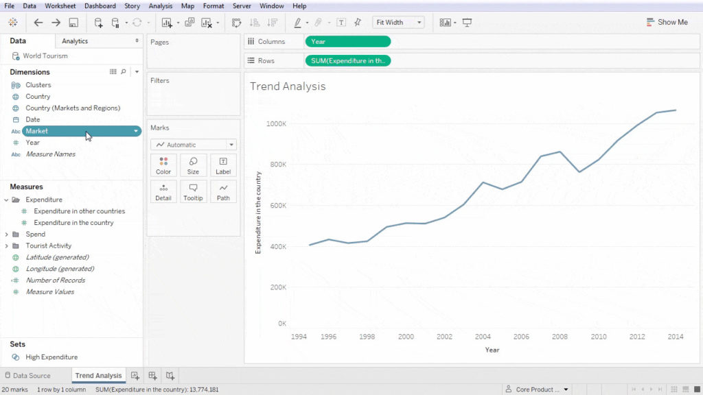
Tableau is particularly useful for creating interactive visualizations like this one on popular dog breeds:
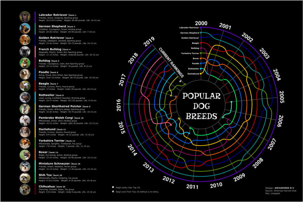
This data visual uses a rainbow of colors to represent dog types, then plots them on a radial graph to demonstrate their popularity over time.
When you run your cursor over the graph, you can quickly see where each dog type ranked in any year.
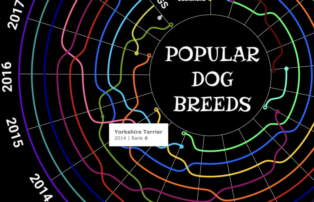
Tableau is ideal for going several steps beyond the spreadsheet graph and it can update your visualizations in real time if connected to a live data source.
It takes time to learn how to create visualizations like the one above (see more “data viz” inspiration in the community and browse the tutorials), so if you’ve got the budget, opt for a designer’s help.
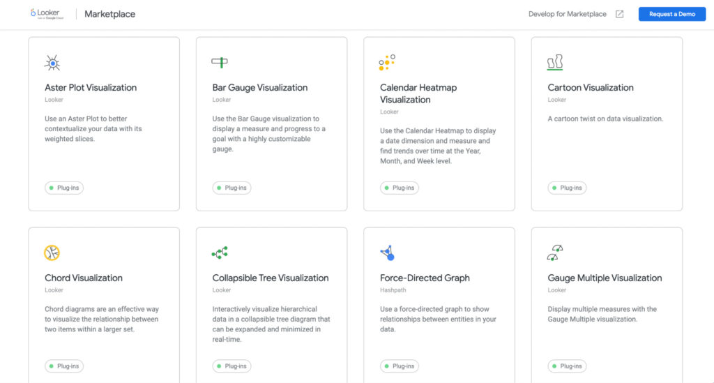
2. For internal visualizations that integrate with Google Cloud: Looker
Looker is a browser-based business intelligence platform that Google acquired in 2019 and is now a part of the Google Cloud.
It comes with a wide range of blocks and plugins in its Marketplace, each offering different graphical representations (e.g., tree maps and area charts) that you can embed, link, or add to your dashboard.
You can also customize your visualizations by specifying which dimensions you want represented in your visual and selecting the type of chart you’d like to use:
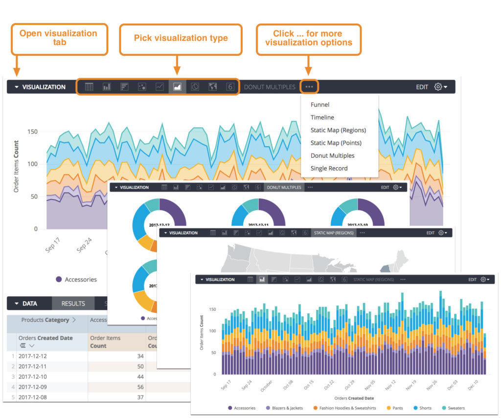
Looker also lets you combine multiple data visuals, like a line chart over a stacked bar chart to signify outliers.
Use Looker to demonstrate your internal visualizations. It gives you far more options than your standard spreadsheet graph and it’s easy to customize.
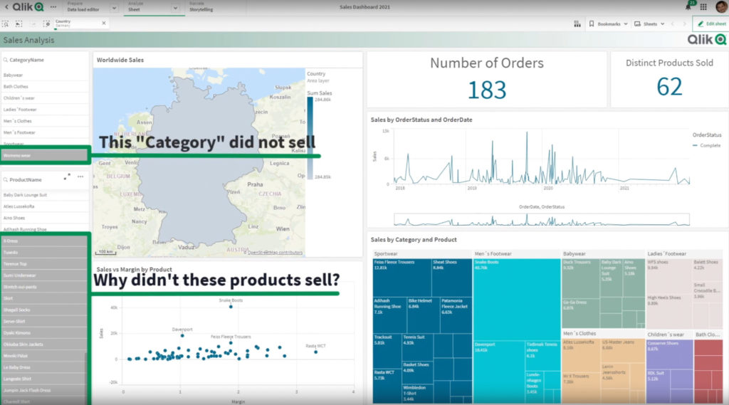
3. For drag-and-drop speed: Qlik
Qlik is a data visualization tool that helps you create interactive charts quickly. Once you connect your data, you’re given a range of options to display the information.
The main perk to Qlik is its speed. It really is a matter of plugging in the numbers and then customizing your graph with the drag-and-drop tool.
The platform is also helpful for identifying relationships between data points that may be missed by the human eye with its built-in AI data analyst.
Data visuals can be expensive and time-consuming to produce since multiple teams—design, product, sales, and marketing—typically must work together to produce them.
Let’s look at how you can repurpose them for maximum gain from your marketing spend.
Repurpose your data visuals for multiple channels
Recycling your content saves resources and conveys a unified message across all platforms.
Let’s say your company sells a music production app. You produce this infographic explaining how music industry sales have changed over time.
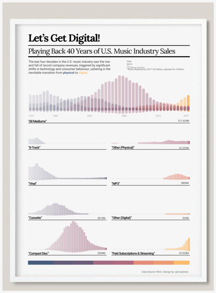
There are multiple ways to break down this visual for different marketing channels and use cases.
Perhaps you post this infographic on your blog as a hub piece. From that infographic article, you could:
- Write several spoke articles giving the background context to the rise and fall of music mediums;
- Repurpose those articles into several social media posts using images from the infographic;
- Repurpose the original post into a YouTube video;
- Demonstrate this infographic in presentations to reinforce your app’s purpose (to ride that incoming digital music tidal wave).
Tailor the visuals to the channel you’re using for maximum effect.
Effective data visualizations are highly shareable, and a great way to provide your followers with value while building your brand’s authority. Help them discover your data visuals by repurposing them in digestible formats.
Conclusion
Visual representations of your data can accelerate your brand’s growth when used strategically. You can enhance partnerships, connect with customers, and align sales and marketing teams.
There are many ways to visualize your data, so don’t let it sit in a spreadsheet. Get the most value from your analytics by representing them in understandable, visual, engaging ways.
Master data storytelling with our Data Presentation and Visualization online course.
Related Posts
-

Do you need to be a big company and need large volumes of traffic to be data…
-

You have your CRM, web analytics, email marketing tool, payment processors, survey tools and so…
-

How do you become an expert? Well, it starts by first deciding you want to…
-
Over the last years, Google Data Studio has evolved from an appealing but clunky application…