Investing in data lets you make strategic business decisions based on insights rather than instinct or opinion. It reduces risk and drives smarter investments.
But data has no value without understanding. While the data might make sense to you, it might appear as meaningless numbers on a page to people outside of your role.
The benefits of data lie in the way you communicate it.
In this article, you’ll learn why data storytelling is an important skill and how to use data presentation and visualization to influence your audience.
Table of contents
What is data storytelling?
Data storytelling is the process of transforming data findings into an understandable, relatable story that allows for better decision-making.
It simplifies the complex and presents insights in basic terms to influence decision-making, engage customers and stakeholders, and inspire action.
Why data storytelling matters: putting insights into context
Data is a critical contributor to growth. Its power is in the what: how many sales, how much traffic, how often actions are taken, etc.
Without analysis, data lacks the why to provide context: why do those numbers matter, why are those figures important, why should we care?
As Effective Data Storytelling: How to Drive Change author Brent Dykes says, “People hear statistics, but they feel stories.”
Also from Dykes:
Your data may hold tremendous amounts of potential value, but not an ounce of value can be created unless insights are uncovered and translated into actions or business outcomes. [via Forbes]
Humans are hard-wired to share stories as a way of communicating information. It’s in our nature to need them. We think in stories, remember in stories, and turn experiences into stories.
On this, Jonathan Haidt, author of The Righteous Mind, says:
The human mind is a story processor, not a logic processor.
An exercise at Stanford University, carried out by Made to Stick author and professor Chip Heath, shows how stories resonate.
Heath divided his students into groups and gave them statistics on crime patterns in the United States. Half the students in the group then had to give a one-minute presentation in support of non-violent crime being a serious problem. The other half had to give a one-minute presentation on non-violent crime not being a serious problem.
In each presentation, the typical student used 2.5 statistics. One in 10 students told a story. When the students were asked to recall the speeches, only 5% remembered a statistic, but 63% remembered the stories.
Data storytelling takes this in-built attraction to story-led communication and pairs it with visuals to simplify learning.
Humans respond extremely well to visuals. Dr. John Medina, author of Brain Rules, found that we remember 10% of information we hear after three days, but pair the information with an image, and we remember 65%.
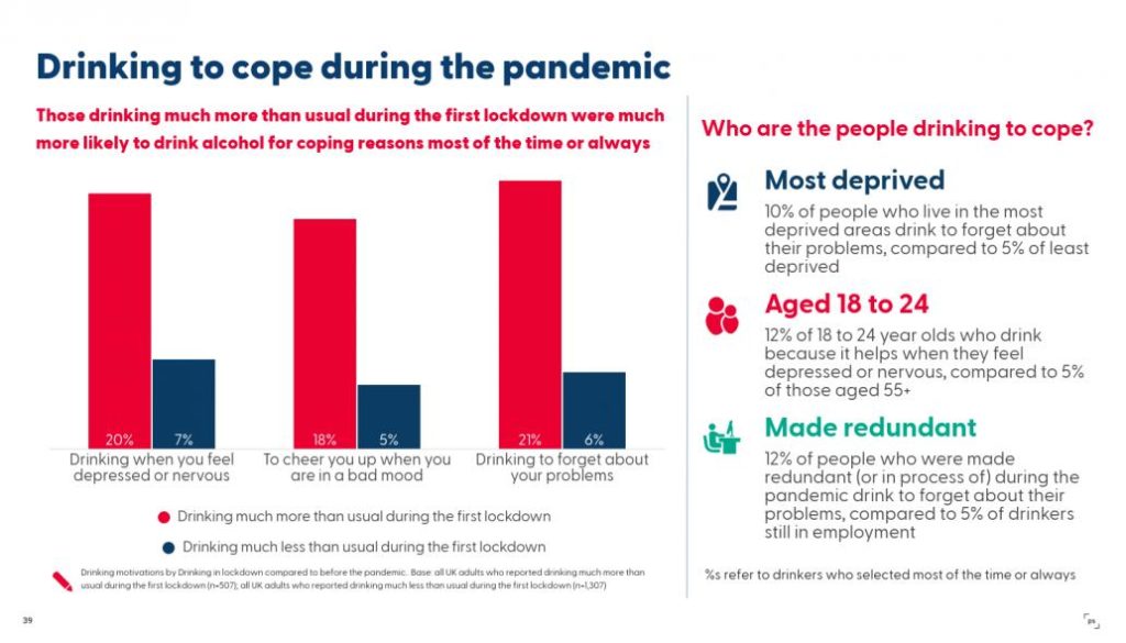
This is why data, visuals, and story go so well together. For example, this visualization on alcohol consumption by PSResearch for Drinkaware is much more compelling than simply stating percentages. 20% and 7% mean nothing without context.
Narrative adds weight to the bar chart, helping us understand the people behind the numbers.
Combining narrative with visualizations can have a powerful impact on your audience. It makes it easier to hold their attention, explain important points quickly, and have them retain the message.
The result? Added value that can be turned into actionable steps to improve marketing campaigns and grow your business.
The ability to turn numbers and insights into stories is why Brent Sykes says data storytelling skills are essential for data scientists and why demand for data analysts is projected to grow 23% by 2031, much faster than the average for all occupations.
As a marketer, learning how to analyze and communicate your own insights starts by understanding what makes a powerful data story.
The three essential elements of data storytelling
Every data story is built on three main components:
- Data. The foundation of your story and the information used to understand the big picture.
- Narrative. The storyline used to communicate insights, provide context, and hook the audience.
- Visuals. The visualization of your data and narrative to communicate the story effectively and make information easy to compute.
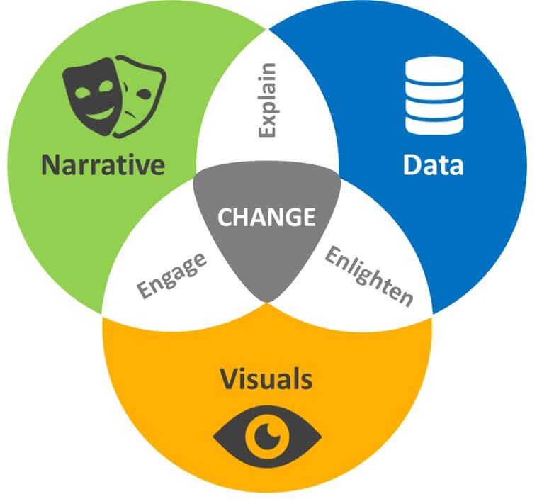
The diagram below shows the relationship between these elements and how they overlap.
For a story to have the desired impact, each component has to work in tandem.
Narrative explains the data, visuals make content engaging, and good data delivers insights and backs up the narrative to drive change (e.g., improved marketing campaigns, new product innovations, or personal development).
In Letterboxd’s Year in Review, readers are pulled into the story from the start with timely and relatable woes from the coronavirus pandemic.
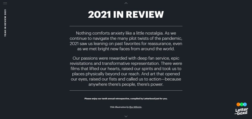
A hint at the content fans were consuming positions the data and builds intrigue. The intro is followed by a list of the top movies Letterboxd’s users were watching.
Each one is accompanied by an auto-playing trailer, review, and link to the corresponding page on the Letterboxd website.

The story concludes with a poignant message and a call to action to entice non-members.

It’s a great example of how data storytelling can turn something dry into engaging, interactive, and meaningful content.
Letterboxd’s data could have easily been a throwaway top 10 list on the company’s blog. Instead, it’s a content experience that makes users want to shout about their favorite films and gets them excited about movies they haven’t seen.
How to use data storytelling to compel your audience (with examples)
Data, narrative, and visuals are the framework for effective data storytelling. The overlapping benefits—engage, explain, enlighten, and change—are what your stories should seek to achieve.
Here are five steps to striking the perfect balance in your data storytelling.
1. Who is your story for?
A data story will only hit home if it’s relevant to (and resonates with) the right people.
Ask: Who is the audience?
Be clear on who will be consuming the story. Nailing this will dictate how you tell the story and what language you use.
For example, if you’re presenting to an internal audience, you may be able to get technical with language and use terms that your customer base might not understand.
However, how you speak to different people within your company will also vary. Data and language that engages board members might not have the same impact with floor staff.
If your story is for customers, ensure it maintains consistency with your marketing campaigns to deliver familiarity.
Look closely at your brand guidelines and marketing strategy. Think of your data story as another marketing tactic, so the content should match your branding and tone of voice.
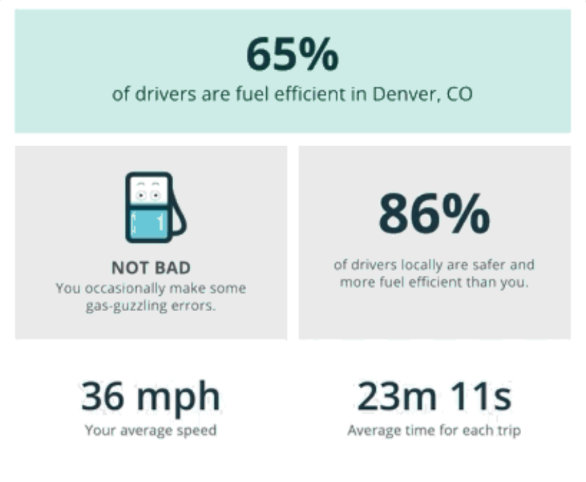
For example, GasBuddy’s driving insights email matches the color scheme, imagery, and conversational messaging of its website:
The style of content is familiar to customers, making it more naturally engaging. Had GasBuddy strayed from this aesthetic, it would have risked confusing the audience, creating a breakdown in the trust it had built by maintaining consistency. In doing so, the message would have been lost.
2. Find a story your audience cares about
Your story is built around the central element of the data storytelling framework: change.
- What are your goals?
- What are you trying to explain?
- What change do you want to drive?
For example, in its annual report for stakeholders and the public, Oxfam shows how its work benefits people worldwide and motivates its audience to get behind the cause.
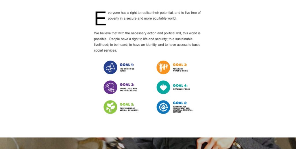
The data, narrative, and visuals focus on goals that are important to Oxfam’s audience:
- The right to be heard;
- Advancing women’s rights;
- Saving lives;
- Sustainable food;
- Fair sharing of natural resources;
- Financing for development and essential services.
This makes it easier to keep people engaged, which helps Oxfam communicate the data insights that will inspire action.
Consider what your audience cares about. Use these topics to find the hook (e.g., a theme, question, or conundrum) that you can take the audience on a journey to resolve to help them solve a problem or improve their lives.
Oxfam knows its audience cares about advancing women’s rights. Looking at the data, it found that youth unemployment for young women was a problem and used storytelling to show how Oxfam is helping.

Here are some approaches to identify a hook for your story.
Trends
What’s on the rise? What’s on the slide? Are there flattening trends? How does this impact the future? The peaks and troughs of trends can warrant further inspection.
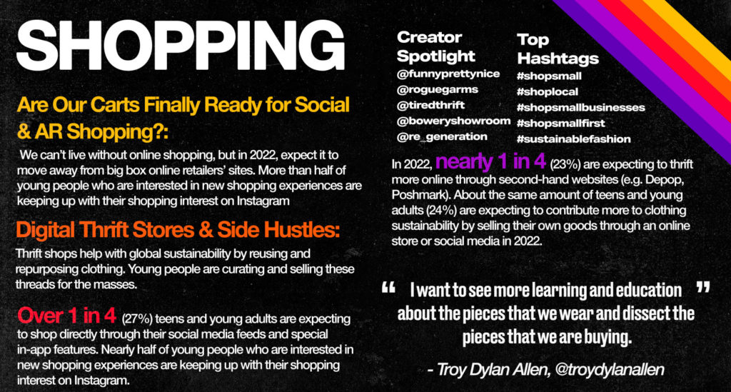
Instagram, for example, used audience insights from 2021 to create a visual outlook for 2022.
Comparisons
Side-by-side datasets and how they change over time can be analyzed deeper to find why one is more successful than the other.
For example, you might compare a series of ads to see which was more effective. From there, you could look at the elements like headlines and CTAs to provide insights that help your audience improve future campaigns.
Correlations
Interesting and surprising connections between datasets can provide insight for a meaningful narrative.
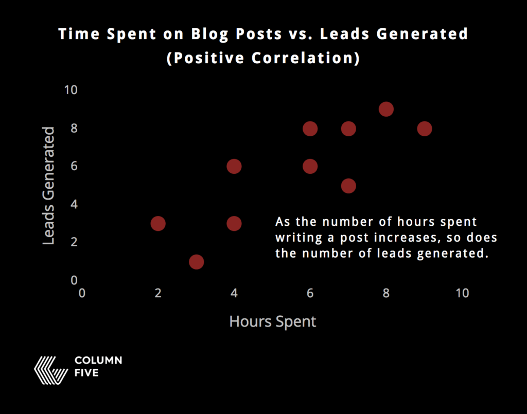
For example, this scatterplot by Column Five shows the correlation between time spent writing blog posts and leads generated.
Through visualization and narrative, Column Five shows that as the number of hours spent writing a post increases, so does the number of leads.
This information can be expanded further to look at different elements of longer blog posts that convert and how to use these elements to improve content marketing campaigns.
Outliers
Data outside of the norm is an instant point of analysis. Why is it acting that way? What’s causing it?
For example, if the majority of your customers regularly spend $1,000–$1,500 a year on your product but three spend $10,000, why is this the case? Has a particular upselling campaign made the difference? Do these customers interact with the same sales rep?
Look out for surprising data; the unexpected can make for great stories.
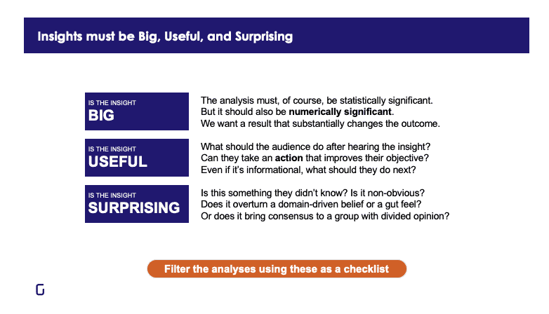
To uncover insights worth talking about, follow Gramener’s BUS formula. Focus on data points that are Big, Useful, and Surprising.
If data is numerically significant, actionable, and non-obvious, it has the ingredients to engage audiences.
3. Develop a compelling narrative to take the audience on a journey
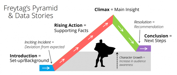
When crafting your narrative, it pays to follow a tried-and-tested narrative structure. While structures differ in the way they navigate from beginning to end, the most popular story arcs—Freytag’s Pyramid, The Hero’s Journey, The Three Act Structure, etc.—deploy the same four components in some shape or form:
- Context. The situation and why you are telling the story.
- Characters. The main players (e.g., people or places).
- Conflict. The problem that data presents.
- Solution. The key insights, actionable steps, and value to be gained from the story.
We can see these play out in this modified version of Freytag’s Pyramid.
Introduction
The introduction is the context. This is where you detail the reason for your story and place your hook — the inciting incident that kickstarts the journey.
For example, Nadieh Bremer sets the scene and builds intrigue for her “Why do cats and dogs…?” data story by introducing common questions.
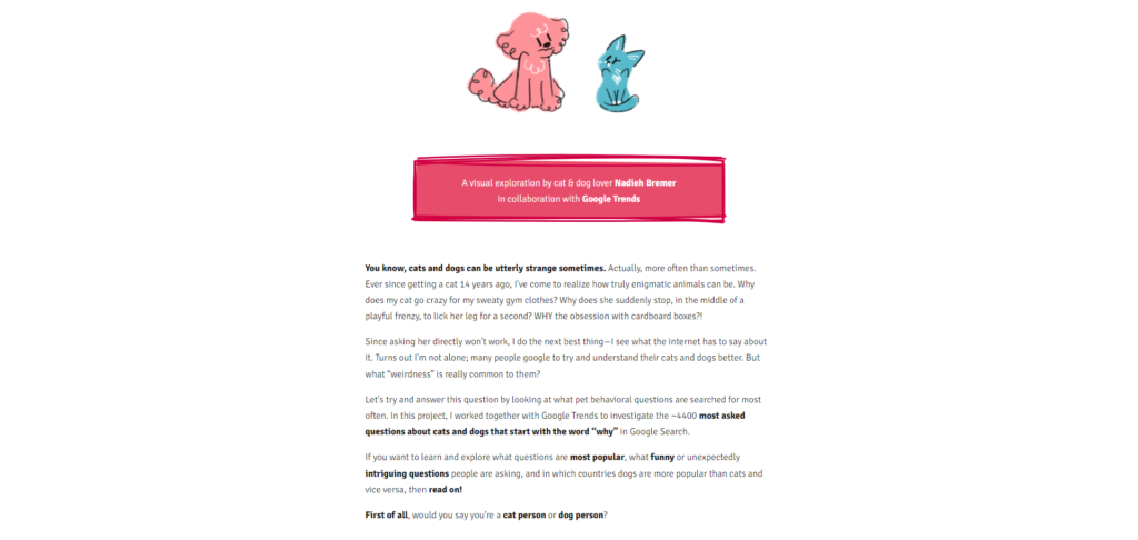
The hook is wondering why cats and dogs do what they do, but not being able to ask them directly. Data will uncover the answers. Bremer’s intro also helps the audience understand what they’ll learn and introduces the characters (cats and dogs). This immediately brings the story to life.
Your intro’s goal is to get people to move down the page. Provide context on time periods, data sources, trends, and questions to help the audience orientate themselves and get excited for what’s to come.
Rising action
The rising action is the conflict—the supporting facts that carry readers to the peak of the journey (e.g., what influenced or contributed to change? What other evidence is helpful?)
But supporting facts are just that: supporting. The central characters are people, animals, or places.
In “Why do cats and dogs…?” pets are the main players in the story. In Bill & Melinda Gates Foundation’s Goalkeepers Report data story, people are the heroes:
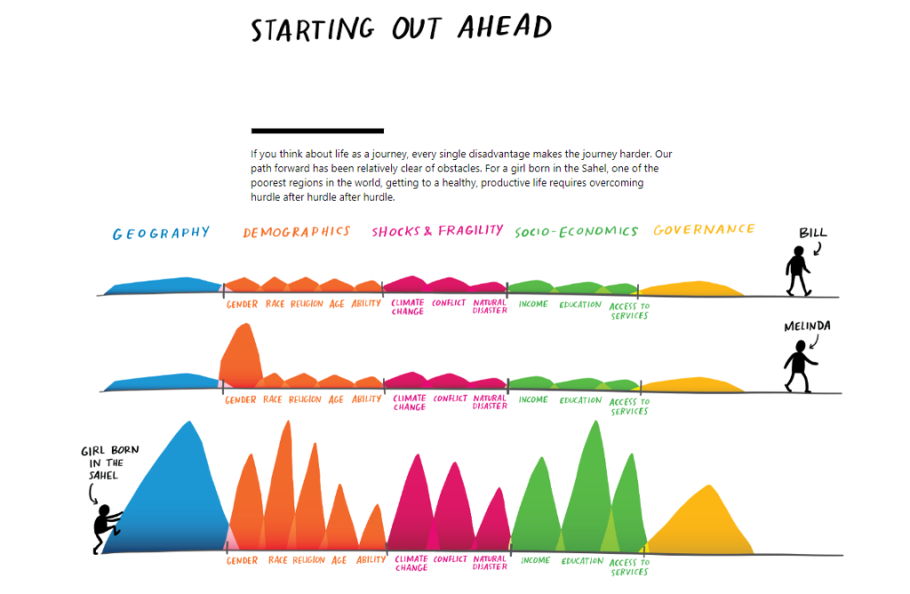
In both cases, data takes a back seat, providing the supporting facts that help move the story forward. Add a relatable central character to your story to make it resonate with your audience.
People care more about characters they can envision in their daily lives. Numbers, as the hero of the story, will fail to strike an emotional connection.
Climax
The climax is the “Aha!” moment—the major finding or central insight of your data.
In traditional storytelling, this is where the audience moves from identifying to empathizing with the main character, solidifying their emotional connection.
For your narrative, it might be part of the story where everything falls into place. The audience recognizes the problem or benefit and begins to wonder what can be done about it.
In the Goalkeepers Report, a narrative backed by supporting facts leads to a climax of geography and gender being deciding factors in your future.

In “Cicadas: A data story,” created with Juicebox, the climax is the number of U.S. counties that will be impacted by periodical cicadas.
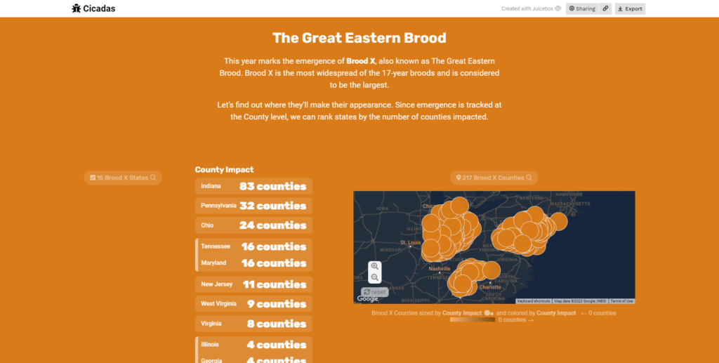
In both examples, the issue is clear. What follows are solutions.
Conclusion (Next steps)
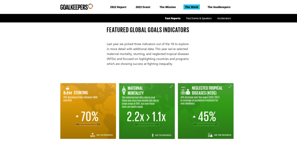
The final section delivers the solution. What do you want people to do next? In the Goalkeepers Report, Bill & Melinda Gates Foundation encourages readers to examine additional data in more detail to see the progress being made on different issues.
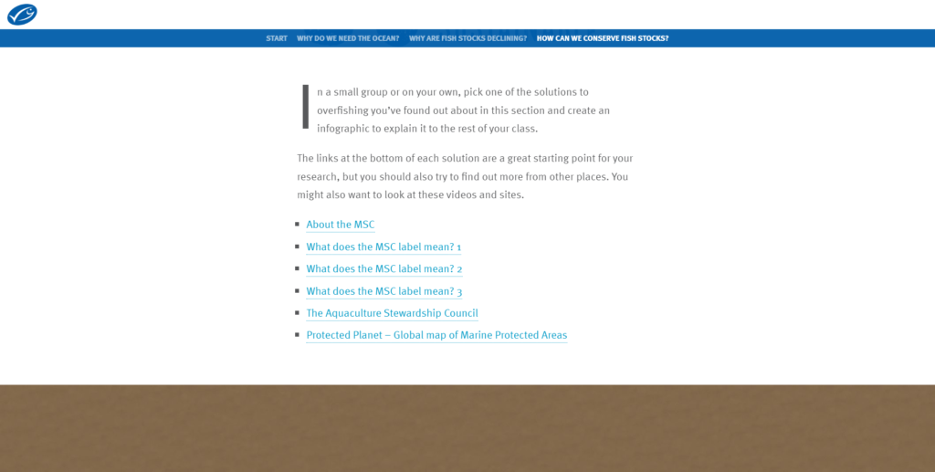
In “How my dad fishes for the future,” The Marine Stewardship Council provides exercises for the audience to help answer questions like “how can we conserve fish stocks?”
Leave readers with some actionable takeaways. If what they’ve seen is likely to have them enthused about your brand, provide a call-to-action to encourage further interaction.
4. Find visuals that simplify and clarify the message
Visualization does a lot of heavy lifting in any data story, so your chosen method must help display information effectively to get your point across.
For example, in its fan study, Spotify uses a bar chart to display the percentage of weekly top songs from outside North America and Europe.
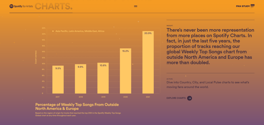
This helps readers quickly process information, while clearly demonstrating the difference in volume. Had that information been presented as text or a table, it may not have had the same impact.
If you want to show differences in proportions between groups, a horizontal or vertical bar chart is the easiest way to do it. But other datasets are best displayed in different ways.
Here are some common types of visualizations to use in your stories.
Line charts
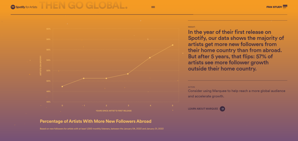
This is the best way to show changes in continuous data over a period of time.
For example, Spotify’s line chart quickly demonstrates the increase in artists’ followers.
Tables
If you’re covering several categories at the same time, a table will let the audience process a large amount of information at a glance.
This sample table from Beautiful.ai shows how financial data analysis has been simplified to show improvements over time.
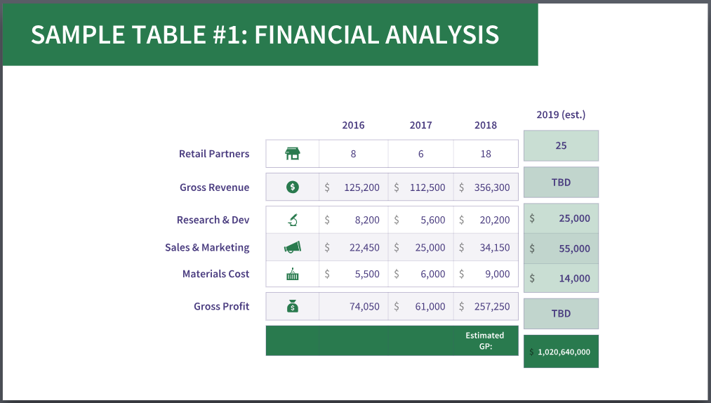
When designing tables, use icons and colors to draw attention to specific categories and numbers that are important to your story.
By highlighting the most recent year in green, Beautiful.ai is able to quickly focus its audience on the most impressive figures.
Pie charts
Use pie charts to communicate the sum of proportions across categories.
For example, MicroStrategy uses pie charts to visualize survey results and quickly show how the majority compares to the minority:

Maps
Use maps to show geographic trends and location breakdowns at a glance.
Cicadas, for example, uses Google Maps to show how a brood will impact different counties.
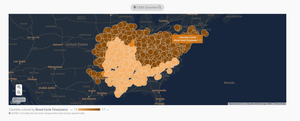
To increase interactivity and enhance user experience, each dot on the map shows information about the county and the Brood Cycle Time, allowing users to pinpoint how their area will be affected. For more context, use interactive maps to add more value to your data.
Notice how the map also uses darker and light colors? These are a useful way to quickly demonstrate higher population densities or increased activity in certain locations.
Infographics
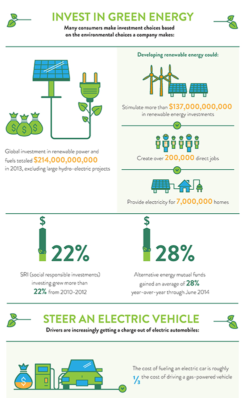
Use infographics to draw attention to information. Huff Post’s infographic on the economics of going green is a great example of how pictures can make statistics more engaging.
Scatterplots
Use scatterplots to explore the positive or negative correlation between data, as shown in the Column Five example of time spent writing blog posts vs. leads generated.
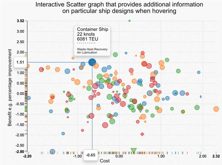
These are great for making interactive data visualizations, and you can add variables (such as density, weight, or amount) by making your scatter points bubbles:
Visual storytelling best practices
If you want to wow your audience and deliver a clear message, you’ll want to learn some data storytelling basics, such as:
- Simplicity and clarity are key to helping your audience understand information at a glance.
- Use whitespace to draw readers’ attention to the data.
- Use color to highlight key data points you want to draw attention to.
- Ensure graphics match the data. For example, if you’re presenting sales data for different regions, larger circles should represent higher volumes.
- Remove chart borders, gridlines, and axes that distract from the data.
- Use standardized units consistently to avoid confusing your audience. For example, if you’re measuring distance, use feet and yards or centimeters and meters, not a combination of the two.
Excel and PowerPoint provide data visualization tools within their products. But to wow your audience, you’ll want to look at specialist platforms with enhanced design features.
There are several powerful tools you can use to simplify and visualize data for your stories:
- Microsoft Power BI for creating interactive dashboards;
- Google Data Studio for time series visualization;
- Tableau (or Tableau Public) for complete data visualization;
- Datawrapper for creating charts, maps, and tables from datasets;
- Leaflet for building interactive maps;
- Open Refine for cleaning and transforming data;
- Canva or Visme for creating infographics.
Each software comes with its own benefits and includes different features and restrictions depending on the subscription plan.
Weigh up the pros and cons for each based on the kind of stories you want to create. Most tools offer a free trial or package. Take advantage of this to test features and usability before committing.
5. Draft, test, and edit your story
To create a draft that engages your audience, follow the linear story arc: introduction, rising action, climax, and resolution. A clear beginning, middle, and end will make it easy for people to follow along and give you a clear structure to add visuals where they make sense.
Use visual hierarchy to place information. Most people in Western cultures read from left to right in a Z-pattern. Follow this pattern to guide readers through your story and help the audience process information.
Work with a designer or use a template to bring your story together and test it with members of your team. Ask users to answer the following questions:
- Does the story tell the truth? Do statistics add up? Do insights make sense? Data should dictate the narrative and not be manipulated to fit. Getting caught massaging data for a better story can damage your credibility. Stick to the facts.
- Is the story relevant to the audience? Will they be interested in the findings? Do insights provide genuine value? If anything seems repetitive or not useful, cut it.
- Is it presented clearly? Is the story easy to read and understand? Visuals and copy should contribute to the narrative and move the story forward. Look for any points of confusion and ambiguities that may drive the audience to conclusions that differ from the overall goal.
- Did the story engage, explain, and enlighten them? After reading your data story, the audience should be able to answer their questions, make better decisions, or improve an outcome.
The best insights will fall flat if the story doesn’t do them justice. Use feedback to improve conciseness and clarity so that data has a powerful impact.
The do’s and don’ts of data storytelling
When creating your data stories, keep the following rules in mind to stay on the right track.
Data storytelling don’ts
- Don’t cherry-pick data. Don’t solely favor insights that support your idea, give readers the whole picture.
- Don’t offer single facts without value. The what is nothing without the why.
- Don’t make the “Aha!” moment difficult. Use clear comparisons to help people understand why data is significant. For example, if you want to highlight the significance of sales in a particular region, compare it to a competitor’s sales, sales from a previous year, or sales in another region.
- Don’t overcomplicate design. Stick with a small number of colors that contrast if printed in black and white. Use images of familiar objects to help readers connect data. For example, if you’re describing distances, use football fields to help readers easily visualize length.
- Don’t show a lack of confidence. Share opinions and deliver recommendations. Show off your expertise at every opportunity.
Data storytelling do’s
- Do ensure data is complete and reliable. List sources and include links where relevant so readers can further explore insights. Avoid assumptions.
- Do provide key takeaways. Give readers information they can use going forward.
- Do maintain consistency. Use repetition in colors, labels, and conventions between visuals. Use language that fits the audience.
- Do explain data stories in stages. Present complex information in digestible chunks to make it easier to process. For example, if your data story focuses on new markets for growth, introducing different elements gradually by product-level demand, regional demand, and global demand will help make info easier to understand than if it was bundled together. It also allows you to strengthen your argument with every step.
- Do present authority. Cut filler words that don’t add value. The below hack from Grizzle editor Erica Schneider shows how subtle tweaks can make a big difference to perception.

Conclusion
Data storytelling is the difference between data analytics looking positive to marketers and getting buying in from stakeholders and customers.
Design stories for the audience and your objectives. Insights need to be engaging and enlightening, but they should also be strategically relevant to influence business decisions and change outcomes. A good story leaves people with new ideas and perspectives they can put to use.
Learn more about presenting clear and engaging data in our Data Presentation and Visualization course.
