
In a world where A/B tests are done by over 70% of online businesses, choosing not to follow a data-driven methodology to make informed decisions on website changes might seem unreasonable.
But what if your website doesn’t have enough traffic? Or if your management refuses to justify the costs of A/B testing? At Map My Growth, we often face this scenario.
You can either play a guessing game and hope that your optimization efforts will be successful, or you can use more qualitative (and often budget-friendly) methods to turn that guessing into a safer bet.
Table of contents
The “Safest Bet” approach to website optimization
To be clear, the methods detailed below will never provide the statistical validity of well-executed A/B tests. But they will help you avoid making changes based solely on gut instinct or because something worked well for your competition.
As Kurt Andersen puts it:
The end has come for making marketing decisions based on gut instincts; everything marketers do in the digital world can now be tracked, from the first click all the way to the deal close. CMOs who do not embrace and accept this concept will likely not be CMOs for very long.
The Safest Bet approach is a way to eliminate as much guessing from the website optimization process as possible. It’s based on gathering quality user feedback that drives changes to your design, copy, and funnels. (You can test messaging, for example, with tools like Wynter.)
Here’s what you can test with this approach:
- Landing pages (especially recommended before you invest in PPC).
- Major redesigns of old pages (also if you want to rebrand or add a new page).
- Navigation (if you have many categories and subcategories, but you’re not sure how to structure them to provide a seamless user experience).
- Sales funnels (essential for websites offering demo calls or free trials to identify friction points).
- Any significant changes to your existing website (rather than minute, low-ROI tweaks like the CTA text or rewriting just one headline).
And here’s how to do it.
Alternatives to A/B testing for low-traffic sites
It’s time to get our hands dirty and look at specific alternatives to traditional A/B testing—how to use them, which tools to choose, and what to be aware of.
User testing to verify optimization changes
User testing (or usability testing) is one of the most commonly used qualitative research methods. For almost 20 years, marketing professionals have reported that only 5 user tests can reveal 80% of usability issues.
And for the most part, that’s true. It’s recommended to run smaller studies every few months. The problem, however, is that when you make changes based on user testing insights and your website traffic is low, it can take months before you see the results.
As Alex Barzelay, Head of European Business Development at Userlytics, points out, A/B tests can’t explain why one variation won, even if you test on high-traffic pages and reach 95%+ statistical significance:
A/B Testing is a great way to optimize the user experience and conversion between two or more design variants. But if you need to understand the why, not just the what, as part of your design process, or if you are dealing with a low traffic website or app, nothing beats an iterative qualitative user experience test process.
An A/B test, by nature, requires a large sample size which can be both costly and time-consuming to analyze. Why not let users express what they would improve, without being forced to choose between two versions?
To get the most from your testing efforts, you can add more quality and speed by:
- Recruiting more than 20 (or, ideally, 50+) users.
- Ignoring verbal feedback (especially if you’re short on time).
More users = more data points
Consider this: You buy a new jumper that’s nothing like what you usually wear. You ask a friend if she likes it. She says no. You decide to ask three more people to verify the opinion.
Two of them say yes, but the last one says no. It’s a tie.
What do you do? You go with your gut instinct and keep the jumper because you invested time and money to buy it.
But what if you ask 20 people who don’t know you? What about 50? From a scientific point of view, that many data points still wouldn’t get you close to statistical significance, but it certainly could cause you to rethink your gut instinct.
With 50 “users,” you can essentially end up with three scenarios:
- 35+ (70%+) users will love your new jumper (design), so that’s a likely win;
- 35+ (70%+) users will hate your new jumper (design), so that’s a likely loss;
- You get a split somewhere between 30/70 and 50/50, so it’s likely that people won’t pay attention to your new style (no likely winner), but…
In this case, you shouldn’t just ask if a user prefers the new jumper, and instead take your learnings further by asking them why. The combination of their reasoning and other research methods will help you make a more informed decision.
Written feedback = depth and speed
This one can be a bit controversial. We love user testing videos because they show us people interacting with our website (in a controlled environment). Over the last eight years, I’ve seen more than 1,000 such recordings, and what strikes me is that when participants are asked to “speak their thoughts aloud” or “share their feedback verbally,” that feedback is often superficial.
To (almost) force your users to really think about what they like/dislike/don’t understand about the content/design/offer they’re reviewing, ask them to write down their response after providing verbal feedback.
Here’s an example (based on real, unmoderated tests):
- Task: Tell us what you didn’t like about the cart page.
- Verbal answer: There wasn’t anything I disliked, maybe the images could be better. [Generic feedback—you can’t do much with it.]
- Written task: Describe, in a sentence or two, one thing you didn’t like about the cart page (and why). [User is forced to use many words and, therefore, provide a more detailed response.]
- Written answer: The images of the products I added to the cart were small and I couldn’t immediately verify if I’m buying the right products. [User had to think about the issue a bit longer and provided actionable feedback.]
You’ll often hear users say words like “better,” “good,” “bad,” “confusing,” which ultimately isn’t helpful in creating new designs or writing copy. Putting thoughts into writing results in higher-quality feedback.
Workflow for user testing
With low traffic, your testing process needs to involve the following stages:
- Selecting and recruiting the right users;
- Creating a prototyping environment;
- Preparing questions and tasks;
- Analyzing data.
1. Selecting and recruiting participants
If you have a compelling value proposition for your product/service, chances are you’ve already identified your target audience—who they are, what they need, why they should buy from you.
When you do user testing, you usually have only one or two screening questions to comb through thousands of registered users and get your ideal profile.
Here’s what you should avoid in your screening process:
- Asking yes/no kind of questions such as, “Do you need a CRM solution?”
- Offering very similar responses for multiple-choice questions. (You’ll lose potentially ideal users who tick more than one box but have to pick just one answer.)
Let’s take a look at an example scenario: You’re trying to find users to review your B2B payroll solution. The ideal profile (based on your internal research) is:
- 30+, US based, male or female (most tools will allow you to pick these settings without wasting your screening questions);
- Company size of 50+;
- Problem identification/pain point: wastes time on monthly payroll activities.
If you have just one screening question available, you can generalize that ideal profile and focus on the product and/or problem you’re solving. Here’s what you can ask:
Which of the following is your biggest problem at work? (We will verify this during the test, so please answer truthfully.)
- Finding C-level staff;
- Managing many communication channels;
- Processing payroll for many employees [Qualified];
- Struggling to get promoted or noticed;
- Having to use old hardware;
- Managing legal contracts with clients;
- Finding reliable e-signature software;
- None of the above.
We have eight different options. The only common element is that they are most likely related to an office-based job. Someone who isn’t the right fit won’t be able to guess the correct answer, and they’re also discouraged from trying to do so by the sentence in parentheses.
If you have two, three, or more screening questions available (like with UserZoom GO or User Interviews), you can get even closer to your ideal profile.
However, if your tests are not “picked up” within two or three days, it usually means that your screening process is too strict. Some tools allow you to change the screening questions after your test is live, but I don’t recommend it. The change will most likely apply only to future candidates, not the ones who’ve already been disqualified but could have otherwise passed the more lenient version of your screener.
2. Prototyping environment
Comparing the variations side by side is where the learnings of your tests lie. If both your control and variation(s) are live and have individual URLs, that’s great. But if not, then you can do the following:
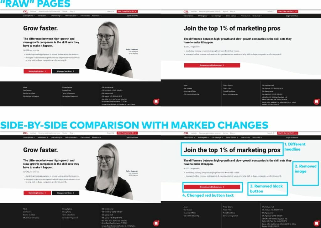
- Take screenshots of your control and variation(s). You can use free tools like FireShot to capture long pages and show these “raw” pages to the users (without any indications of what was changed).
- Copy the screenshots and mark all the changes you made in the variation(s) so that users can easily see them.
- Upload all the files into a prototyping tool (like InVision) to generate URLs that you can publicly share with your users during the test.
Here’s how it’d look if we decided to (A/B) user test the CXL homepage:
3. Questionnaire preparation
Once you have your users and URLs ready, you need a script for users to follow during the test. For user testing, you should cover the following areas:
- Group 1 (50% of the users): General impressions about the Control (likes, dislikes, confusing elements, what users would improve).
- Group 2 (the other 50% of the users): General impressions about the Variation (same aspects as above).
- Both groups: Side-by-side comparison of the different versions, looking at the pages without marked changes. (Can users spot the differences? What do they think? Which difference do they see first?)
- Both groups: Side-by-side comparison of the different versions, looking at the pages with marked changes. (Which changes users didn’t notice? Which change, overall, is the most impactful?)
If you ask your users to look first at the Control and then at the Variation, their opinion about the latter will be biased (they’ll have a fresh reference point in mind), so it’s important to split your participants into two groups.
Let’s look at the example of the CXL homepage again.
Example for Group 1 (Control):
- Start the test on the Control page. [Verbal task] Spend 1–2 minutes looking at this page. Don’t click on anything. (You can scroll down.) Once you’ve reviewed the page, proceed to the next tasks:
- [Written task] What are the top 3 things that you liked about this page? Please be specific.
- [Written task] What are the top 3 things that you didn’t like about this page? Please be specific.
- [Written task] Explain in one sentence what CXL offers.
- [Written task] If this wasn’t a test, what would you do next? Would you leave the site and forget about it? If not, where would you click and why?
- [Written task] What’s the one thing that could be clarified about what CXL offers?
- Redirect users to the side-by-side comparison of the pages (without marked changes). [Verbal task] We’re thinking of changing a few things about the page you’ve just seen. Spend 1–2 minutes comparing the pages and try to spot the differences. When you’re ready, proceed to the next tasks.
- [Written task] List all the changes that you’ve noticed compared to the first page that you reviewed.
- [Written task] Which of these changes would you consider positive and why?
- [Written task] Which of these changes would you consider negative and why?
- [Written task] If this wasn’t a test, which page (let’s call them First and Second) would make you more likely to explore CXL’s offer? Why?
- Redirect users to the side-by-side comparison of the pages (with marked changes). [Verbal task] You can now see all the changes we made compared to the original page. Take some time to review them. When you’re ready, proceed to the last task.
- [Written task] Are there any changes that you didn’t originally notice? If so, please write down their numbers as indicated in the image you see.
This approach would help reveal:
- What users think about each page (separately), which can generate ideas to modify the designs.
- Which of the changes are too small to make a difference and thus unnecessary.
- Which of the changes affect the experience in a positive/negative way.
- Overall (if you have many users), which page is better—and why.
4. Data analysis and generating insights
If you use a test script that’s similar to the one above, you’ll end up with written answers to 10 questions. You might have your own in-house approach to analyzing written data, but if you don’t, there are spreadsheet templates that you can use to structure and understand the responses from your test.
Recommended tools if you can spend up to $500
If you or your company have never invested in user research, you might be constrained by not including this type of activity in your marketing budget.
This first step in getting started is a proof of concept. At this stage, you’re willing to invest some money to see if the new approach is for you (spoiler: it is). What should you choose?
With $500, you won’t be able to afford a subscription-based user-testing platform. You’ll need to rely on tools that don’t offer granular screening other than filtering users by demographics.
The best option will be UsabilityHub because you won’t need a subscription, and testing is very cheap, starting at $6 per participant. The results are usually available within minutes from launching a test.
You’ll be able to use this tool to gather feedback on design, colors, layout, but not the actual value proposition and features (the users might not understand them).
You can also recruit users manually by:
- Posting on LinkedIn, especially in LinkedIn groups.
- Asking in Facebook groups.
- Inviting your customers and newsletter subscribers via email. (Warning: these people will be familiar with your brand, so the results might be biased.)
- Using on-site pop-ups (like the ones offered by Hotjar or CrazyEgg) to ask website visitors to take part in your study. (Same warning as above. Plus, you need to be aware of legal constraints, like GDPR.)
In each case, you’ll need to moderate the process yourself—invite each user on a call rather than rely on the benefits of unmoderated user testing. It’ll take more time, but it’s your best option with a limited budget.
Recommended tools if you can spend up to $5,000
With this budget, you can either recruit users ad-hoc or invest in a yearly subscription with some of the best-available tools. Here are the recommendations:
User Interviews. They don’t offer a testing environment, so you’ll still have to stick to the moderated, more manual approach, but they are the best platform to recruit niche participants and verify them.
You can access participants’ social media profiles and talk to them before they’re accepted for the test. Cost: $40/non-B2B user, $80/B2B user + custom incentives (usually $20–40/user). You’ll also get three free credits when you sign up.
UserZoom GO. With UserZoom, you get unlimited screening questions, and it’s easy to replace users if the recordings aren’t up to your standards. The yearly subscription costs $3,000, with an additional cost of $15 per participant, sometimes more (e.g., for app testing). There are extra costs to purchase study credits, but, overall, it’ll be within the $5k budget.
Userlytics. The team behind the platform can help you set up your study and recruit participants based on a very flexible screening process. (You’re not limited to multiple-choice questions.) If you operate outside of the United States, they can recruit users from other relevant countries.
The starting bundle costs $3,450, and you get 100 test credits ($34.50 per recording).
Recommended tools if you can spend $5,000+
With this budget, you have two options:
- Make user testing part of your CRO process and spend the budget on repeating tests whenever needed, using the less-expensive tools from the previous section.
- Invest in an enterprise-level subscription.
If you decide to “go enterprise,” you can upgrade your User Interviews/UserZoom/Userlytics subscription and get more customization or even get a dedicated researcher to set up and analyze everything for you.
You can also choose Usertesting.com. They’re the biggest user-testing platform and offer exceptional collaboration, recruitment, and data-analysis features. They’re fast (you can get users even the same day) but also very expensive—their subscriptions start around $20k/year.

Map testing for optimizing user attention patterns
The user testing method above works most effectively when you have a variation to test, but you risk losing time (and money) if the changes you’re verifying aren’t backed by additional research methods.
One solution is heat maps. There are many types that offer insight on what users do on your pages, how much they scroll, what they click on, etc., but the fact that this data can be used to also imitate A/B testing is easy to overlook.
1. Using heat maps to drive website optimization
Let’s take a look at a simulation of heat maps for the CXL Conversion Optimization Minidegree page (a scroll map on the left, and a click map on the right):
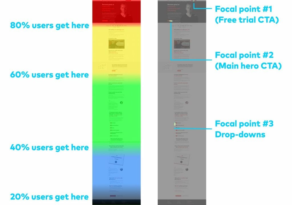
The purpose of a product page like this should be to:
- Spark enough interest for the visitors to take action (conversion); or
- Encourage the visitors to scroll down and understand the benefits (nurturing).
These simulated heat maps clearly show that users’ attention concentrates on the hero section, and the action points (clicks) are where they should be—around the CTAs.
However, there’s also significant activity more than halfway through the page, where many visitors click on the drop-downs with the course outline, which suggests that they’re searching for more information.
This brings us to a testing hypothesis: If we move the course outline section right below the hero section, we will see less scrolling, and, as a result, users will find the information they’re looking for more easily, which could lead to higher conversions.
Of course, the hypothesis can be A/B tested, but if you don’t have enough traffic, you can (A/B) map test that new design idea.
2. Workflow for map testing
By following these steps, you can get a better idea as to whether your new design is more effective than your old one:
- Generate heat maps for the existing page and analyze them as per the example above.
- Make changes and tweaks based on your analysis. (Remember to form a hypothesis to give these changes a purpose to satisfy.)
- Replace the old page with your modified design. (It should “go live.”)
- Generate heat maps for the new page.
- Compare the heat maps from before and after making the changes to see if they worked as intended. If they did, keep the new design live.
There are some real limitations to this method. For one, you’re optimizing for micro-conversions—user engagement metrics that, you’re assuming, will translate into improvements at the macrolevel (i.e. sales). That doesn’t always pan out.
Additionally, you’re comparing a page’s performance over two different time periods. Seasonality and other marketing campaigns will affect your results. And, with a low-traffic page, you may be waiting months to learn, for example, if users scrolling less to find course information really does lead to more conversions.
Of course, you’re choosing this method out of necessity. But report “results” cautiously, and test big changes, not small tweaks, so that the difference in user behavior is clear.
3. Traffic and time considerations
Map testing isn’t something that everyone can do.
If your target page attracts 2,000 visits a month, it’d take you around 30 days to gather those 2,000 pageviews, which is similar to how long A/B tests usually run.
However, keep in mind that not every page visit is trackable (e.g., if a user doesn’t accept your privacy policy), so you should observe how many data points are generated every day to accurately estimate the expected end date for your experiment.
4. Eye tracking instead of real-visitor data
If the traffic landing on your target page is so low that it’d take you months to create user-generated heat maps, instant feedback tools using eye-tracking technology might be the best option.
While traditional heat maps are based on real-life input from website visitors, eye tracking takes advantage of artificial neural networks supported by machine-learning algorithms. Instead of waiting weeks, you can generate attention and click maps within seconds, with accuracy as high as 85% compared to real visitor data.
The main disadvantage is that you can’t create scroll maps, so they work well only for one-screen tests—hero sections, short landing pages, or app screens.
There are also eye-tracking tools that can recruit real users and track their eyes to generate heat maps.
Adam Cellary, CEO of RealEye, explains the advantage of people-generated eye tracking over purely machine learning-driven methods:
In my opinion, successful behavioral research on Humans requires conducting it on Humans. The more I see comparisons between real eye-tracking results vs. AI-generated heat maps, the more I doubt the results. Eye-tracking research is not only about the colorful heat maps, but mostly about the data behind them (fixations, second by second)… Human behavior can be merely unpredictable, and that’s the clue of neuromarketing research.
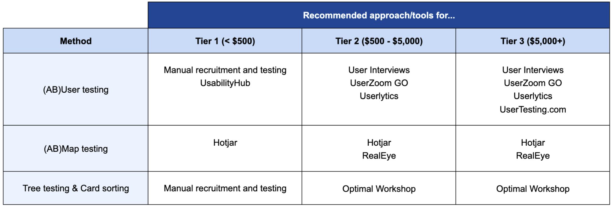
Recommended tools for every budget
While using heat maps to test website changes takes time, this method is relatively affordable and, in most cases, requires little technical knowledge. There are, of course, enterprise solutions that can generate heat maps (like VWO), but they come with many other features.
Here are some recommendations for tools that are focused (almost entirely) on creating heat maps:
Hotjar. Traditional heat maps. Probably the best mapping solution, considering its price (from €39/month for the Plus plan—I don’t recommend Basic due to page view limits) and the range of features.
They also recently introduced user segmentation, which means that you can exclude returning visitors from your heat maps. This is a must-have if you own a site where users log in, and, thus, the non-segmented heat maps would suggest that most people never scroll down and click only the “Login” button.

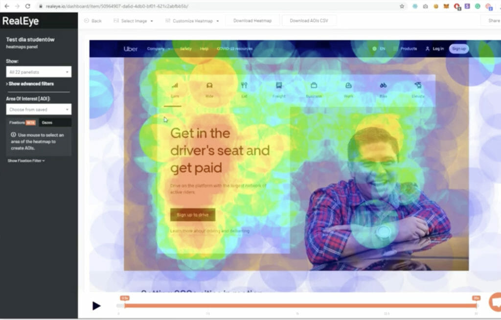
RealEye. The most budget-friendly, high-accuracy eye-tracking solution (from $89/month for unlimited studies) that creates static and dynamic maps (attention change vs. time) based on real user feedback. You can bring your own testers or pay extra for access to RealEye’s panel.
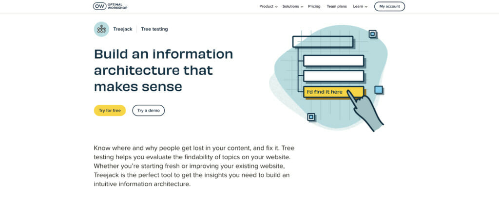
Tree testing and card sorting for optimizing navigation
Navigation is one of the most difficult elements of a website to optimize and test. Tests often include back-end and site architecture changes rather than just front-end tweaks that affect copy, images, layouts, etc.
However, having user-friendly navigation is crucial for more complex websites (often applicable to ecommerce).
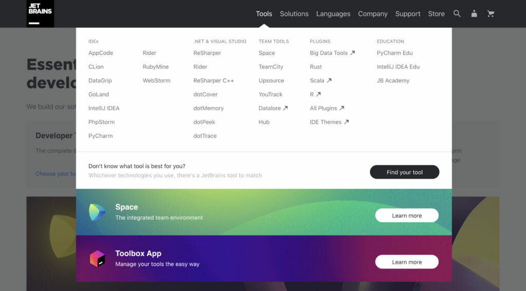
Here’s an example of JetBrains and their effort to make a complex navigation (5 categories, 32 subcategories) clearer by using white space and capitalization:
If you own a high-traffic site, you can A/B test navigational optimization changes like reducing the number of categories, making more important sections prominent with flashy colors, etc. If you have a low-traffic site, you’ll need to gather feedback differently.
Let’s look at the example of the CXL homepage again. Imagine that we’d like to find the best way (navigational structure) to lead people to a page where they could learn more about their A/B testing course:
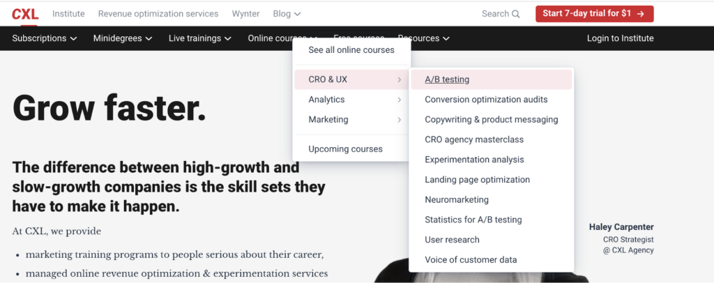
The fastest route is: Online courses > CRO & UX > A/B testing
However, some users will likely take a different route that will leave them stranded. For example, if they click through like this:
- Minidegrees > Conversion optimization;
- Live trainings > See all sprints;
- Free courses.
How likely is it? That’s where tree testing comes to play. Tree testing allows you to give users (recruited from external or internal panels) tasks such as “find a page about XYZ,” and, for each task, calculate the likelihood of website visitors choosing a wrong path (i.e. failure probability).
You also get other useful statistics about the average number of clicks before reaching the right page or how many users reached the right page directly vs. indirectly (i.e. looked at other pages first).
1. Manual workflow for testing navigation variations
Before you start testing changes to your navigation, you’ll need a reference point, which means testing your current navigation.
Here’s how you can do it:
- Recruit participants who will take part in the test. You can do it via user testing platforms, social media posts, emailing your newsletter list, etc. (all the methods discussed for the user testing recruitment).
- Arrange calls with the participants, during which you ask them to complete various actions (e.g., finding specific pages or information).
- For each task, write down: how many clicks a user needed before completing the task, whether they succeeded, and whether they had to navigate back to previous pages before finding the right content (i.e. direct success vs. indirect success).
- Finally, create a table summarizing your findings. This is your starting point for testing new navigational changes.
Here’s a list of questions/tasks you can use during a tree-testing exercise:
- Which category would you click first if you wanted to find information about XYZ?
- Which of the pages available in this navigation tree would provide you with information about XYZ?
- Click through the navigation categories until you find a subcategory/page that would help you answer the question: [Enter your question]. How sure are you about your choice (3 – Unsure, 2 – Hesitant, 1 – Certain)?
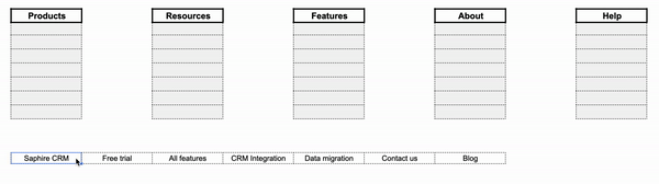
You can use a template like this to compile your results and extract quantifiable metrics:
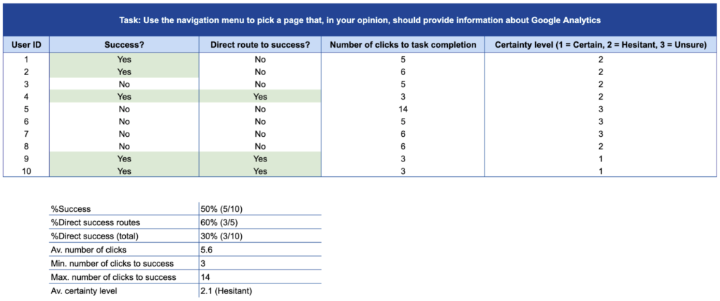
Based on this data, you can make changes to your navigation and apply the exact same process (with a different set of participants to avoid bias). You’ll end up with a summary like the one below, which will give you an indication of which version of the navigation is better (here marked in light-green):

2. Time and effort considerations
The more users you have, the more reliable your results will be. However, it can be difficult (mainly time-wise) to organize dozens of interviews. Luckily, some tools (listed below) can automate this process and help gather results much more quickly.
3. Card sorting for brand-new navigation
The described tree-testing process works for testing navigational variations that aren’t too different from each other. However, sometimes websites change their navigation almost completely (e.g., when rebranding), which can lead to a disaster if not preceded by a thorough research process.
To avoid this trap, you can combine tree testing with a similar method called card sorting, where you ask users to assign different subcategories to the core categories (the ones that’d usually be displayed at the top of the screen):
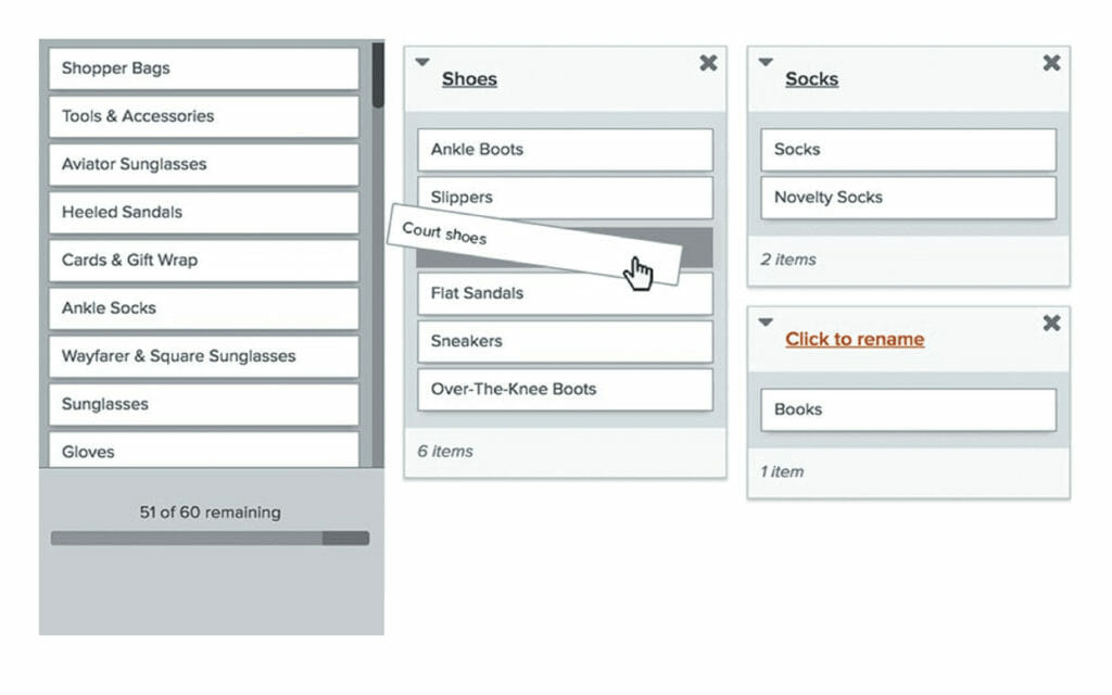
You can do this manually by inviting participants to sort cards and provide verbal feedback on a call. Another solution is to send them a Google Sheet and ask them to arrange cells (subcategories) into different columns (main categories), like so:
Once you’ve established the most user-friendly variation, you’re ready to use the tree testing approach to “test” your new navigation against the old one.
Recommended tool ($1,000+)
While tree testing and card sorting is useful, it can take a lot of time if done manually. A few online platforms can help make the spreadsheet visualization of your navigation more appealing. However, if you care about the number of data points and using your time effectively (and you should), then you’ll need to pay.
The best tool for tree testing and card sorting (it also offers other features) is Optimal Workshop, mainly due to its recruitment and automation capabilities.
It allows you to set up a test in a few minutes, create reports without any input from you/your analysts, and, the most important part, you can ask screening questions and recruit users from an external panel. This gives you a higher quantity and quality of pre-qualified participants.
The only downside might be the cost. The recruitment cost starts at around $8/user, so you’re looking at around $800–1,600 for one high-volume study. The more difficult the screening criteria, the higher the cost, but it’s a recommended investment if you want your navigational changes to be as data-driven as possible.
Budget considerations (cheat sheet)
We’ve covered a lot of ground so far, and, depending on your budget, you might be limited to choosing only some of the described testing methods.
Here are three “tiers” based on the available budget and organizational maturity:
- Tier 1 ($500 to spend). An organization (or individual marketer) new to testing and using data to support marketing decisions; willing to start testing, but needing to first verify if this approach works for them (almost like a proof of concept).
- Tier 2 ($500–5,000 to spend). A marketing team with a reasonable budget and trust from the board of decision-makers to follow and invest in data-driven optimization regularly.
- Tier 3 (more than $5,000 to spend). A data-driven marketing team willing to repeatedly spend a significant portion of their budget to determine if new ideas are better than the old ones (i.e. they’d use A/B testing if they had enough traffic).
Depending on which tier is closest to your situation, you can pick the right testing tools and methods from this table:
Conclusion
Low traffic and/or low marketing budget shouldn’t be an excuse for marketing teams to give up on data-driven optimization.
Even though businesses with low-traffic sites can’t do A/B testing the traditional way, they still can (and should) use other methods to determine whether their optimization efforts will make their sales soar or leave their website visitors frustrated and confused.
Related Posts
-

One of my favorite UX quotes comes from Chikezie Ejiasi, Head of Studio and Design Systems…
-

A/B testing is highly useful, no question here. But a lot of businesses should not be…
-

"I have too little traffic to test; hence, I can't do conversion optimization." I've heard…
-

"Our A/B testing tool's visual editor allows marketers to set up tests without needing developers!" A version…


Thanks a lot for this profund article! People worry often about traffic because they think CRO is only about a/b testing. I’ll definitely recommend this article to other copywriters/CRO or uncertain clients.