One of my favorite UX quotes comes from Chikezie Ejiasi, Head of Studio and Design Systems at Google.
He wrote: “Life is conversational. Web design should be the same way. On the web, you’re talking to someone you’ve probably never met—so it’s important to be clear and precise. Thus, well-structured navigation and content organization goes hand in hand with having a good conversation.”
Can tabbed navigation be clear and precise? Of course it can, which makes it a valid form of navigation and content organization.
What matters, as with most things related to UX, is how you implement it and how you optimize it.
Table of contents
What is tabbed navigation?
Tabbed navigation is a navigation and UI style where information is organized in tabs, which separate content into different sections.
Generally, when looking at tabbed navigations, you’ll notice some common characteristics:
- Rounded tab corners;
- Separation of tabs, whether it’s space or a single line;
- Hover effects on tabs;
- Gradient to add depth and dimension to the tabs.
Tabbed navigation is based on the folder metaphor, which anyone who works in an office or watches television should be familiar with. Just like Mifsud of UsabilityGeek explains…

Justin Mifsud, UsabilityGeek:
“In UI terminology, metaphors are ideas or objects that are used to facilitate the familiarity between the user and the application.
The use of tabs in the UI is an excellent metaphor since they look like real-world tab dividers in files or tabs on folders in a file drawer.
Thus, it is more intuitive for users to know that these tabs are dividing content into sections and just like in real life, reaching for the tab (emulated on the web by clicking on a tab) will show the respective content.” (via UsabilityGeek)
Because the metaphor is so common, it’s important that you’re careful of implementation. Tabbed navigations have a strong prototype, so they must look and work exactly the way they’re expected to.
Like any good navigation system, tabs allow you to:
- Meaningfully separate content into different sections;
- Show people what content is available to them and how they can get to that content;
- Show people, visually, where they are within your site.
When is it a good idea to use tabbed navigation?
Generally, it’s a good idea to use tabbed navigation when…
- You have between two and nine different categories of content.
- Category names are relatively short and predictable, both in terms of position and copy (i.e. they match the prototype).
- The number of categories is unlikely to change on a regular basis.
- The categories are similar in nature; it makes logical sense that they’re tabbed together.
- The categories fit in a single row.
As Jakob Nielsen of Nielsen Norman Group explains, when tabbed navigation grows so complex that it requires multiple rows, problems begin to arise…

Jakob Nielsen, Nielsen Norman Group:
“Multiple rows create jumping UI elements, which destroy spatial memory and thus make it impossible for users to remember which tabs they’ve already visited.
Also, multiple rows are a sure symptom of excessive complexity: If you need more tabs than will fit in a single row, you must simplify your design.” (via NN/g)
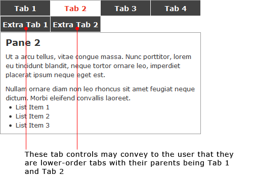
Multiple rows also create visual hierarchy issues. When there’s a second row, it may signal to the user that the tabs in the second row are sub-categories or, at least, less important than tabs in the first row.
Generally, it’s not a good idea to use tabbed navigation when:
- You want people to compare content simultaneously. This strains memory and increases cognitive load substantially.
- You find yourself considering adding a “More…” style link.
Of course, these are just basic guidelines. You could match with all the “you should use it” rules and find that it doesn’t work for your audience. It’s ultimately something you’ll need to test.
Remember, you can use your digital analytics to figure out if your tabbed navigation is creating problems for your visitors. From there, you can either make changes to fix the issues or experiment with a new type of navigation.
The controversy
While modern design practices have a lot of sites looking like this…

…some people do use tabbed navigation as their main navigation.
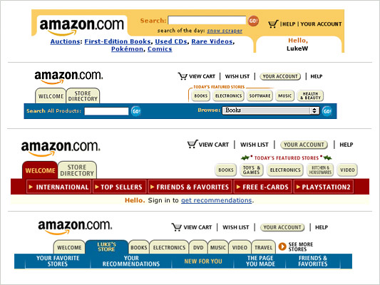
As Luke Wroblewski of Google chronicled years ago, Amazon really pioneered this trend…

Luke Wroblewski, Google:
“In 1998, the site had two top-level categories: books and music.
As additional categories were added (such as video and gifts), the horizontal tab system scaled quite well and created a nice opportunity for differentiating product categories through color.” (via LukeW)
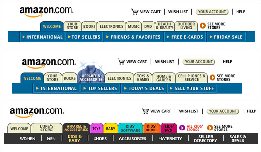
Here’s a look at how Amazon used tabbed navigation in the earlier days…
As the site grew in popularity, so did the number of tabs Amazon needed…
In 1999, Jakob called this “a bad design and an abuse of the tab metaphor”:
I maintain that tabs would be better used for switching between alternative (but related) views than for navigating to unrelated locations.
You should use tabs to alternate between views within the same context, not to navigate to different areas. This is the single most important point, because staying in place while alternating views is the reason we have tabs in the first place
Jakob Nielsen
Still, many sites followed Amazon’s lead and the definition of tabbed navigation started to shift from Nielsen’s “switching between alternative views.”
While using tabbed navigation as a main navigation system has gone a bit out of style, it can work. As with most things, your primary concern should not be what Nielsen says about tabbed navigation, but what your audience says.
Do they find it difficult to use? Are they navigating your site properly? Can they find the most important elements of your site? Conduct usability testing to be sure.
How to implement tabbed navigation
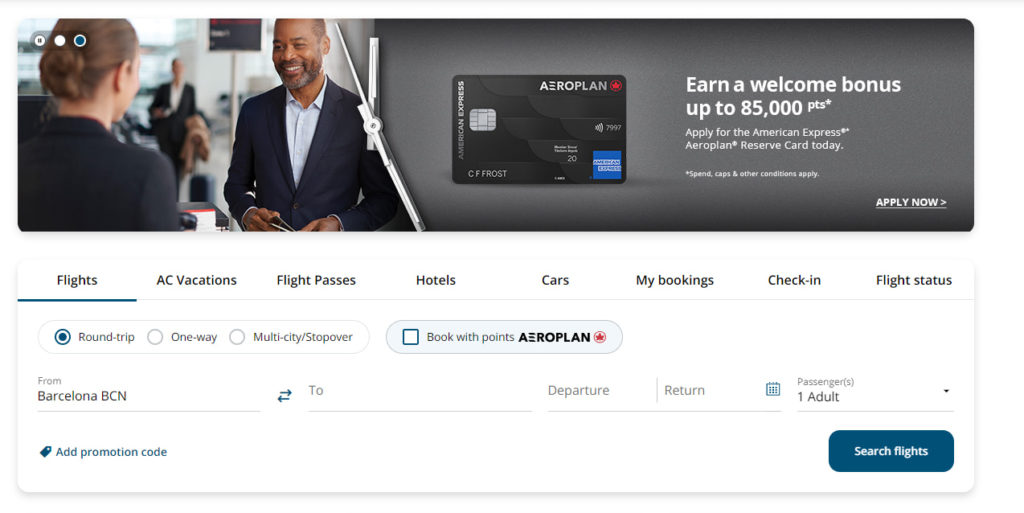
Air Canada, along with most major airlines, uses tabbed navigation well…
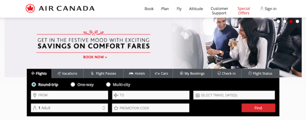
When implementing tabbed navigation yourself (at any level), here are some things to keep in mind:
- First, design the information architecture (IA) of your site so you can make smarter tab-related decisions.
- The entire tab should be clickable, not just the category name (text).
- Don’t use a “home” tab, even if you’re using tabbed navigation for your entire site. Instead, have your logo take visitors to the homepage.
- The tab should be connected to the content area it controls so that the scope of the tab is clear.
- Category names should be one or two words long and written in plain English. Avoid using all caps as it makes the tabs more difficult to read.
- Don’t stack multiple rows of tabs. If you must, use sub-categories (i.e. a second horizontal bar below the tabs) instead. If you do use sub-categories, make sure there is a visual connection between the selected tab and the bar of subcategories below. Be sure the amount of sub-categories you use is not overwhelming; condense and simplify.
- The selected tab should be prominently marked to indicate current location. Unselected tabs should not be so muted that they are forgotten or overlooked, however.
- A consistent tab order should be maintained from page to page so that the user fully understands how the tabs relate to one another.
Jakob explains why this type of consistency is important…
1. Recognizability. When something always looks the same, you know what to look for and you know what it is when you find it.
2. Predictability. When something always works the same way, you know what will happen when you act on it.
3. Empowerment. When you can rely on your past knowledge of all the available features, you can easily compose a set of actions to achieve your goal.
4. Efficiency. There’s no need to spend time learning something new or worrying about the effect of inconsistent features.
Jakob Nielsen
Examples of tabbed navigation done right
The best way to understand tabbed navigation, especially since it can be used in so many different ways, is to look at some examples.
1. Album Art Collection
Album Art Collection is a rather popular example of tabbed navigation…
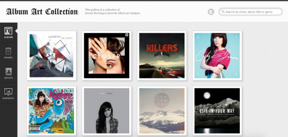
Two things are interesting here…
- The navigation is vertical, not horizontal.
- The navigation includes icons.
Typically, you’ll find tabbed navigations presented horizontally. This is in part due to design prototypes. Since it is common, people tend to look for navigations in the horizontal space below the logo.
Of course, that doesn’t mean you’re restricted to using that space for navigation. Just be sure to use user testing. You don’t want moving your navigation for stylistic reasons to impact the ease of use of your site.
Note that while Album Art Collection uses navigational icons, they do not abandon text-based descriptions. Icon usability testing is an article of its own, but more often than not, text-based descriptions are more usable than icons alone. Jacob Gube of Six Revisions explains…

Jacob Gube, Six Revisions:
“Avoid using icons to substitute tab control text because symbols can mean different things to different people – the safest bet is using plain text to describe pane information.” (via Smashing Magazine)
2. The Invoice Machine
The Invoice Machine is your basic tabbed navigation as a main navigation example…
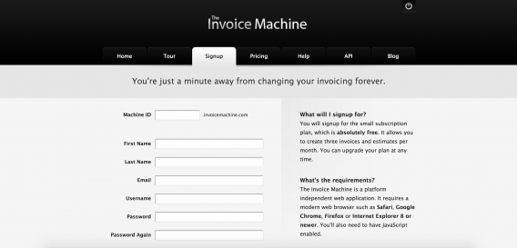
However, they do include a “Home” tab, which is redundant. Note how the selected tab is brought forward and the tabs are connected to the content area.
3. Buffer
Buffer was one of my favorite examples of tabbed navigation. In the past, they had an offering for individuals and an offering for businesses, so they use tabs to separate their content below the fold.
Here was the start of the content for individuals…

And here was the start of the content for businesses…

This allowed them to speak to two different audiences without creating an entirely separate site or experience.
Later on, Buffer’s product page underwent deep changes, with Publish, Reply, and Analyze among other offerings (all quite self-explanatory). Here’s the tab navigation they used for their pages:
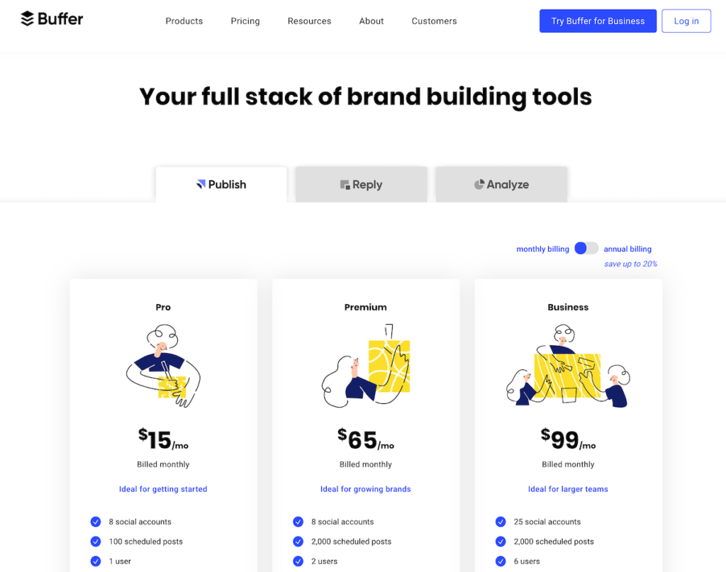
Aside from different pricing plans, these product-based tabs displayed a different testimonial, relevant to the product on the tab:

As David Leggett of UX Booth explains, tabbed navigation is relevant beyond primary and secondary levels of navigation. They can even be used below the fold, as in Buffer’s case…

David Leggett, UX Booth:
“Tabs do not need to be limited to primary and secondary levels of navigation. If they provide a user with the ability to flip between areas of the same content, they can prove quite useful.
Combined with technology that switches content without reloading a page can instill a tangible feel to the end user navigating the page.” (via UX Booth)
3 best practices to remember
Before you experiment with tabbed navigation or decide it’s not working for you, consider these three factors: accessibility, chunking, and speed.
1. Accessibility matters
You want your site to be accessible to those with disabilities or limitations. In order to do that with tabbed navigation, you’ll have to…
- Allow people to navigate tabs using the “Tab” key on their keyboard.
- Allow people to select a tab using the “Enter” key on their keyboard.
- Indicate which tab is selected using an alternative method. For example, you can include a title attribute with the word “active.”
Making your site easier to use for more people will never hurt conversions.
2. Chunking matters
With tabbed navigation, how you decide to organize and chunk your content is incredibly important. That’s why my first implementation recommendation above was related to the information architecture of your site.
Justin explains why proper organization is vital…

Justin Mifsud, UsabilityGeek:
“Tabs divide content into meaningful sections which occupies less screen space. In this regard, users can easily access the content that they are interested in (rather than having all the content in paragraphs).” (via UsabilityGeek)
Consider all of the content you would like on your site. Then, group that content into four to five buckets. Likely, you’ll be able to repeat this exercise and end up with two or three different buckets. That’s good. Conduct user testing to see which people respond to and navigation with better.
Above all, you’ll want to ensure…
- Your content is chunked in a way that is logical, expected and clear to visitors.
- The order of your tabs is meaningful and logical.
- Your tabs follow existing prototypes. For example, SaaS sites are often chunked in a specific way while ecommerce sites are often chunked in another.
3. Speed matters
We’ve written about the importance of speed time and time again. So, it shouldn’t be surprising that speed plays a role in the effectiveness of tabbed navigation as well.
Jacob explains it quite well…

Jacob Gube, Six Revisions:
“A purpose for using module tabs is to permit quick and interactive presentation of content. For this, you should try to have the inactive pane contents written inline in the HTML document, and then use CSS and JavaScript to style and hide the pane visually, which is quicker than requiring a page reload or requesting remote-source data.
Avoid page reloads when switching in between the panes because this significantly delays navigation in between panes. Remotely-loaded content using Ajax can be an option for dynamic and remotely-located pane information but presents a challenge for screen reader users who may not be aware of asynchronously DOM-inserted nodes in the document’s tree.” (via Smashing Magazine)
This advice does not apply to those using tabbed navigation as their main navigation, but those using tabbed navigation the way Air Canada and Buffer are should take note.
Conclusion
Tabbed navigation can absolutely result in “a good conversation” with your visitors. If implemented properly, it’s clear and precise enough to tell your visitors: exactly where they are, exactly what’s available to them, and exactly how they can access what’s available to them.
With the help of usability testing and optimization, that conversation improves even more.
As with anything, however, be sure to conduct your research (in this case, your information architecture research) and test, test, test.
In summary…
- Tabbed navigation can be used as a main navigation system as well as beyond the primary or secondary navigation levels.
- Try tabbed navigation when you have two to nine solid, similar categories with short names that fit in a single row.
- Don’t try tabbed navigation when you want people to compare content or find yourself thinking about adding a “More…” link.
- You can follow implementation best practices, but…
- What matters is your data. Do your visitors find it difficult to navigate your site with tabbed navigation? Conduct usability testing to find out.
- Fix the issues that pop up. Or, if there are many costly issues, consider another navigation system.
- Accessibility, chunking and speed all matter when it comes to tabbed navigation, so pay close attention.
Working on something related to this? Post a comment in the CXL community!


Nice write-up from a UX point of view! What I think is still missing is a discussion or at least mention of the SEO aspect.
In my view Google shouldn’t make tabbed content ‘secondary’ more than it does content lower on the page because it often is a great way to improve the usability of a page/site.
However that seems to be what Google is doing nonetheless for now so introducing tabs would negatively impact your organic traffic and thus conversion.
What is your take on this?
I would have loved to discuss SEO in the article, so thanks for bringing it up here. I think awareness and understanding of how Google treats tabbed content is the most important element here. For example, knowing how Google treats tabbed content is certainly important when deciding which tab is activated by default.
However, Google is changing its stance on tabbed content fairly quickly (from not indexing it at all to considering it “secondary”). Google is also generally interested in creating positive user experiences, so I don’t doubt that their stance will change again soon.
As with most things, tabbed navigation is something to test. If tabbed navigation makes sense for your site and improves UX, the dip in organic traffic could be irrelevant (as far as revenue goes).
A nice follow up article would ask if tabs work for mobile devices.
Absolutely. Thanks for reading!
Thank you Shanelle the examples inside the article!
No problem! Glad you liked them.