Why spend hours and thousands of dollars redesigning your website from scratch when someone has already done the work for you?
Millions of businesses turn to website templates to make the design process more efficient. But there’s something almost no one is talking about and it’s a big problem.
Website templates are not optimized for conversions.
Table of contents
Just how popular are website templates?
While there isn’t a ton of hard data about how often templates are used, we can get a good idea by looking at the popularity of some of the top template sites.
- Themeforest alone has over 30,000 website templates.
- The entire Envato Market has over 10M community members and has sold over 50 million items.
- HubSpot has over 1,500 website and email templates.
- TemplateMonster has over 50,000 website templates.
There is also an entire site dedicated to mocking the average bootstrap startup website template, Every Fucking Bootstrap Website Ever…
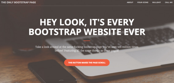
Also, a semi-recent Moz article cited the fact that “templates and themes are awesome now” as one of the ten reasons custom web design is “dying”.
Before that, a Tuts+ article encouraged custom web designers to adopt a “if you can’t beat ’em, join ’em” mentality about templates and themes. Essentially, sell clients on the customization of a template or theme.
So, while we don’t know for certain what percent of sites, emails and landing pages are based on a template, we do know enough to start asking some key questions…
- Are website templates a good idea from a conversion rate optimization standpoint?;
- If not, what should CRO professionals be doing instead?;
- If so, is there anything CRO professionals need to be aware of?
Does originality matter?
But first, a more basic question: Does ‘originality’ matter anymore?
It seems that with so many people using website templates, we’ll get a lot of sites looking exactly the same. Justin Rondeau of Digital Marketer doesn’t see that as an issue…

Justin Rondeau, Digital Marketer:
“Optimizers, for the most part, aren’t trained designers – for this reason I am VERY ok with them using site design templates for initial launches. In general, templates are meant to serve the purpose of making 1) site design and launch possible and 2) using a design schema that users expect.
The second point is crucial! We know that there are no TRUE best practices, but I hold that what is common to your user is generally best. So use templates as a starting point, then iterate to find out what works best for your business. Don’t just set and forget! Launch, get data, iterate, then improve.
I think some marketers/optimizers think there is something disingenuous about site templates. They think ‘Someone else might use the same theme or template as me!’ Honestly, who cares? You are so closer to your design, your content, really everything about your business than any customer or prospect.
Don’t sweat this stuff… use what works then tweak it to make it yours. I mean, seriously, nearly every blog uses that two-column layout where the content takes up 2/3 of the page and the right has promotions on the other 1/3.”
Does it really matter if some other sites looks like yours?
Consider how powerful prototypes and the science of familiarity can be. Typically, if it’s common and expected, the visitor’s brain will appreciate it.
Josh Dunsterville, who leads design at KlientBoost, shares the same mentality…

Josh Dunsterville, KlientBoost:
“As humans we pay attention to patterns, in fact we seek them out. We expect when we visit a site to find the logo in the top left corner, followed by the navigation in the top right. When we come to a site that breaks these patterns it does one of two things. It either intrigues us, or frustrates us.”
Do you want to go around copying your competition or using a template you’ve seen 400 times this week? No. Is originality a reason to shoot down the idea of using a template? No.
Here are a few of the benefits of using website templates.
Advantages of using website templates
There’s no denying that website templates are an excellent starting point. They’ve made it possible for average people to affordably throw up a site or landing page, to launch their businesses.
You’re familiar with the expression “done is better than perfect”, right? Templates thrive on that concept.
If you have the time and resources for perfect, indulge. But if you’re like most people, Skylar Richard, a UX designer at Qimple, suggests that website templates are a “good enough” alternative…

Skylar Richard, Qimple:
“Generally speaking design templates serve as a ‘good enough’ option. In a perfect world we would all have the time (and money) to spend on research, design and development. Sadly, though, that is rarely the case.
My experiences with design templates are seldom outside of using them for landing pages. Running campaigns in high volume in order to get conversion rates requires quick turnaround, which templates are great for. Get the framework in place via template and then make your style changes to suit your brand and the campaign’s purpose.
Conversely, putting all your eggs into one template while the clock is ticking down might lead you into some trouble if you aren’t sure what to look for in a template.
If people have the resources to design and develop a template from scratch I do suggest they do that. But again, that’s a fairly ideal situation!”
Note Skylar’s cautionary words about relying on a template while the clock is ticking down. You have to know what to look for in a website template, you can’t simply select “Most Popular” from a dropdown list because you’re tight on time.
So, what should you be looking for in a website template? Josh suggests focusing on the fundamentals, looking for something simple and skeletal…

Josh Dunsterville, KlientBoost:
“Templates aren’t necessarily bad for UX, however they should just be used as a starting point. I like to compare templates to houses. When building a house, it’s okay to start with a general template. You know you’re going to want a living room, a kitchen, a bathroom, etc.
But that’s just the starting point. From there you’ll want to customize things like paint color, fixtures, size of specific rooms, etc. Each house and its qualities will appeal to different people and families. A one bedroom house most likely isn’t going to work for a family of five, just like a template designed for a dental office most likely won’t work for a SASS company.
Overall, I would say start with a template that works for your industry and has a specific conversion focus. In other words start with something simple. Steer clear of the fancy animations, sliders, and parallax. From there transform the template into something that works specifically for your visitors.”
How to choose a website template
It’s important to consider factors when choosing a website template. Clarity, distraction, navigation, compatibility, performance, customization, and UX, are the most important.
- Clarity: Does the template make it easy for you to clearly articulate your value proposition? Is it overloaded with useless design elements take away from your message?
- Distraction: Is there too much going on, is the design too busy?
- Navigation: Are the icons (if applicable) clear? Is it straightforward enough? Does it have a never ending scroll that prevents you from reaching the footer?
- Mobile Compatibility: How will it look on mobile?
- Performance: Will any of the features or components of the template slow down your site?
- UX: Are there any obvious UX mistakes?
- Customization: Is it easy to customize the site to fit your brand and specific needs? This is especially important for ecommerce driven sites.
Once you have that initial website template up, your job is certainly not done. As with any other site, the process of conversion research and testing is just starting.
3 cons of using website templates
Aside from being fairly affordable and easy to setup, the benefits stop there.
Here are some of the major risks and drawbacks that you need to address if you plan to use a website template.
They don’t consider conversion optimization principles
Website templates are designed by, well, designers. They’re not designed with conversion rate optimization principles in mind. Oli Gardner of Unbounce explains why this is a big problem…

Oli Gardner, Unbounce:
“Buyer beware when it comes to website and landing page templates.
Anyone who’s started a business and needed a website cheaply and quickly – perhaps to get an MVP site live to gather leads for a beta launch, or perhaps you need to rush out a last minute marketing campaign – has probably, at one time or another, purchased or used a template.
You probably bought a WordPress theme from Themeforest, or used a landing page template inside the Unbounce landing page builder.
Templates can be a wonderful way to accelerate delivery, working with the lean practice of done is better than perfect. But, and it’s a big but (not that kind), you need to be very careful when choosing, and implementing a template.
A big problem is that graphic and web designers have never been taught how to design for conversion. They have been taught grid systems, typography, colour theory, and so on. But they haven’t been taught how to focus a visitor’s attention on the goal of the page.
This is why I wrote the Attention-Driven Design ebook, to establish a set of 23 design principles that can be used to craft a competitive business advantage by ensuring proper attention is applied to your pages in order to create a focused and simplified experience, design specifically to encourage a conversion.”
I’m willing to bet the few designers who really understand how to design for conversions are not designing site templates for $30.
By choosing a website template that’s easy to customize, you can simply read Oli’s eBook (and other conversion-focused design / UX resources) and optimize the site yourself. If you have enough traffic to test, create hypotheses based on the principles and test them. If not, principles can help guide you heuristically.
But be aware that worked on one site will not necessarily work on another. As Sarah Doody, founder of The UX Notebook, explains, conversions are not transferable…

Sarah Doody, The UX Notebook:
“One of the principles I always have in mind when designing is to ‘make it familiar’. A trend that has come up in design is the idea of templates. Although I see the value in using templates, I fear that designers are relying on templates as a crutch.
When designers use templates, many of them do not think about whether or not why that template is appropriate for their audience and their content.
Another concern I have with templates (or let’s face it, copying other designers) is that you have no idea how that template performed — what worked for one product may not work for yours. Design is about context, and when you use a template, you don’t know the context in which it was intended to be used.”
Before using a website template, ask yourself…
- Does this fit the prototypes that exist within my industry?;
- Does this fit my industry—period?
- Will my content flow correctly if I use this?
- Am I able to integrate the template with other important tools I use for my business?
Custom website designs are based on your unique brand and goals. Website templates are designed based on common contexts. Don’t try to fit your square peg in a round hole.
As Josh explains, the fact that website templates are designed to fit many different contexts often results in a lack of focus…

Josh Dunsterville, KlientBoost:
“In my opinion the biggest mistake that I find in templates is that they try to focus on too much. A lot of the ones you’ll find on template marketplaces like themeforest will have examples for all sorts of types of content.
For example you’ll see pages that have team sections, feature sections, map sections, contact sections, videos, sliders, etc. None of these sections have inherently bad UX, however when you throw them all in one page, you’re drastically increasing the amount of things that a user has to focus on.”
They want to be “trendy” and “pretty”
Often, designers want to be trendy, they want to add the newest, “coolest” thing to their designs. The result? As Oli explains, they end up aiming for a pretty site vs. an effective site…

Oli Gardner, Unbounce:
“An even bigger problem, that plagues many theme designs is feature overstuffing, and design trend masturbation. It seems every theme these days includes a promo slider (carousel), parallax scrolling, ghost buttons, flat design, video backgrounds, and worst of all, scroll jacking.
Design trends emerge every year, and they are blindly implemented within these templates without considering the potential consequences of their inclusion. Many (such as the aforementioned carousel) have been shown in many A/B tests to hurt your conversion rates.
Ghost buttons might look cool, but they are of such low affordance (how clickable they look) that they can literally and figuratively scare your visitors’ mouse away from them. There are circumstances where they are appropriate – such as for a secondary navigation option, where the primary CTA is a more dominant visual entity – but there are many cases where they damage the simple visual perception of what is required to take the next step on a page.
Parallax is a beautiful design device when done correctly, but a horrible and dizzying experience when poorly implemented. Video backgrounds can slow page load speed and present a distraction that removes focus from your headlines, and scroll jacking, wow, what a terrible concept!
Scroll jacking is when the theme designer includes some jQuery code that takes control of the scrolling experience (breaking 20 years of established interaction design convention). It essentially attempts to smooth the entrance and exit parameters of a user executed scroll.
If you scroll up or down a page, after you release the mouse button, the scrolling continues for a subsequent second, essentially rendering it impossible to end your scroll at the place you intended. The practice of scroll jacking should be killed with fire, along with the ‘designers’ who consider it a helpful or enjoyable experience.”
If you don’t want your visitors to be secretly hoping you get killed with fire, think twice before choosing a website template that appears “trendy”. What’s latest is rarely what’s greatest.
In case you’re unfamiliar with the terms above, here’s what parallax and ghost button mean…
- Parallax: “Involves the background moving at a slower rate to the foreground, creating a 3D effect as you scroll down the page.”
- Ghost Button: “Transparent and empty buttons that have a basic shape form, such as a rectangular or perhaps squared.”
Justin echoes Oli’s thoughts on ghost buttons, adding another common website template faux pas…

Justin Rondeau, Digital Marketer:
“Ghost buttons and large image sliders are probably some of the most common element mistakes I see on popular site templates.”
Maarja Käsk, a web designer at CXL, adds that while website templates may look nice, they are typically far from realistic…

Maarja Käsk, CXL:
“The general problem with templates is that the good ones look good because they have a lot of colorful, random stock photos and very little copy. Headings consist of 2-3 words, there are short paragraphs and lots of whitespace.
On real websites, there is usually much more information that needs to be communicated and having a lot of good, real photo material to choose from is rare.
If you use a template, you will have to make your content fit into a design, but what you should do instead is figure out how to communicate your message with design.
What I see used very often on templates are experimental and flashy hover effects, which are distracting and do not suit all audiences. Also search bars are often hidden behind icon and hamburger menus (without a describing ‘menu’ label).”
They make it easy to be lazy
Convenience can, occasionally, lead to laziness. People can and do use templates as if they’re “set it and forget it” solutions. Don’t be one of those people.
Here’s a suggestion from Justin on how to avoid falling into the lazy trap…

Justin Rondeau, Digital Marketer:
“I think another mistake is that the default settings are, at times, considered optimal. I’ve seen some interesting tests where an ecommerce shop tested the number of products shown on a product listing page because they just ran with the default since the site launched.
Default settings are suggestions and these are areas where you can immediately start improving your site template.”
Think of website templates as a minimum viable product. A lot of optimization has to follow for it to be successful. Templates are a start, but you can’t stop there.
Good website templates examples
One of the reasons I reached out to Oli for this article is because Unbounce has a landing page template library that they proudly feature on their home page.
Though he has largely talked about where most website templates go wrong so far, he does believe they can be done right if the designer is conversion-focused and willing to put in the time…

Oli Gardner, Unbounce:
“On a positive note, it is possible to use these concepts in a responsible and delightful manner. At Unbounce we have a template library built into the landing page builder, and we take the design of these templates really seriously.
A few things to note: we use parallax in our templates, but it’s a wonderful implementation, smooth, fast and without the double direction shift that is often used. We have also added a video background feature. A word of caution with these would be to use them further down your page to create an interesting and dynamic experience, instead of using it at the top of the page, where it can distract from your value proposition.
To demonstrate the lengths we go to ensure a good conversion experience in our templates, take a look at the process we went through when creating one of our template sets. The process included ideation, content requirements, page feature development, paper prototyping, typography and palette choices, a Conversion-Centered Design checklist, and finally a rigorous QA process to ensure we considered all of the important parts of template design.
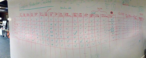
Conversion is never a simple art, so it’s imperative that you take it seriously and choose wisely when picking a template.
If you have purchased a WordPress theme or similar, it’s often possible to go into the settings and turn off some of these features, and I highly recommend that you do so. The speed increases, and usability of your website or landing page will be vastly improved as a result.
Remember, it’s the clarity, and delight of the marketing experiences you are creating that matter to your visitors, and as a result, your conversion rates. Focus on those two things, and you can’t go wrong.”
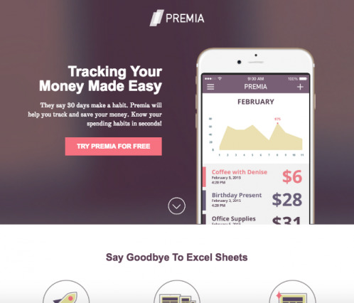
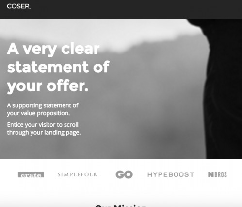
Here are a couple of examples from the Unbounce template library that Oli discusses…
1. Premia for SaaS
2. Coser for eCommerce
3. Denoli for Agencies
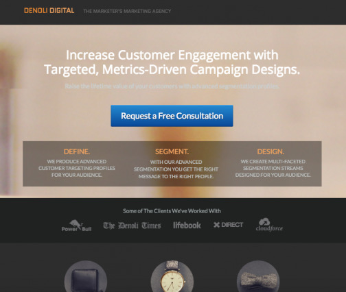
Remember folks, with great convenience comes great responsibility.
Maarja offers another solution for responsible website template use…

Maarja Käsk, CXL:
“You have to start with something. I think that using a template in the beginning is an acceptable starting base, especially when there may be high opportunity cost of getting visible online. Then start iterating with using ResearchXL model.
Many clients that we have worked with have started with a template and have used our help after they have got their business up and running.
If you have more time and resources for design, start by creating copy first. Create a design based on that copy using best practices. Then start iterating using ResearchXL model.”
Conclusion
You can have the exact same website template as someone else and see significantly fewer conversions. Why? Because every site is different. Every site needs to conduct their own conversion research, come up with their own hypotheses and run their own tests.
Website templates may be a design shortcut, but they are never an optimization shortcut.
If you don’t have the design resources to make it custom, choose your website template wisely. Stay simple, focus on clarity and choose the template that best communicates your message.
And remember, your job has only just begun.
Working on something related to this? Post a comment in the CXL community!


I’m so glad you dealt with this topic as I find that all too often designers use templates as a an excuse for not delivering what is needed to improve conversion. If they were a starting point that would be fine, but often they expect you to work within the confines of what the template offers.
Thanks for reading, Neal. Glad you found it helpful.
I see what you mean, yeah. The designer should fully understand the need (based on your conversion research), find the template that provides the best foundation and then be willing to make the necessary changes. That is, of course, if a custom design is out of the question.
The truth is that no “serious” website uses a pre-built template, even when it comes to user-friendly systems like WordPress. As chatter grows this year about the typical web page continuing to grow fatter and more bloated, there should be less focus on shopping for templates and more on how to build out custom themes based on WordPress concepts. The idea of “header-less” themes for example is growing, or integrating various CSS pre-processors or javascript frameworks. I am organizing a free starter theme with integrated SEO, to render bloated and unstable plugins such as Yoast SEO unnecessary: https://www.littlebizzy.com/themes/starter
Thanks for sharing this, Jesse! Appreciated.
This is great in a perfect world where we are all working for clients that say “here is an unlimited budget and timeframe – build me something spectacular”.
The reality is with most freelancers working for smaller clients the breif is “here is $1000. Can you have something to me by next week?”
As much as I agree with the article, a template is a foot in the door. A template gets you beyond the price only comparison and allows you to start educating the client.
We all want to be conversion experts rather than web designers, but sometimes you need real conversations and real data before clients see the value in the services you are providing.
Thanks for reading and commenting, Lucas.
I absolutely agree that a template is a foot in the door. As you said, they’re a good starting point when you’re low on resources. I don’t personally think they should be disregarded as a whole.
I just don’t think they’re a replacement for conversion rate optimization, which I believe they are occasionally mistaken for.
For WordPress sites, I find Page Builders such as Beaver Builder or Thrive Landing Pages give you pretty decent templates to get started but also make it easier to quickly customize these templates via a drag-n-drop interface with very little coding needed.
These tools are fairly inexpensive and help where budgets are limited.
Thanks Rich! I’m sure a lot of people will find those tools helpful.
I almost totally agree with the article, many templates on ThemeForest are not made with UX and Conversions in mind, but I see that the trends on ThemeForest are changing in a good way.
Time ago, about a year, on ThemeForest there was a bum of very animated templates (paralax, appearing animations, etc.), because buyers on ThemeForest expected these from templates.
Of course authors on ThemeForest make templates to sell good on ThemeForest, these is the main focus. Other focuses as UX, etc., are secondary.
But as said. I see that the treding are changing and that many new templates and authors are designing and building templates with Conversions in mind.
They are getting more minimalist, with CTA very visible, etc.
Also we have started to build for ThemeForest, we make our first template, and as also an web agency, our main focus was good UX and website goals.
Awesome point, Andrej. I would absolutely like to see the trend shift in that direction. But even still, templates will never be optimized for unique audiences. I think it’s incredibly important that site owners and optimizers remember that a template isn’t a quick fix.