The four different media tools for communicating with your customer on the web are text, graphics, moving images, and sound. That’s it.
Those are the only tools you have to explain concepts, convey emotions, and create a satisfying user experience.
Take a step back, and you’ll see that what “converts best” is really just how these elements are designed and combined to get a user into a “flow” state, where each click comes more naturally than the next.
A good flow is like interactive storytelling & keeps your visitor consuming your site. If you’re telling a good story, that makes a hell of a difference when increasing your conversions.
Table of contents
What Traditional Marketing Teaches Us About Creating Good Flow
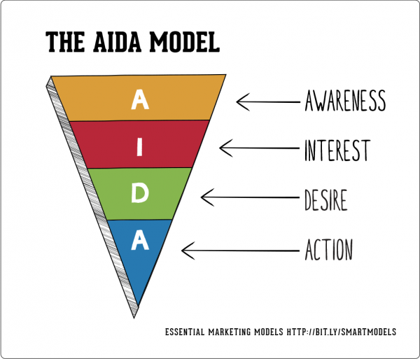
In marketing theory the AIDA framework outlines the different stages a customer will go through before making a purchasing decision.
Using this framework, you can tailor creative speak directly to each stage of the decision making process.
These principles should not be set aside when designing a website.
The four elements represent equally important but wholly separate parts of a webpage. Taking AIDA into consideration during the design process sets a guideline for how eye paths on the site should be directed.
Attention
Studies show you have between 15-25 ms to grab a visitor’s attention. Later in this article we’ll discuss a few tips for creating attention grabbing images and rules that are too often sidelined by online entrepreneurs.
Interest & Desire
Interest and desire aren’t created just by giving potential customers the necessary information but by all of the tools at your disposal to speak to their appropriate emotional state. Good copywriting, high resolution imagery, explainer videos and high quality sound can all be used to build desire.
Sometimes text accompanied with an image is enough (see the example of clickandgrow.com below), but depending on the product or service a video or sound may add additional explanatory value.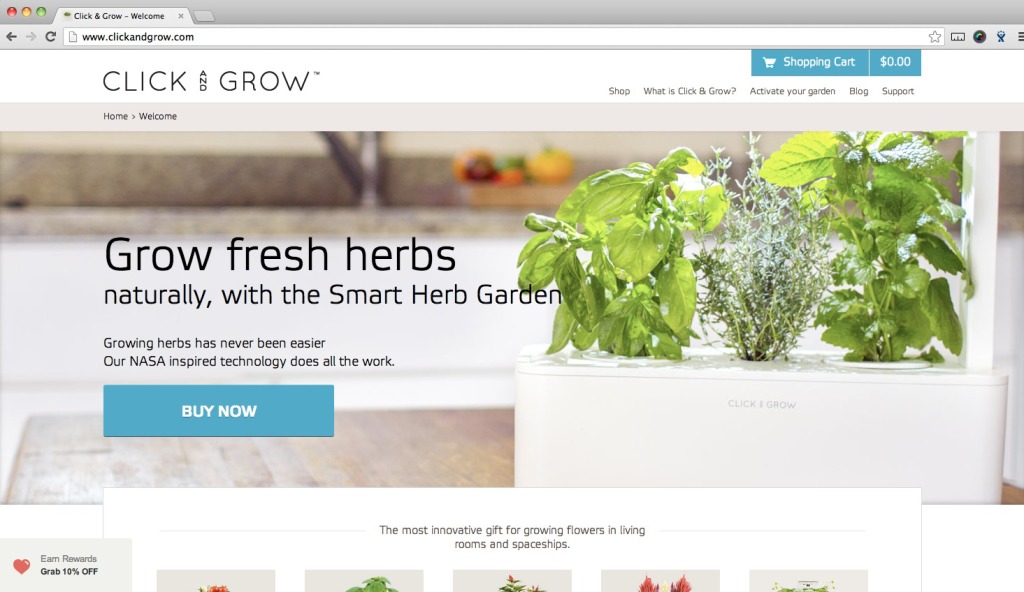
In my experience, there is a strong disconnect here. It’s not that having video or high resolution images is what makes you interesting.
All of the creative still has to be good.
In this case study on Mashable, filmmaker Luke Aker was able to sell his old Nissan car on craigslist by making a mock advertisement using many car ad tropes. The creative is spot on creating both interest and desire in anyone coming across this video.
With clever guidance and by following some rules you can do the same on your website.
Action
The final CTA button cannot be stressed enough.
If you think of visiting a website as storytelling – everything on the page is guiding the customer to the call-to-action where they must make a decision.
If the button itself is invisible or does not offer the same value communicated though out the page, all of that work done goes to waste.
Later, I’ll pinpoint guidelines for each section of the website that’ll help you control the flow on your site.
1. Images As Good Attention Catchers
Images of people who look like your customers are great at grabbing attention & your models play a much bigger role than you might imagine.
This article by Ahmed Hussam on Tutsplus gives a lot of different techniques to direct the visitor’s eye. One of which, is having your model look in a specific direction, or pose a certain way. Combining gaze, emotion, body language and design is what brings the best results.
Here are some webpages to illustrate this concept, test where they guide your eye.
Warm gaze with open body language vs. a closed position with no emotion
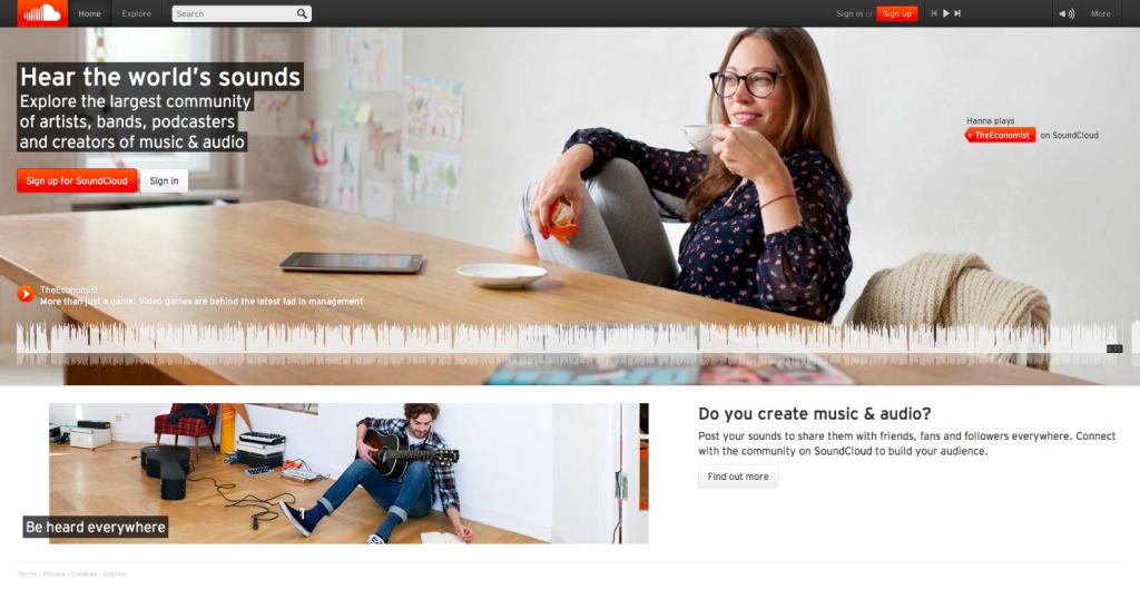
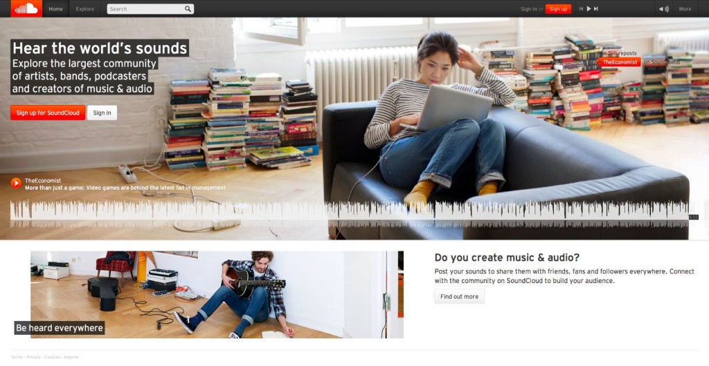
SoundCloud’s frontpage is a really good example.
They appear to be testing how the photo subject’s gaze will impact conversions.
Which of the following websites draws you more towards the sign up button?
My guess is that the girl with the coffee cup will convert better. Why? Because her whole body and her gaze are directed toward the call to action. She is smiling, seems happy & looks like someone who might use SoundCloud regularly.
The girl in option B does not show any emotion nor pay attention to anything else than her laptop. She blends together with the general background and does not play a role in guiding the beginning of the customer flow.
Remember that as a side effect the images create an immediate feeling of the site, and first impressions matter.
If the only thing the customer sees before being halted by the call-to-action is a high-quality image of a pleased smiling customer it will likely give a push towards accepting the solution offered.
Combination Of Body Language, Sight Direction & Frame
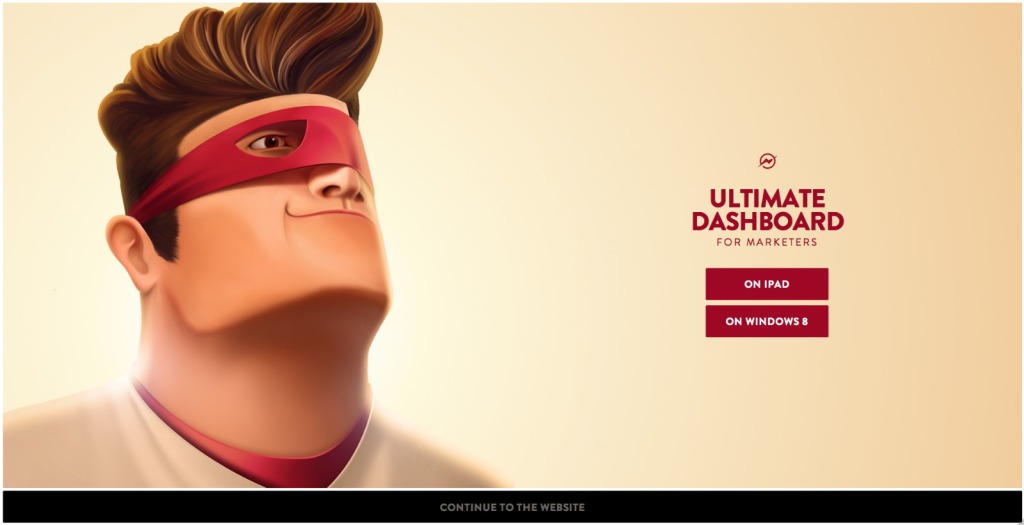
The Captain Dash homepage this past autumn made us immediately look at the enlightened superhero and follow his gaze to the upper right hand corner. The sense of movement is even stronger as both his look and body are aimed for the same direction.
Moreover his eye is surrounded by an oval/triangular shape making the visitors focus at his eye and move immediately on. The CTA buttons are too low though.
Having the call-to-action designed to be in-line with the gaze of the superhero would be worth testing
Avoid Rotating Images & Guiding The Visitor Off Your Home Scree
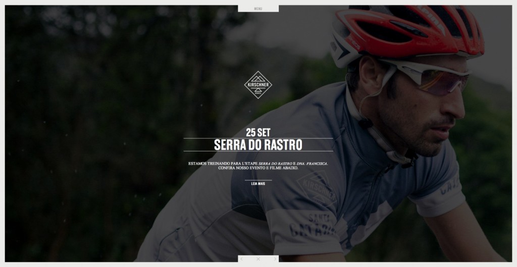
Kirschnerbrasil has great photos, but does it convert as well as it could?
When entering the site attention might be captured by the constantly turning images of the rider – but rotating images have proven to kill conversions time and time again.
Many of the images also have the model looking off screen & looking away from the site. With this particular background open wide, the screen directs you to look at whatever else is on your desk.
If they’re experiencing a high bounce rate from this page, this might be a reason why.
Emotion & Gaze Combined With Simple, Effective Design Tweaks
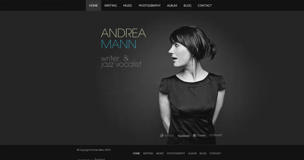
The image of musical artist Andrea effectively glares her own name and title.
With a slight highlight on her last name, it’s easy for viewers to remember as their eyes are automatically drawn to it by following her gaze.
Also, notice how her mouth drops open ever so slightly? Could this subtle design choice be a visual reinforcement that Andrea Mann is a jazz vocalist? I think so.
2. Creating A Good Flow/Eye Path
After you’ve started your page flow by directing your visitors eyes from the image towards your call to action you need to create an alternative route for those who are not ready to purchase/sign-up just yet.
Composition tricks, such as using arrows or “spotlighting” are great for this, especially if the additional information requires the person to scroll below the fold.
Arrows
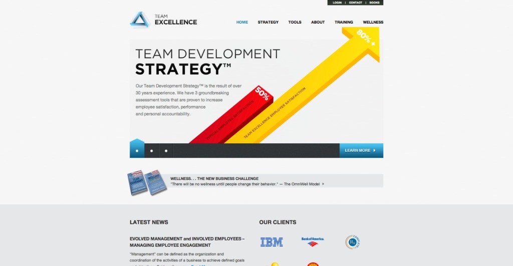
TeamExcellence seems to have a pretty good grasp on the concept of using arrows (however their micro-copy could use some work).
Clearly the bright yellow arrow across the page guides us to “wellness” menu item. But what is “wellness” and why should I care?
As it turns out, “wellness” is one of the most important products Team Excellence has to offer. The strong usage of the arrow gets the eye stuck on “wellness” without giving the visitor enough information about the product.
Here an A/B test could be set up by removing the huge arrows and using a smaller arrow to guide people to the “learn more” button or to scroll below the fold.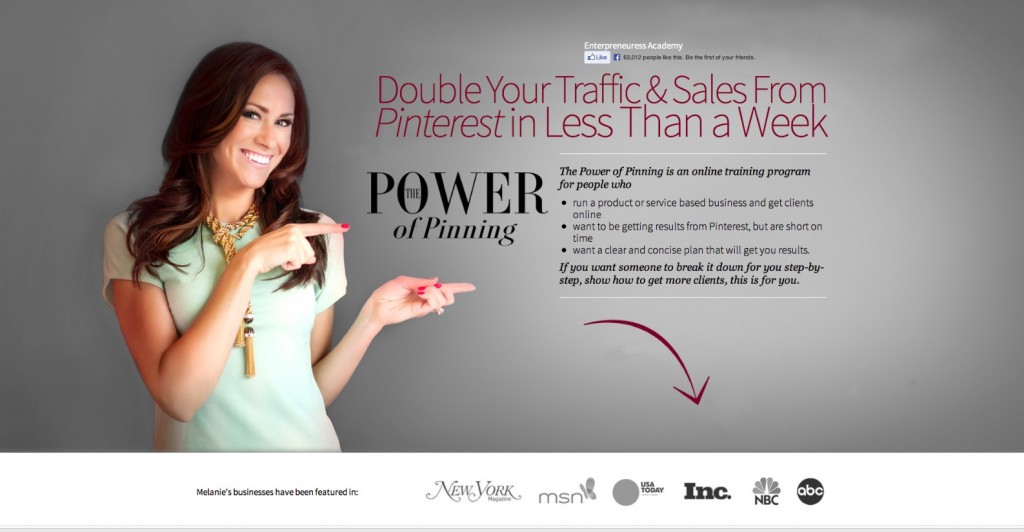
The Power of Pinning demonstrates how the the flow begins by making eye contact, then uses body language to direct you to the main value proposition on the right and then encourages you to scroll down using an arrow.
The arrow creates a clear path for visitors who may need more information to make an informed decision.
Less Eye Movement = Less Work For The Visitor
It is important to keep in mind that less eye movement makes pages easier to scan and understand, hence also simpler and more clear.
In a study by French researcher Marie-Line Bosse, it was discovered that a high degree of eye movement has a direct correlation to lower attention spans and retention rates for readers.
The same happens if your design forces their eye to jump from one end of the page to the other. Having 2 columns of equally important information will make the eye do a constant Z movement whilst scrolling down.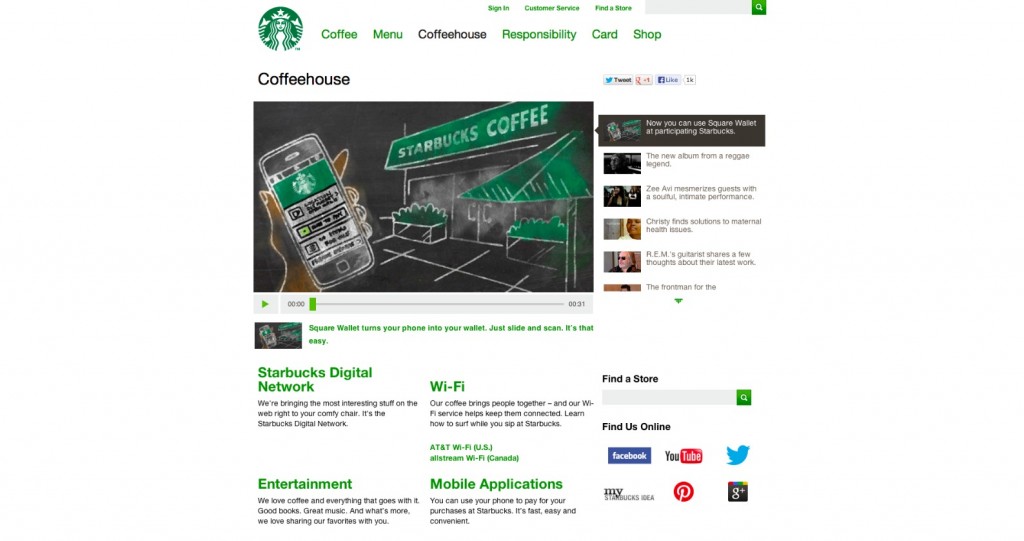
Starbucks webpage presents customer benefits in a two column layout for their coffeehouse page.
The eye’s movement would start from Starbucks Digital Network, move on to Wi-Fi, then back on Entertainment and so forth. With a quick formatting fix all this information could be presented in a much simpler way. Bulleted lists are a good solution.
On the web people follow a readability flow described by Nielsen as the F-shaped pattern. Having information in one column and bulleted supports this form of reading. Less effort means more visibility and better concentration from the customer.
Hand Drawings
Neil Patel shows how hand drawn arrows & graphs can work well on a web design.
There is something loved, nostalgic, yet surprising about it that allows to direct an eye at anything.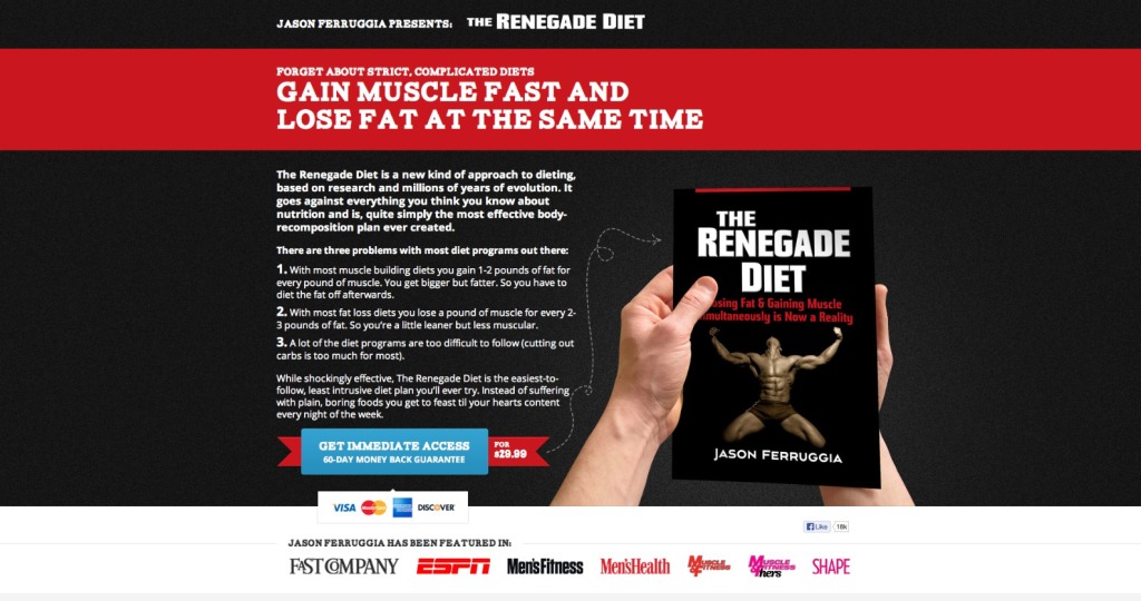
Renegade Diet Book perfectly draws attention to the main product with just a small hand drawn arrow.
Alternatively, the direction of the forearms subtly draws attention to the social proof underneath and encourages visitors unfamiliar with the book to learn more what it’s all about.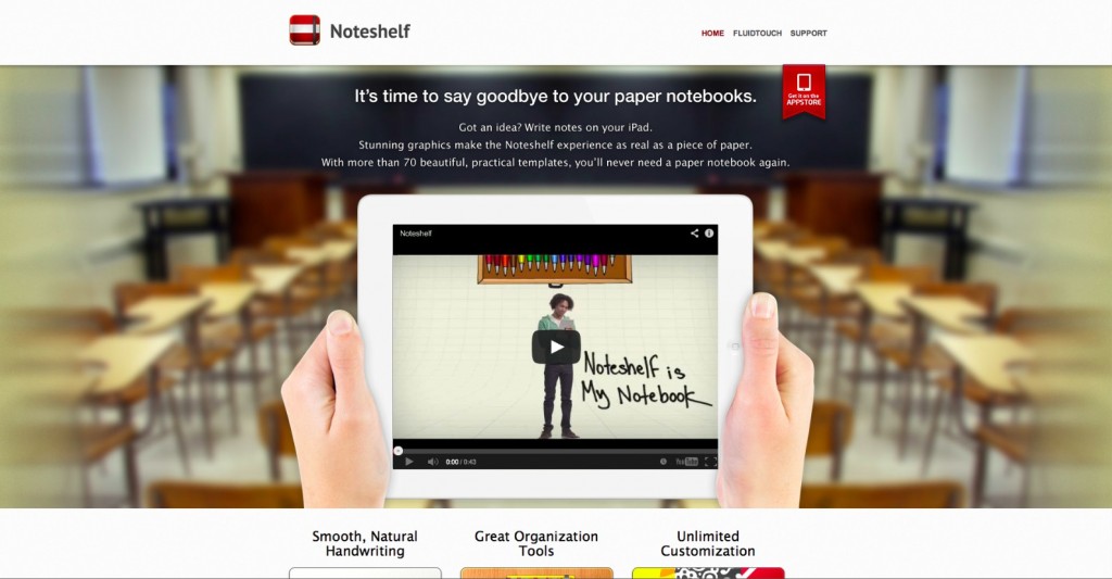
Noteshelf uses a similar technique to draw immediate attention to their product introductory video.
It literally makes you focus on the video before the headline of the page.
If you notice too, the lines of the hands create a frame for the benefits underneath, ensuring that any first time visitor can take in every piece of vital information without ever having to scroll.
Stronger Visual Hierarchy Is Easier To Follow
By now you might be quite confused by all the rules and additions to guide the eye flow through your webpage.
Well, it is true that there are many options. Selecting what to use will depend on the type and purpose of your website. However a clearly outlined hierarchy is a key factor for all.
To be sure you won’t get stuck – start designing your page in the following order:
- First, set in stone the hierarchy of everything you want to display on your homepage.
- Second, make sure that with the visual design the same hierarchy is met.
- Third, check that there is always a guide/connection to the next piece of information.
- And finally make sure that the end of the flow is set in stone.
Stories sell and all stories have a an ending.
3. Final Destination: Stopping The Eye With A Beautiful Finale.
Space and a visual frame
Following the same rules as photographic composition, you should isolate the areas that you want to call attention to .
To allow the eye to focus on a single object in the visual you need to have space around it for your eye to identify it as the most important piece of information.
Having a frame around the CTA is no different.
Because our brain unconsciously controls our eyes only to focus on receiving the most vital information – as to prevent becoming overloaded with visual stimuli – you see a slight blur around everything you are directly looking at. For example, you can “see” there is another sentence and image below, but you don’t know exactly what they say yet.
A good design will frame the images, text inside boxes, or anything you’re trying to call attention to, so the eyes and brain can process only the most important elements one chunk at a time.
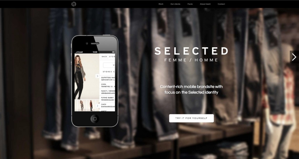
Sometimes the space around the object builds the frame, sometimes the frame is made from simple shapes. The example from the Inze.it page below does both by blurring the background image to focus on the iphone, and using a rectangle to frame the call to action.
This is why questions like “Which color converts best?” are silly. Many tests show that it’s usually the button that contrasts with the rest of the design is the most likely to get clicked.
Also, if you want visitors to click on the button, design it to look like a button.
Getting People To Notice Your Button
As our friend Michael Aaagaard says on Unbounce:
“The main optimization principle is that the button has to stand out from the rest of the page, so it’s easy for prospects to find the button once they’ve decided to take the next step.”
Often times, this can mean increasing the size of the button to be more noticeable, but don’t just assume bigger always better, because there are case studies that support either side, and no two industries are the same.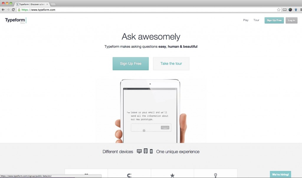
Maximizing Call-To-Action copy
CTA copy is one of the last phrases in the website flow your visitor sees.
By the time they reach it, they should be convinced and wanting to sign-up/purchase or perform any of the other goals the website represents. Hence the call to action should tell them exactly what they are looking for/will get after clicking on the button.
Managing expectations with your copy is a large part of marketing and when the messaging does not match with the expectations people might feel confused, stressed and leave.
Make sure you get this right. The good news is that it is super easy to test.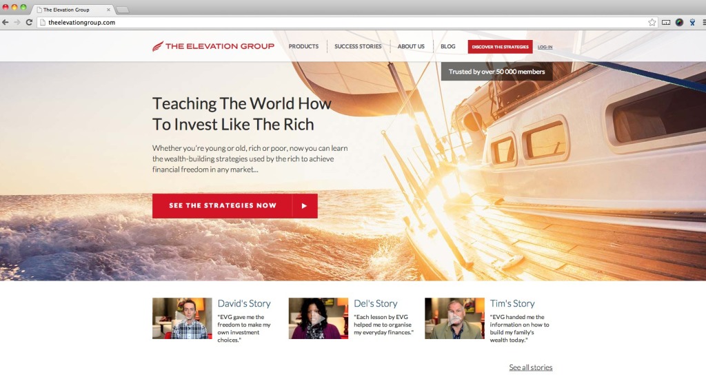
Supporting Information
An essential part of the CTA, as supporting information often enforces the need to buy now. It can be placed on the button or below it, depending on design and space around the CTA.
Urgency
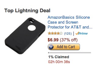
If something will be soon out of stock or is open for the last day people feel that they need to make the decision fast as otherwise they might loose the product or benefit. Thus words like “last”, “free”, “now” are good to use on the CTA copy.
Look at Amazon who have even added a timer that shows how much time you have down to the very last second.
White Space
Finally as mentioned before the area around the end of the funnel (the CTA) should be clean of disturbances.
There may be some arrows pointing to it but other than that it needs to be surrounded by at least a small amount of whitespace to allow the eye to naturally concentrate there. As if an item is placed separately it immediately is perceived as more important more attention catching.
Apple is guru when it comes to designs that use whitespace to draw attention even to the smallest details.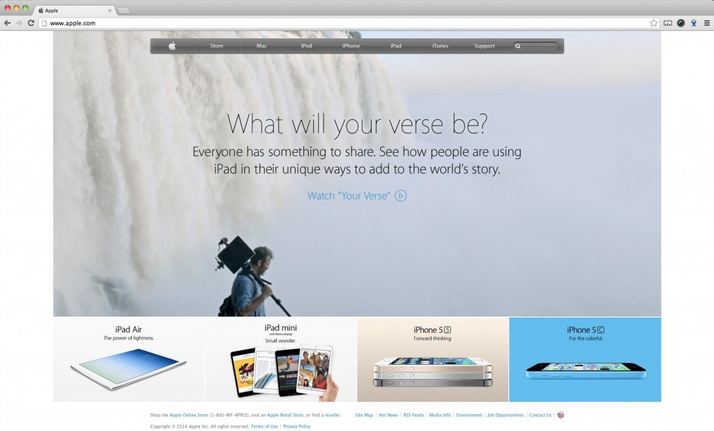
Conclusion – Always Balance Information With Design
Remember the eye-path is not something that can be taken for granted.
For good conversions you’ll need it to make the flow as natural as possible. Simplicity is key, but you need to treat your customer with all the necessary information.
Use images to show, text to tell, composition to direct & remove everything you don’t need.
Good flow is all about balance.




That’s a pretty cool article. When redesigning landing pages, especially long ones, I always insist on creating a good flow or path through the content, and it’s always proved quite effective in terms of conversions.
Plus, kudos for digging deeper than the usual « Perfect landing page » infographics that go through the different elements that should be there, but never talk about how they INTERACT, which to me is a lot more fundamental.
Hi David, thank you. It is true that getting every element added to the site to support the same flow is essential. Contradictions will create confusion and break the eye path. Hopefully we’ll be able to write an article about possible combinations sometime.
great article marie! where do you get these images? a lot of the stockphotos are just not good enough. any advice?
cheers ;)
See here https://medium.com/design-ux/62ae4bcbe01b
Cheers Peep!
This is a great post with so many great resources!! Thanks for sharing!
The Contact Keeper is a unique product, designed so end
users can keep business cards together with relevant notes about
the person and/or business.