You may be wondering, “why should I make my own visualization of my A/B test results?”
Because the A/B testing tools in the market already provide you all the necessary tables and graphs, right? They tell you when an A/B test is significant and what the expected uplift is. So why bother?
The thing is, these tables and graphs are comprehensible when you – a data driven analyst – take a look at them. However, if you’re the manager that bumps into them as a screenshot in an email or presentation document, then they aren’t that clear at all.
Moreover, you should always analyze your A/B tests in your analytics tool instead of in your A/B testing tool. Problematically, your analytics tool doesn’t tell you whether or not your A/B-test was a significant success. It doesn’t provide you the statistical significance (p-value), power level and error margins. You need to calculate and visualize this yourself.
Table of contents
Finding a Clear Way To Visualize A/B Test Results
Problem is, it’s tricky coming up with an A/B test visualization that everyone gets. However, we’ve gone through the process and have come up with a clear way to do A/B test visualizations.
If you follow, hopefully it will result in a graph that positively convinces everyone of your awesome job. You’ll be able to easier convince people that you need more resources for A/B testing. A good graph doesn’t just look nice, but it helps you to get the message across and boosts the credibility of your A/B test results.
1st Try: Why Reinvent The Wheel?
In the first couple of months when we started analyzing the results of A/B tests ourselves (in a spreadsheet), we used no graph at all. We just presented a table with the main results. Being good statisticians we included the standard error, the z-value, the p-value and the power. So at least we knew for sure that no one would understand it☺.
Oh well, we did use color coding; green meant we have a winning result!

Next, we added a graph to bring these boring and difficult numbers to life.
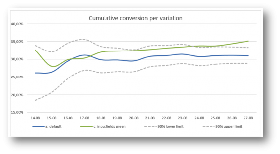
We started by copying what every other A/B test tool reports: a graph with the conversion rate per day, accumulated over time. We do added two lines: representing the 90% lower and upper limit of the default variation (computed by the conversion rate of the default variation plus/minus the critical z-value times the standard error).
The main problem we ran into was the simple fact that conversion over time doesn’t really give us an insight.
This graph tells you whether there’s a significant and stable effect, but that’s only interesting to the web analyst. Others are, of course, only interested in the main conclusion: does this A/B test have a significant winner and could we make a big positive impact on our KPI’s when we implement it? This graph didn’t give a clear answer to that question:
2nd Try: Cut to the Chase
We wanted to get rid of the graph with the conversion rate over time and only show the main conclusion. This meant clearly visualizing the last data points of the graph: the conversion rates of variation A and of variation B.
In addition, the 90% lower and upper limit (the confidence interval) of both variation A and variation B were needed to see whether the difference is significant.
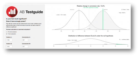
Basically, we wanted to replicate what statisticians use to visualize a test: two bell curves, a critical value and a shaded area (as used in the A/B test calculator of ABtestGuide or CXL’s AB test calculator), but more comprehensibly presented. Problem is, this bell curve visualization won’t get the message across in a persuasive and clear way to your company. It simply looks too difficult:
This is what we came up with to overcome that problem:
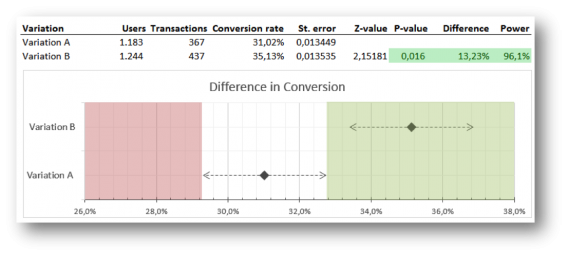
What you see are two clear points representing the conversion rate of variation A and B.
The dotted lines are the confidence intervals of them both. If the conversion rate of variation B lies outside the reach of the confidence interval of A, variation B is significantly better. The green shaded area accentuates this. A dot in the red area would mean that the variation is performing significantly worse.
One problem: the graph wasn’t fully automated.
The graph could easily be refreshed by changing the users and transactions for each variation (and thereby automatically changing the conversion rates, standard errors, z-value, p-value and power), but the shaded green and red areas had to be adjusted by hand.
No biggy if you’re running few tests, but if your job is analyzing more than 10 A/B-tests a week, this becomes really annoying. Another minor issue was that the graph still looked too nerdy. It looked like something you had to draw for your mathematics homework ☺.
3rd Try: “You’re Doing It All Wrong!”
On a Friday afternoon, we sat down with the data scientist that programmed the R calculations of the ABtestguide calculator and showed him our visualization. We consulted him, because the calculation of power wasn’t accurate and we didn’t know what was wrong with it (it took some time, but we found the small error in the formula).
However, the conversation soon turned to the visualization at hand. According to him – and probably the whole scientific community – our visualization wasn’t scientifically correct ☹.
Fixing Our Inaccuracy
Basically, we displayed the two bell curves in a one-dimensional graph and used this to verify whether the A/B test was significant or not. However, the correct way would have been to show the graph of the distribution of a difference between variation B and variation A (the lower graph of the ABtestguide calculator).
This distribution can be calculated by computing the standard error of a difference (take the root of the sum of the squared standard errors of variation A and variation B) and use this in the calculation of one overall confidence interval.
Great, now the calculation was correct, but consequently it had a huge impact on our visualization. We no longer could present a single row for each variation, but we had to merge the two to represent the distribution of a difference between variation A and B, so we did:
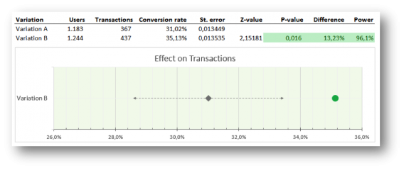
Here’s what this graph can tell you: if the conversion rate of variation B lies within the confidence interval, this variation isn’t significantly better; if it lies outside the confidence interval, it is, and the dot turns green (positive) or red (negative).
Now Our Graph and Table Are Automated
The problem with our previous visualization was the lack of automation. This graph and table solved that. We just had to import the data through the analytics API (the users and transactions per variation) and bang…the results and graph were ready!
That seemed like a dream come true, but when we started using this visualization with a couple of our clients we soon noticed that we still had to explain (even more than before) what they were seeing in this graph…
Our Graphs Still Weren’t Fully Communicating Results Across Teams
Especially, with multiple variations in the A/B test the graph becomes confusing. A test with a default and 3 variations would show 3 rows with grey diamonds and grey dotted lines (the confidence intervals) surrounding them that were all just slightly – barely noticeably – different, because all the standard errors of a difference between the variations and the default are usually roughly the same.
People were puzzled as to why there were only 3 lines and not 4: what happened to the default variation? And every row looked basically the same, so it felt like the impact of winners wasn’t that big.
Hmm…we just woke up from our perfect dream. Back to the drawing board.
4th Try: Stepping Back in History, But Now Automated!
So, we went back to our visualization of our 2nd try – one row for every variation. We know this might not be the perfect scientifically correct way of displaying results, but it is understandable and that was our main goal. We did keep the new design and sharpened it a bit by using dots instead of geeky diamonds. And by looking into all the possible features of graphs in Excel we came up with a way to automate this kind of visualization too…yeah!
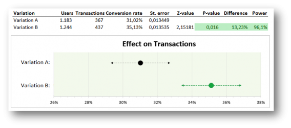
Before we went ahead and used this visualization with our Online Dialogue clients (and confuse them once more with a different A/B test visualization), we consulted our own colleagues.
We found out that the graph was very clear to all participants in our A/B test teams, but stakeholders, managers and other important people, not directly involved in testing, could still have many questions and/or remarks:
- “Why is the conversion rate in this graph thirty something percent? I thought we had a 3% conversion rate on our digital channels?” Naturally, the graph is based on the actual conversion rate through that page. You know that it’s different for every page and that your sales funnel can have a thirty something percent conversion rate, but they don’t.
- “I just want to know how big the uplift is.” The graph tells you that there is something green going on, so something ought to be good, but what’s the exact effect? They can’t find the 13.23% uplift. They have to read the table to get all the necessary information.
- And if they do notice the 13.23% uplift, you might get: “Wow, 13% more sales! You’re my hero – let’s put it live now!”. They should, but you’d have to explain it was an A/B test on a page of the website that only leads to 367 conversions a week, not the 8,000 conversions you have on the whole website. So, yes it had 13.23% uplift through that part of the website, but it probably will only have an effect of 1% or so on total conversions.
5th Try: We’re Getting Closer Baby
These questions and remarks were taken care of in our next (and so far final) visualization. Besides a visual update to make this visualization client and Online Dialogue PR friendly we made 2 major changes:
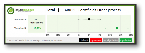
- We decided to change the x-axis so it no longer reports on the conversion rate through that page, but on the relative difference it makes. So the default is set on 0% difference, while the variation may bring a certain increase (or decrease)
- We put the number of conversions of the default in front of the default graph row. For every variation we added the relative change in conversion rate in front of the graph. We also automatically color-coded the difference: when the difference in conversion rate is significantly better the number turns green, when the difference is significantly worse, the number turns red.
With this visualization you will be able to see the uplift and the expected impact immediately. We also added the number of test weeks and the average population per variation – so the data analyst can still feel confident with the results. The analyst could also easily explain that with a 90% certainty the increase in conversion after implementation will be somewhere between 7.5% and 19%.
We now think this visualization offers enough information to convince the manager and the analyst – so we got rid of the table (which is still there when the analysts in the team open the Excel of course – but it’s removed from the PowerPoint, result email and/or PDF).
The Online Dialogue clients are happy with this new visualization and at Testing.Agency we already hired a developer to automate this visualization based on data from the Google Analytics API, but we think there’s still room for improvement.
Conclusion: What Are Your Thoughts?
Though A/B testing tools provide graphs and charts, it’s important to create A/B test visualizations the whole team understands. We’ve gotten to the point where we’re conveying our results clearly, but we’d like to get even better at it.
Something we know we want to do is to give way more focus to the real possible impact once you implement a winning variation on your website. How many conversions or revenue will it add? We already know that not every page reaches all visitors and therefore not all conversions.
Moreover, sometimes tests aren’t run on 100% of the population on that page. Consequently, this makes the reported number of transactions in the default less important – and possibly even confusing – to managers. They just want to know the number of extra conversions every month once this new variation is implemented and what that means for the uplift of total revenue. We may need that in our visualization.
So, according to you, what else is missing? What would you change?
Thank you for reading our quest and join in by adding your feedback below, thanks! You can download our Excel template by clicking here.





Hiya,
A few questions:
1a) What if you have more than one competing alternatives – do you plot all of them? What do you use as the lift measure?
1b) Family-wise corrections? A bit technical, but do you adjust for multiple comparisons if multiple alternatives?
2) Do you pick the default confidence level for the color coding, or does the client – account level or for each test
3) Unequal traffic allocation – ie what if the control is given more than 1/k share of traffic – will the average traffic per arm be meaningful – maybe it dons’t matter since that is an edge case?
4) Prediction/forecast – should report show over next month, 6 months, year (whatever the timescale is) a forecast for the expected number of incremental conversion events and allow the client to give conversions a a weight/value (assuming you are only doing binary rewards). That way they can see the estimated value of the change over a future time horizon.
5) While a agree that the results from AB tests should be pushed in to primary data/analytics system for additional analysis, and potential incremental long term impacts, I am not clear on for this use case why the reports from the testing solutions don’t give you similar information (outside of your custom look and feel).
Cheers!
Matt
Hi Matt,
Thanx for your reply on our post. Good to hear this post triggers some interesting questions. I’ll try to answer all of these:
1)
We try to refrain from multiple alternatives to be honest (because of the mathematical difficulties you will get) and attempt to stick with just A/B-testing. When we test multiple variations it will be limited to A/B/C or in a very rare case A/B/C/D testing. As you mentioned you need to correct the alpha to make sure you don’t heighten the chance of a Type I error.
Visualizing an extra variation results in an extra line in the graph, where we always compare the variation to the default (because the hypothesis we state will have the default situation as the reference point). The lift is then computed as CRc/CRa. So actually, the same as a regular A/B-test. We don’t use a very scientific way (Bonferroni or Šidák procedure) of correcting the alpha just yet (we’re looking into that), but simply test with a stricter alpha (0,05 instead of 0,1 or 0,025 instead of 0,05).
2)
The confidence-level is set by us – the client doesn’t usually have the necessary knowledge to define the desired alpha) and we use the same confidence-level across tests. It would be too confusing to the client to change the confidence level per test. And I don’t see an apparent reason why you want to do that?
3)
In fact, we never test with unequal traffic allocation, so we don’t need to deal with this. We believe comparing uneven sample sizes isn’t reliable – samples can have a different composition in regard to traffic sources, browsers etcetera if one sample is far smaller than the other.
4)
I agree with your view on the prediction/forecast of conversion lift over time. The prediction/forecast would be very effective in communicating results to higher managements, but we should be aware of the risks. You are pretty sure (90/95%) the variation will result in an uplift, but the exact uplift is not known. Therefore, putting an exact number on the test result can be tricky. If the communicated result cannot be found after implementation all faith in A/B-testing could vanish. So, we’re not sure what the exact communication should look like.
5)
We think our visualization is clearer than the results you see in for example VWO or Optimizely – the added graph gives a clearer picture of the spread of the variations and their possible overlap. But the foremost reason for developing this visualization is that we don’t use the data of an external test tool at all. We always analyze our A/B-test results in the analytics tool (where no visualization of results is available). We don’t want to compare apples with oranges when it comes to drawing conclusions from an A/B-test. You use data from the analytics tool to see whether there are differences between for example new and returning visitors or per browser. We believe drawing conclusions partly based on the test tool and partly on the analytics tool should be prevented.
I hope these answers sled some light on your questions
Annemarie
Hello Peep,
@all contributors of this article: thank you so much for this awesome sharing!!!
Thank you Roy! Glad you like it!
You may consider looking at a tool such as http://www.Tableau.com The data can be refreshed. Has native connection to GA. You can push data to other places (or get it) and then combine them.
The cost is one time.
Not associated with them but a avid user.
Thanks AnneMarie,
A couple if quick follow up points.
RE 4) The entire testing enterprise is predicated on uncertainty . The whole reason for running tests is to 1) evaluate relative efficacy and 2) estimate the both the expected ‘lift’ and to place bounds around our uncertainty about that lift.
In other words, which is better AND what should one expect to get from following the new policy.
If we can’t make a statement about what to expected return will be over some future time period for taking an alternative course, I am not sure if there is much value in any of this.
RE 5) you are of course free to analyze data as you wish, but if the results from one’s testing and analytics software are apples and oranges, than there is something fundamentally wrong in the process. While the exact counts may not match, if what you are saying is that each system disagrees on the general outcome of a test, or has radically different lift results, then something is broken.
Matt
Apologies for typos I am using a phone to type.
Well said about both points. I think you make a very important point at 4) when discussing uncertainty. I think this could be explored a bit more. Specifically the optimization and testing space has been so anti case study and anti common practices that we’ve created a sort of variant paralysis.
If we can’t say ‘Hey I think this concept will work for this page because of this reason and I’ll know it worked when I see X’ then the entire system crumbles. Testing by its very nature is dealing with ambiguity, and when we create a new variation we do so because we believe that it will out perform the control. We don’t just add a variation for the sake of change or the pursuit of knowledge, that would be an awful practice. We have to do these things with purpose.
Also to 5) I agree that we can’t expect 100% accuracy between techs, but if we are seeing major gaps the tech needs to be evaluated.
I always enjoy your input Matt thanks for beating me to the punch here :-)
I’m agreeing with both of you, I just wanted to point out that we should be careful of just how we communicate the expected uplift to upper management. If you put it too firmly they might keep you accountable when the real uplift turns out to be lower than expected. So instead of saying “you will earn an extra 3 million in 6 months time once you implement the variation”, you should say something like: “there’s a 95% chance you will earn between 1 and 3 million extra…”
And as to the analyzing the test in the test tool versus the analytics tool: we’re not seeing huge differences in users and conversions, but we’d like to be on the safe side. When we measure everything in one tool, we’re in control of what is measured and we can be confident in comparing the numbers (https://cxl.com/analyze-ab-test-results-google-analytics/).
If this visualization if basically the same value as VWO or Optimizely visualization and its main value is automation in Excel – where can we download the Excel? :D
Hi Edgar, we believe our visualization is even better (more comprehensible for managers) than the ones in VWO or Optimizely :-) so you should definitely download the Excel. We are working on that – stay tuned!
Hi Edgar,
We just released the Excel download page – you can download it from this Online Dialogue landing page: http://onlinedialogue.com/abtest-visualization-excel/ – it’s without the API connection (that’s only working in specific set-ups), but with a full working visualization for A against B.
It’s free, without email harvester, would appreciate the tweet love though :-)
Cheers,
Ton
Wow! Thanks for sharing such a useful post and healthy insights.
I completely agree, we should always analyze our A/B tests in our analytics tool instead of relying on the testing tools. The 3rd point is very well agreed upon by me. We need to fix our inaccuracies. Lack of automation always created problems in visualisation and stuff. Importing the data through the analytics API has solved this. Automated graphs and tables did the magic. Wohoo ! such a great thing.
One question I wanna ask is should we plot all of the competing alternatives, if we have more than one?
Hi Flynn, great to hear you like our post! If you test multiple variations you could plot all of them in one graph or visualize each comparison in a separate graph, but – regardless of which method you use – you should correct the alpha to make sure you don’t heighten the chance of a false positive (Type I error). Because the more variations you test, the higher the likelihood of a false positive. For example, if you test 4 variations with 95% confidence your chance of a false positive isn’t 5%, but 18,5% (1-(1-0,05)^4)! To correct for this you need to test against a stricter alpha (and consequently you’ll need larger sample sizes). Because of this issue, we actually try to refrain from testing multiple variations and stick with just A/B-testing.
Hi Annemarie,
I find this post VERY informative and I realize now I have to do something similar for my clients as well (looking forward to your excel!).
1 thing dough: I always configure separate tests for desktops and mobiles (do you?).
Shouldn’t the device category be mentioned in the results as well?
Vele groeten :-) Nico
Hi Nico, thanx for the compliment!
Yes, normally we would create different tests for mobile and desktops, because behavior (and motivation) across devices isn’t usually the same. The Excel offers a couple of form fields in which you can state the name of the A/B-test, the segment you’re looking at (total or desktop/mobile, new/returning visitor etc) and test duration. The input of these fields is used in the visualization – in the example in this post we’re looking at the results of the total population of A/B-test AB015 with a test duration of 2 weeks.
Groetjes :-), Annemarie
Hi Nico,
The Excel download is live: http://onlinedialogue.com/abtest-visualization-excel/
Enjoy,
Ton
Thanks Ton!
Thanks for the great post!
I use similar approach to communicate a/b testing results. My current version looks like your first try though, so I feel it lacks of visualization:).
Since you’ve mentioned Excel only, I have a question: is it possible to replicate this visualization in Goolge Sheets?
Hi Yaroslav, thanx for reading it!
Unfortunately Google Sheets doesn’t provide as many possible graphs as Excel does and you’re less flexible in adjusting those graphs as well. I tried to replicate the visualization in Google Sheets, but came away empty-handed :-(
Hi Yaroslav,
We have a download for Excel for PC and one for Excel for Mac – Google Spreadsheet will not work, sorry – blame Google :-)
Download the Excel here: http://onlinedialogue.com/abtest-visualization-excel/
Thanks,
Ton
Great job guys! I am going to share this post with our data team. Will be getting in touch with you :)
BTW SmartStats is now launched! https://vwo.com/bayesian-ab-testing
Do have a look at the new Bayesian results screen. Let me know if it’s better than the old one. We now show conversion ranges and any overlaps.
Excellent visual representation!! Thx Ton and Annemarie for your efforts of making the results/stats part more usable and comprehensible for all of us! Can’t wait for the extended A/B/C version . This one will have a higher alpha, 99%, setting?
Suggestion: since you are using ‘frequentist’ stats, it would be nice to put a ‘traffic estimator, test duration calculator’ in it as well.
Jeroen
additional: can you display the exact confidence range, e.g. in grey, for the variant b beneath the displayed improvement/loss percentage?
Jeroen
Hi Jeroen,
Interesting add-on – it can help understanding the potential uplift. Especially with the fact that winning tests on average are performing at a better conversion rate while winning than after implementation. We should test if it’s not confusing information for the manager though, the analyst can read the data from the graph. We will try! Thanks for your input.
Ton
What I like about this post is that you guys illustrated the process that you went through, shared the various outputs, and the thinking that went into each iteration. I believe this is what’s missing in most teams and organizations. I suspect they crank out one iteration, maybe two, and call it quits without assessing opportunities for further improvement. As a result they end up with output that is harder to understand and thus less likely to be understood and subsequently acted on. Well done and thanks for the many useful links.
Thx George for the compliment! It was quite a journey, but a very educational and foremost fun process
There was a minor bug in the Excel version for English language users – we fixed that. So should be fully working for you English users if you re-download!