
Optimizing the sign-up flow is a never-ending saga for SaaS companies, for whom it’s mission-critical to acquire and activate users as quickly as possible.
Within the sign-up flow, the dreaded word is “friction.” Sadhana Balaji sums it up:
You can optimize your value proposition or call to action buttons all you want, but if your sign-up flow contains too much friction, you’re leaving money on the table.
Friction, Sadhana continues, is “the psychological resistance that your visitors experience when trying to complete an action.” It’s a conversion killer. There are various ways to optimize sign-up flows and reduce friction, many of which are detailed in Sadhana’s article.
At the same time, every sign-up flow has some friction. All SaaS businesses, for example, need at least an email to connect a service or purchase to a specific user.
It’s easy to assume that the sign-up process with the least amount of friction is best. But there are no absolutes in conversion optimization—what works for one site or business doesn’t work for another.
We’ve learned that the hard way. We built a near-frictionless sign-up flow with a 96% conversion rate. And while it worked wonders for creating sign-ups, it unearthed other issues and became a blocker to solving them.
This is our cautionary tale for frictionless sign-up flows—their latent perils and our ongoing quest to create the right amount of friction.
Table of contents
The original sign-up flow
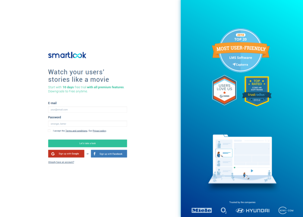
Our company, Smartlook, provides qualitative analytics solutions for websites and mobile apps. We’re a startup in a dynamic industry and without extravagant resources.
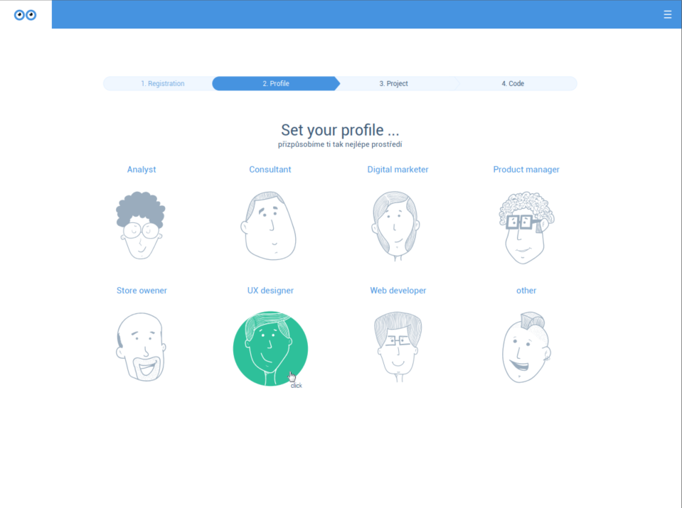
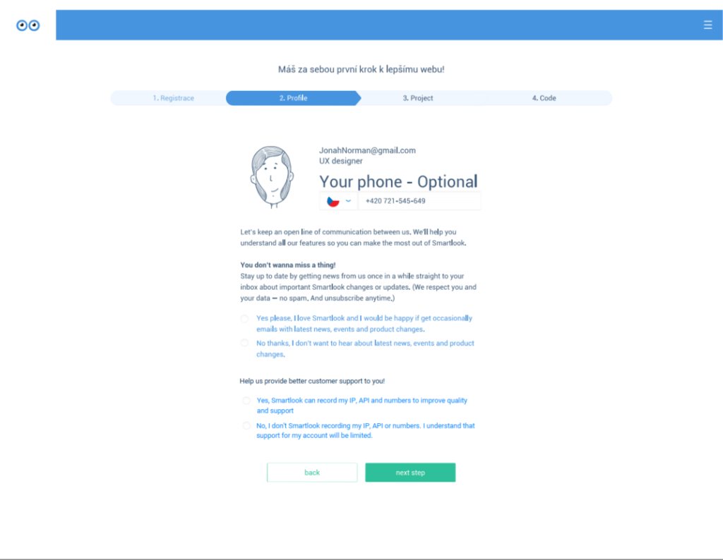
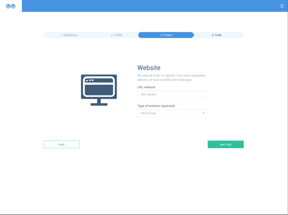
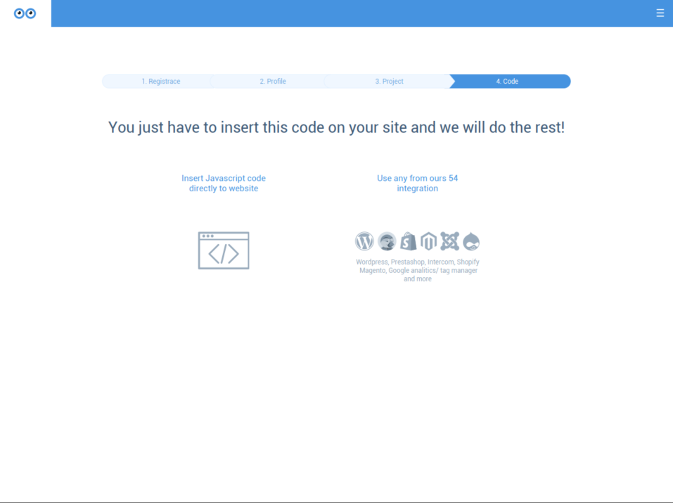
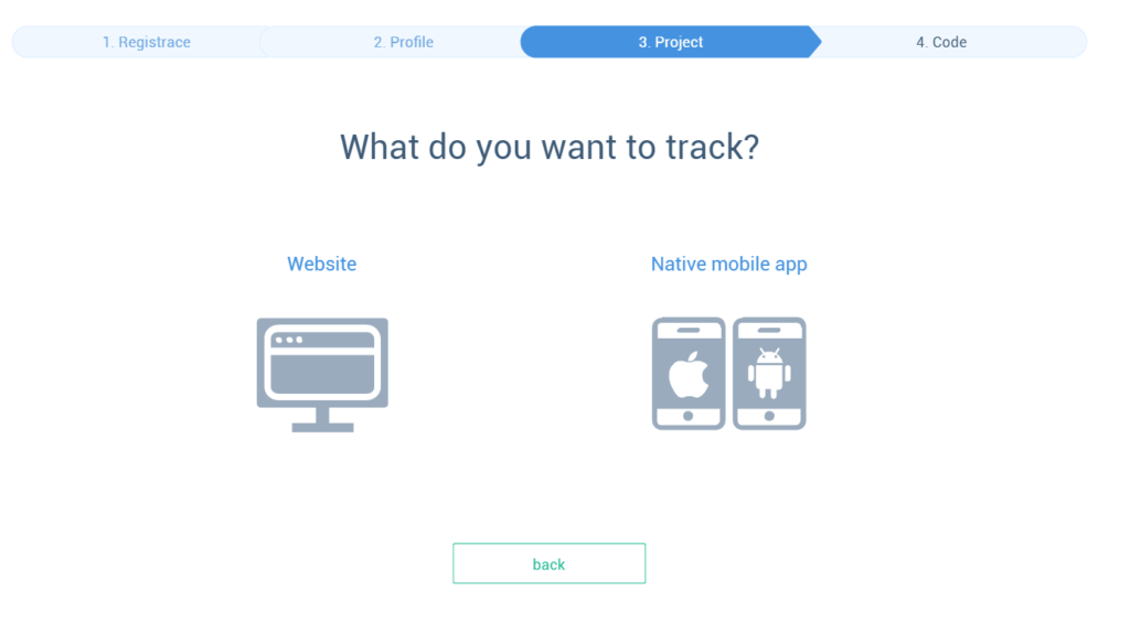
This story starts with our (now older) sign-up process. It was a simple four-step process embedded within the app environment:
Step 1: Registration
Step 2: Profile
Step 3: Project
Step 4: Code
This flow needed to change—fast. But not because it wasn’t driving conversions or user engagement. There were other reasons:
- The flow didn’t work for mobile project creation. At the time, we’d just released our product for mobile apps, and we needed to tweak the flow to support mobile projects, too.
- The flow design was dated. It was a holdover that didn’t match our latest app design. The experience from registration to the refreshed dashboard was inconsistent.
- The flow locked users in. This was our biggest sin. There wasn’t an easy way to leave the flow and check out the app without finishing. The user had to add the project tracking code or choose an integration to proceed onward. This, of course, was detrimental for non-technical users who just wanted to review the app.
These challenges spurred us to revamp the flow as soon as possible. But that urgency worked against us. We moved forward without a specific framework, deep data analysis, or comprehensive testing plan. Everything was ad-hoc.
The work started with the addition of a mobile project option, like this:
It was an obvious first-aid patch. But it allowed us to focus our attention on other issues within the sign-up flow.
The next iteration of the sign-up flow
Our team brainstormed ways to solve the known issues with our sign-up flow—what we could change, what direction to take, etc.
Aside from the urgent issues outlined above, which initiated the whole ordeal, we outlined a couple of underlying objectives for our redesign:
- Get users to our core feature (session recording) faster.
- Make the process as frictionless as possible.
We also tried to make the flow more graphical, seamless, and fun. We wanted it to be an engaging introduction to the Smartlook story and product.
We decided to delay the marketing and support consents (Step 2 in the old process) until the very end—when the user lands on the app dashboard. Tracking code and project details would also be delivered once the user was inside the app.
We further simplified signup with Google and Facebook logins. This is how the new flow worked:
- A sign-up URL with several options for account creation and a legal agreement.
- Definition of project type—mobile or web.
- Name and role definition.
- Company name and segmentation.
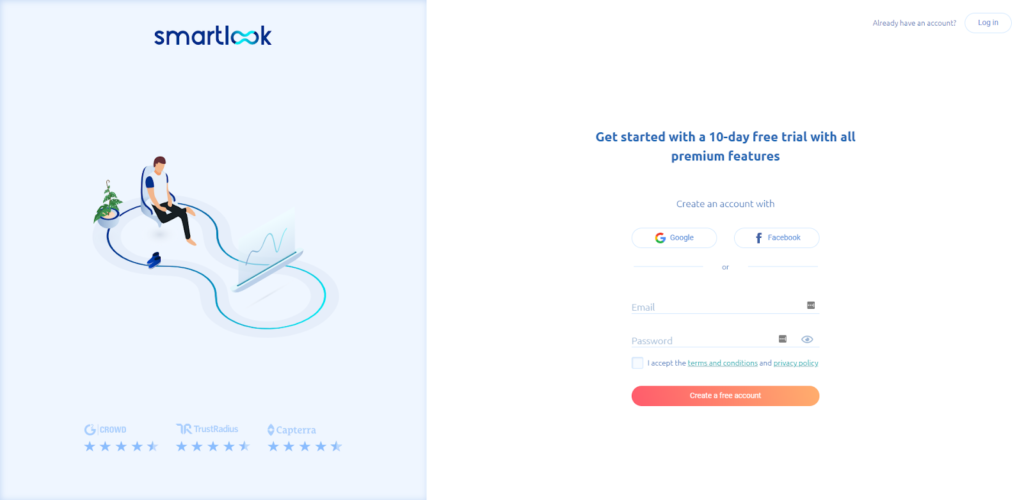
These adjustments minimized the steps and friction in the user experience—from landing on the website to signing up and seeing Smartlook’s capabilities. It also looked nicer—way nicer. But, aesthetics aside, did it meet our objectives?
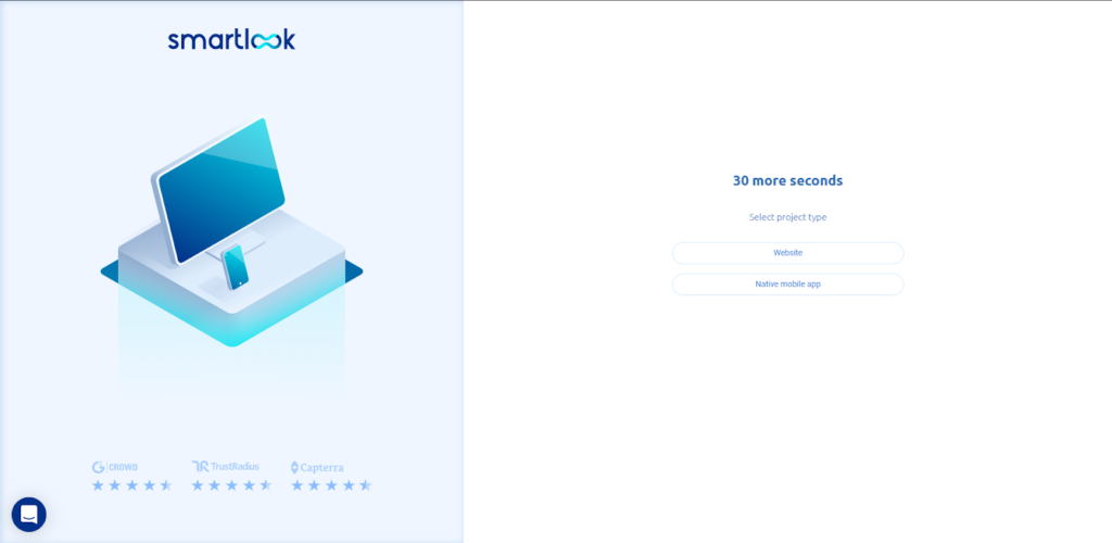
We had built the flow to minimize user inputs and remove friction. For example, when someone typed in a name, clicking on the “Role” immediately led to the next step. There was no need to click “Next”; user inputs drove the flow.
Our data showed that the changes indeed streamlined the sign-up process. Our new sign-up funnel started with a pageview of the sign-up URL and ended with a custom event that confirmed a project had been created:
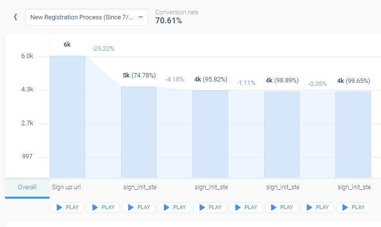
The conversion rate from landing on the sign-up page to completing the process was 70.6%. At the very least, that exceeded industry benchmarks (for what they’re worth). We were generally satisfied with the results.
And, as we gathered more data, the numbers kept getting better:
- 75% of users who saw the sign-up page converted.
- 99% of those who started the sign-up process completed it.
But we had created unanticipated problems.
The perils of a frictionless sign-up flow
So what was the issue? Our conversion metrics didn’t connect to more important ones: activation rate and, of course, revenue. In our platform, activation rate is the number of projects that actually receive data.
Project activation, not surprisingly, is essential for us to demonstrate value and engage users. Until users connect data sources, we can’t show them anything other than demo projects, videos, images, etc. And demo data lacks the context users care about—their data.
Our users needed to take an extra step—activation—to get to a “Wow!” moment. After the changes to our sign-up flow, our activation rate was floating around 60%, which may seem good until you consider the big picture:
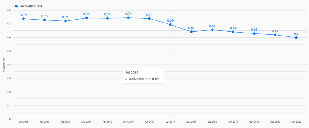
The activation rate had been dropping since the July 2019 changes and, by January 2020, was down 18.9% (14 percentage points) compared to the beginning of last year.
This led to some serious introspection:
- Was the new sign-up flow to blame? Activation rate is a relative number that can be offset by other activities. Sure, we increased lead generation, which can decrease the activation rate. But such a significant drop shouldn’t happen.
- What new problems did it create? More accounts created but not activated incurred unjustifiable costs on AWS, Intercom, Mailchimp, etc. Additionally, all our users and product engagement metrics got skewed. We saw more users, but they weren’t doing anything. Filtering out passive users became a growing nuisance to the team.
- Why did it happen? In comparison to the previous sign-up flow, we delayed project activation and instructions until after the sign-up flow was complete.
We had a hypothesis: A sign-up flow that completed without users adding their data meant that they got lost, distracted, or disappointed with Smartlook before installing the snippet and activating the project.
We had to fix that.
Re-introducing friction into our sign-up flow
We decided to revamp user onboarding by focusing on personas within the Jobs-to-be-done framework. That meant we had to show our users specific solutions to problems and issues based on their profile. This is the context we aimed to provide to users upon finalizing registration.
That wasn’t easy. We had a solution that allayed pain points for different roles within companies. Within the same platform, store owners, product managers, marketing analytics professionals, customer success officers, and UX specialists all had “jobs” that Smartlook could help them do.
To improve our activation rate, we poured over our user data to identify core personas and JTBD. Many new users shared the first role and first category of company—not because those were their roles but because they were flying through the sign-up flow at full speed, clicking the closest button.
From their perspective, this was fine. From ours, not really. We needed specific answers to improve product tours and onboarding. But that also meant that we’d need to reintroduce some friction into our sign-up flow.
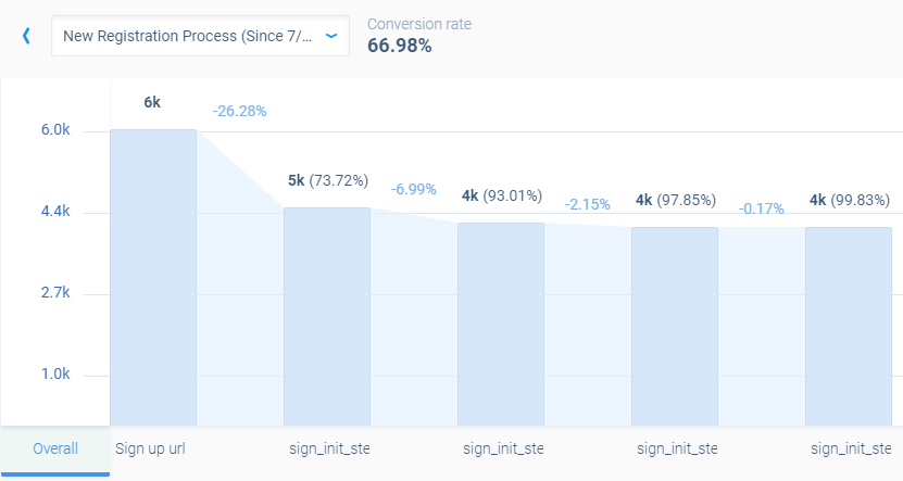
We tweaked the flow so that users had to select the role and company category—in two separate steps—before signing in. We also added a “Prev” and “Next” button as a second interaction. The flow didn’t proceed automatically after users picked a category.
Also, unlike the first sign-up flow, we made “website category” mandatory, not optional. That small bit of friction reduced conversions.
If you compare it to the prior funnel (before introducing the friction), you can see that the sign-up flow steps completion worsened by 1.21 percentage points; the overall conversion rate dropped from 70.61% to 66.98% (a 5.14% decline).
But this small tweak brought us the intended benefits:
- The number of new, inactive accounts dropped. That saved money on consumption-based services.
- We still have a sign-up flow that’s efficient for users, but it also delivers the information we need to tailor onboarding. We can now work to reduce friction so long as we preserve the information we need.
- We’ve had great success building contextual product tours with Intercom, which rely on the new data acquired by friction in the flow. For example, we now show users how to add events directly from a session recording as they watch it—not after, not before, but as they review recordings. (I explore other changes in detail here.)
The next instance of product tours will be built with even greater emphasis on specific user roles, like funnel building for ecommerce or dashboard tiles tailored to store owners’ needs. That work is already underway.
Conclusion
Best practice–driven solutions are tricky. Sometimes they work, sometimes they expose more problems.
In our case, the goal of optimizing our sign-up flow started with the elimination of friction. But that exacerbated other issues with our project activation rate, increased consumption rate, and, as a result, costs.
There are no universal solutions. The best practices we all rely on sometimes don’t make any sense in our specific, real-world applications. There was no template for introducing just the right amount of friction for our product.
I’d like to close with an open call for critical thinking and thoughts. I did my best to be as transparent as possible and show real issues we face. The team and I will gladly take criticism on where we made mistakes and direction on plausible solutions.
Related Posts
-

Friction is “the psychological resistance that your visitors experience when trying to complete an action."…
-

You got people to sign up for your free SaaS trial—great! Trouble is, a significant percentage…
-
User flow is the path a user follows through your website interface to complete a…
-

Think about every lead magnet you've ever signed up for. Of all of those free…


The images here are all broken :(
Sorry about that, Vitor. Fixed!
Images still broken https://prnt.sc/s1127m
Sorry, Bohdan. I think it’s (finally) resolved this time.